This section allows you to create the Slider with images, Customers can swipe to see the next images or they watch it autoplay. You also can add texts, call-out buttons for them.
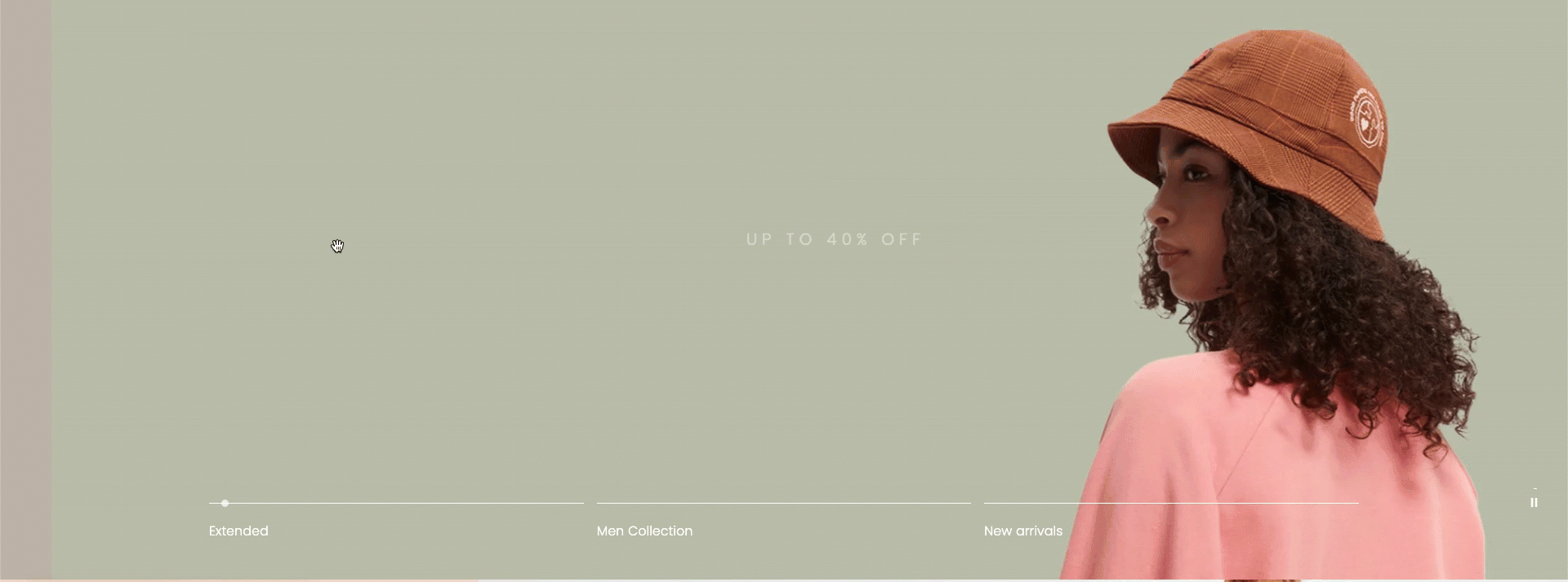
It is usually located on Homepage. However, Shopify 2.0 allows you to add the Slideshow 3 section to any pages that you wanna use.
Steps
1.In the theme editor (Customize), click Add section
2.Search Slideshow 3
3.Click Save
1. Slideshow 3 content
The Slideshow 3 section has total of 9 content blocks, you can use those blocks to build the Slideshow layout that you wanna use, you can view the video below to know about the Slideshow 3 section blocks:
2. How to configure the Slideshow 3 section?
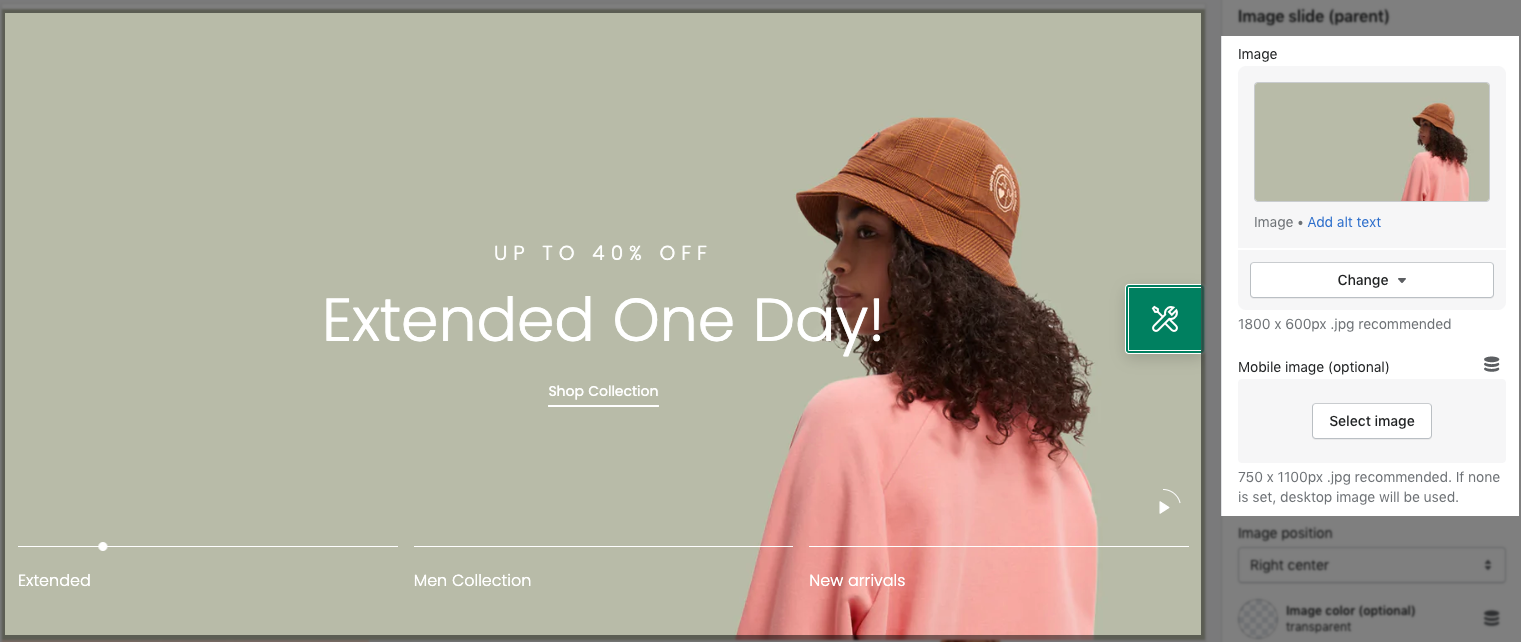
- Image Slide (parent): You can upload the Slide image here, this section allows you to add 2 separate images for the Desktop and Mobile devices.
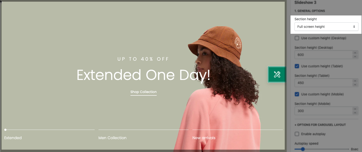
- Section Height option: This option allows you to configure the height for the Slideshow 3 section. There are many choices for you to choose, if you choose the Custom height option, you can configure the height for all devices: Desktop, Tablet and mobile devices; you can enter different values for the height for the Slideshow 3 section.
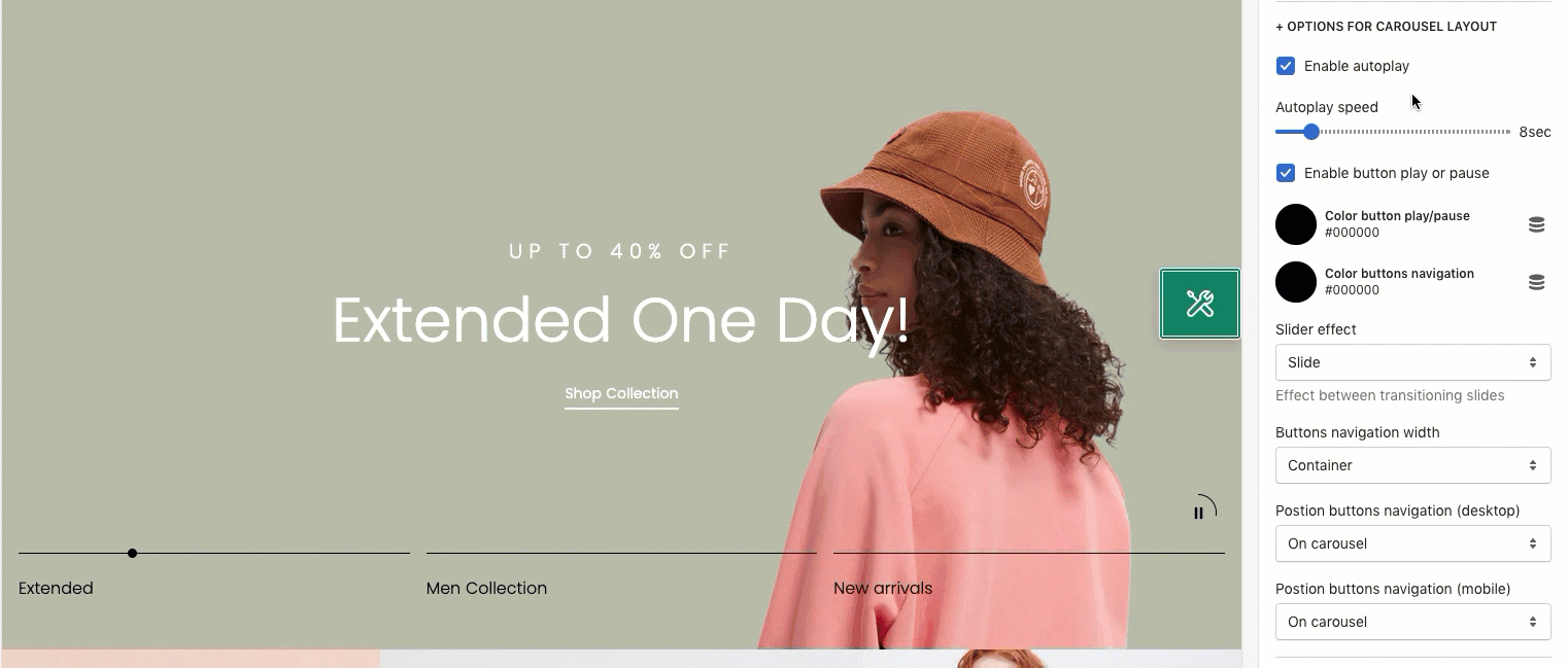
- Enable Auto-play: Tick on this checkbox to enable auto-play mode for the Slideshow 3 section.
- Autoplay speed: You can set the automatic time to move on to the next slider. Set is ‘0’ to disable auto-play.
- Enable button play or pause: Auto-playing will pause when the user hovers over the slideshow.
- Position buttons navigation (desktop & mobile): You can choose a position for the Navigation button of the Slideshow section here. You can feel free to show 2 different positions for the Navigation button on Desktop and Mobile devices.
- Layout: You can choose the layout for the Slideshow 3 section here. We have 2 layouts for you to choose: Wrapped Container and Fullwidth.
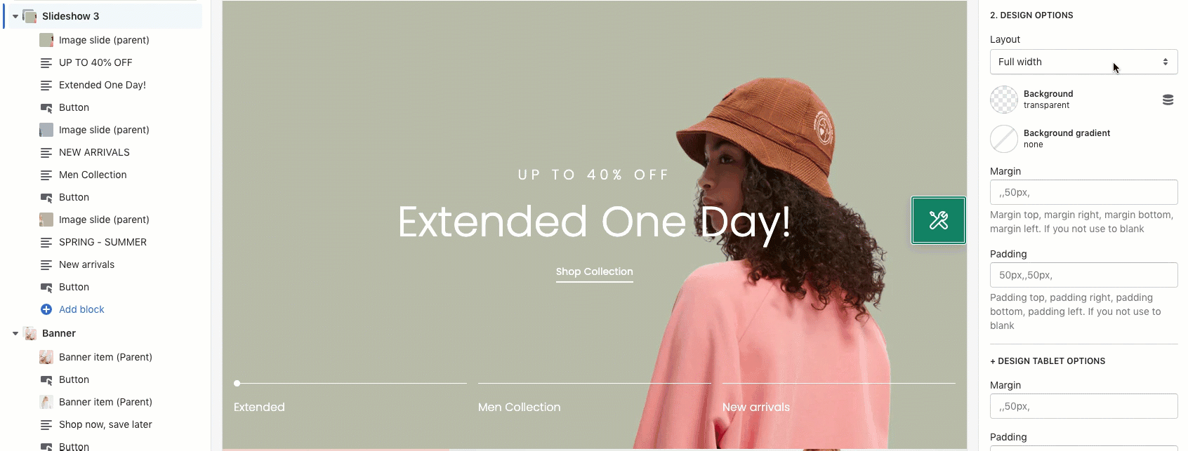
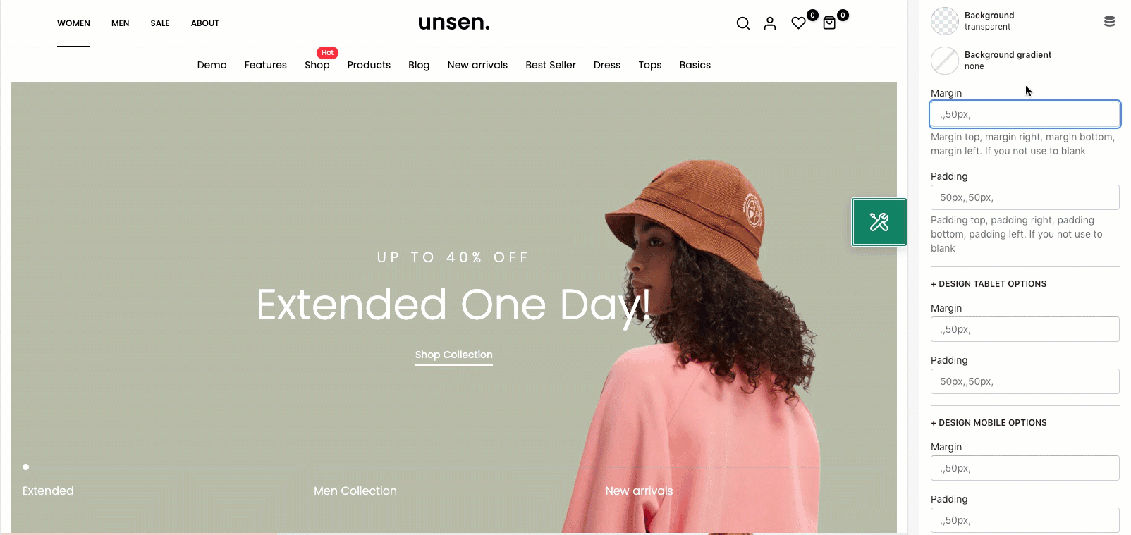
- Margin/ Padding: You can configure the margin/ padding for the Slideshow 3 section here. You also can configure margin/ padding for other devices: Tablet and Mobile devices.