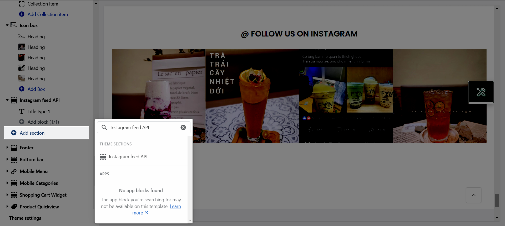
From Theme Section Sidebar -> Add section Instagram feed API
1.Instagram feed API settings
Instagram image source: You can choose between Instagram Access Token and Instagram via app.
Instagram Access Token: You can follow this document about How to get Instagram Access Token.
Instagram via app: You need to install Section Feed App(opens a new window) to use this section.
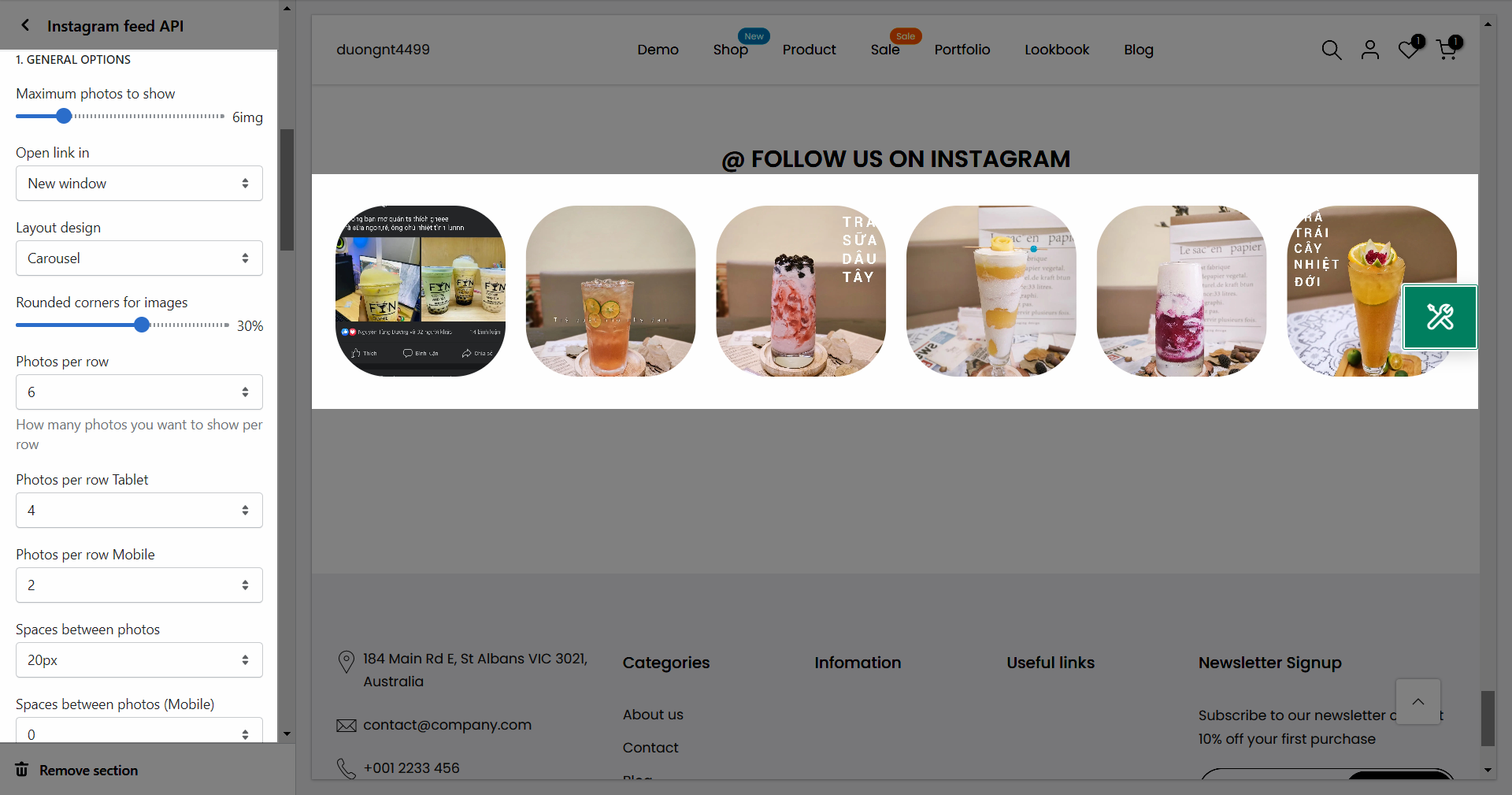
1.1. GENERAL OPTIONS
Maximum photos to show: You can set number of Instagram photos to show on your store.
Open link in: You can choose between New window and Current window.
Layout design: You can choose between Grid and Carousel.
Rounded corners for images: You can adjust the roundness for the photos.
Photos per row: Set number of photos display each row.
Spaces between photos: You can set spaces between photos.
1.2.OPTIONS IMAGE PRODUCTS
Image ratio: Aspect ratio custom will settings in general panel.
Image size: This settings apply only if the image ratio is not set to 'Adapt to image'.
Image position: The first value is the horizontal position and the second value is the vertical. This settings apply only if the image ratio is not set to 'Adapt to image'.
1.3.OPTIONS FOR CAROUSEL LAYOUT
Enable loop: At the end of cells, wrap-around to the other end for infinite scrolling.
Autoplay speed in second: Set is ‘0’ to disable autoplay.
Pause autoplay on hover: Auto-playing will pause when the user hovers over the carousel.
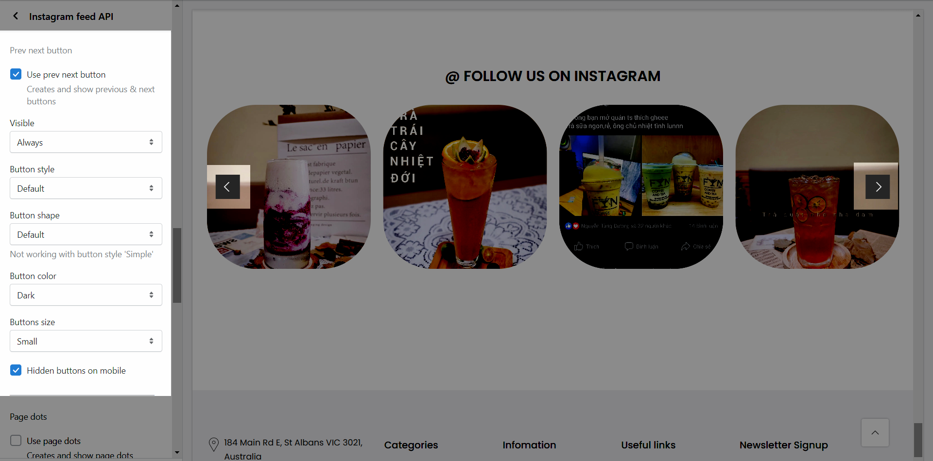
1.4.Prev next button
Use prev next button: Creates and show previous & next buttons.
Visible: You can choose between Always visible or Only hover.
Button style: You can set style for prev/next button.
Button shape: You cans set button shape for prev/next button (Not working with button style 'Simple').
Button color: You can set color for prev/next button.
Button size: You can set size for prev/next button.
Hidden buttons on mobile: This option allows you to disable prev/next button on mobile.
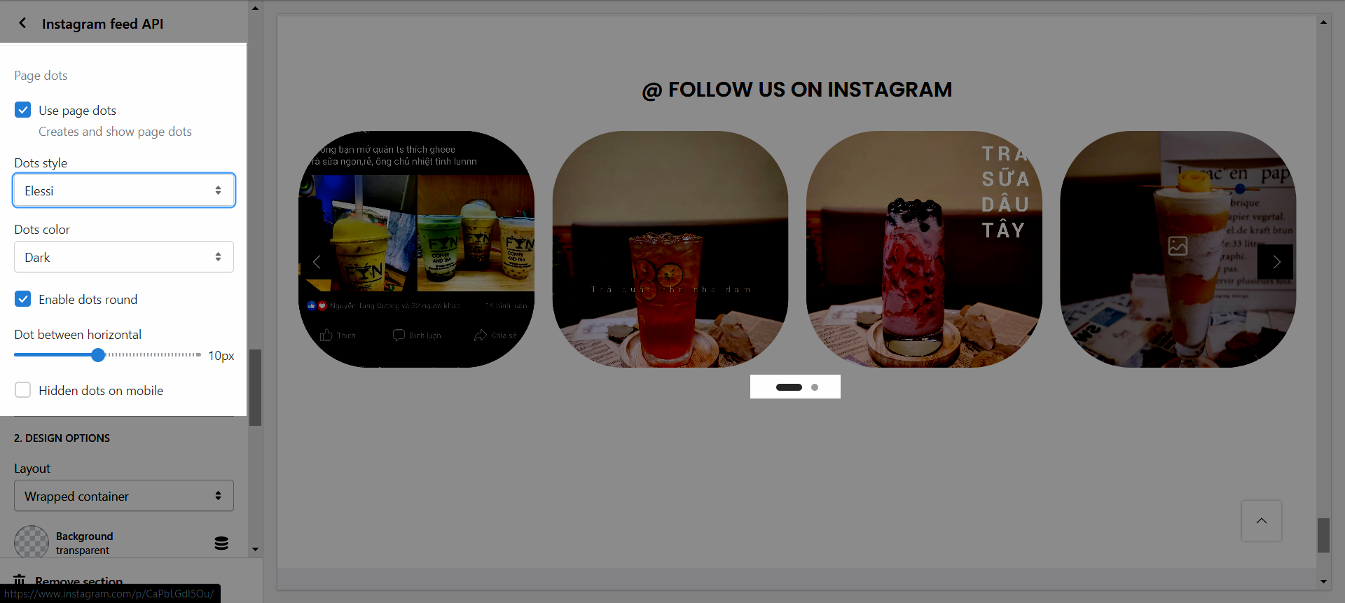
1.5.Page dots
Hidden dots on mobile: This option allows you disable dots on Mobile versions.
Dot between horizontal: You can adjust space between dots.
Enable dots round: This option allows you to change the dots square to dots round.
Dots color: You can set color for dots.
Dots style: You can set style for dots.
Use page dots: Creates and show page dots.
1.6.DESIGN OPTIONS
Please follow this guideline to config Layout, Background, Margin/Padding for the section.
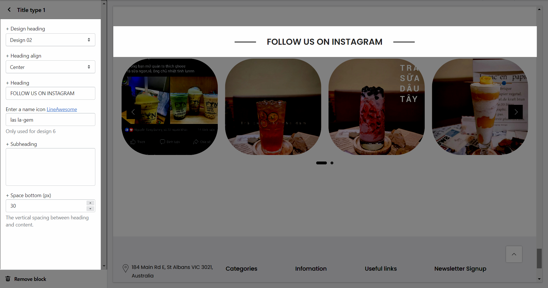
2.Title type
Design heading: There are a variety of designs for you, please try each all.
Heading align: You can set positions Left, Center or Right for heading.
Heading: You can add the heading title for this Lookbook section.
Enter a icon name on heading: You can choose the icon that you want to add in this LineAwesome and paste the name in here (Only used for design 6).
Subheading: You can add the sub title for this Lookbook section.
Space bottom (px): You can set the vertical spacing between heading and content.