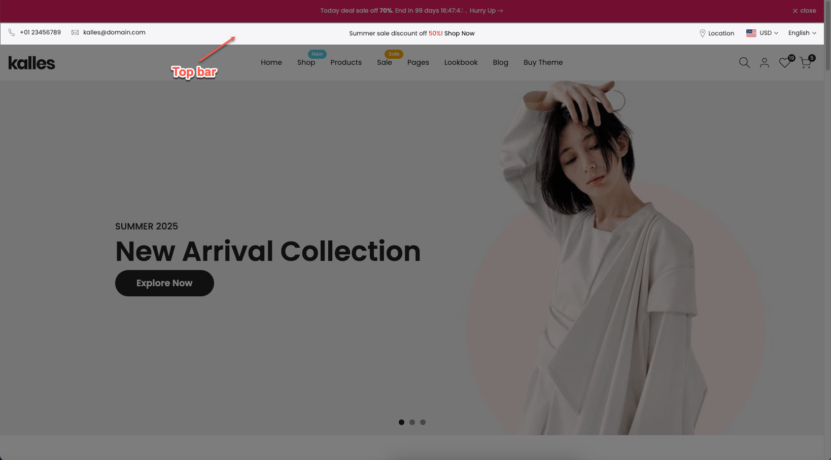
The Top Bar is a slim section positioned above the main header, typically used to display quick-access information such as Welcome message, contact details, language and currency options, or social links.
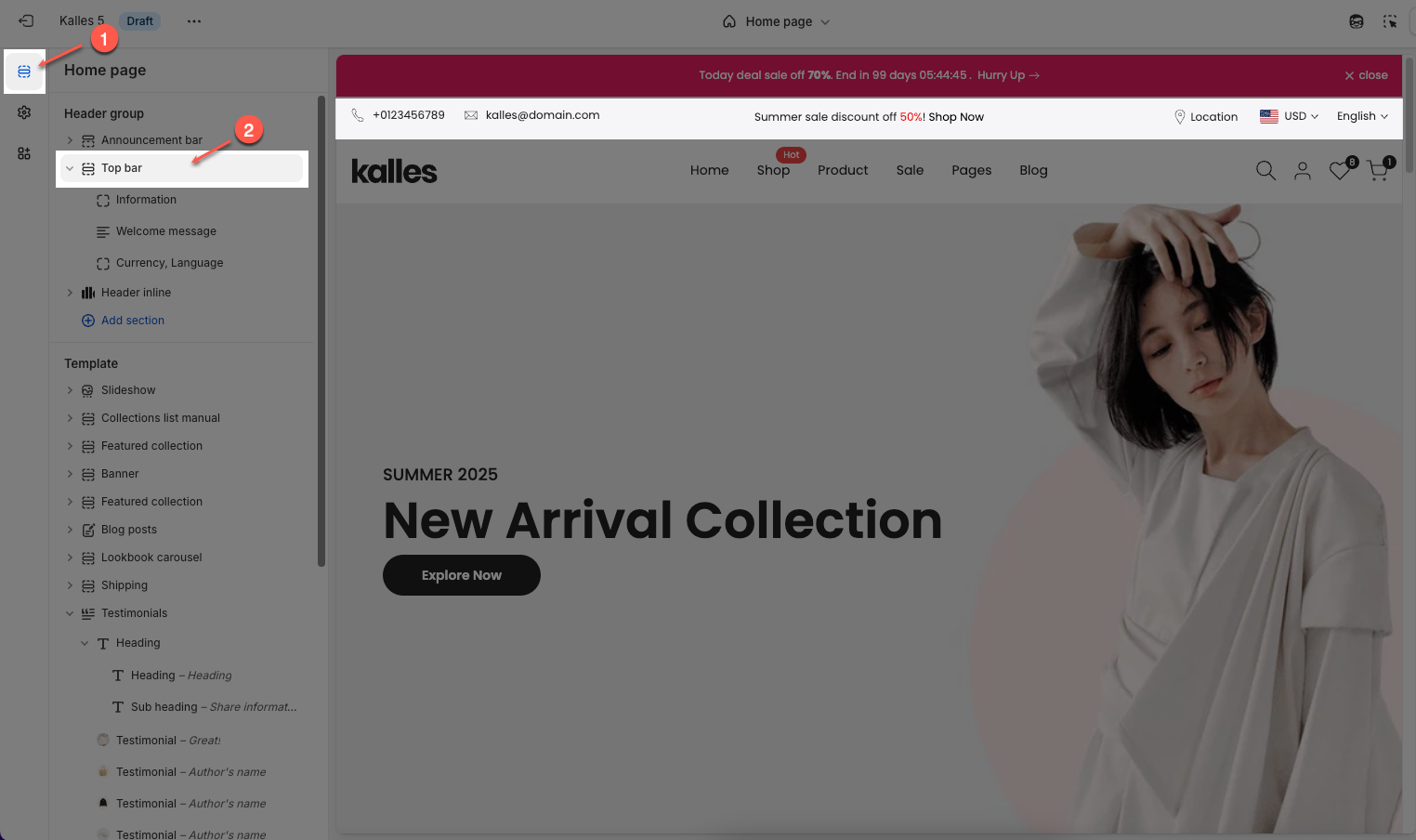
How to access the Top bar section?
In the theme editor (Customize), click the Sections button > In Header group, add Top bar section
How to customize the Top bar section?
1. Access Section Settings
To open the section settings, simply click on the section name
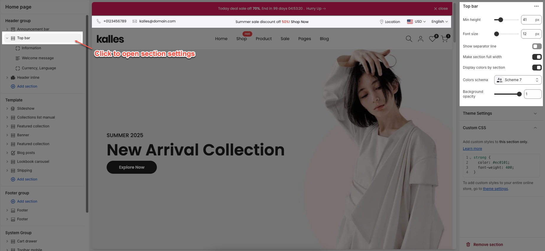
Main options include:
Min height: Set the minimum height for this section. This helps ensure the section always occupies a certain vertical space, even if its content is minimal.
Font size: Set the font size for the text within this section.
Show separator line: Check to display a separator line above or below this section, helping to visually divide content.
Make section full width: Check to stretch this section to full width of the screen. If unchecked, the content will be constrained to the page's maximum content width.
Display colors by section: Check to apply a specific color schema for this section. When selected, you can assign an independent color scheme to this section, overriding global theme color settings.
Colors schema: Select the color schema to be applied to this section. A color schema defines color variables such as background color, text color, button colors, and more, ensuring consistency and easy management.
Background opacity: Set the opacity of this section's background. 0 is completely transparent, 1 is fully opaque.
Theme Settings tab:
Relevant options will be displayed based on the block you've added.
Show country flag: Check to display the country flag next to the country name in the currency/region selector.
Flag size: Set the size of the country flag
Multiple Currencies By: Select the multi-currency management tool being used.
Shopify: Utilizes Shopify Payments' built-in multi-currency feature.
The4: Uses The4's custom solution (likely an app or integrated theme feature).
Custom CSS tab: If you want to add custom CSS specifically for this section, please use this tab.
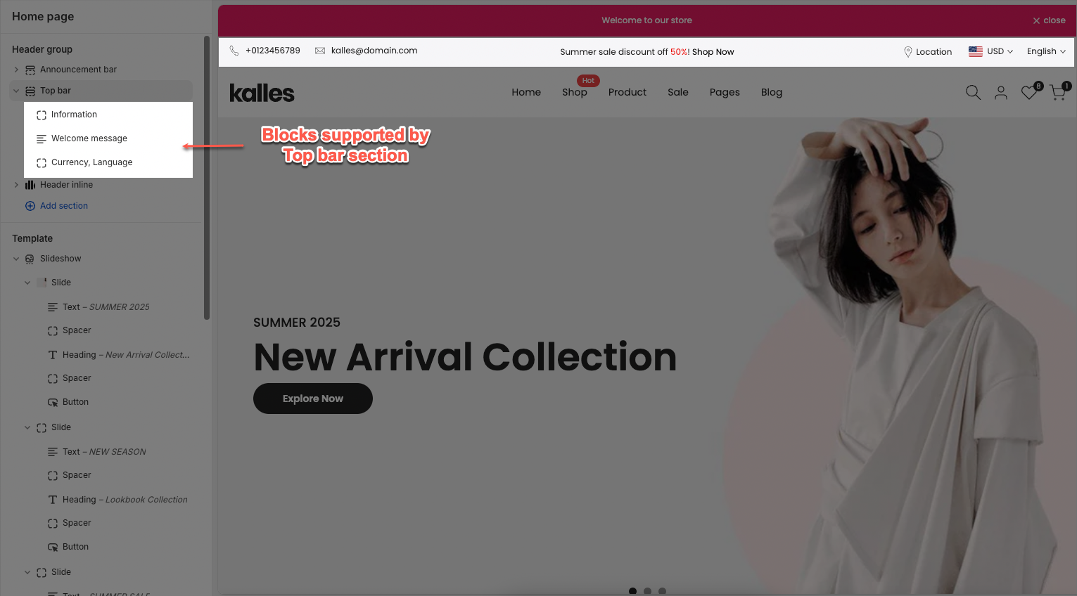
2. Blocks Supported by This Section
You can add up to 3 blocks in this section, with the available options being Information, Welcome message, Currency – Language, Custom liquid, and Socials.
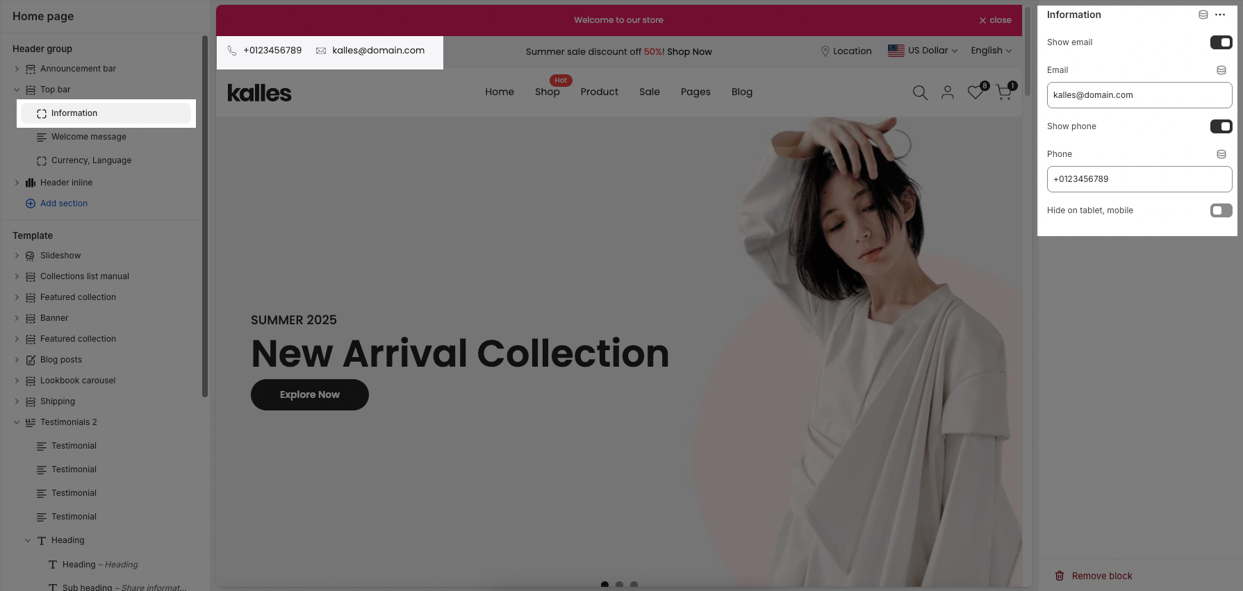
2.1 Infomation block
Show email: Check to display your contact email address on the website.
Email: Enter the email address you wish to display and use for contact.
Show phone: Check to display your contact phone number on the website.
Phone: Enter the phone number you wish to display and use for contact.
Hide on tablet, mobile: Check to hide these contact details (email and phone number) on tablet and mobile devices.
2.3 Welcome message block
Text1, Text2, Text3: Enter the text content for these fields. Each field can be used for different announcements, taglines, or concise information.
Adding a bottom border on link: Check to add a bottom border to links within this section. This helps to visually emphasize the links.
Date countdown: Select the end date and time for the countdown. The countdown will display the time remaining until this date.
Text day countdown: Enter the text to display alongside the countdown
Effect slider: Choose the transition effect between slides.
Fade: Slides fade in and out.
Slider: Slides slide horizontally or vertically.
Autoplay speed in seconds: Set the autoplay speed in seconds. Set to 0 to disable autoplay.
Pause when hover: Check to pause autoplay when the user hovers over the slider.
Hide on tablet, mobile: Check to hide this entire section on tablet and mobile devices.
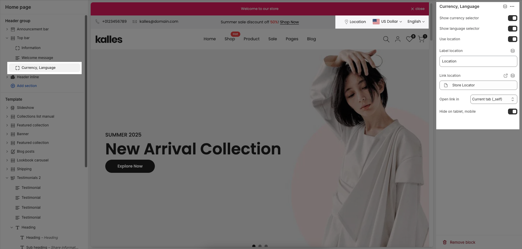
2.4 Currency, Language block
Show currency selector: Check to display the currency selector, allowing customers to view and purchase products in their desired currency.
Show language selector: Check to display the language selector, allowing customers to browse your store in their preferred language.
Use location: Check to display a link to a specific location (e.g., a physical store address, a region-specific page).
Link location: Enter the URL that the location link will point to.
Open link in: Select how the location link will open when clicked: in the current tab or a new tab.
Hide on tablet, mobile: Check to hide these items (currency selector, language selector, and location link) on tablet and mobile devices.