The Footer provides essential information and quick access to important resources. It typically includes useful links, contact details, terms of service, and social media channels.
This guide will walk you through the different blocks of the footer, explaining their purpose and how to use them effectively, so you can navigate the website with ease and make the most of the available features.
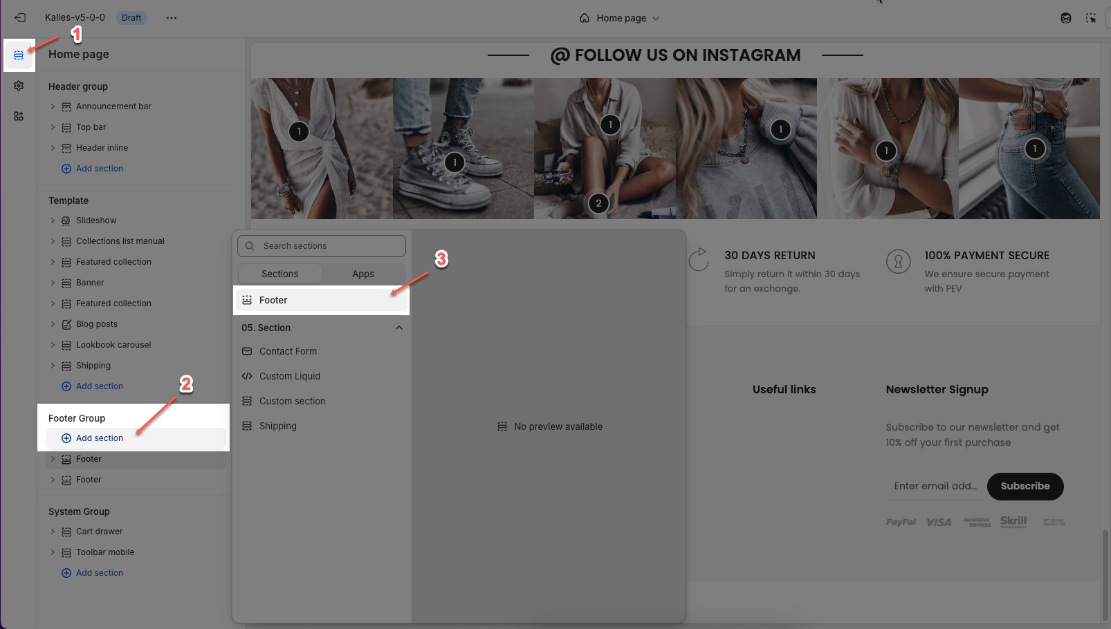
How to access the Footer section?
In the theme editor (Customize), click the Sections button > then add Footer section inside the Footer group
1. How to customize the Footer section?
In the footer section, you can easily adjust settings like layout, background, and spacing with details provided below.
To open the section settings, simply click on the section name
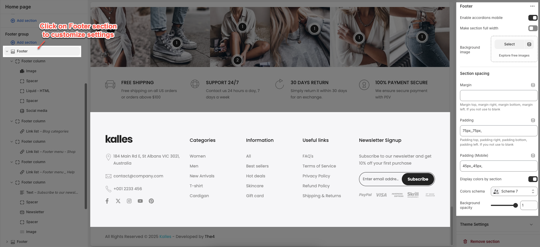
Enable accordions mobile: Enables collapsible (accordion) sections within the footer when viewed on mobile devices.
Make section full width: Expands the footer section to span the full width of the browser.
Background image: This option allows you to upload or select an image to be displayed as the background of the footer section.
Section padding
Margin/Margin (Mobile): Sets the spacing outside the section(top, right, bottom, left) for desktop and mobile device.
Padding/Padding (Mobile): Sets the spacing inside the section (top, right, bottom, left) for desktop and mobile device.
Display colors by section: When enable, you can apply colors individually to each section, with options to choose a colors schema and adjust the background opacity.
In addition, you can configure social media and enable the sticky footer for the footer section in the Theme Settings tab.
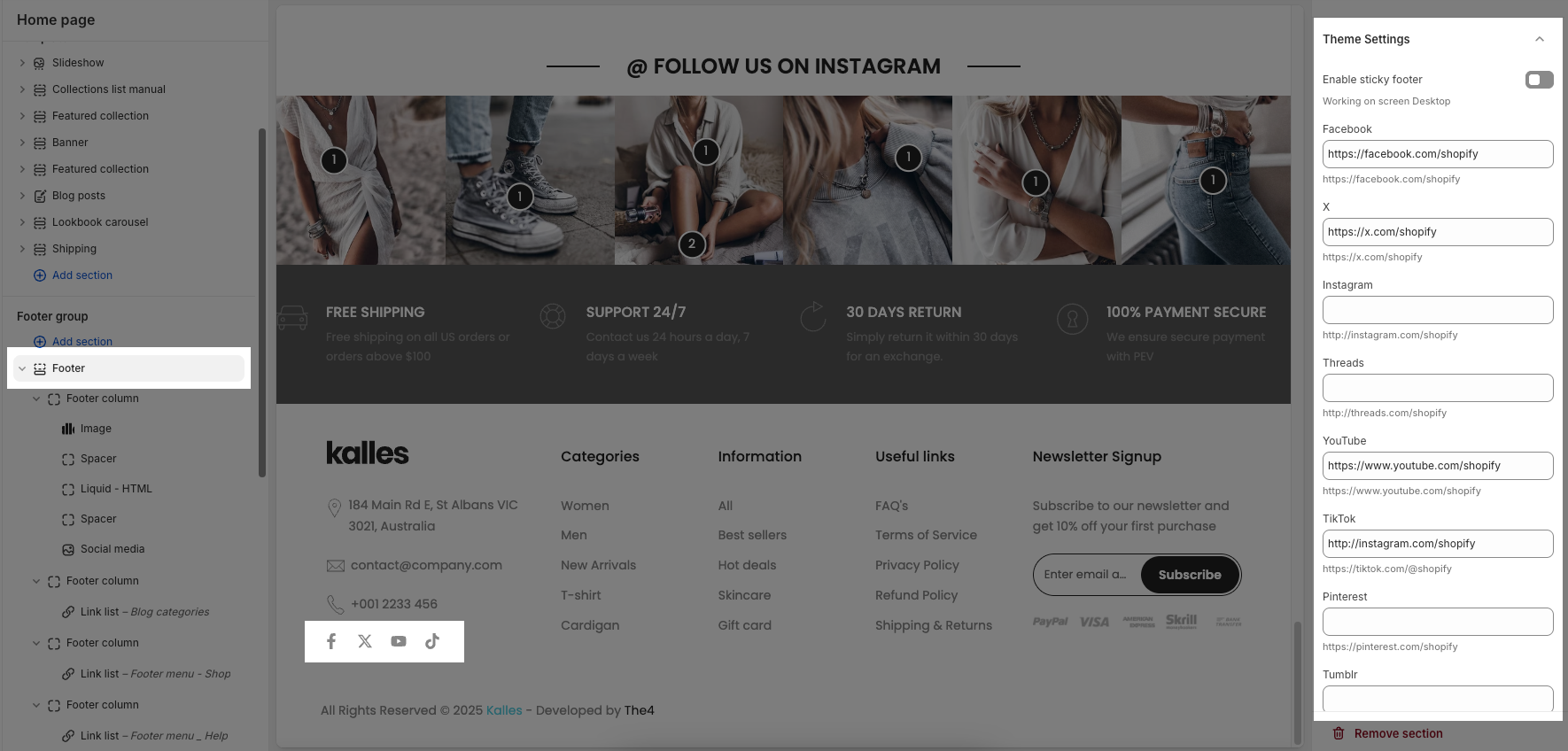
Enable sticky footer: Keeps the footer fixed at the bottom of the screen on desktop, even when scrolling. (Note: Only works on desktop screens.)
2. Footer block contents
2.1. Footer Column
The structure of the footer is defined by using Footer Column blocks. Each column in the footer is created through these blocks, so to adjust the number of columns displayed in the footer, simply add or remove Footer Column blocks.
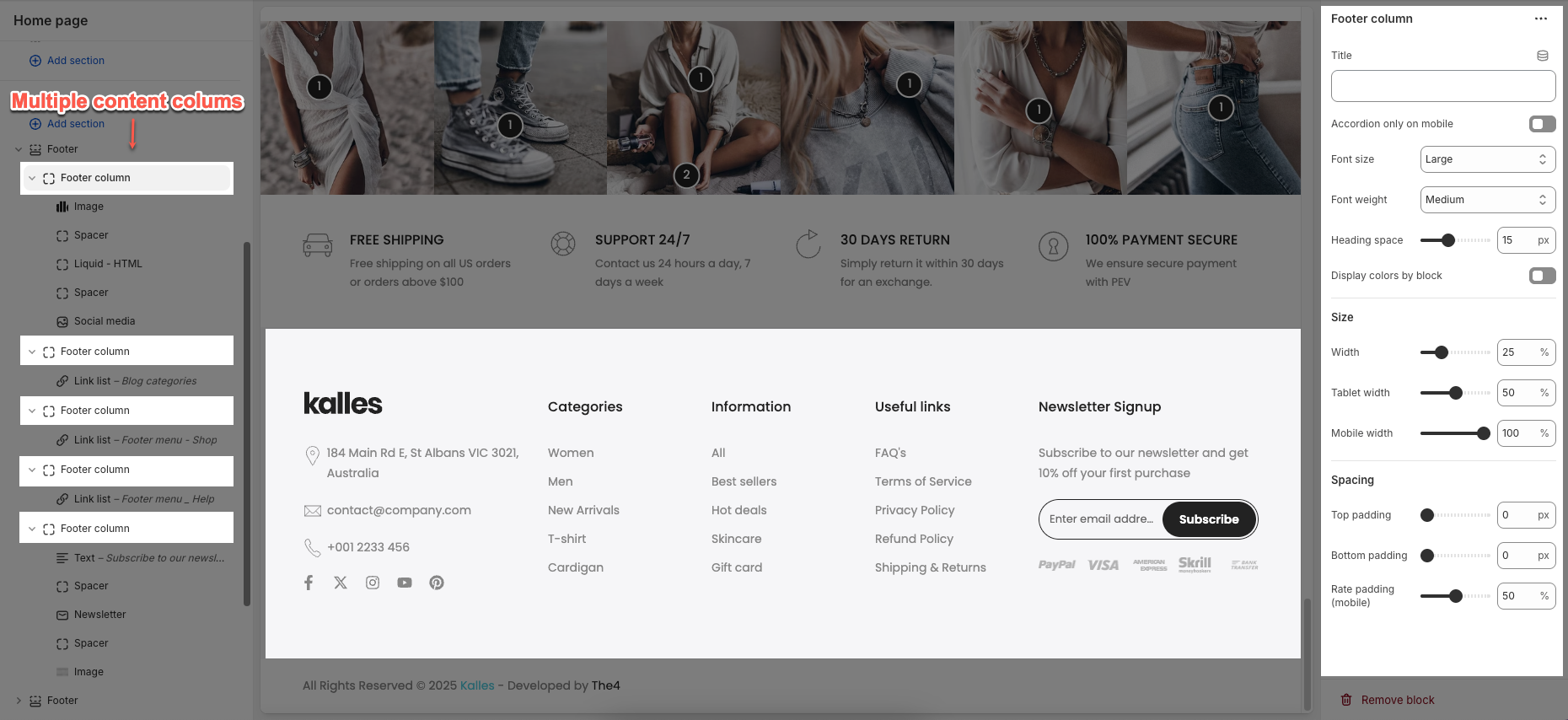
Here are the detailed settings of Footer Column block:
Text: This is the heading or label text for the column and you can choose to hide this text on mobile devices if needed.
Accordion only on mobile: When enabled, content in this block will appear in accordion format only on mobile devices.
Font size: Sets the font size for the text inside this column (e.g., Small, Medium, Large).
Heading space: Controls the vertical spacing (in pixels) below the heading/title.
Display colors by block: When enabled, allows individual blocks to use their own color schema and background opacity settings.
Size: allows you to set the column width for desktop (as a percentage of the footer), tablet, and mobile devices (usually 100% for full-width stacking)
Spacing
Top/ bottom Padding: Adds space above and below of the column
Rate padding (mobile): Sets the relative padding (in percentage) for mobile devices.
Each Footer column can contain various inner blocks such as Button, Image, Heading, Text, Linklist, Newsletter, and more allowing you to organize your footer content flexibly and effectively.
Follow the instructions below to configure them accordingly.
2.2. Liquid - HTML block
The Liquid - HTML block lets you add custom content to your footer, using Liquid or HTML code, with options to style text such as font, size, weight, and color
Option type: This option lets you add custom content to your footer using either Liquid or HTML
Content page: Allows you to select a page to display, only visible when the option type is set to HTML.
Content: Add your own custom code or text here, you can choose to hide this content on mobile devices if needed.
2.3. Link list block
The Link list block lets you display a menu of links in the footer, where you can choose a link list, set the menu title, and adjust the font size.
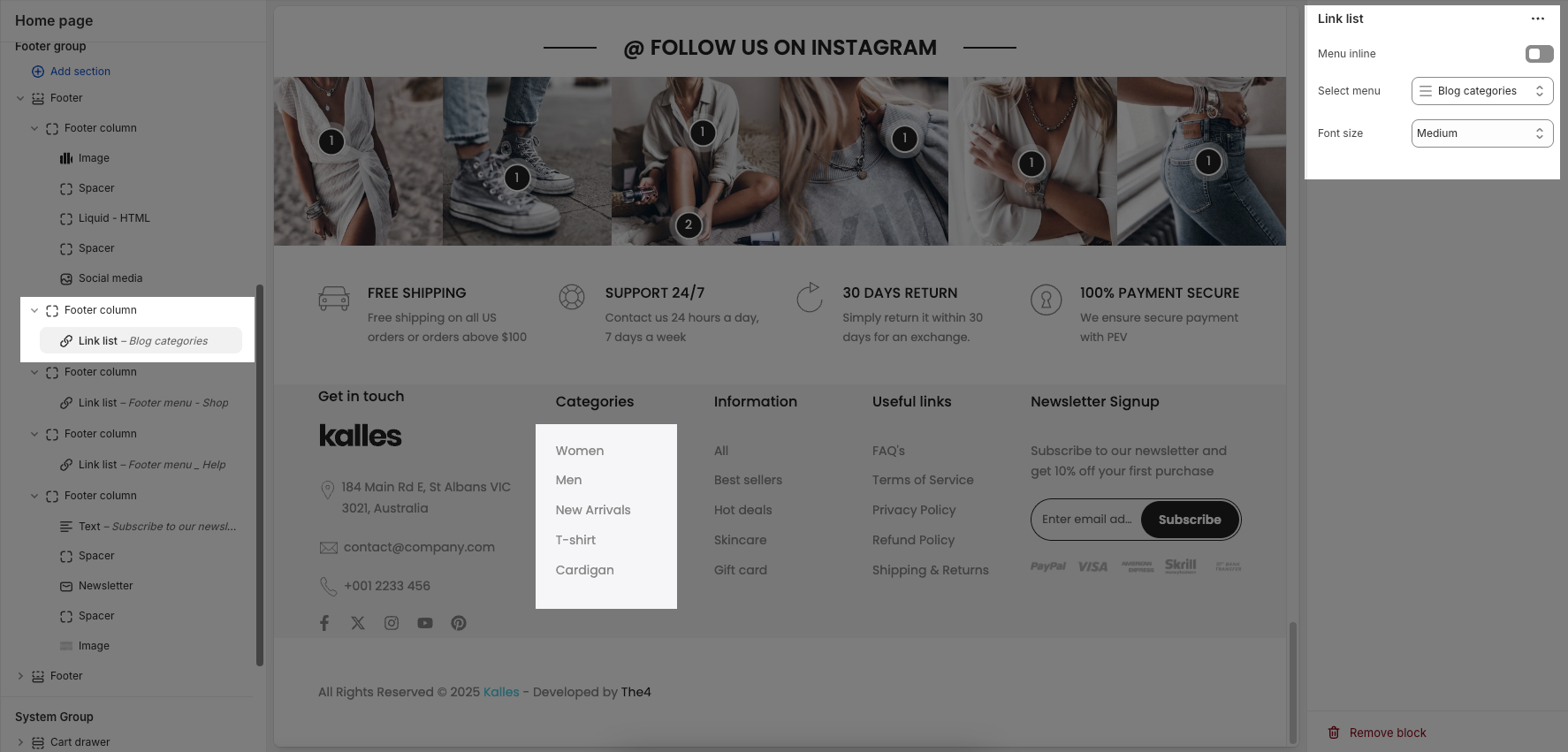
Menu inline: When enabled, displays menu items horizontally (inline). When disabled, items are stacked vertically.
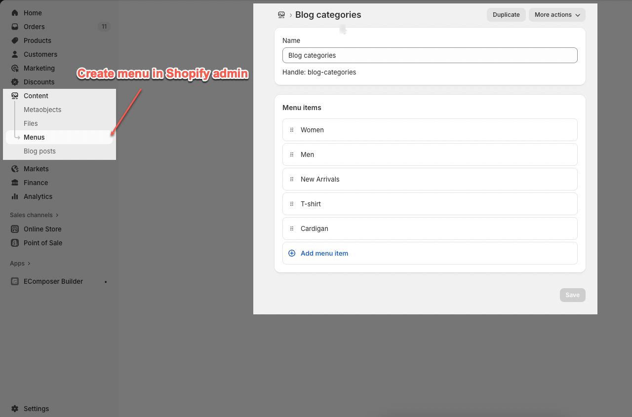
Select menu: Allows you to choose a menu from your navigation to display as a link list.
Font size: Controls the font size or overall visual size of the menu text
2.4. Newsletter block
The Newsletter block allows you to add a signup form in the footer, where customers can subscribe with their email and you can customize the design, button, and text.
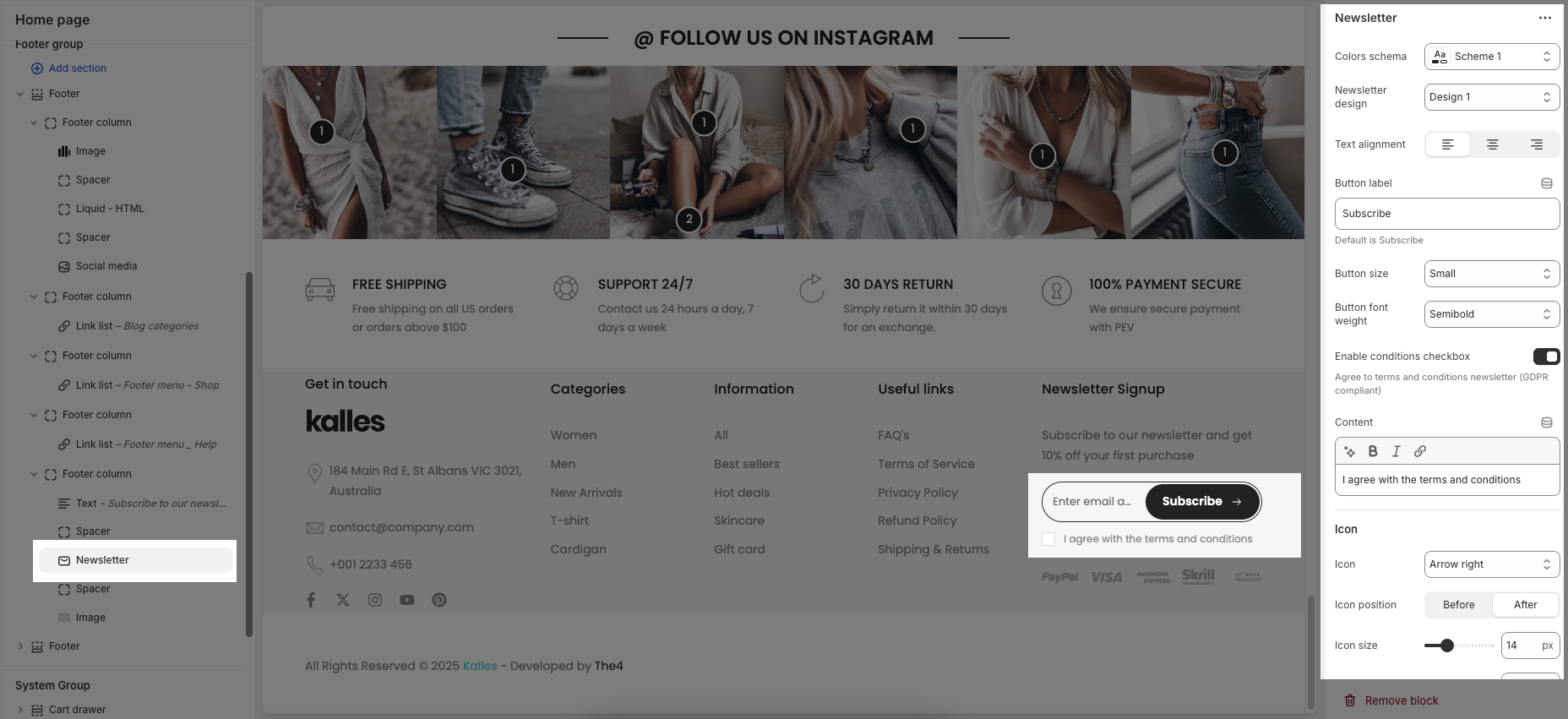
Color scheme: Choose a predefined color style for the block.
Design newsletter: Select a layout style for the newsletter form.
Button label: Customize the subscribe button text.
Button size: Set the size of input and button (Small, Medium, Large).
Buttont font weight: Adjust the thickness of the text (e.g., Semibold).
Enable conditions checkbox: Show a checkbox to agree to terms (for GDPR).
Content: Enter and style the text next to the checkbox.
Icon: Choose an icon to display in the button.
2.5. Currency & Language block
You can add individual Currency and Language blocks to display in the footer section.
Spacing: option allows you to adjust the space (in pixels) between these two blocks for better layout alignment.
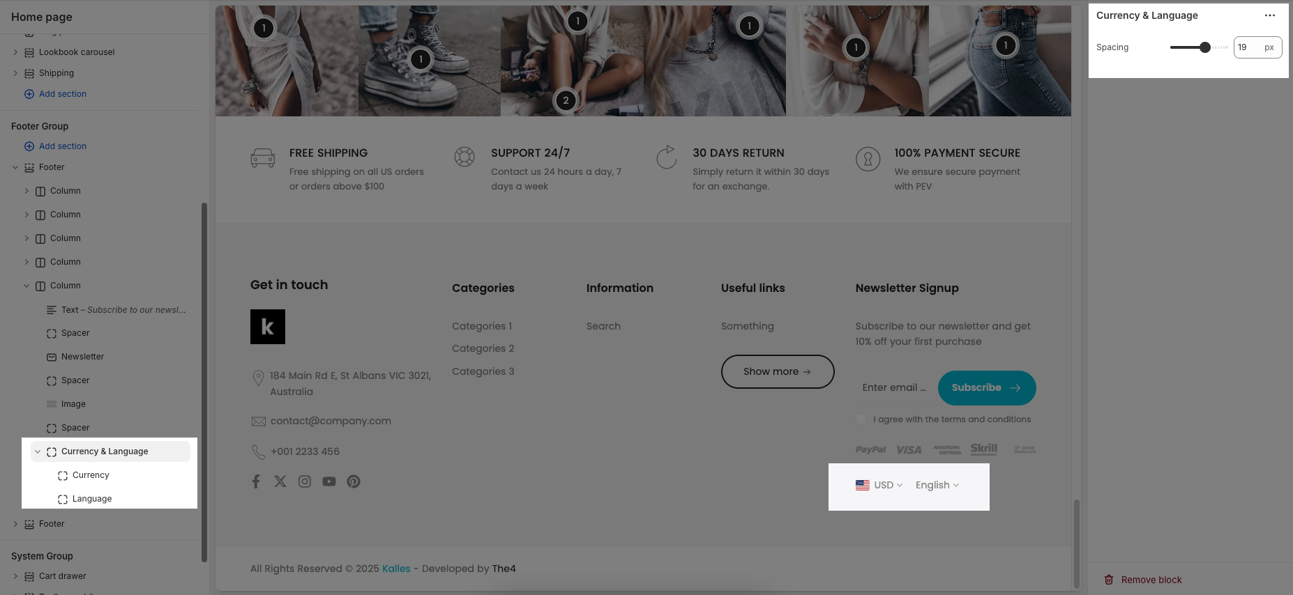
To learn how to add different currencies and languages, please refer to the This guides.
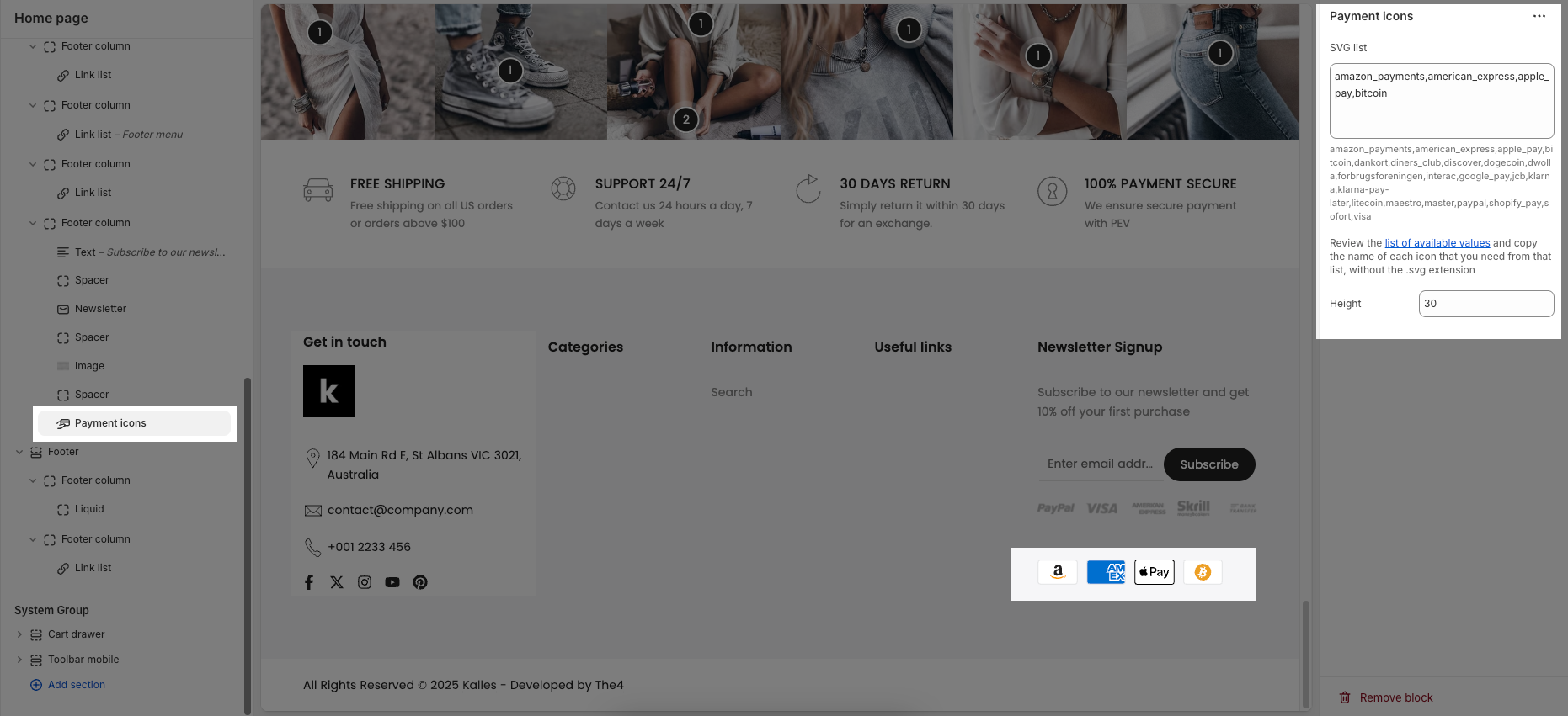
2.6. Payment icons block
SVG list: This is where you enter the names of the payment icons you want to display. Only icon names from the provided list of available values are accepted.
Height: Defines the height of each payment icon in pixels.