


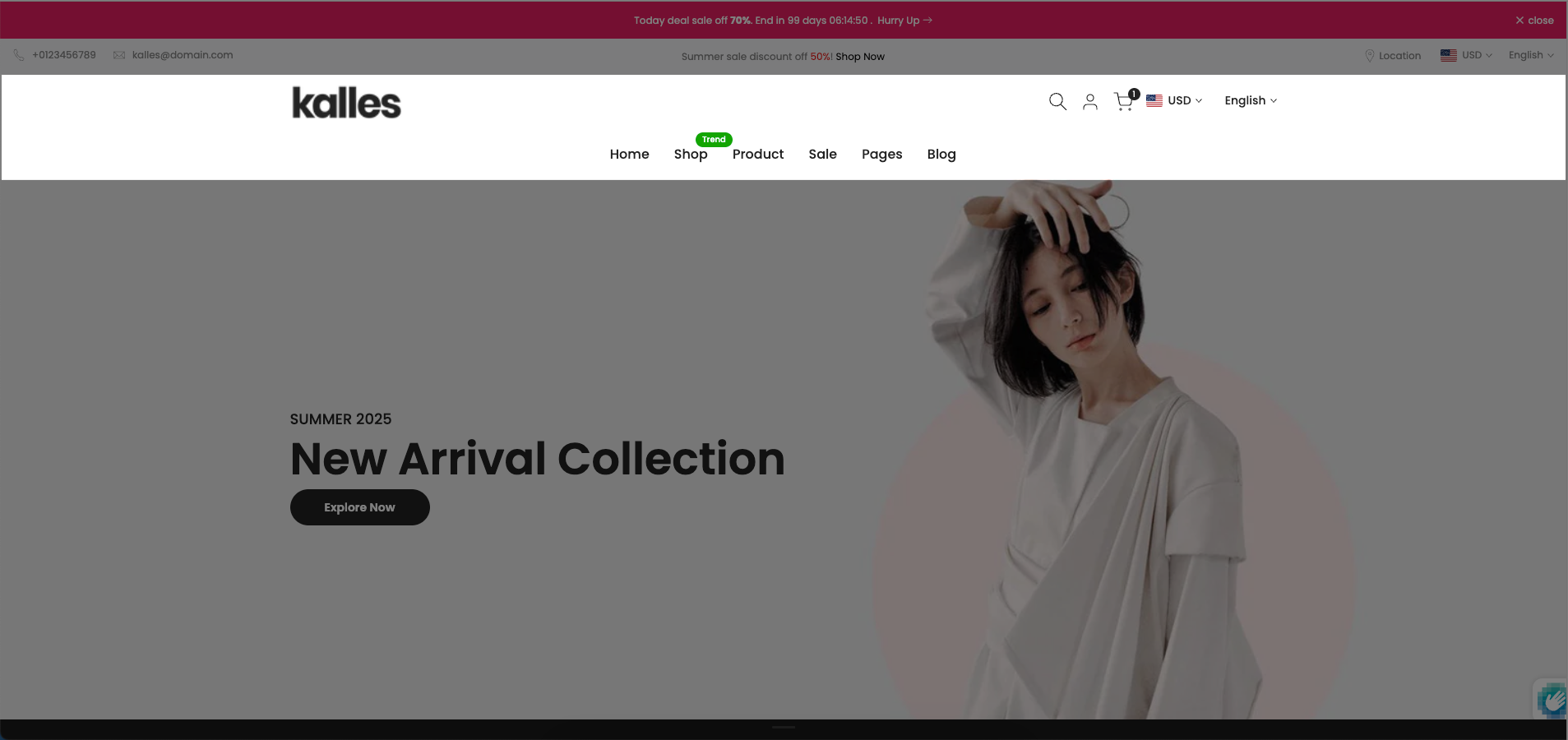
The "Section Header Bottom" refers to a dedicated area or element positioned at the very bottom of a section's header component. This area provides a flexible and configurable zone to place additional elements that complement the main header content, such as sub-navigation links, call-to-action buttons, search bars, or decorative dividers. Its strategic placement at the base of the header ensures these elements are visually connected to the header's context while maintaining a distinct position.
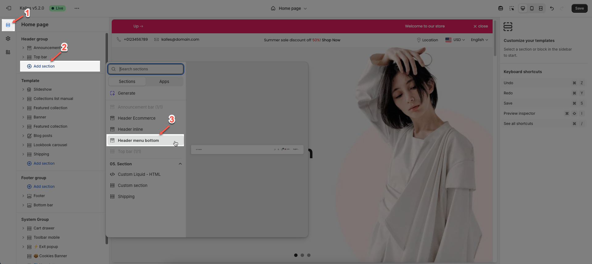
How to access the Header menu bottom section?
In the theme editor (Customize), click the Sections button > then add the Header menu bottom section inside the Header group
1. Header menu bottom section Settings
We prioritize the top first section header to show. Please delete header sections that you do not use.
To open the section settings, simply click on the section name
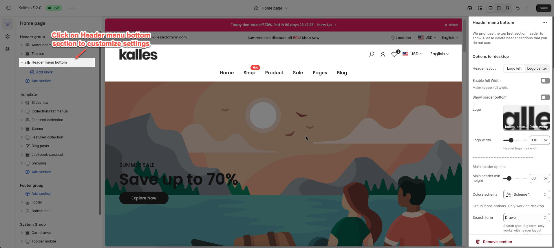
1.1. Options for desktop
You can config Header layout, enable full-width, show border bottom
Logo: Upload your logo image file & Set the width of the logo
Main header options
Main header min height: Set the minimum height of the header on desktop. This affects the vertical space the header occupies on the page.
Colors schema: Select the color schema for the header.
Group icons options. Only work on desktop
Show or hide Search form, User, Language and currency
Bottom header options
Bottom header min height: Set the minimum height for the bottom part of the header.
Colors schema: Select the color scheme to be applied to this section or component.
Navigation options
Main menu: Select the main menu to be displayed.
Enable Lazy menu?: Check to enable lazy loading of sub-menu items (only load on demand).
Improve page load speed
Main menu position: Set the position (alignment) of the main menu.
Menu item size: Set the text size for menu items.
Menu item weight: Adjust the boldness or thickness of the text for menu items.
Enable uppercase text: Check to convert the text of menu items to uppercase.
Show dropdown arrow: Check to display a small arrow icon next to menu items with dropdowns.
Spacing menu items: Set the horizontal distance between main navigation menu items.
Open dropdown items on event: Select the trigger event to open dropdown sub-menus (hover, click).
Color for submenu default: Set the default background color for sub-menus (dropdowns).
Enable header categories: Check to display a product category navigation or dropdown within the header.
Categories title: Enter the title for the product categories section in the header.
Add menu categories: Select the menu that will be used to display product categories.
Bottom header border: Check to display a border at the bottom of the header section.
1.2 Options for mobile
Main header min height on mobile: Set the minimum height for the main header when viewed on mobile devices.
Logo mobile: Select or upload a different logo image specifically for mobile display.
Logo mobile width: Adjust the display width of the mobile-specific logo.
Menu mobile: Check to enable lazy loading of sub-menu items on the mobile menu.
Enable Lazy menu?: Only allow clicking on the icon to expand/collapse sub-menus on mobile.
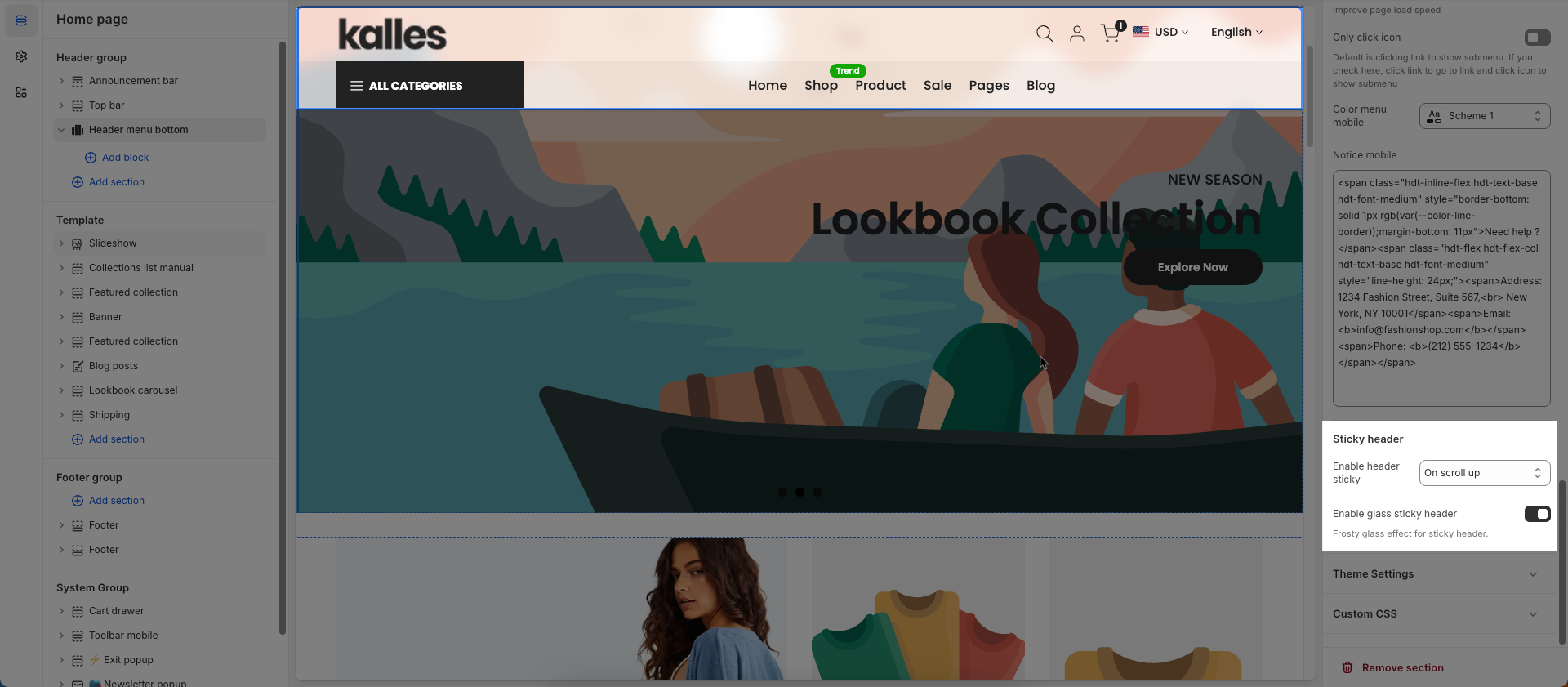
Only click icon: Default is clicking link to show submenu. If you check here, click link to go to link and click icon to show submenu
Color menu mobile: Set the colors for the mobile menu (background and text colors).
Notice mobile: Enter a short message or announcement to display specifically for mobile users.
1.3 Sticky header
Enable header sticky: Select the behavior of the sticky header when scrolling.
On scroll up: The header reappears only when the user scrolls upwards.
Always: The header remains fixed at the top of the page after scrolling down a certain distance.
None: The header does not stick (it scrolls out of view).
Enable glass sticky header: Enable this option to apply a "glassmorphism" effect to your sticky header.
Frosty glass effect for sticky header.
1.4 Header categories
This feature is only available from version Kalles 5.4.1
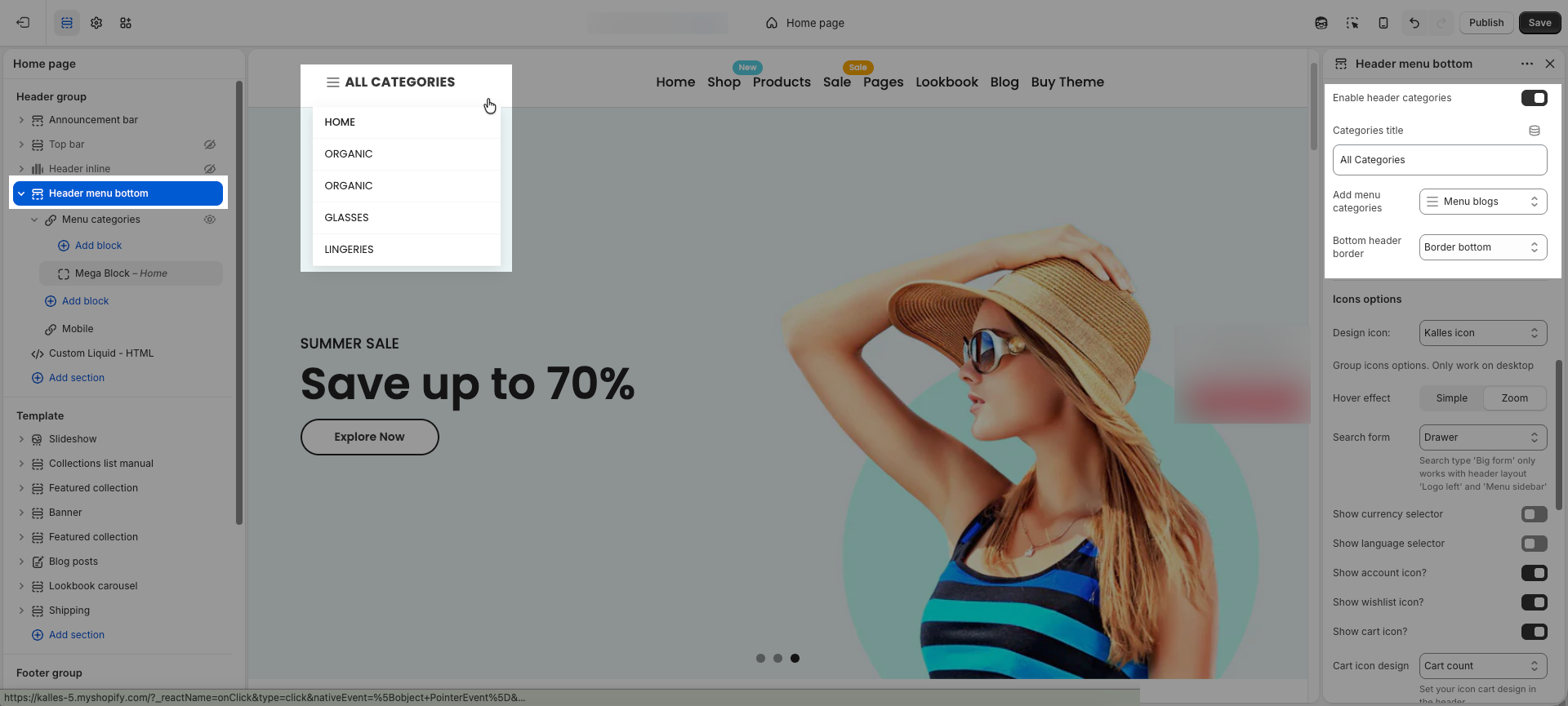
You can add the Categories menu to show it under the Categories when hovering.
If you’d like to set up a mega menu for it, please follow this documentation.
2. Blocks Supported by This Section
The mega menu blocks that you can add are Mega Block, Mega Block Column(10), Mega Block Column(12)
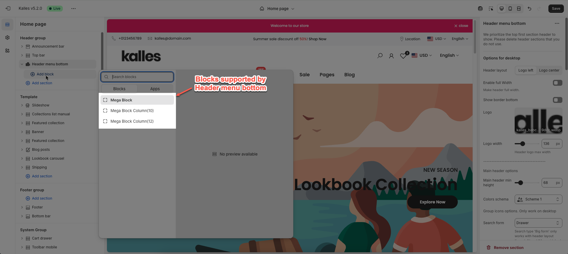
To learn more about those three mega menu blocks please follow this Guide


