


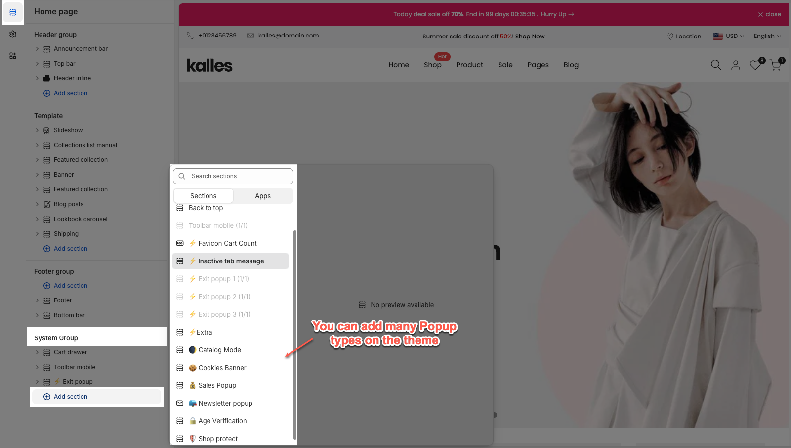
This part allows you to add many Popup types on the theme: Newsletter Popup, Exit Product Popup, Sales Popup, Age Verification Popup, and Cookie banner. All of them added more features to increase flexibility. Let's stick to this article to figure them out.
Go to Sections > System group > Add section > add the section you want to show on the store.
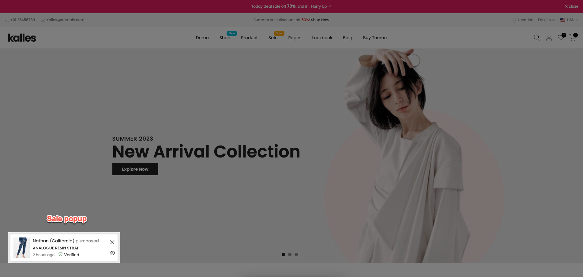
SALES POPUP
1. What is the Sales Popup?
The Sales Popup section displays recent purchase notifications on your store. It helps build trust and create urgency by showing real-time sales activity.
Each popup includes purchased product, customer name, location, purchase time, and quickview, etc.
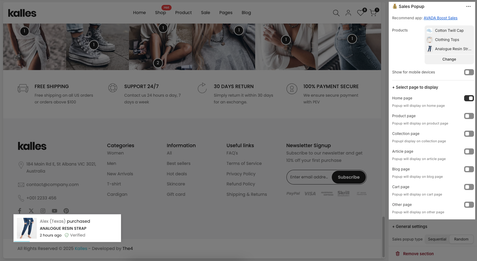
2. How to customize Sales popup section?
In the Sale popup section, you can easily adjust settings like select products, pages to display, general (like popup type, timing) and layout settings.
Product
You can choose each product for the popup and enable Show for mobile devices to show a sale popup on Mobile devices.
Select page to display
You can choose pages to activate the Sale popup. These are the pages for you to choose: Home page, Product page, Collection page, Article page, Blog page, Cart page, Other page.
General settings
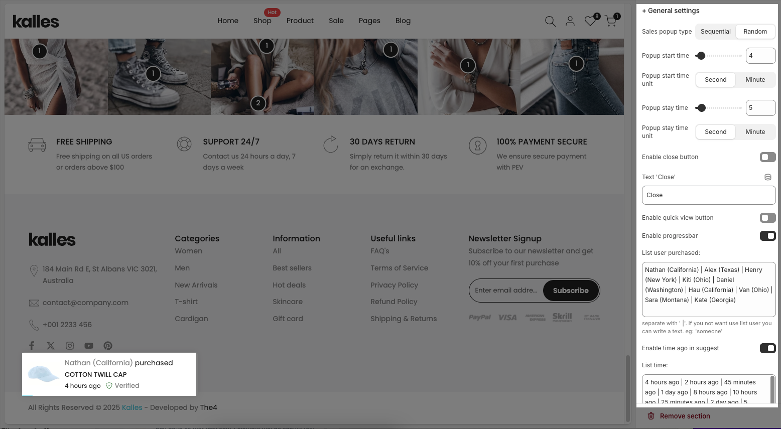
Sales popup type: This option controls how popups are displayed. Sequential shows them one by one in the order of the product list, while Random displays them in a shuffled, unpredictable order.
Popup start time/ Popup stay time: Define when the first popup appears and how long each popup stays visible on the screen.
Enable and change the text for close button, Enable Quickview button, Progress bar and Enable verified.
List user purchased: This option allows you to enter list fake purchases.
Enable time ago in suggest: You can enter the list time. That was separated with '|'.
Layout settings
You can change Design popup, Animation style, Text 'purchased' and Text 'verified'
Follow the video below to see how you can customize the Sales Popup:
NEWSLETTER POPUP
1. What is the Newsletter popup?
The Newsletter Popup helps you collect customer emails, share news, and offer special deals to grow your subscriber list.
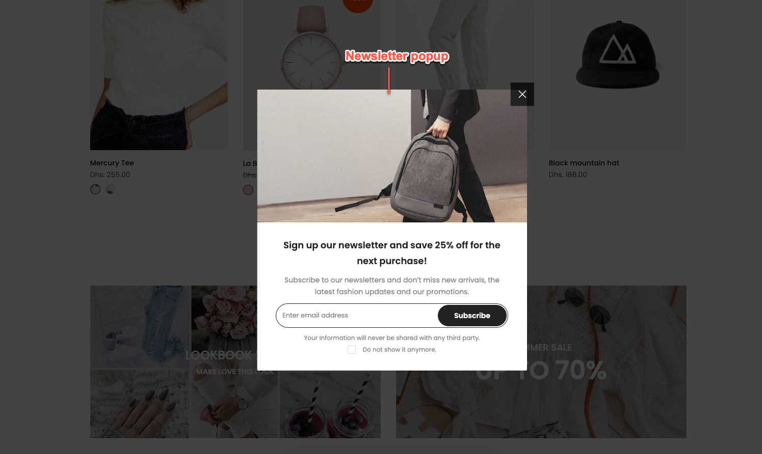
The popup includes two parts: an image and content, both of which you can easily add and customize by following the guide below.
2. How to customize Newsletter popup section?
Click the section name to start customizing the popup settings
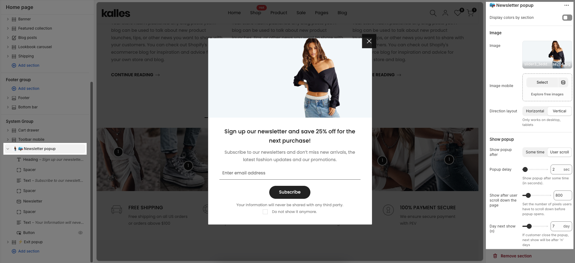
Display colors by section: Enable options let you apply color styles to the popup and choose a Colors scheme for consistent design.
Image
Image/ Image mobile: Image lets you upload the main popup image, while Image mobile allows you to set a separate image for mobile devices
Direction layout: Choose the popup layout – display the image and content either horizontally or vertically
Show popup
Show popup after: Choose how the popup appears either after a some time or when the user scroll the page.
Popup delay: Set the number of seconds before the popup appears (when using “Some time”).
Show after user scroll down the page: Define how many pixels the user must scroll before the popup appears (when using “User scroll”).
Day next show (n): If the user closes the popup, it will reappear only after n days.
EXIT POPUP
1. What is the Exit popup?
The Exit Popup is a feature designed to capture visitors’ attention right before they leave your store. It can be used to offer discounts, display promotions, or showcase recommended products or product carousel, encouraging users to complete their purchase instead of exiting.
2. How to customize Exit popup section?
With the Exit Popup, you can easily customize the color, the image, featured products, and more inside the popup. You can also choose which pages it appears on and adjust how the popup is displayed.
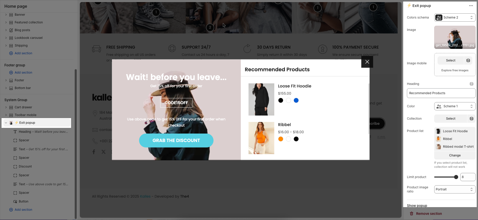
Colors schema: Select the color scheme to apply for styling consistency popup.
Image / Image mobile: Upload or select an image for the popup, with the option to set a different image for mobile devices.
Heading/ Color: Enter the main title text displayed on the popup and choose the color scheme for content area.
Collection/ Product list: Select a product collection/ specific products to showcase inside the popup.
Limit product: Set the maximum number of products shown in the popup.
Product image ratio: Define the aspect ratio for product images (e.g., Portrait, Square).
Show product carousel: When both the collection and product list fields are left empty, the 'Show product carousel' option will appear, allowing you to customize the product carousel block.
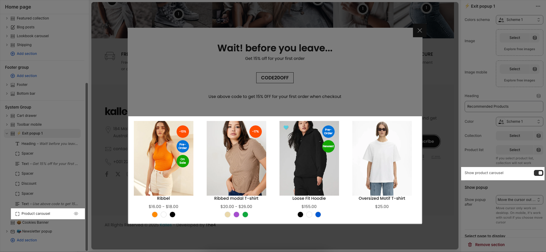
Shop popup: popup show after action
Move the cursor out of screen: The popup appears when the user moves their mouse outside the browser window and only work on desktop.
After amount time: The popup shows after a set delay time.
Scroll to end of page: The popup displays when the user scrolls to the bottom of the page.
Select page to display: You can choose pages to activate the Exit popup. These are the pages for you to choose: Home page, Product page, Collection page, Article page, Blog page, Cart page, Other page.
AGE VERIFICATION
The Age Verification popup is a simple check that asks visitors to confirm their age before entering your store. It makes sure only the right audience can access your content in a clear and easy way.
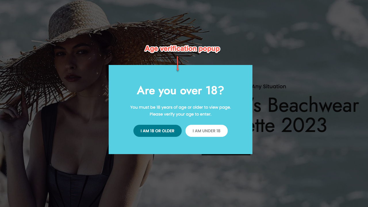
The Age Verification popup includes general settings, content, image, and color options. Click the section name to start customizing the popup settings.
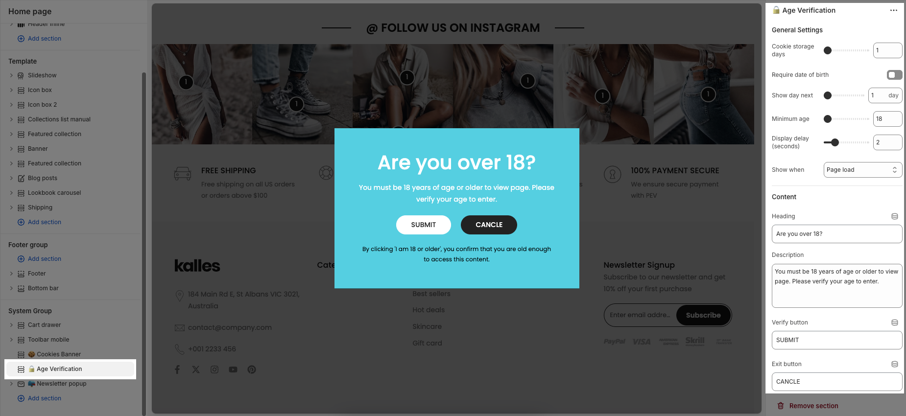
General Settings
Cookie storage days: Set the number of days the cookie will store the user's age verification information.
Require date of birth: Enable if you want users to enter their exact birthdate.
Show day next: Decide how many days the user will have to re-verify their age
Minimum age: Set the required age limit for access.
Display delay (seconds): Set the time delay before the popup appears after the user visits the page
Show when: Choose when the popup should display – on page load, when users scroll, or when their cursor is about to leave the page.
Content
You can change the text for Heading, Description, Verify button, Exit button, Legal text
Image
Background image: You can upload an image from your device here. Background image (Mobile) is a mobile-specific option.
Color: Color schema option allows you to customize the color of the popup.
COOKIES BANNER
A cookies banner is a small notification displayed on a website that informs visitors about the use of cookies. It gives users the choice to accept or decline cookies.
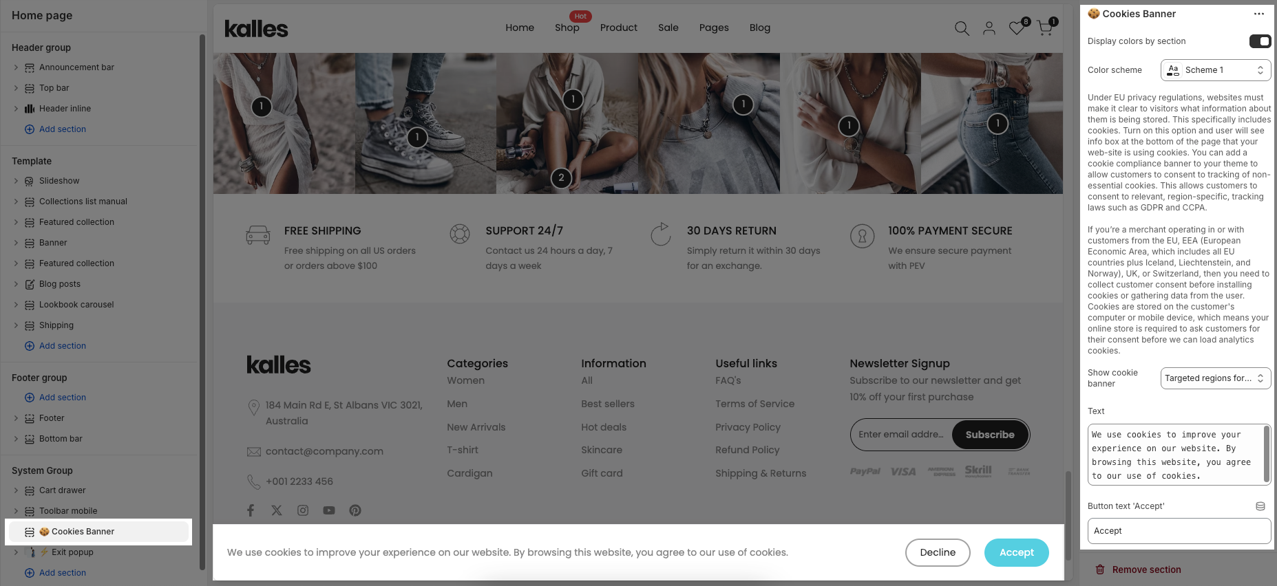
Display colors by section: Enable this option to apply a color scheme, then choose Color scheme specifically that will be applied to this section.
Show cookie banner: you can choose Show cookie banner for All regions or only Targeted regions for limited data collection.
Text: You are allowed to enter the whole text, Button text "Decline", Button text "Accept", Button text "More info" and you can add a Link “More info”, usually pointing to a page that contains detailed information about your Privacy Policy.


