The Hero Image section is designed to create a strong visual impact at the top of the homepage. It typically includes a large background image, headline text, supporting description, and a call-to-action button. This section is ideal for highlighting promotions, featured products, or key brand messaging. It helps grab the visitor’s attention immediately and directs them to explore your offerings further.

How to access the Hero image section?
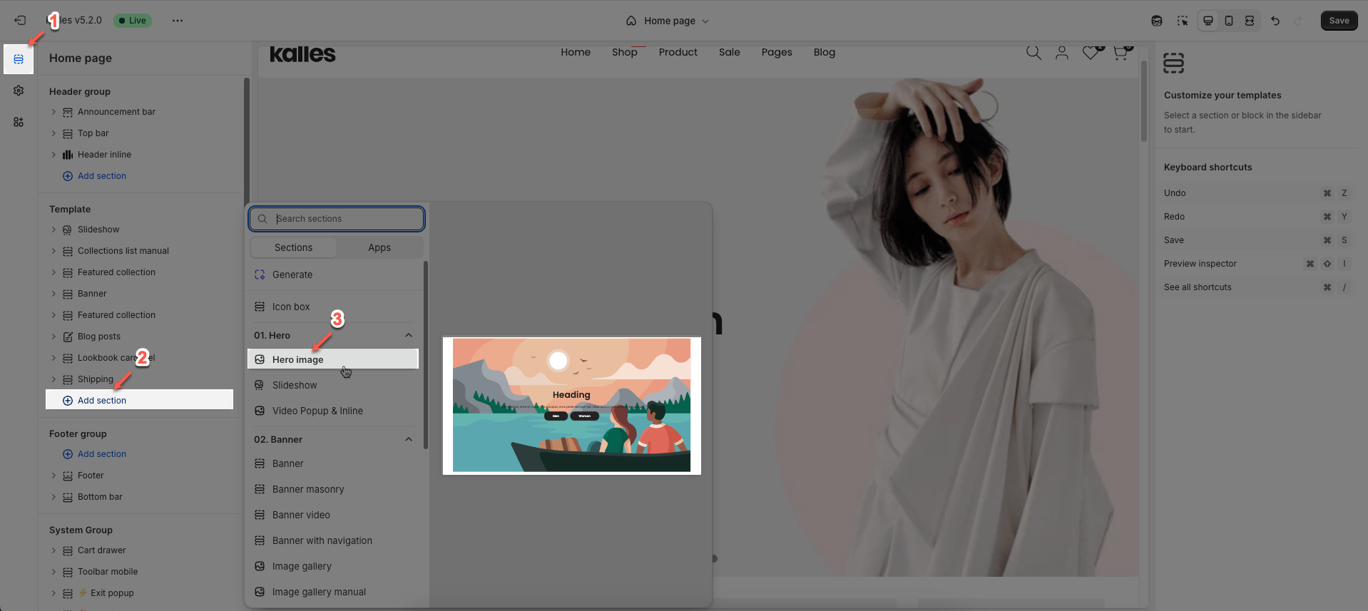
In the theme editor (Customize), click the Sections button > In Template, add Hero image section
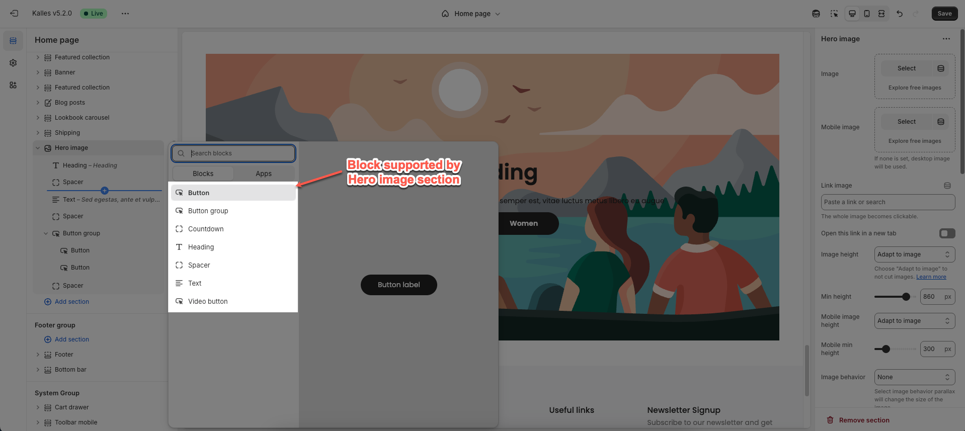
1. Blocks in the Hero image
In the Hero image section, you can add various blocks such as Heading, Text, Button, Button Group, Countdown, Video button, and Spacer to enhance the layout and design.
Follow this guide to configure Heading, Text, Button, Button Group, Countdown, Video button, and Spacer
2. Hero image section
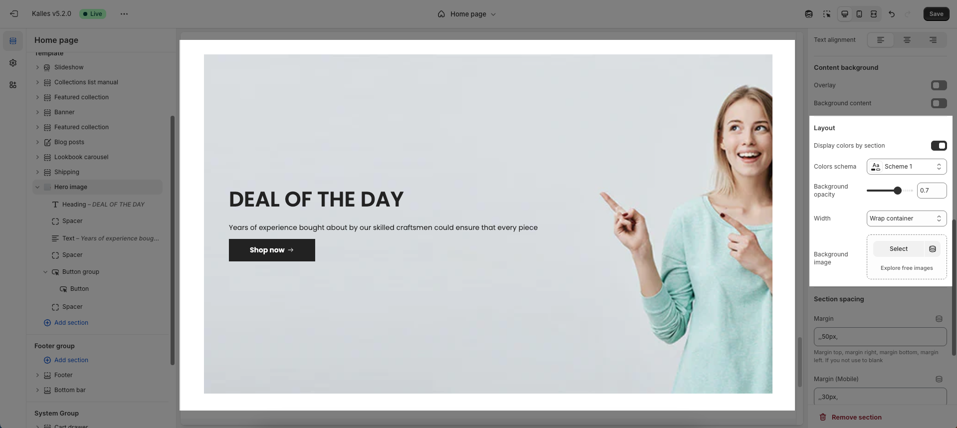
To open the section settings, simply click on the section name
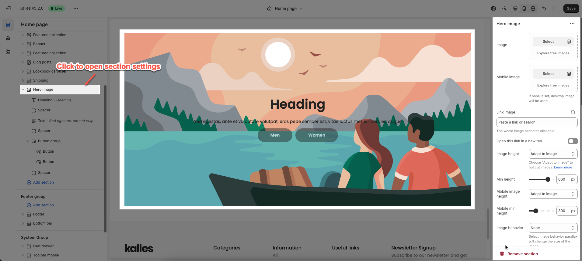
Here’s how you can customize the Hero image section to best fit your content and layout. Below are the available options for customization:
Upload Image on desktop & mobile
Select: Click this button to choose an image from your files or a library.
Explore free images: This option suggests finding images that are available for free.
Connect dynamic source: create a metafield image
If you don't choose a separate mobile image, the desktop image will be displayed on mobile devices.
Link image: In this input field, you can paste a URL or type a search query to link the image to. And the whole image becomes clickable.
Open this link in a new tab: When enabled, clicking the linked image will open the destination URL in a new browser tab or window. When disabled, the link will open in the current tab/window.
Image height (Desktop/Mobile): This controls how the image scales vertically.
Min height (Desktop/Mobile): This sets the minimum height for the image.
Image behavior: This defines how the image interacts with scrolling or other elements
Content position type (container, custom): Choose how the content block's position is determined. Select Container to keep the content within the default container limits. Choose Custom to freely adjust the position.
Content position (Desktop/Mobile): Set the specific position of the content block on desktop and mobile screens (only works when Position type is Container)
Text alignment (Desktop/Mobile): Choose the text alignment method (left, center, right)
Horizontal (Desktop/Mobile): Adjust the horizontal spacing of content elements (only works when Position type is Custom)
Vertical (Desktop/Mobile): Adjust the vertical spacing between rows or different components (only works when Position type is Custom)
Content background
Config overlay, background, box for content
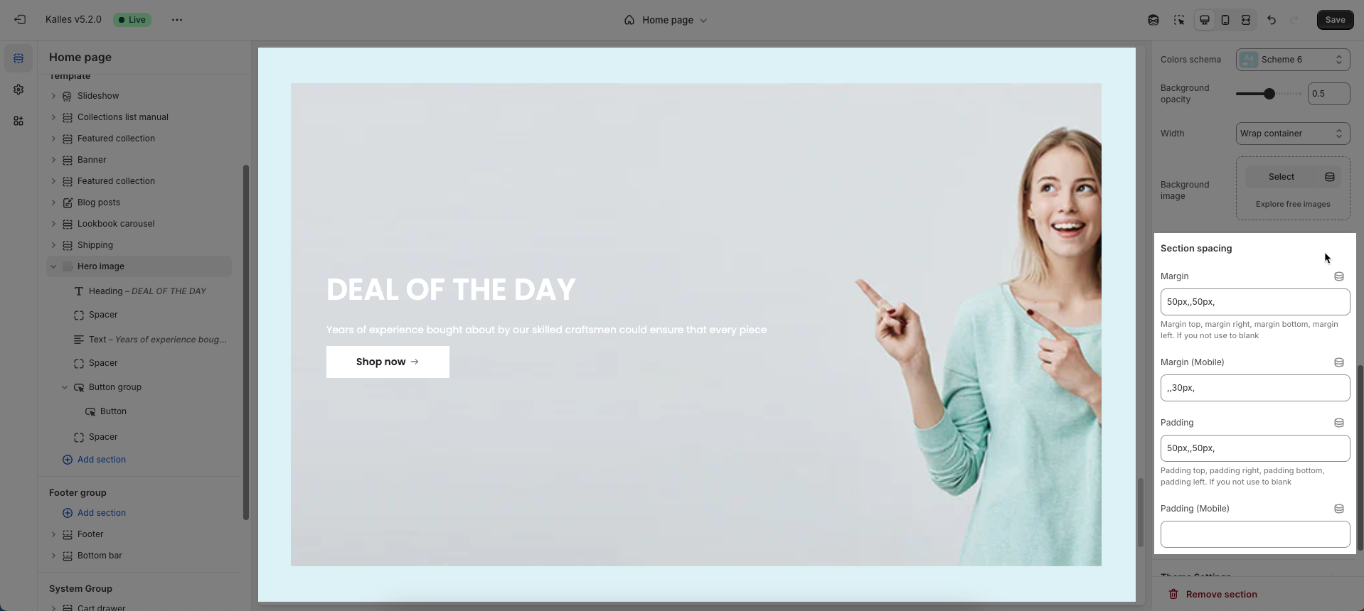
Layout
You can enable Display colors by section, configure Colors schema, Background opacity, Width, add Background image for section
Section spacing
Config Margin top, margin right, margin bottom, margin left for desktop & mobile screens. If you not use to blank