


The Custom Section is a flexible section that lets you build creative layouts using the blocks supported by the theme. You are free to explore, experiment, and mix & match these blocks - treating the Custom Section as a “playground” to create unique designs tailored to your store’s style and specific needs.
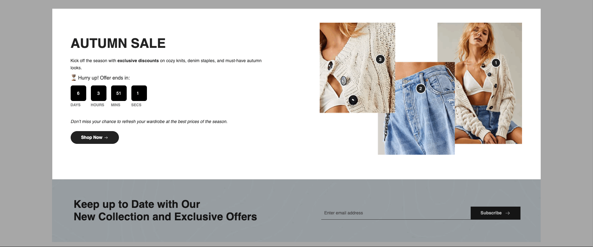
Another style you can create is by adding hotspots, lookbook items, and call-to-action elements.
1. Key Blocks You Need to Know
When using Custom Section, you first need to add a Column or Group to contain the inner blocks.
1.1. Column
Best for dividing the layout into fixed columns; easy ratio control columns (10 columns or 12 columns), simple config, easy to use, great for simple column-based layouts.
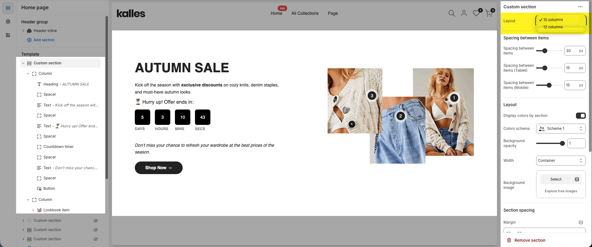
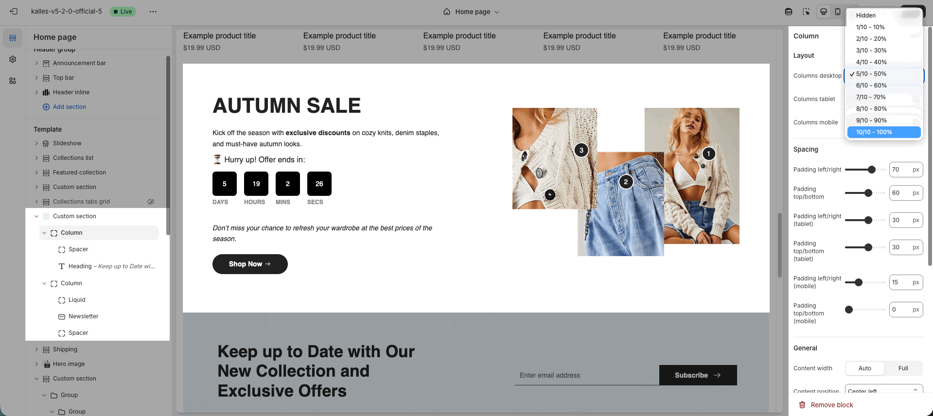
10 columns
Divides layout into 10 parts with fixed ratios (1/10 – 10/10 = 10% – 100%). Best for simple and evenly split layouts.
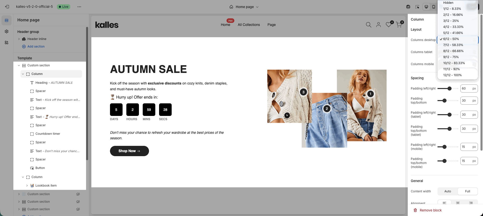
12 columns
Divides layout into 12 parts with flexible ratios (1/12 – 12/12 = 8.33% – 100%). Great for complex or uneven grid layouts.
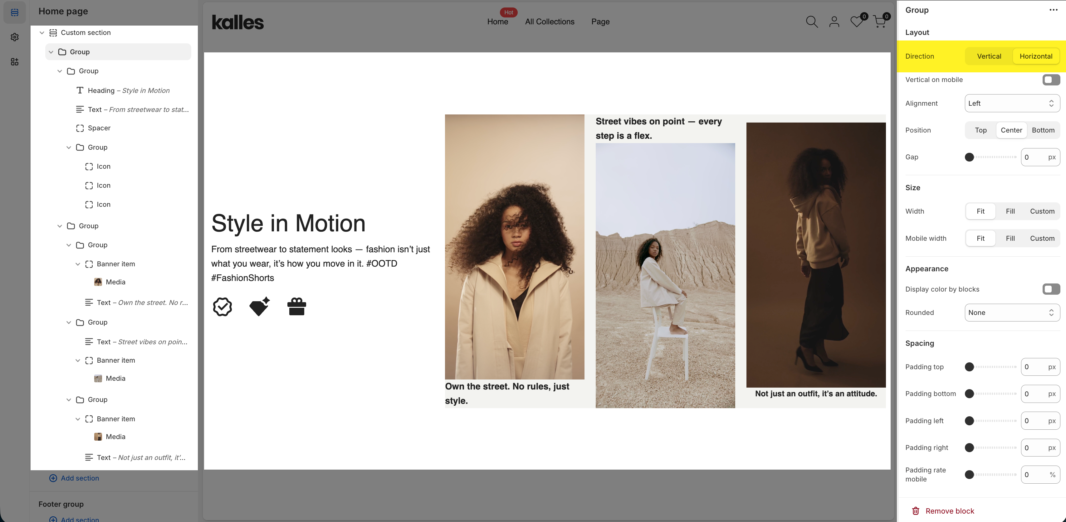
1.2. Group
The Group block is ideal when you need flexible layouts. It allows you to:
Nest multiple blocks (even other Groups).
Use any public block supported by the theme.
Arrange and align content with flexbox (horizontal or vertical).
This makes Group perfect for building multi-level structures and creative layouts with full control over spacing and alignment.
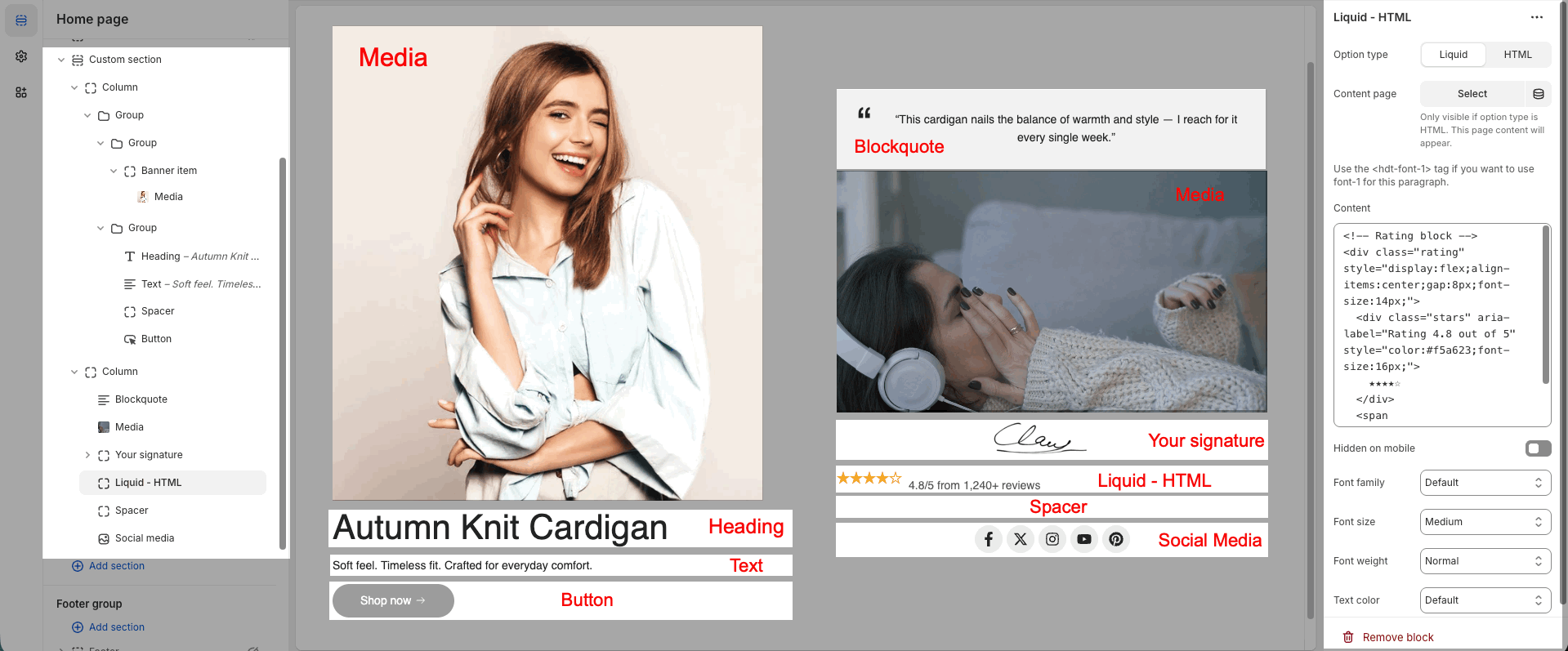
2. Blocks Supported by Custom Section
Heading – Highlighted titles.
Text / Text custom – Text content or advanced custom text.
Image / Media / Video – Add product or lifestyle images and videos.
Banner with product – Banner with featured product.
Lookbook item – Hotspot pins on images.
Blockquote – Quotes or testimonials.
Button / Button custom – Call-to-action buttons.
Countdown timer / Counter – Countdown for sales & number counters.
Newsletter – Subscription form.
Social media – Social links.
Icon – Decorative or highlight icons.
Your signature – Brand or personal signature.
Spacer / Space HTML – Create spacing.
Liquid – HTML – Embed custom HTML code.
By mixing Column, Group, and blocks like Media, Heading, Text, Spacer, Button, Blockquote, Your Signature, and Liquid HTML, you can create a complete section in just over 3 minutes.
Here’s a video of the process we used to build this section—you can check it out to see how the section works.
Hope you’ll come up with unique and creative sections.
3. Section Layout Examples
3.1. Text Color Animation Effect
You can create a simple color-changing text effect by adding Custom Liquid / HTML blocks inside a Custom Section.
Configuration Steps
Add section → Custom section
Inside the section → Add block → Column (100%)
Inside the Column → Add block → Group (Horizontal layout)
Inside the Group → add Liquid / HTML blocks with the code below.
Important: Any element that should animate must include
class="text_custom_animation"
Lightning Icon Code
<svg class="text_custom_animation" style="width: 2.9rem; height: 4rem;" xmlns="http://www.w3.org/2000/svg" width="31" height="42" viewBox="0 0 31 42" fill="none"> <path d="M3.47892 23.31H9.63607V37.7088C9.63607 41.0685 11.4493 41.7484 13.6611 39.2286L28.7452 22.0301C30.5983 19.9303 29.8212 18.1905 27.0116 18.1905H20.8544V3.79173C20.8544 0.43202 19.0412 -0.247921 16.8294 2.27186L1.74536 19.4704C-0.0878407 21.5902 0.689276 23.31 3.47892 23.31Z" stroke="currentColor" stroke-width="1.5" stroke-miterlimit="10" stroke-linecap="round" stroke-linejoin="round"/> </svg>“UP TO – 70% OFF” Code
<div class="text_custom_animation hdt-text-sale">
  <div class="hdt-text-column">
    <span>UP</span>
    <span>TO</span>
  </div>
  <h3 class="hdt-sale-percent">70% OFF</h3>
</div>

<style>
  .hdt-text-sale{display:flex;align-items:center;gap:1.9rem;}
  @media(768px<width<=1150px){.hdt-text-sale{flex-direction:column;gap:0;}}
  .hdt-text-column{display:flex;flex-direction:column;}
  @media(768px<width<=1150px){.hdt-text-column{flex-direction:row;gap:10px;}}
  .hdt-text-column span{font-size:clamp(24px,3vw,30px);font-weight:600;line-height:2.8rem;}
  .hdt-sale-percent{font-size:clamp(35px,4vw,70px);margin:0;font-weight:700;}
</style>
Video for quick set up this layout:


