


Product layouts let you customize how product images, information, and features are displayed on the product detail page. Choosing the right layout helps create a better shopping experience and highlights your products effectively.
1. Product Media feature
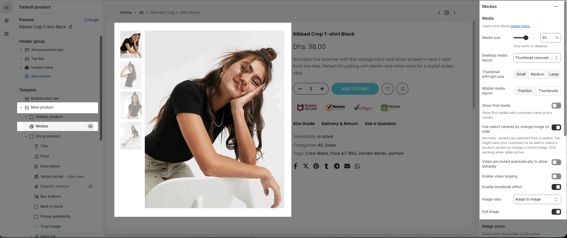
Media layout allows you to choose how product images and videos are displayed on the product detail page. Depending on the layout, you can arrange images in columns, stacked format, or with thumbnails to best present your products.
Desktop media layout
On the product page, the theme offers 7 available media layout options optimized for large screen displays:
Product Media 1 column: All product images are shown in a single column, one below another.
Product Media 2 columns: Product images are arranged in two side-by-side columns.
Product Media Stacked: Images are displayed in a vertical stack; one main image at the top, followed by additional images below.
Thumbnail carousel (Bottom): Main image on top with a thumbnail carousel displayed underneath.
Thumbnail carousel (Left): Main image on the right, thumbnails in a vertical carousel on the left.
Thumbnail carousel (Right): Main image on the left, thumbnails in a vertical carousel on the right.
Without thumbnail: Only the main image is displayed, without thumbnails.
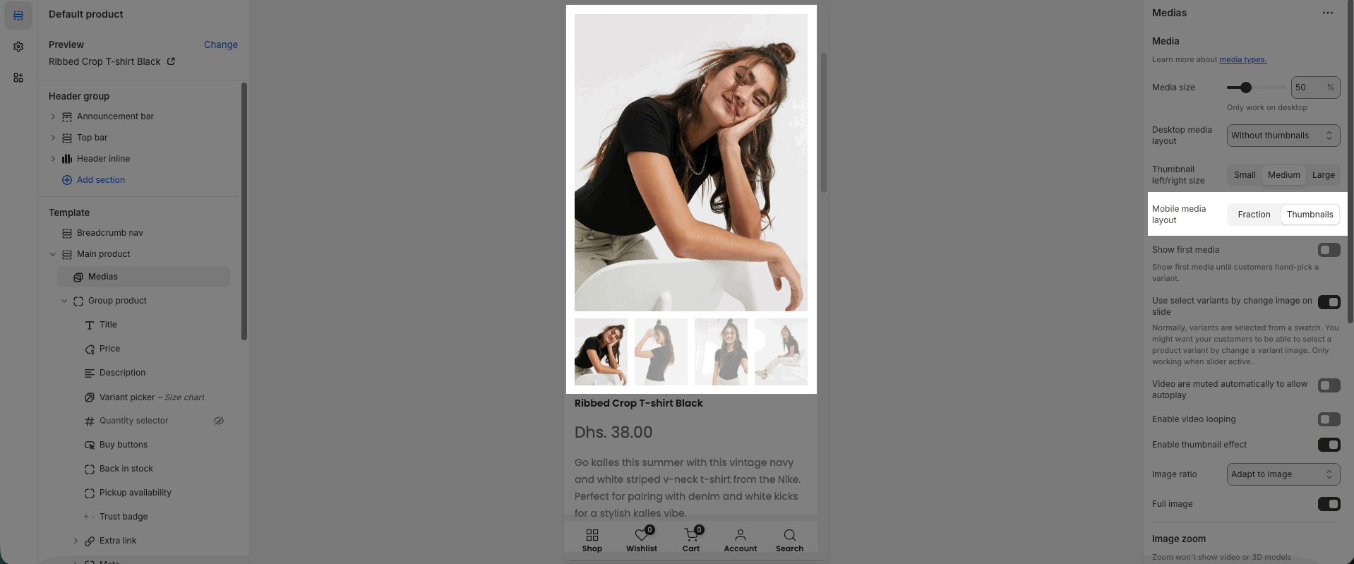
Mobile media layout
On mobile devices, the theme supports 2 layout options for displaying product media:
Fraction: Displays the number of images as fractions (e.g., 1/5).
Thumbnails: Shows the main image with a row of thumbnails below.
2. Product Sticky feature
If your product has many images, making the media section longer than the product details, the theme will automatically keep the product information (title, price, buttons, etc.) visible while you scroll through the images.
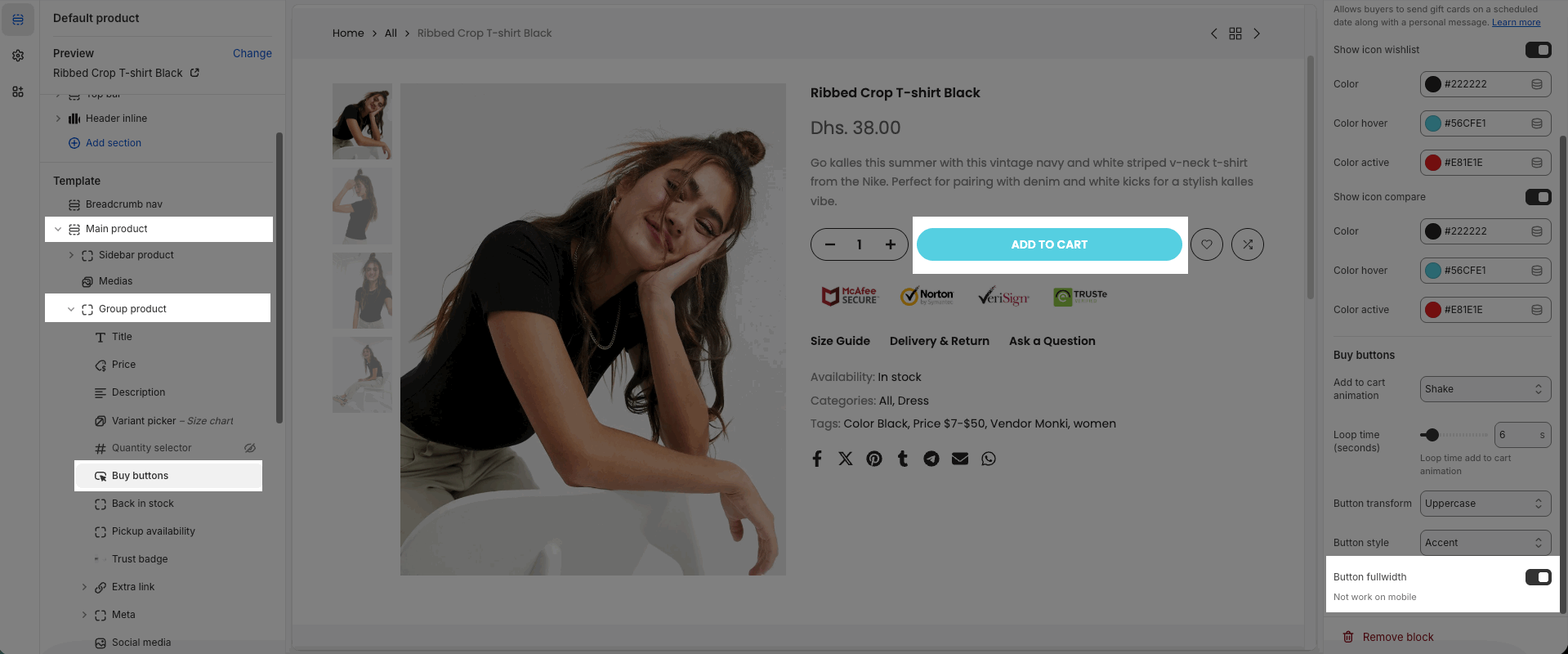
3. Product ATC Full feature
To make the Add to Cart button display across the full width on desktop, go to the Buy buttons block, scroll to the bottom of the settings, and turn on Button fullwidth.
Note: On mobile, the Add to Cart button is already fullwidth by default, so this option won’t apply.
4. Product full-width feature
Allows you to display the product detail page in a fullwidth layout. When this option - Enable full Width is enabled in Product Main, the entire product content expands to the full width of the screen, creating a modern look and stronger focus on product images and information.


