


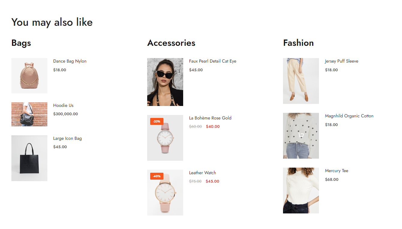
This section helps you to show the categories as columns.
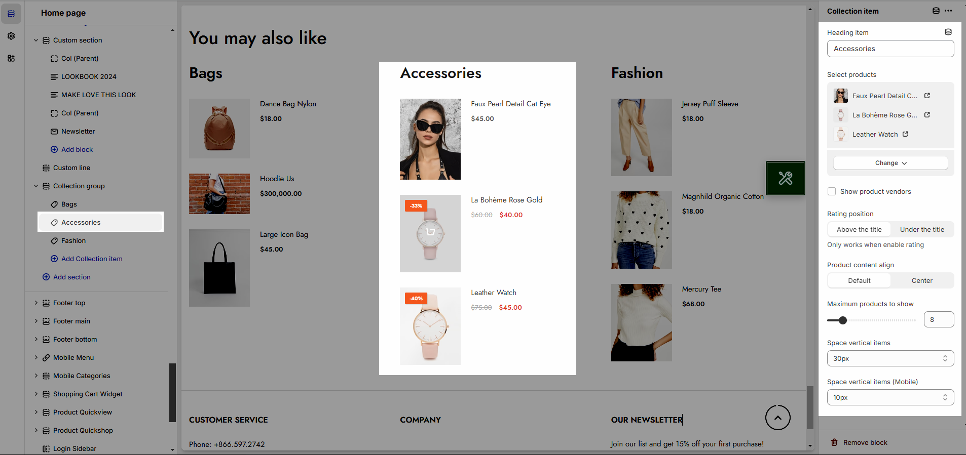
1. Collection items
Heading item: change your heading
Select products: Select products from your collection & Show product vendor
Rating position: You can display the rating above the title or under the title
Product content align: You can choose Default or Center
Maximum products to show: Maximum number of optional products allowed to be displayed
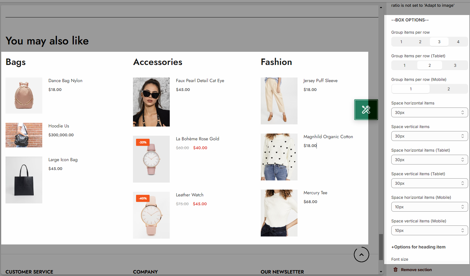
Space vertical items: To add vertical spacing between items in a layout
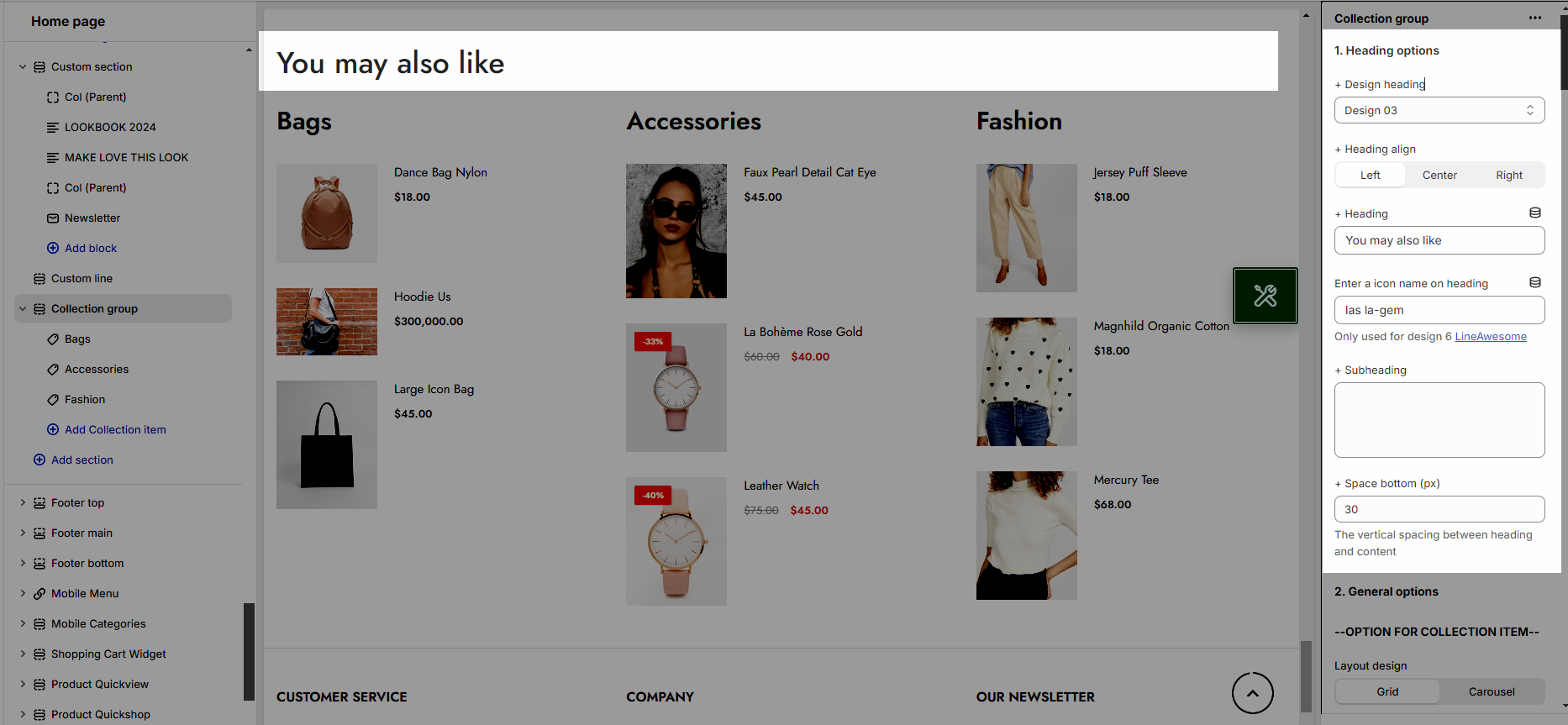
2. Collection Group
2.1. Heading options
You can enter the Heading and Subheading, choose the design for the heading, also can choose text align: center, left, right.
2.2. General settings
OPTION FOR COLLECTION ITEM
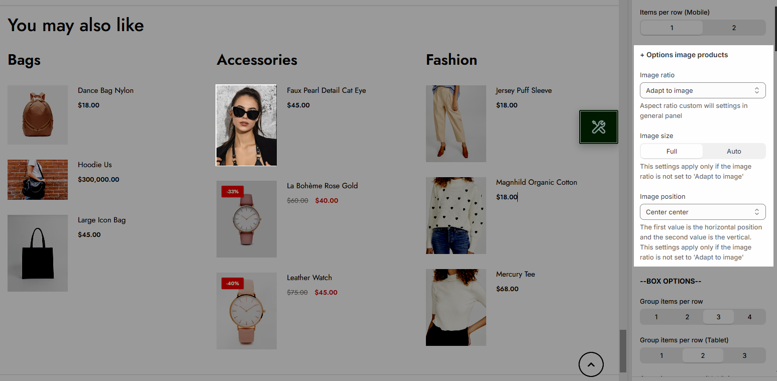
You can set layout design and items per row
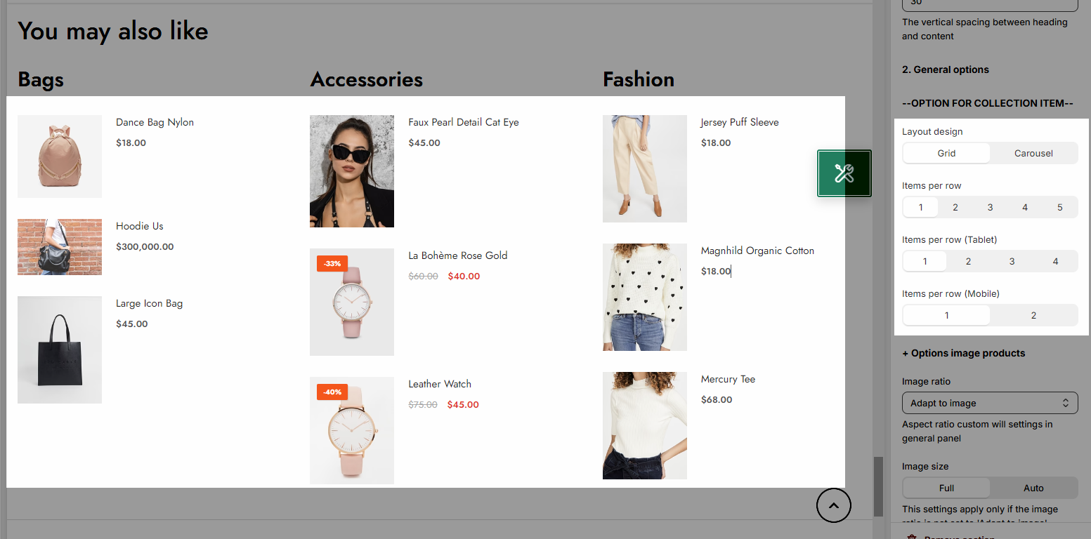
You can choose image ratio, image size, image position
BOX OPTIONS
Set Group items per row for Desktop/Tablet/Mobile
Space horizontal items: To add horizontal spacing between items in a layout
Set Options for heading item: font size, font weight, color,...
Set Options for carousel layout: Select carousel layout to see
Turn on the Use prev next button option and you can configure the prev/next button
Turn on the Use page dots option and you can configure the section for the dots
2.3. Design options
Please follow this guideline to config Layout, Background, Margin/Padding for the section.


