The Featured Collection section displays a grid, carousel, or masonry of products from one of your collections.
It is usually located on Homepage. However, Shopify 2.0 allows you to add the Featured Collection section to any pages that you wanna use.
Steps
In the theme editor (Customize), click Add section
Search Featured Collection
Click Save
1. How to configure the Featured Collection section?
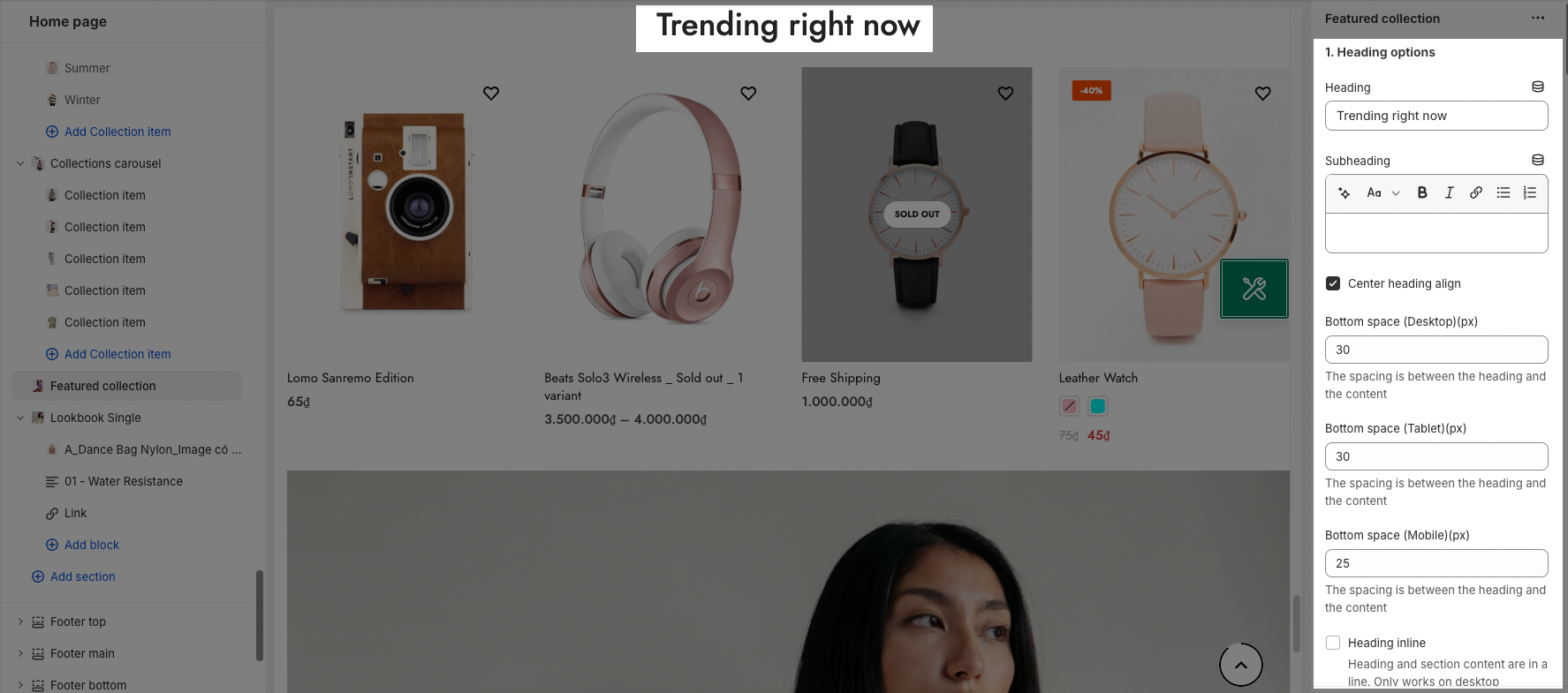
1.1. Heading Options
You can change Heading, Subheading
Center align the heading: Tick on this checkbox to enable Heading section on the center. If you uncheck this checkbox, the Heading will align left by default.

1.2. General Options
- Collection: You can choose the collection that you wanna show in the Featured Collection section here.
- Product item Designs: It has 21 designs for you to choose from. You can check it in the customized theme.
Besides, you can enable show vendors and countdown for products.
OPTIONS IMAGE PRODUCTS
You can change Image ratio, Image size, Image position.
Product content align: set text align for text content of product.
Maximum products to show, Items per row and Space between items (horizontal and vertical)
BOX OPTIONS
Layout design: You can choose Grid, Carousel or Masonry layout.
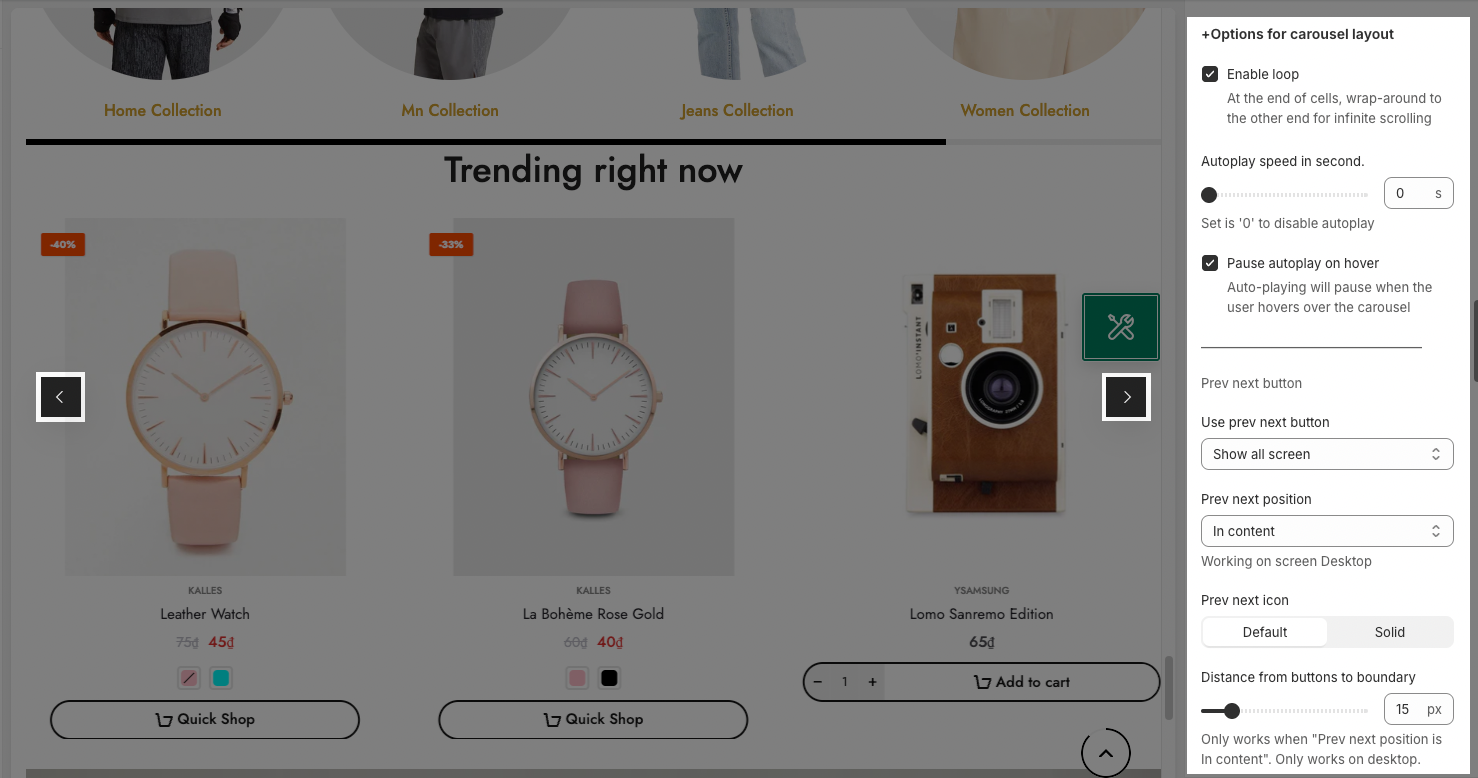
OPTIONS FOR CAROUSEL LAYOUT
It has many options for your config Carousel Layout: Enable box border, Enable loop, Autoplay speed in second, Pause autoplay on hover, Enable center slide, option to config Pre-next button and Page dots.

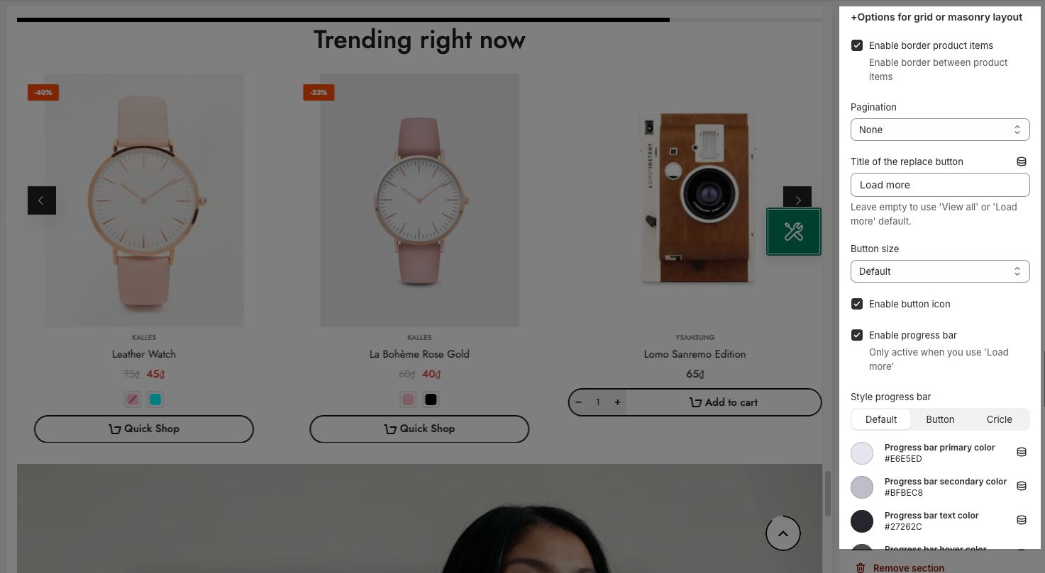
OPTIONS FOR GRID OR MASONRY LAYOUT
Pagination: You can choose among Load more button, View all button, or None. You also have some options to config for this button

2. Design options
Please follow this guideline to config Layout, Background, Margin/Padding for the section.


