


This section is very flexible and you can design it like whatever you want with images, text, and buttons, etc. It is usually located on Home Page
1. Custom section content
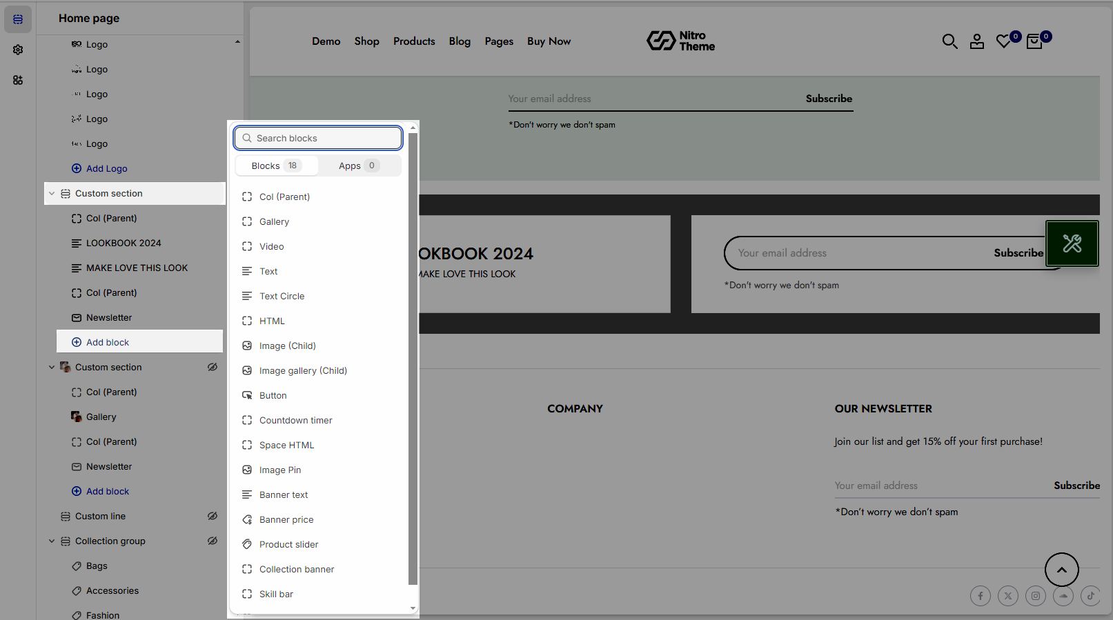
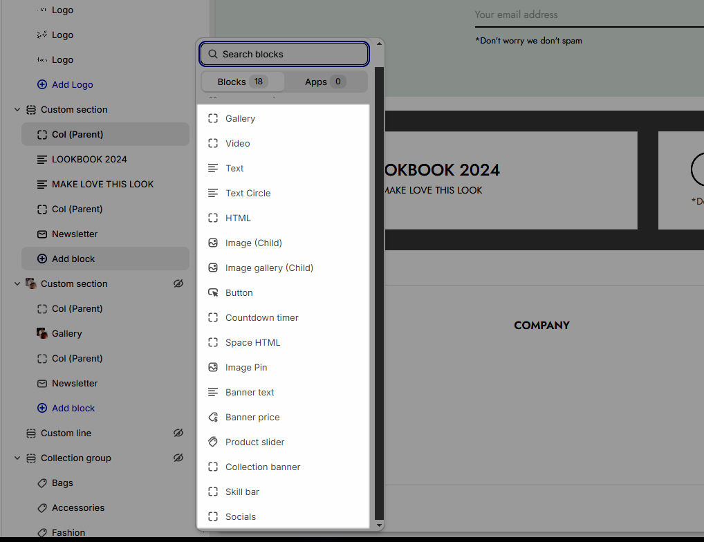
Click on Custom section > ADD BLOCK > choose the block you want to add.
1.1. Col (Parent)
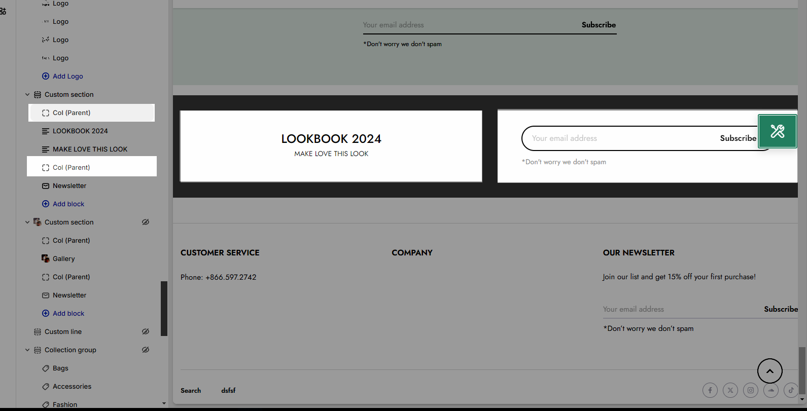
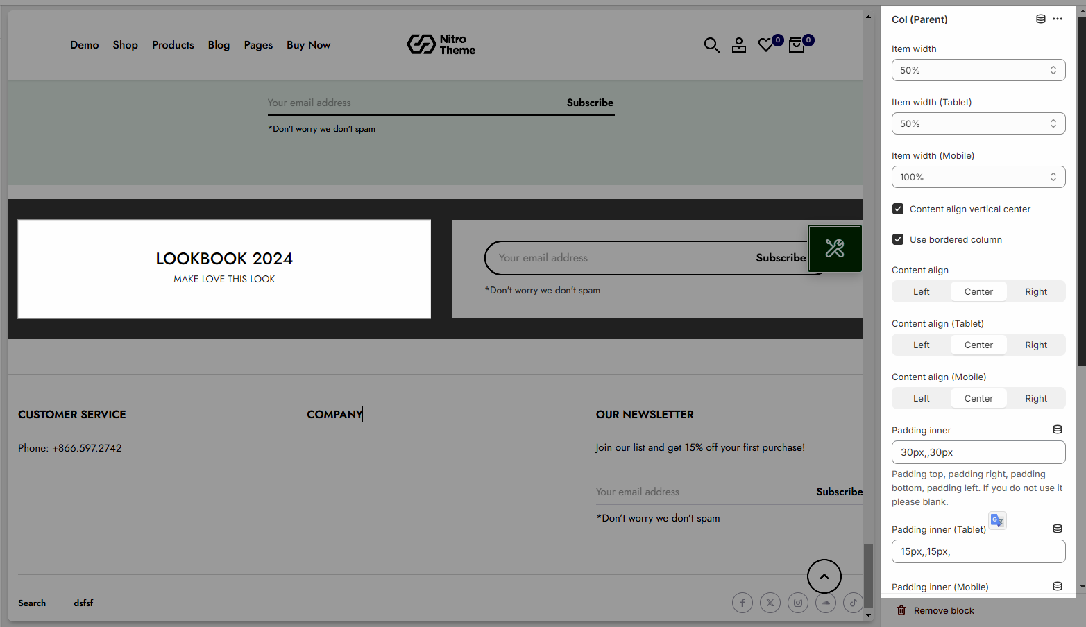
Each Col (Parent) represents for one column. In this block, you can adjust it with many options below:
Item width for many devices: Desktop, Tablet, Mobile
Content align: You can align content to Left, Center or Right and Content align vertical center
Padding inner for many devices: Desktop, Tablet, Mobile
Background image/background color for this column
Animation options: Duration animation each block & Time animation delay
1.2. Other blocks (Child)
Text: you can add a text to the banner image and you can adjust text with many options like Font family, Font size, color, etc.
Button: This block allows you to create a button for the banner, you can customize this button with many options like add a link, style, effect, color, etc.
HTML: you can add a HTML codes
Image (Child): With this block, you can add a Image(child) inside the Image(parent) and you can adjust the Image(child) more creatively.
Countdown timer: This block help you add the countdown timer and set it very easily just by adding the date countdown into.
Newsletter: you can add a subscribe form here.
Space HTML: This block allows you to create a separator line for this section.
Banner with product: you can add a banner with a product inside the banner.
Gallery & Video: A gallery showcases a collection of images or video, often displayed in a grid or carousel format.
Text Circle: A design element where text is displayed within a circular shape.
Image Gallery: Similar to a gallery but specifically focused on showcasing multiple images in various layouts.
Image Pin: A design element where an image is used as a pin or marker
Banner Text: A banner that displays promotional or important text.
Banner Price: A banner designed to display a price prominently.
Product Slider: A slider component for displaying multiple products that users can scroll through.
Collection banner: A banner highlighting a collection of items or products.
Skill bar: A graphical representation of skills or progress in various areas.
Socials: Icons or links to social media profiles.
Newsletter: Allowing users to subscribe to updates, promotions, or news
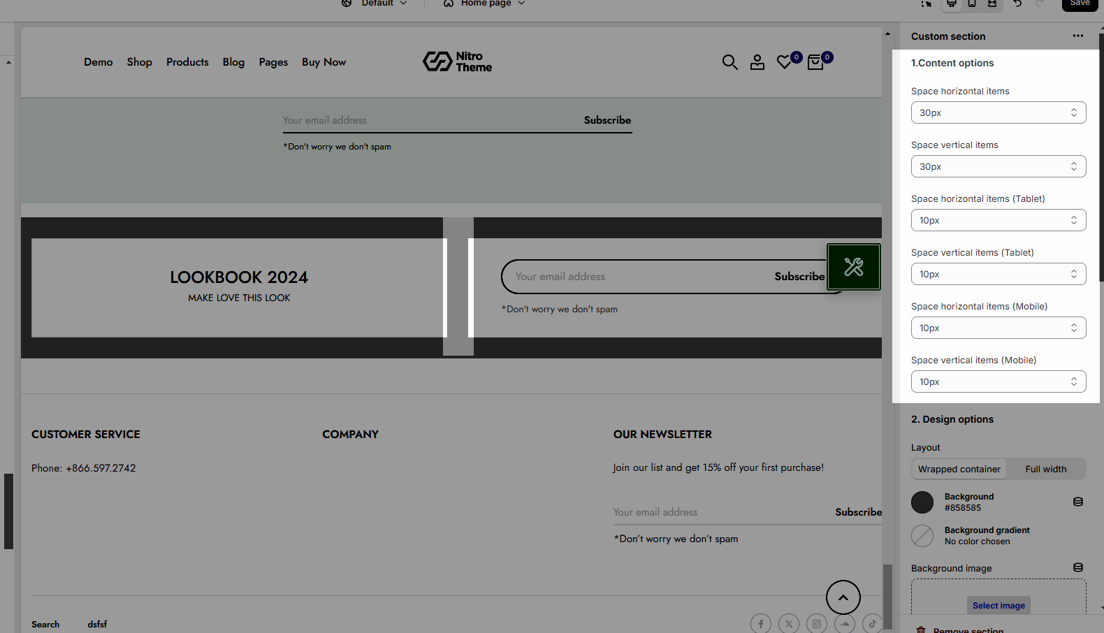
2. How to configure the Custom section?
2.1. Content options
Space horizontal/vertical items: You can set the space between items by horizontal/vertical. Moreover, you can choose different spaces for many devices: Desktop, Tablet, Mobile.
2.2. Design options
Please follow this guideline to config Layout, Background, Margin/Padding for the section.


