


The Lookbook section is designed to showcase your products or collections in a visually appealing and engaging way. It helps customers visualize how items can be styled together and inspires them to purchase.
1. Lookbook Single settings
A Lookbook Single focuses on one product, text, or link per page. This layout is ideal for highlighting specific items and giving them more attention.
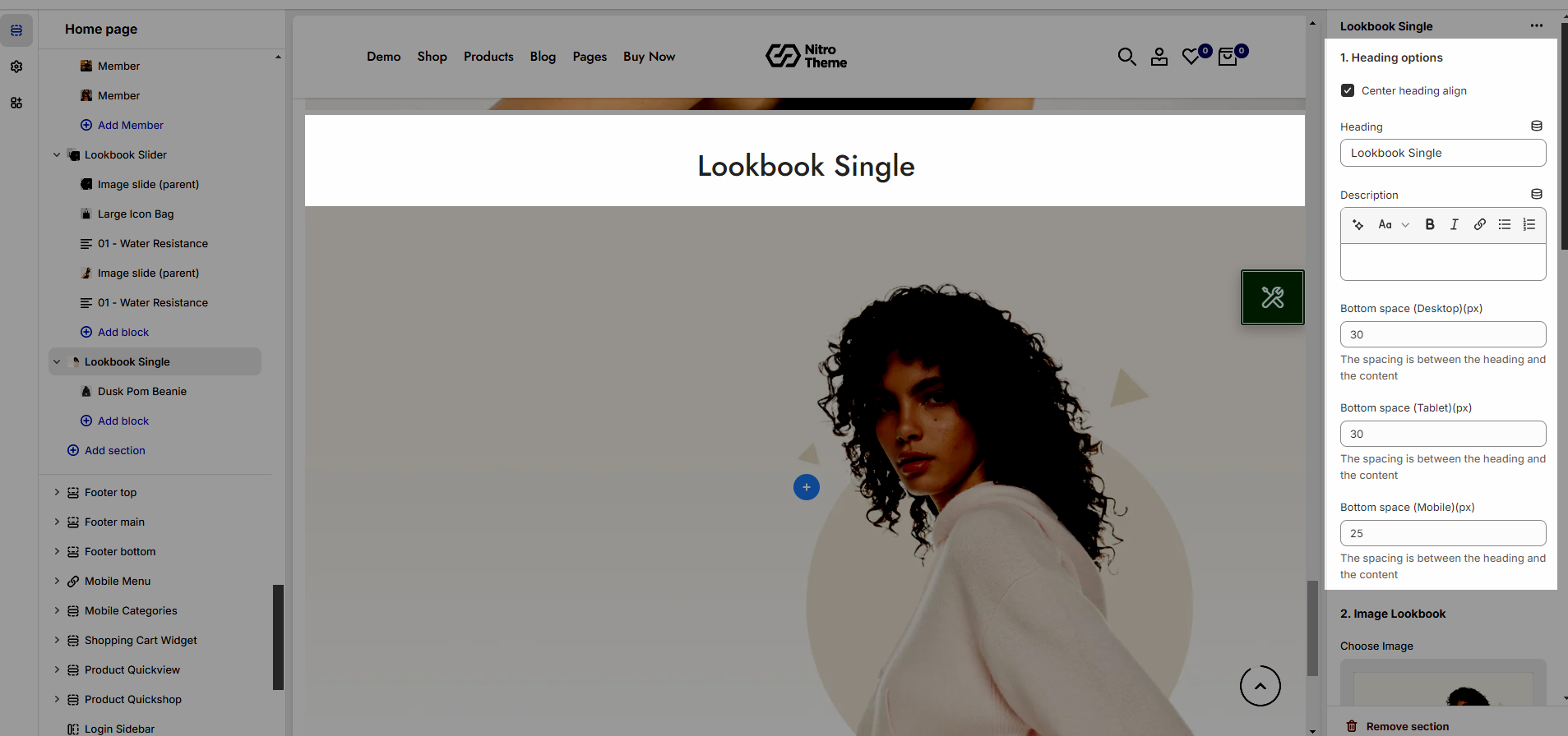
1.1. Heading options
Heading alignment: Set the alignment of your heading to make sure it fits well with the overall layout and design.
Heading: This is where you input the main heading or title of the Lookbook section. Make sure it's descriptive and catchy to attract attention
Description: Provide a brief description that gives more context to your heading.
Bottom space (Desktop/Tablet/Mobile): The spacing is between the heading and the content
1.2. Image Lookbook
You can set an Image for Lookbook section.
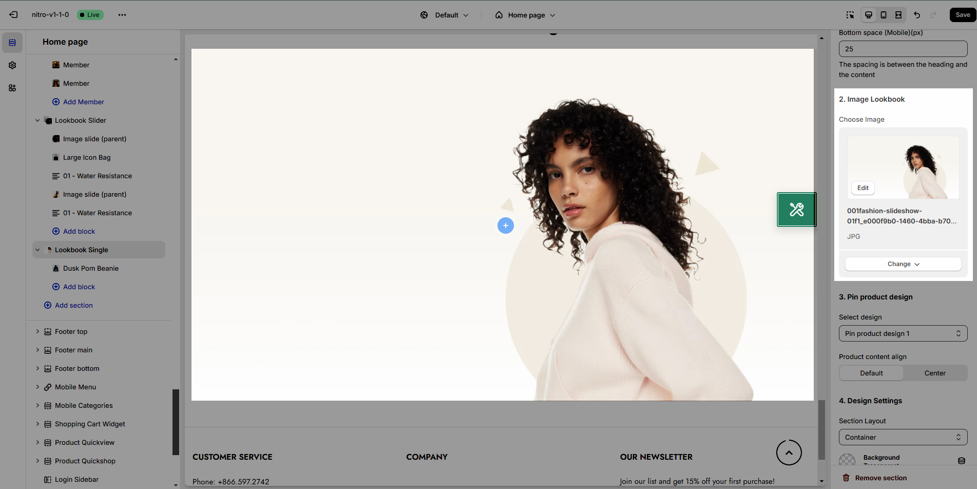
1.3. Pin Product design
This option allows you to choose any designs you want to display for Product in Lookbook section. And set alignment for product content
We have created 4 designs for you to select, let's check it out:
1.4. Design Settings
Please follow this guideline to config Layout, Background, Margin/Padding for the section.
2. Lookbook Single blocks
In this section, we provide 3 types of Pin as Product, Text and Link.
Pin position: You can adjust position for pin by Top and Left parameter.
Position: popup display position
Title type: There are three types of icon design for you to select.
Short text: You can change the text content to display when your Title type is "Short text".
Pin size: You can set the pin size with many selections as Small, Medium, Large and Extra large.
Background color: This option allows you to set the background color for pin.
Icon/Text color: This option allows you to set the color for icon and text inside pin.
Please check this video to know more:


