This section allows you to show a logo list and you can choose a grid, carousel and packery layout for the images. You can go to Theme sections > Add section > Search and add Logo List to configure it.
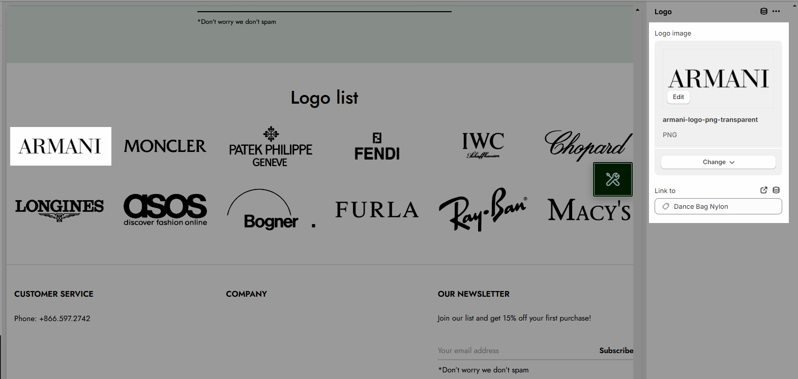
1. Logo Item
Click on Logo list > Add Logo > to add more logo items on this section.
You can choose an image and link for each logo item.
2. Logo list settings
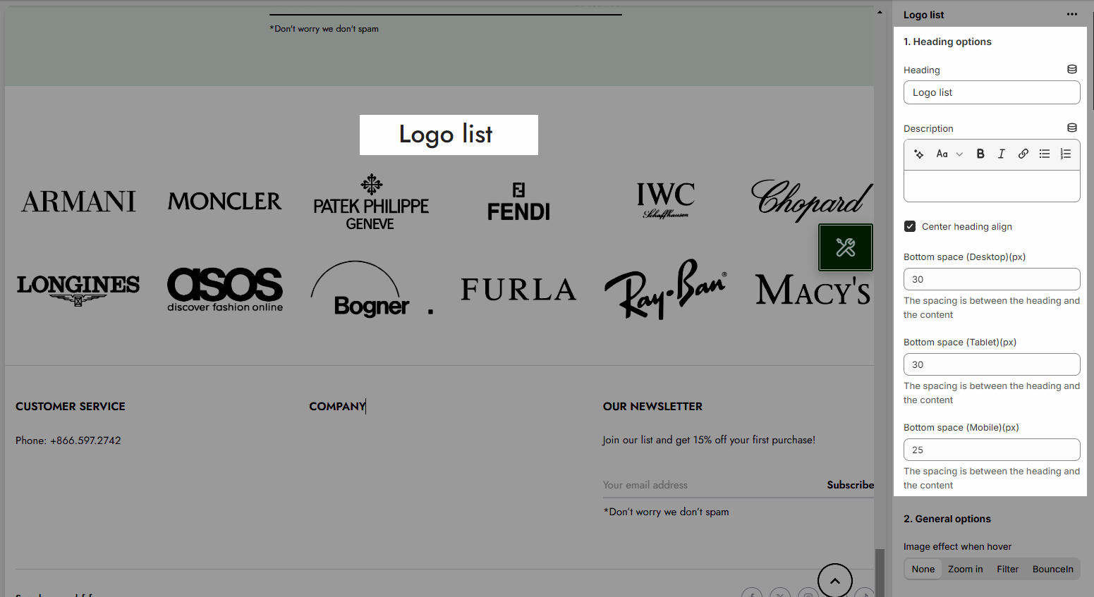
2.1. Heading options
Heading alignment: Set the alignment of your heading to make sure it fits well with the overall layout and design.
Heading: This is where you input the main heading or title of the Lookbook section. Make sure it's descriptive and catchy to attract attention
Description: Provide a brief description that gives more context to your heading.
Bottom space (Desktop/Tablet/Mobile): The spacing is between the heading and the content
2.2. General options
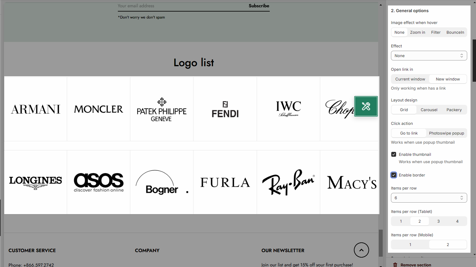
Image effect when hover: Adding hover effects to images can enhance the user experience and make your website more interactive
Effect: there are 5 styles to choose from
Open link in: you can open link in Current window or New window
Layout design: Grid, Carousel, and Packery
Click action: you can set up image hover effects with click actions that either go to link or open a Photoswipe popup for larger image viewing.
Item per row: Number of items displayed per row
You can enable Thumbnail and border
Space between items: Adjust the appropriate spacing between items
OPTION FOR CAROUSEL LAYOUT
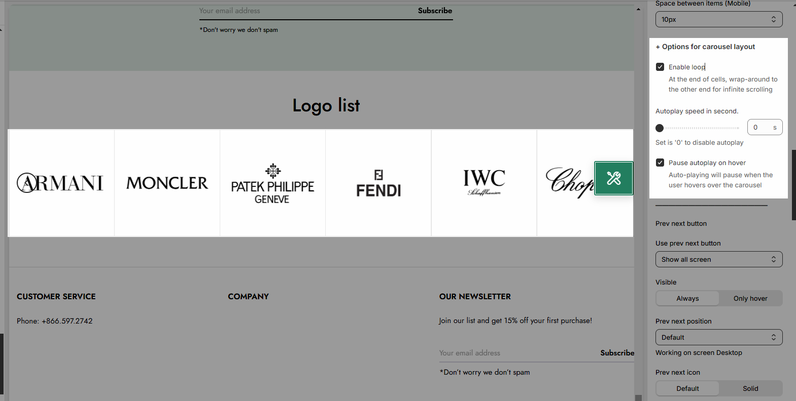
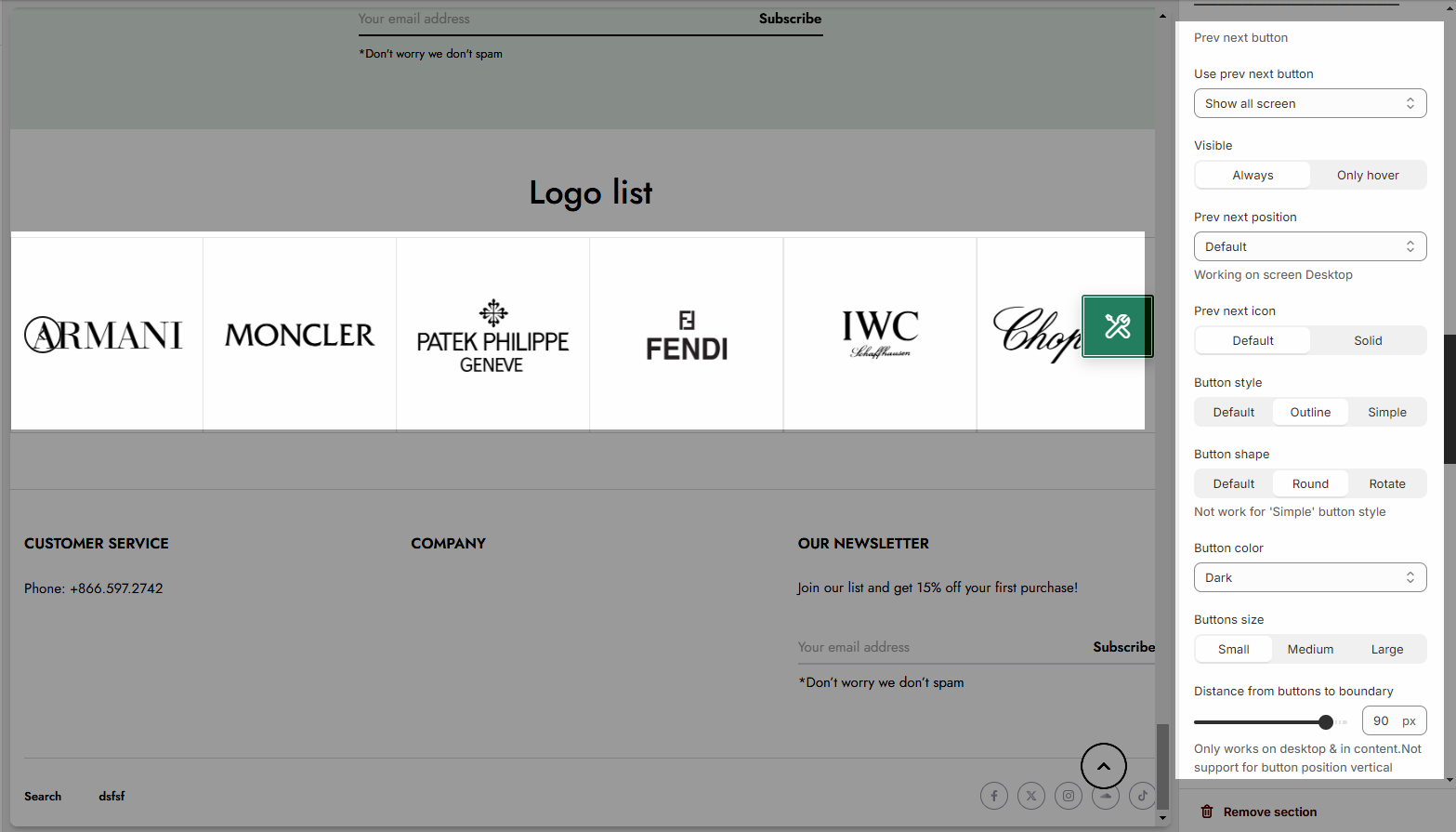
Turn on the Use prev next button option and you can configure the prev/next button
Turn on the Use page dots option and you can configure the section for the dots
2.3. Design options
Please follow this guideline to config Layout, Background, Margin/Padding for the section.


