


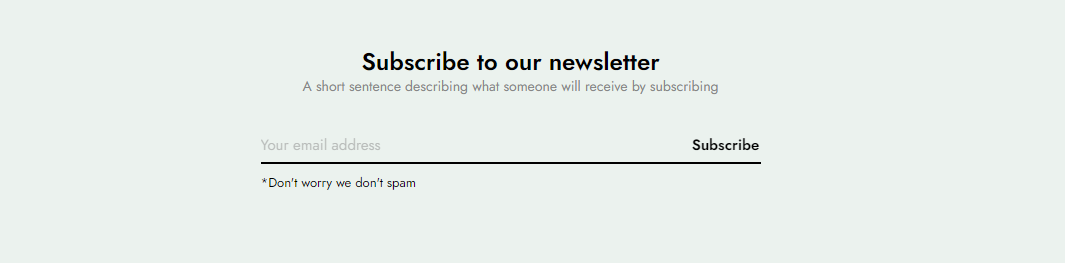
Newsletters are one of the most powerful digital marketing tools at your disposal since they let you communicate directly with your customers in a personalized way when they subscribe.
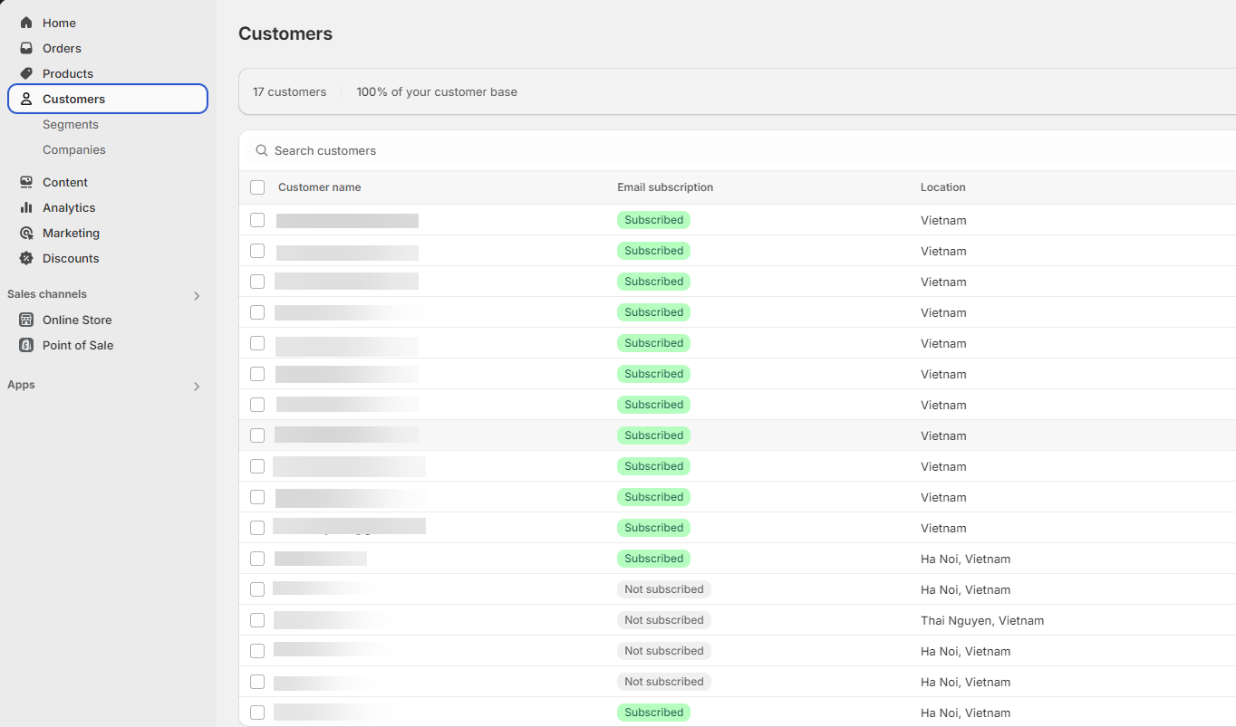
Note: After the customer fills in the email in the newsletter form, the customer's email will be saved in Shopify admin > Customers or in the email marketing app that you use. This belongs to the setting in Theme settings > General. You can refer to this guide for details Link
Steps: In the theme editor (Customize) > Add section > Newsletter > Save.
1. Newsletter item content
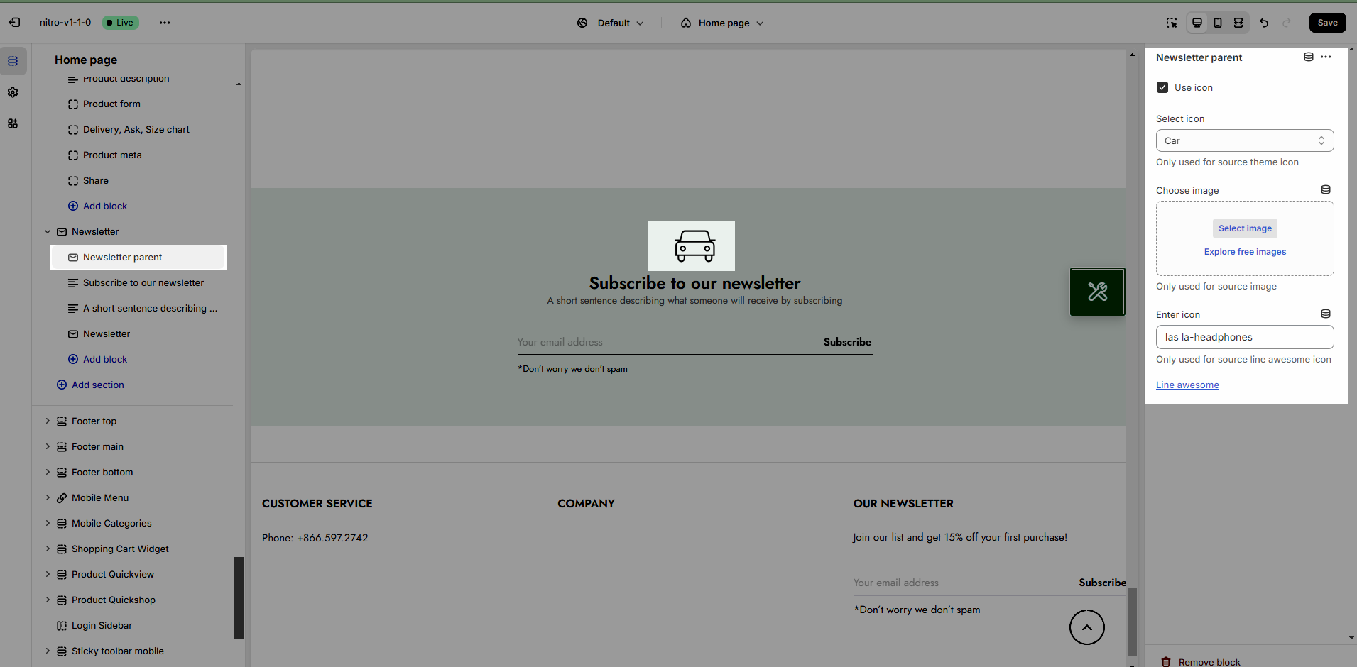
1.1. Newsletter parent
Use & select icon
Choose image: Use image instead of icon
Enter icon: Only used for source line awesome icon
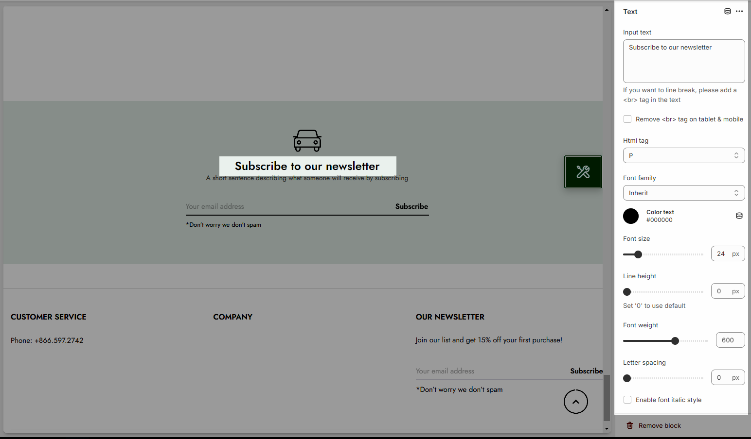
1.2. Text
Config for text: you can add text, config font-family, font-size, color, lineheight,...
2. How to config Newsletter section
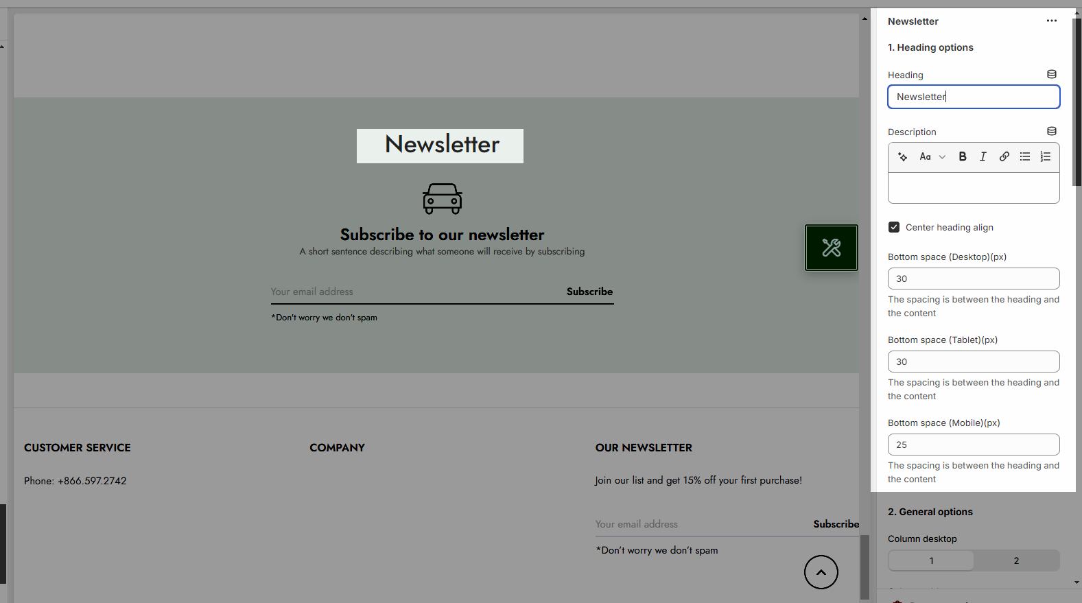
2.1. Heading options
Heading alignment: Set the alignment of your heading to make sure it fits well with the overall layout and design.
Heading: This is where you input the main heading or title of the Lookbook section. Make sure it's descriptive and catchy to attract attention
Description: Provide a brief description that gives more context to your heading.
Bottom space (Desktop/Tablet/Mobile): The spacing is between the heading and the content
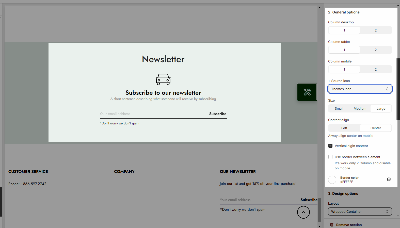
2.2. General options
You can set for Column desktop/Tablet/Mobile on one row
Source icon: use Theme icons, Images or Line awesome
Size:
Content size: Small, Medium, Large
Content align: you can choose Left or Center (Alway align center on mobile_
Enabel Vertical algin content, Use border between element
Border color: set color fo border
2.3. Design options
Please follow this guideline to config Layout, Background, Margin/Padding for the section.


