Engage customers with smooth navigation, eye-catching images, and seamless browsing, making it easier for them to discover and shop their favorites. Customize the layout, navigation, and design to match your store’s aesthetics and provide an effortless shopping experience.
1. Featured product carousel
1.1. General settings
Select Collection – Choose a collection to feature in the carousel, showcasing a curated selection of products for your customers.
Products List – Displays the products from the selected collection, allowing customers to browse through them effortlessly.
Product Design – Choose from 12 beautifully crafted designs, ready for you to use.
Image Ratio – Adjust the aspect ratio of product images to ensure consistency and a professional look. Options may include square, portrait, ASOS, landscape, and custom.
Full Image – Enable this option to display the entire product image without cropping, ensuring a true-to-life presentation
Show Vendor – Display the vendor or brand name beneath each product
Products Border – Add or remove borders around each product card to enhance visual separation and clarity.
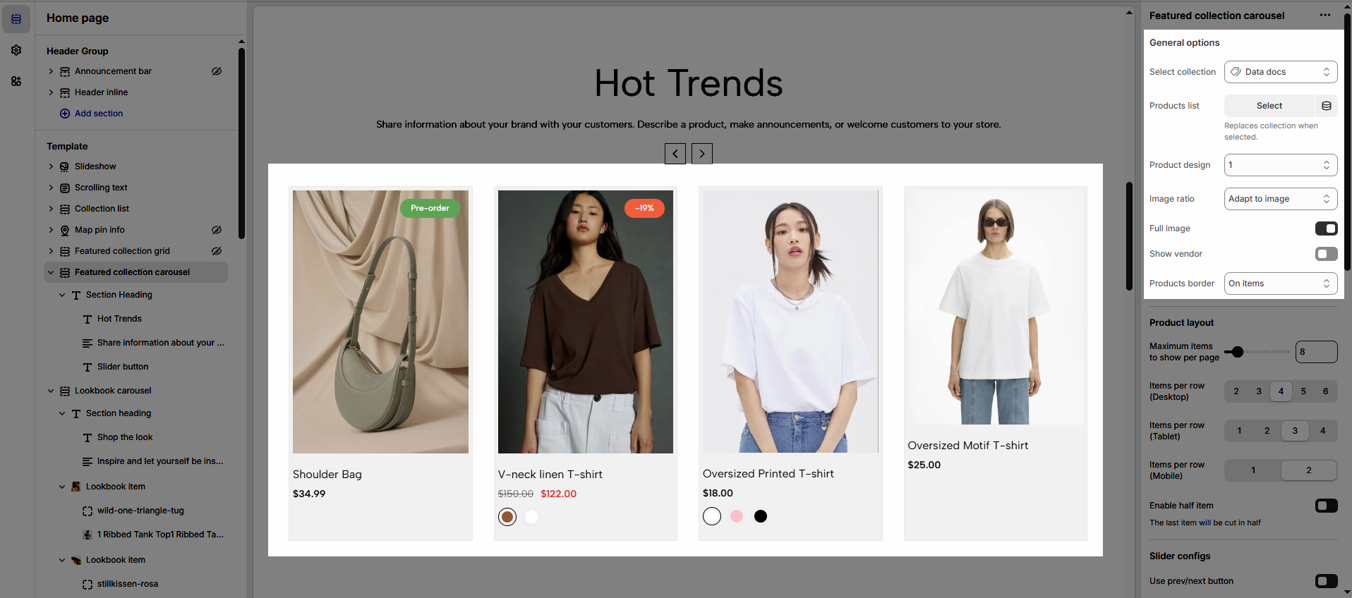
1.2. Product layout
Maximum items to show per page: Set the number of items displayed per page to control how many products customers see at once.
Items per row (Desktop/Tablet/Mobile): Adjust the number of items shown in a single row for different devices, ensuring a seamless browsing experience.
Enable half item: Display a partially visible item at the edge of the carousel to hint at more products, encouraging users to scroll.
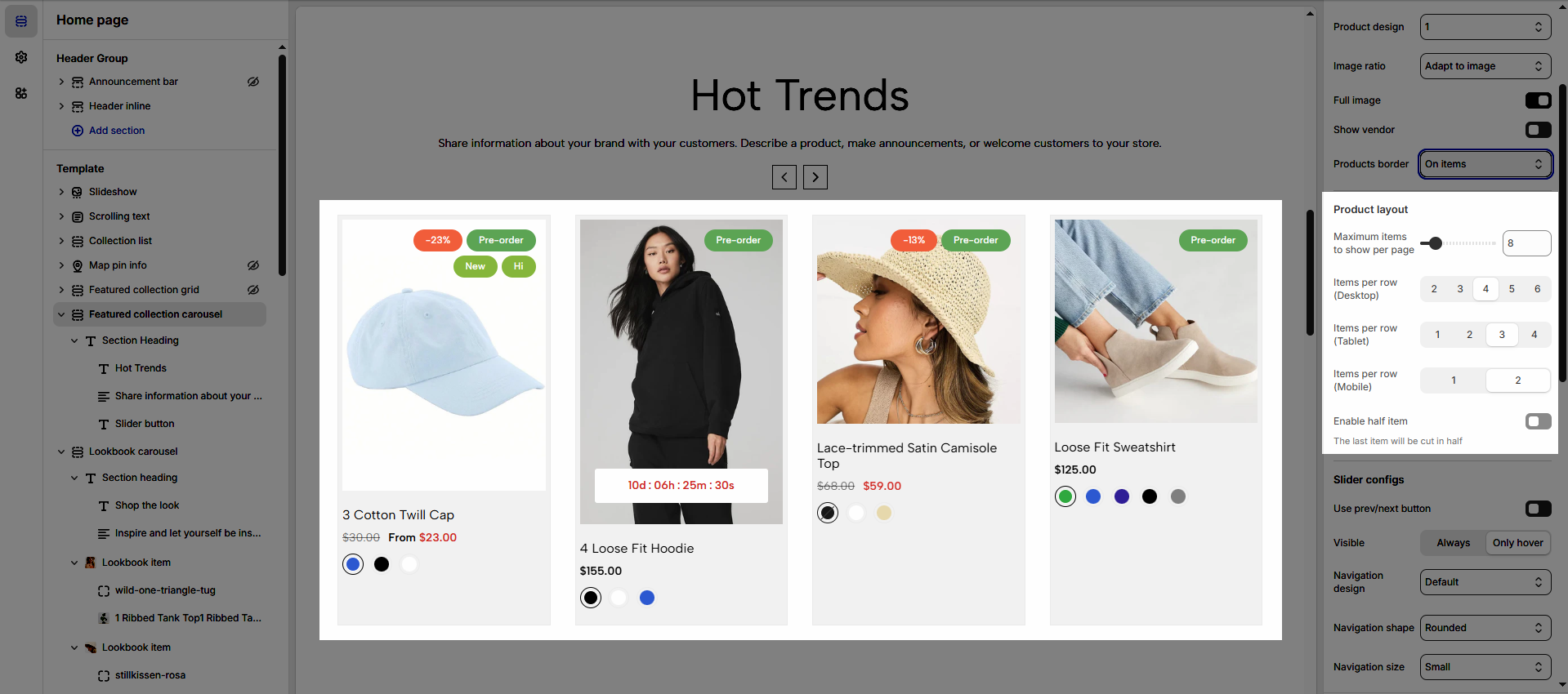
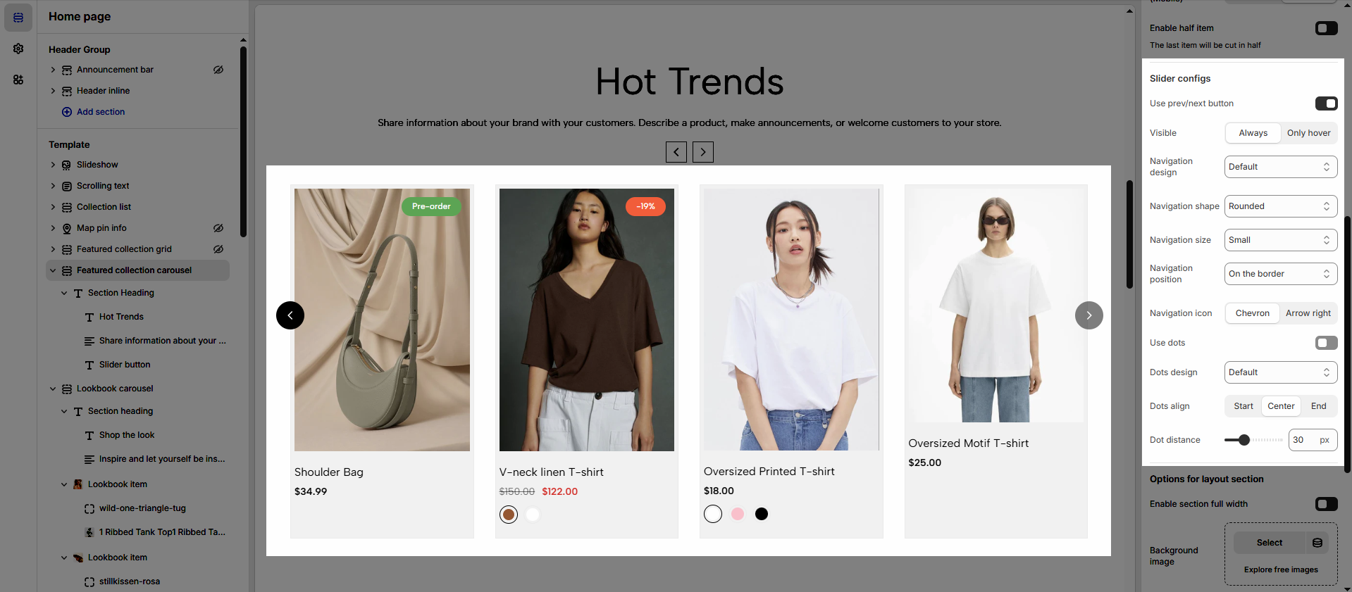
1.3. Slider configs
Use prev/next button: Enable navigation buttons to allow users to scroll through items easily.
Visible: Choose whether the navigation buttons are always visible or appear only on hover.
Navigation design: Select a style for the navigation buttons that best matches your store’s aesthetic.
Navigation shape: Customize the shape of the navigation buttons (rounded, rotate, square).
Navigation size: Adjust the size of the navigation buttons for better visibility and usability.
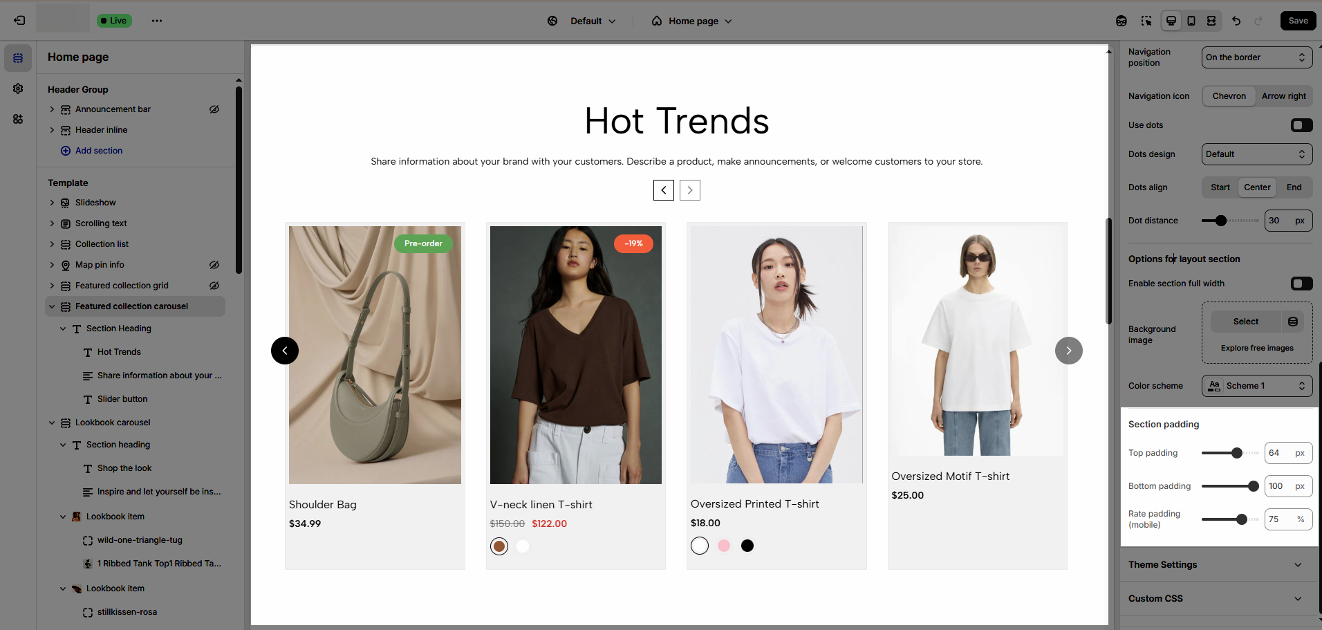
Navigation position: Set the placement of the navigation buttons (inside or outside the content area).
Navigation icon: Choose an icon style for the navigation buttons to enhance the user experience.
Use dots: Enable dot indicators to show the number of slides and improve navigation.
Dot design: Select a dot style to match the overall design of your carousel.
Dots align: Adjust the alignment of the dot navigation (center, left, or right).
Dot distance: Set the spacing between dots to maintain an organized look.
1.3. Options for layout section
Color Scheme: to learn more about this, refer to this document
Background image: select an image for the background section
Enable section full width: make your section 100% of the screen width.
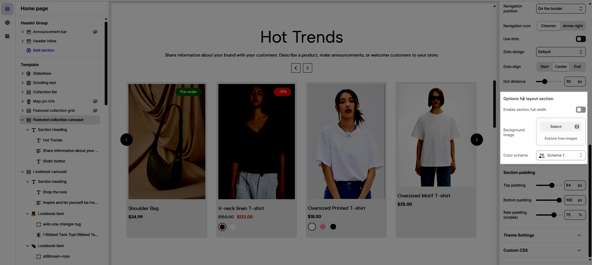
1.4. Section padding
Section padding: This option allows you to adjust top and bottom padding both on desktop and mobile.
1.5. Theme Settings
Refer to the document for Products and Product card & for step-by-step guidance on configuring product card options.
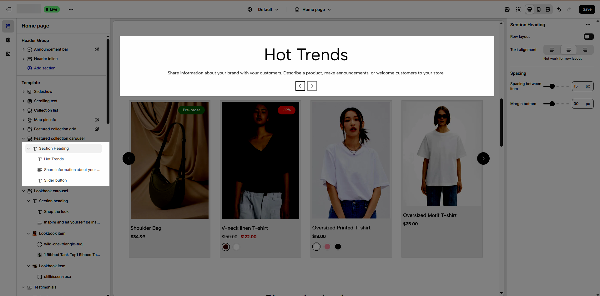
2. Section heading
Follow this document