


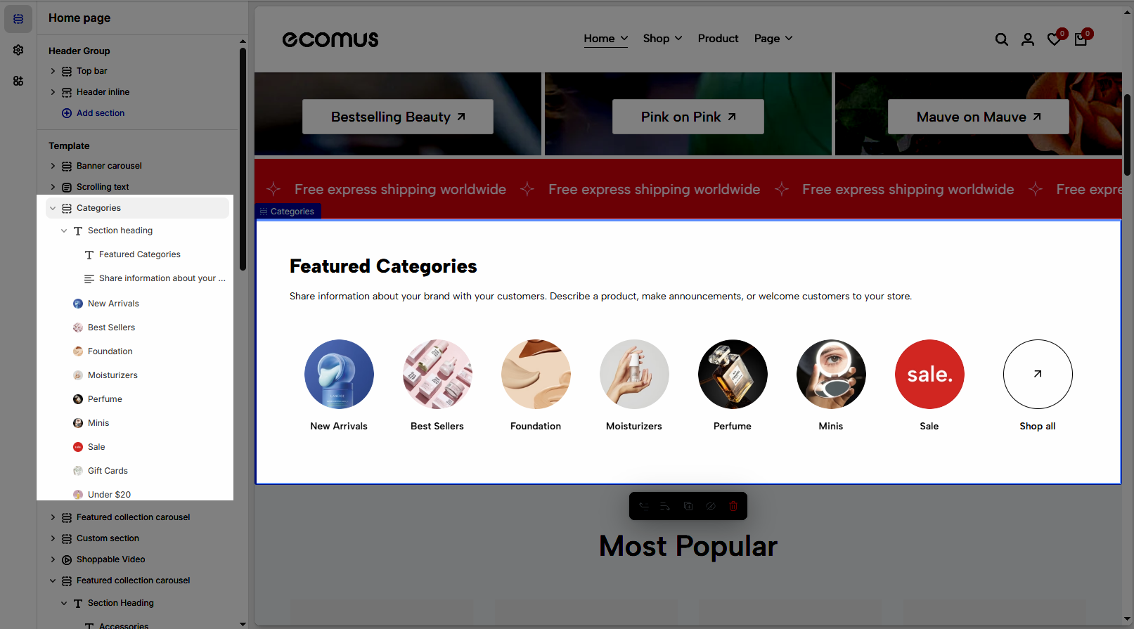
The Categories Section in your Shopify theme allows customers to easily navigate and discover product categories in your store, enhancing the shopping experience by organizing products into specific groups.
1. How to access the Categories section?
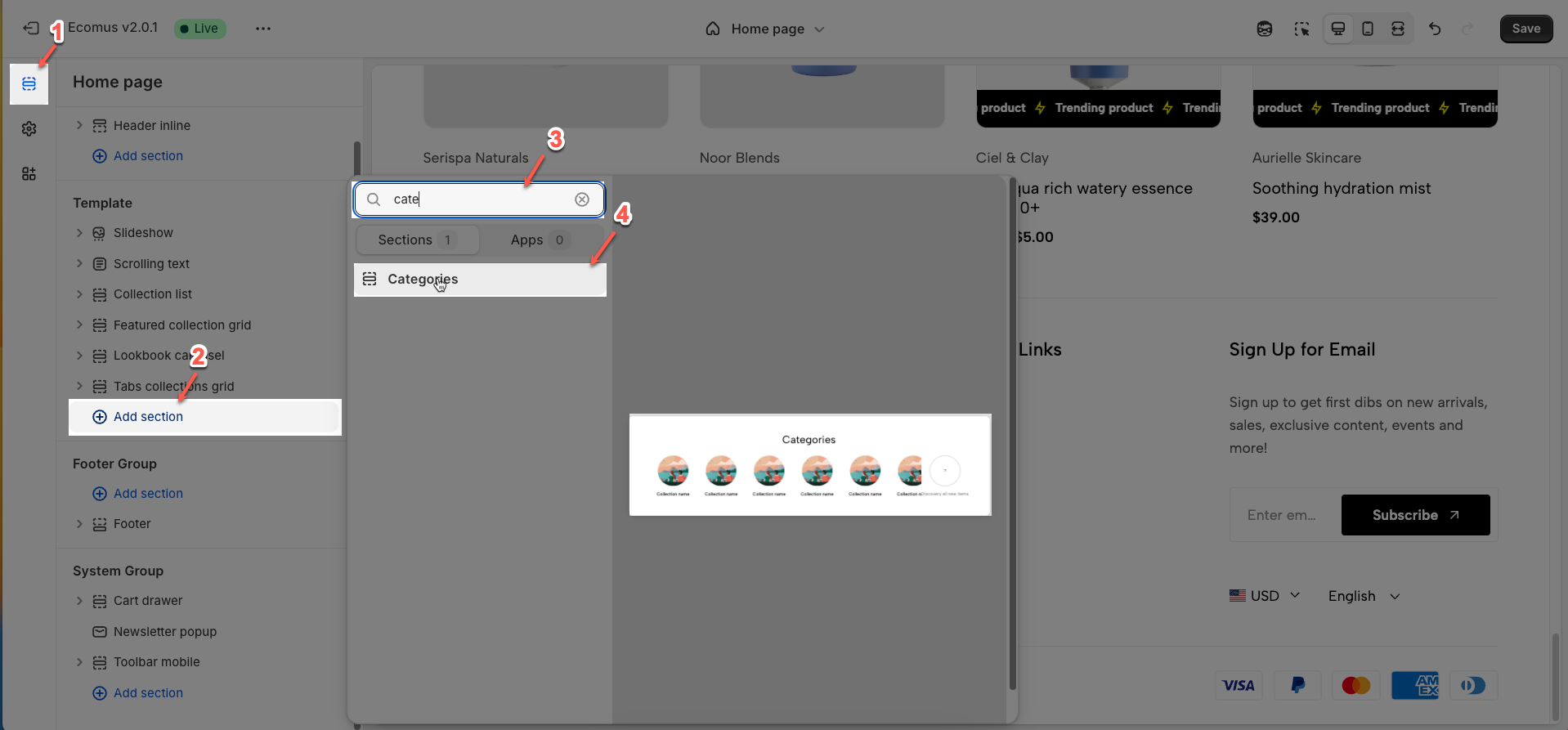
Step 01: From Shopify Admin, click on Online Store > Select Themes > In the Current theme section, click the Customize button.

Step 02: In the theme editor (Customize), click the Sections button > Click the Add section button > In the Sections tab, scroll through the list or use the search bar to find and select the Categories.
2. How to customize the Categories section?
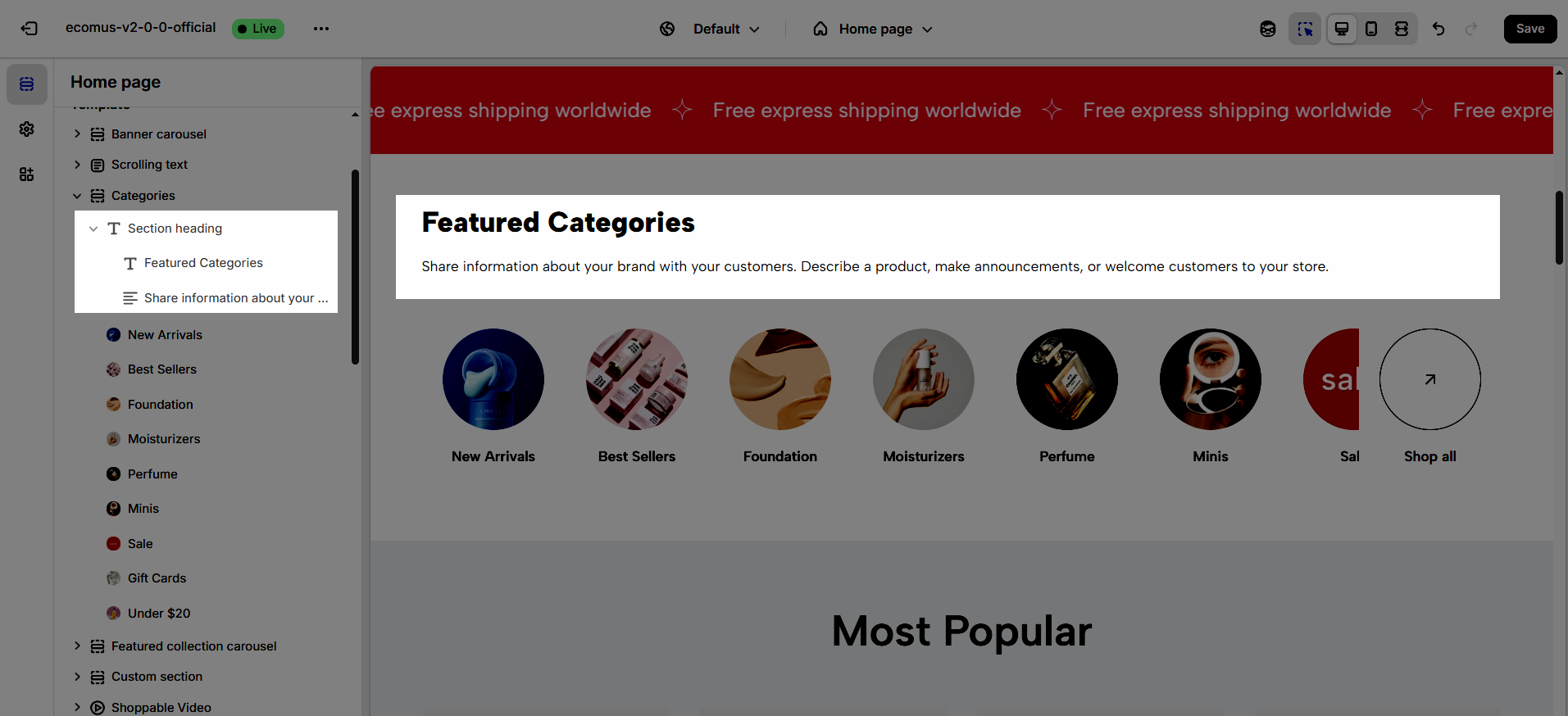
2.1. Category item block
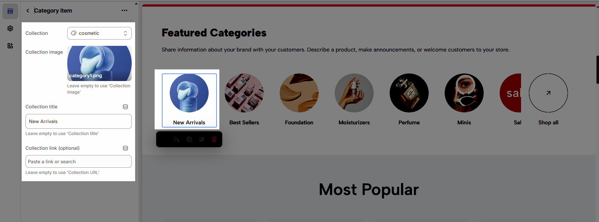
To add a Category item block to the Tab collections grid, click the Add Category item button (plus icon ➕) under the Categories.
After adding the Category item block, you can adjust its settings using the sidebar—located on the right or left side of your screen depending on your device
Select collection is required
Collection: Choose the product collection you want to display
Collection image: Upload a custom image for this tab (if left empty, the collection's featured image will be used).
Collection title: Enter a custom title for this tab (if left empty, the collection's name will be used).
Collection link (optional): Enter a custom URL for this tab's title (if left empty, the link to the collection page will be used).
How to add Label for collection?
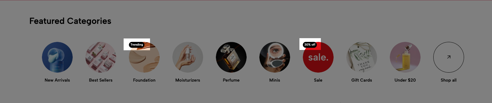
Step 1: Go to Metafields and metaobjects > Collections > Add Denifition
Name: Label
Namespace and key: theme.label
Type: Single line text
Step 2: Go to Products > Collections > choose collection > add Label
Follow this video
2.2. Section heading
Choose a heading that aligns with your brand’s tone and message to build trust and engagement.
2.2.1. Section heading
Clicking on the Section heading title under Shoppable video section, you can customize that section's settings in the right sidebar
Text alignment: Choose how your testimonials are aligned for the best visual impact. Center alignment creates a balanced look, while left or right alignment can match your overall design style.
Spacing between items: Adjust the spacing between items to create the perfect flow
Margin bottom: Set the bottom margin to control the spacing between the heading and the section
2.2.2. Heading block
To add Heading block to the Section heading, click the Add item button (plus icon ➕) under the Section heading.
Once the Heading block is added, you can customize its settings in the right-hand sidebar:
Heading: Define the main title that represents your content or section. Make it engaging and relevant.
Hidden <br> on mobile: Remove unnecessary line breaks on mobile devices
Hidden on mobile: Choose whether to hide the heading completely on mobile devices for a streamlined display.
Choose "Custom size inline" to freely adjust the size in the Custom Size Options section.
Size: Adjust the overall heading size to fit the design aesthetics of your store.
Text Color: Customize the heading color to align with your brand identity and improve readability.
Font size (Desktop/Tablet/Mobile): Set different font sizes for each device type to ensure a responsive and visually appealing layout.
Font weight: Control the thickness of the heading text
Letter spacing (in pixel): Adjust the space between letters to enhance readability and design precision.
2.2.3. Text block
To add Text block to the Section heading, click the Add item button (plus icon ➕) under the Section heading.
Once the Text block is added, you can customize its settings in the right-hand sidebar:
Text (Shift + Enter to line break): Allows users to add textual content, providing information, descriptions, or explanations.
Hidden <br> on mobile: Remove unnecessary line breaks on mobile devices
Hidden on mobile: Choose whether to hide the heading completely on mobile devices for a streamlined display.
Choose "Custom size inline" to freely adjust the size in the Custom Size Options section.
Size: Adjust the overall heading size to fit the design aesthetics of your store.
Text Color: Customize the heading color to align with your brand identity and improve readability.
Font size (Desktop/Tablet/Mobile): Set different font sizes for each device type to ensure a responsive and visually appealing layout.
Font weight: Controls the thickness of the heading text
Letter spacing (in pixel): Adjust the space between letters to enhance readability and design precision.
2.3. Categories section
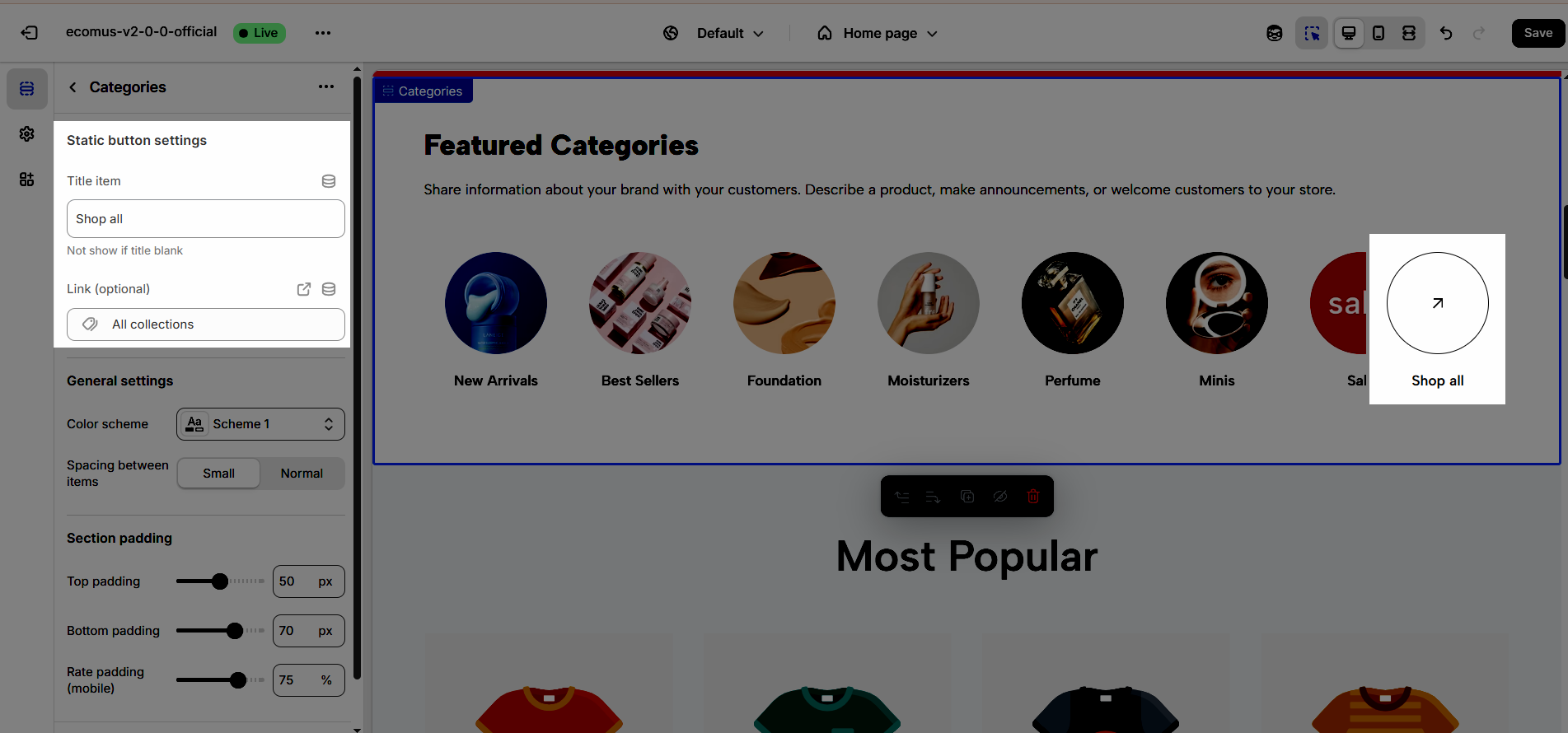
2.3.1. Static button settings
Title item (Not show if title blank): Enter the title for this static button (if left blank, the button will not be displayed).
Link (optional): Paste the web address you want users to visit when they click the static button.
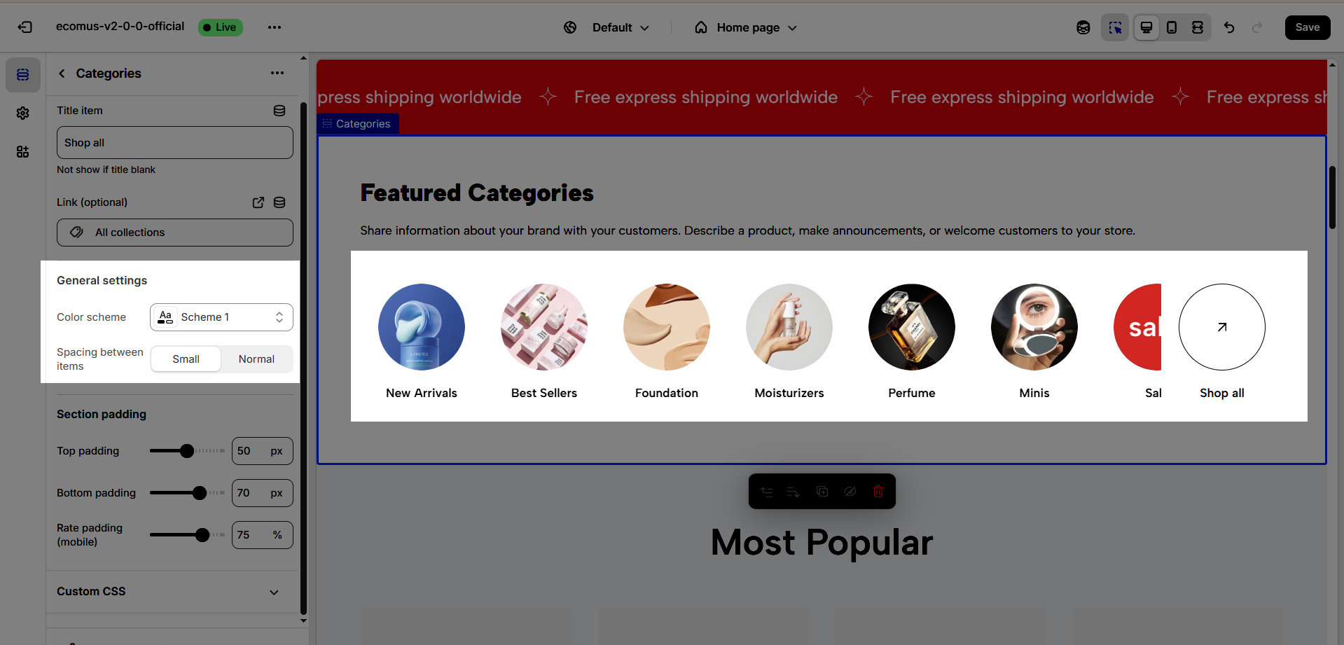
2.3.2. General settings
Color Scheme: The set of colors used throughout the design or section, determining the overall look and feel
Spacing between items: Adequate spacing between items ensures a clean, organized layout, improving readability and user experience.
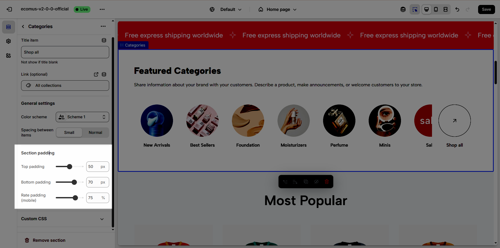
2.3.3. Section padding
This section controls the spacing around the entire slider section, both above and below the content.
Top padding: This option allows you to set the amount of space (padding) at the top of the slider section. You can drag the slider or directly enter a numerical value to adjust this spacing
Bottom padding: This option allows you to set the amount of space (padding) at the bottom of the slider section. You can drag the slider or directly enter a numerical value to adjust this spacing
Rate padding (mobile): This option allows you to set the aspect ratio-based padding for mobile view (in percentage). For example, 75% means the height will be 75% of the width.
2.3.4. Custom CSS
Allows users to customize by adding CSS rules, beyond the limitations of default settings. This allows for fine-tuning the design to every detail, to suit specific needs.
Add custom styles to this section only.
To add custom styles to your entire online store, go to theme settings.


