


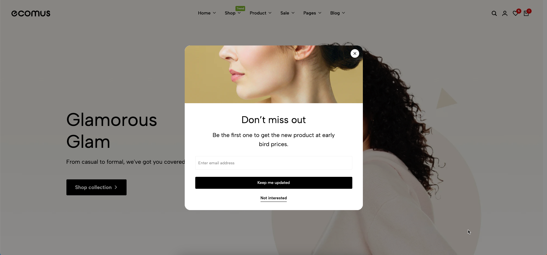
Newsletter Popup is a powerful tool for collecting leads, helping you build your marketing list and stay connected with your customers.
1. How to access the Newsletter popup?
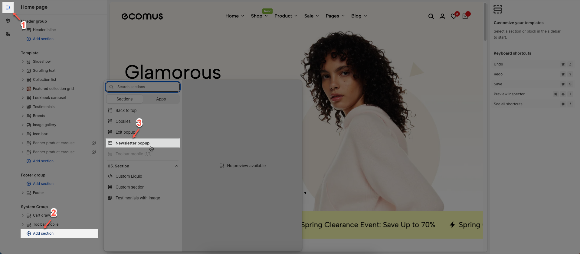
Step 01: From Shopify Admin, click on Online Store > Select Themes > In the Current theme section, click the Customize button.

Step 02: In the theme editor (Customize) > Click the Section button > In the Sections tab, scroll through the list or use the search bar to find and select the System Group > click Add section button > add Newsletter popup
2. How to customize the Newsletter popup?
2.1. Newsletter popup blocks content
There are 4 blocks: Text, Sub Text, Newsletter, and Button.
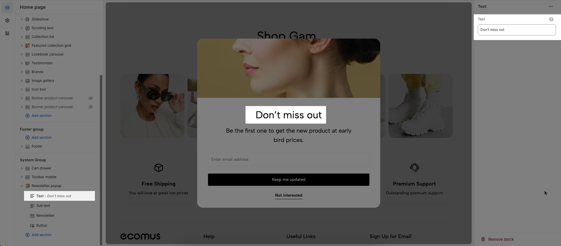
2.1.1. Text block
To add a Text block to the Newsletter popup, click the Add block button (plus icon ➕) under the Newsletter popup.
After adding the Text block, you can adjust its settings using the sidebar—located on the right or left side of your screen, depending on your device
Text: Enter text you want to display
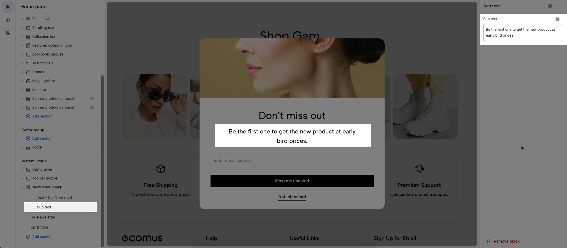
2.1.2. Sub Text block
To add a Sub Text block to the Newsletter popup, click the Add block button (plus icon ➕) under the Newsletter popup.
After adding the Sub Text block, you can adjust its settings using the sidebar—located on the right or left side of your screen, depending on your device
Sub Text: Enter sub text you want to display
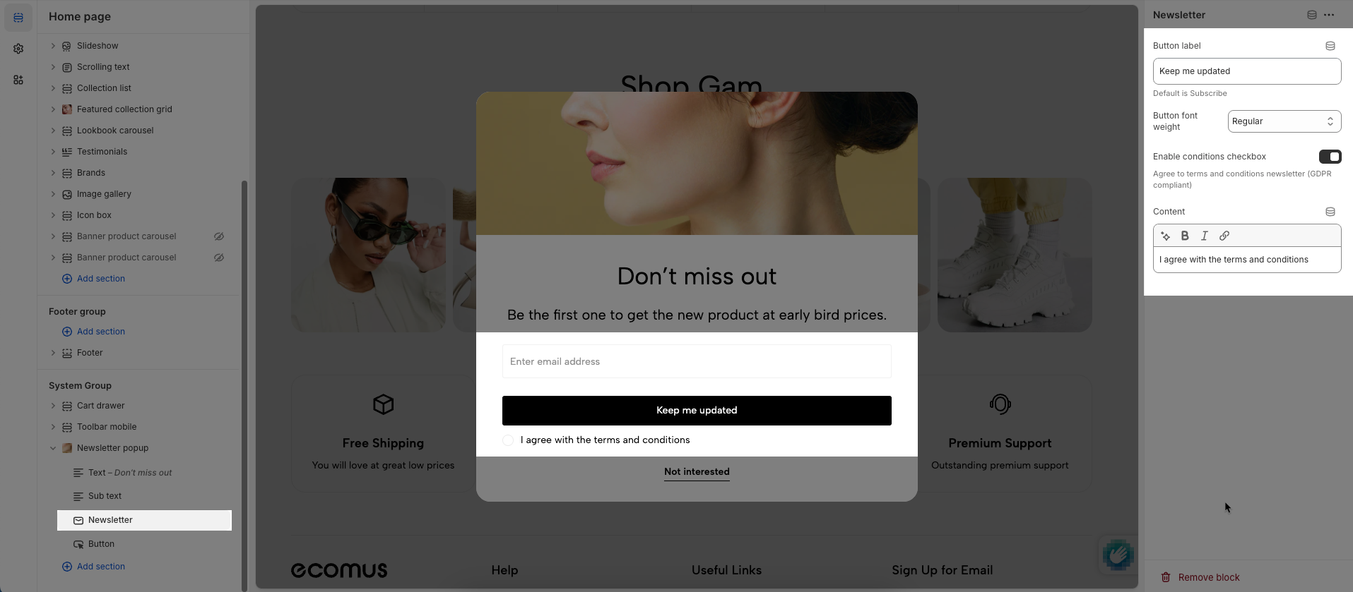
2.1.3. Newsletter block
To add a Newsletter block to the Newsletter popup, click the Add block button (plus icon ➕) under the Newsletter popup.
After adding the Newsletter block, you can adjust its settings using the sidebar—located on the right or left side of your screen, depending on your device
Button label: Enter the text to be displayed on the button.
Default is Subscribe
Button font weight: Set the boldness or weight of the font on the button (e.g., normal, bold, extra bold).
Enable conditions checkbox: Check to display a checkbox requiring users to agree to certain terms, conditions, or policies before proceeding.
Agree to terms and conditions newsletter (GDPR compliant)
Content: Enter the main content to be displayed within this section.
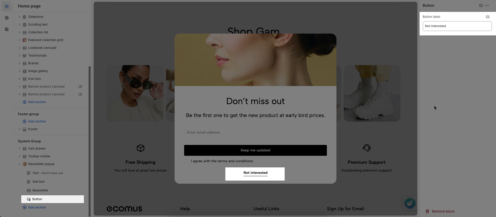
2.1.4. Button block
To add a Button block to the Newsletter popup, click the Add block button (plus icon ➕) under the Newsletter popup.
After adding the Button block, you can adjust its settings using the sidebar—located on the right or left side of your screen, depending on your device
Button label: Enter the text to be displayed on the button.
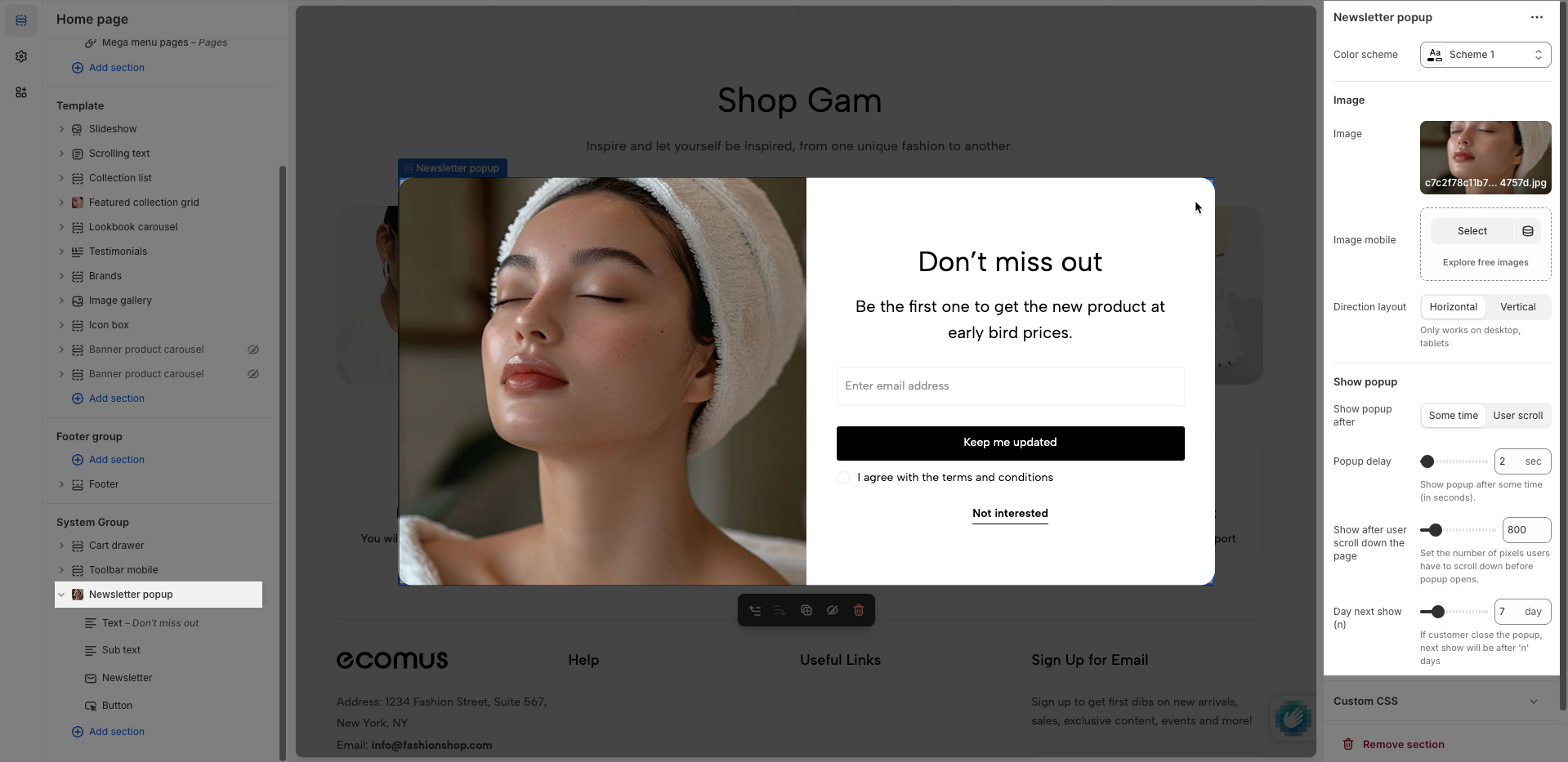
2.2. Newsletter popup options
Color scheme: Select the color scheme to be applied to this section or component. A color scheme includes predefined colors for backgrounds, text, and buttons.
Image
Image: Upload or select the image to display.
Image mobile: Upload or select a different image to display specifically on mobile devices.
Direction layout: Set the layout direction for elements within: horizontal (items side-by-side) or vertical (items stacked).
Show popup
Show popup after: Display the popup after one of the following conditions is met:
After amount time: The popup will show after the user has spent a specified duration on the page.
User scroll: The popup will appear when the user scrolls the page to a certain position.
Popup delay: Set the duration (in milliseconds or seconds) before the popup appears after its primary trigger condition has been met.
Show after user scroll down the page: Set the number of pixels users have to scroll down before popup opens.
Day next show (n): If customer close the popup, next show will be after 'n' days
Custom CSS
Allows users to customize by adding CSS rules, beyond the limitations of default settings. This allows for fine-tuning the design to every detail, to suit specific needs.
Add custom styles to this section only.
To add custom styles to your entire online store, go to theme settings.


