


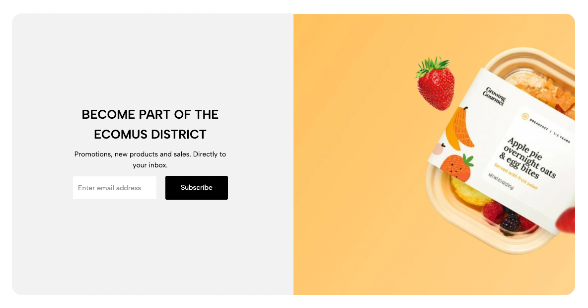
The Newsletter with Image section allows you to combine a visually engaging image with a subscription form, making it easier to capture visitor emails while enhancing your website’s design. In this guide, you’ll learn how to customize and optimize the Newsletter with Image section for the best user experience.
From Theme section sidebar -> Add section -> Newsletter with image Section
1. Newsletter block
The Newsletter Block allows users to subscribe to updates, promotions, and news by entering their email. It typically includes email input field and a subscribe button.
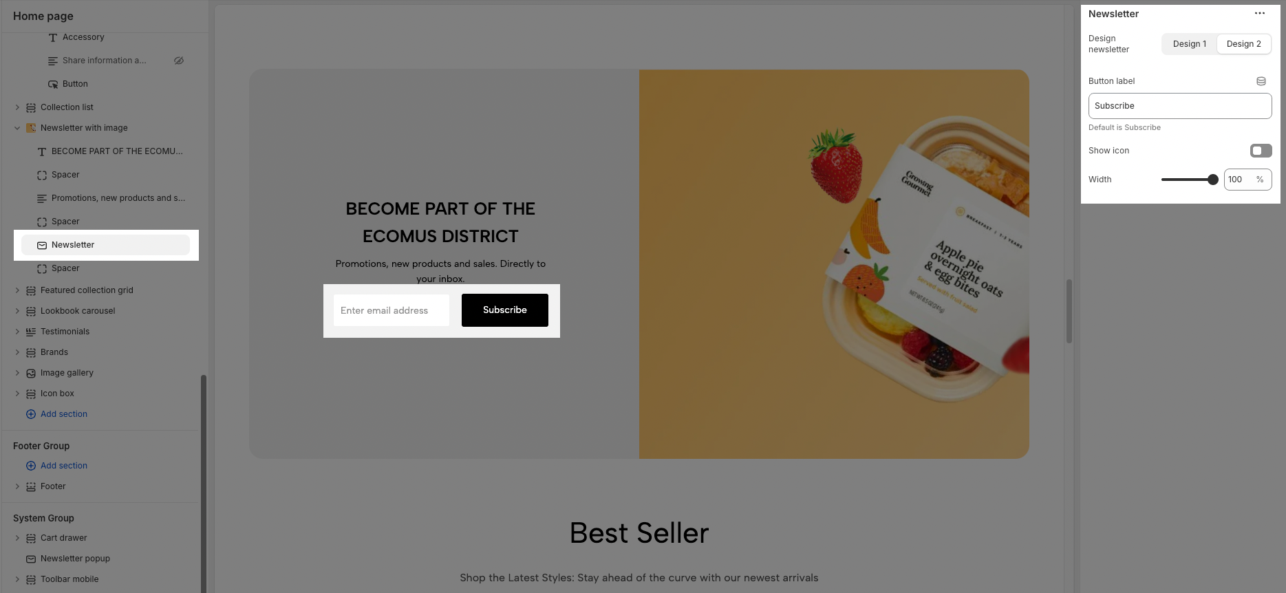
Design newsletter: You can choose between Design 1 or Design 2.
Button label: Change the button text (default is "Subscribe").
Show icon: Enable/disable the icon on the button.
Width: Adjust the form button width
2. Other block
You can add blocks such as Heading, Text, and Spacer to design a Newsletter with Image section. These blocks will help structure the content effectively, making the section visually appealing and easy to read.
To customize these blocks, follow the detailed guide here.
3. How to configure Newsletter with image section?
The Newsletter with Image section combines a subscription form with a featured image, making it visually appealing and engaging for users. Below are the key settings to help you customize this section for the best layout and user experience.
3.1. General option
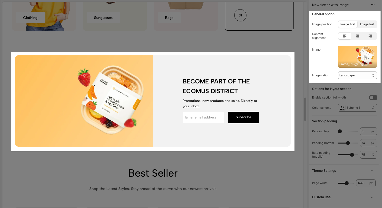
Image position: Choose whether the image appears before or after the newsletter form (Image first or image last)
Content alignment: Adjust the text alignment (left, center, or right).
Image: Upload or select an image to display alongside the newsletter form.
Image ratio: Set the aspect ratio of the image
3.2. Options for layout section
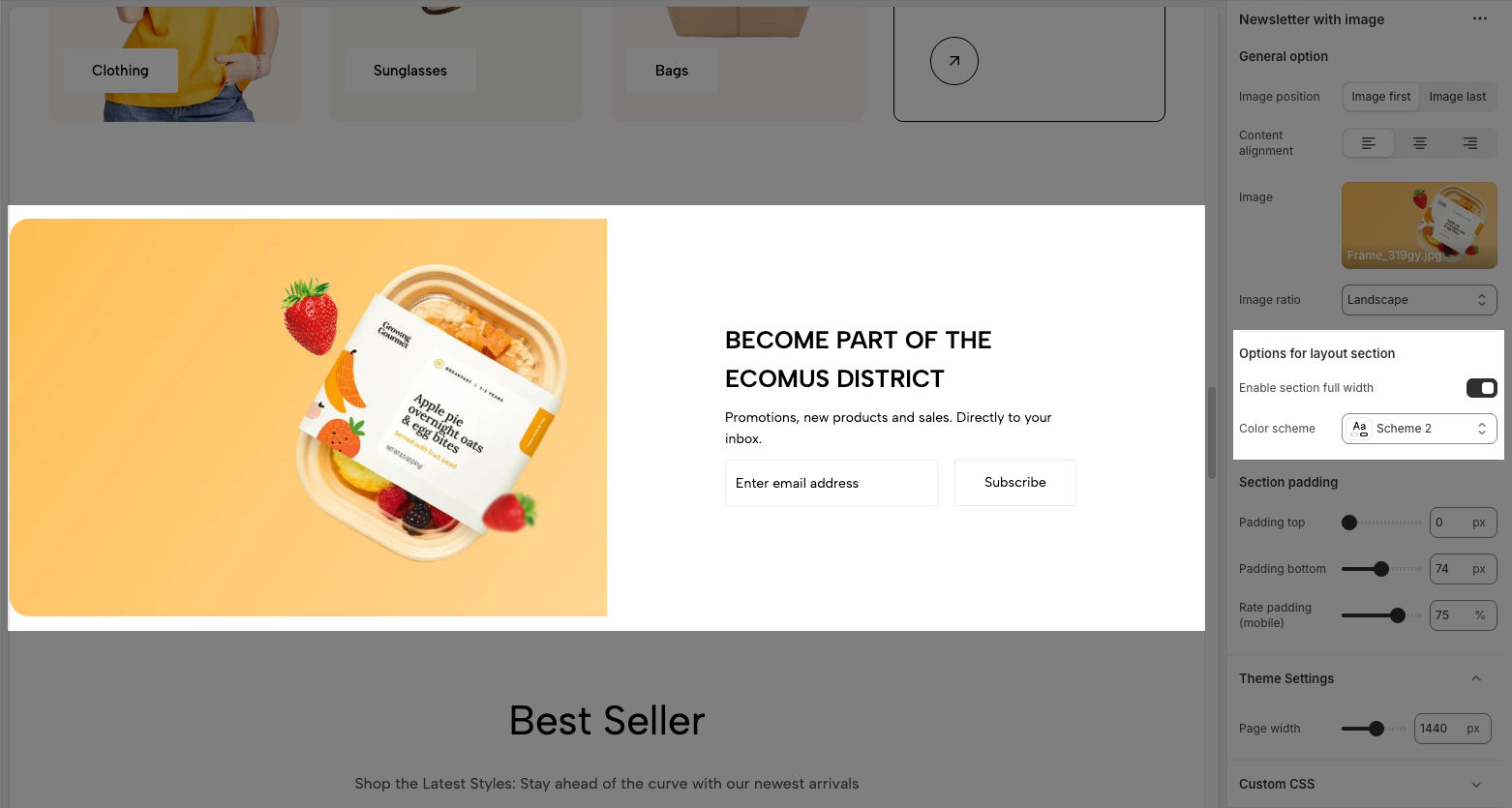
Enable section full width: Enable this option to make the section span the full width of the page.
Color scheme: Select a predefined color scheme for the section.
3.3. Section padding
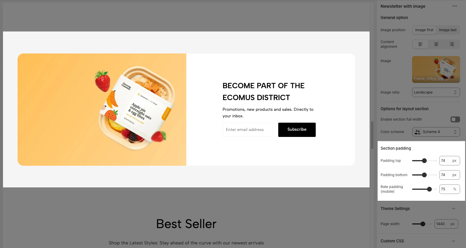
Padding top: Adjust the space above the section.
Padding bottom: Adjust the space below the section.
Rate padding (mobile): Set the padding percentage for mobile devices.


