In Shopify, a product card is a visual snapshot of a product, displaying essential details like image, title, and price. It streamlines the shopping experience by providing key information without requiring users to visit a separate product page, enhancing the overall user interface design.
To configure it, you will access Theme Settings > Product card.
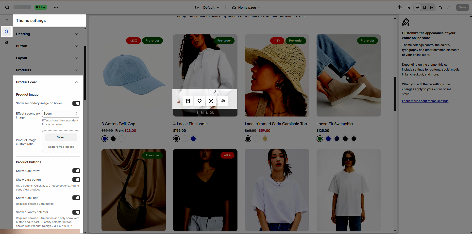
1. Product Image
There are many options to config Product image:
Show secondary image on hover: Disable this option if you want to show 1 image for product.
Effect secondary image: There are 6 effects None, Opacity, Zoom, Move top to bottom, Flip, Rotate
Product image custom ratio: An image's aspect ratio is the ratio of its width to its height. You will change ratio in the section.
2. Product buttons
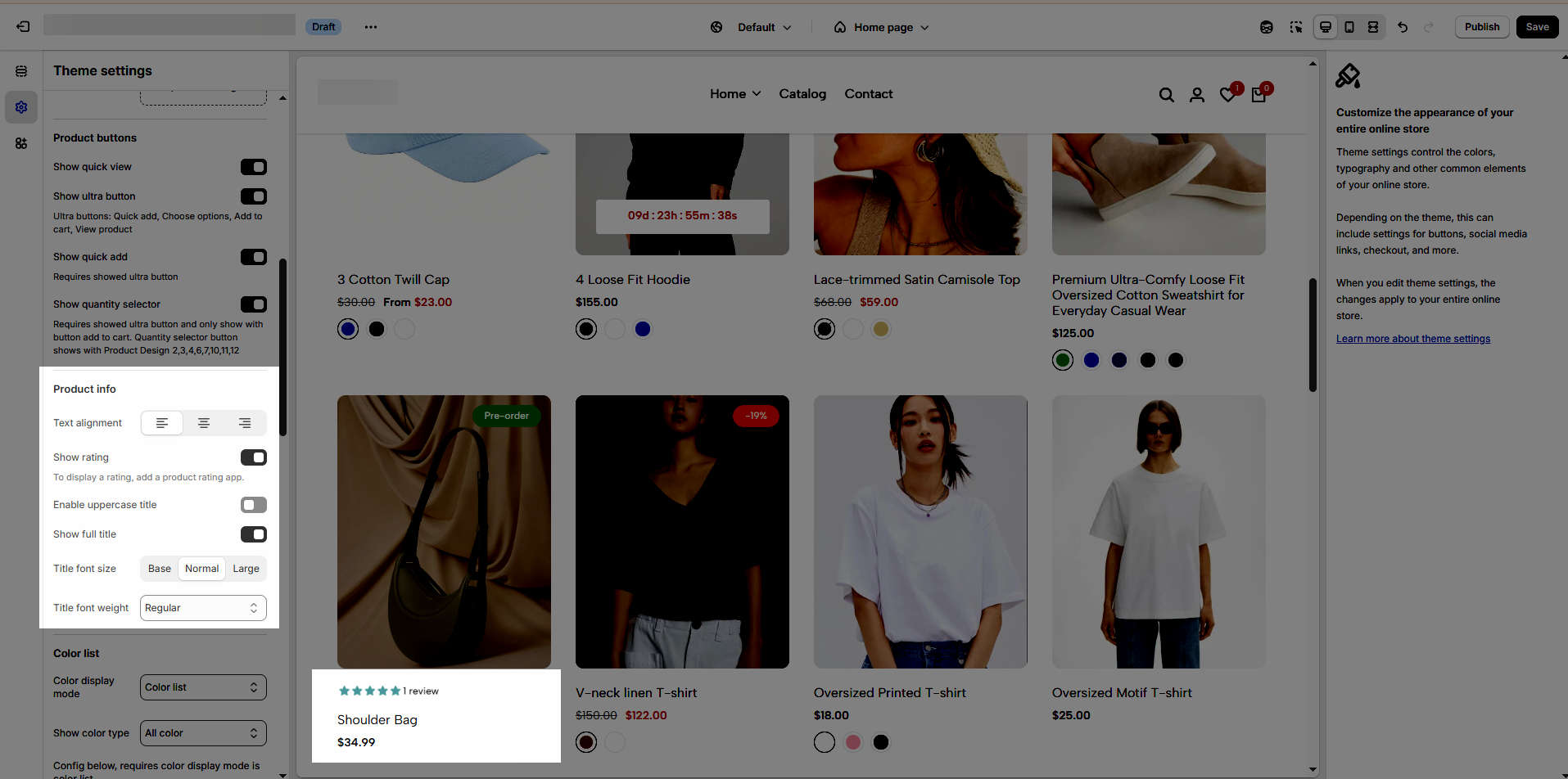
Show quick view
Show ultra button: Ultra buttons are Quick add, Choose options, Add to cart, View product.
Show quick add: Requires showed ultra button
Show quantity selector: Requires showed ultra button and only show with button add to cart. Quantity selector button shows with Product Design 2, 3, 4, 6, 7, 10, 11, 12
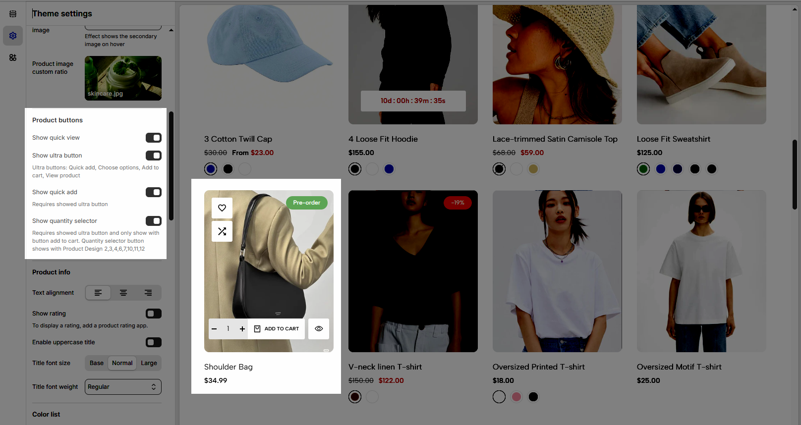
3. Product Info
Text alignment: This option allows you to change align text to Left, Center or Right.
Show rating: To display a rating, add a product rating app.
Enable uppercase title: Activate this option to display the title in all uppercase letters for a bold and attention-grabbing look.
Show full title: Display the full title if it exceeds the standard length.
Title font size: Adjust the font size of the title to ensure optimal readability and visual hierarchy across your store.
Title font weight: Customize the thickness of the title text, from light to bold, to match your store’s branding and design aesthetics.
4. Color list
Color display mode: There are 3 options Hide, Count, or Color List.
Show color type: This option allows you to show All colors or Only colors available.
Config below, requires color display mode is color list.
Color shape: There are 2 options Square or Circle
Color image source: There are 2 options Variant images or Custom images
Change product image when clicking swatch on event: Swatch color will change when you Hover or Click
Enable color limit: You can limit the swatch color to show with the options below.
Maximum color to show: 0 to responsive auto number. Requires color limit is enabled.
Action after color view more is clicked: You have two options for it Expand all colors or Go to the product page. The required color limit is enabled.
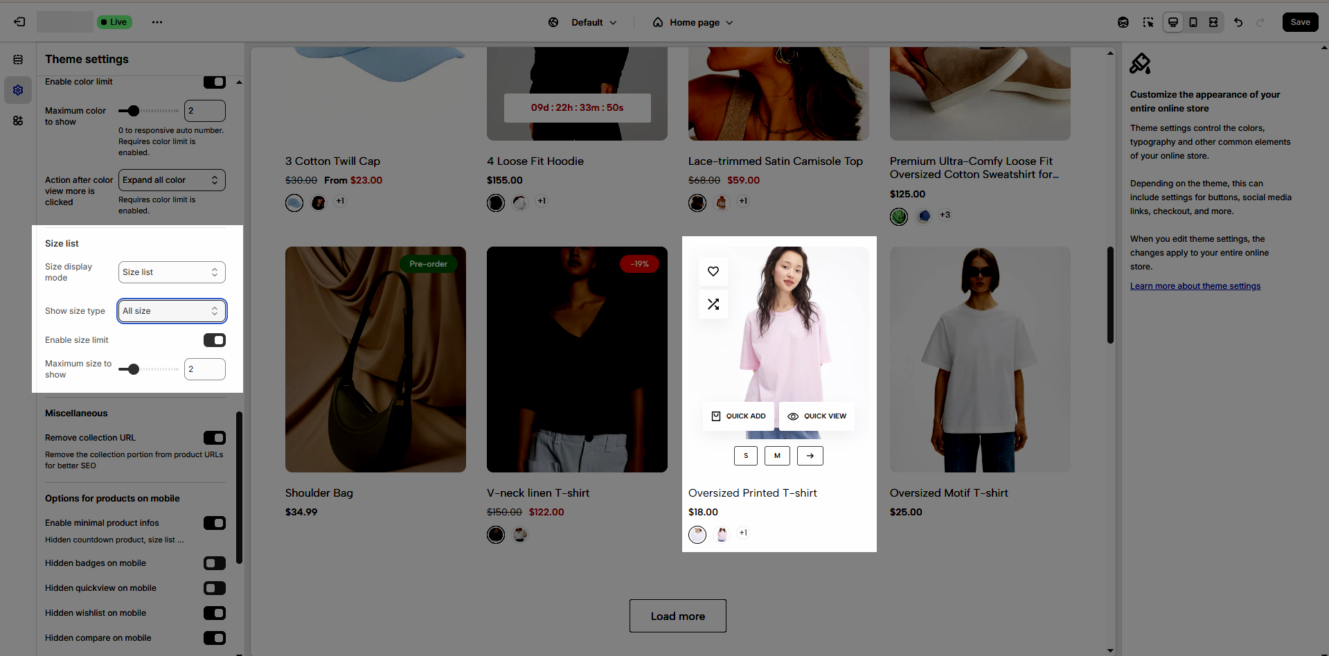
5. Size list
Size display mode: Hide, Count, or Size list
Show size type: All size or Only size available
Enable size limit: You can limit the swatch size to show with the options below.
Maximum color to show: 0 to responsive auto number. Requires color limit is enabled.
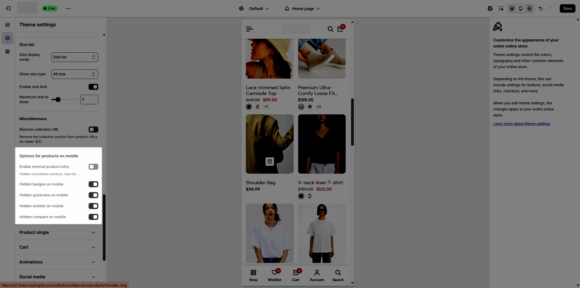
6. Miscellaneous
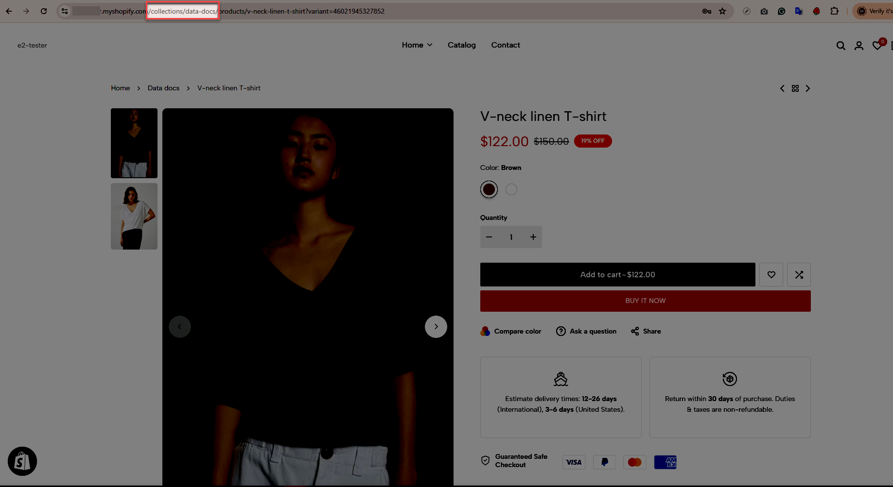
Remove collection URL: Remove the collection portion from product URLs for better SEO.
7. Options for products on mobile
Enable minimal product info: Hidden countdown product, color, size list ...
Group product buttons.Only work on mobile
Hidden add to cart on mobile
Hidden quickview on mobile
Hidden wishlist on mobile
Hidden compare on mobile