


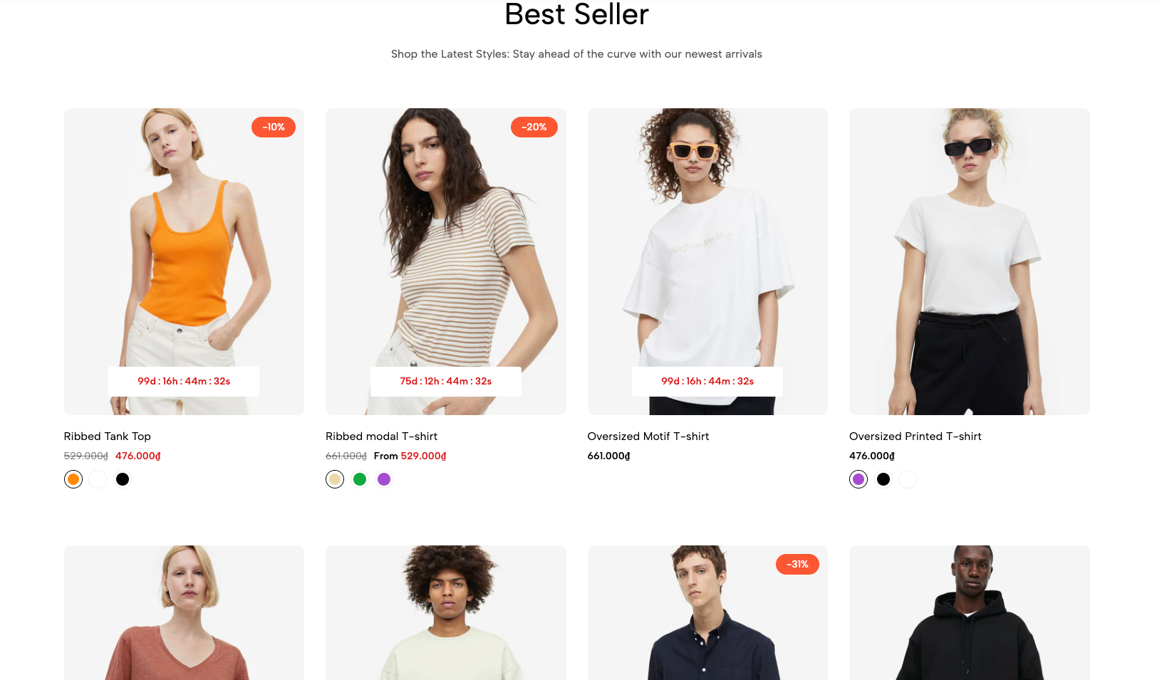
The 'Featured Collection Grid' section is an essential tool for clearly and effectively presenting your highlighted products or collections. By arranging items in a well-organized grid, it allows customers to easily view multiple products at a glance, facilitating direct comparison and encouraging deeper exploration of your offerings.
1. How to access the Featured collection grid section?
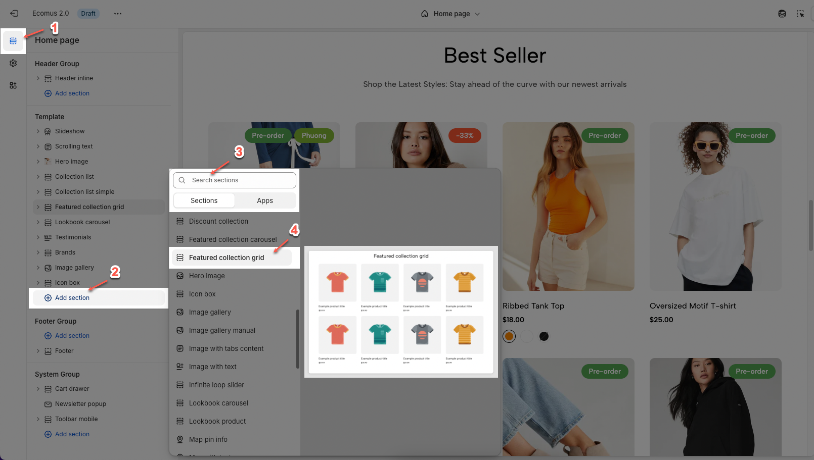
Step 01: From Shopify Admin, click on Online Store > Select Themes > In the Current theme section, click the Customize button.

Step 02: In the theme editor (Customize), click the Sections button > Click the Add section button > In the Sections tab, scroll through the list or use the search bar to find and select the Featured collection grid.
2. How to customize the Featured collection grid section?
2.1. Featured collection grid section
After adding the Featured collection grid section, you can adjust its settings using the sidebar—located on the right or left side of your screen depending on your device.
2.1.1. General options
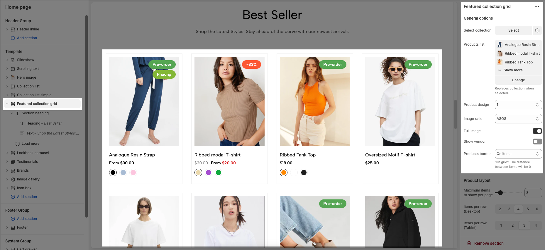
Select collection: Allows users to choose a product collection to display in the grid, customizing the displayed content.
Products list: Displays a list of products from the selected category, allowing users to view the products.
Product design: Customize the product display style (we have 12 designs available)
Image ratio: Adjusts the aspect ratio of product images, ensuring images display beautifully and proportionally (Adapt to image, Square, ASOS, Portrait, Lanscape, Custom)
Full image: Allows the full product image to be displayed, avoiding cropping and preserving product details
Show vendor: Displays the product vendor's name, providing additional information to customers.
Products border: Adds a border around the products, creating distinction and highlighting the products (None, In image, On items)
2.1.2. Product layout
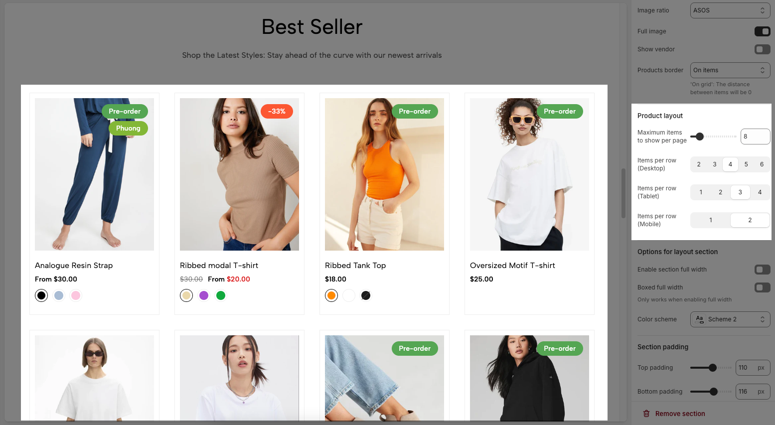
Maximum items to show per page: Limits the number of products or items displayed on each page, optimizing loading speed and user experience.
Items per row (Desktop): Defines the number of products or items displayed in each row on desktop screens, optimizing the layout for large screens.
Items per row (Tablet): Adjusts the number of products or items displayed in each row on tablet screens, ensuring balanced and easy viewing.
Items per row (Mobile): Optimizes the number of products or items displayed in each row on mobile phone screens, ensuring neat and interactive display.
2.1.3. Options for layout section
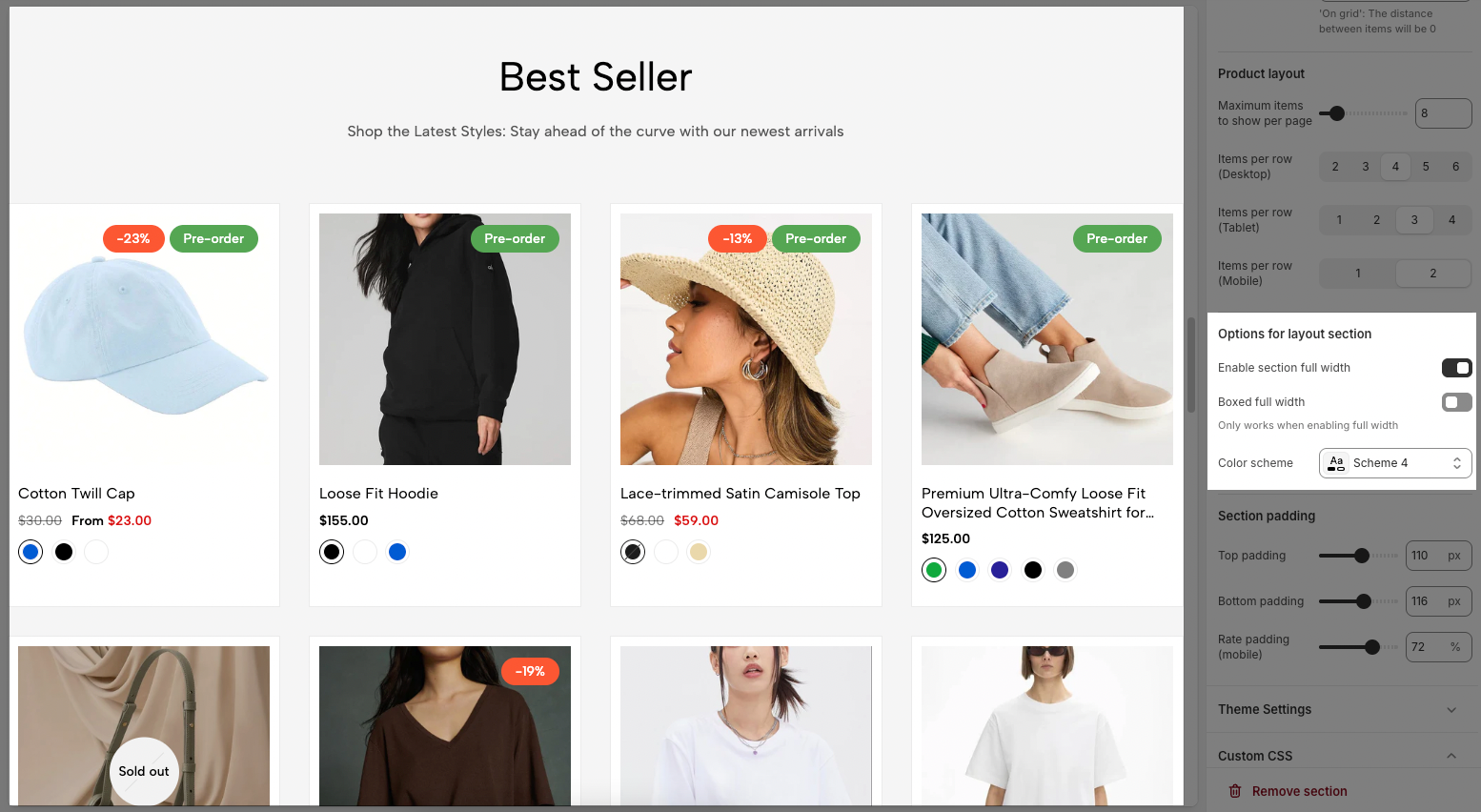
Enable section full width: A toggle switch to enable or disable the section from taking up the full width of the screen.
Bound full width: A toggle switch to enable or disable bounding the full width.
Only works when enabling full width
Color scheme: A dropdown menu to select the color scheme.
2.1.4. Section padding
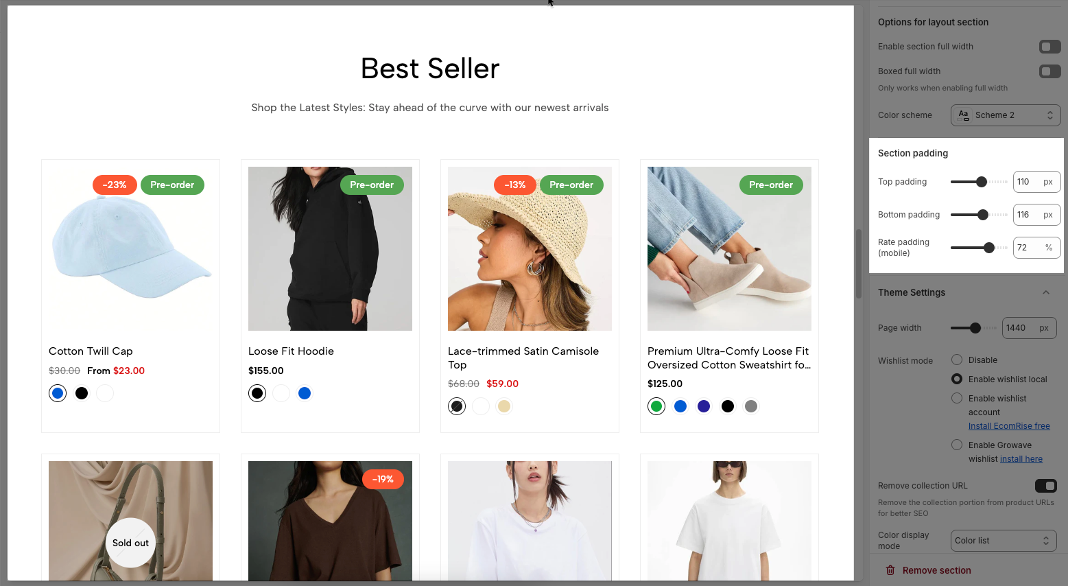
Top padding: Creates space above the content within an element, separating it from elements above and improving visual layout.
Bottom padding: Creates space below the content within an element, separating it from elements below and improving visual layout.
Rate padding (mobile): Adjust spacing around mobile top elements, optimizing user experience and ensuring easy interaction on smaller screens.
2.1.5. Theme Settings
Page width: Defines the maximum width of the page content, influencing layout and display on various devices.
Wishlist mode: Enables or disables the wishlist feature, providing users with a function to save favorite products.
You can Disable, Enable wishlist local, Enable wishlist account Install EcomRise free, Enable Growave wishlist
Remove collection URL: Eliminates the collection URL from the product page path, optimizing SEO and creating shorter URLs.
Remove the collection portion from product URLs for better SEO
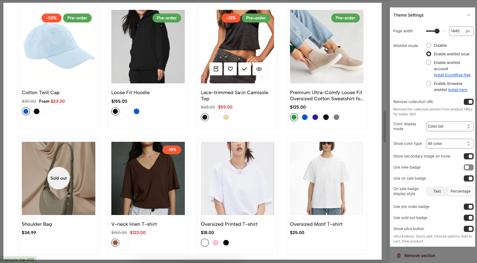
Color display mode: Selects the product color display method, such as color list or count
Show color type: Displays All colors or Only color available. This option allows customers to see the complete color range of a product or focus solely on colors currently in stock.
Show secondary image on hover: Displays a secondary product image when hovering over it, giving customers a multi-dimensional view of the product.
Use new badge: Enables or disables the display of a "new" badge on new products, attracting customer attention.
Use on sale badge: Enables or disables the display of an "on sale" badge on discounted products, stimulating purchases.
On sale badge display style: Selects the display style "Text" or "Percentage" for the "on sale" badge
Use pre-order badge: Enables or disables the display of a "pre-order" badge on upcoming products, informing customers of pre-order availability.
Use sold out badge: Enables or disables the display of a "sold out" badge on out-of-stock products, notifying customers of product availability.
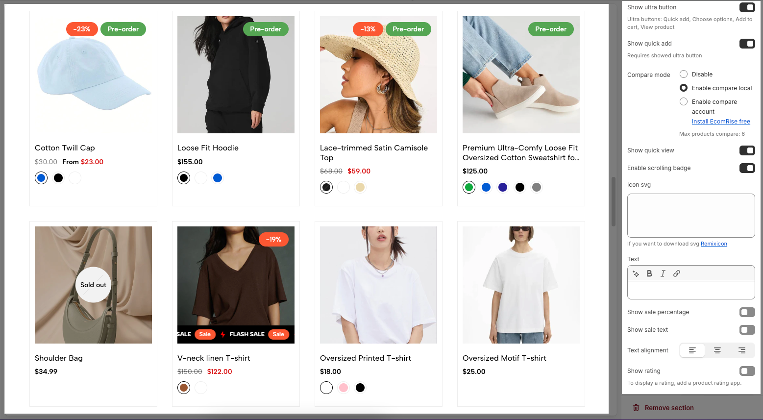
Show ultra button: Enables or disables the "ultra" button (custom button), allowing the addition of special action buttons to products.
Ultra buttons: Quick add, Choose options, Add to cart, View product
Show quick add: Enables or disables the "Quick Add" button on each product card.
When enabled, it allows customers to quickly add a product to their cart (or choose options like size/color) without having to open the product detail page.Requires showed ultra button
Compare mode: Enables or disables the product comparison mode, allowing customers to compare products side-by-side for informed purchasing decisions.
You can Disable, Enable compare local, Enable compare account
Max products compare: 6
Show quick view: Enables or disables the "quick view" button, allowing customers to view product details without leaving the current page.
Enable scrolling badge: Enables or disables scrolling badges, allowing badges to move with the page
Icon SVG (If you want to download svg Remixicon): Use icon from Remixicon to enhance visual appeal and personalize the interface.
Text: Enter custom text to display alongside icons or other information, creating clear and engaging messages.
Show sale percentage: Enables or disables the display of the sale percentage on products, helping customers easily identify discounts.
Show sale text: Enables or disables the display of sale text (e.g., "Sale"), providing clear information about promotional offers.
Follow this document to know more about the Srcolling badge
Text alignment: Adjusts the text alignment of products (left, right, center), customizing the display layout.
Show rating: Enables or disables the display of product ratings, providing customer feedback information.
To display a rating, add a product rating app.
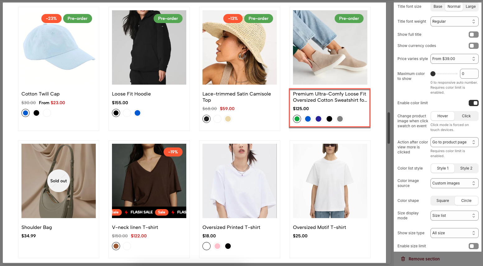
Title font size: Adjusts the font size of the product title, ensuring readability and compatibility with the website design
Title font weight: Selects the font weight of the product title, creating emphasis and attracting attention.
Show full title: Enables or disables the display of the full product title, preventing title truncation and ensuring complete information.
Show currency codes: Enables or disables the display of currency codes next to product prices, providing clear currency information.
Price varies style: Choose a display style for variable product prices (e.g. "From [price]"), which helps customers understand the price range.
Maximum color to show: Limits the number of product colors displayed
0 to responsive auto number. Requires color limit is enabled.
Enable color limit: Enables or disables the limit on the number of product colors displayed, allowing control over the color count shown on the product page.
Change product image when click swatch on event: Allows the product image to change when a user clicks on a color swatch, creating a more interactive and visual experience.
Click mode is forced on touch devices.
Action after color view more is clicked: Defines the action that occurs when a user clicks the "view more colors" button, such as showing all colors or redirecting to a more detailed page (Expand all colors, Go to product page)
Requires color limit is enabled.
Color list style: Selects the display style for the product color list
Color image source: Selects the image source for product colors, allowing the use of actual product images or standard color images for display (Custom images or variant images)
Color shape: Selects the display shape for product colors (e.g., square, circle), customizing the color display interface.
Size display mode: Selects the display method for product sizes (e.g., list, count), suitable for the website layout and user experience.
Show size type: Displays All sizes or Only size available. This option allows customers to see the complete size range of a product or focus solely on sizes currently in stock.
Enable size limit: Enables or disables the limit on the number of product sizes displayed
Maximum size to show: Limits the number of product sizes displayed, with "0" for responsive auto-adjustment based on screen resolution. (Requires size limit to be enabled.)
2.1.6. Custom CSS
Allows users to customize by adding CSS rules, beyond the limitations of default settings. This allows for fine-tuning the design to every detail, to suit specific needs.
Add custom styles to this section only.
To add custom styles to your entire online store, go to theme settings for detailed instructions.

2.2. Section heading
The Section Heading helps introduce and visually separate different parts of your homepage. Adding it gives context to your product collections or featured content, making the layout more organized and easier for customers to browse.
2.2.1. Section heading
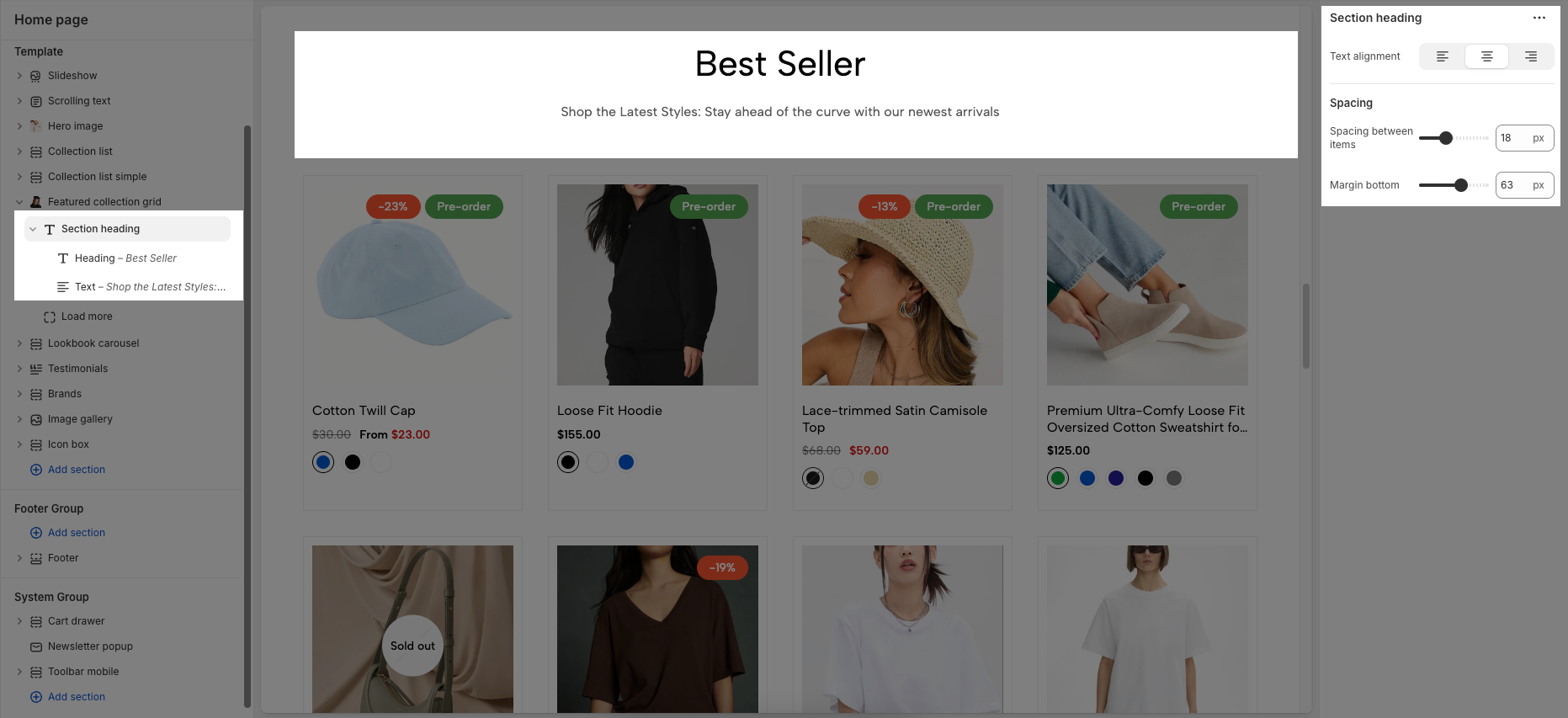
Text alignment: Choose how your section heading are aligned for the best visual impact. Center alignment creates a balanced look, while left or right alignment can match your overall design style.
Spacing between items: Adjust the spacing between items to create the perfect flow
Margin bottom: Set the bottom margin to control the spacing between the heading and the section
2.2.2. Heading/text block
Customizing the Heading allows you to control its appearance across different devices, ensuring consistency and responsiveness. Below are the available options to fine-tune your heading styles.
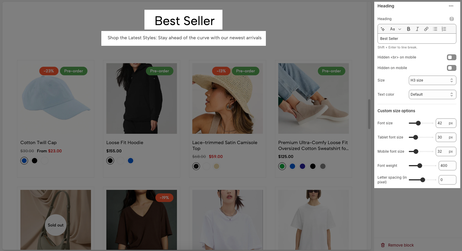
Heading: Allows you to enter and format the text (bold, italic, underline, lists, links, etc.). Shift + Enter to line break.
Hidden <br> on mobile: Disables line breaks on mobile devices.
Hidden on mobile: Hides the heading on mobile screens.
Size: Lets you select sizes for the heading.
Text color: Allows you to set the text color. Please follow this guideline to configure the Color.
Custom Size Options:
Font size: Adjusts the heading size for desktop.
Tablet font size: Adjusts the heading size for table.
Mobile font size: Adjusts the heading size for mobile.
Font weight: Controls the thickness of the text (e.g., 600 is semi-bold).
Letter spacing: Adjusts the space between characters.
2.3. Load more block
The Load More button in the Featured Collection Grid allows customers to reveal more products without leaving the current page, creating a smoother browsing experience.
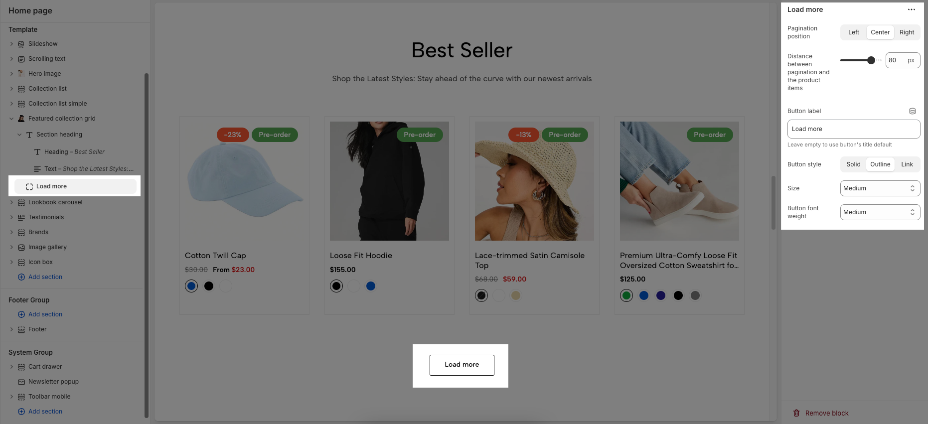
Pagination position: Align the button to the left, center, or right.
Distance between pagination and the product items: Adjusts the vertical spacing above the button.
Button label: Set custom button text
Leave empty to use button's title default
Button style: Choose between Solid, Outline, or Link appearance.
Size: Define the button size (e.g., Medium).
Button font weight: Set text weight, such as Medium for balanced emphasis.


