


The Collection List Simple section is a clean and modern layout designed to showcase product collections in a straightforward, visually appealing format. Its minimalist design ensures content remains the focus while maintaining a polished look.

1. How to access the Collection list simple section?
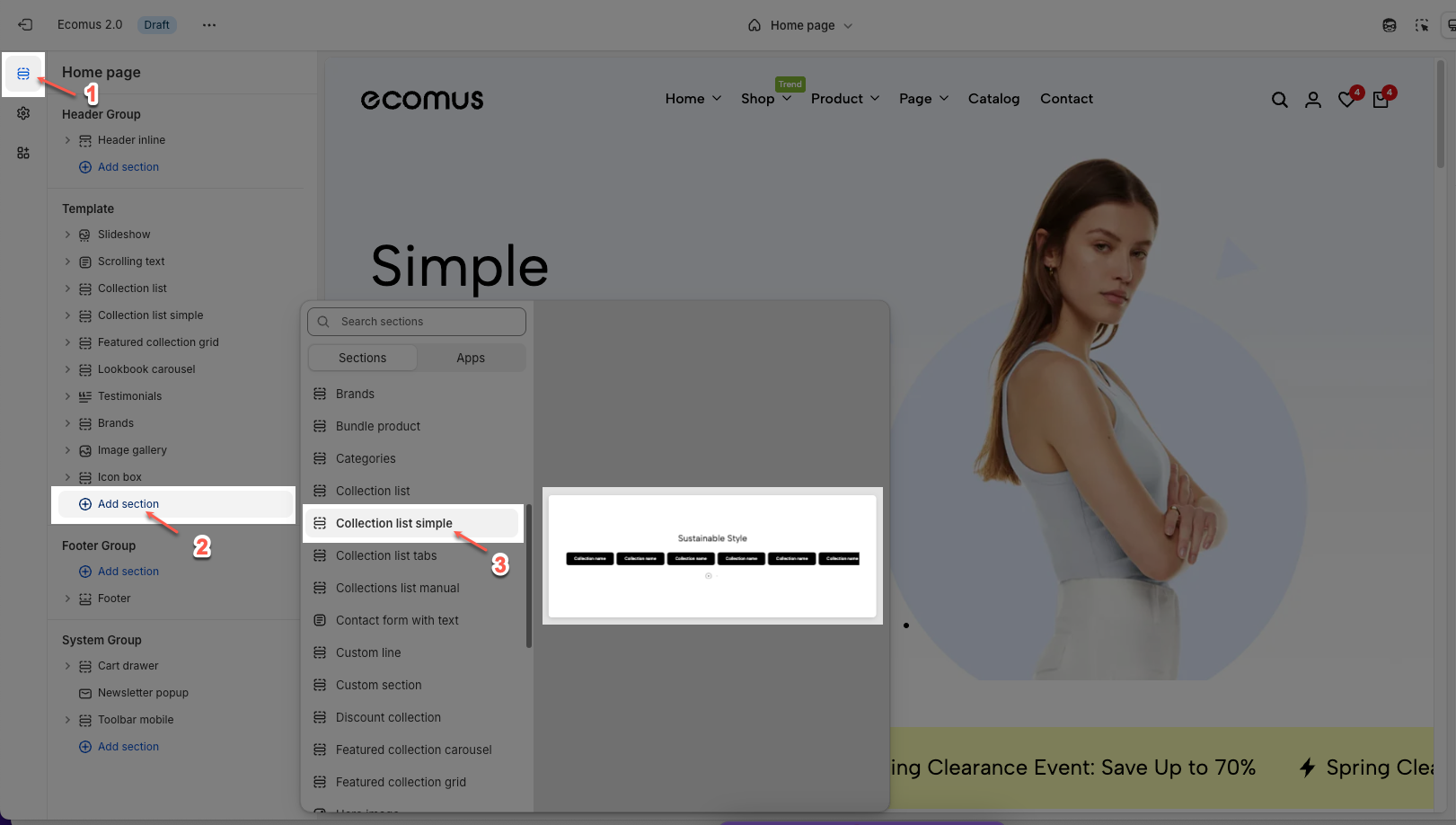
Step 01: From Shopify Admin, click on Online Store > Select Themes > In the Current theme section, click the Customize button.

Step 02: In the theme editor (Customize), click the Sections button > Click the Add section button > In the Sections tab, scroll through the list or use the search bar to find and select the Collection list simple.
2. How to configure the Collection list simple section?
The Collection List Simple section enables you to display multiple collections in a sleek, horizontal layout with minimal styling. Below are the available configuration options to help you customize this section to match your store’s design.
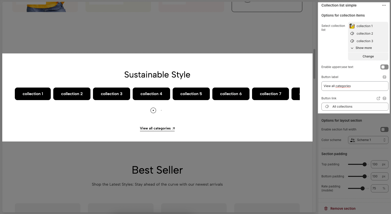
2.1. Options for collection items
Select collection list: Choose the collections you want to display in this section. You can select from your store's existing collections.
Enable uppercase text: Toggle this option to convert all collection titles to uppercase.
Button label: Enter the text for the button that appears below the collection list (e.g., "View all categories").
Button link: Paste a URL or search for an internal link that the button should lead to when clicked.
Note: The button will not appear unless both the Button label and Button link fields are filled.
2.2. Options for layout section
Enable section full width: Enable this to make the section span the full width of the page. When disabled, the content stays within a fixed-width container.
Color scheme: Choose a predefined color scheme for this section based on your theme's settings.
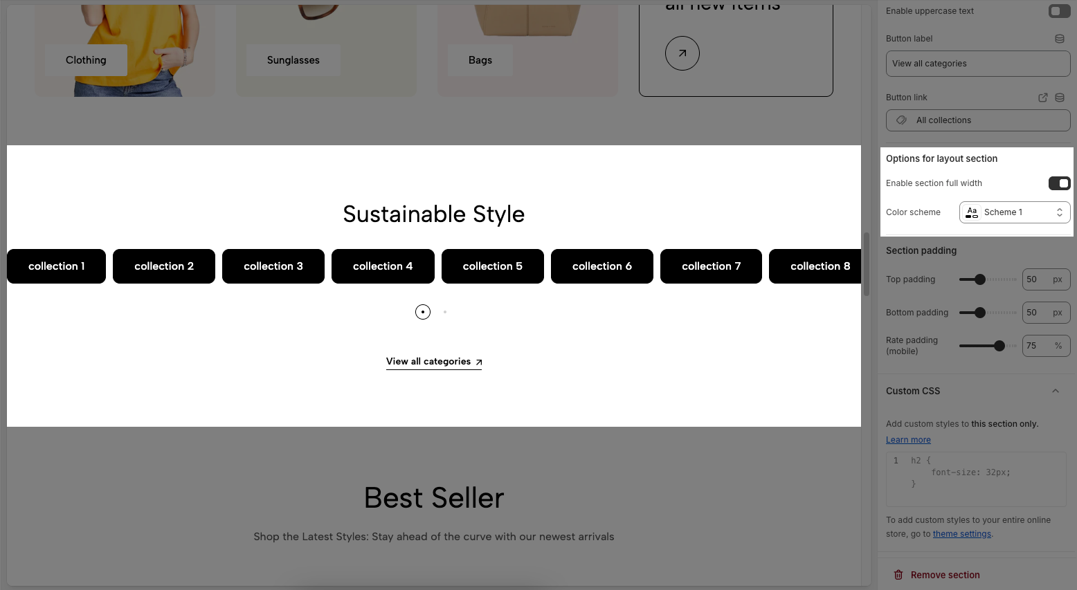
2.3. Section padding
Top padding: Sets the vertical spacing (in pixels) above the section.
Bottom padding: Sets the vertical spacing (in pixels) below the section.
Rate padding (mobile): Defines the vertical padding as a percentage for mobile devices, allowing responsive spacing.
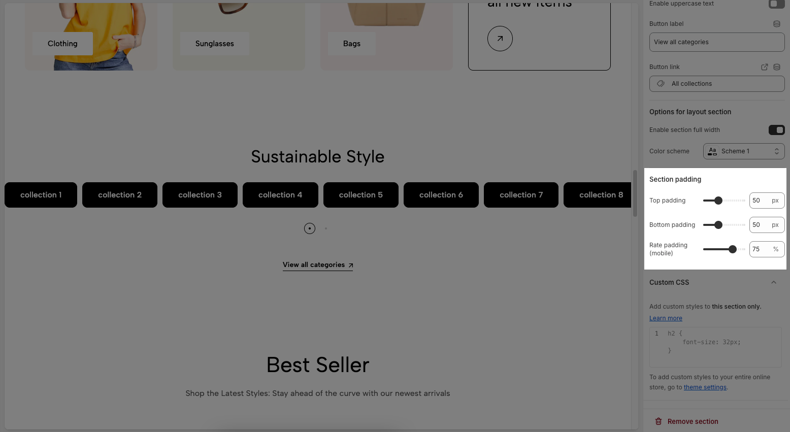
2.4. Custom CSS
Allows users to customize by adding CSS rules, beyond the limitations of default settings. This allows for fine-tuning the design to every detail, to suit specific needs.
Add custom styles to this section only.
To add custom styles to your entire online store, go to theme settings for detailed instructions.


