


This section lets you display an interactive map on your Shopify store, making it easy for customers to locate your physical store or find nearby retailers that carry your products.
1. How to access the Store Locator section?
Step 01: From Shopify Admin, click on Online Store > Select Themes > In the Current theme section, click the Customize button.

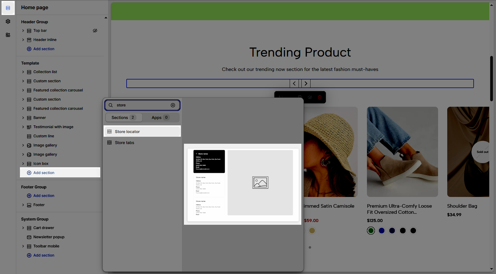
Step 02: In the theme editor (Customize), click the Sections button > Click the Add section button > In the Sections tab, scroll through the list or use the search bar to find and select the Store locator.
2. How to customize the Store Locator section
2.1. Store item block
These blocks help you create multiple store locator maps:
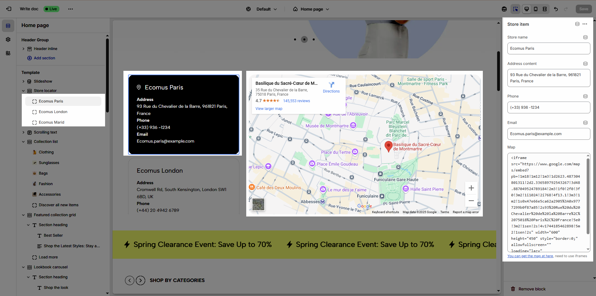
From Store locator section > Click Store item or click the Add Store item button (plus icon ➕) under the Store Locator section > customize its settings in the right-hand sidebar
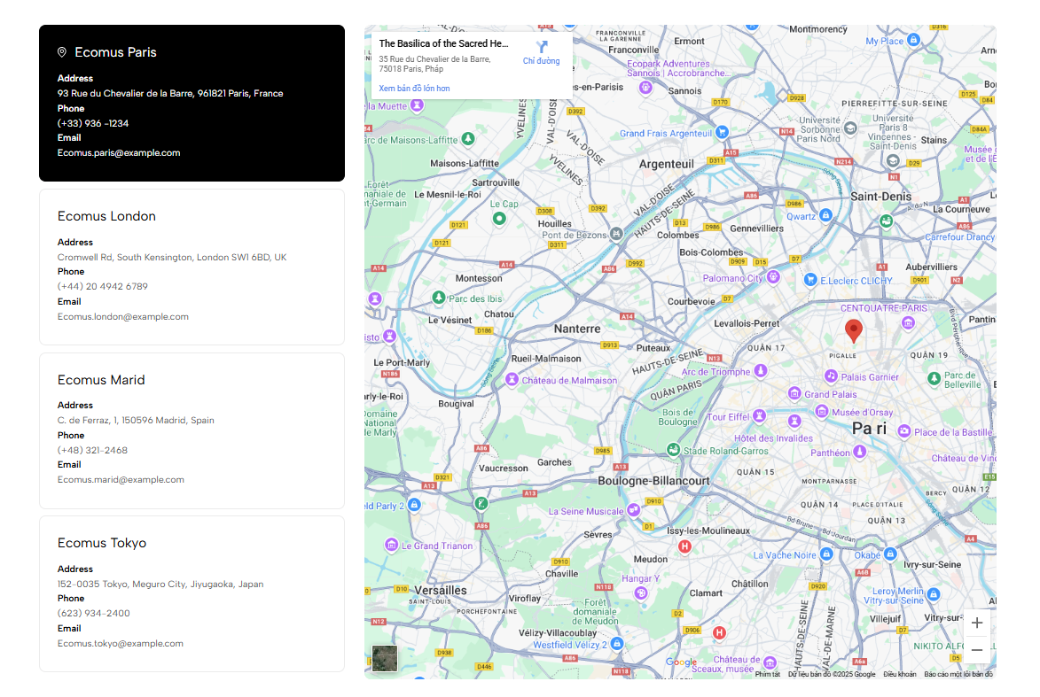
Store name: Establishes brand identity, enabling customers to quickly recognize and remember the business.
Address content: Provides accurate location details, assisting customers in easily finding the store.
Phone: Sets up a direct communication channel, allowing customers to receive immediate support and answers.
Email: Creates a professional communication channel, facilitating detailed information exchange and long-term relationship building.
Map (You can get the map at here, need to use iframes): Visually aids customers in locating and navigating to the store, enhancing user experience
Click to You can get the map at here > search address > click Share button > choose Embed a map > click Copy HTML button > paste in Map
Follow video:
2.2. Store locator section
From Store locator section > Config Options for section in the right-hand sidebar
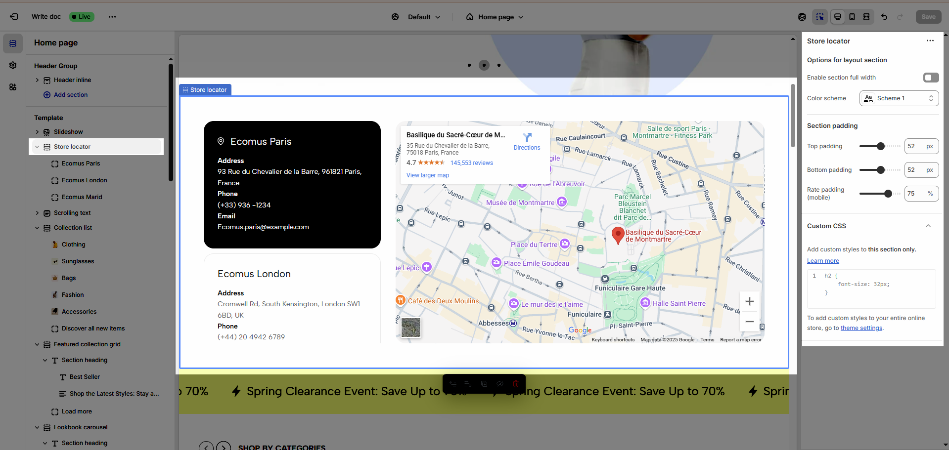
2.2.1. Options for layout section
Enable section full width: Extends the element to fill the entire horizontal screen space, creating a wide and attention-grabbing layout.
Color scheme: Selects the overall color palette for the section, ensuring aesthetics and consistency.
2.2.2. Section padding
Top padding: Creates space above the content within an element, separating it from elements above and improving visual layout.
Bottom padding: Creates space below the content within an element, separating it from elements below and improving visual layout.
Rate padding (mobile): Adjust spacing around mobile top elements, optimizing user experience and ensuring easy interaction on smaller screens.
2.2.3. Custom CSS
Allows users to customize by adding CSS rules, beyond the limitations of default settings. This allows for fine-tuning the design to every detail, to suit specific needs.
Add custom styles to this section only.
To add custom styles to your entire online store, go to theme settings.


