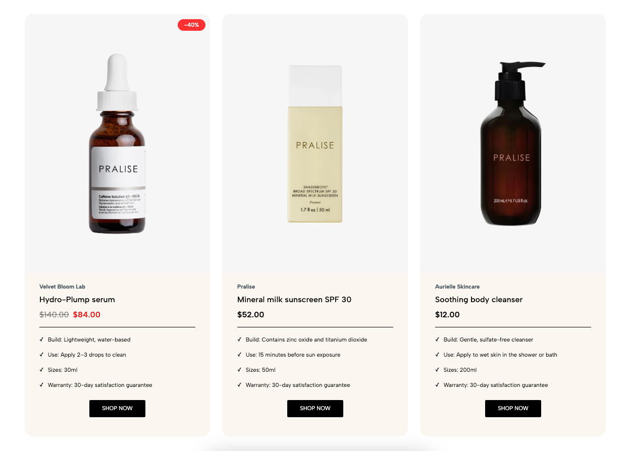
The Price tables is built with a clear structure, allowing for easy customization of both layout and functionality. It supports displaying multiple service or product packages with various attributes. Optimized for both desktop and mobile devices to ensure the best user experience.
1. How to access the Price tables section?
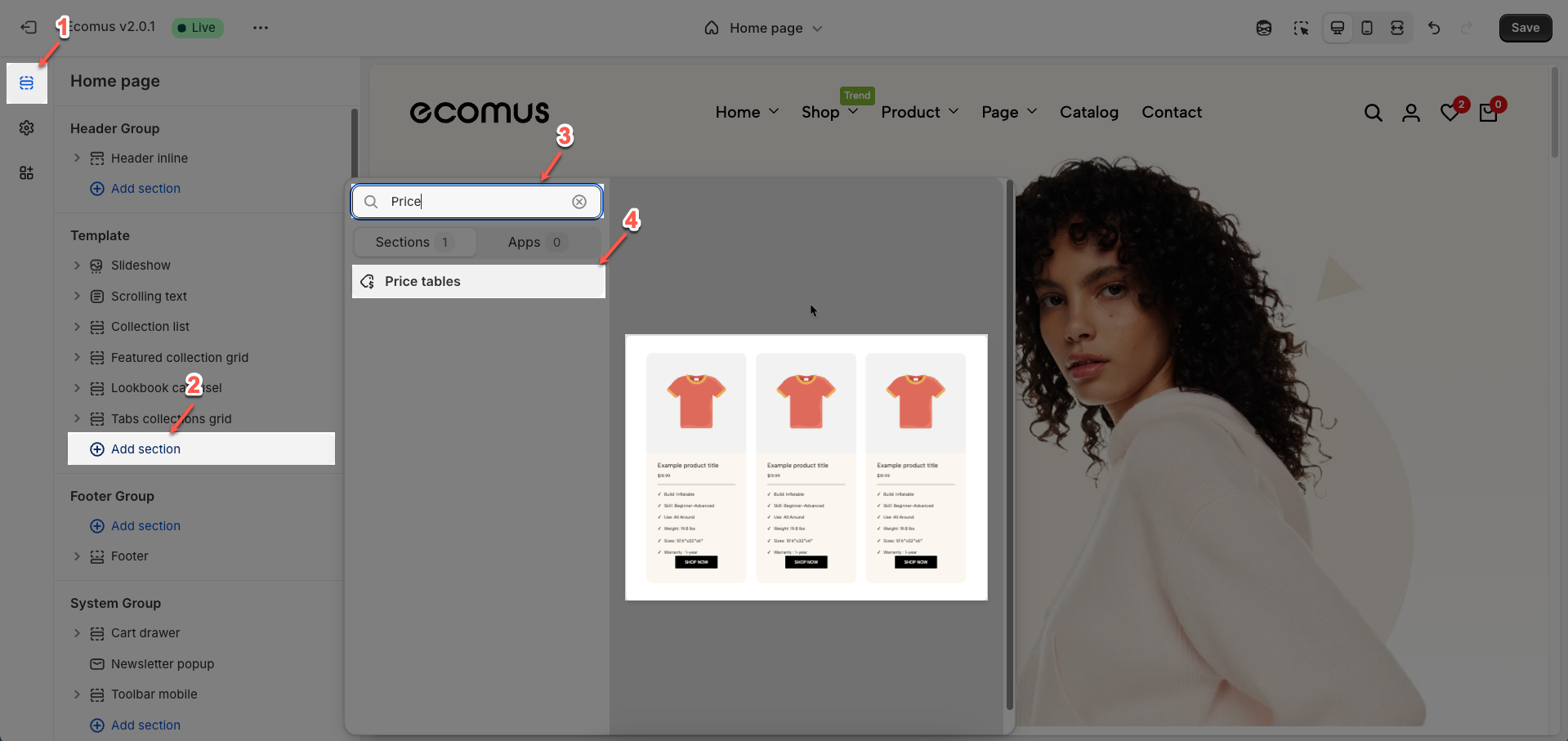
Step 01: From Shopify Admin, click on Online Store > Select Themes > In the Current theme section, click the Customize button.

Step 02: In the theme editor (Customize), click the Sections button > Click the Add section button > In the Sections tab, scroll through the list or use the search bar to find and select the Price tables.
2. How to customize the Price tables section?
2.1. Price table item block
To add a Price table item block to the Price tables, click the Add Price table item button (plus icon ➕) under the Price tables.
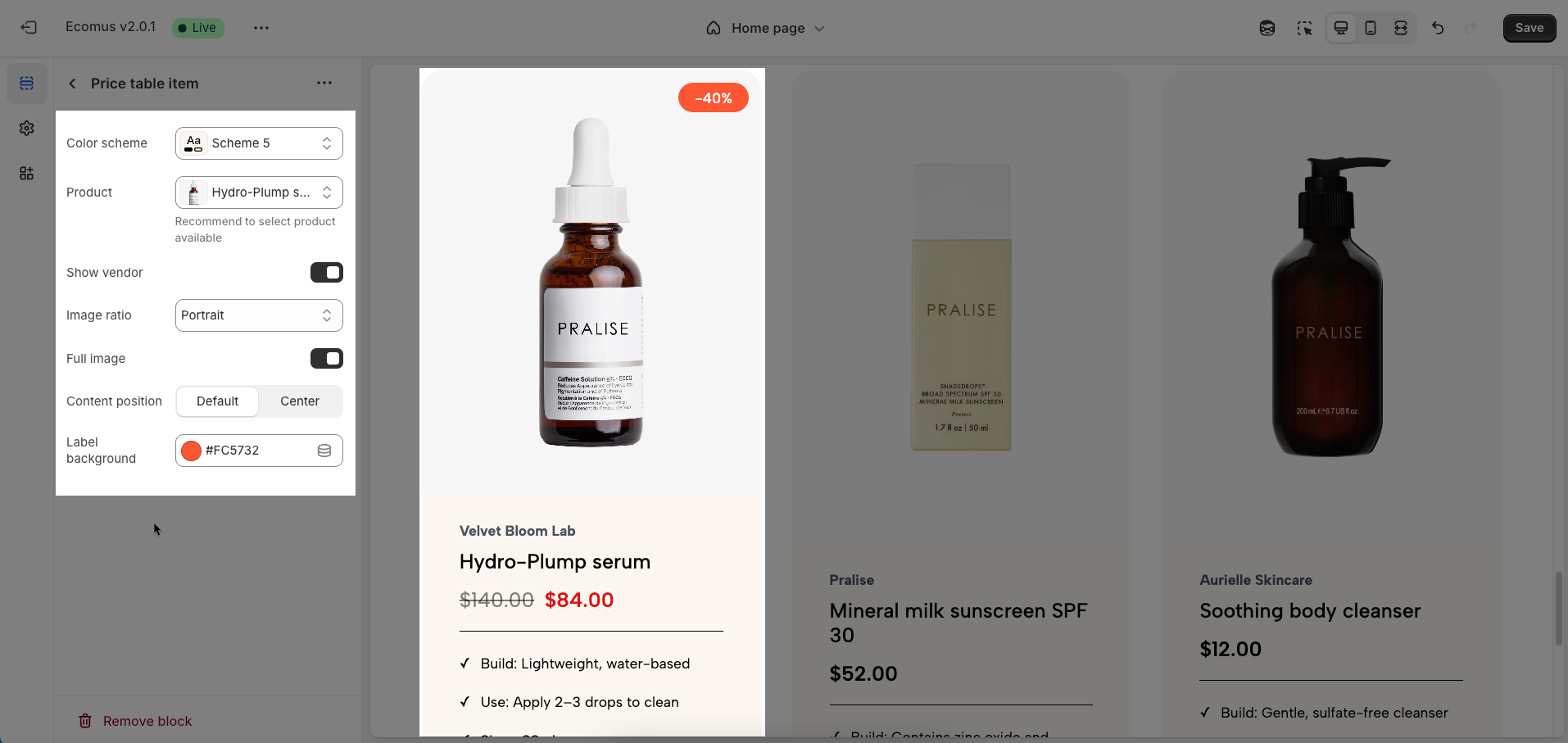
After adding the Price table item block, you can adjust its settings using the sidebar—located on the right or left side of your screen depending on your device
Color scheme: Select the overall color scheme for the pricing table section, ensuring brand consistency and highlighting key information effectively.
Product: Choose a specific product to showcase within the pricing table. It's recommended to select featured products or recommended service packages to attract attention.
Show vendor: Toggle the visibility of the product vendor's information within the pricing table.
Image ratio: Define the aspect ratio (e.g., Adapt to image, Square, Potrait, Lanscape,...) for product images within the pricing table, ensuring consistent and visually appealing presentation.
Full image: Determine whether to display the full product image within its container or adjust it to fit the selected aspect ratio (which may result in cropping).
Content position: Define the positioning of content elements (e.g., name, price, description) relative to the image within each column of the pricing table (Default, Center)
Label background: Customize the background color for special labels (e.g., "Sale", "Popular") to attract attention and differentiate service packages.
2.2. Other block
2.2.1. Section heading block
To add a Section heading block to the Price tables, click the Add Section heading button (plus icon ➕) under the Price tables.
After adding the Section heading block, you can adjust its settings using the sidebar—located on the right or left side of your screen depending on your device
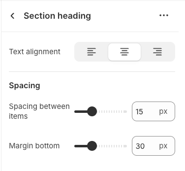
Text alignment: Choose how your testimonials are aligned for the best visual impact. Center alignment creates a balanced look, while left or right alignment can match your overall design style.
Spacing between items: Adjust the spacing between items to create the perfect flow
Margin bottom: Set the bottom margin to control the spacing between the heading and the section
2.2.2. Heading block
To add a Heading block to the Section heading, click the Add Heading button (plus icon ➕) under the Section heading.
After adding the Heading block, you can adjust its settings using the sidebar—located on the right or left side of your screen depending on your device
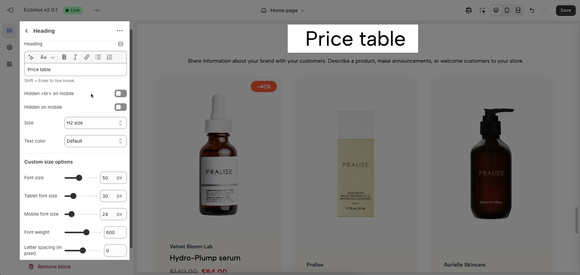
Heading: Define the main title that represents your content or section. Make it engaging and relevant.
Hidden <br> on mobile: Remove unnecessary line breaks on mobile devices
Hidden on mobile: Choose whether to hide the heading completely on mobile devices for a streamlined display.
Choose "Custom size inline" to freely adjust the size in the Custom Size Options section.
Size: Adjust the overall heading size to fit the design aesthetics of your store.
Text Color: Customize the heading color to align with your brand identity and improve readability.
Font size (Desktop/Tablet/Mobile): Set different font sizes for each device type to ensure a responsive and visually appealing layout.
Font weight: Control the thickness of the heading text
Letter spacing (in pixel): Adjust the space between letters to enhance readability and design precision.
2.2.3. Text block
To add a Text block to the Section heading or Price table item, click the Add Text button (plus icon ➕) under the Section heading or Price table item.
After adding the Text block, you can adjust its settings using the sidebar—located on the right or left side of your screen depending on your device
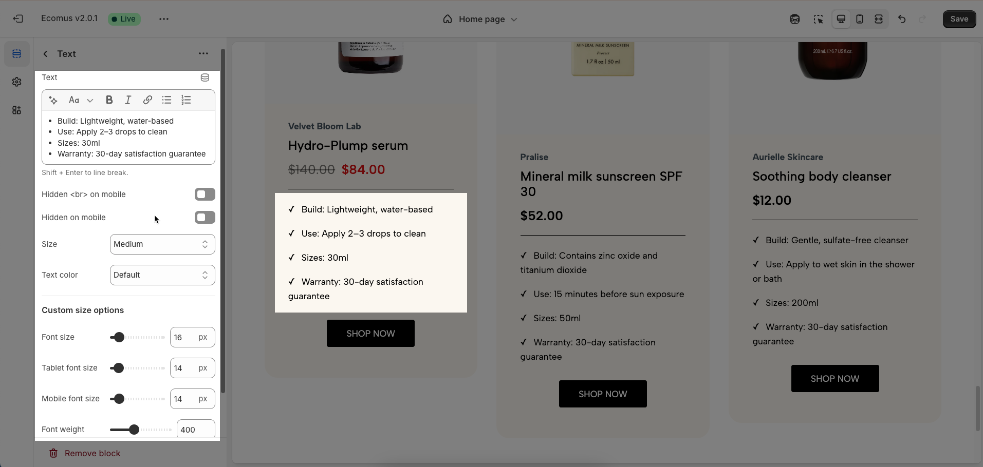
Text (Shift + Enter to line break): Allows users to add textual content, providing information, descriptions, or explanations.
Hidden <br> on mobile: Remove unnecessary line breaks on mobile devices
Hidden on mobile: Choose whether to hide the heading completely on mobile devices for a streamlined display.
Choose "Custom size inline" to freely adjust the size in the Custom Size Options section.
Size: Adjust the overall heading size to fit the design aesthetics of your store.
Text Color: Customize the heading color to align with your brand identity and improve readability.
Font size (Desktop/Tablet/Mobile): Set different font sizes for each device type to ensure a responsive and visually appealing layout.
Font weight: Controls the thickness of the heading text
Letter spacing (in pixel): Adjust the space between letters to enhance readability and design precision.
2.2.4. Spacer block
To add a Spacer block to the Price table item, click the Add Spacer button (plus icon ➕) under the Price table item.
After adding the Spacer block, you can adjust its settings using the sidebar—located on the right or left side of your screen depending on your device
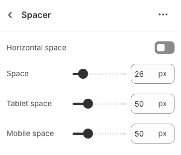
Horizontal space: Enable to adjust the horizontal space between elements, creating a balanced and easy-to-read layout
Space: Setting space between elements creates clear separation.
Tablet space: Optimizes the spacing between elements on tablet screens, ensuring content is displayed balanced and easy to interact with on medium-sized screen devices.
Mobile space: Adjusts the spacing between elements on mobile phone screens, optimizing the user experience on small screens
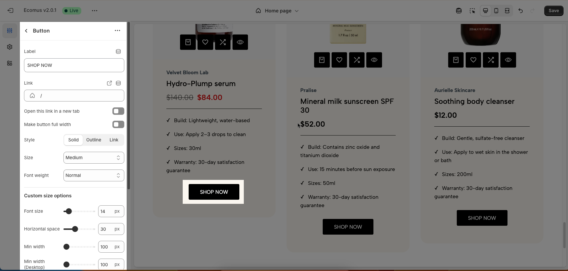
2.2.5. Button block
To add a Spacer block to the Price table item, click the Add Spacer button (plus icon ➕) under the Price table item.
After adding the Spacer block, you can adjust its settings using the sidebar—located on the right or left side of your screen depending on your device
Label: Defines the text displayed on the button.
Link: Specifies the destination URL when the button is clicked.
Open this link in a new tab: Opens the link in a new browser tab when enabled.
Make button full width: Expands the button to take up the full width of its container.
Style: Choose between Solid, Outline, or Link styles for different visual effects.
Size: Adjusts the button size (e.g., Extra Large, Medium, etc.).
Font weight: Controls the thickness of the button text (e.g., Normal, Bold).
Custom Size Options
Font size: Adjusts the heading size for desktop.
Tablet font size: Adjusts the heading size for tablet.
Mobile font size: Adjusts the heading size for mobile.
Font weight: Controls the thickness of the text (e.g., 600 is semi-bold).
Letter spacing: Adjusts the space between characters.
Icon
Icon: Select the icon to display on the button (e.g., arrow, plus, etc.).
Icon position: Choose whether the icon appears Before or After the button text.
Icon size: Adjust the size of the icon in pixels.
Icon spacing: Set the spacing between the icon and the text to ensure proper alignment and readability.
2.3. Price tables section
After adding the IPrice tables section, you can customize its settings using the sidebar—located on the right or left side of your screen depending on your device.
2.3.1. General options
Items per row (Desktop): Defines the number of products or items displayed in each row on desktop screens, optimizing the layout for large screens.
Items per row (Tablet): Adjusts the number of products or items displayed in each row on tablet screens, ensuring balanced and easy viewing.
Items per row (Mobile): Optimizes the number of products or items displayed in each row on mobile phone screens, ensuring neat and interactive display.
Use prev/next button: Enable "Previous/Next" buttons for navigating through items in a horizontally displayed section, enhancing user browsing convenience
Use dots: Display dot indicators representing the number and current position of items in a horizontally scrolling section, providing a visual way to track progress and navigate quickly.
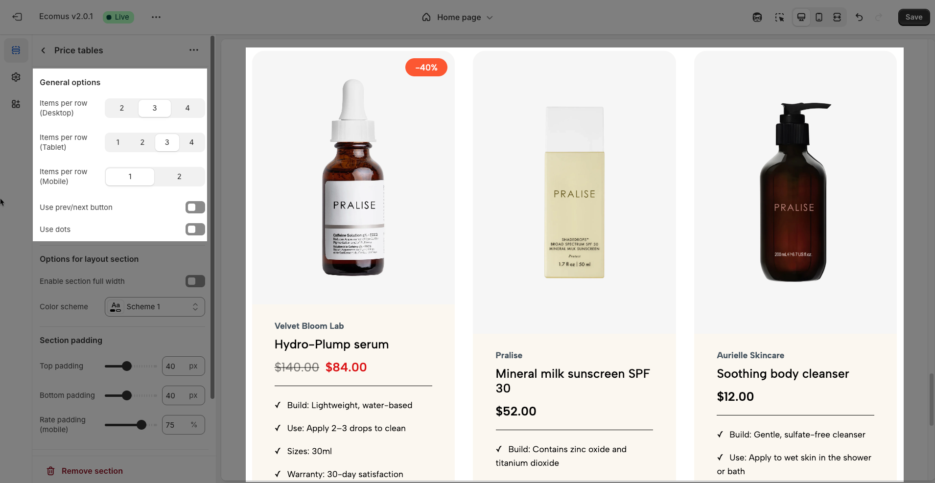
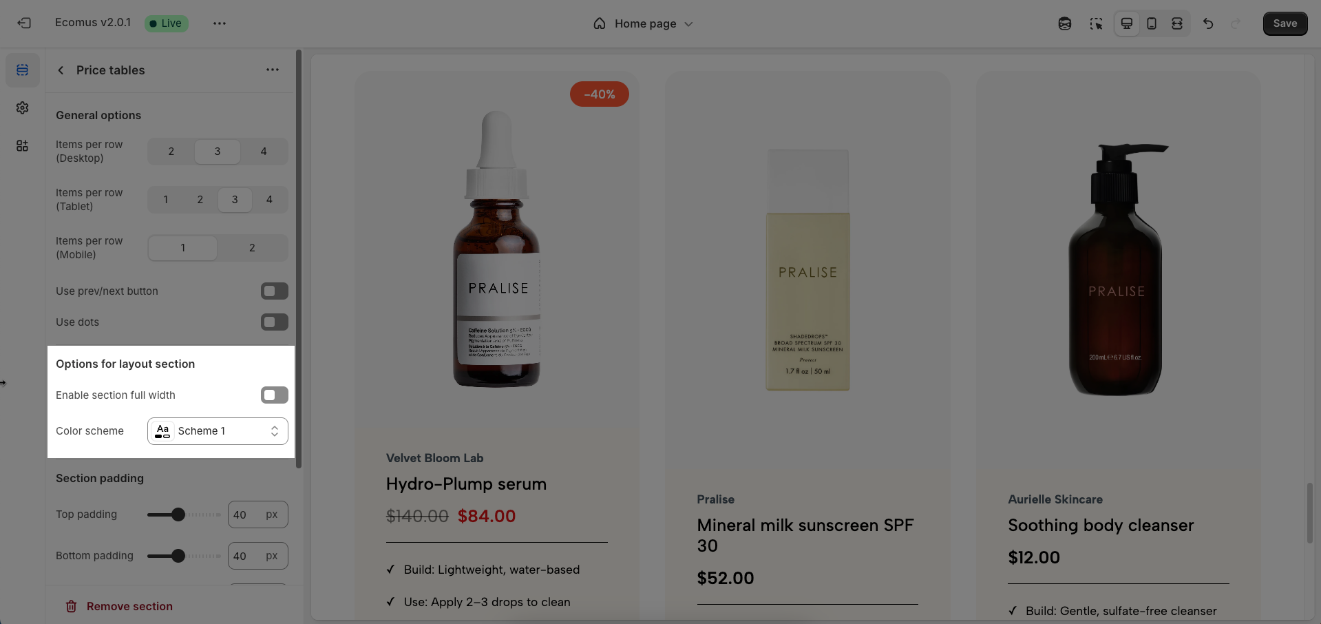
2.3.2. Options for layout section
Enable section full width: This toggle switch, when turned on, will make the entire section span the full width of the browser window. When turned off, the section will likely be constrained to the website's main content width.
Color scheme: This dropdown menu allows you to select a predefined color scheme for the section. Clicking the dropdown will likely reveal other color palettes that you can apply to the background, text, and other elements within this section for a consistent look.
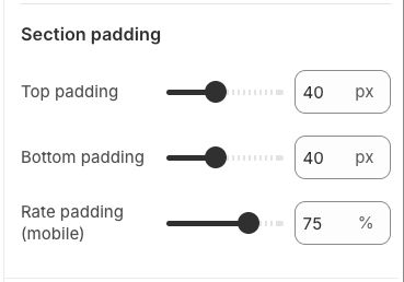
2.3.3. Section padding
Top padding: This option allows you to set the amount of space (padding) at the top of the slider section. You can drag the slider or directly enter a numerical value to adjust this spacing
Bottom padding: This option allows you to set the amount of space (padding) at the bottom of the slider section. You can drag the slider or directly enter a numerical value to adjust this spacing
Rate padding (mobile): This option allows you to set the aspect ratio-based padding for mobile view (in percentage). For example, 75% means the height will be 75% of the width.
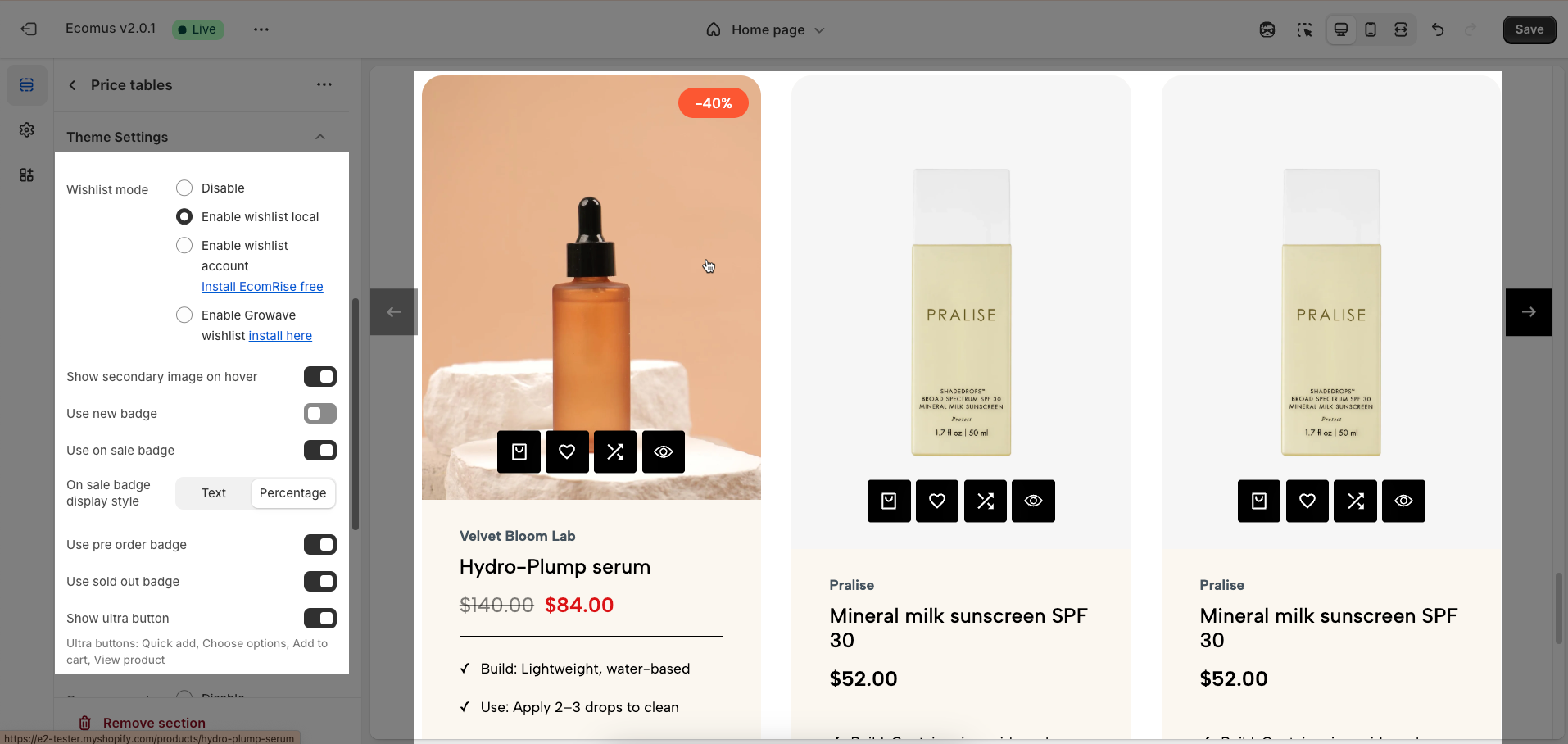
2.3.4. Theme Settings
Wishlist mode: Enables or disables the wishlist feature, providing users with a function to save favorite products.
You can Disable, Enable wishlist local, Enable wishlist account Install EcomRise free, Enable Growave wishlist
Show secondary image on hover: Displays a secondary product image when hovering over it, giving customers a multi-dimensional view of the product.
Use new badge: Enables or disables the display of a "new" badge on new products, attracting customer attention.
Use on sale badge: Enables or disables the display of an "on sale" badge on discounted products, stimulating purchases.
On sale badge display style: Selects the display style "Text" or "Percentage" for the "on sale" badge
Use pre-order badge: Enables or disables the display of a "pre-order" badge on upcoming products, informing customers of pre-order availability.
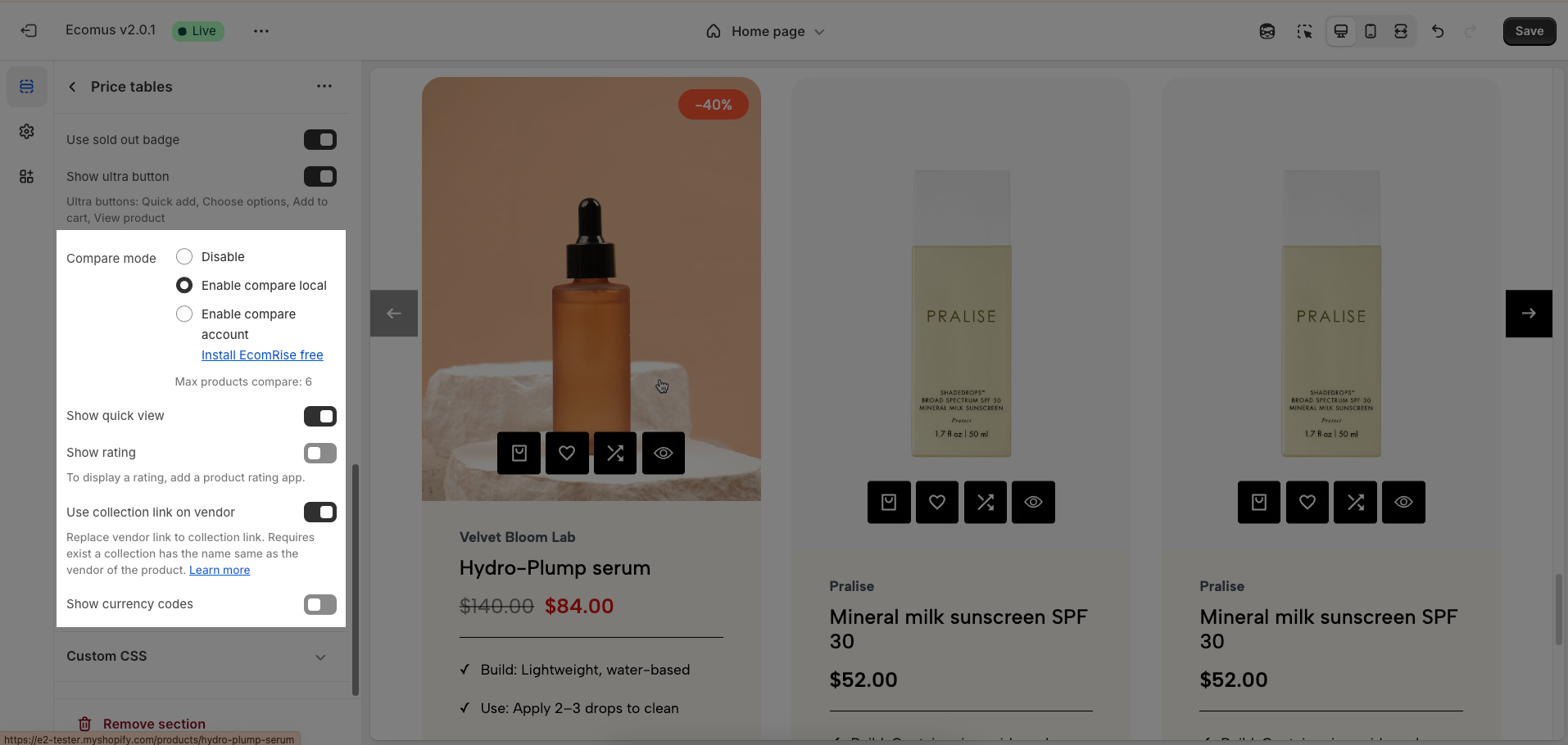
Use sold out badge: Enables or disables the display of a "sold out" badge on out-of-stock products, notifying customers of product availability.
Show ultra button: Enables or disables the "ultra" button (custom button), allowing the addition of special action buttons to products.
Ultra buttons: Quick add, Choose options, Add to cart, View product
Compare mode: Enables or disables the product comparison mode, allowing customers to compare products side-by-side for informed purchasing decisions.
You can Disable, Enable compare local, Enable compare account
Max products compare: 6
Show quick view: Enables or disables the "quick view" button, allowing customers to view product details without leaving the current page.
Show rating: Enables or disables the display of product ratings, providing customer feedback information.
To display a rating, add a product rating app.
Use collection link on vendor: Replace vendor link to collection link. Requires exist a collection has the name same as the vendor of the product
Show currency codes: Enables or disables the display of currency codes next to product prices, providing clear currency information.
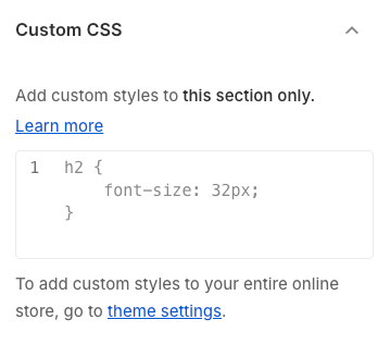
2.3.5. Custom CSS
Allows users to customize by adding CSS rules, beyond the limitations of default settings. This allows for fine-tuning the design to every detail, to suit specific needs.
Add custom styles to this section only.
To add custom styles to your entire online store, go to theme settings.