


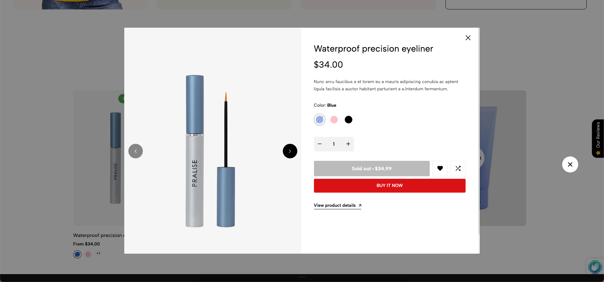
Quickview is a user interface (UI) feature that optimizes the shopping experience by allowing customers to view product details and add to cart without leaving the current page (usually a collection page or home page).
1. How to access the Quick view?
Step 01: From Shopify Admin, click on Online Store > Select Themes > In the Current theme section, click the Customize button.

Step 02: In the theme editor (Customize), click to open dropdown pages in the topbar > select Products > select Only config
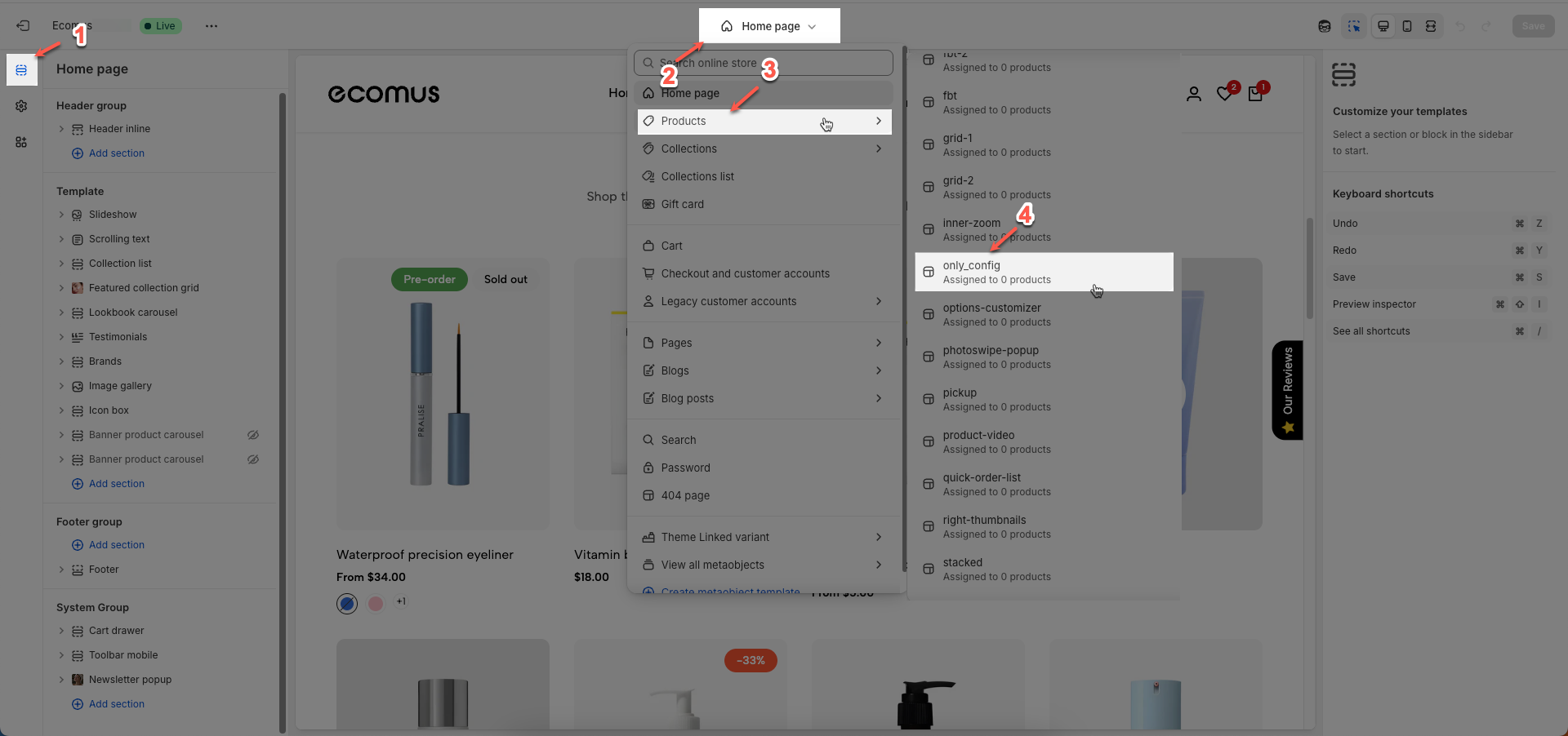
Step 03: In the Sections tab, scroll and find Quick view in Template
2. How to customize the Quick view section?
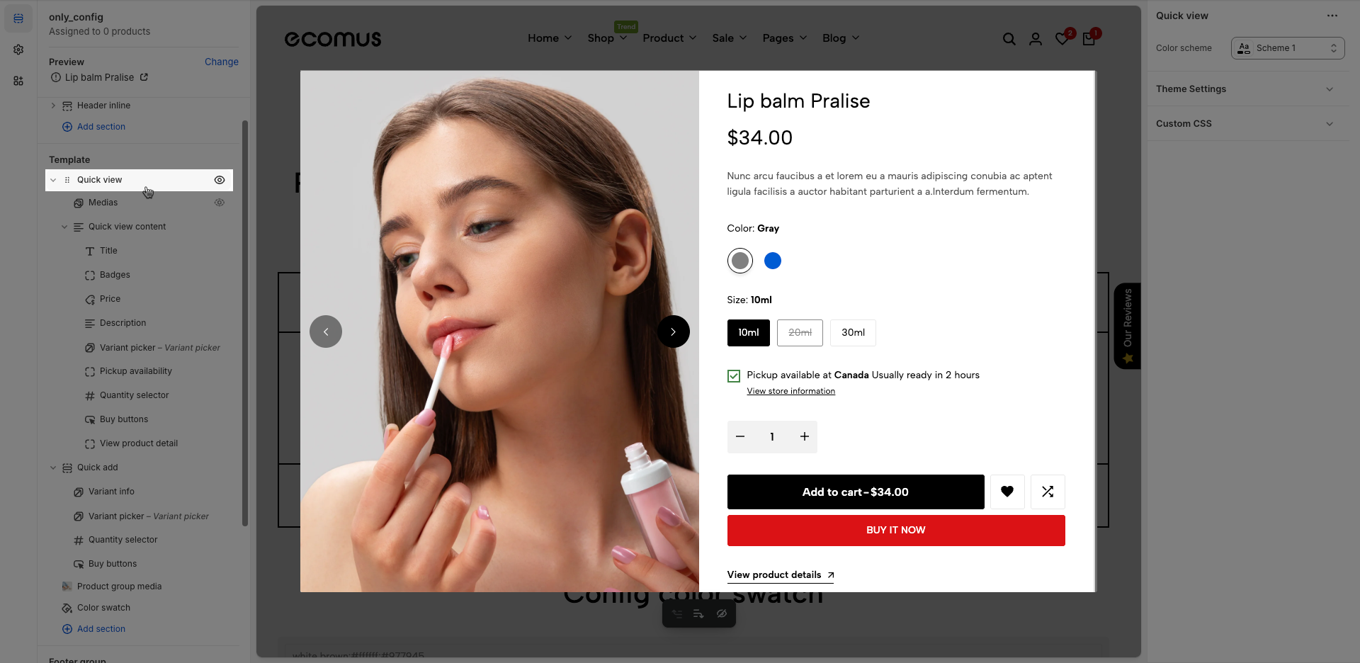
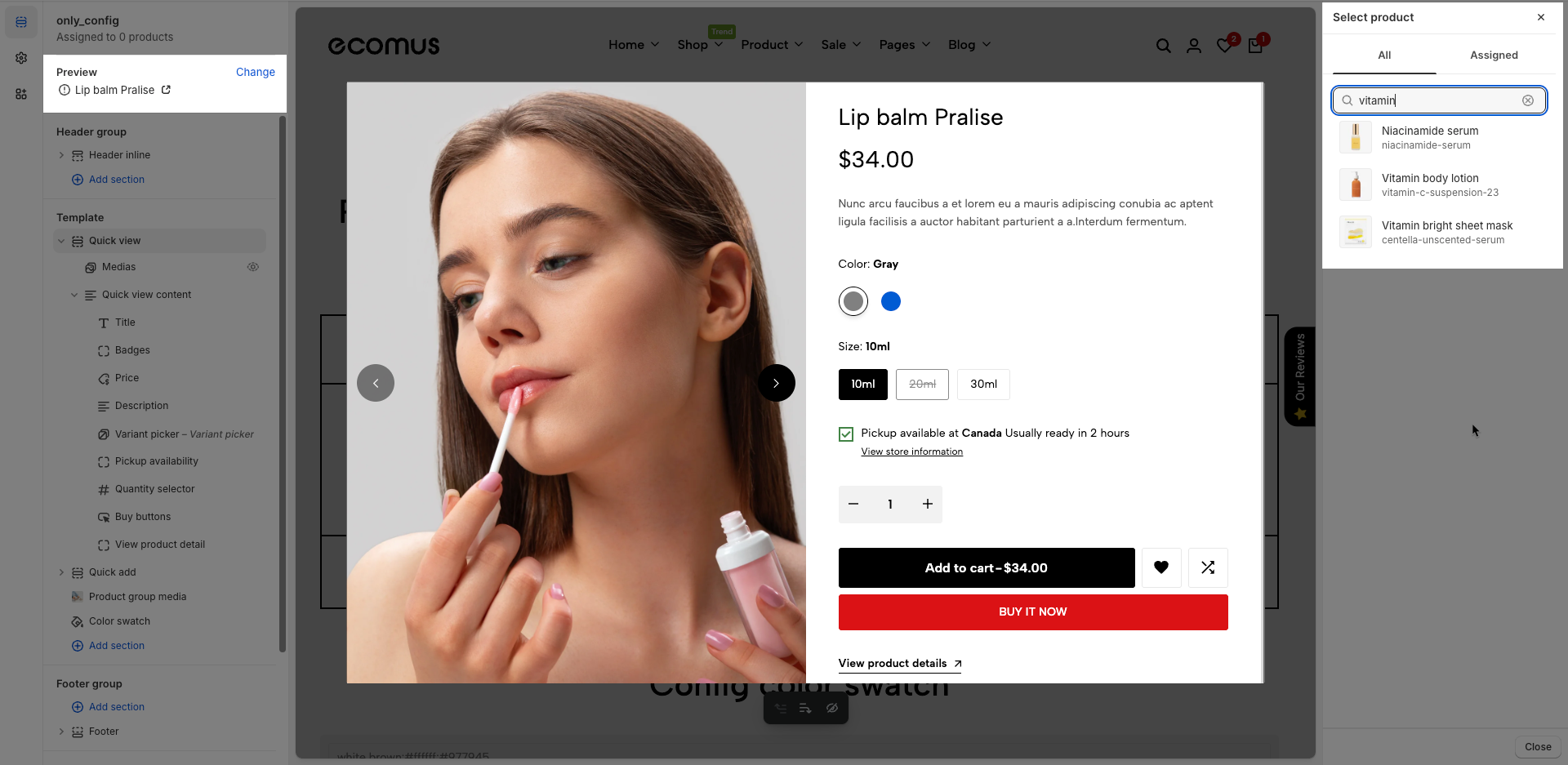
To configure a specific product, go to the Preview section at the top left and click Change. From there, select the product you want to edit. The available settings for that product will then be displayed under the Main product section, where you can customize its layout and content.
Within the Quick view section, there are two primary blocks:
Medias block – used to configure and display product images or videos.
Quickview content block – used to manage and customize all product content such as title, price, description, variant options, and buy buttons.
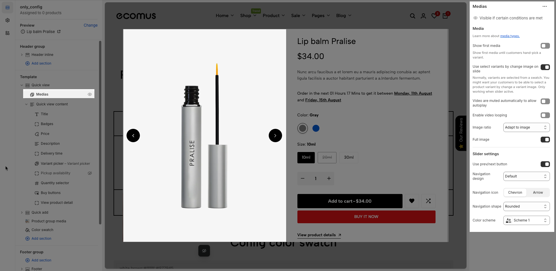
2.1. Medias block
After open the Medias block, you can adjust its settings using the sidebar—located on the right or left side of your screen depending on your device
Visible if certain conditions are met
Media
Show first media: Show first media until customers hand-pick a variant.
Use select variants by change image on slide
Normally, variants are selected from a swatch. You might want your customers to be able to select a product variant by change a variant image. Only working when slider active.
Video are muted automatically to allow autoplay: Enable this option to automatically mute videos when they start playing. Muting is required to enable autoplay functionality on most modern browsers.
Enable video looping: Enable this option to automatically loop videos when they finish playing.
Image ratio: Select the aspect ratio (Adapt to image, Square, Portrait, Landscape,...) for the image. Setting an aspect ratio helps ensure consistency in layout
Full image: Enable this option to make the image span the full available width of its containing element.
Slider settings
Use prev/next button: Check to enable "Previous" and "Next" navigation buttons for this element.
Navigation design: Select the visual design style for navigation elements (e.g., default, outline, simple).
Navigation shape: Set the geometric shape or rotational effect for navigation elements (e.g., default, rounded, rotate).
Navigation icon: Select the icon to be used for this navigation item.
Color scheme: Select the color scheme to be applied to this section or component.
2.2. Quickview content block
After open the Quickview content block, you can adjust its settings using the sidebar—located on the right or left side of your screen depending on your device
Color scheme: Select the color scheme to be applied to this section or component.
The Quickview content block contains multiple sub-blocks that represent different pieces of product information. You can easily add, rearrange, remove, and customize these blocks with flexibility to match your desired layout. In the following Product content block guide, we’ll walk you through how to configure each block in detail.
2.3. Quickview options
Color scheme: Select the color scheme to be applied to this section or component.
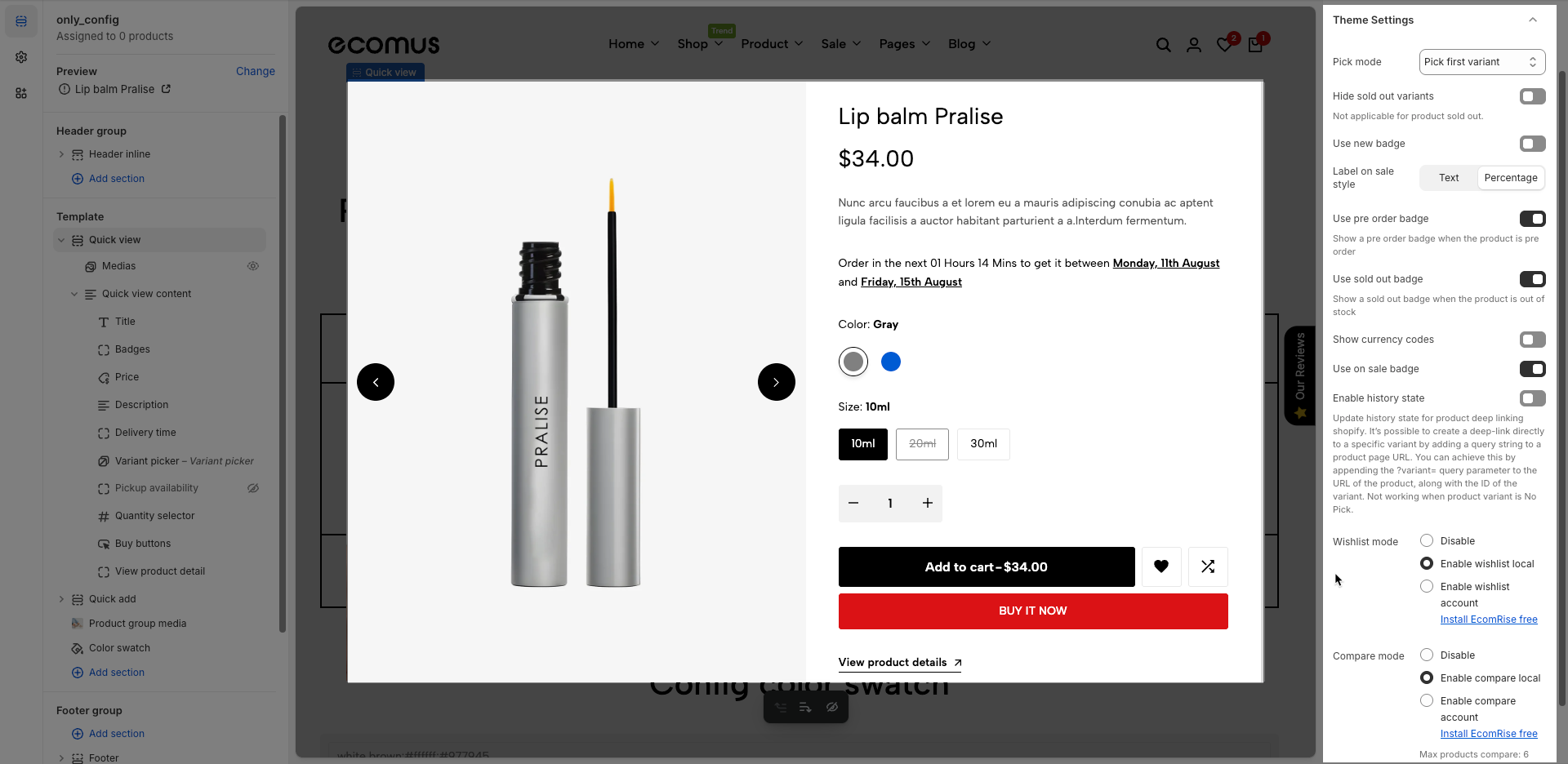
Theme Settings
Pick mode: Choose the default product variant selection method.
No pick: No product variant is selected by default. The customer must manually select a variant before purchasing.
Pick first variant: Automatically selects the first variant in the product’s variant list, regardless of availability (even if it's sold out).
Pick first available variant: Automatically selects the first variant that is in stock. This is the most user-friendly option to ensure a purchasable variant is preselected.
Hide sold out variants: Hide variant options that are sold out. (This option does not apply if the product itself is sold out.)
Use new badge: Enable this to show a “New” badge on newly added products.
Label on sale style: Choose how the sale badge appears — either as plain text (e.g. "Sale") or as a discount percentage (e.g. "20% off").
Use pre order badge: Display a “Pre-order” badge when the product is available for pre-order.
Use sold out badge: Show a “Sold Out” badge when the product is out of stock.
Show currency codes: Display the currency code (e.g., USD, EUR) next to the product price.
Enable history state: Activate deep-linking for product variants. It allows sharing URLs that automatically select a specific product variant. (Only works when a variant is selected.)
Update history state for product deep linking shopify. It’s possible to create a deep-link directly to a specific variant by adding a query string to a product page URL. You can achieve this by appending the ?variant= query parameter to the URL of the product, along with the ID of the variant. Not working when product variant is No Pick.
Wishlist mode:
Disable – Turns off the wishlist feature entirely.
Enable wishlist local – Allows customers to save their wishlist locally using browser storage.
Enable wishlist account – Enables account-based wishlist saving (requires the EcomRise app).
Compare mode:
Disable – Turns off the product comparison feature.
Enable compare local – Allows customers to compare products locally without an account.
Enable compare account – Enables account-based product comparison (requires the EcomRise app).
Note: You can compare up to 6 products.
Custom CSS
Allows users to customize by adding CSS rules, beyond the limitations of default settings. This allows for fine-tuning the design to every detail, to suit specific needs.
Add custom styles to this section only.
To add custom styles to your entire online store, go to theme settings.


