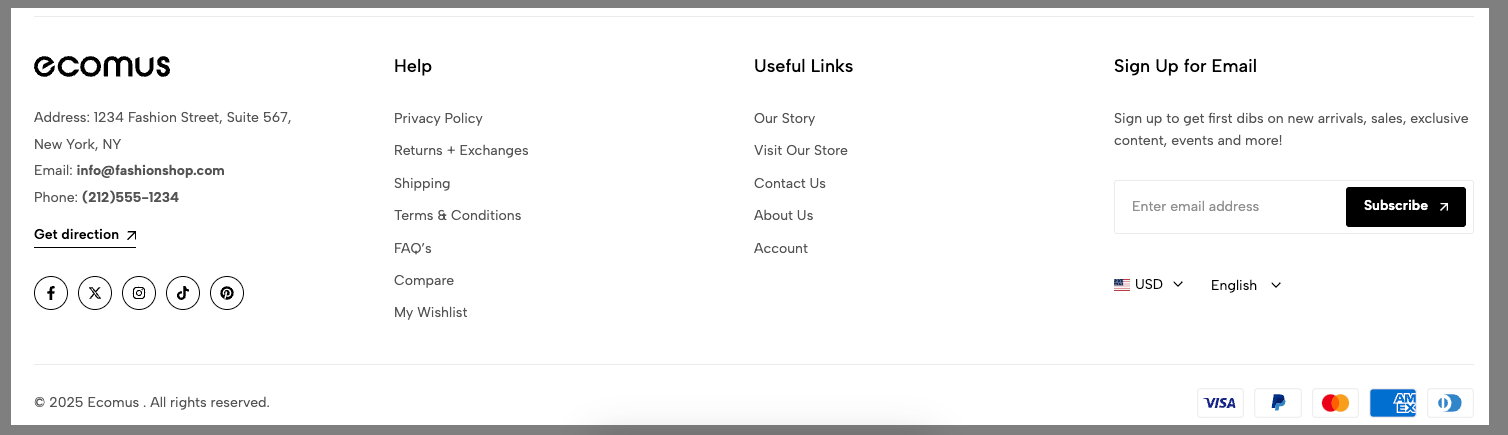
The Footer provides essential information and quick access to important resources. It typically includes useful links, contact details, terms of service, and social media channels.
This guide will walk you through the different blocks of the footer, explaining their purpose and how to use them effectively, so you can navigate the website with ease and make the most of the available features.
1. Config Footer section
Enable accordions mobile: Enable this option if you want to it show accordion style on mobile.
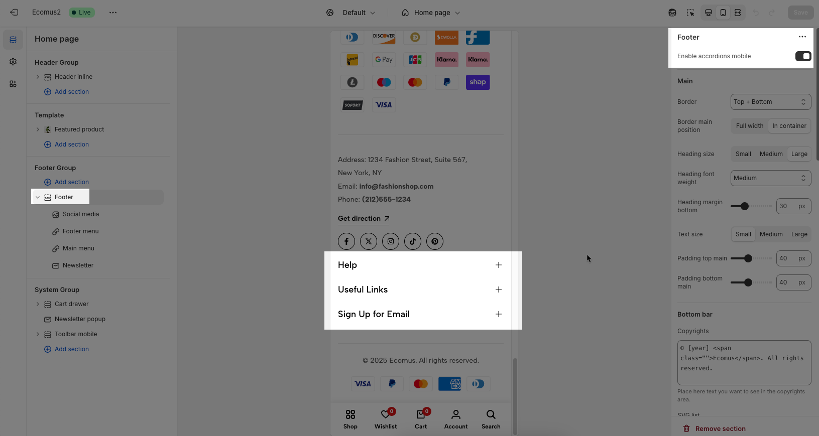
Main
Border: You can set the border for the Footer as you want: None, Top, Bottom or Top + Bottom.
Border main position: Full width or In container
Heading size: We have some sizes for you to choose: Small, Medium or Large
Heading font-weight: Normal, Medium or Extrabold
Heading margin-bottom: You can change the heading margin-bottom as you want.
Text size: Small, Medium or Large
Padding top main and Padding bottom main: set padding for Footer
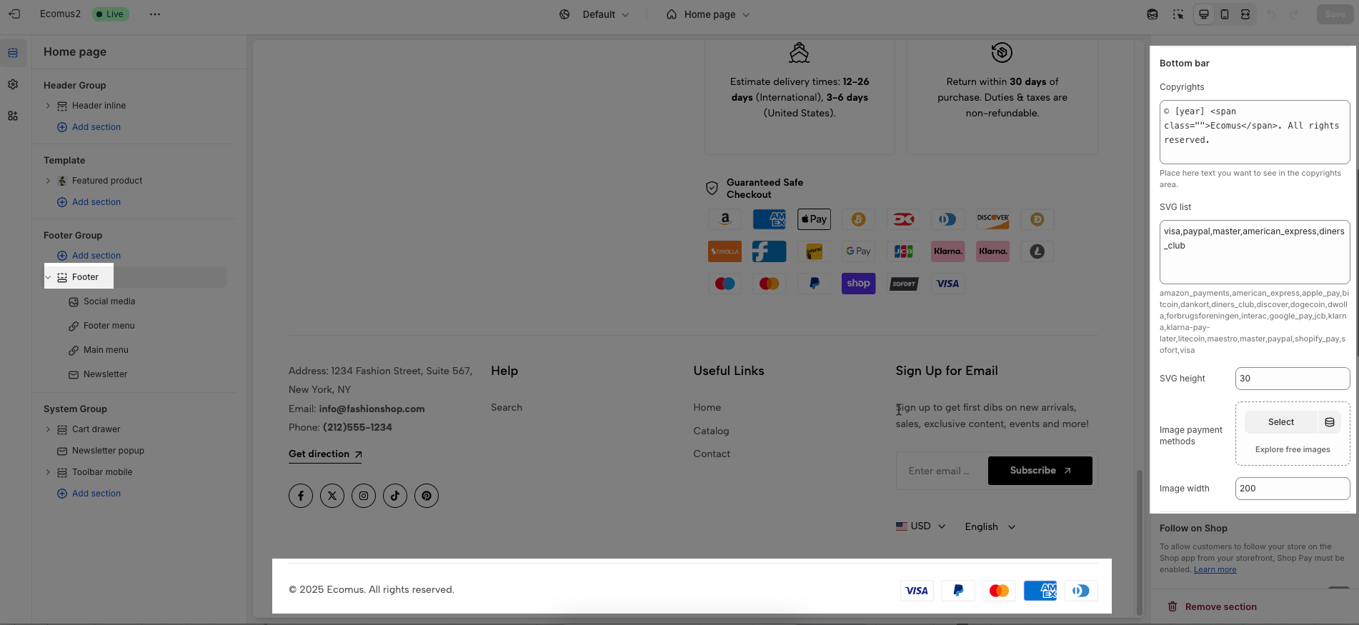
Bottom bar
Copyrights: Add the Copyrights text here.
SVG list: You will enter the list of SVG for payment method and can set SVG height.
Image payment methods: If you don't have an SVG list, you can also use the payment image to show here.
Follow on Shop
To allow customers to follow your store on the Shop app from your storefront, Shop Pay must be enabled. Learn more
Please enable Follow on Shop if you want to use it.
Country/region selector
To add a country/region, go to your Shopify admin -> Settings ->Markets to set up:
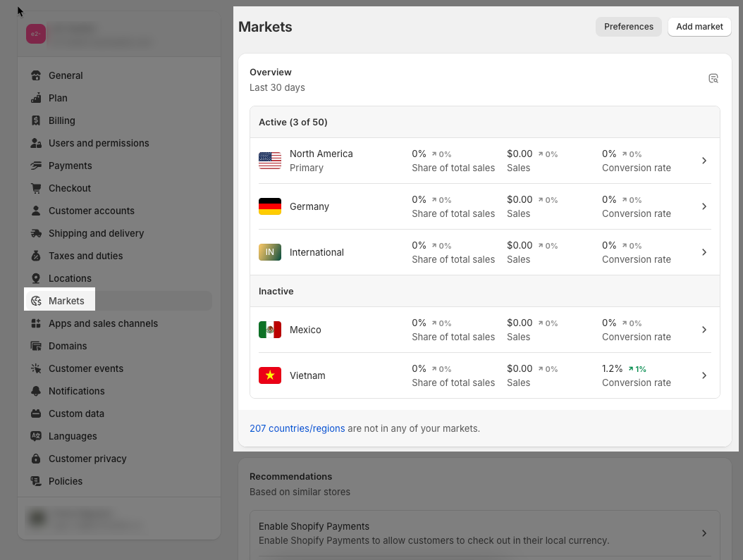
Please Enable country/region selector if you want to show it in the Footer
Language selector
To add a language, go to your Shopify admin -> Settings -> Languages to set up:
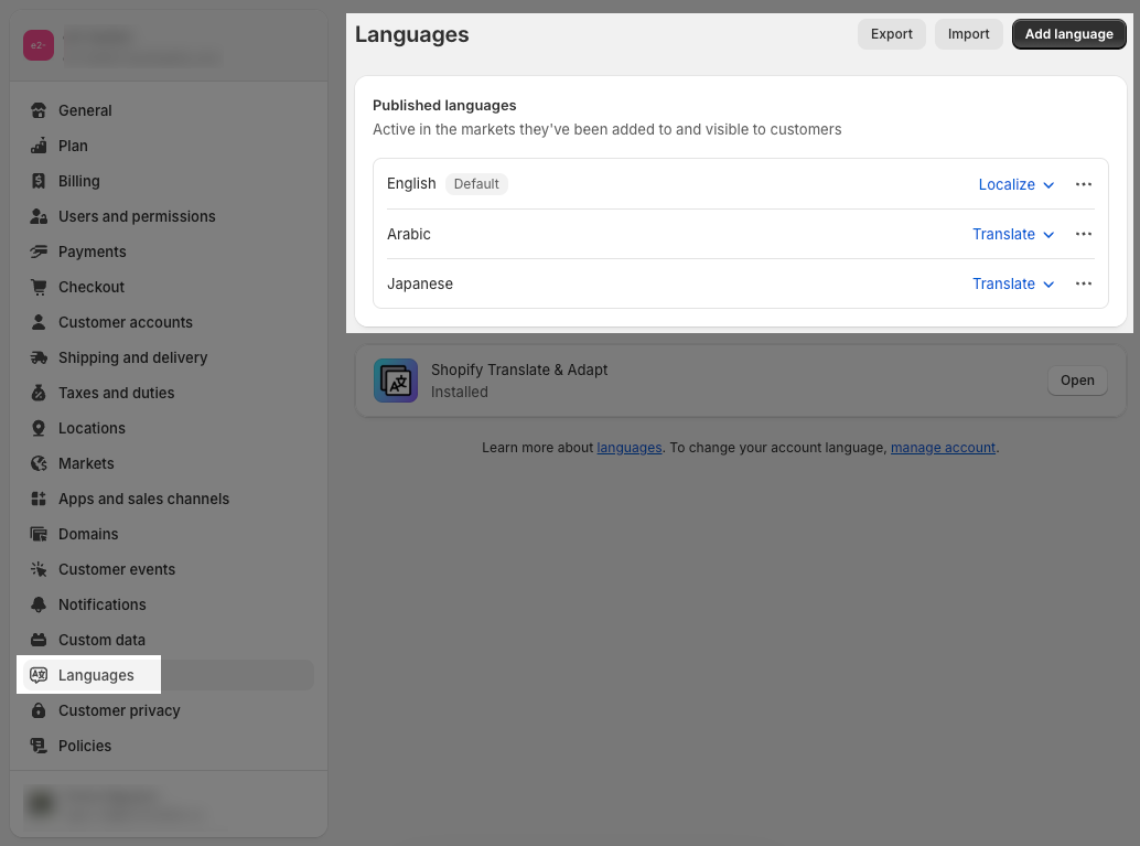
Enable the language selector if you want to show it in the Footer
Policy links
To add store policies, go to your Shopify admin -> Settings -> Policies to set up:
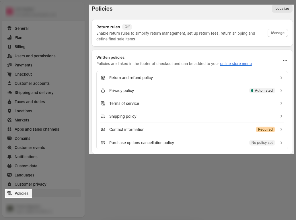
If you want to show Policy in the bottom bar, please enable Show Policy links.
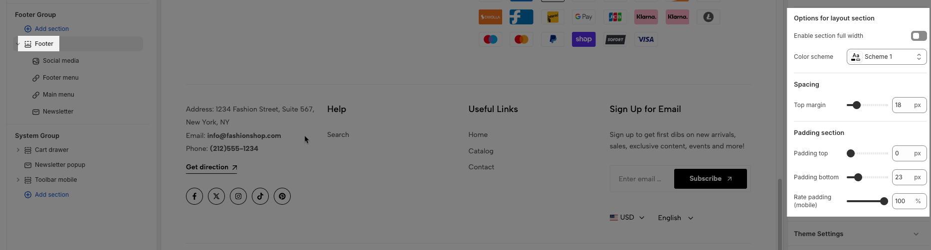
Options for layout section
Enable section fullwidth: This option allows you to show Footer fullwidth.
Color scheme: You can config color for Footer here.
Spacing: You can set Top margin for Footer here.
Padding section: You can set the top and bottom padding of the Footer section.
Rate padding (mobile): The padding on mobile will correspond to the desktop according to the percentage you choose here.
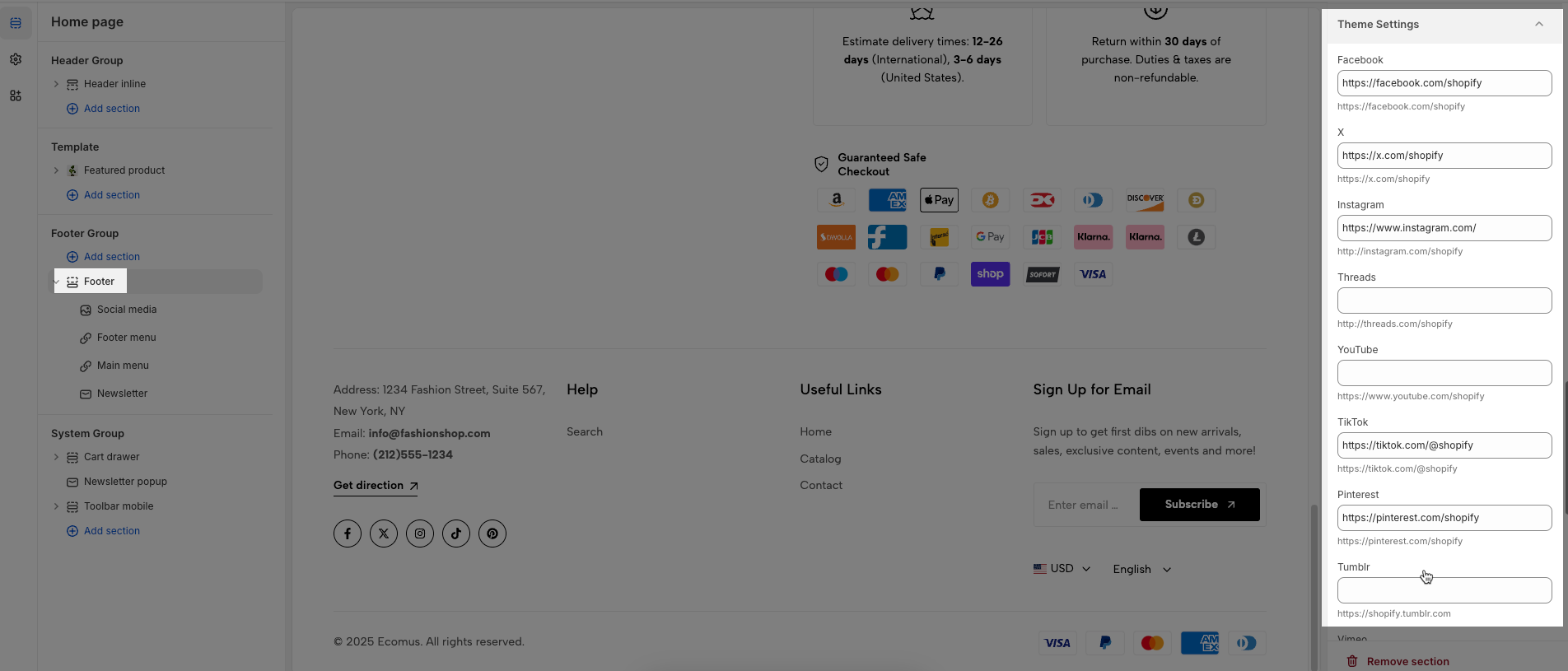
Theme Settings
You will configure Social Media and add links for them here.
2. Config Footer blocks
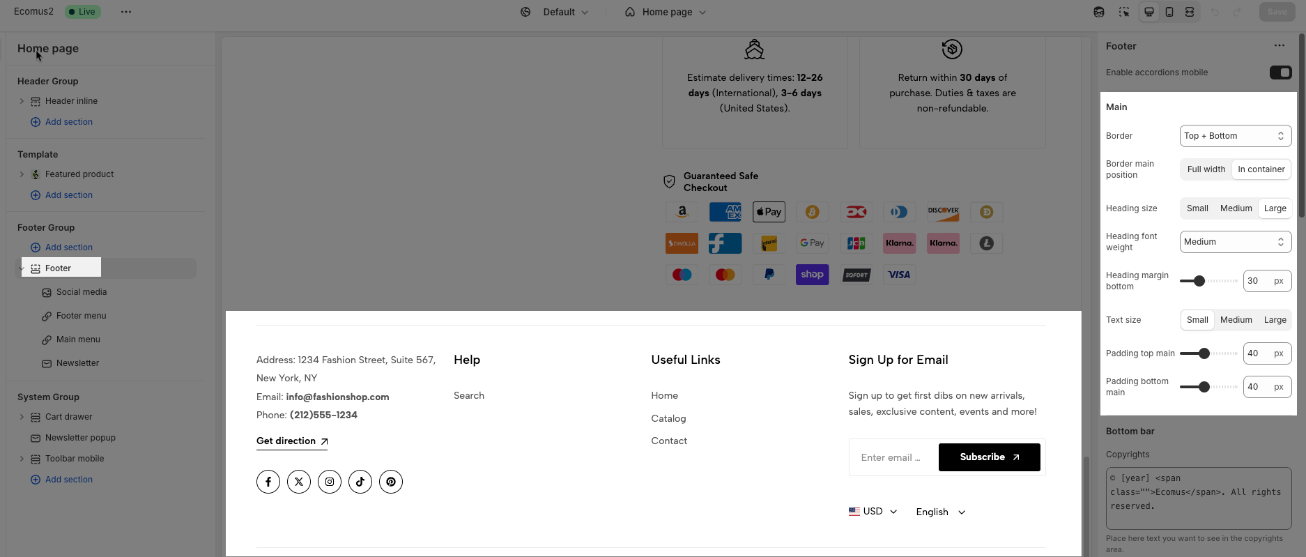
There are 3 blocks:
Menu
Social media
Newsletter
2.1. Menu
This block allows you add menu navigation.
Enable border right: This option only works on desktop
Heading: You can blank if you don't need.
Menu: Add menu from navigation.
Padding inner: Padding top, padding right, padding bottom, padding left. If you do not use it please blank and only works on desktop
Options for this column
Custom item width: The value of the unit is '%' only works on the desktop. On Mobile, it is default 100%.
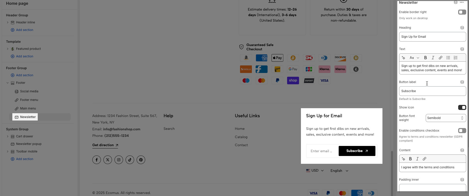
2.2. Newsletter
You can add Heading, Text and Button for the submit form.
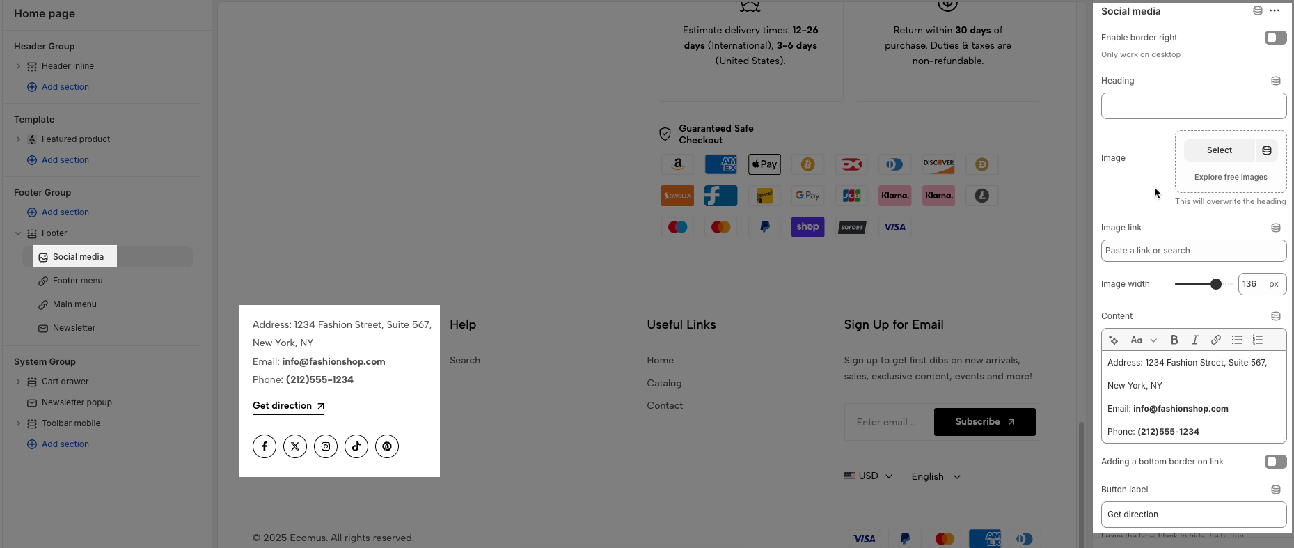
2.3. Social Media
You can add Heading, Image, Content, Button, Social for this block.