


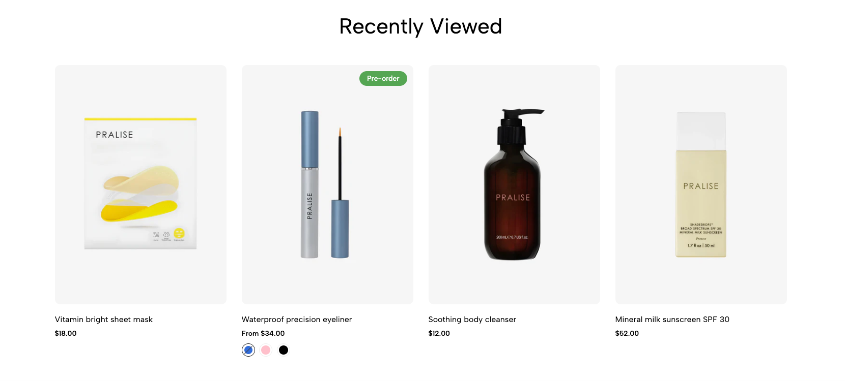
Intelligent "Recently Viewed Products" Section: Displays a list of products that customers have viewed during their current or previous browsing sessions (based on cookies or local storage). Supports customization of the number of products to show, layout style (grid, carousel), and product attributes (name, image, price). This feature helps enhance product discovery and repeat purchases.
1. How to access the Recently products section?
Step 01: From Shopify Admin, click on Online Store > Select Themes > In the Current theme section, click the Customize button.

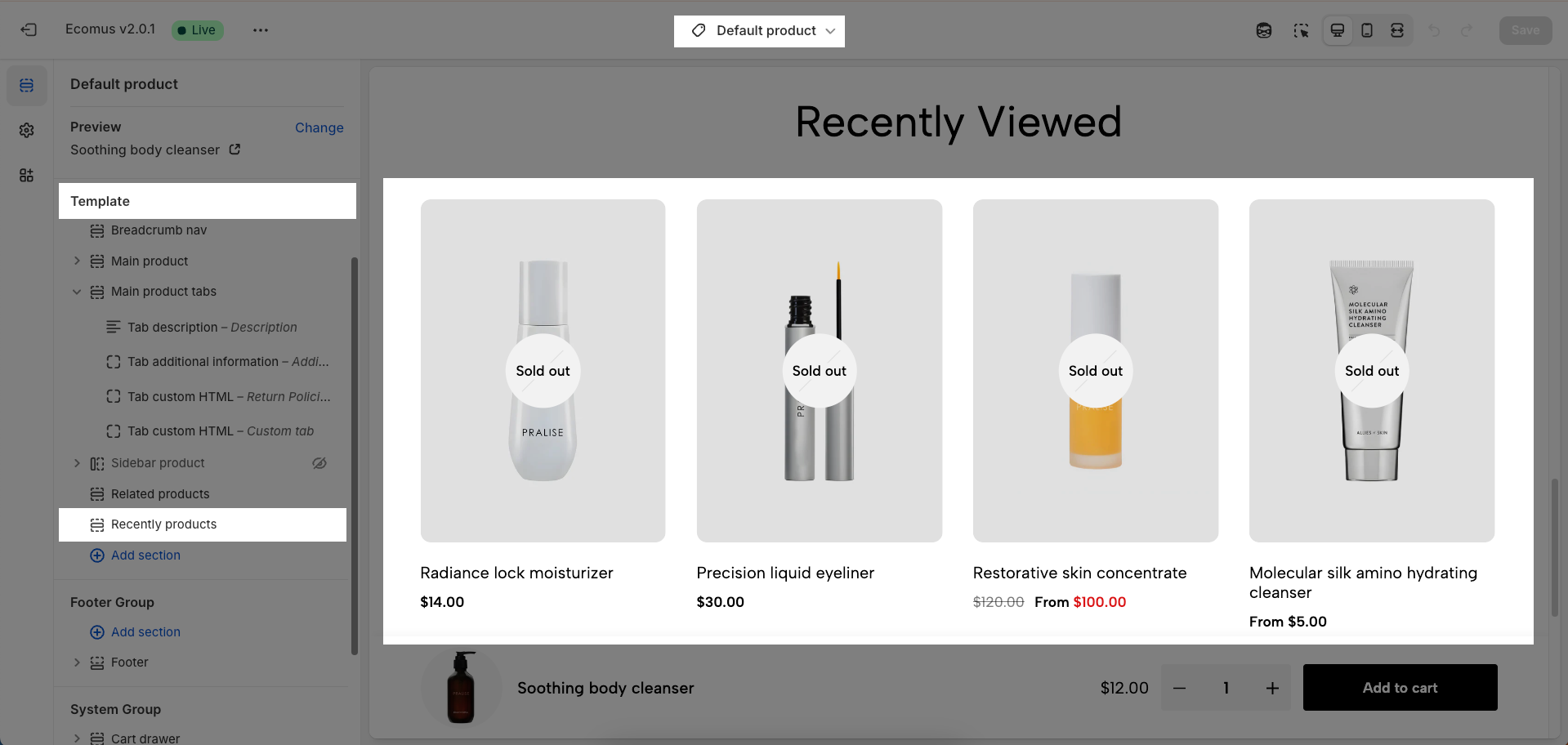
Step 02: In the theme editor (Customize), click to open dropdown pages in the topbar > select Products > select Default product > In the Sections tab, scroll and find Recently products in Template
2. How to customize the Recently products section?
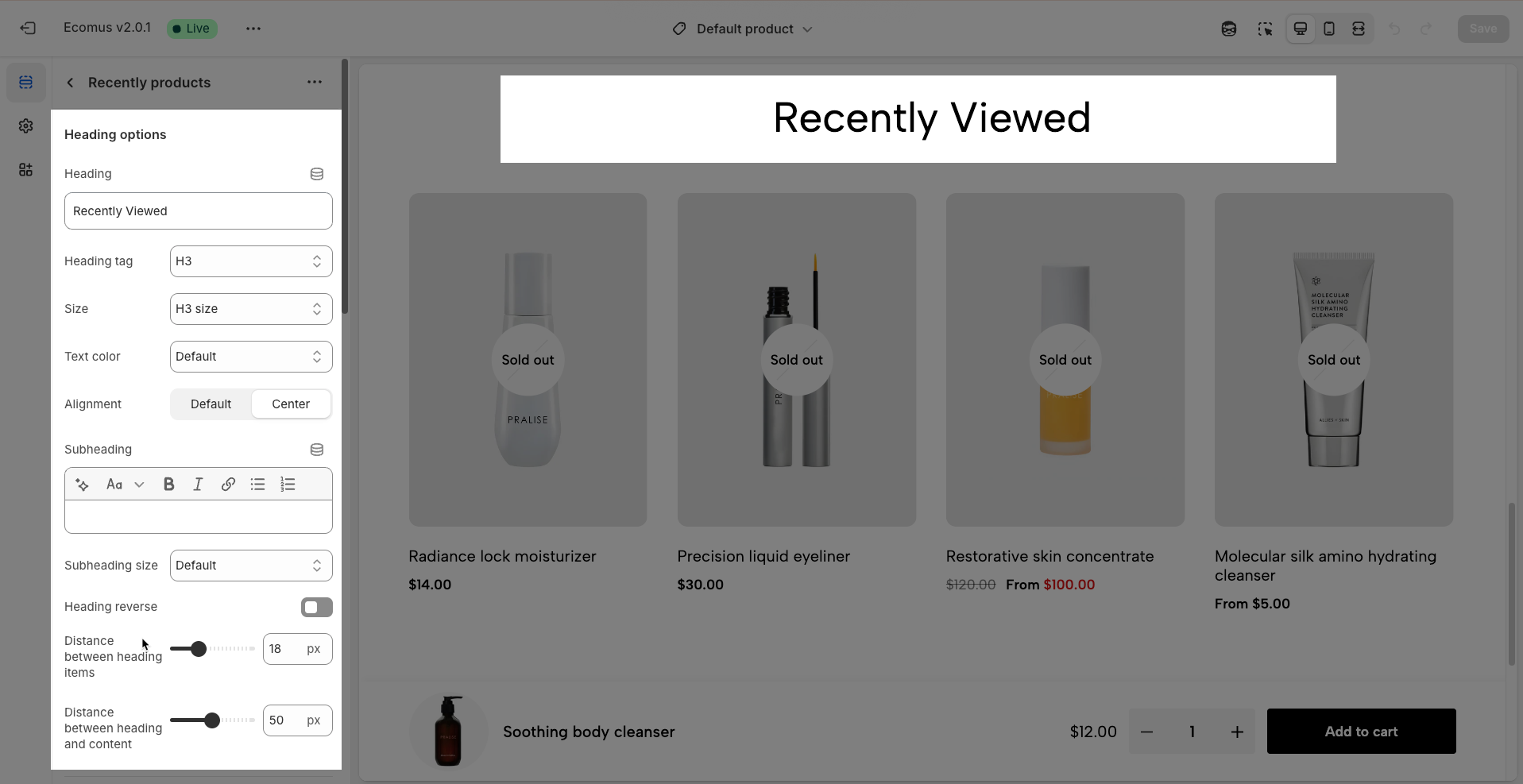
2.1. Heading options
Heading: Set the main title for your section to grab attention and build trust
Alignment: Choose how your heading is positioned—left or center
Heading tag: Select the HTML heading tag (H1, H2, H3, etc.) for SEO and accessibility purposes
Heading font size: Customize the font size of your heading to ensure it stands out while maintaining readability across all devices
Subheading: Add a short introductory text below the heading to provide context, helping visitors understand their value
Subheading size: Adjust the font size of the description text to make it easy to read without overpowering the main heading
Heading reverse: Enable this option to swap the position of the heading and description, allowing for alternative layouts that better suit your design preferences
Distance between heading items: Adjust the spacing between the heading and the description to ensure optimal readability and visual balance
Distance between heading and content: Set the gap between the heading section and the content to create a clear separation and improve the overall layout structure
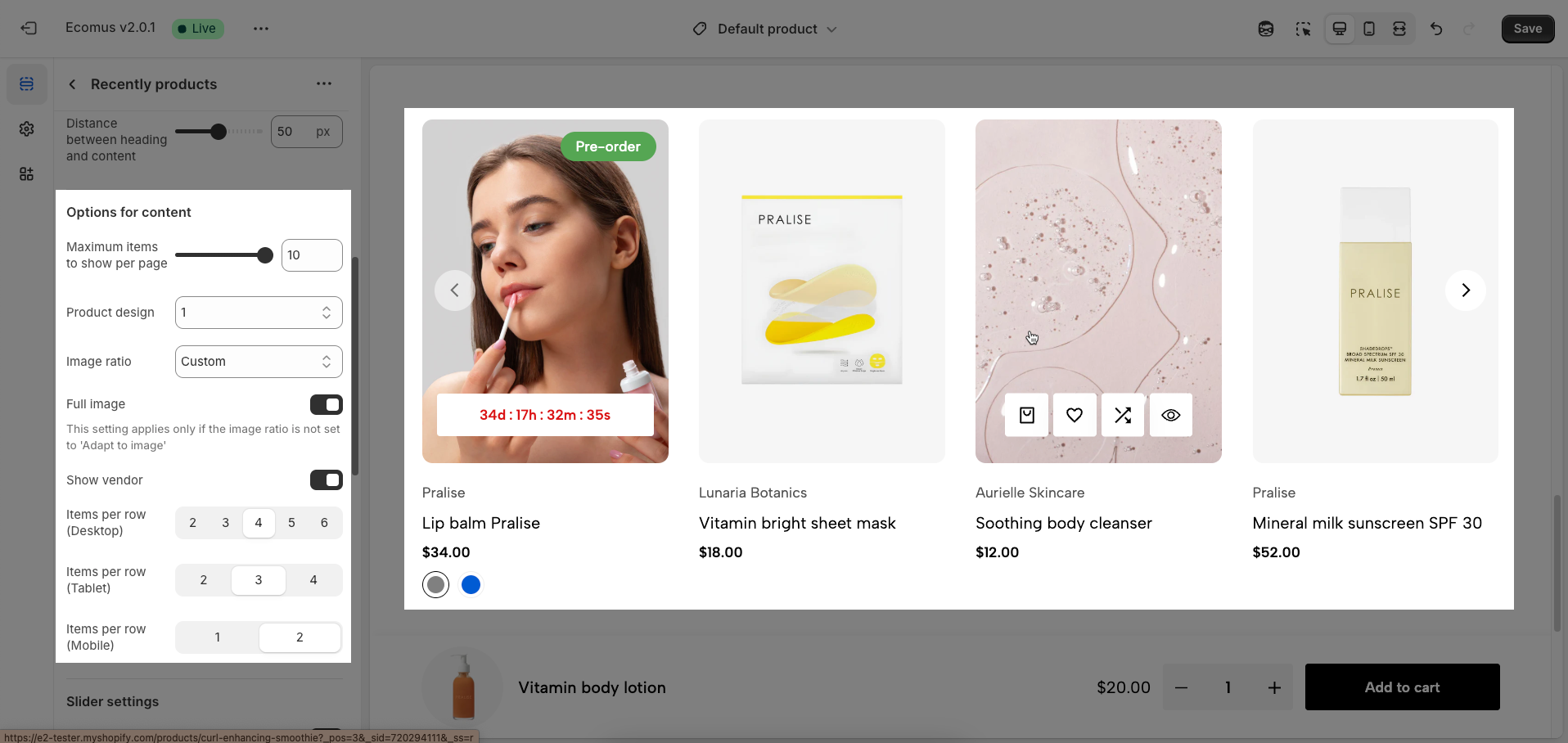
2.2. Options for content
Maximum items to show per page: Define the maximum total number of products displayed on a single page. This value affects pagination and page load performance.
Product design: Choose the overall display style for the products within the tab.
Image ratio: Choose the aspect ratio for the product images (Adapt to image, Square, Portrait, ASOS, Landscape, Custom)
Full image: If enabled, the complete product image will be shown without cropping.
This setting applies only if the image ratio is not set to 'Adapt to image'
Show vendor: Enable to display the vendor name of the product.
Items per row (Desktop): Define the number of products displayed in a single row on desktop screens. Adjusting this number helps optimize the display layout for larger screens, utilizing space effectively and creating visual balance for the product listing.
Items per row (Tablet): Define the number of products displayed in a single row on tablet screens. Typically, this number will be less than on desktop to suit the smaller screen size and ensure a comfortable browsing experience on touch devices.
Items per row (Mobile): Define the number of products displayed in a single row on mobile screens. Due to the small screen size, this value is usually 1 to ensure each product displays with sufficient space and is easy to interact with.
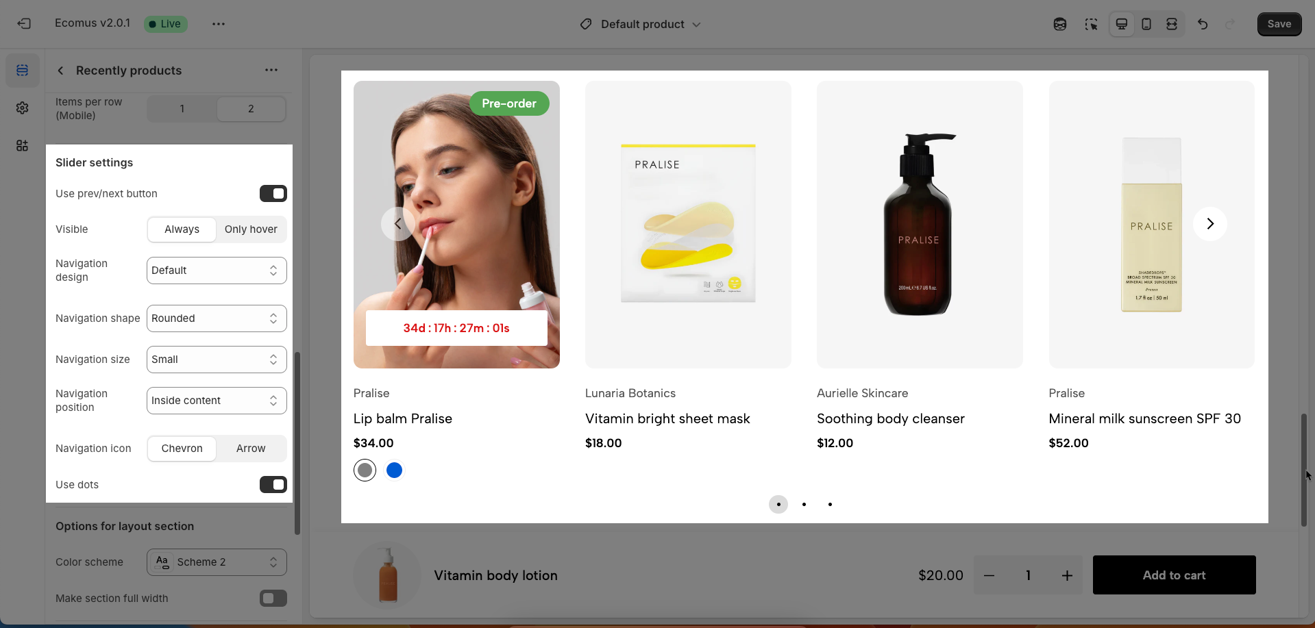
2.3. Slider settings
These options control the behavior and appearance of the carousel navigation.
Use prev/next button: This toggle switch enables or disables the display of the prev/next button on the carousel. When turned off, these buttons will not be visible.
Visible: This set of options determines when the prev/next button are visible.
Always: The buttons will be visible at all times.
Only hover: The buttons will only appear when the user hovers their mouse cursor over the carousel area.
Navigation design: This dropdown menu allows you to choose from different visual designs for the prev/next button. Options included Default, Outline, and Simple
Navigation shape: This dropdown menu lets you select the shape of the prev/next button. Options included Default, Rounded, and Rotate
Navigation size: This dropdown menu controls the size of the prev/next button. Options included Extra small, Small, Medium, and Large.
Navigation position: This dropdown menu controls the placement of the prev/next button. Option included:
Inside content: The prev/next buttons are displayed overlaid on top of the carousel's content.
Outside content: The prev/next buttons are positioned to the left and right of the carousel's items, in the surrounding container.
On the border: The prev/next buttons are placed along the edges or borders of the carousel container.
Navigation icon: This set of buttons allows you to choose the type of icon used for The prev/next buttons. You can select either "Chevron" (arrow-like symbols, often angled) or "Arrow" (more traditional straight arrows).
Use dots: This toggle switch enables or disables the display of pagination dots below the carousel. When turned off, pagination dots will not be visible.
2.4. Options for layout section
Enable section full width: This toggle switch, when turned on, will make the entire section span the full width of the browser window. When turned off, the section will likely be constrained to the website's main content width.
Color scheme: This dropdown menu allows you to select a predefined color scheme for the section. Clicking the dropdown will likely reveal other color palettes that you can apply to the background, text, and other elements within this section for a consistent look.
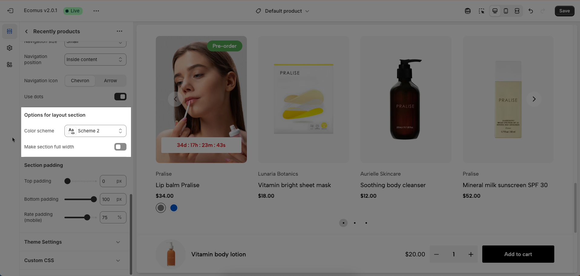
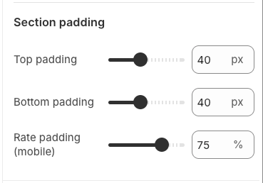
2.5. Section padding
Top padding: This option allows you to set the amount of space (padding) at the top of the slider section. You can drag the slider or directly enter a numerical value to adjust this spacing
Bottom padding: This option allows you to set the amount of space (padding) at the bottom of the slider section. You can drag the slider or directly enter a numerical value to adjust this spacing
Rate padding (mobile): This option allows you to set the aspect ratio-based padding for mobile view (in percentage). For example, 75% means the height will be 75% of the width.
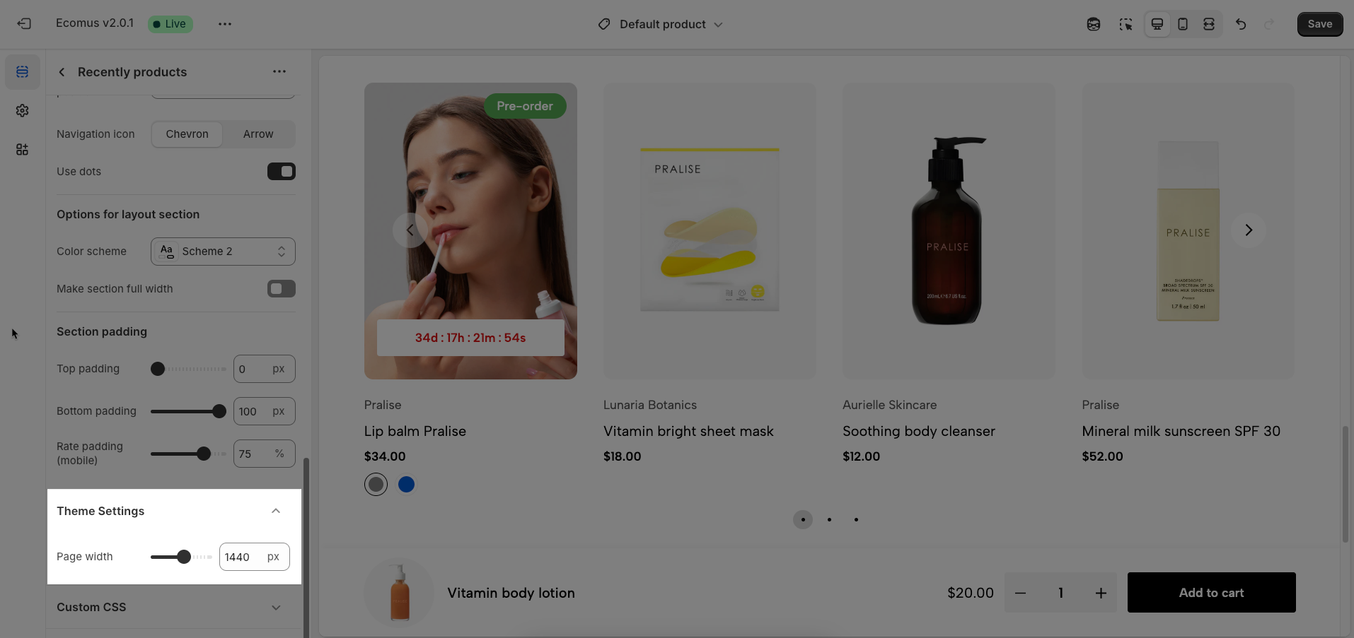
2.6. Theme Settings
Page width: Defines the maximum width of the page content, influencing layout and display on various devices.
2.7. Custom CSS
Allows users to customize by adding CSS rules, beyond the limitations of default settings. This allows for fine-tuning the design to every detail, to suit specific needs.
Add custom styles to this section only.
To add custom styles to your entire online store, go to theme settings.


