


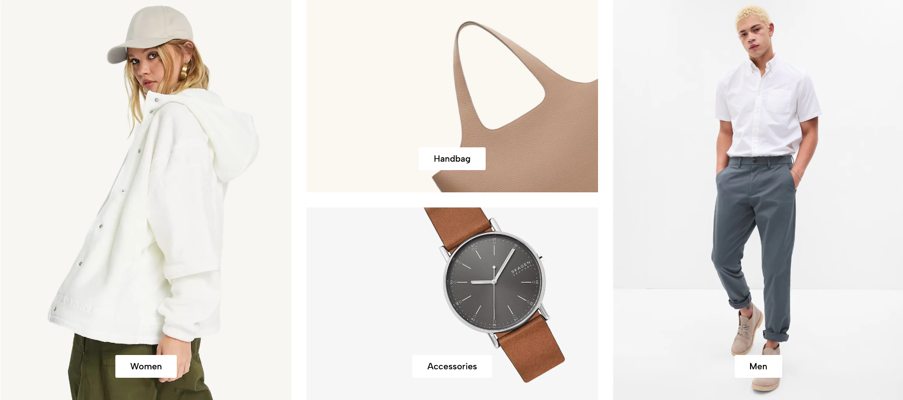
The Collection list manual section allows you to manually showcase specific product collections on your homepage. It offers flexible layout options for desktop, tablet, and mobile views. This section is ideal for curating featured categories or seasonal highlights.
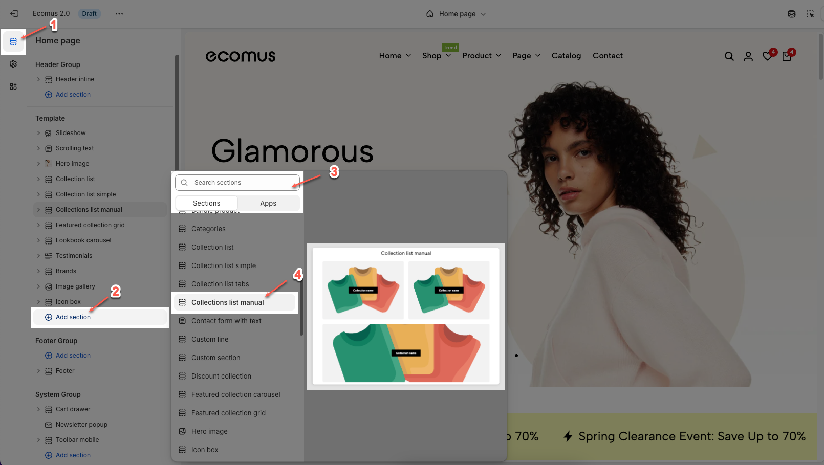
1. How to access the Collection list manual section?
Step 01: From Shopify Admin, click on Online Store > Select Themes > In the Current theme section, click the Customize button.

Step 02: In the theme editor (Customize), click the Sections button > Click the Add section button > In the Sections tab, scroll through the list or use the search bar to find and select the Collection list manual.
2. How to Customize the Collection list manual section?
2.1. Item block
To add a Item block to the Collection list manual, click the Add block button (plus icon ➕) under the Collection list manual.
After adding the Item block, you can adjust its settings using the sidebar—located on the right or left side of your screen depending on your device:
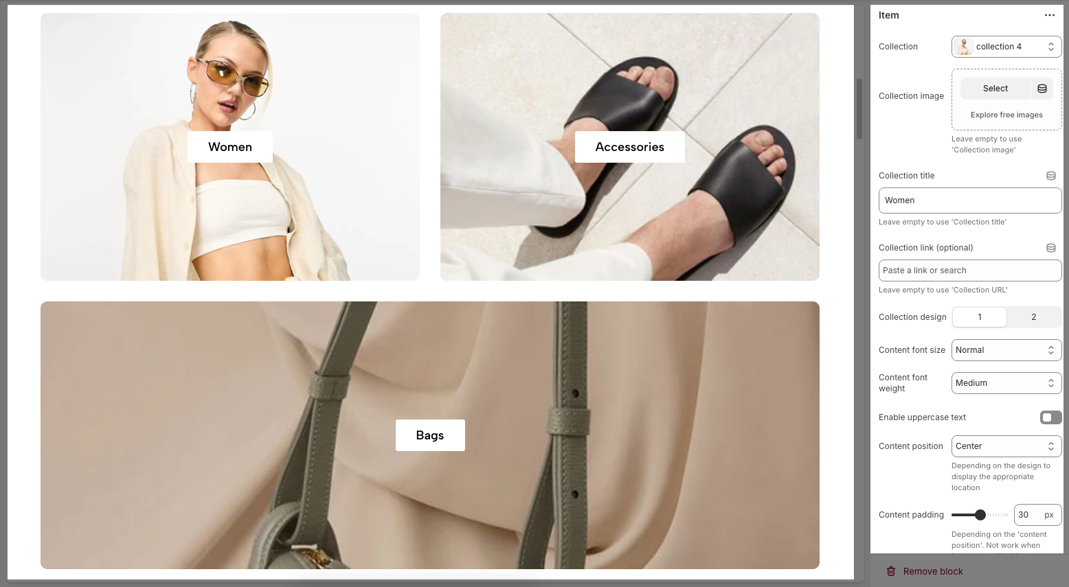
Collection: Select the specific collection to display in this block.
Collection image: Choose or upload a custom image; leave empty to use the default "collection image".
Collection title: Enter a custom title for the collection; leave empty to use the default "collection title".
Collection link (optional): Add a custom URL to override the default collection link; leave empty to use 'Collection URL'.
Collection design: Choose between layout design 1 or 2 for different visual styles.
Content font size: Set the size of the collection title text (e.g., Base, Normal, Medium, Large).
Content font weight: Adjust how bold the title text appears (e.g., Regular, Medium, Semibold, Bold).
Enable uppercase text: Toggle to display the title in all uppercase letters.
Content position: Define where the title appears within the image (e.g., Top, Center bottom, Left bottom, Right bottom). Depending on the design to display the appropriate location.
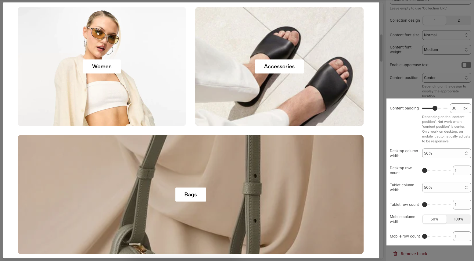
Content padding: Set the spacing between the text and the image edge, depending on the content position. Depending on the 'content position'. Not work when 'content position' is center. Only work on desktop, on mobile it automatically adjusts to be responsive
Desktop column width: Sets the width percentage of each collection block in a desktop layout (e.g., 50% for two items per row).
Desktop row count: Defines the number of rows to display for collections on desktop.
Tablet column width: Sets the width of each collection block on tablet view.
Tablet row count: Defines how many rows of collections appear on tablet devices.
Mobile column width: Sets how wide each collection block is on mobile (e.g., 50% for 2 per row, 100% for 1 per row).
Mobile row count: Determines the number of collection rows to show on mobile view.
2.2. Collection image section
After adding the Collection list manual section, you can customize its settings using the sidebar—located on the right or left side of your screen depending on your device.
2.2.1. Collection layout
Desktop row height: Sets the height of image rows on desktop view.
Tablet row height: Sets the height of image rows on tablet view.
Mobile row height: Sets the height of image rows on mobile view.
Spacing between items: Sets the space between items in desktop view.
Spacing between items (Tablet): Sets the space between items in tablet view.
Spacing between items (Mobile): Sets the space between items in mobile view.
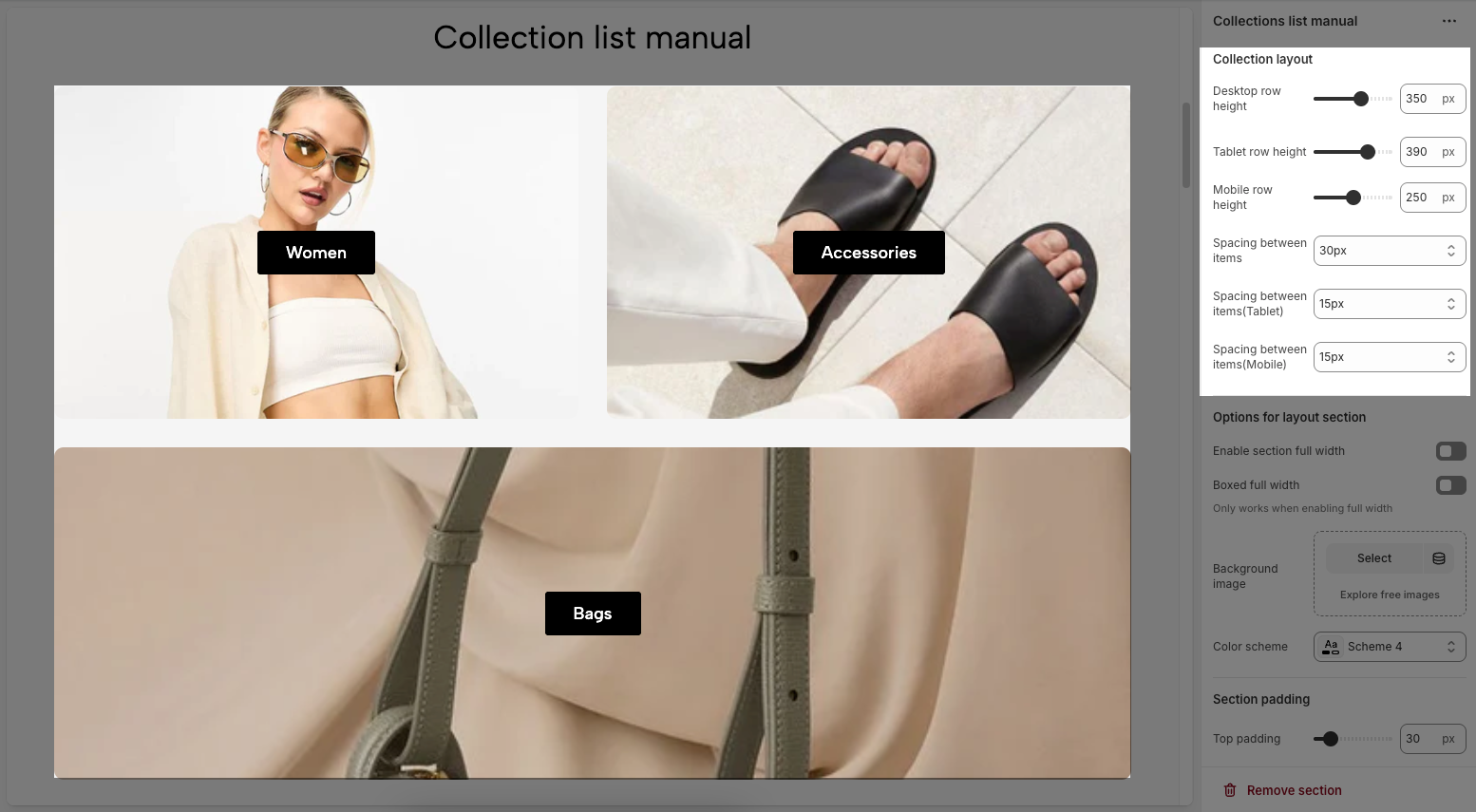
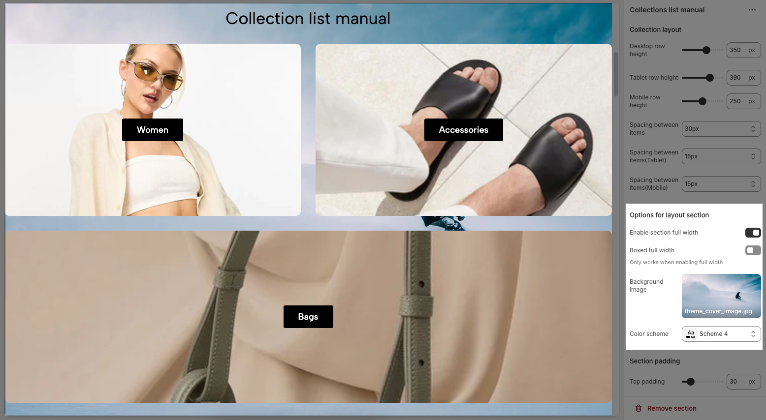
2.2.2. Options for layout section
Enable section full width: Enable to stretch the section across the entire screen width.
Boxed full width: Keep content centered within a box layout when full width is enabled.
Background image: There are two option
Select: Upload or choose a custom background image.
Explore free images: Browse a library of free background images.
Color scheme: Choose a predefined color scheme (this dropdown lets you pick different themes).
2.2.3. Section padding
Top padding: Sets the vertical spacing (in pixels) above the section.
Bottom padding: Sets the vertical spacing (in pixels) below the section.
Rate padding (mobile): Defines the vertical padding as a percentage for mobile devices, allowing responsive spacing.
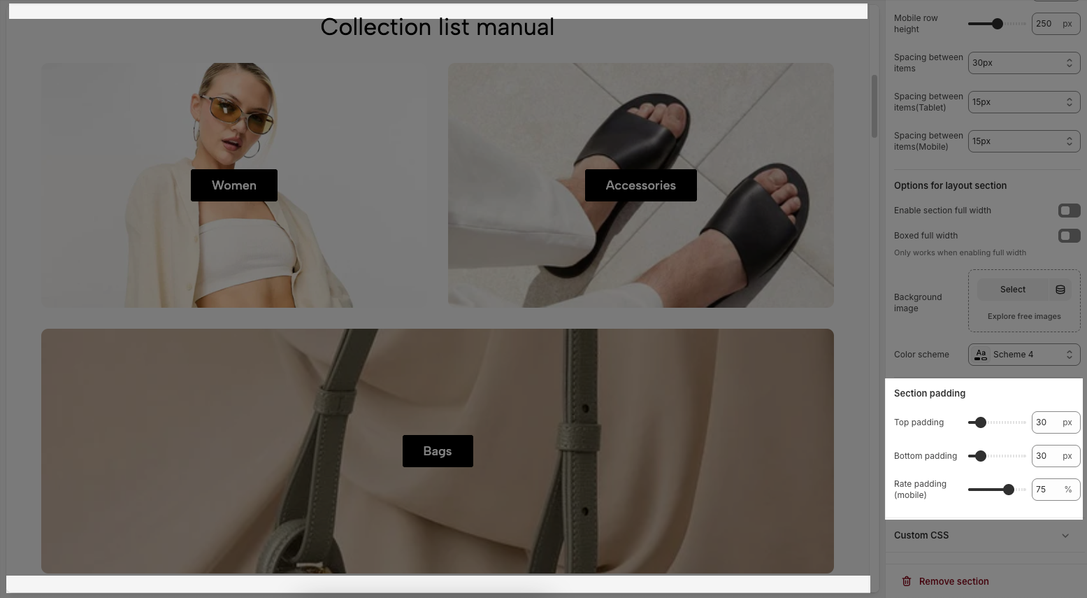
2.2.4. Custom CSS
Allows users to customize by adding CSS rules, beyond the limitations of default settings. This allows for fine-tuning the design to every detail, to suit specific needs.
Add custom styles to this section only.
To add custom styles to your entire online store, go to theme settings for detailed instructions.

2.3. Section heading
The Section Heading helps introduce and visually separate different parts of your homepage. Adding it gives context to your product collections or featured content, making the layout more organized and easier for customers to browse.
2.3.1. Section heading
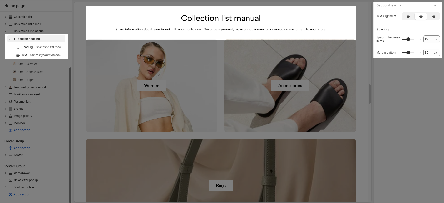
Text alignment: Choose how your section heading are aligned for the best visual impact. Center alignment creates a balanced look, while left or right alignment can match your overall design style.
Spacing between items: Adjust the spacing between items to create the perfect flow
Margin bottom: Set the bottom margin to control the spacing between the heading and the section
2.3.2. Heading/text block
Customizing the Heading allows you to control its appearance across different devices, ensuring consistency and responsiveness. Below are the available options to fine-tune your heading styles.
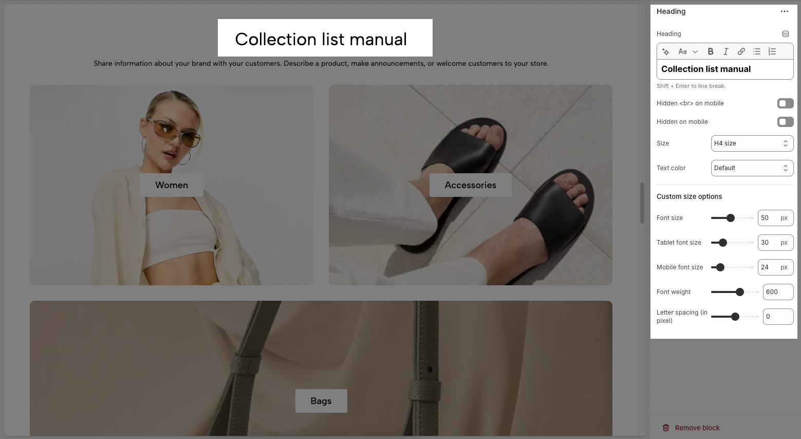
Heading: Allows you to enter and format the text (bold, italic, underline, lists, links, etc.). Shift + Enter to line break.
Hidden <br> on mobile: Disables line breaks on mobile devices.
Hidden on mobile: Hides the heading on mobile screens.
Size: Lets you select sizes for the heading.
Text color: Allows you to set the text color. Please follow this guideline to configure the Color.
Custom Size Options:
Font size: Adjusts the heading size for desktop.
Tablet font size: Adjusts the heading size for table.
Mobile font size: Adjusts the heading size for mobile.
Font weight: Controls the thickness of the text (e.g., 600 is semi-bold).
Letter spacing: Adjusts the space between characters.


