In this guide, you'll learn how to customize each sub-block inside the Group product block, which belongs to the Main product section, to effectively manage the content and layout of your product details.
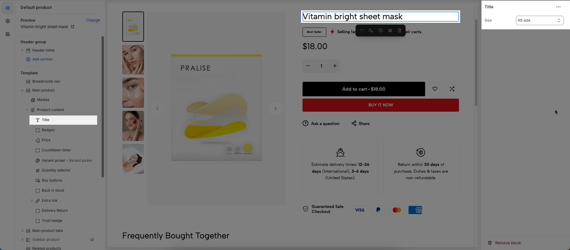
1. Title
To add Title block to the Product content, click the Add block button (plus icon ➕) under the Product content > Select Title block.
Once the Title block is added, you can customize its settings in the left or right-hand sidebar (depending on your screen size)
Size: Set the dimensions of this title
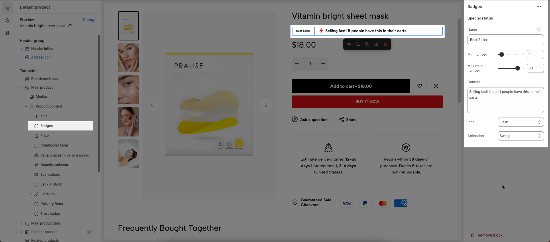
2. Badges
To add Badges block to the Product content, click the Add block button (plus icon ➕) under the Product content > Select Badges block.
Once the Badges block is added, you can customize its settings in the left or right-hand sidebar (depending on your screen size)
Name: Enter a name or descriptive label for this element.
Min number: Set the minimum permissible numerical value for this setting.
Maximum number: Set the maximum permissible numerical value for this setting.
Content: Enter the main content (text, image, video, etc.) to be displayed within this section.
Icon: Select the icon to display.
Animation: Select the animation effect to apply to the icon.
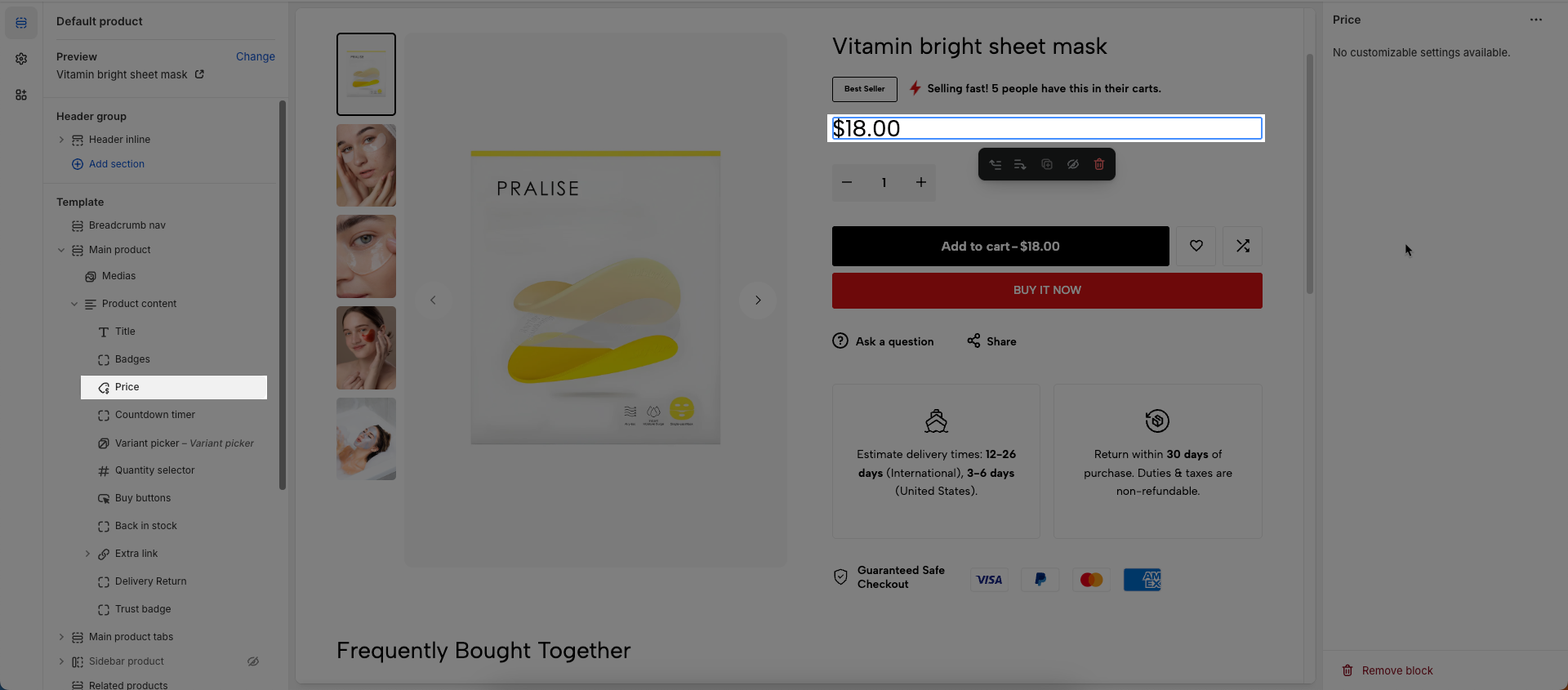
3. Price
To add Price block to the Product content, click the Add block button (plus icon ➕) under the Product content > Select Price block.
Once the Price block is added, you can customize its settings in the left or right-hand sidebar (depending on your screen size)
No customizable settings available.
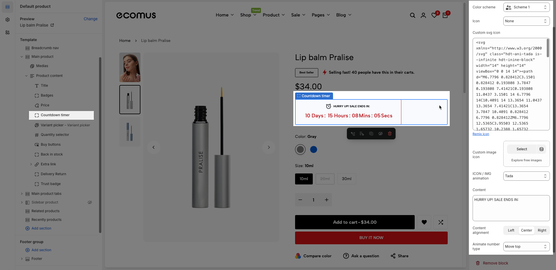
4. Countdown timer
To add Countdown timer block to the Product content, click the Add block button (plus icon ➕) under the Product content > Select Countdown timer block.
Once the Countdown timer block is added, you can customize its settings in the left or right-hand sidebar (depending on your screen size)
The countdown timer is automatically show if product has metaobjects theme_countdown or metafield 'countdown'
Click the link How to create a countdown metafield to view the instructions for creating a countdown metafield.
Color scheme: Select the color scheme to be applied to this section or component.
Icon: Choose a predefined icon to display next to the countdown timer (e.g. Door lock).
Custom SVG Icon: Paste your own SVG code here to use a custom icon instead of the default options.
Line Awesome SVG icons: Click the link to browse and copy free SVG icons from the Line Awesome library.
Custom Image Icon: Upload or select a custom image to display as the icon.
ICON / IMG Animation: Choose an animation effect (e.g. Tada) to apply to the icon or image
Content: Enter the countdown message text (e.g. “Hurry up! Sale Ends in”).
Content Alignment: Select how the text and timer should be aligned — left, center, or right.
Animate number type: Select the style or effect of animation to apply to numerical values (e.g., move top, move bottom, scale, rotate).
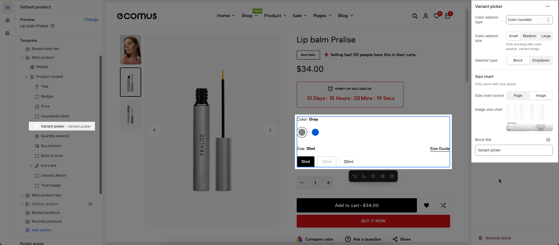
5. Variant picker
To add Variant picker block to the Product content, click the Add block button (plus icon ➕) under the Product content > Select Variant picker block.
Once the Variant picker block is added, you can customize its settings in the left or right-hand sidebar (depending on your screen size)
Color selector type (color rounded, rounded, block, dropdown...): Select the display type for the color variant selector. This directly impacts the user interface and how customers interact with color options.
Color selector size: Adjust the display size of the color swatches.
Only working with color swatch, variant image
Selector type: Choose the display style for the selector:
Block: Options are presented as distinct clickable blocks or tiles.
Dropdown: Options are presented within a traditional dropdown menu.
Size chart
Only show with size option.
Size chart source: Select the data source for the size chart.
Page: Uses content from an existing Shopify page as the size chart. This method is flexible for complex text and tabular content.
Image: Uses an image as the size chart.
Page size chart: Select the Shopify page that contains your size chart content
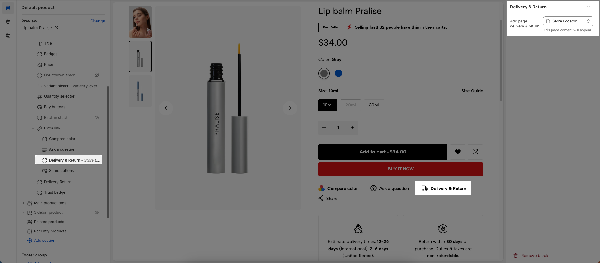
This page content will appear.
Image size chart: Upload or select the image you want to use as the size chart
Block title: enter title you want to display
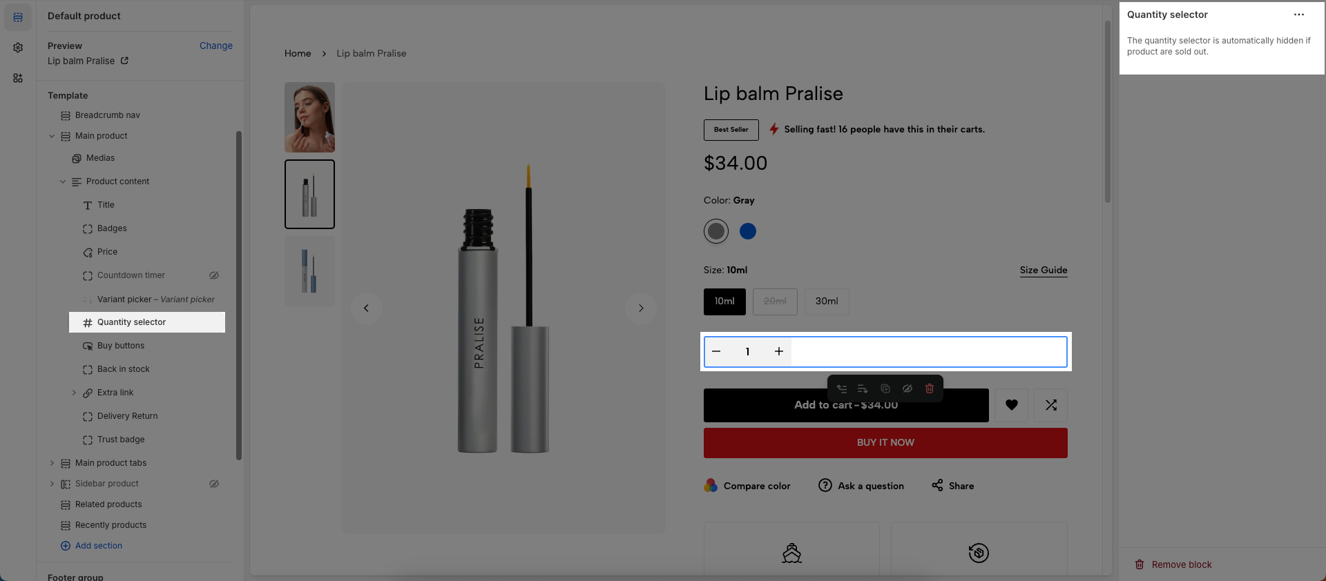
6. Quantity selector
To add Quantity selector block to the Product content, click the Add block button (plus icon ➕) under the Product content > Select Quantity selector block.
Once the Quantity selector block is added, you can customize its settings in the left or right-hand sidebar (depending on your screen size)
The quantity selector is automatically hidden if product are sold out.
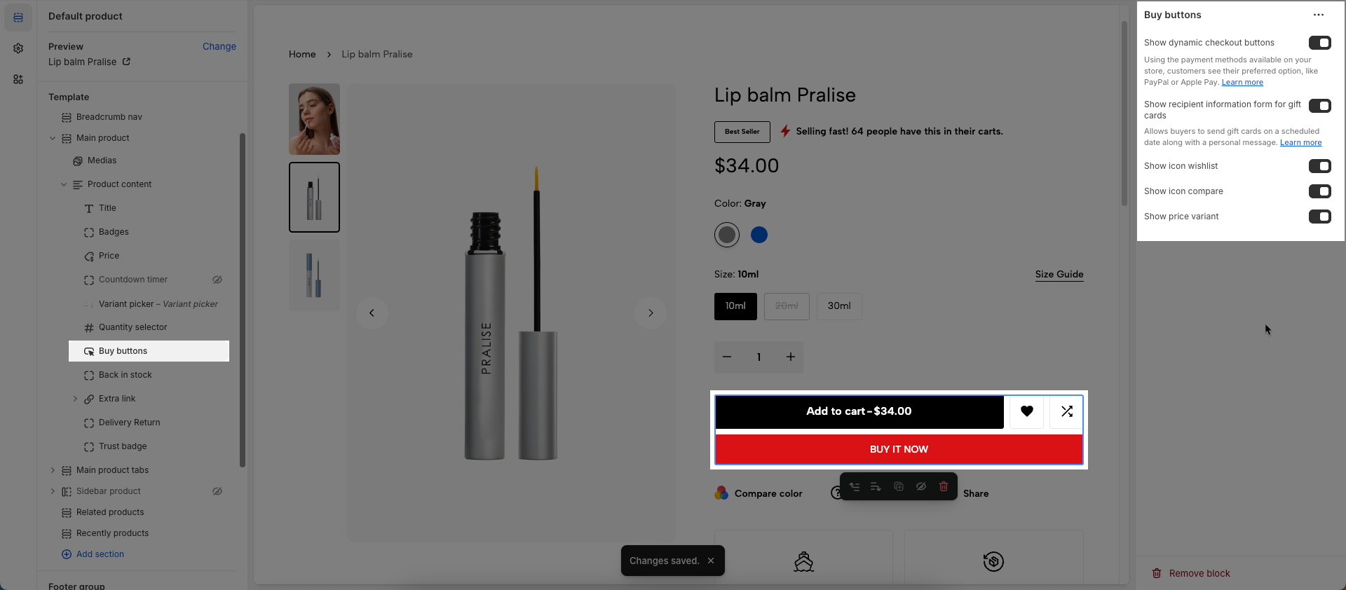
7. Buy buttons
To add Buy buttons block to the Product content, click the Add block button (plus icon ➕) under the Product content > Select Buy buttons block.
Once the Buy buttons block is added, you can customize its settings in the left or right-hand sidebar (depending on your screen size)
Show dynamic checkout buttons: Enable this option to display accelerated checkout buttons (e.g., Shop Pay, Google Pay, Apple Pay, PayPal)
Using the payment methods available on your store, customers see their preferred option, like PayPal or Apple Pay. Learn more
Show recipient information form for gift cards: Enable this option to display a recipient information form when the product is a gift card.
Allows buyers to send gift cards on a scheduled date along with a personal message. Learn more
Show icon wishlist: Enable this option to display a Wishlist icon in this section
Show icon compare: Enable this option to display a Product Compare icon on this section.
Show price variant: Enable this option to display price of each variant
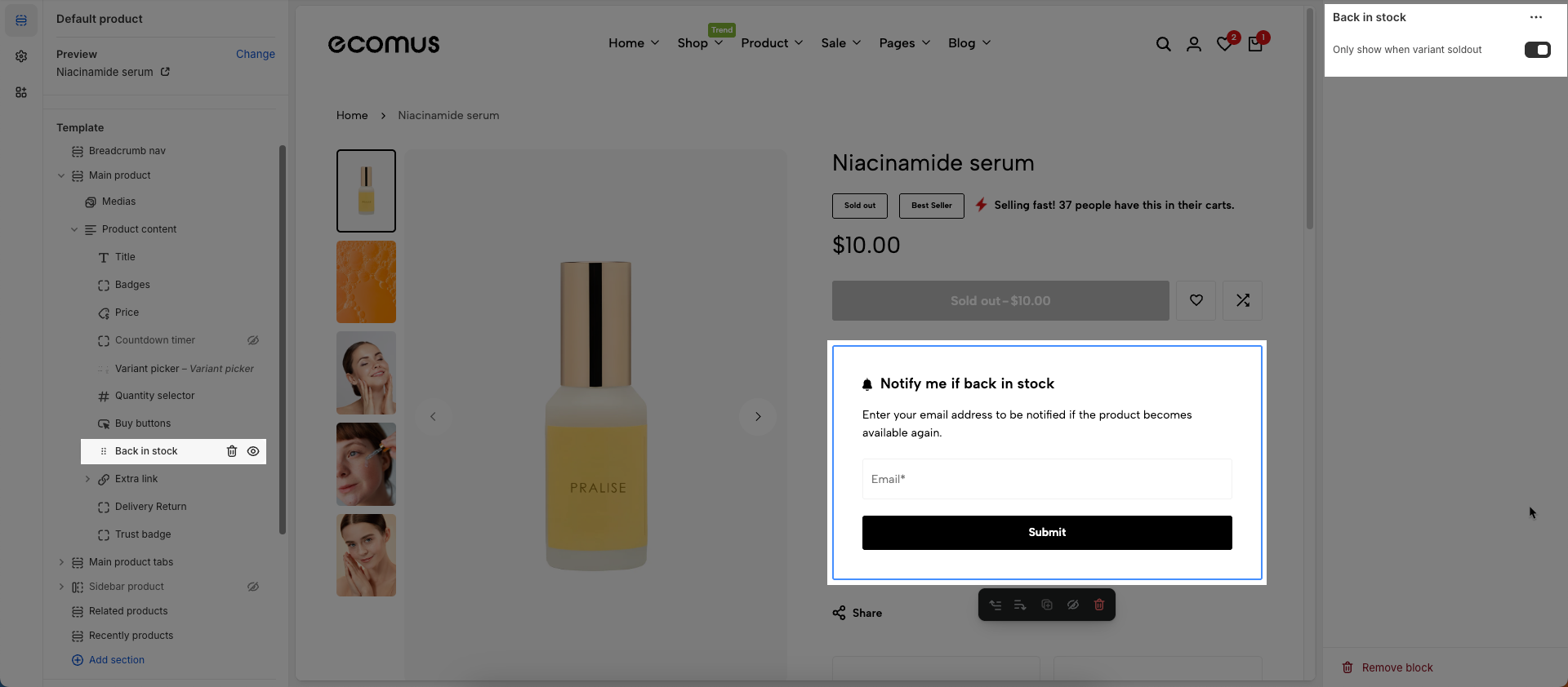
8. Back in stock
To add Back in stock block to the Product content, click the Add block button (plus icon ➕) under the Product content > Select Back in stock block.
Once the Back in stock block is added, you can customize its settings in the left or right-hand sidebar (depending on your screen size)
Only show when variant soldout: Check to display this element only when a specific product variant is out of stock (sold out)
9. Extra link
To add Extra link block to the Product content, click the Add block button (plus icon ➕) under the Product content > Select Extra link block.
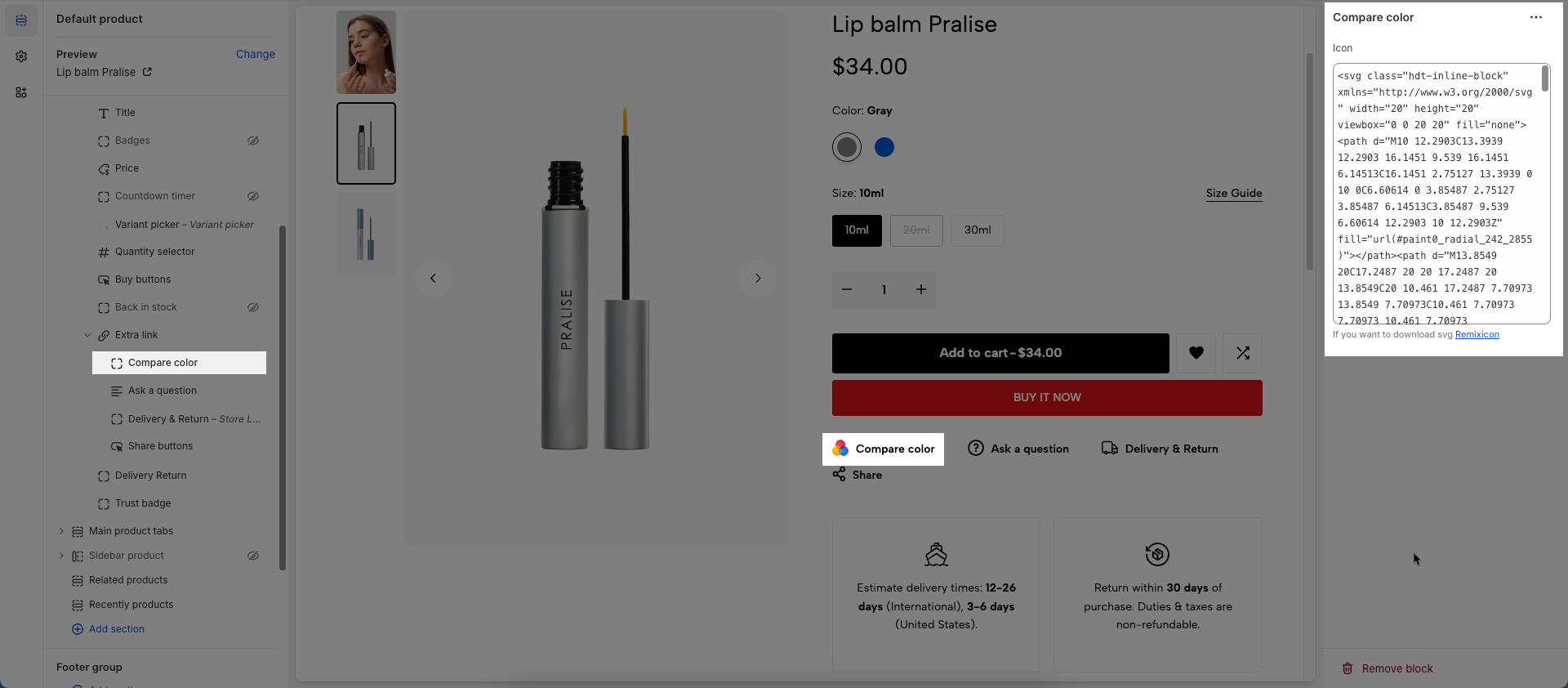
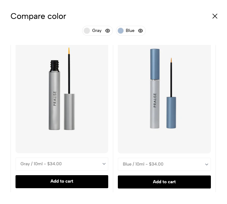
9.1. Compare color
To add Compare color block to the Extra link, click the Add block button (plus icon ➕) under the Extra link.
After the Compare color block is added, a link labeled "Compare color" will appear. You can click on this link to open a popup and submit your information to the store owner.
Icon: If you want to download svg Remixicon
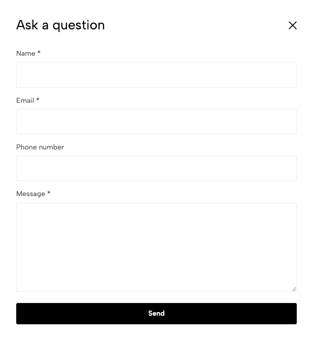
9.2. Ask a question
To add Ask a question block to the Extra link, click the Add block button (plus icon ➕) under the Extra link.
After the Ask a question block is added, a link labeled "Ask a question" will appear. You can click on this link to open a popup and submit your information to the store owner.
Show phone: Check to display the contact phone number on the form.
9.3. Delivery & Return
To add Delivery & Return block to the Extra link, click the Add block button (plus icon ➕) under the Extra link.
After the Delivery & Return block is added, a link labeled "Delivery & Return" will appear. You can click on this link to open a popup and submit your information to the store owner.
Add page delivery & return: This page content will appear.
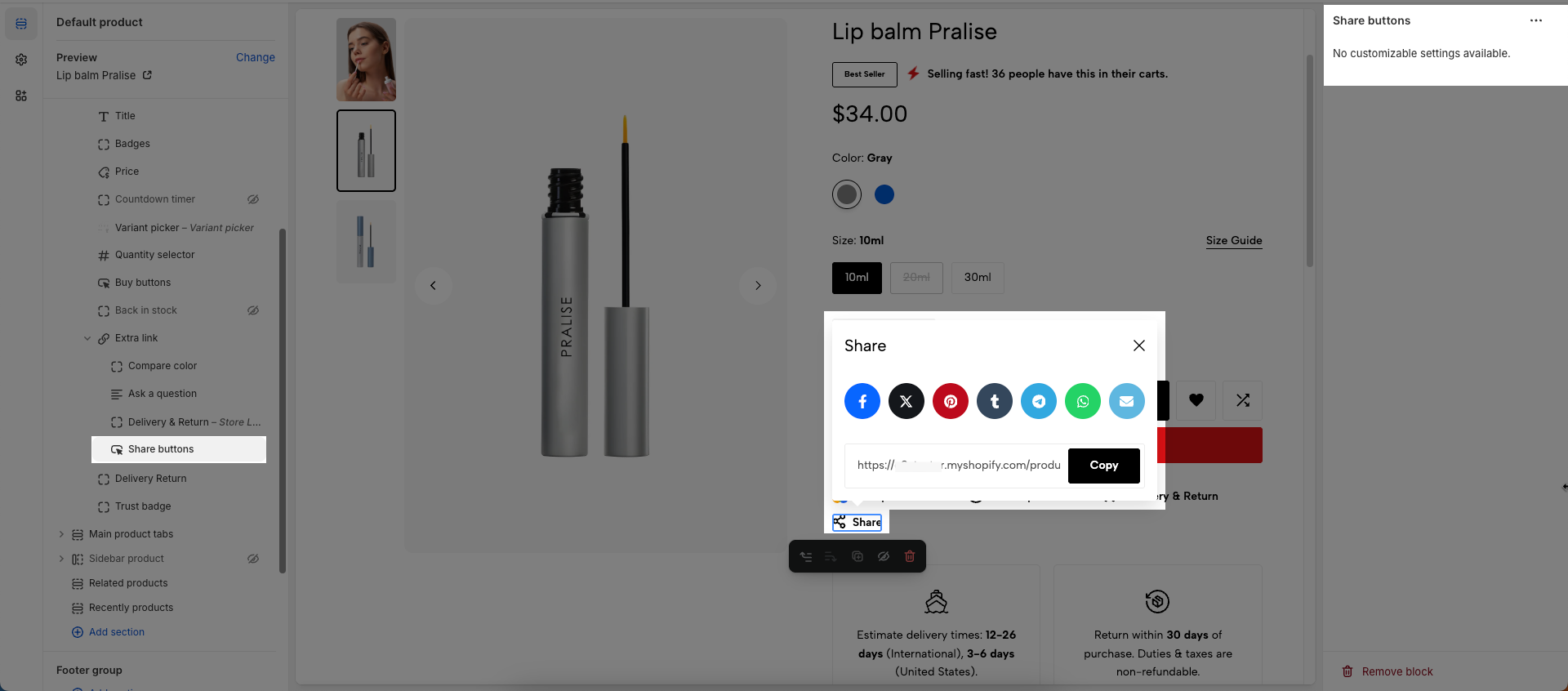
9.4. Share buttons
To add Share buttons block to the Extra link, click the Add block button (plus icon ➕) under the Extra link.
After the Share buttons block is added, a link labeled "Share buttons" will appear. You can click on this link to open a popup and submit your information to the store owner.
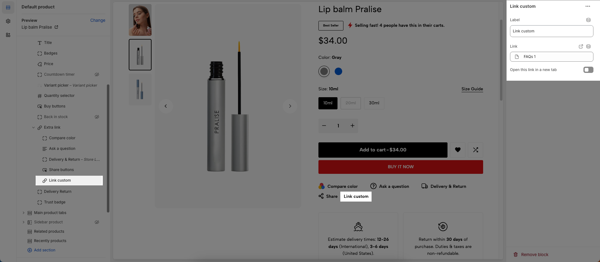
9.5. Link custom
To add Link custom block to the Extra link, click the Add block button (plus icon ➕) under the Extra link.
After the Link custom block is added, a link labeled "Link custom" will appear. You can click on this link to open a popup and submit your information to the store owner.
Label: Enter the text that will be displayed for this label. This is typically the visible text that a customer will see and click on.
Link: Enter the URL or select a page/product/collection you want to link to. This is the destination when a user clicks on the element.
Open this link in a new tab: Check this option to open the link in a new browser tab or window. When unchecked, the link will open in the current tab.
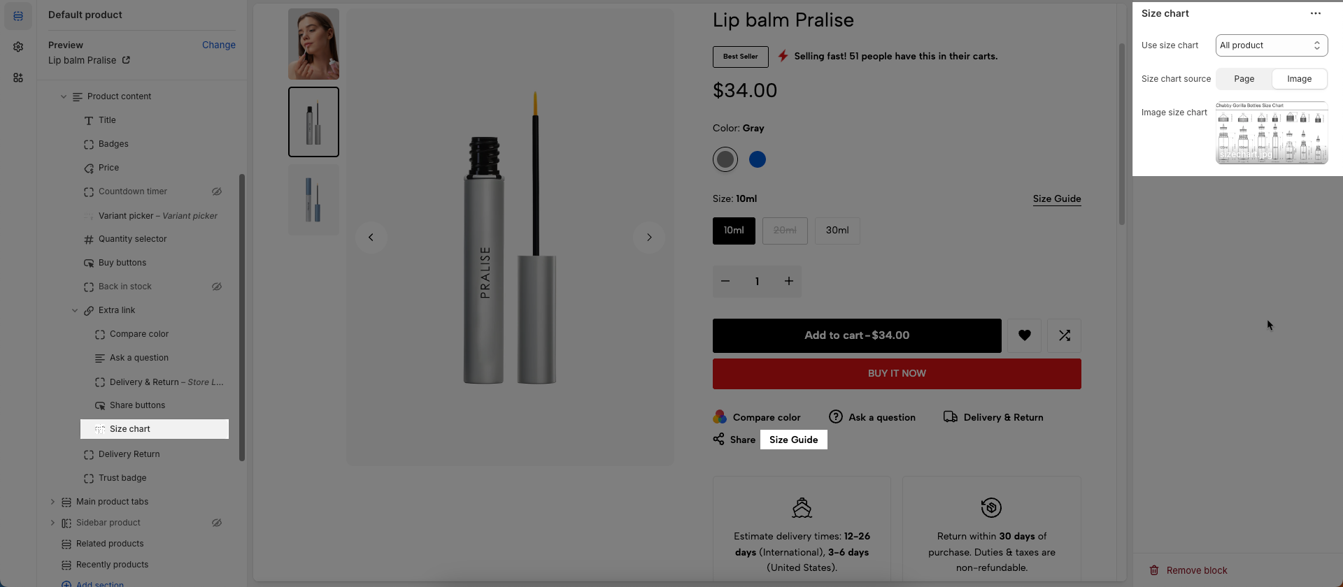
9.6. Size chart block
To add Size chart block to the Extra link, click the Add block button (plus icon ➕) under the Extra link.
Once the Size chart block is added, you can customize its settings in the left or right-hand sidebar (depending on your screen size)
Use size chart: Choose when the size chart will be displayed.
All products: The size chart will appear for all products in your store.
Only product has option name 'size': The size chart will only appear for products that have a variant option named 'size' (e.g., 'Size', 'S', 'M'). This is the most flexible option, ensuring the chart only shows when relevant.
Size chart source: Select the source for displaying the product size chart (page or image), customizing how size information is shown\
Page size chart: Select the page containing the product size chart information, displaying content from the selected page.
Image size chart: Upload an image containing the product size chart information, displaying the uploaded image.
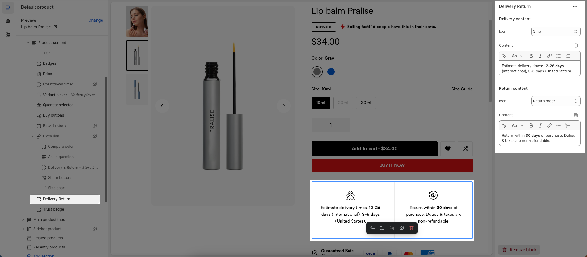
10. Delivery Return
To add Delivery Return block to the Product content, click the Add block button (plus icon ➕) under the Product content > Select Delivery Return block.
Once the Delivery Return block is added, you can customize its settings in the left or right-hand sidebar (depending on your screen size)
Delivery / Return content
Icon: Select the icon to display.
Content: Enter the main content to be displayed within this section.
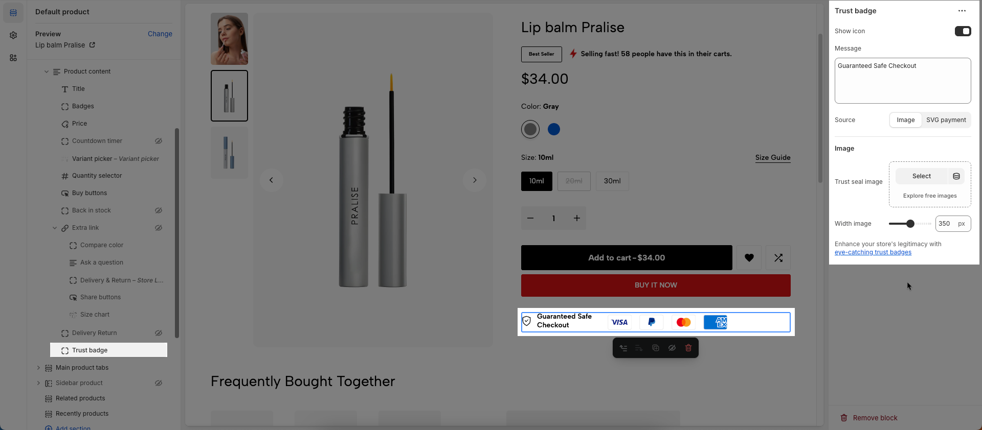
11. Trust badge
To add Trust badge block to the Product content, click the Add block button (plus icon ➕) under the Product content > Select Trust badge block.
Once the Trust badge block is added, you can customize its settings in the left or right-hand sidebar (depending on your screen size)
Show icon: Check to display the icon within this element.
Message: Enter the content of the message you want to display. This is the main text that will appear alongside the chosen icon.
Font size: Select the font size for the message text
Source: Select the source of the icon that accompanies the message
Image: Allows you to upload or select an image file (.jpg, .png, .gif) from your library to use as the icon.
SVG Payment: Provides a list of standard Shopify payment icons (e.g., Visa, Mastercard, American Express, PayPal) rendered as SVGs
Image
Trust seal image: Upload or select the trust seal image you want to display
Width image: Select the display width of the trust seal image
Enhance your store's legitimacy with eye-catching trust badges
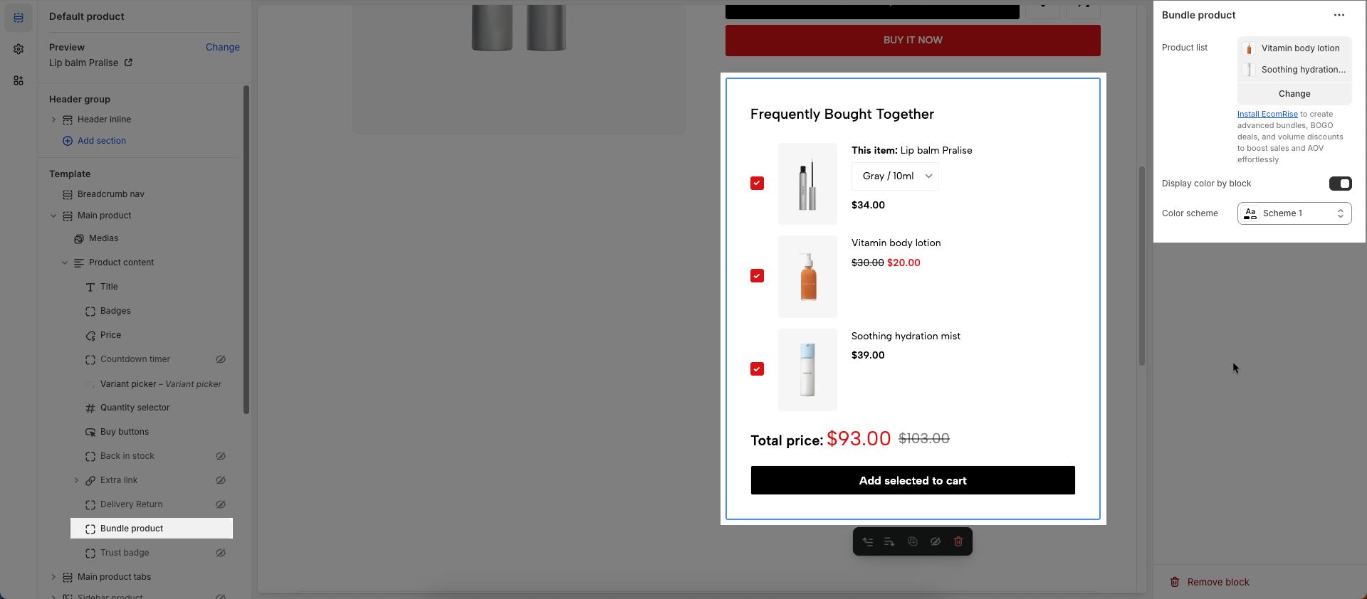
12. Bundle product
To add Bundle product block to the Product content, click the Add block button (plus icon ➕) under the Product content > Select Bundle product block.
Once the Bundle product block is added, you can customize its settings in the left or right-hand sidebar (depending on your screen size)
Product list: Select the list of products to be displayed in this section.
Display color by block: Check to allow individual blocks within this section to have their own distinct color schemes, independent of the section's main color scheme.
Color scheme: Select the color scheme to be applied to this section or component.
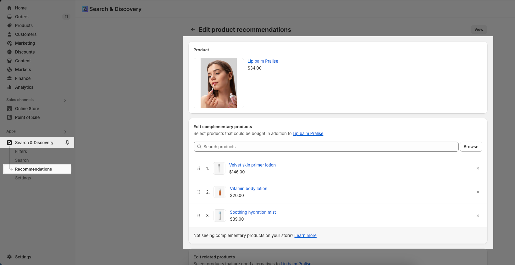
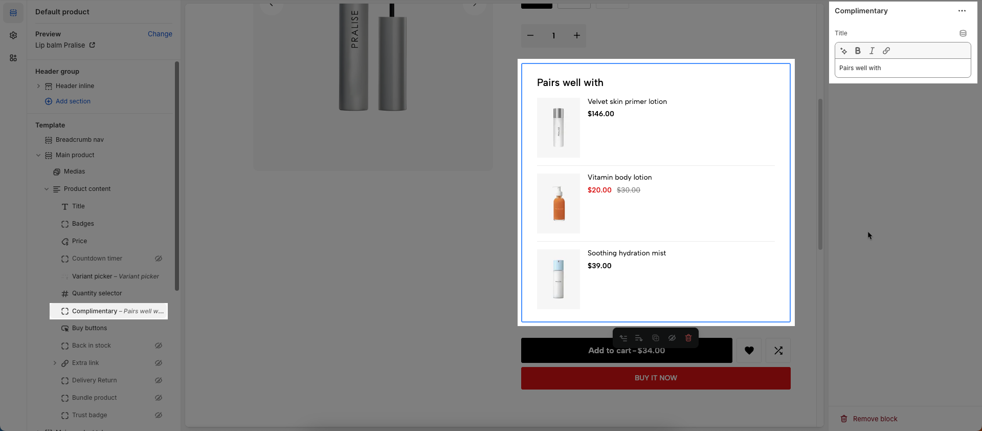
13. Complimentary
You can add the complementary products block to your product pages in the theme editor. Learn how to use the Shopify Search & Discovery app to choose complementary products for your website’s product pages.
Displaying complementary products to customers makes it easier for them to discover new products, and can help increase online store sales.
Note: To have this feature, you must install Shopify Search & Discovery
Configure Product Recommendation in the app.
You need to access the app and configure the product related.
From your Shopify admin homepage, open the Search & Discovery app, navigate to the "Recommendations" tab, then search for and select the product you want. Next, choose the complementary products you'd like to associate with it > Save
Add Complimentary block to Product Main.
To add Complimentary block to the Group Product, click the Add block button (plus icon ➕) under the Group Product > Select Complimentary block
Once the Complimentary block is added, you can customize its settings in the left or right-hand sidebar (depending on your screen size)
From there, modify the Title, and arrange its placement as desired using drag-and-drop functionality.
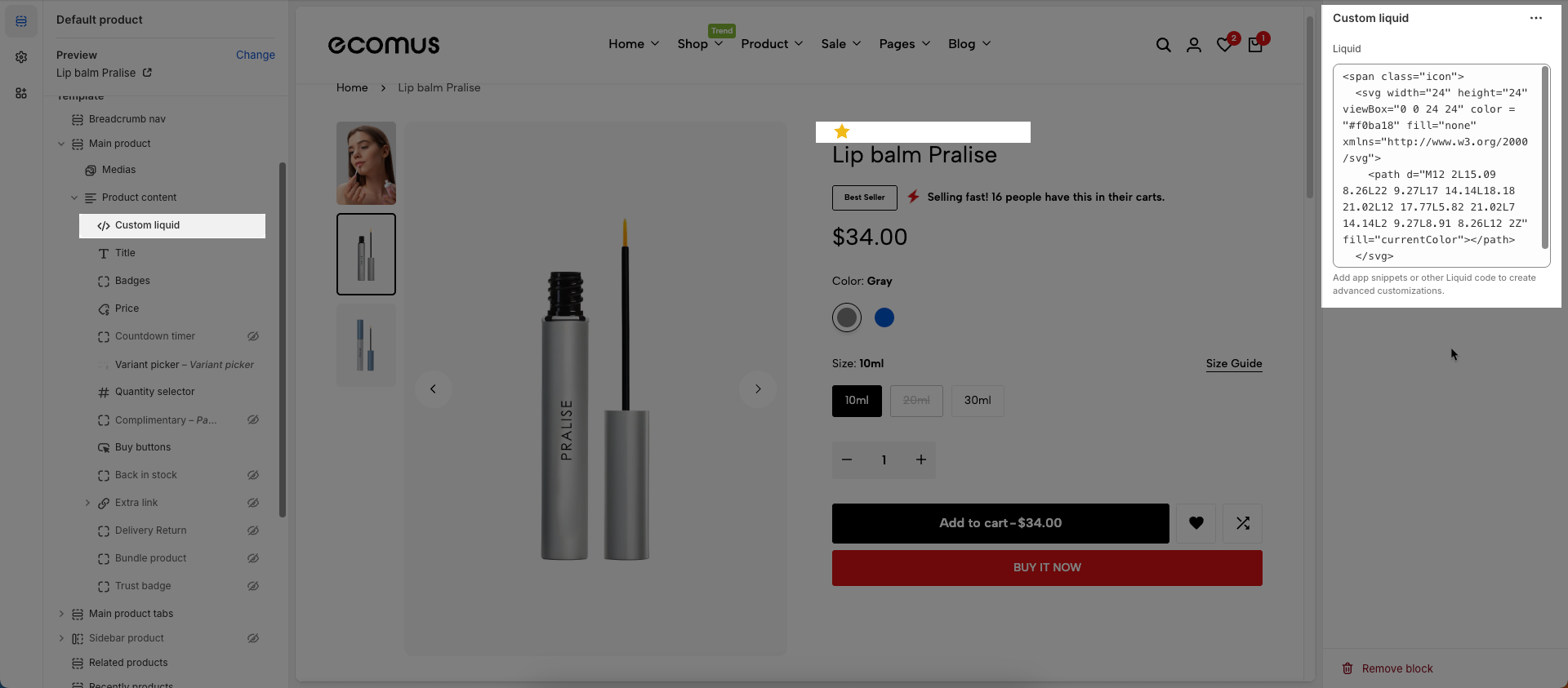
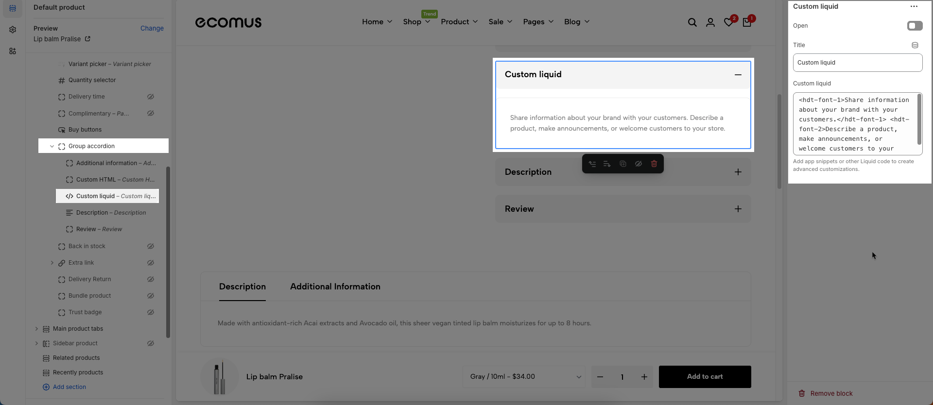
14. Custom liquid
To add Custom liquid block to the Product content, click the Add block button (plus icon ➕) under the Product content > Select Custom liquid block.
Once the Custom liquid block is added, you can customize its settings in the left or right-hand sidebar (depending on your screen size)
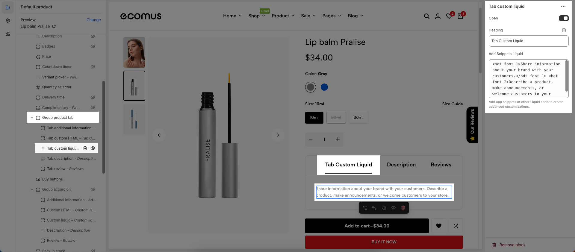
Liquid: Add app snippets or other Liquid code to create advanced customizations.
Example shown: <hdt-font-1>Share information about your brand with your customers.</hdt-font-1> <hdt-font-2>Describe a product, make announcements, or welcome customers to your store.</hdt-font-2>
15. Delivery time
To add Delivery time block to the Group Product, click the Add block button (plus icon ➕) under the Group Product > Select Delivery time block.
Once the Delivery time block is added, you can customize its settings in the left or right-hand sidebar (depending on your screen size)
Display an approximate date of delivery.
Hide with 'pre-order': When enabled, this component will automatically be hidden if the product is in a 'pre-order' state. This helps prevent customer confusion when the item isn't immediately available for purchase.
Icon: Select the icon to be displayed. Options are typically a predefined list of icons available within the theme
Custom SVG icon: You can paste the raw SVG code directly into this field (Line Awesome)
Custom image icon: Upload or select the image file (.jpg, .png, .gif) you want to use as the icon.
ICON / IMG animation: Select the animation effect to be applied to the icon (or image). Animations can make the icon stand out and grab user attention.
Delivery text: Enter the delivery or supplementary text message that will appear alongside the icon.
Order in the next [hour] to get this to you between [date_start] and [date_end], Order in the next [hour] to get it by [date_end], Order in the next [hour] to get it soon
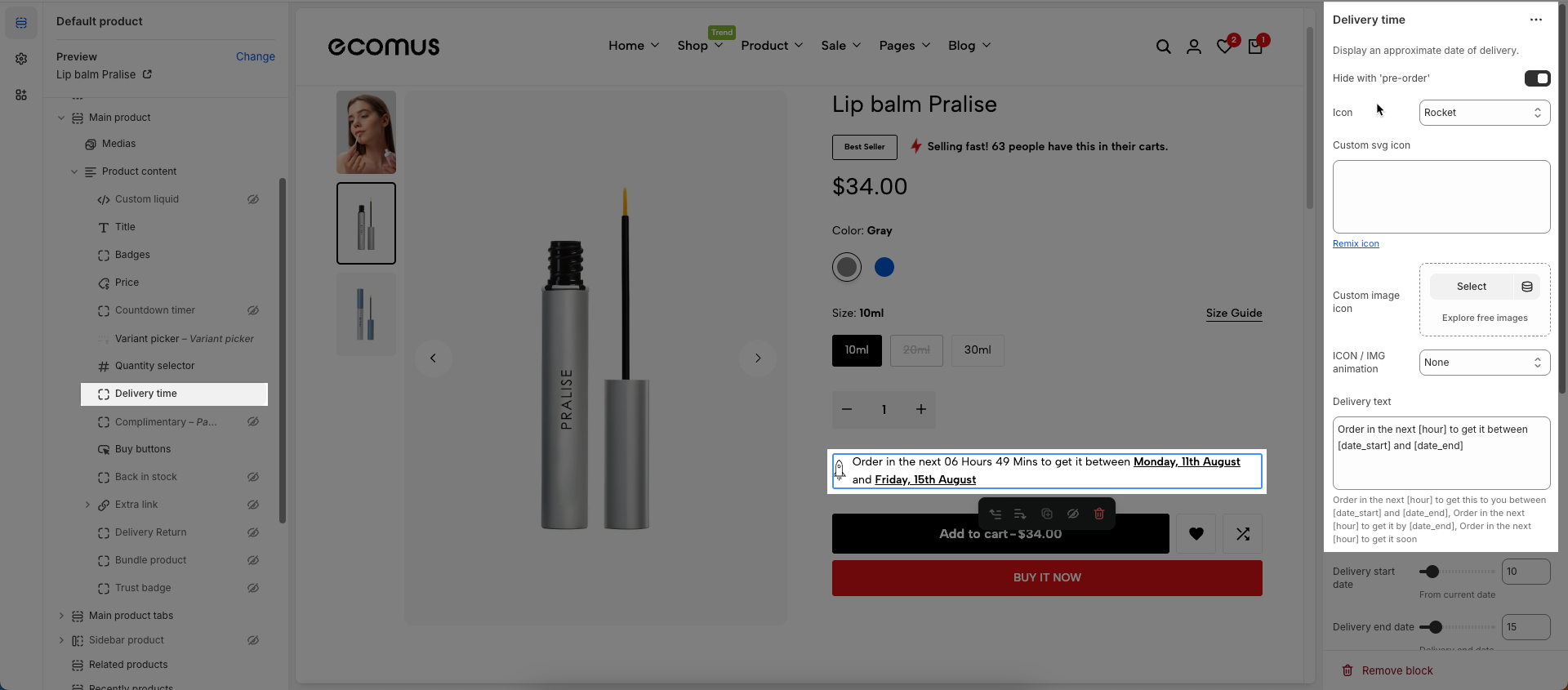
Delivery start date: Select the earliest possible start date for delivery. This could be the current date plus your minimum processing time.
From current date
Delivery end date: Select the latest possible end date for delivery. Together with the start date, this creates an estimated delivery window
Delivery end date
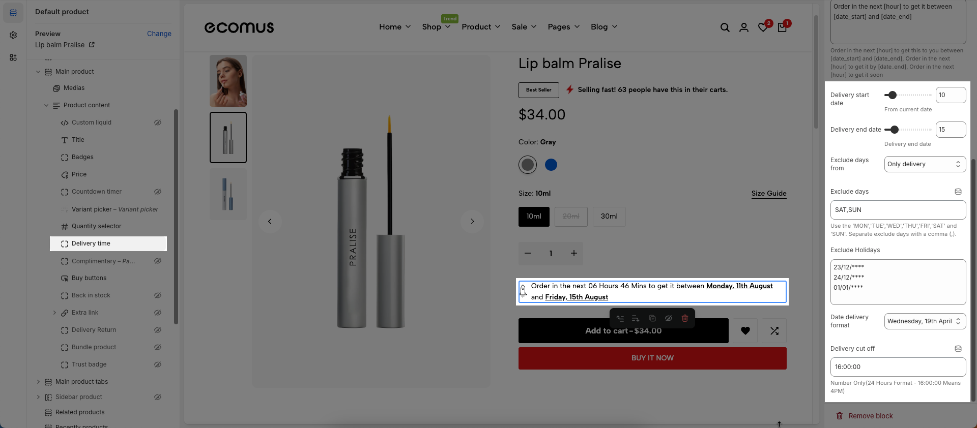
Exclude days from: Select the start date of a period from which you want to exclude specific days from delivery calculations
Exclude days: Select the days of the week on which you do not make deliveries
Use the 'MON','TUE','WED','THU','FRI','SAT' and 'SUN'. Separate exclude days with a comma (,).
Exclude Holidays: Select specific dates (holidays) on which you will not make deliveries. You might need to add multiple dates for various holidays throughout the year.
Date delivery format: Select the display format for the delivery date shown to customers
Delivery cut-off: Set the daily delivery cut-off time. If a customer places an order after this time, their order will be processed on the next business day.
Number Only(24 Hours Format - 16:00:00 Means 4PM)
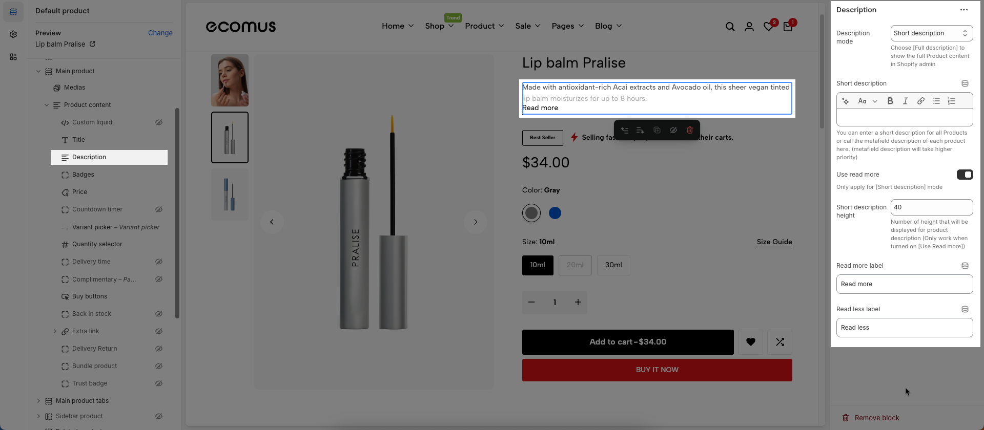
16. Description
To add Description block to the Group Product, click the Add block button (plus icon ➕) under the Group Product > Select Description block.
Once the Description block is added, you can customize its settings in the left or right-hand sidebar (depending on your screen size)
Description mode: Select the display mode for the product description.
Short description: Displays only a truncated portion of the product description.
Full description: Displays the entire product description.
Short description: You can enter a short description for all Products or call the metafield description of each product here. (metafield description will take higher priority)
Use read more: Enable this option to display a "Read More" link that allows users to expand to view the full description and a "Read Less" link to collapse it back.
Short description length: (Set the maximum number of characters or words for the short description that is automatically truncated from the product's full description.
Read more label: Enter the text to display for the "Read More" link
Read less label: Enter the text to display for the "Read Less" link
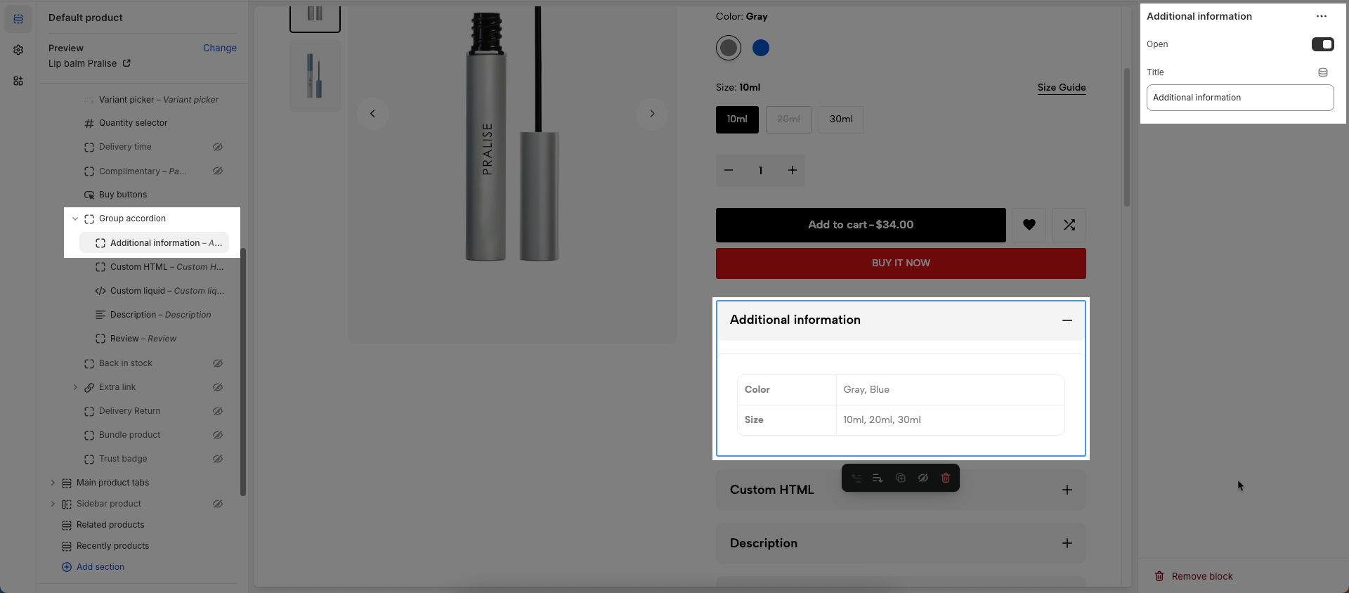
17. Group accordion
To add Group accordion block to the Product content, click the Add block button (plus icon ➕) under the Product content > Select Group accordion block.
Once the Group accordion block is added, you can customize its settings in the left or right-hand sidebar (depending on your screen size)
No customizable settings available.
Additional information block
To add Additional information block to the Group accordion block, click the Add block button (plus icon ➕) under the Group accordion.
The Additional information will be automatically sourced from the product details.
Works with products that have variants
Open: This option (typically a button or state) allows users to expand (show content) or collapse (hide content) an accordion item
Title: Enter a title for this accordion
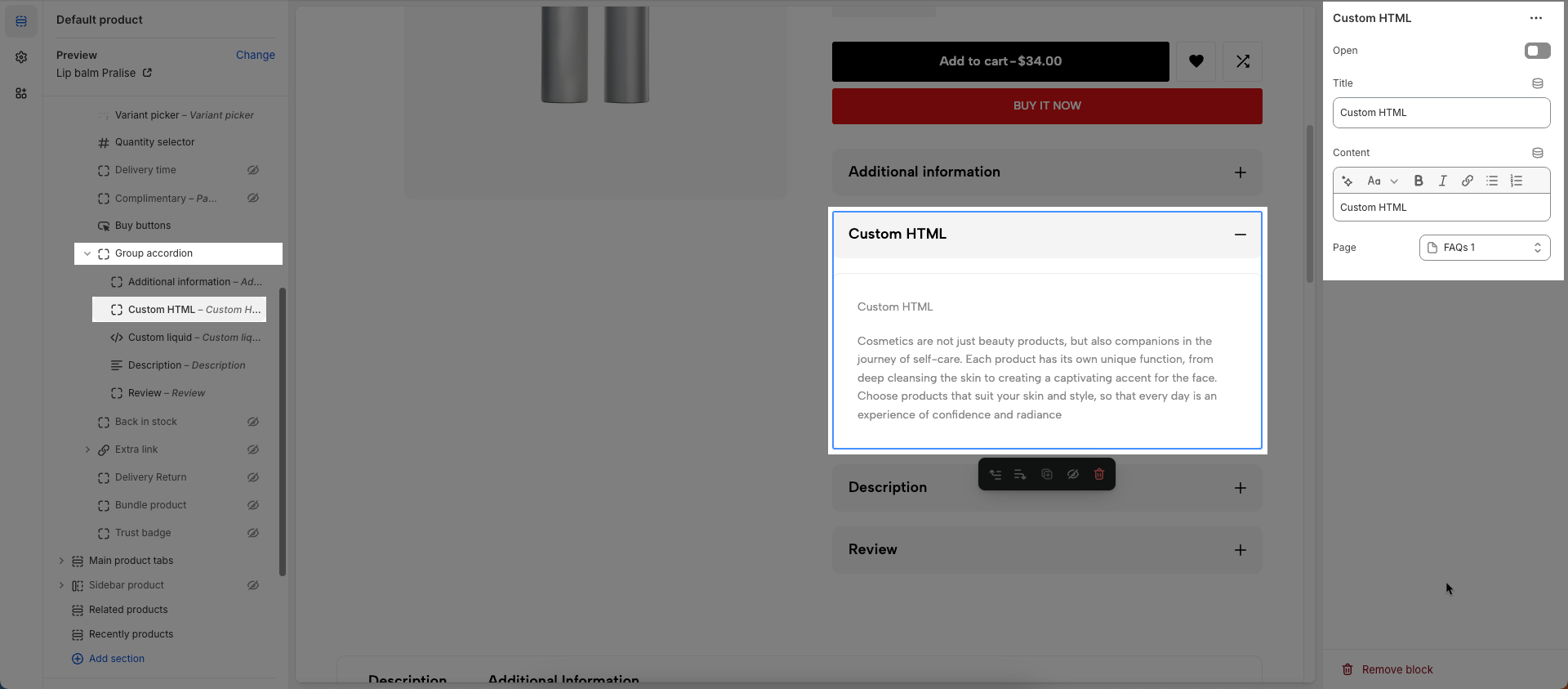
Custom HTML block
To add Custom HTML block to the Group accordion block, click the Add block button (plus icon ➕) under the Group accordion.
Open: This option (typically a button or state) allows users to expand (show content) or collapse (hide content) an accordion item
Title: Enter a title for this accordion
You can enter Tab content or choose a Page
Tab content: Enter the main content that will appear when this tab is selected. This can include text, images, videos, or any other HTML elements.
Page: Select an existing Shopify page to pull content from. If a page is selected, the tab's content will be automatically populated from that page's content
Liquid block
To add Liquid block to the Group accordion block, click the Add block button (plus icon ➕) under the Group accordion.
Open: This option (typically a button or state) allows users to expand (show content) or collapse (hide content) an accordion item
Title: Enter a title for this accordion
Custom liquid: Add app snippets or other Liquid code to create advanced customizations.
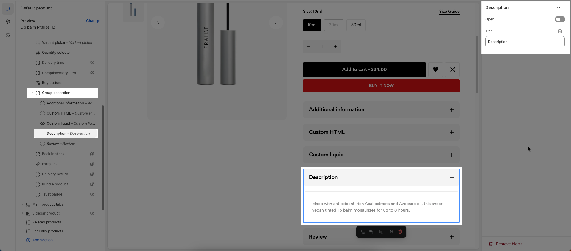
Description block
To add Description block to the Group accordion block, click the Add block button (plus icon ➕) under the Group accordion.
The product description will be automatically sourced from the product details.
Open: This option (typically a button or state) allows users to expand (show content) or collapse (hide content) an accordion item
Title: Enter a title for this accordion
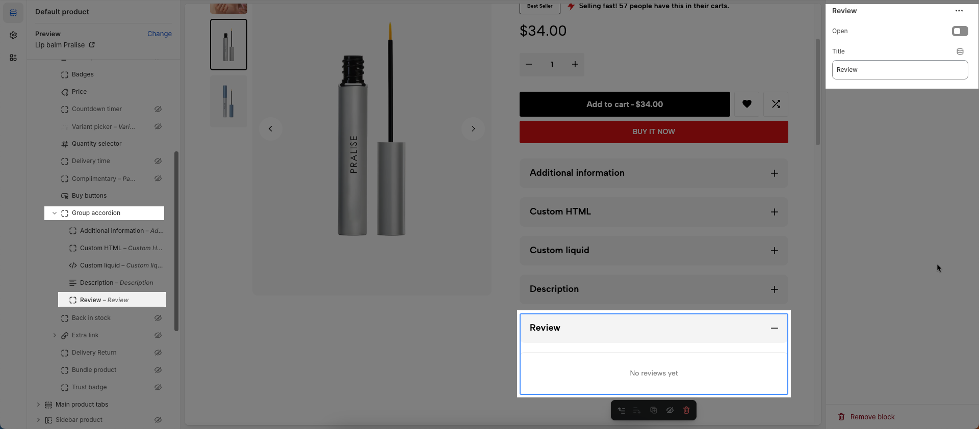
Reviews block
To add Reviews block to the Group accordion block, click the Add block button (plus icon ➕) under the Group accordion.
Open: This option (typically a button or state) allows users to expand (show content) or collapse (hide content) an accordion item
Title: Enter a title for this accordion
18. Group product tab
To add Group product tab block to the Product content, click the Add block button (plus icon ➕) under the Product content > Select Group product tab block.
Once the Group product tab block is added, you can customize its settings in the left or right-hand sidebar (depending on your screen size)
No customizable settings available.
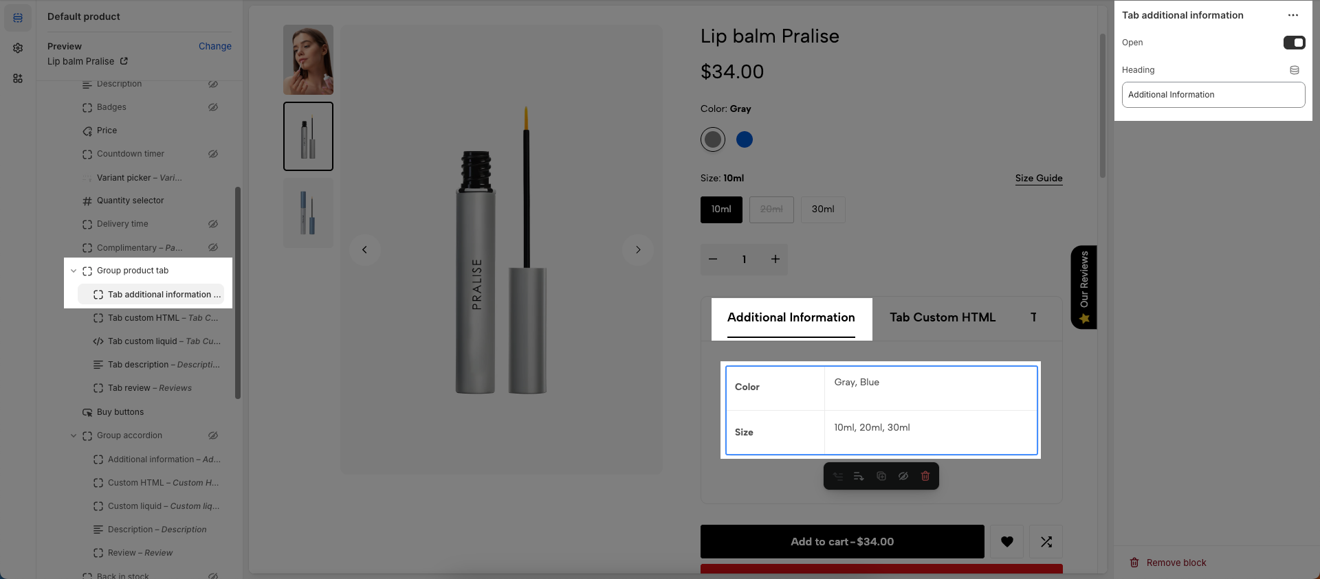
Tab additional information block
To add Tab additional information block to the Group product tab block, click the Add block button (plus icon ➕) under the Group product tab.
The Additional information will be automatically sourced from the product details.
Works with products that have variants
Open: This option (typically a button or state) allows users to expand (show content) or collapse (hide content) an accordion item
Title: Enter a title for this accordion
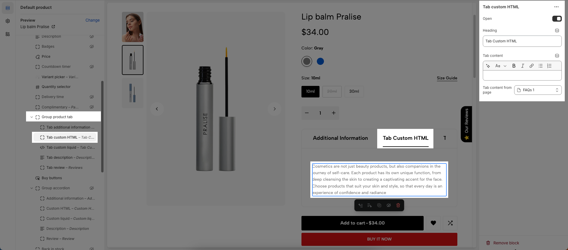
Tab Custom HTML block
To add Custom HTML block to the Group product tab block, click the Add block button (plus icon ➕) under the Group product tab.
Open: This option (typically a button or state) allows users to expand (show content) or collapse (hide content) an accordion item
Title: Enter a title for this accordion
You can enter Tab content or choose a Page
Tab content: Enter the main content that will appear when this tab is selected. This can include text, images, videos, or any other HTML elements.
Page: Select an existing Shopify page to pull content from. If a page is selected, the tab's content will be automatically populated from that page's content
Tab Custom Liquid block
To add Tab Custom Liquid block to the Group product tab block, click the Add block button (plus icon ➕) under the Group product tab.
Open: This option (typically a button or state) allows users to expand (show content) or collapse (hide content) an accordion item
Title: Enter a title for this accordion
Custom liquid: Add app snippets or other Liquid code to create advanced customizations.
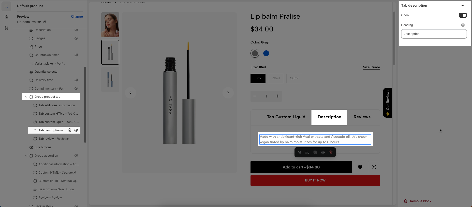
Tab description block
To add Tab description block to the Group product tab block, click the Add block button (plus icon ➕) under the Group product tab.
The product description will be automatically sourced from the product details.
Open: This option (typically a button or state) allows users to expand (show content) or collapse (hide content) an accordion item
Title: Enter a title for this accordion
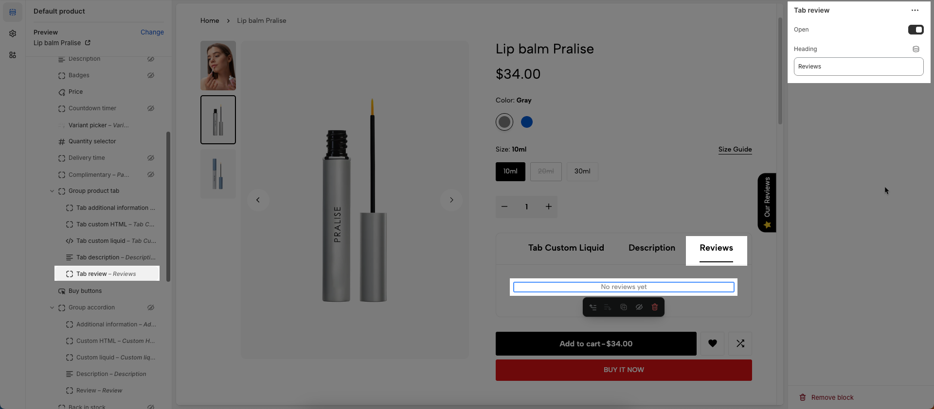
Tab reviews block
To add Tab reviews block to the Group product tab block, click the Add block button (plus icon ➕) under the Group product tab.
Open: This option (typically a button or state) allows users to expand (show content) or collapse (hide content) an accordion item
Title: Enter a title for this accordion
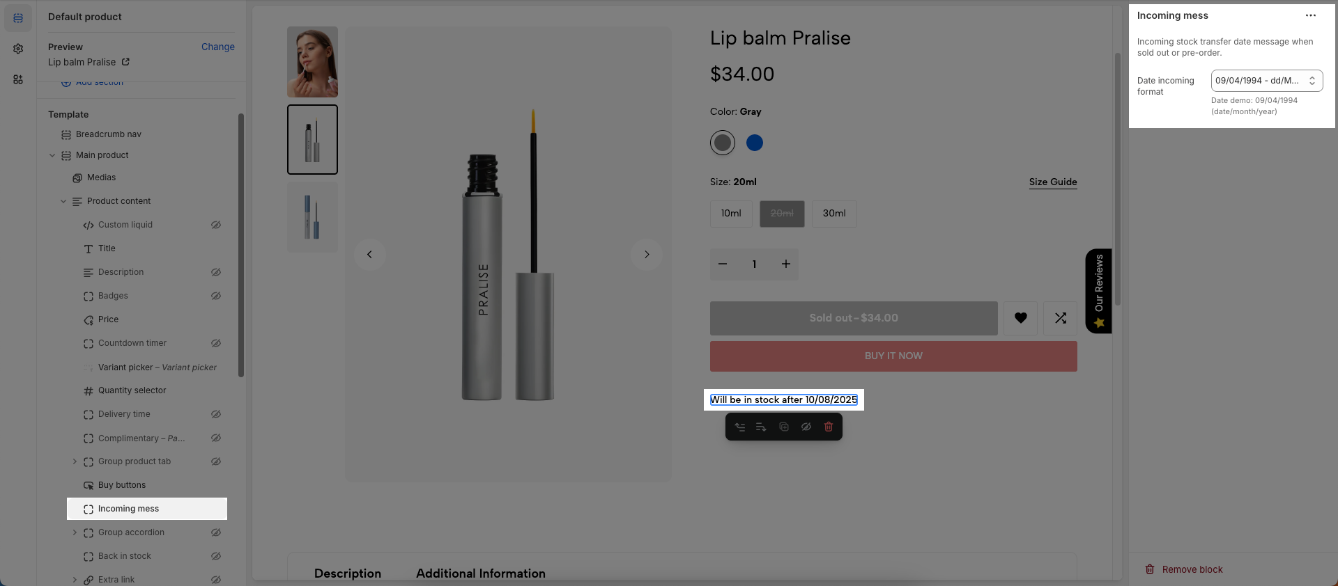
19. Incoming mess
To add Incoming mess block to the Product content, click the Add block button (plus icon ➕) under the Product content > Select Incoming mess block.
Once the Incoming mess block is added, you can customize its settings in the left or right-hand sidebar (depending on your screen size)
How to show Incoming mess?
If you want to show this option, you must set on Shopify admin first. Please follow my instruction below:
Incoming stock transfer date message when sold out or pre-order.
Date incoming format: Set the expected format of the incoming date string
20. Installments banner
To add Installments banner block to the Product content, click the Add block button (plus icon ➕) under the Product content > Select Installments banner block
To display installments banner, your store needs to support Shop Pay Installments. Learn more.
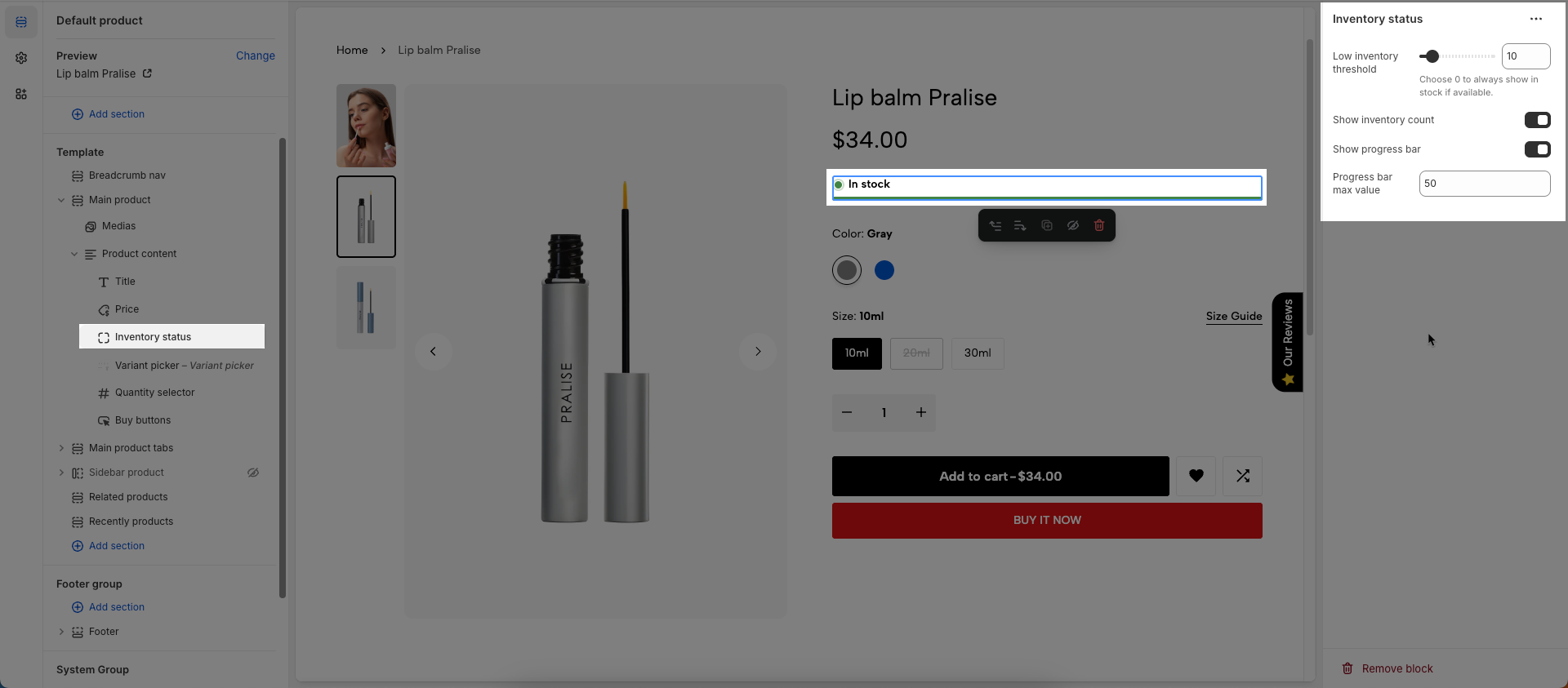
21. Inventory status
To add Inventory status block to the Product content, click the Add block button (plus icon ➕) under the Product content > Select Inventory status block.
Once the Inventory status block is added, you can customize its settings in the left or right-hand sidebar (depending on your screen size)
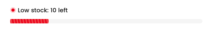
Low inventory threshold: Set the low inventory threshold; when the product quantity falls below this threshold, a warning will be displayed. Choose 0 to always show "in stock" if available.
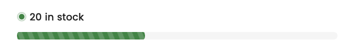
Show inventory count: Display the remaining product quantity in stock, providing customers with information about product availability.
Show progress bar: Display a progress bar indicating the remaining product quantity, helping customers visualize the stock status.
Progress bar max value: Set the maximum value for the progress bar, defining the display range of the progress bar.
For pre-order products, the inventory will appear in yellow and will not show a quantity.

For low stock threshold products, the inventory status will be displayed in red and include the quantity.
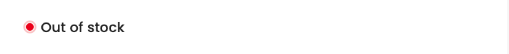
For Out of stock products, the inventory will appear in red and will not show a quantity.
For In stock products, the inventory status will be displayed in green and include the quantity.
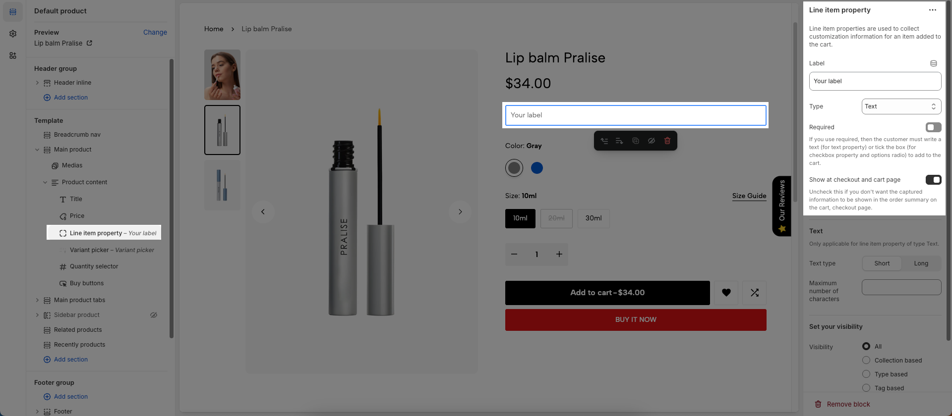
22. Line item property
To add Line item property block to the Product content, click the Add block button (plus icon ➕) under the Product content > Select Line item property block.
Once the Line item property block is added, you can customize its settings in the left or right-hand sidebar (depending on your screen size)
Line item properties are used to collect customization information for an item added to the cart.
Label: Enter the label text for the data field, providing a clear description of the field's purpose.
Type: Select the data entry type for the field (text, checkbox, options), defining how users interact with the field.
Required: If you use required, then the customer must write a text (for text property) or tick the box (for checkbox property and options radio) to add to the cart.
Show at checkout and cart page: Uncheck this if you don't want the captured information to be shown in the order summary on the cart, checkout page.
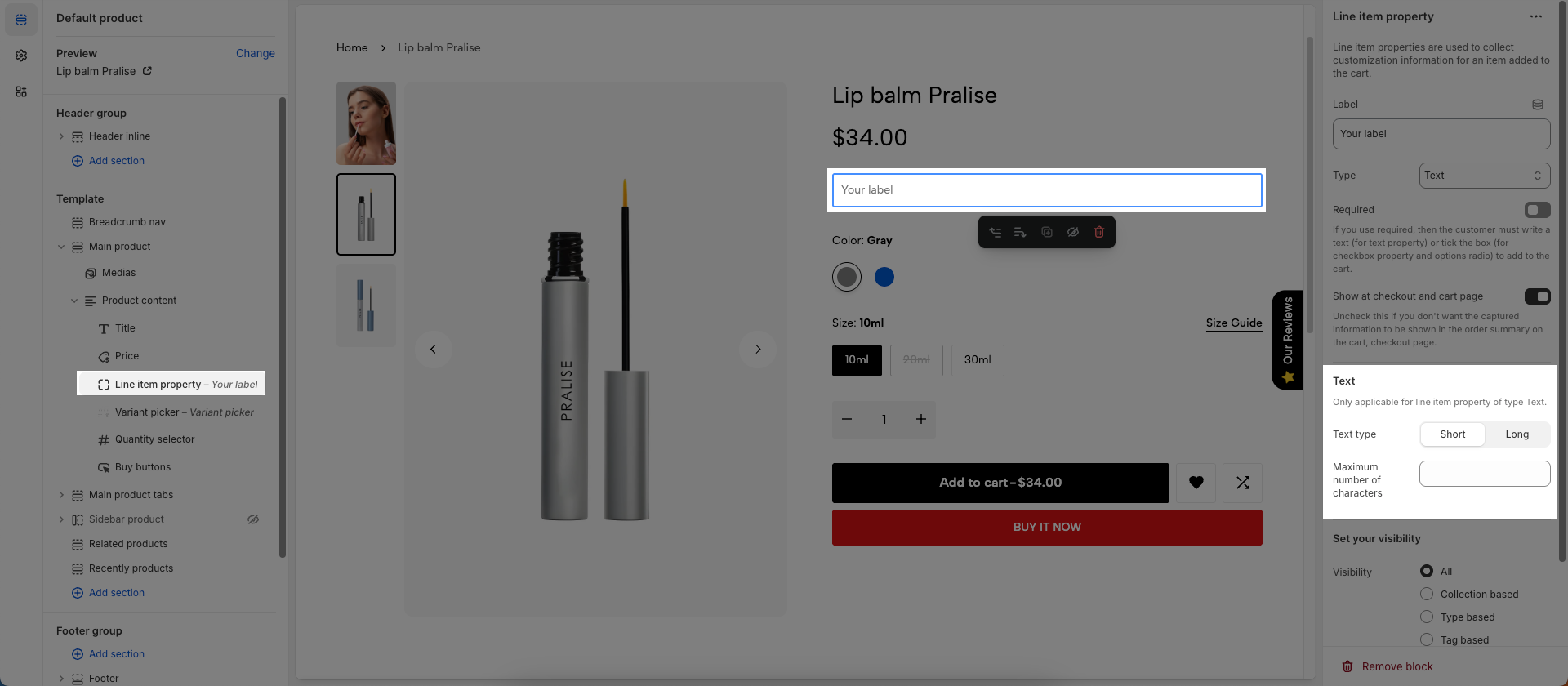
Text
Only applicable for line item property of type Text.
Text type: Select the text input type (short or long), defining the size of the text input area and its intended use.
Maximum number of characters: Set the maximum number of characters allowed in the text field, controlling the length of the input content.
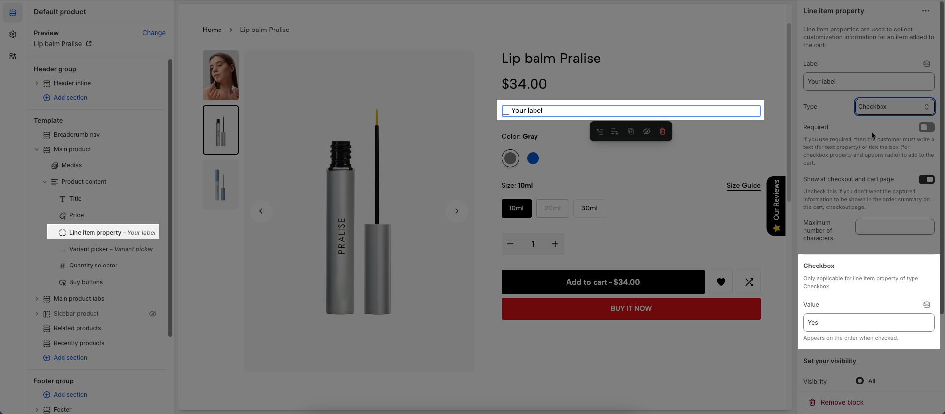
Checkbox
Only applicable for line item property of type Checkbox
Value: Appears on the order when checked.
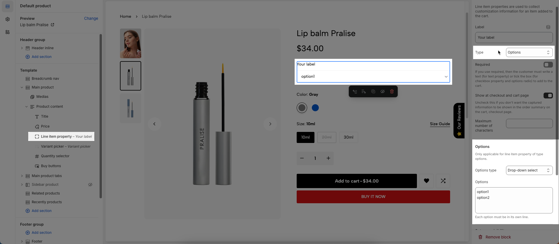
Options
Only applicable for line item property of type options.
Option type: Select the display style for the options (dropdown select or radio buttons), customizing how users select options.
Options: Enter the options, each option on a separate line, defining the available choices for the user.
Each option must be in its own line.
Set your visibility
Visibility (All, Collection based, Type based, Tag based, Product based, Metafield based): Select the method to control the visibility of this element.
All: The element will always be visible (no specific conditions).
Collection based: The element will be visible only if the current product belongs to one or more specified collections.
Type based: The element will be visible only if the current product has one or more specified product types.
Tag based: The element will be visible only if the current product has one or more specified product tags.
Product based: The element will be visible only if the current product is one of the specifically designated products.
Metafield based: The element will be visible based on the value of a specific metafield of the current product. This allows for very granular and flexible control over visibility.
Collection list: Select one or more collections that the product must belong to for this element to be visible.
Maximum choose: 50 collections
Product types: Enter one or more product types
Separate your types with a comma.
Product tags: Enter one or more product tags, separated by commas
Product list: Select one or more specific products. The element will be visible only if the current product matches one of the selected products.
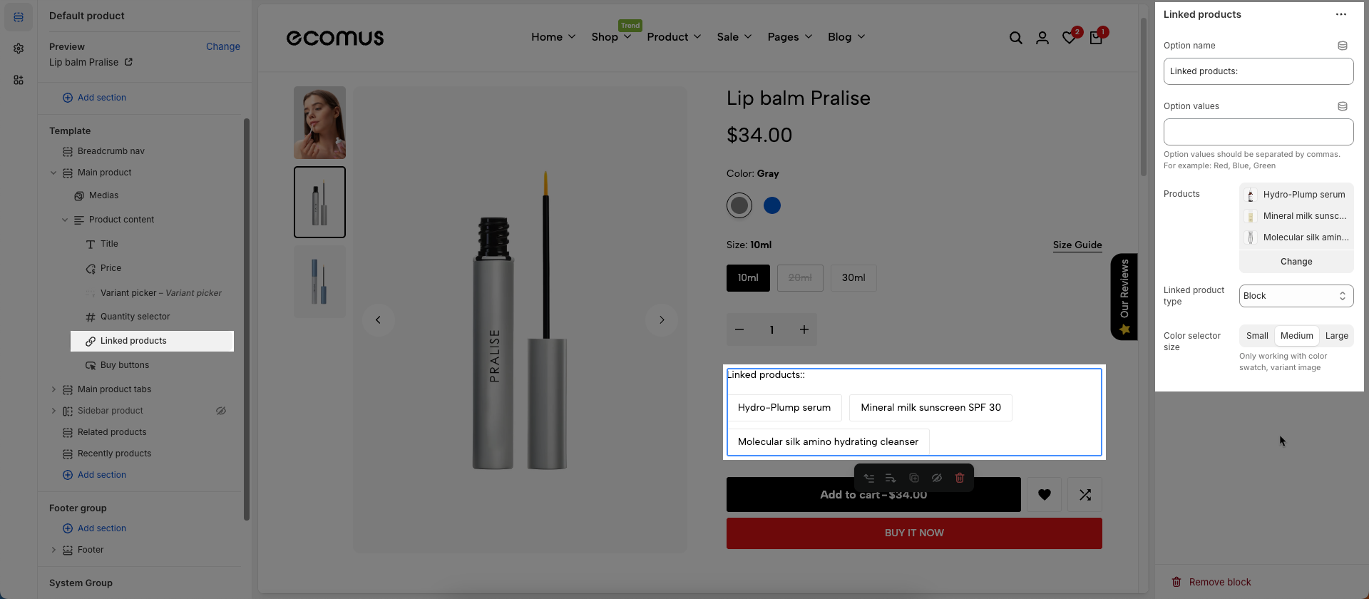
23. Linked products
To add Linked products block to the Product content, click the Add block button (plus icon ➕) under the Product content > Select Linked products block.
Once the Linked products block is added, you can customize its settings in the left or right-hand sidebar (depending on your screen size)
Option name: Enter the name of the product option you want to display specially
Option values: List the specific values of the chosen option (e.g., "Red", "Blue", "Yellow" for the "Color" option) to replace the product title.
Products: Select the products to which the options will apply
Linked product type: Select how option values are displayed and how they link to other products/variants.
Block: Each option value (e.g., "Red") is displayed as a simple block (e.g., a button or a swatch).
Block with color: Each color value will display as an actual color swatch, helping customers visualize the color better.
Image with title: Each option value will be displayed with a small image representing that option and the option's title
Color selector size: Select the aspect ratio for the option's representative images
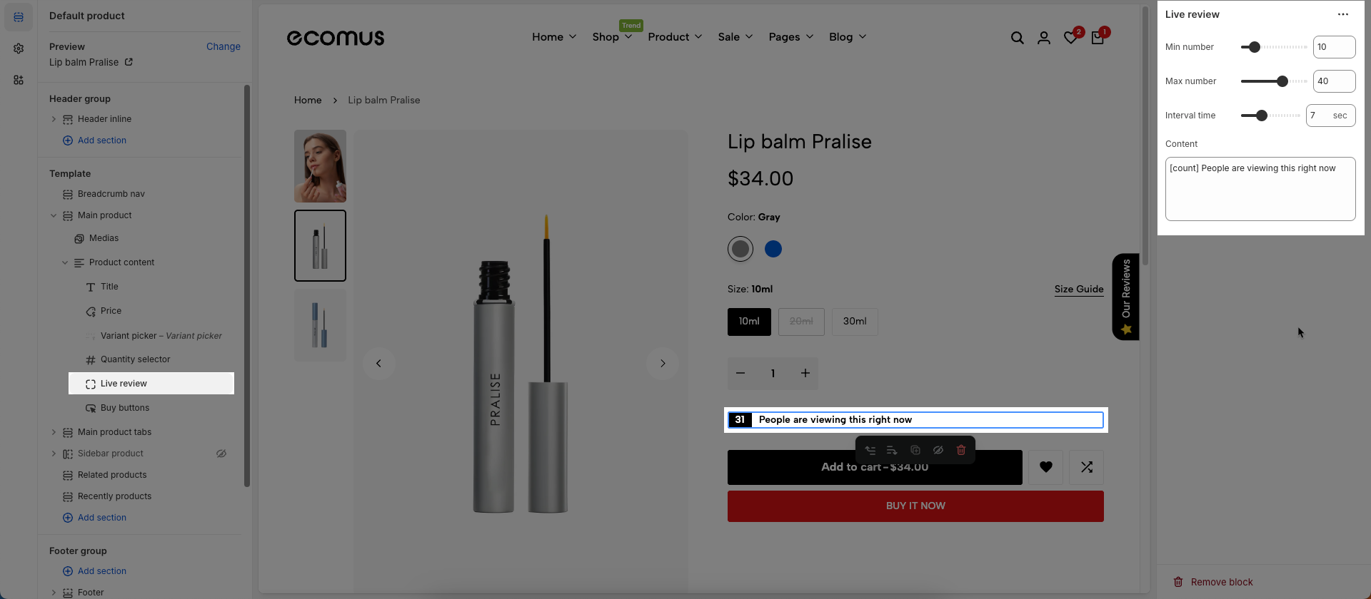
24. Live review
To add Live review block to the Product content, click the Add block button (plus icon ➕) under the Product content > Select Live review block.
Once the Live review block is added, you can customize its settings in the left or right-hand sidebar (depending on your screen size)
Min number: Set the smallest numerical value in the range.
Max number: Set the largest numerical value in the range.
Interval time: Set the time interval (e.g., in seconds, minutes, hours, days) at which an event will repeat or a value will change.
Content: Enter the content to be displayed. This could be a descriptive text, a dynamic message,...
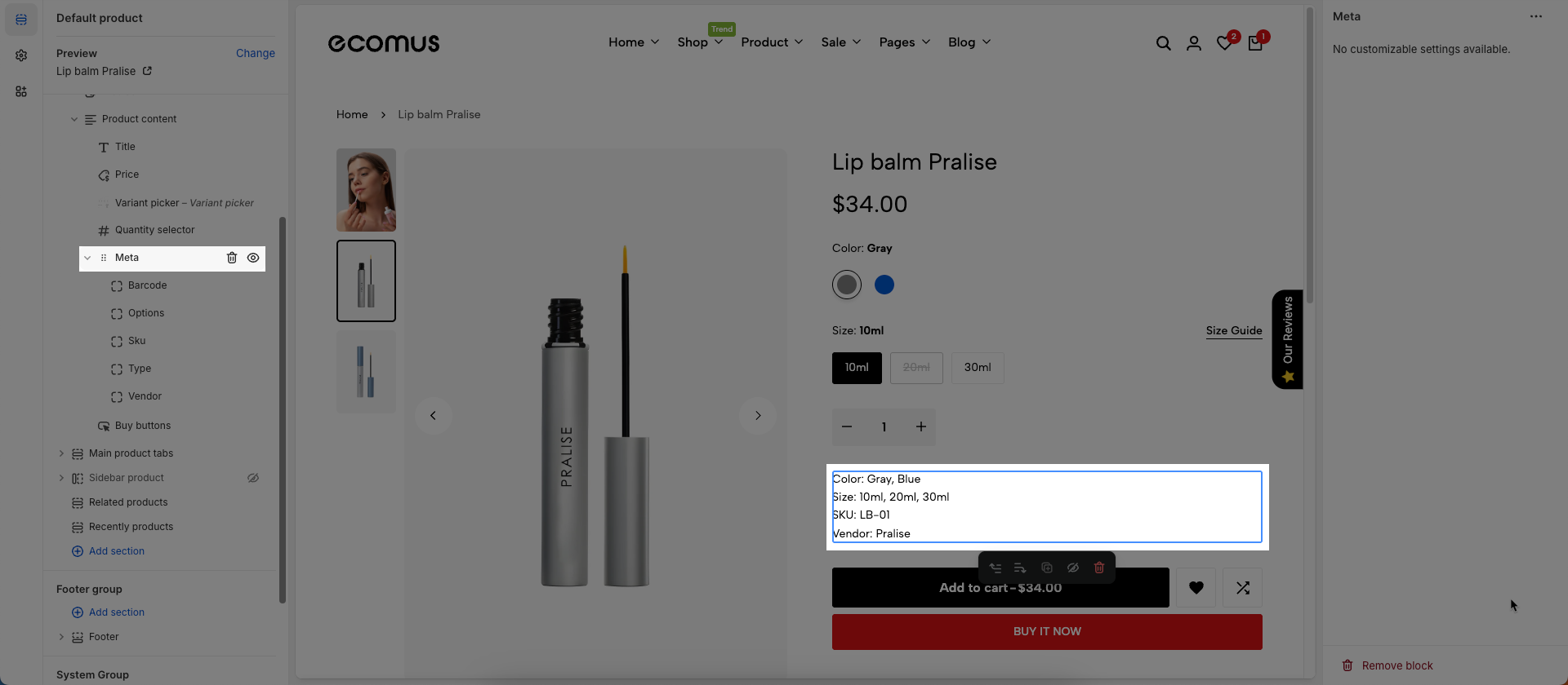
25. Meta
To add Meta block to the Product content, click the Add block button (plus icon ➕) under the Product content > Select Meta block
The block information in the meta section will be sourced directly from the product in your Shopify store.
26. Pickup availability
To add Pickup availability block to the Product content, click the Add block button (plus icon ➕) under the Product content > Select Pickup availability block.
Once the Pickup availability block is added, you can customize its settings in the left or right-hand sidebar (depending on your screen size)
Engage local shoppers by showing where items are available for pickup — right from the product page. Learn more
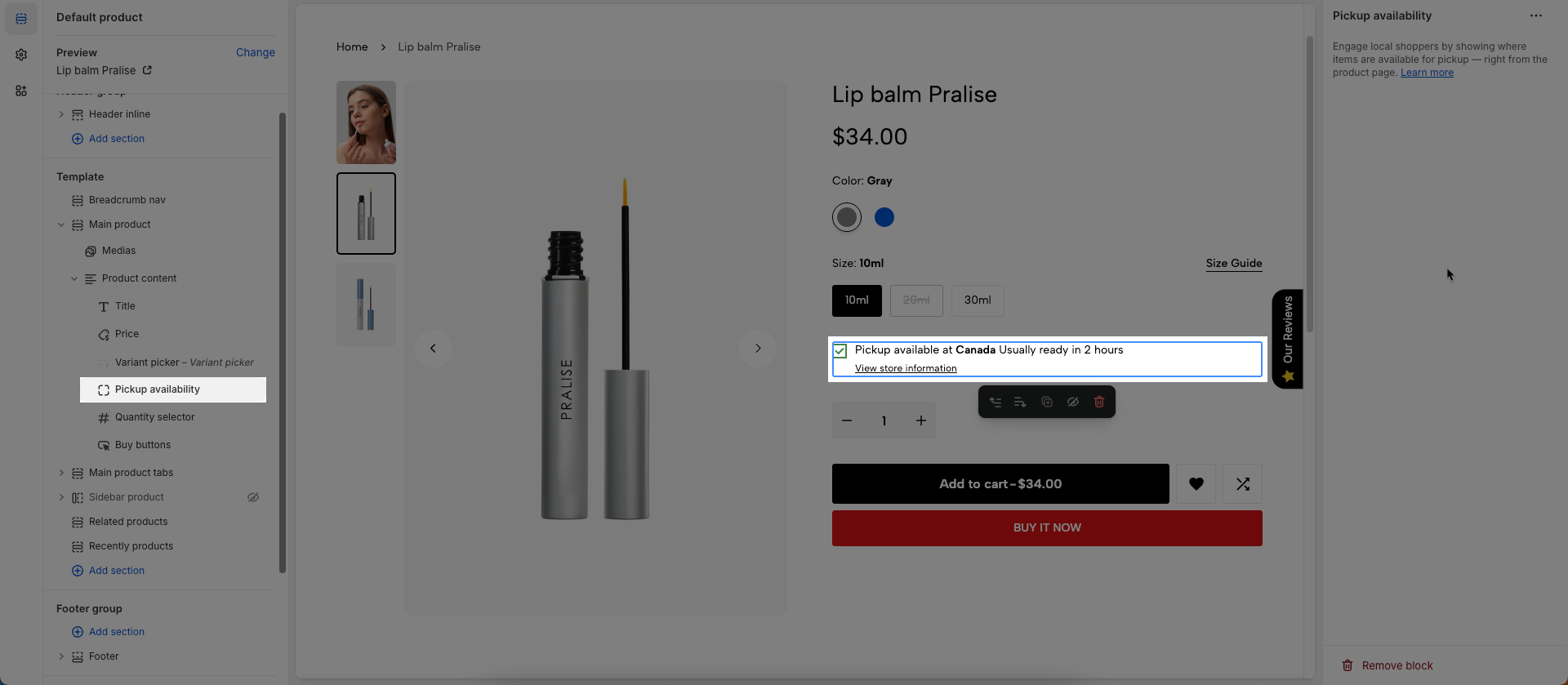
How to set up the local pickup?
Step 1: From the main screen of your Shopify store, click the Settings tab in the left sidebar > navigate to and open the Locations > click Add location if you haven't set up a shipping location yet, or select and open an existing location if one is already available.
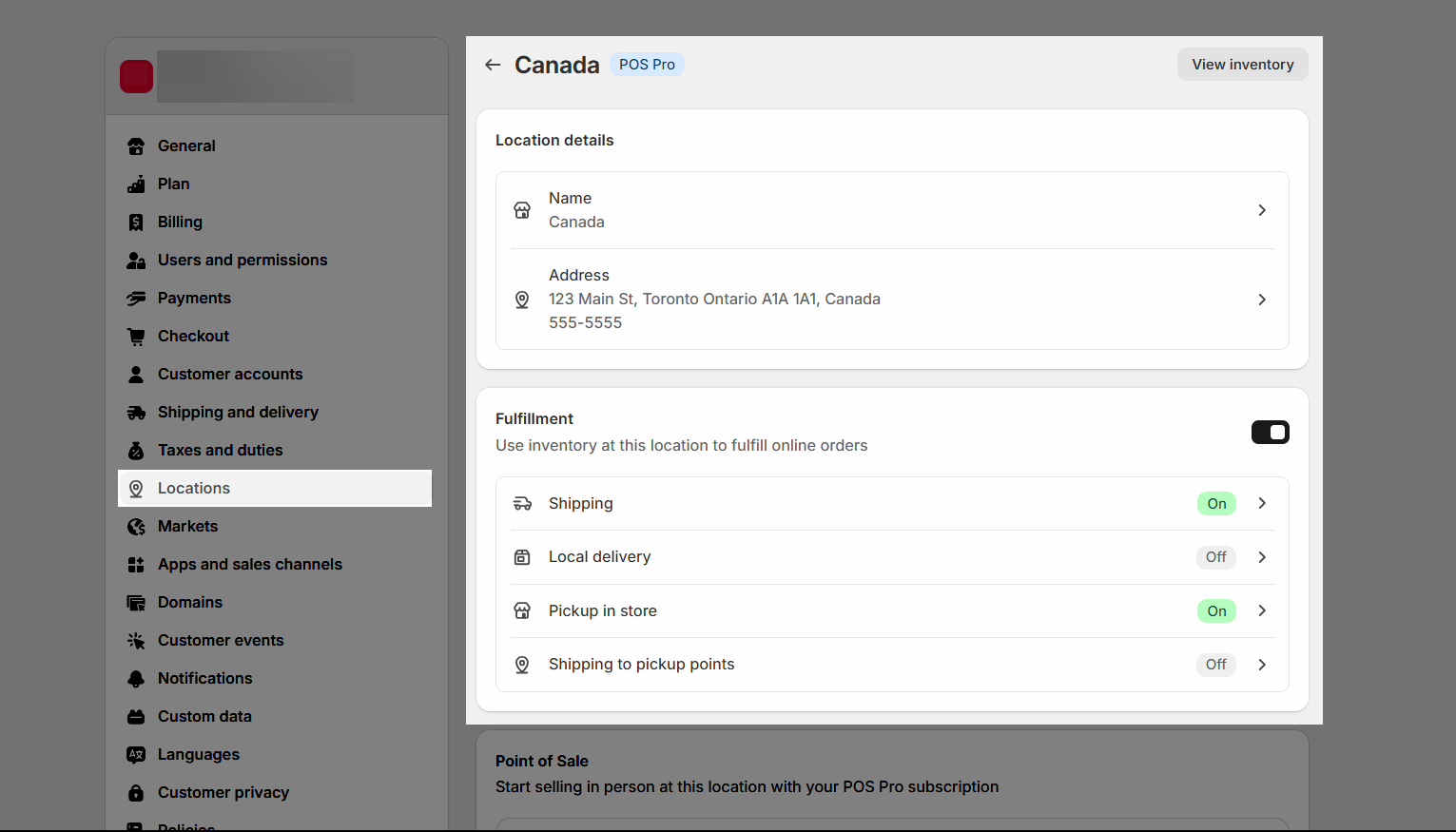
Make sure you tick the Fulfillment (Use inventory at this location to fulfill online orders) checkbox
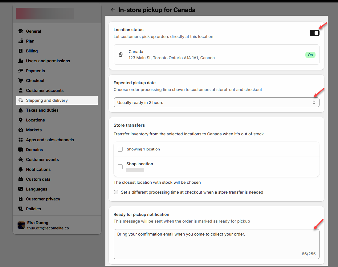
Step 2: Still in the Settings tab, go to the Shipping & Delivery section > scroll down to Pickup in store > click on the store you want to configure for pickup > check the box for Location status (Let customers pick up orders directly at this location) > set the expected pickup time, for example: Usually ready in 2 hours.
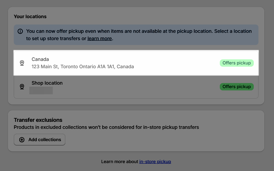
The result: you will see the location store shows the Offers pickup tag.
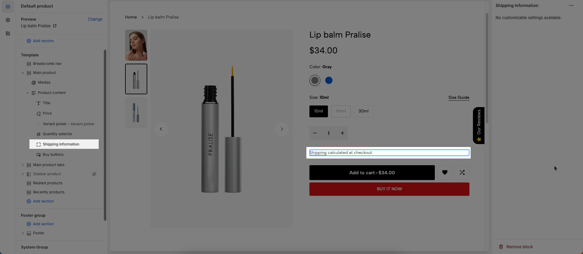
27. Shipping information
To add Shipping information block to the Product content, click the Add block button (plus icon ➕) under the Product content > Select Shipping information block.
Once the Shipping information block is added, you can customize its settings in the left or right-hand sidebar (depending on your screen size)
No customizable settings available.
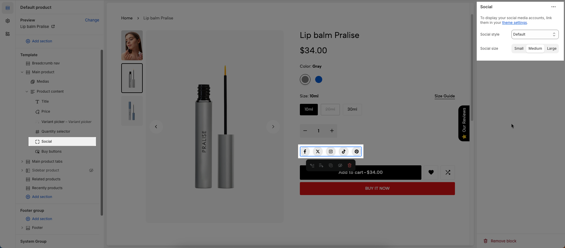
28. Social
To add Social block to the Product content, click the Add block button (plus icon ➕) under the Product content > Select Social block.
Once the Social block is added, you can customize its settings in the left or right-hand sidebar (depending on your screen size)
To display your social media accounts, link them in your theme settings.
Social style: Select the visual style for social media icons or links (solid, outline, simple).
Social size: Set the dimension or scale of the social media icons (e.g., small, medium, large).
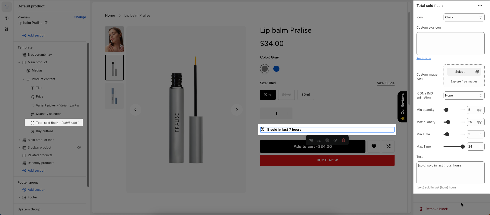
29. Total sold flash
To add Total sold flash block to the Product content, click the Add block button (plus icon ➕) under the Product content > Select Total sold flash block.
Once the Total sold flash block is added, you can customize its settings in the left or right-hand sidebar (depending on your screen size)
Icon: Select the icon to be displayed. Options are typically a predefined list of icons available within the theme
Custom SVG icon: You can paste the raw SVG code directly into this field (Line Awesome)
Custom image icon: Upload or select the image file (.jpg, .png, .gif) you want to use as the icon.
ICON / IMG animation: Select the animation effect to be applied to the icon (or image). Animations can make the icon stand out and grab user attention.
Min quantity: Set the minimum quantity a customer can purchase for this product. If a customer tries to order less than this amount,
Max quantity: Set the maximum quantity a customer can purchase for this product in a single order. This helps control inventory or prevent excessively large orders.
Min Time: Set the minimum time (e.g., number of days, hours) required for a service or for the product to be ready
Max Time: Set the maximum time (e.g., number of days, hours) a service can last or a product can be completed
Text: Enter the custom text that will be displayed alongside this quantity or time information.
[sold] sold in last [hour] hours
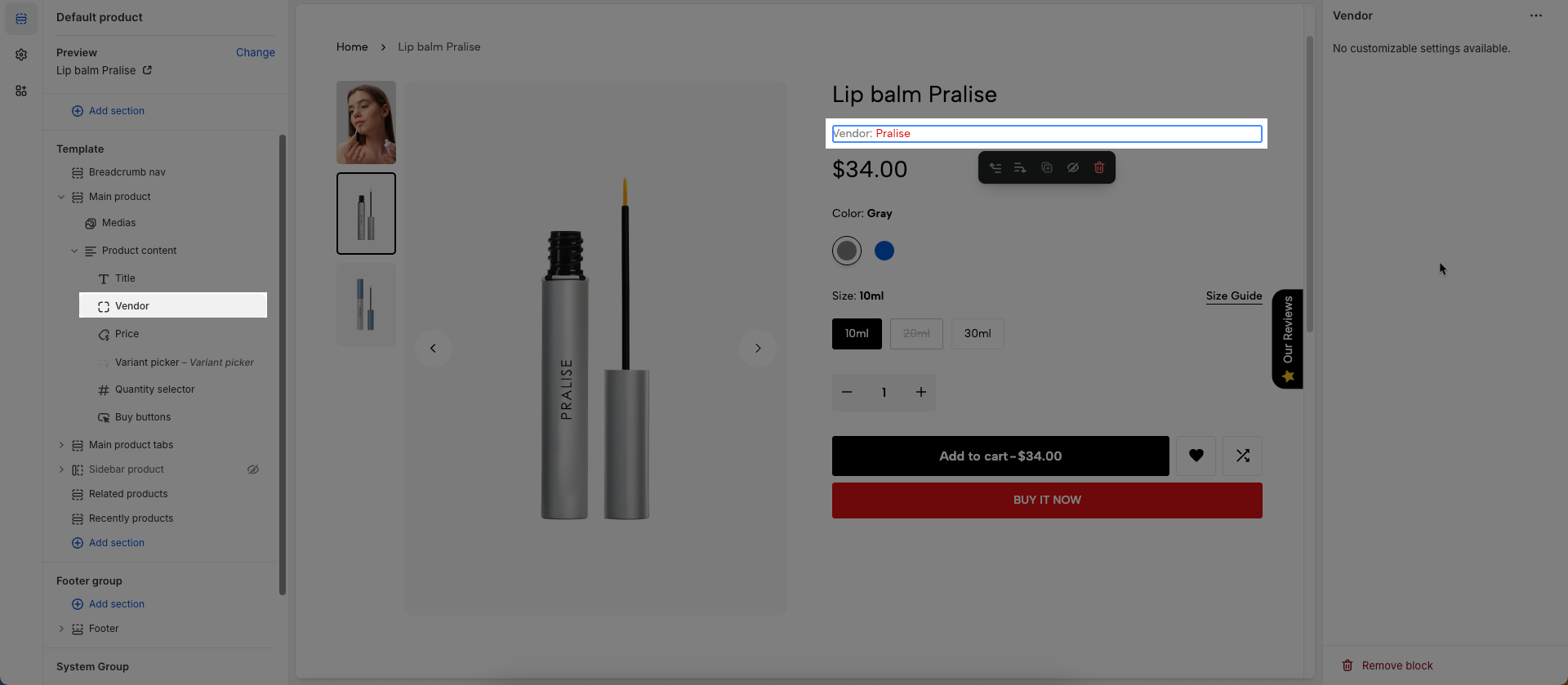
30. Vendor
To add Vendor block to the Product content, click the Add block button (plus icon ➕) under the Product content > Select Vendor block.
Once the Vendor block is added, you can customize its settings in the left or right-hand sidebar (depending on your screen size)
No customizable settings available.