


The Image with Text section is a versatile layout that pairs visual content with a custom message, making it ideal for highlighting products, promotions, or brand stories. It helps create a strong visual impact while delivering key information side by side.
1. How to access the Image with text section?
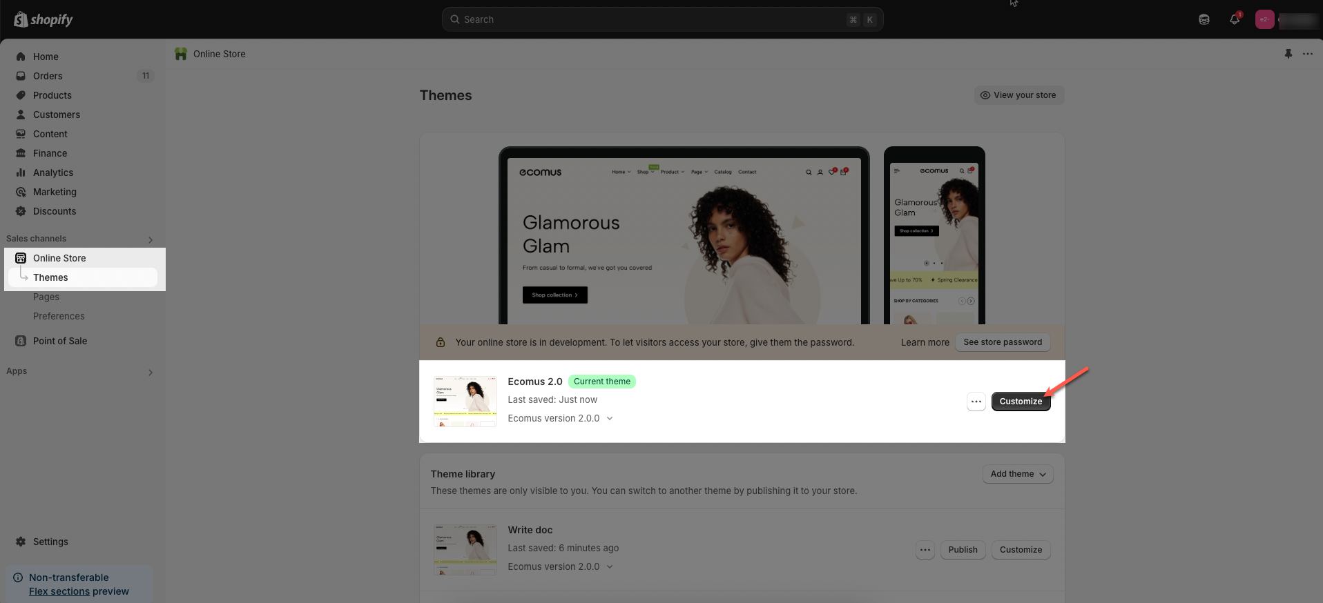
Step 01: From Shopify Admin, click on Online Store > Select Themes > In the Current theme section, click the Customize button.
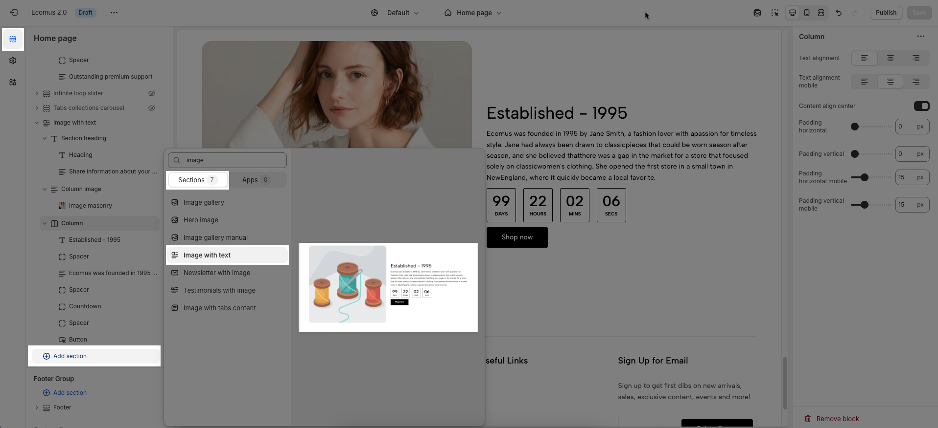
Step 02: In the theme editor (Customize), click the Sections button > Click the Add section button > In the Sections tab, scroll through the list or use the search bar to find and select Image with text.
A comprehensive Image with text section is constructed using three blocks: Section heading, Column, and Column image. Make sure to add and fully customize each of these for optimal results.
Let's move on to the customization options for each of these blocks.
2. How to customize Section heading block?
2.1. How to customize the Heading block
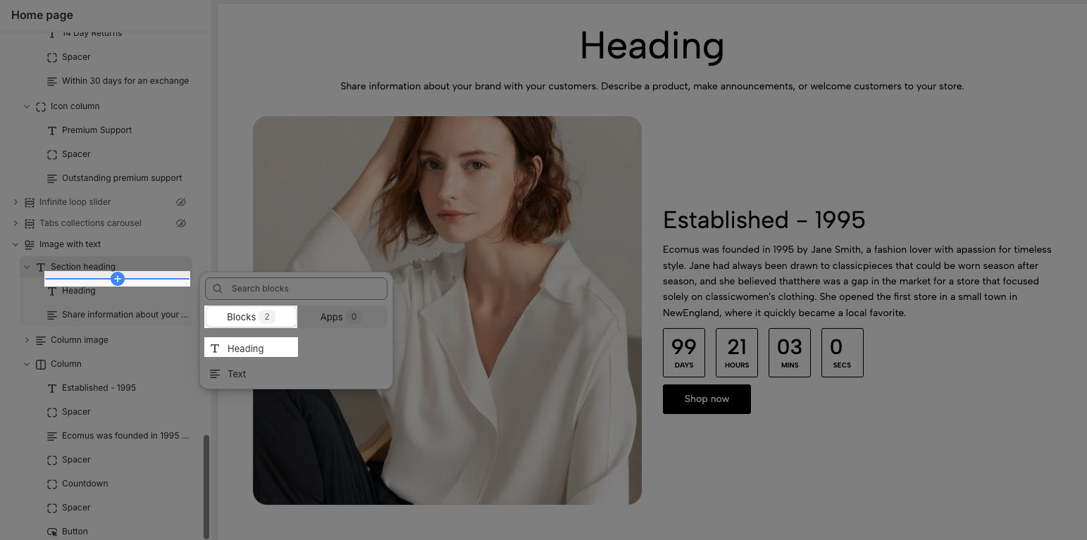
To add a Heading block, click the Add block button (plus icon ➕) under the Section heading block > In the Blocks tab, select Heading.
Once the Heading block is added, you can customize the Heading block in the right-hand sidebar:
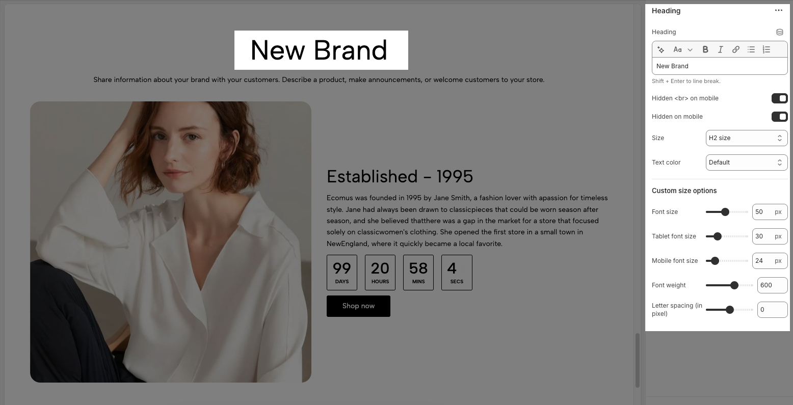
Heading: Allows you to enter and format the text (bold, italic, underline, lists, links, etc.). Press Shift + Enter to line break.
Hidden <br> on mobile: Enable this option to disable line breaks on mobile devices.
Hidden on mobile: Enable this option to hide the heading on mobile screens.
Size: Let you select sizes for the heading. You can choose the options included Base size, H6 size, H5 size, H4 size, H3 size, H2 size, H1 size, H0 size, and Custom size inline.
Text color: Allows you to set the text color. Please follow this guideline to configure the Color.
Custom Size Options:
The options below are only active when you select Custom size inline in the Size option.
Font size: Adjusts the font size of the heading in pixels (px) for desktop screens.
Tablet font size: Adjusts the font size of the heading in pixels (px) for tablet devices.
Mobile font size: Adjusts the font size of the heading in pixels (px) for mobile devices.
Font weight: Controls the thickness of the text. Common font weight values range from 100 to 900.
Letter spacing: adjust the horizontal space between the letters in the heading text, measured in pixels (px).
2.2. How to customize Text block
To add a Text block, click the Add block button (plus icon ➕) under the Section heading block > In the Blocks tab, select Text.
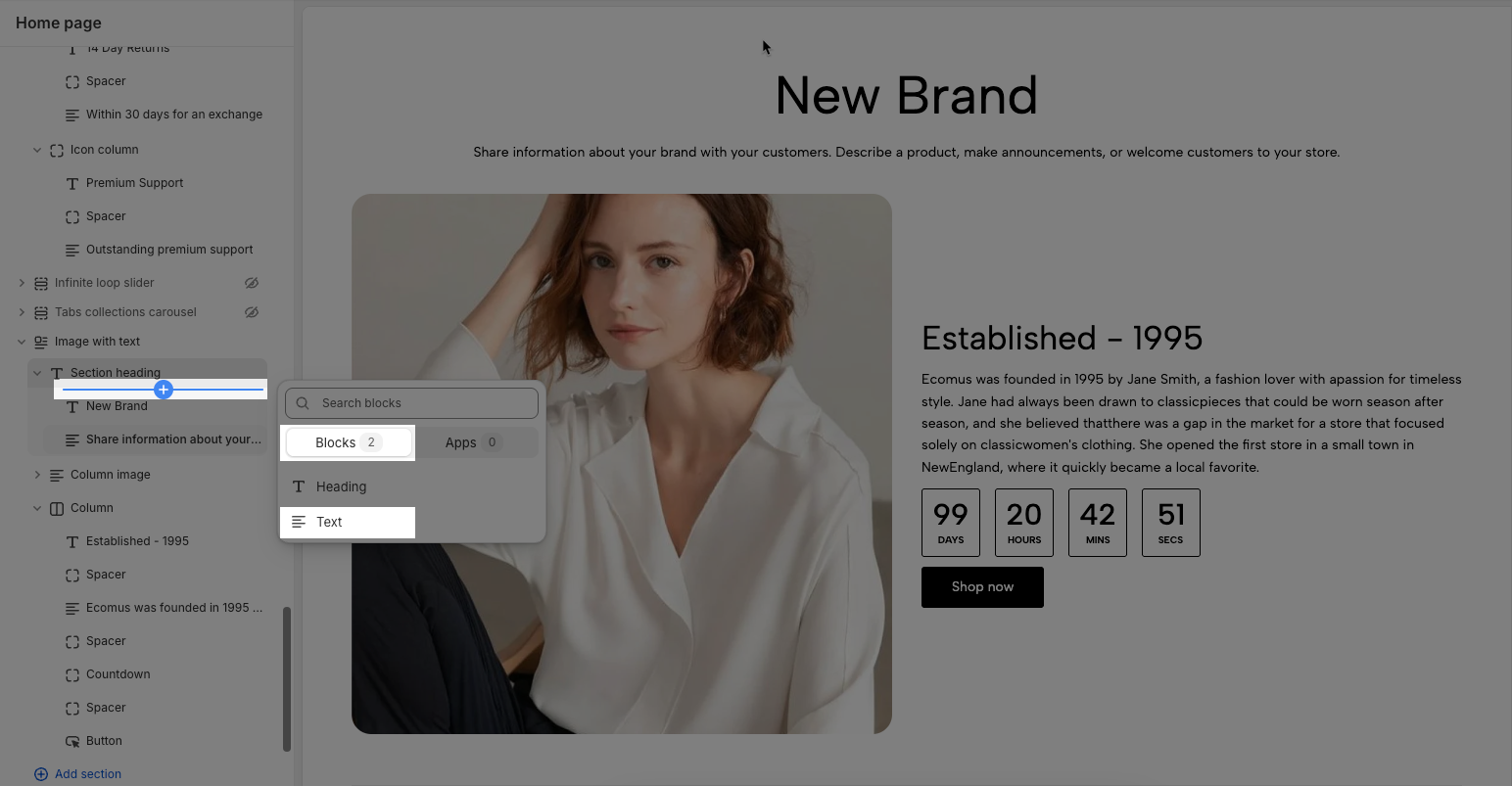
Once the Text block is added, you can customize the Text block in the right-hand sidebar:
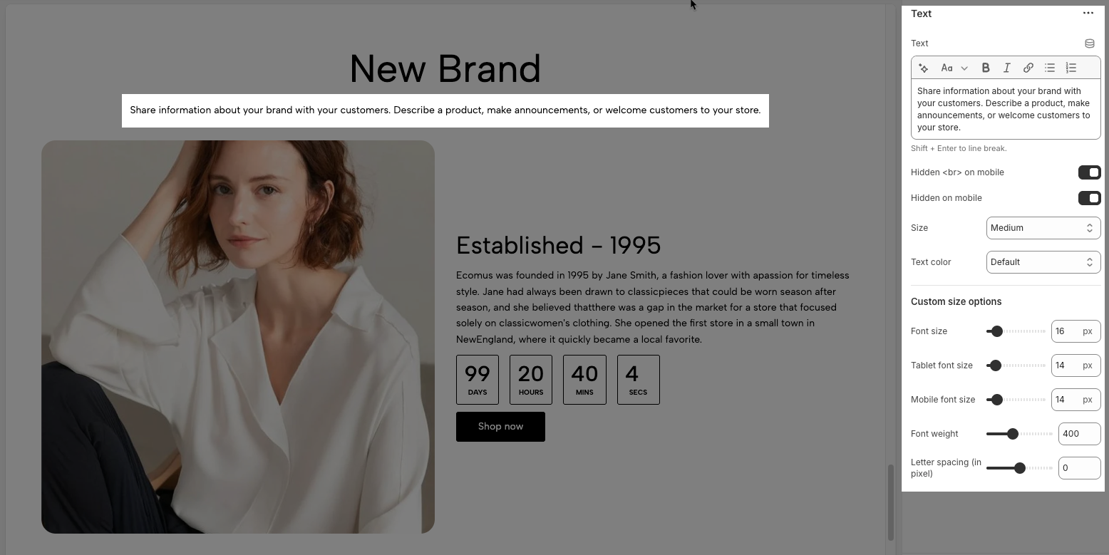
Text: Allows you to enter and format the text (bold, italic, underline, lists, links, etc.). Press Shift + Enter to line break.
Hidden <br> on mobile: Enable this option to disable line breaks on mobile devices.
Hidden on mobile: Enable this option to hide the heading on mobile screens.
Size: Let you select sizes for the text. You can choose the options included Extra small, Small, Medium, Large, Extra Large, 2 Extra Large, 4 Extra Large, and Custom size inline.
Text color: Allows you to set the text color. Please follow this guideline to configure the Color.
Custom Size Options:
The options below are only active when you select Custom size inline in the Size option.
Font size: Adjusts the font size of the heading in pixels (px) for desktop screens.
Tablet font size: Adjusts the font size of the heading in pixels (px) for tablet devices.
Mobile font size: Adjusts the font size of the heading in pixels (px) for mobile devices.
Font weight: Controls the thickness of the text. Common font weight values range from 100 to 900.
Letter spacing: adjust the horizontal space between the letters in the heading text, measured in pixels (px).
2.3. How to customize Section heading block
The Section heading block is automatically included when you add an Image with text section.
You can conveniently customize this block using the options in the right-hand sidebar:
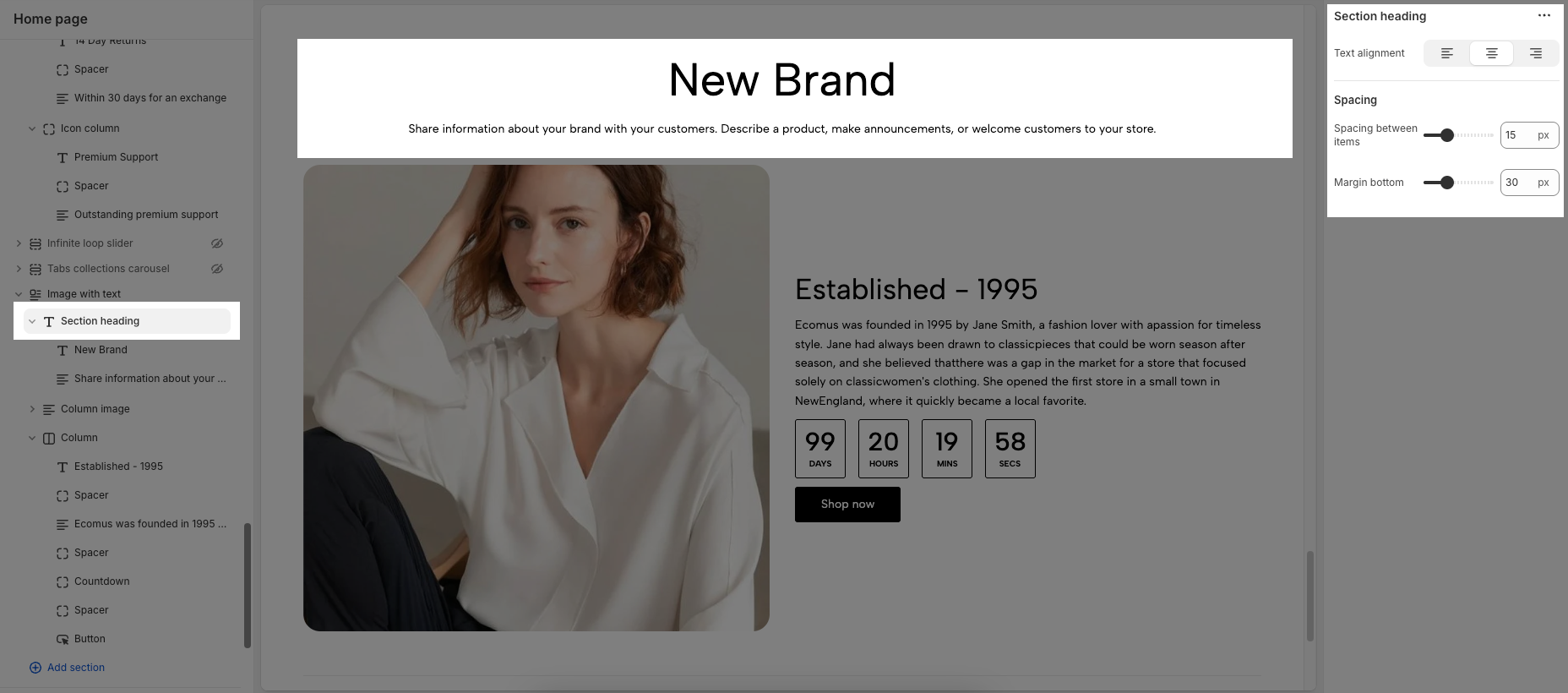
Text alignment: Controls the horizontal alignment of the heading and text. Options include:
Left (first button): Aligns the text to the left side.
Center (second button): Centers the text horizontally.
Right (third button): Aligns the text to the right side.
Spacing: This option controls the spacing around the heading element.
Spacing between items: Adjusts the vertical space (in pixels) between the heading and text within the section heading.
Margin bottom: Sets the space (in pixels) below the section heading, before the next content block begins.
3. How to customize the Column image block
3.1. How to customize the Image masonry block
To add an Image masonry block, click the Add block button (plus icon ➕) under the Column image block > In the Blocks tab, select Image masonry.
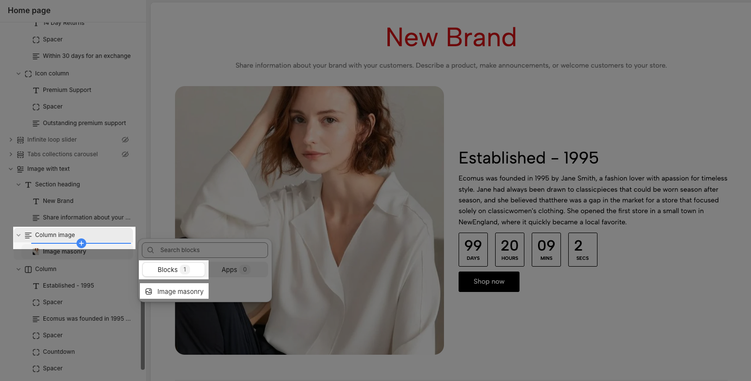
Once the Image masonry block is added, you can customize the Image masonry block in the right-hand sidebar:
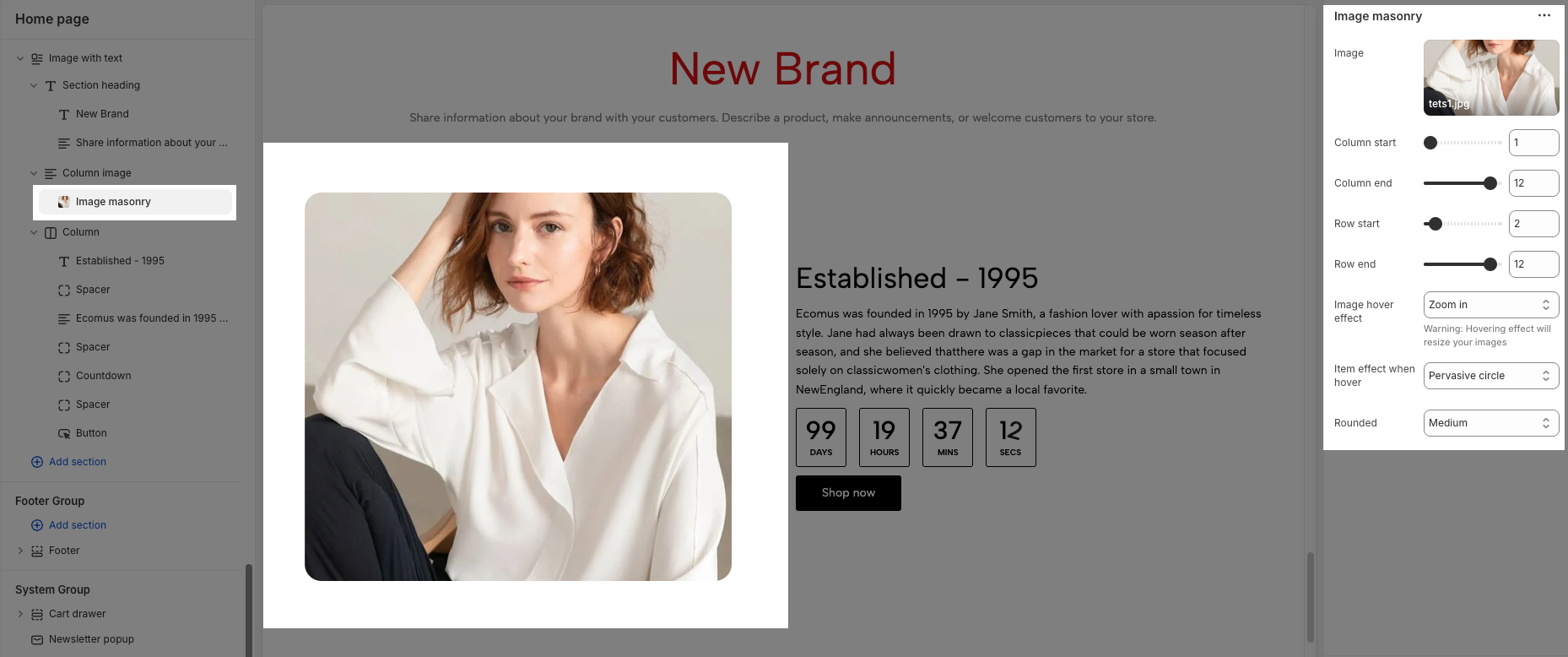
Image: This is where you select the specific picture you want to display in your masonry layout. The “Select” button allows access to your website's media library or upload a new image. And the link “Explore free images” lets you browse stock images.
Column start: This option controls the starting column position of this image within the masonry layout. For example, if the value is set to 1, this image will start in the first column.
Column end: This option controls the ending column position of this image within the masonry layout. For example, if the value is set to 12, this image will span from the "Column start" up to and including column 12
Row start: This option controls the starting row position of this image within the masonry layout. For example, if the value is set to 2, this image will start in the second row.
Row end: This option controls the ending row position of this image within the masonry layout. For example, if the value is set to 12, this image will span from the "Row start" down to and including row 12.
Image hover effect: This dropdown menu allows you to select an effect that will be applied to the image when a user hovers their mouse cursor over it. Options included None, Zoom in, Rotate, Move to top, Move to bottom, Move to right, Move to left, Filter, and BounceIn
Item effect when hover: This dropdown menu lets you choose an effect that applies to the entire item when hovered over. Options included None, Border run, Pervasive circle, Plus zoom overlay, and Overlay.
Rounded: This dropdown menu controls the roundness of the image corners. Options included None, Extra small, Small, Medium, Large, Full.
3.2. How to customize the Column image block
You can conveniently customize this block using the options in the right-hand sidebar:
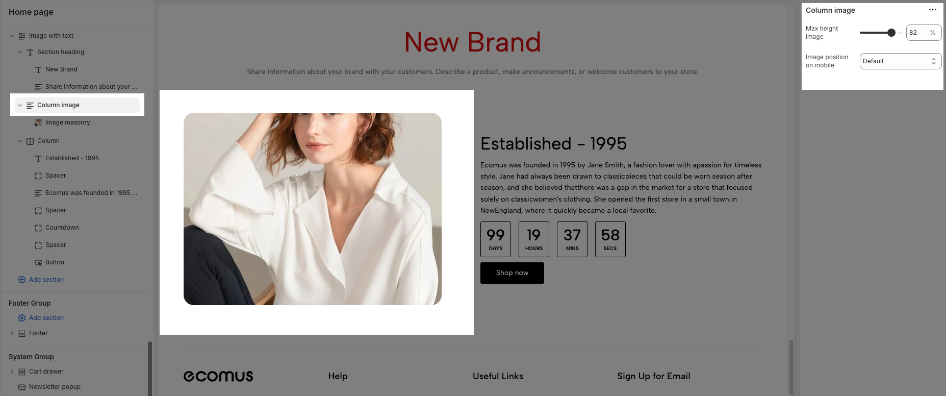
Max height image: Sets the maximum height of the image within the column, displayed as a percentage (%) of its container.
Image position on mobile: This setting defines where the image appears in mobile view (when the layout stacks vertically):
Default: Follows the default layout based on the section's design.
Image last: Displays the image below the text content on mobile devices.
Image first: Displays the image above the text content on mobile devices.
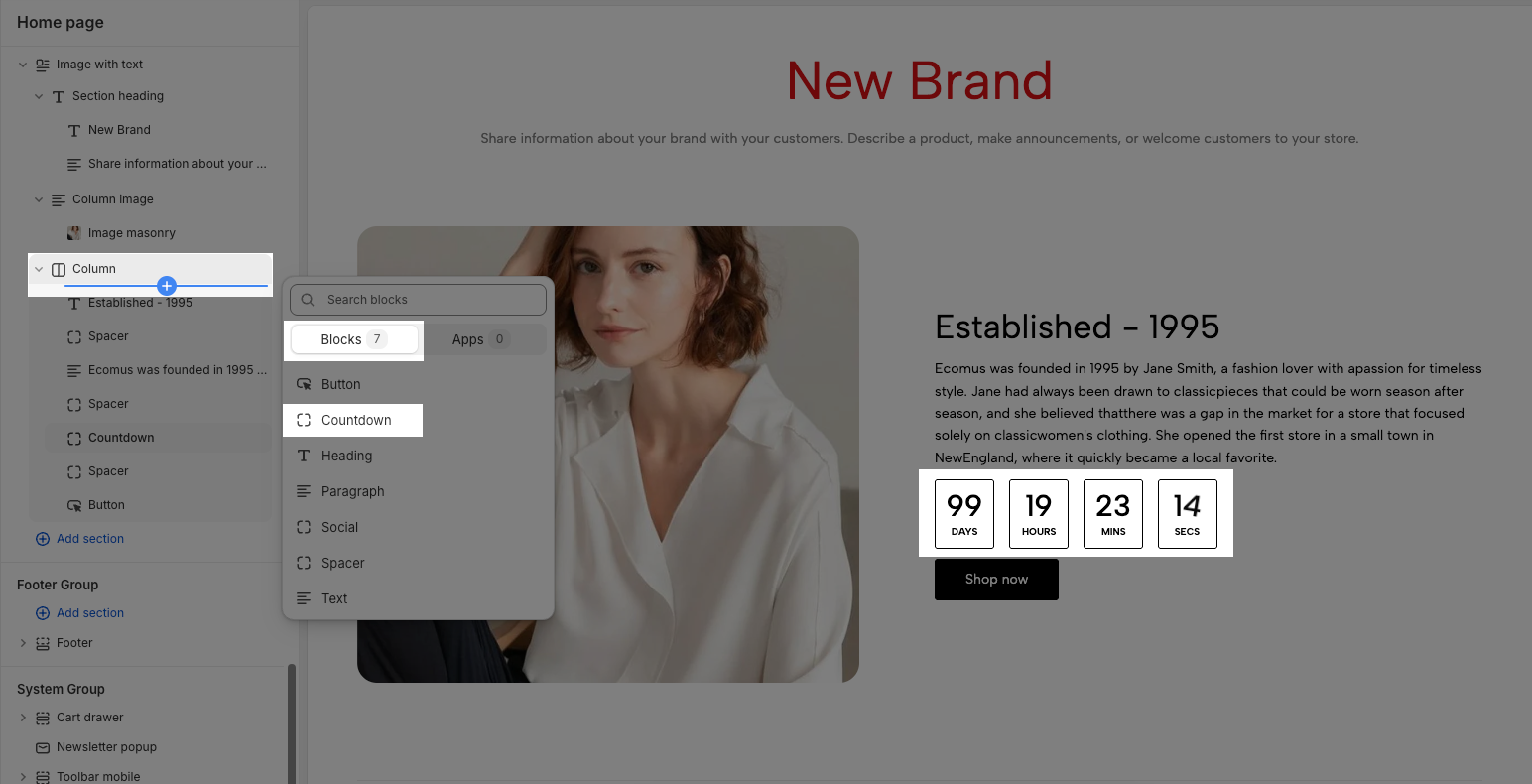
4. How to customize the Column block
The Column block serves as a container for various blocks such as Heading, Button, Text, Countdown, Spacer, Social, and Paragraph block. To effectively customize a Column block, ensure you've added your desired content blocks and configured them appropriately. The following instructions will guide you through editing the Column block itself, as well as the individual content blocks within it.
4.1. How to customize the Countdown block
To add a Countdown block, click the Add block button (plus icon ➕) under the Column block > In the Blocks tab, select Countdown.
Once the Countdown block is added, you can customize the countdown block in the right-hand sidebar:
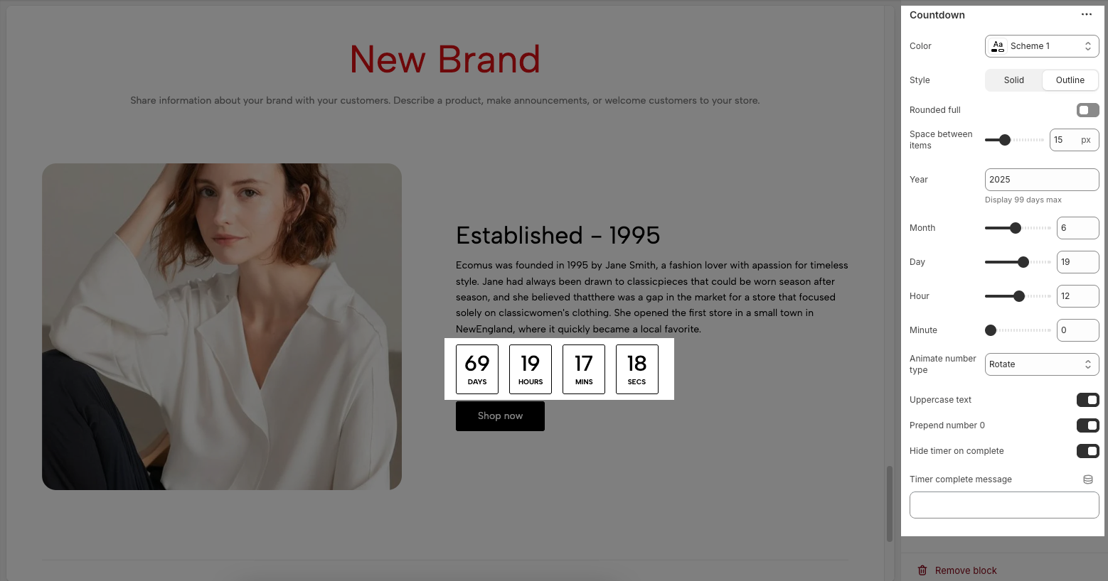
Color: This dropdown menu allows you to select a predefined color scheme for the countdown block. Clicking the dropdown will likely show other color palettes you can choose from.
Style: There are two options to control the visual style of countdown:
Solid: Likely displays the timer elements with a solid background or container.
Outline: Likely displays the timer elements with only a border or outline.
Rounded full: When turned on, will likely apply full rounding to the containers of the countdown, creating a circular. When turned off, the containers will likely have square
Space between items: This option controls the horizontal spacing between the different time units (days, hours, minutes, seconds) displayed in the countdown.
Year: This option allows you to set the target year for the countdown. A maximum display of 99 days.
Month: This option allows you to set the target month for the countdown.
Day: This option allows you to set the target day of the month for the countdown.
Hour: This option allows you to set the target hour for the countdown
Minute: This option allows you to set the target minute for the countdown.
Animate number type: This dropdown menu controls the animation style used when the countdown numbers change. Options included None, Move top, Move bottom, Scale, and Rotate
Uppercase text: When turned on, will display the time units (e.g., "Days", "Hours", "Minutes", "Seconds") in uppercase. When turned off, they will appear in their default capitalization.
Prepend number 0: When turned on, will add a leading zero to single-digit numbers (e.g., display "05" instead of "5"). When turned off, single-digit numbers will be displayed without a leading zero.
Hide timer on complete: When turned on, will make the countdown timer disappear from the page once it reaches zero. When turned off, the timer will likely remain at zero.
Timer complete message: This text field allows you to enter a custom message that will be displayed when the countdown reaches zero. If this field is left empty, a default message might be shown or none.
4.2. How to customize the Button block
To add a Button block, click the Add block button (plus icon ➕) under the Column block > In the Blocks tab, select Button.
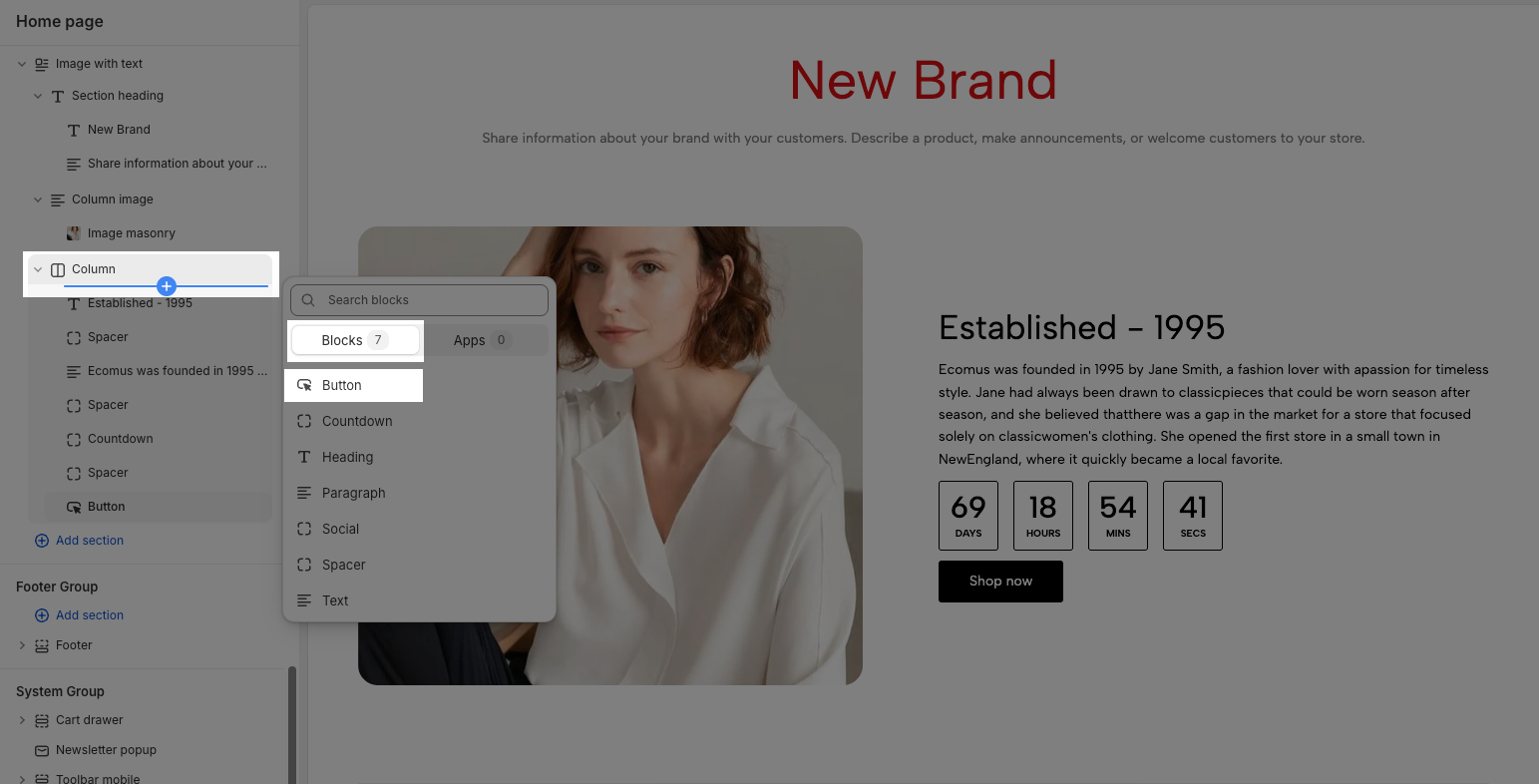
Once the Button block is added, you can customize the button block in the right-hand sidebar:
Label: Defines the text displayed on the button.
Link: Specifies the destination URL when the button is clicked.
Open this link in a new tab: Opens the link in a new browser tab when enabled.
Make button full width: Expands the button to take up the full width of its container.
Style: Choose between Solid, Outline, or Link styles for different visual effects.
Size: Adjust the button size. Options included Extra small, Small, Medium, Large, Extra large, Custom size default, and Custom size inline.
Font weight: Controls the thickness of the button text. Options included Light, Normal, Medium, Semibold, and Bold.
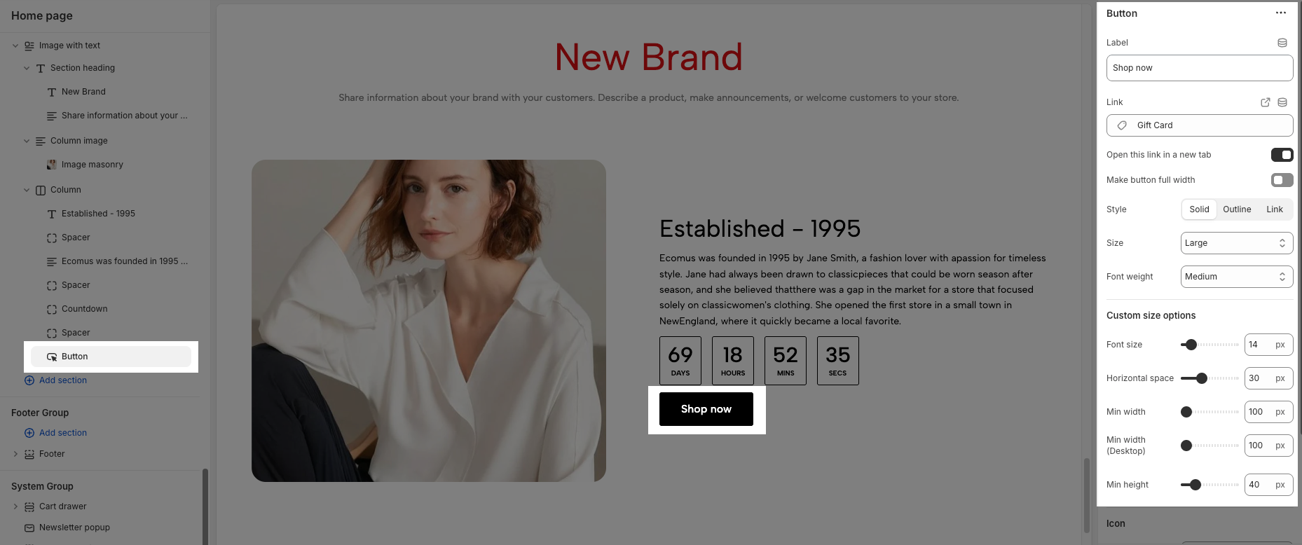
Custom Size Options:
The options below are only active when you select Custom size inline in the Size option.
Font size: Adjusts the font size of the heading in pixels (px) for desktop screens.
Tablet font size: Adjusts the font size of the heading in pixels (px) for tablet devices.
Mobile font size: Adjusts the font size of the heading in pixels (px) for mobile devices.
Font weight: Controls the thickness of the text. Common font weight values range from 100 to 900.
Letter spacing: adjust the horizontal space between the letters in the heading text, measured in pixels (px).
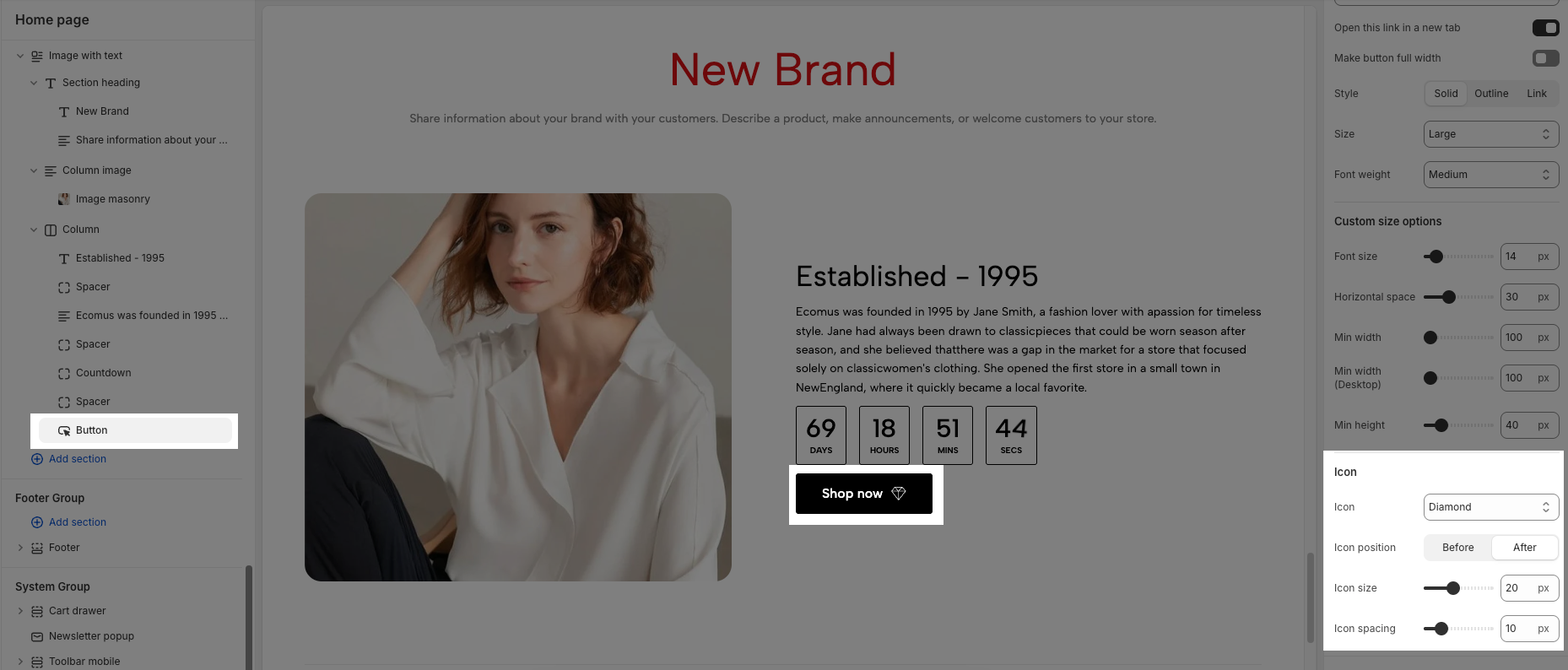
Icon:
Icon: Select the icon to display on the button (e.g., arrow, plus, etc.).
Icon position: Choose whether the icon appears Before or After the button text.
Icon size: Adjust the size of the icon in pixels.
Icon spacing: Set the spacing between the icon and the text to ensure proper alignment and readability.
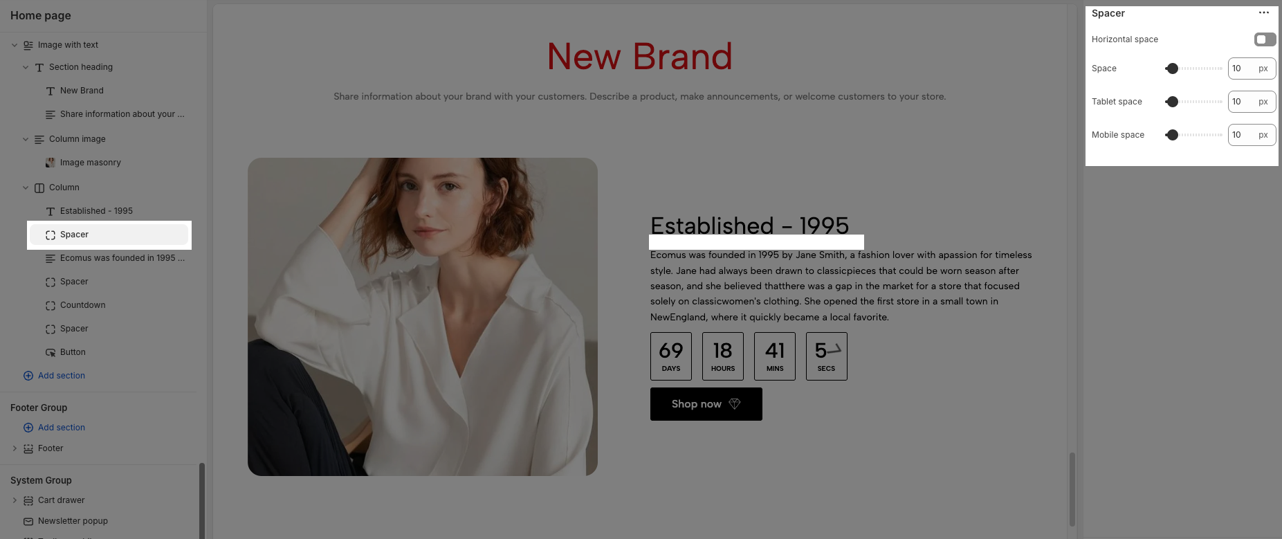
4.3. How to customize the Spacer block
To add a Spacer block, click the Add block button (plus icon ➕) under the Column block > In the Blocks tab, select Spacer.
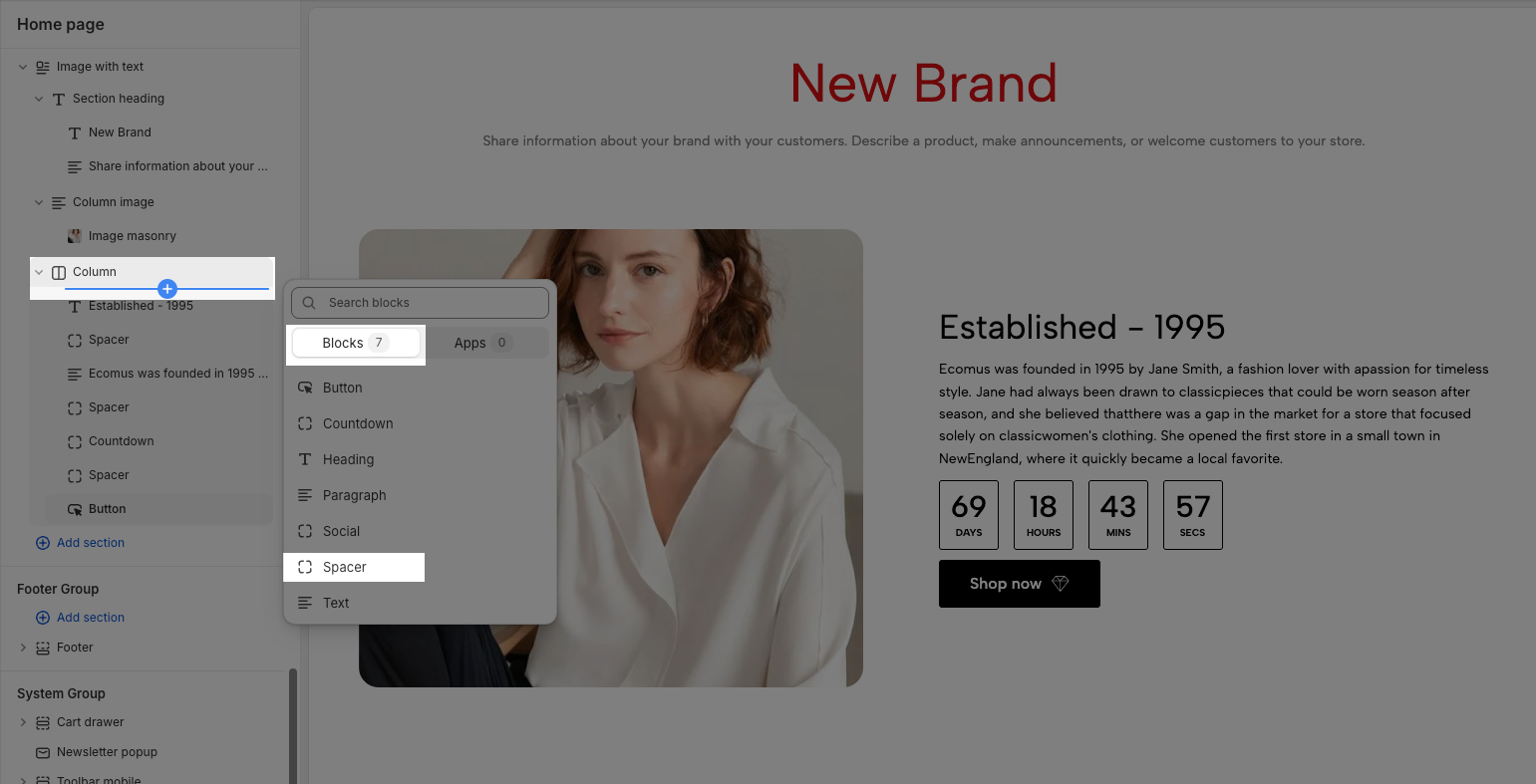
Once the Spacer block is added, you can customize the spacer block in the right-hand sidebar:
Horizontal space: If enabled, the spacer will also add horizontal spacing instead of only vertical spacing.
Space: Adjusts the amount of space (in pixels) on desktop screens.
Tablet space: Defines the amount of space for tablet devices, ensuring responsive spacing.
Mobile space: Sets the spacing specifically for mobile screens.
4.4. How to customize the Paragraph block
To add a Paragraph block, click the Add block button (plus icon ➕) under the Column block > In the Blocks tab, select Paragraph.
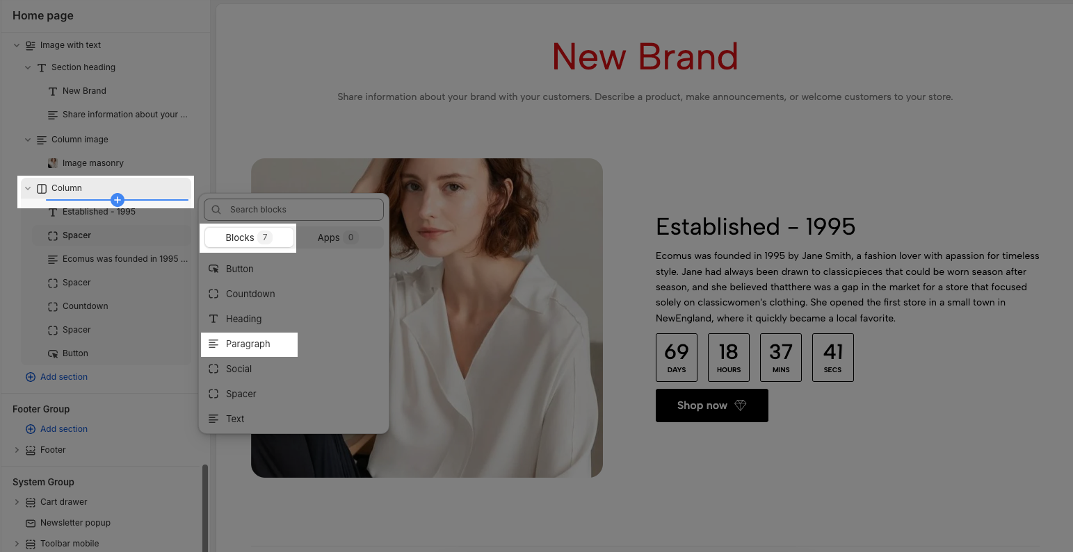
Once the Paragraph block is added, you can customize the paragraph block in the right-hand sidebar:
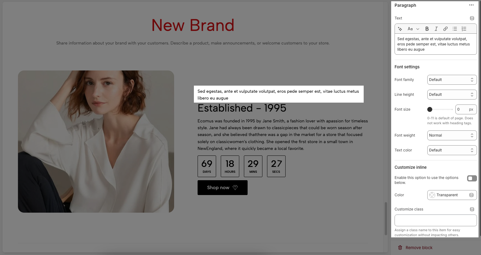
Text: Allows you to enter and format the paragraph.
Font Settings
Font family: Selects the font style for the paragraph text.
Line height: Adjusts the spacing between lines of text. Options included Default, Small, Medium, Large.
Font size: Sets the text size in pixels. The value 0-11 is the default of the page. Does not work with heading tags.
Font weight: Controls the thickness of the text. Options included Lighter, Light, Normal, Medium, Semibold, Bold, and Bolder
Text color: Allows you to choose a color for the text.
Customize Inline
Enable this option to use the options below: Enable this option to configure Color and Customize class option below.
Color: Allows setting a color the paragraph text.
Customize class: Assigns a CSS class to the paragraph for advanced styling without affecting other elements.
4.5. How to customize the Column block
You can conveniently customize this Column block using the options in the right-hand sidebar:
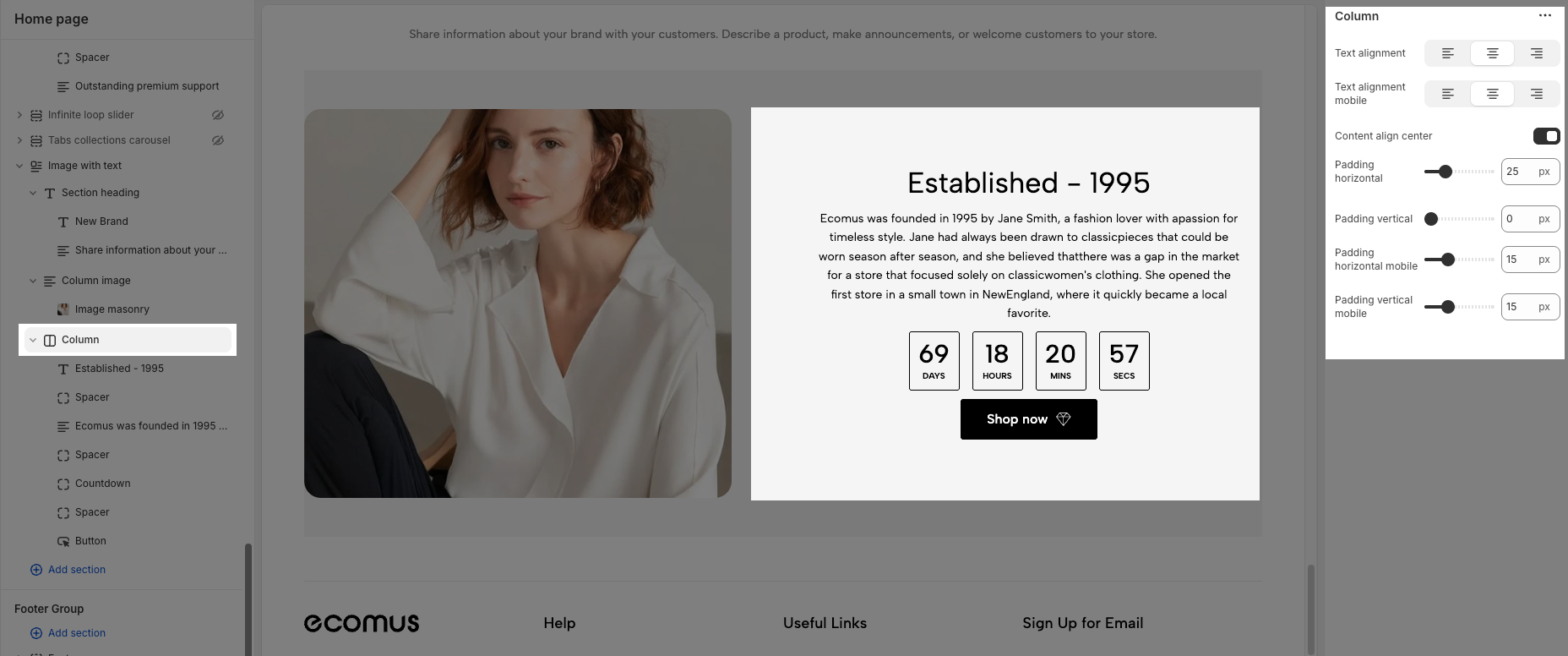
Text alignment: This set of three buttons controls the horizontal alignment of the text content within this column on desktop screens.
Left (first button): Aligns text to the left.
Center (second button): Centers text horizontally.
Right (third button): Aligns text to the right.
Text alignment mobile: This set of three buttons controls the horizontal alignment of the text content within this column specifically on mobile devices.
Left (first button): Aligns text to the left on mobile.
Center (second button): Centers text horizontally on mobile.
Right (third button): Aligns text to the right on mobile.
Content align center: When turned on, will vertically center all the content blocks (headings, text, buttons, etc.) within this column. When turned off, the content will likely align to the top by default.
Padding horizontal: This option controls the amount of empty space (padding) on the left and right sides of the content within this column.
Padding vertical: This option controls the amount of empty space (padding) at the top and bottom of the content within this column.
Padding horizontal mobile: This option controls the horizontal padding (left and right) of the content within this column specifically on mobile devices.
Padding vertical mobile: This option controls the vertical padding (top and bottom) of the content within this column specifically on mobile devices.


