


The Tabs Collection Carousel section allows you to showcase products or collections in a sleek, tabbed interface with a horizontal carousel layout. It's perfect for organizing items into categories while providing an interactive and mobile-friendly browsing experience.
1. How to access the Tabs collection carousel section?
Step 01: From Shopify Admin, click on Online Store > Select Themes > In the Current theme section, click the Customize button.
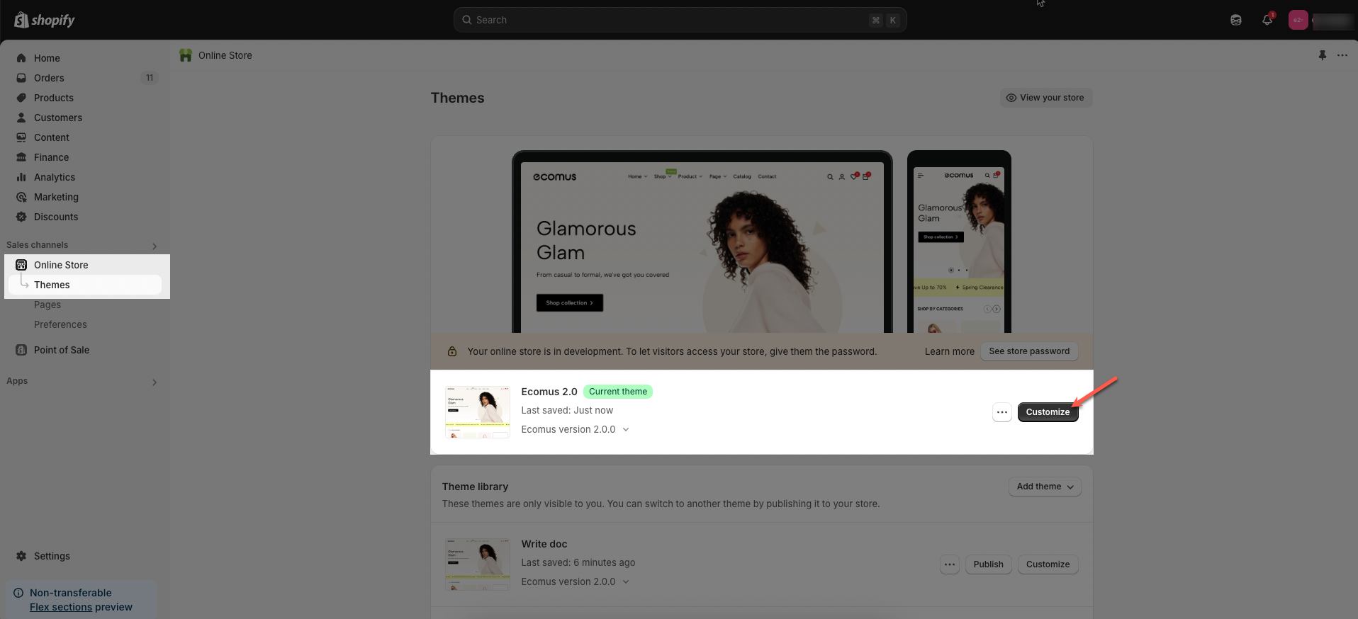
Step 02: In the theme editor (Customize), click the Sections button > Click the Add section button > In the Sections tab, scroll through the list or use the search bar to find and select Tabs collection carousel.
2. How to customize the Tabs collection carousel section?
Before customizing the Tabs collection carousel section, make sure to add the essential Tabs item or Item links blocks. Once these blocks are in place, you can begin styling and adjusting them to match your brand and content goals.
2.1. Customize Tabs item block
To add a Tabs item block to the Tabs collection carousel section, click the Add block button > Select Tabs item block.
Once the Tabs item block is added, you can customize its settings in the right-hand sidebar:
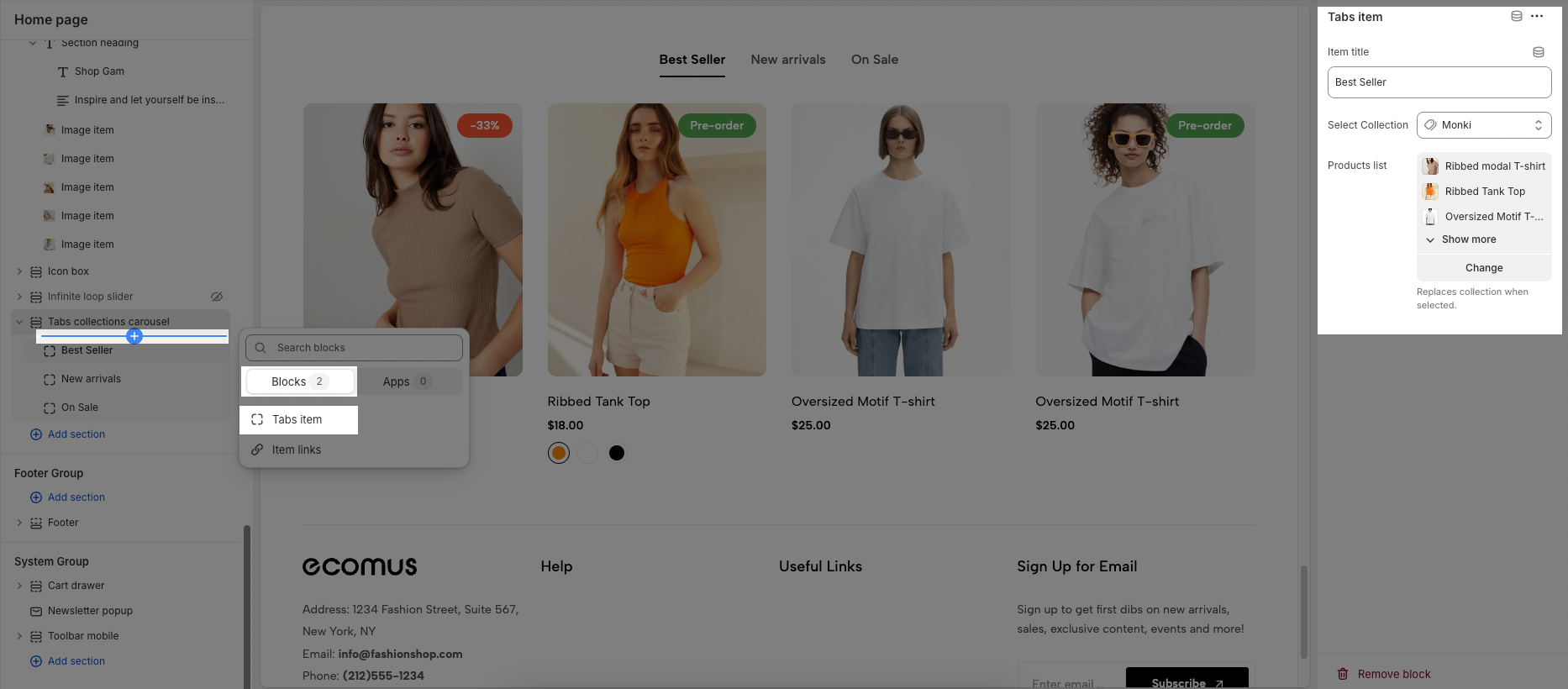
Item title: This is a text field where you can enter the title that will appear in the tabs interface. This title helps users understand the content they will find when they click on this tab.
Select Collection: This option allows you to choose a specific collection of items that will be displayed under this tab. Clicking the dropdown arrow will likely open a list of available collections for you to choose from
Products list: This option allows you to choose some of the products that can replace the collection when selected.
2.2. Customize Item links block
To add an Item links block to the Tabs collection carousel section, click the Add block button > Select Item links block.
Once the Item links block is added, you can customize its settings in the right-hand sidebar:
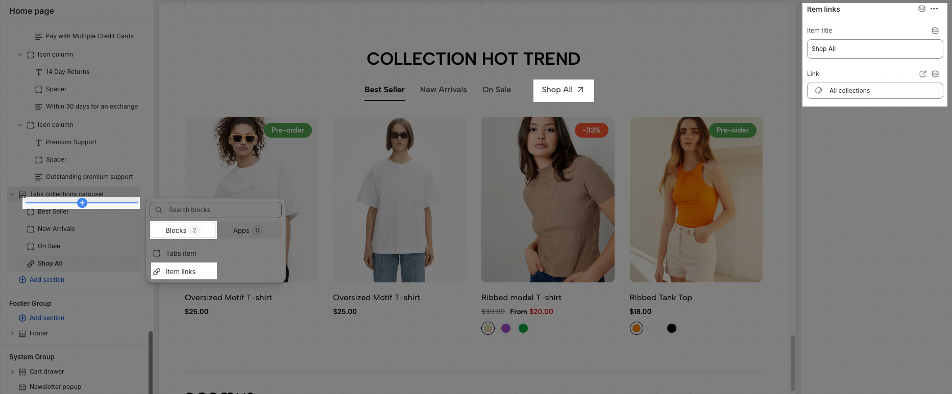
Item title: This is a text field where you can enter the title or label for a link.
Link: This section allows you to specify the destination URL or internal page that the "Item title" will link to.
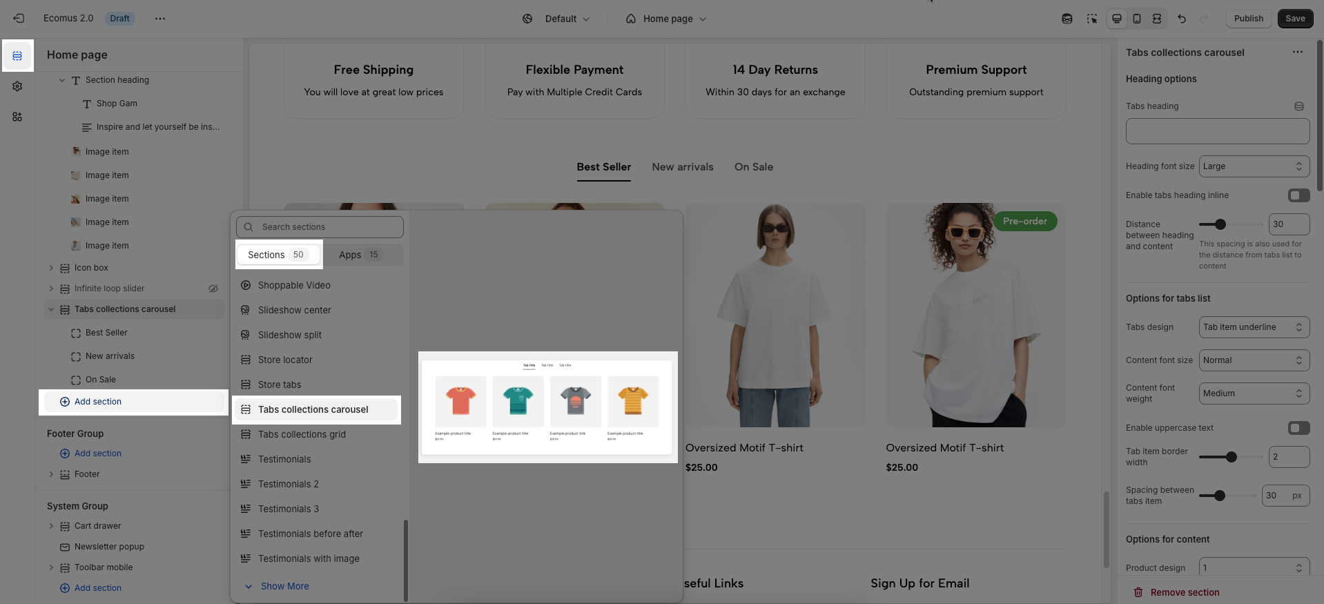
2.3. Customize Tabs collection carousel section
Here’s how you can customize the Tabs collection carousel section to best fit your content and layout. Below are the available options for customization:
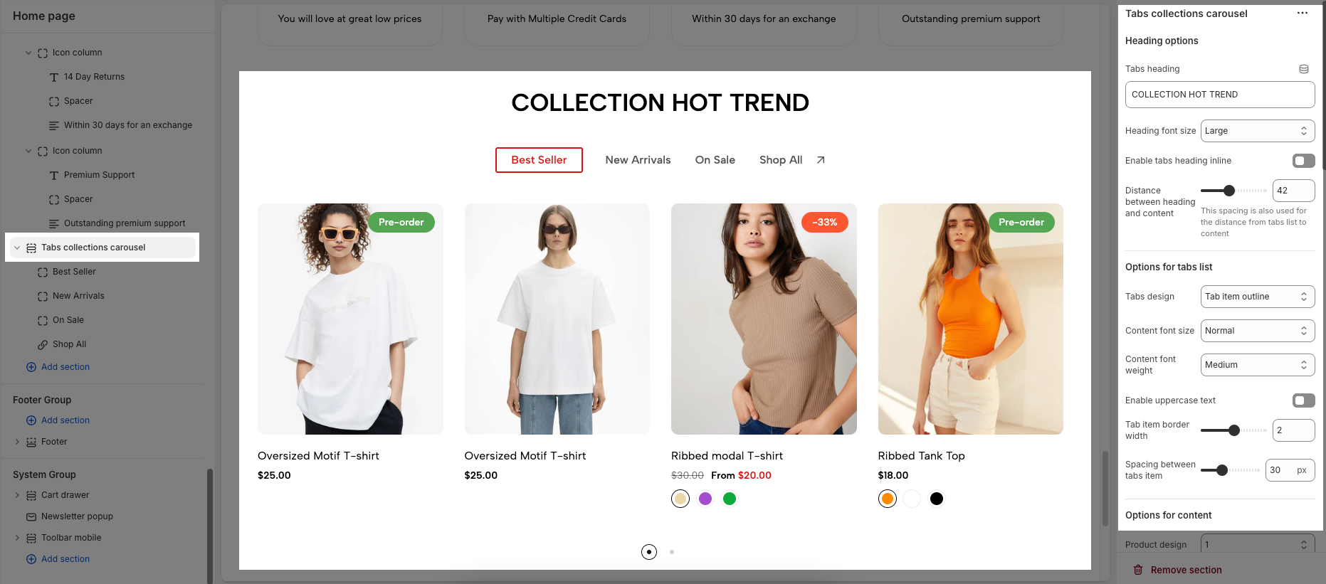
Heading options
These options control the main heading displayed for the entire Tabs Collection Carousel section.
Tabs heading: This is a text field where you can enter the heading for the entire section. This helps users understand the overall content being presented in the tabs.
Heading font size: This dropdown menu allows you to choose the font size for the "Tabs heading". Options included Small, Medium, Large, and Extra Large.
Enable tabs heading inline: This toggle switch, when turned on, would likely display the "Tabs heading" on the same line as the tabs themselves, potentially saving vertical space. When turned off, the heading would likely appear above the tabs.
Distance between heading and content: This option controls the amount of spacing between the "Tabs heading" and the content displayed below the tabs. This spacing is also used for the distance from tabs list to content
Options for tabs list
These options customize the appearance and layout of the tabs.
Tabs design: This dropdown menu allows you to select different visual designs for the tabs. The option is "Tab item underline" so that the active tab might be indicated by an underline. The option is "Tab item outline" which would apply a border or outline around the active tab.
Content font size: This dropdown menu controls the font size of the text displayed within each tab. Options included Normal, Large, and Extra large.
Content font weight: This dropdown menu allows you to set the boldness or weight of the text within the tabs. Options included Regular, Medium, Semibold, and Extra bold.
Enable uppercase text: This toggle switch, when turned on, would transform the text within all the tabs to uppercase. When turned off, the text will appear as you entered it in the "Item title" field for each tab.
Tab item border width: This option controls the thickness of the border that might appear around or below each tab item, depending on the selected "Tabs design".
Spacing between tabs item: This option controls the horizontal space between each individual tab in the tabs list. This allows you to adjust how closely or widely spaced the tabs appear.
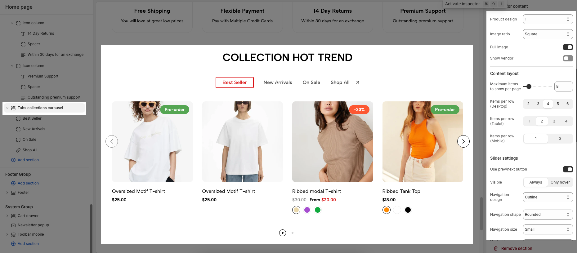
Options for content
These options control how products are displayed within the carousel for each tab.
Product design: This dropdown menu allows you to choose from different designs for how each product is displayed.
Image ratio: This dropdown menu lets you set the aspect ratio for the product images displayed in the carousel. Options included Adapt to Image, Portrait, Square, ASOS, Landscape, and Custom.
Full image: This toggle switch, when turned on, would likely display the full product image without any cropping or resizing to fit a specific container. When turned off, the images might be cropped or resized according to the chosen "Image ratio" and the layout.
Show vendor: This toggle switch controls whether the vendor or brand name of each product is displayed below the product information in the carousel. When turned off, the vendor information will not be visible.
Content layout
These options determine how many items are displayed at once and how they are arranged on different devices.
Maximum items to show per page: This option controls the maximum number of items (products) that will be visible in the carousel viewport at any given time.
Items per row (Desktop): This set of buttons allows you to specify how many items should be displayed in a single row on desktop screens. You can choose between 2, 3, 4, 5, or 6.
Items per row (Tablet): Similar to the desktop setting, these buttons control the number of items displayed in a single row on tablet devices. You can choose between 1, 2, 3, or 4.
Items per row (Mobile): This option sets the number of items displayed in a single row on mobile devices. You can choose between 1 or 2. This responsiveness ensures a good viewing experience on smaller screens.
Slider settings
These options control the behavior and appearance of the carousel navigation.
Use prev/next button: This toggle switch enables or disables the display of the prev/next button on the carousel. When turned off, these buttons will not be visible.
Visible: This set of options determines when the prev/next button are visible.
Always: The buttons will be visible at all times.
Only hover: The buttons will only appear when the user hovers their mouse cursor over the carousel area.
Navigation design: This dropdown menu allows you to choose from different visual designs for the prev/next button. Options included Default, Outline, and Simple
Navigation shape: This dropdown menu lets you select the shape of the prev/next button. Options included Default, Rounded, and Rotate
Navigation size: This dropdown menu controls the size of the prev/next button. Options included Extra small, Small, Medium, and Large.
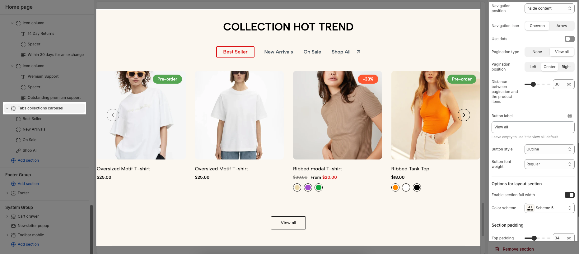
Navigation position: This dropdown menu controls the placement of the prev/next button. Option included:
Inside content: The prev/next buttons are displayed overlaid on top of the carousel's content.
Outside content: The prev/next buttons are positioned to the left and right of the carousel's items, in the surrounding container.
On the border: The prev/next buttons are placed along the edges or borders of the carousel container.
Navigation icon: This set of buttons allows you to choose the type of icon used for The prev/next buttons. You can select either "Chevron" (arrow-like symbols, often angled) or "Arrow" (more traditional straight arrows).
Use dots: This toggle switch enables or disables the display of pagination dots below the carousel. When turned off, pagination dots will not be visible.
Pagination type: This set of buttons determines what kind of pagination is used (if "Use dots" is enabled).
None: No "View all" button is displayed
View all: A "View all" button might be displayed, potentially linking to a page showing all items in the current tab's collection.
Pagination position: If Use dots or a "View all" button are enabled, this set of buttons controls their horizontal alignment. You can choose between Left, Center, or Right.
Distance between pagination and the product items: This option controls the vertical spacing between the pagination elements (dots or "View all" button) and the product items in the carousel.
Button label: This text field allows you to customize the text displayed on the "View all" button (if "Pagination type" is set to "View all"). The current label is "View all". If you leave this field empty, the default text "view all" will be used.
Button style: This dropdown menu lets you choose the visual style of the "View all" button. Options included Solid. Outline, and Outline 2
Button font weight: This dropdown menu controls the boldness or weight of the text on the "View all" button. Options included Regular, Medium, Semibold, and Bold
Options for layout section
Enable section full width: This toggle switch, when turned on, will make the entire section span the full width of the browser window. When turned off, the section will likely be constrained to the website's main content width.
Color scheme: This dropdown menu allows you to select a predefined color scheme for the section. Clicking the dropdown will likely reveal other color palettes that you can apply to the background, text, and other elements within this section for a consistent look.
Section padding
This section controls the spacing around the entire slider section, both above and below the content.
Top padding: This option allows you to set the amount of space (padding) at the top of the slider section. You can drag the slider or directly enter a numerical value to adjust this spacing
Bottom padding: This option allows you to set the amount of space (padding) at the bottom of the slider section. You can drag the slider or directly enter a numerical value to adjust this spacing
Rate padding (mobile): This option allows you to set the aspect ratio-based padding for mobile view (in percentage). For example, 75% means the height will be 75% of the width.


