


Lookbook Carousel sections allow you to create a beautiful lookbook. One of the best sections that make customers is the right-first-time access to your store.
In the Theme editor (Customize) > Add section > Lookbook Carousel > Save.
1. Lookbook item
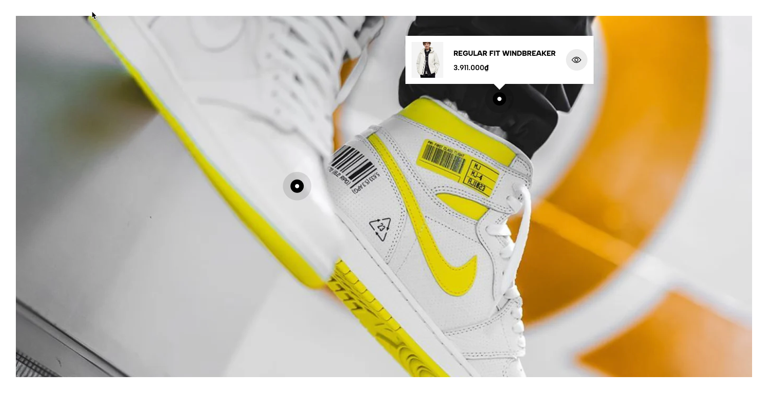
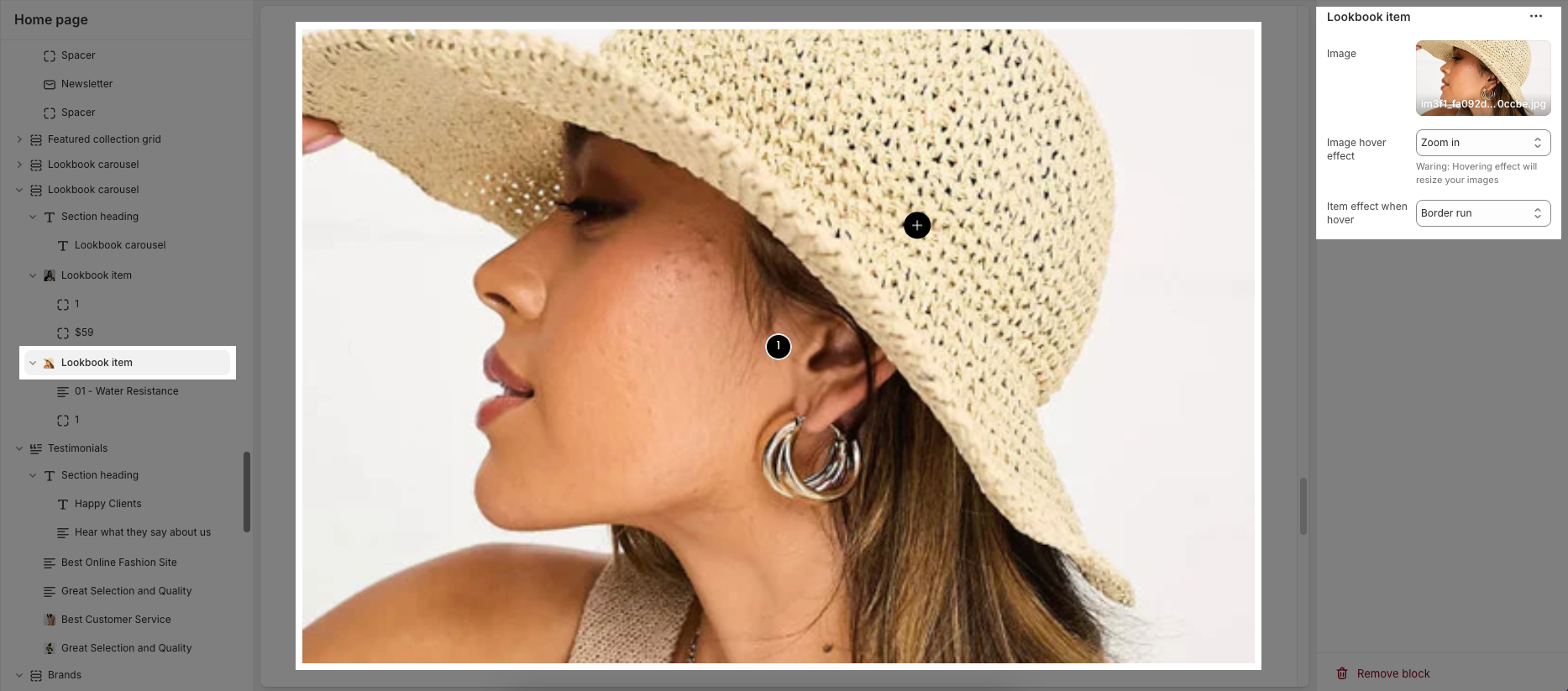
A Lookbook Item is a component within the Lookbook Carousel that allows you to add hotspots on an image to display product details or direct users to a product page.
You can customize a lookbook item with options bellow:
Image: Select the main image for the Lookbook Item.
Image Hover Effect: Allows you to apply effects when hovering over the image. Options may include zooming in, fading, or changing the image color.
Item Effect When Hover: Allows you to apply effects when hovering over the item, such as a running border effect or other visual effects.
There are 3 Pin block can add to lookbook item: Pin product, Pin product 2 and Pin text
1.1. Pin product
The Pin Product feature allows you to add interactive hotspots to images, showcasing specific products with a pop-up display. Below are the customization options available for configuring a product pin.
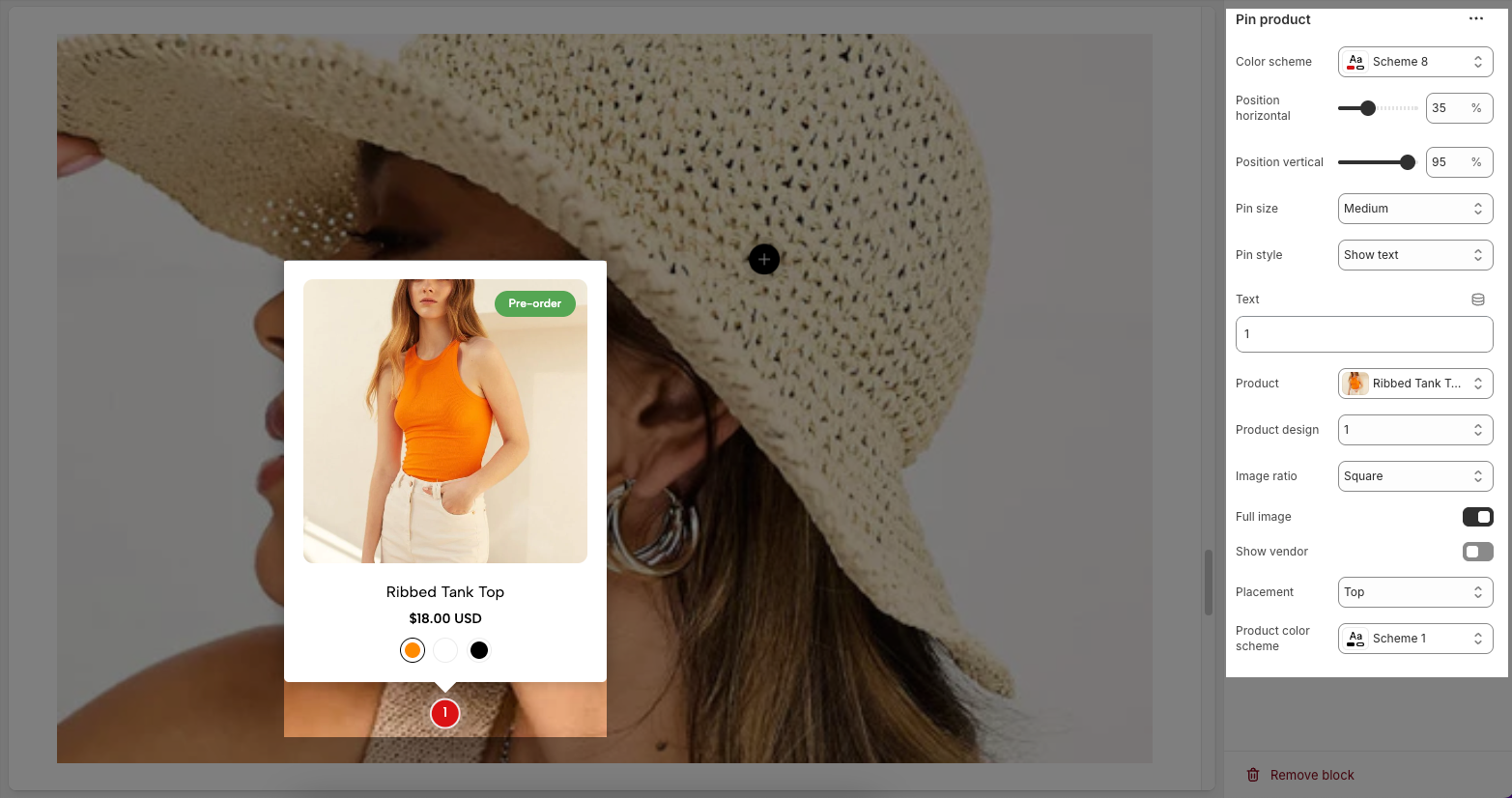
Color scheme – Select the color scheme for the product pin.
Position horizontal/vertical – Adjust the horizontal/vertical position of the pin on the image.
Pin size – Choose the size of the pin (small, medium, large).
Pin style – Select how the pin is displayed (icon only or with text).
Text – Enter the text displayed on the pin.
Product – Assign a product linked to the pin.
Product design – Choose how the product appears in the pop-up.
Image ratio – Select the image aspect ratio (square, landscape, portrait).
Full image – Enable/disable full product image display.
Show vendor – Enable/disable displaying the brand or vendor.
Placement – Choose where the pop-up appears (top, bottom, left, right of the pin).
Product color scheme – Select a custom color scheme for the product in the pop-up.
1.2. Pin product 2
Similar to Pin product, you can be customized Pin product 2 with the bellow options:
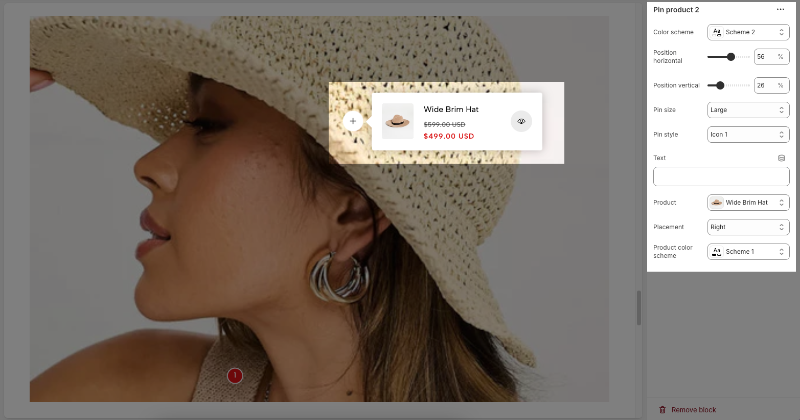
Color scheme – Select the color style for the pin.
Position horizontal/vertical – Adjust the pin's position along the horizontal and vertical axes.
Pin size – Choose the pin size (small, medium, large).
Pin style – Select the icon style for the pin.
Text – Add custom text to the pin. Only work with Pin style is show text.
Product – Assign the product linked to this pin.
Placement – Set the position of the product pop-up relative to the pin (left, right, top, bottom).
Product color scheme – Choose the color scheme for the product pop-up display.
1.3. Pin text
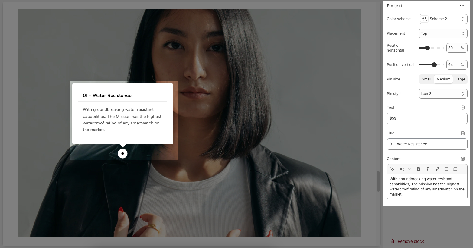
Color scheme – Choose the color theme for the pin.
Placement – Set the position of the text box relative to the pin (top, bottom, left, right).
Position horizontal/vertical – Adjust the pin’s exact location on the image.
Pin size – Select the size of the pin (small, medium, large).
Pin style – Choose the icon style for the pin.
Text – Add custom text to the pin. Only work with Pin style is show text.
Title – Enter a heading for the text box.
Content – Provide a detailed description or information related to the pin.
2. Lookbook carousel
The Lookbook Carousel allows you to showcase multiple images in a slider format, perfect for highlighting products or key visuals. Below are the customization options available:
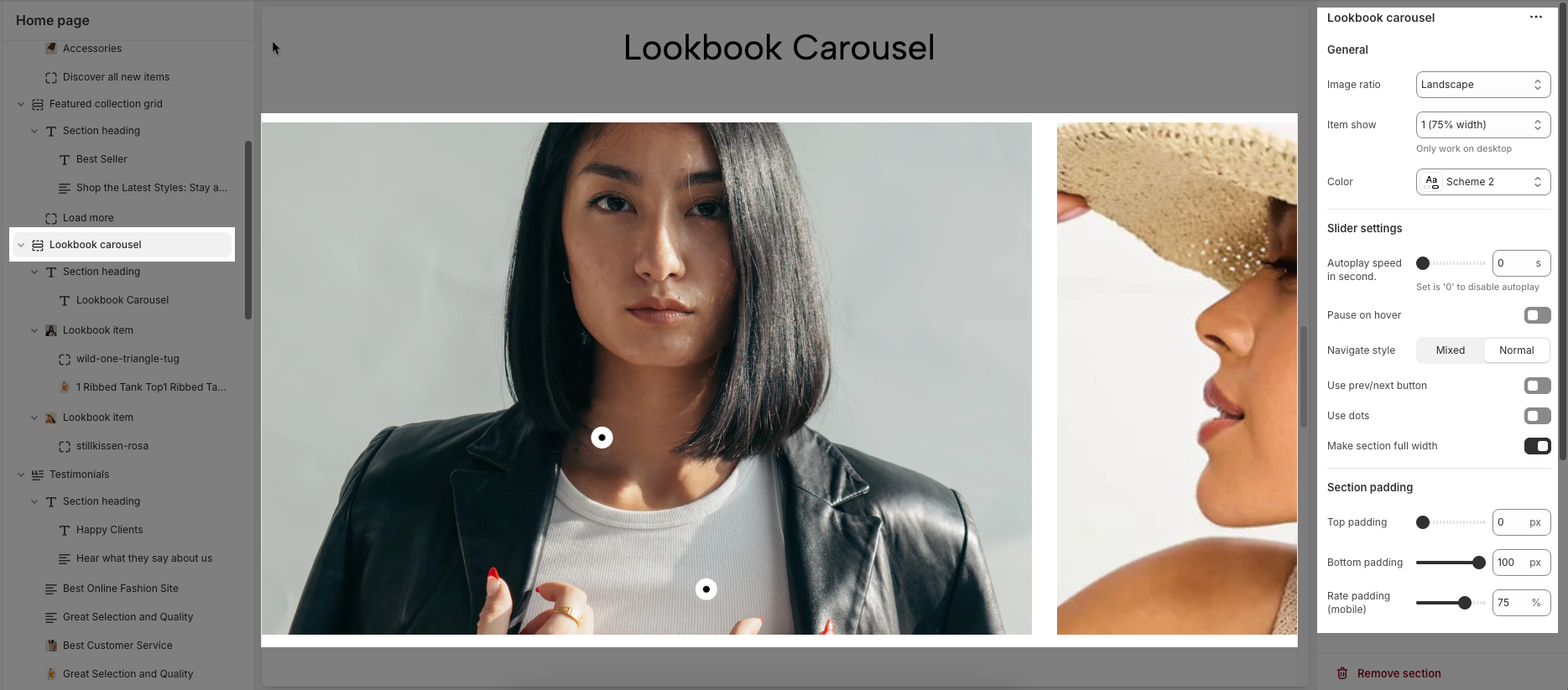
General Settings
Image ratio – Set the aspect ratio of images (e.g., landscape, square).
Item show – Adjust the number of items displayed at a time (only applies to desktop view).
Color – Select a color scheme for the carousel section.
Slider Settings
Autoplay speed in second: This controls the speed at which slides change automatically, measured in seconds. If set to 0, autoplay will be disabled.
Pause on hover:
- If enabled (On), the slider will pause when the user hovers over it.
- If disabled (Off), the slider will continue playing even when hovered over.
Navigate style – Choose between Mixed (combination of navigation options) or Normal (standard sliding effect).
Use prev/next button – Enable or disable previous and next navigation buttons.
Use dots – Toggle on/off the dot indicators for navigation.
Make section full width – Expand the carousel to occupy the full width of the page.
Section Padding
Top padding – Adjust the space above the carousel.
Bottom padding – Adjust the space below the carousel.
Rate padding (mobile) – Set the padding percentage for mobile responsiveness.


