The testimonials section is designed to build trust and credibility by showcasing real customer feedback. It helps potential buyers see the positive experiences of others, reinforcing the quality and reliability of our products/services.
1. How to access Testimonials section?
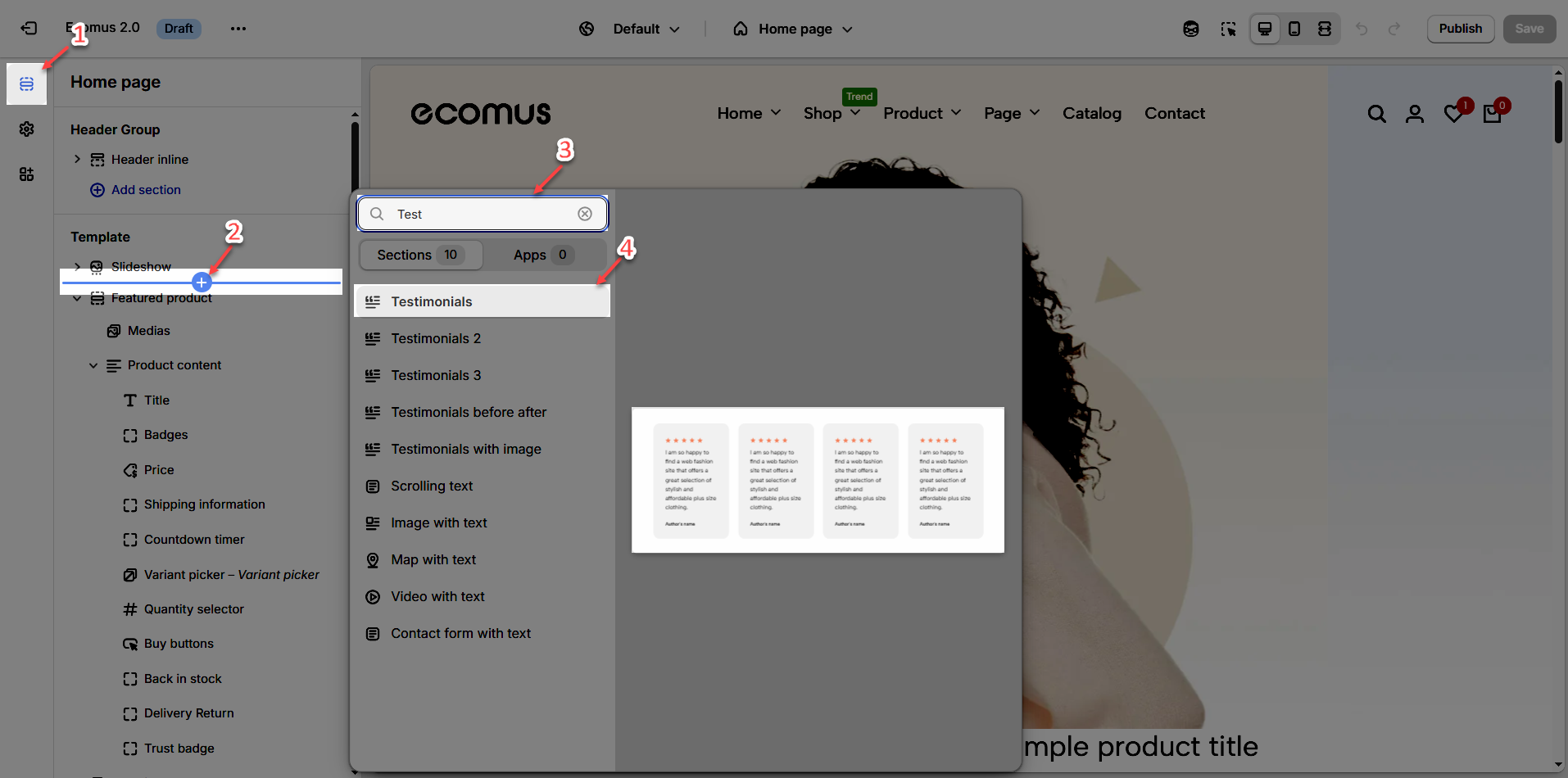
Step 01: From Shopify Admin, click on Online Store > Select Themes > In the Current theme section, click the Customize button.

Step 02: In the theme editor (Customize), click the Sections button > Click the Add Section button or hover below another section until the (➕) icon appears > In the Sections tab, scroll through the list or use the search bar to find and select Testimonials section.
2. How to customize the Testimonials section?
2.1. Testimonals section
After adding the Testimonials section, you can customize its settings in the left or right sidebar (depending on your screen size)
2.1.1. General options
Content align: Choose how you want the testimonials to be positioned—left-aligned, center-aligned—to match your store's aesthetic
Testimonials Design: Customize the look and feel of the testimonials by selecting different layout styles
Items per Row (Desktop/Tablet/Mobile): Control how many testimonials are displayed per row on different devices
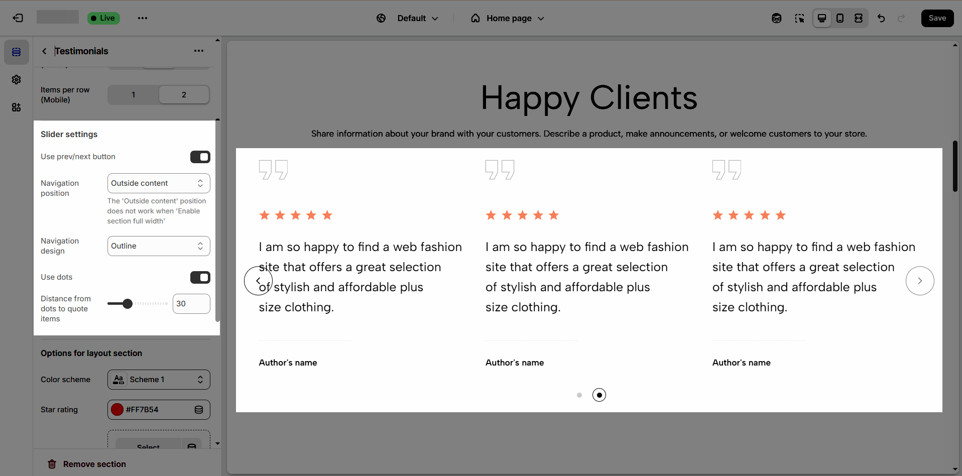
2.1.2. Slider settings
Use Prev/Next Button: Enable or disable previous and next buttons to allow users to navigate through testimonials easily
Navigation position: Choose whether the navigation buttons appear inside the testimonial content or outside.
The 'Outside content' position does not work when 'Enable section full width'
Navigation Design: Customize the appearance of navigation buttons (default, outline, simple) to match your store's branding.
Use Dots: Enable or disable dot indicators for pagination. These dots help users understand how many testimonials are available and allow them to navigate between them easily.
Distance from Dots to Quote Items: Adjust the spacing between the dot navigation and the testimonial content to ensure a visually appealing and well-structured layout.
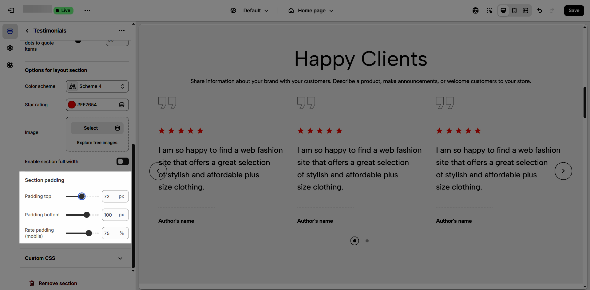
2.1.3. Options for layout section
Color Scheme: This option is used in all testimonials, to learn more about this, refer to this document
Star Rating: Allows you to adjust the star's color.
Image: add an image background for the section
Enable section full width: make your testimonial section 100% of the screen width.
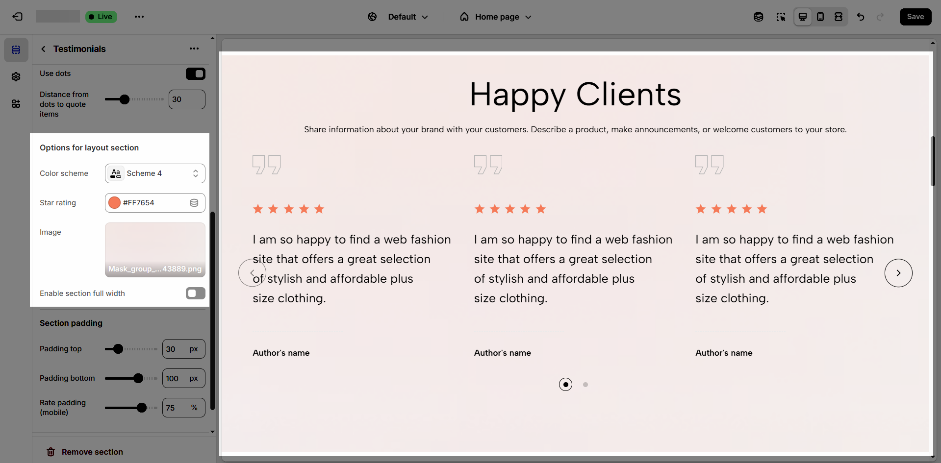
2.1.4. Section padding
Top padding: Creates space above the content within an element, separating it from elements above and improving visual layout.
Bottom padding: Creates space below the content within an element, separating it from elements below and improving visual layout.
Rate padding (mobile): Adjust spacing around mobile top elements, optimizing user experience and ensuring easy interaction on smaller screens.
2.1.5. Custom CSS
Allows users to customize by adding CSS rules, beyond the limitations of default settings. This allows for fine-tuning the design to every detail, to suit specific needs.
Add custom styles to this section only.
To add custom styles to your entire online store, go to theme settings.
2.2. Section heading block
Choose a heading that aligns with your brand’s tone and message to build trust and engagement.
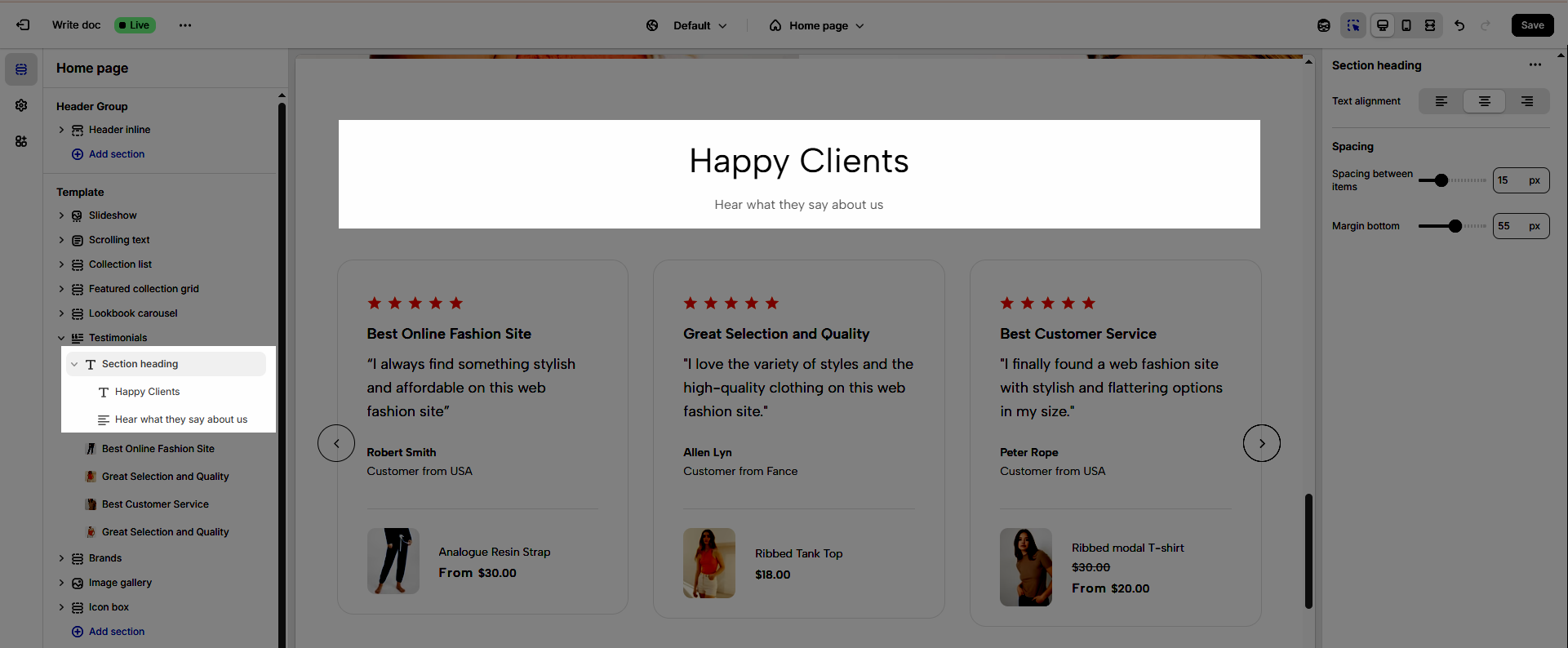
2.2.1. Section heading block
Clicking on the Section heading title, you can customize that section's settings in the right sidebar
Text alignment: Choose how your testimonials are aligned for the best visual impact. Center alignment creates a balanced look, while left or right alignment can match your overall design style.
Spacing between items: Adjust the spacing between items to create the perfect flow
Margin bottom: Set the bottom margin to control the spacing between the heading and the section
2.2.2. Heading block
To add Heading block to the Section heading, click the Add item button (plus icon ➕) under the Section heading.
Once the Heading block is added, you can customize its settings in the left or right-hand sidebar (depending on your screen size)
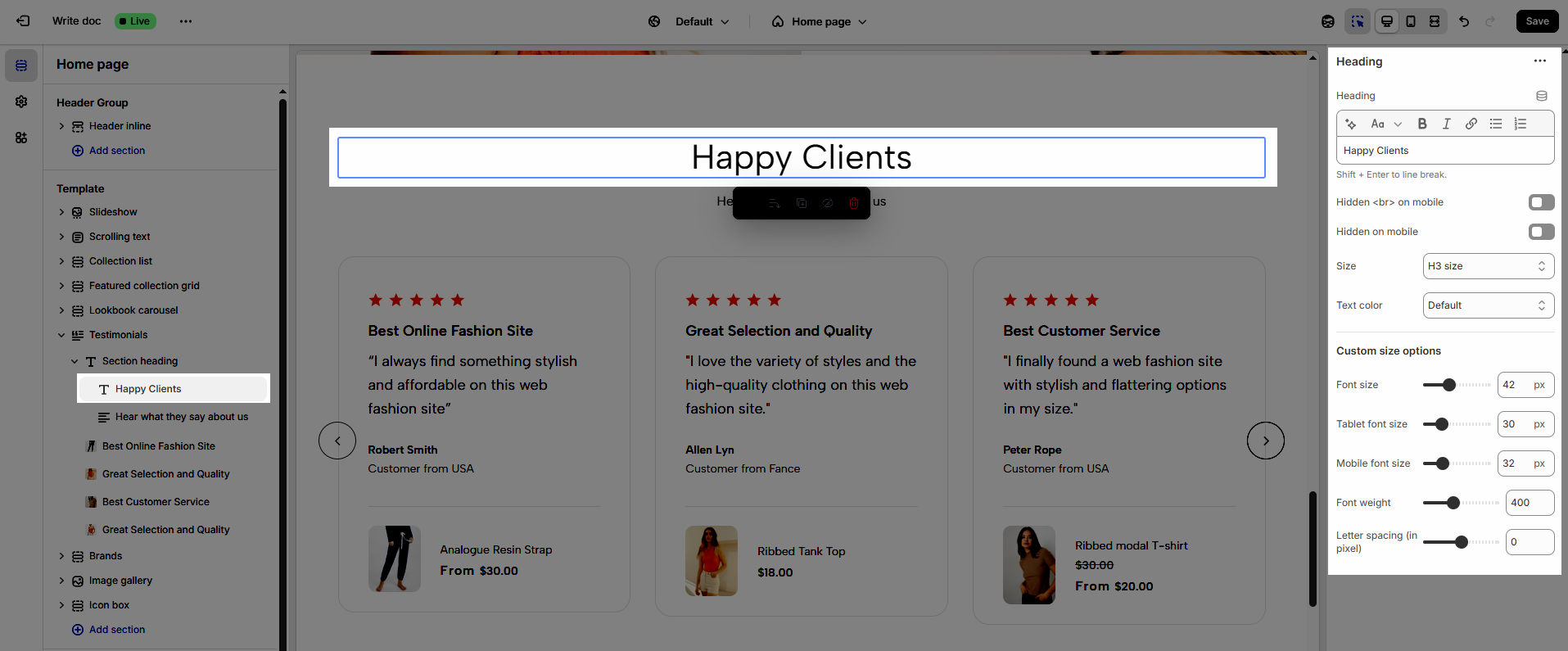
Heading (Shift + Enter to line break): Define the main title that represents your content or section. Make it engaging and relevant.
Hidden <br> on mobile: Remove unnecessary line breaks on mobile devices
Hidden on mobile: Choose whether to hide the heading completely on mobile devices for a streamlined display.
Choose "Custom size inline" to freely adjust the size in the Custom Size Options section.
Size: Adjust the overall heading size to fit the design aesthetics of your store.
Text Color: Customize the heading color to align with your brand identity and improve readability.
Font size (Desktop/Tablet/Mobile): Set different font sizes for each device type to ensure a responsive and visually appealing layout.
Font weight: Control the thickness of the heading text
Letter spacing (in pixel): Adjust the space between letters to enhance readability and design precision.
2.2.3. Text block
To add Text block to the Section heading, click the Add item button (plus icon ➕) under the Section heading.
Once the Text block is added, you can customize its settings in the left or right-hand sidebar (depending on your screen size)
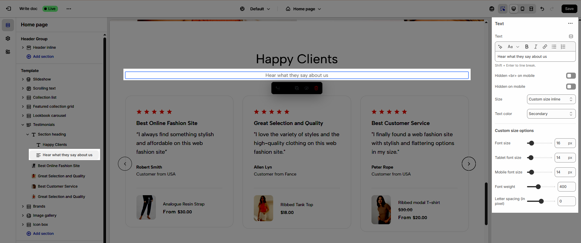
Text (Shift + Enter to line break): Allows users to add textual content, providing information, descriptions, or explanations.
Hidden <br> on mobile: Remove unnecessary line breaks on mobile devices
Hidden on mobile: Choose whether to hide the heading completely on mobile devices for a streamlined display.
Choose "Custom size inline" to freely adjust the size in the Custom Size Options section.
Size: Adjust the overall heading size to fit the design aesthetics of your store.
Text Color: Customize the heading color to align with your brand identity and improve readability.
Font size (Desktop/Tablet/Mobile): Set different font sizes for each device type to ensure a responsive and visually appealing layout.
Font weight: Controls the thickness of the heading text
Letter spacing (in pixel): Adjust the space between letters to enhance readability and design precision.
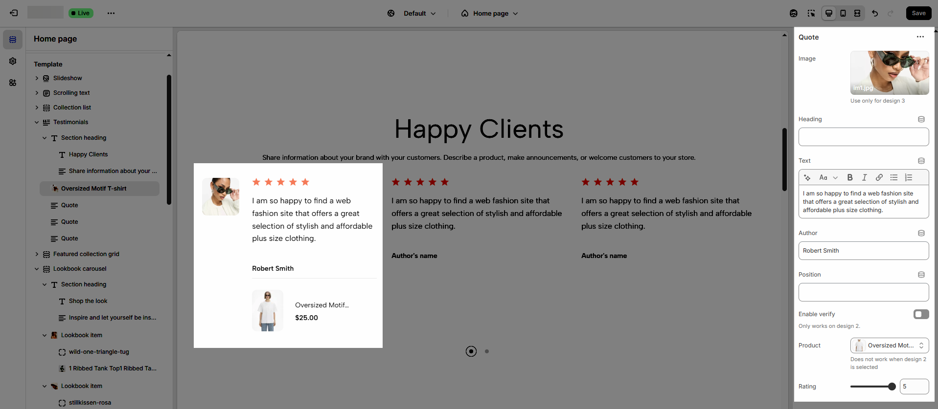
2.3. Quote block
To add a Quote block to the Testimonials section, click the Add item button (plus icon ➕) under the Testimonials section.
Once the Quote is added, you can customize its settings in the left or right-hand sidebar (depending on your screen size)
Image: Upload an optional customer image, company logo, or product photo to enhance credibility and visual appeal.
Use only for design 3
Heading: Add a short, impactful title summarizing the testimonial
Text: Display the main testimonial content, including the customer's feedback about your product or service. Keep it authentic and engaging.
Author: Show the name of the person providing the testimonial to add a personal touch and build trust.
Position: If applicable, display the author's role or designation
Enable Verify: Activate a verification badge to indicate that the testimonial comes from a genuine customer
Use only for design 2
Product: Optionally link the testimonial to a specific product the customer reviewed
Rating: Show a star rating (1–5 stars) to represent the customer's satisfaction level visually. This adds a quick and effective way to convey positive experiences.