


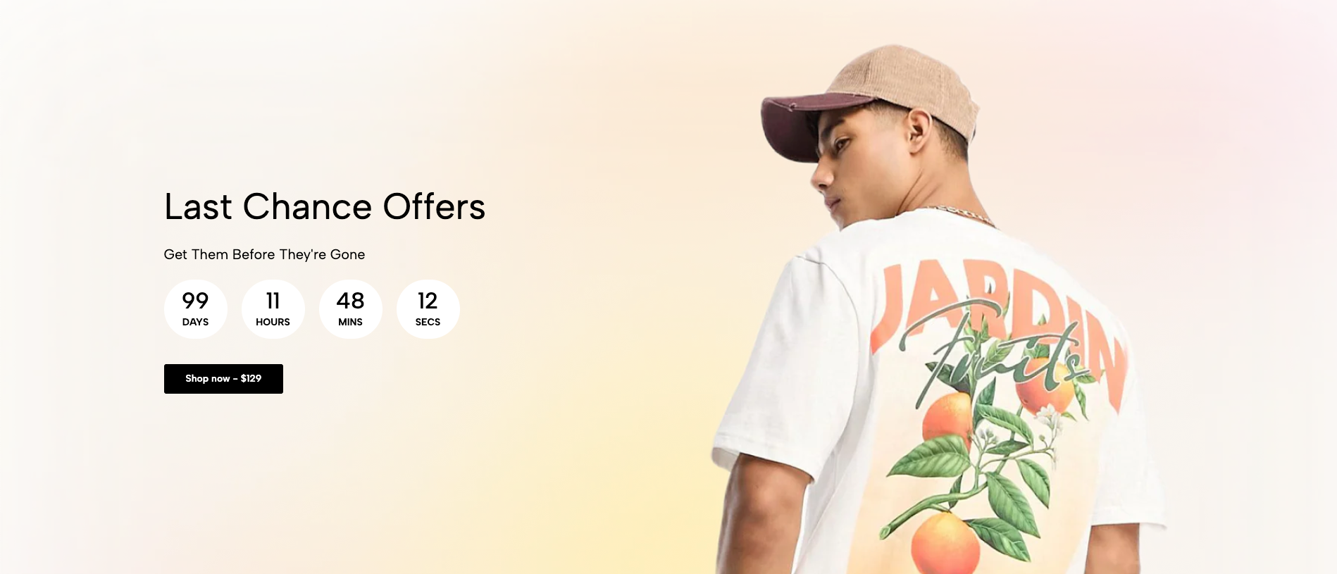
The Hero Image section is designed to make a strong visual impact at your homepage. It features a large background image with customizable text, countdown and an optional call-to-action button. This section is ideal for highlighting promotions, new arrivals, or your brand’s key message.
1. How to access the Hero image section?
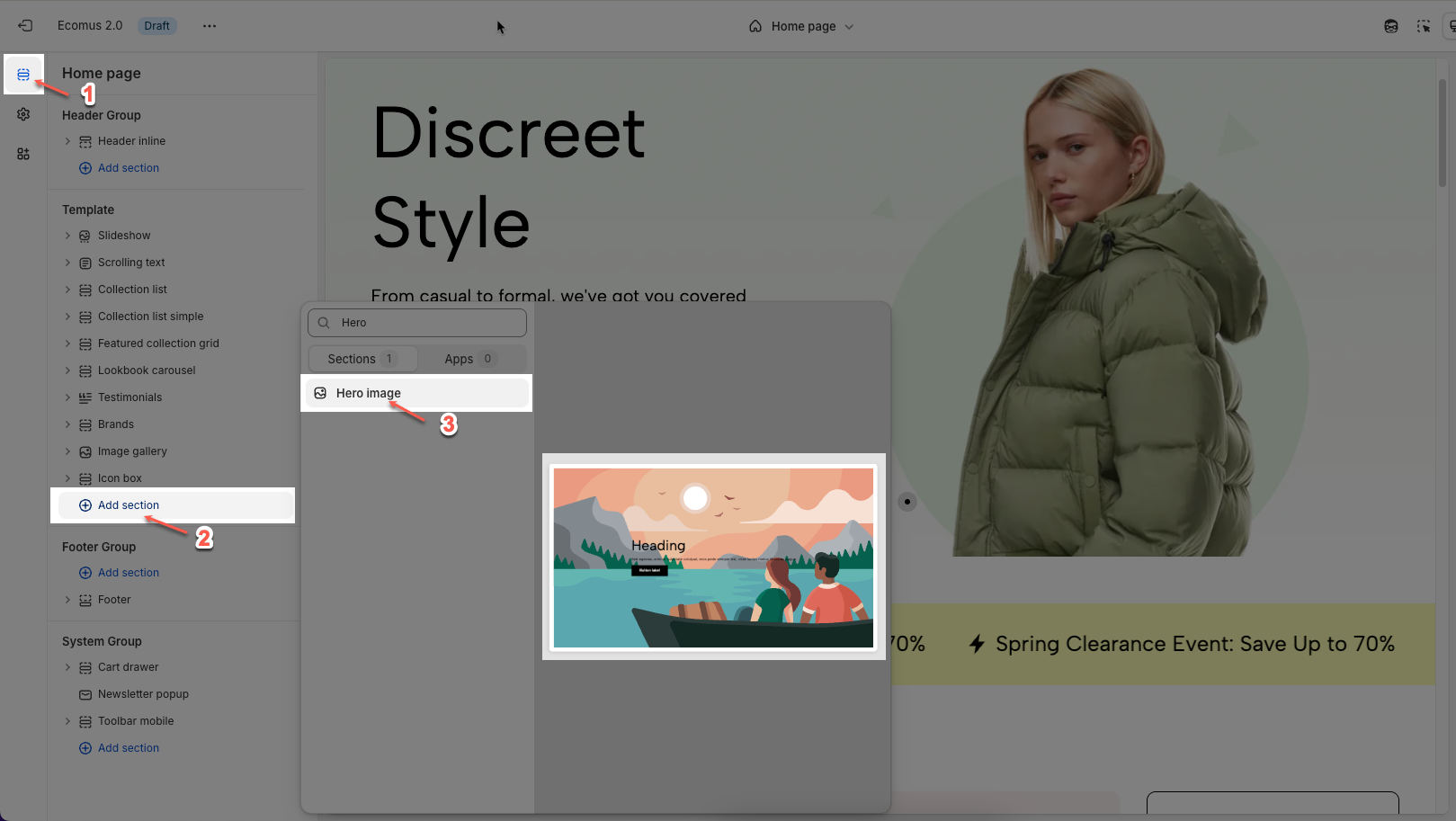
Step 01: From Shopify Admin, click on Online Store > Select Themes > In the Current theme section, click the Customize button.

Step 02: In the theme editor (Customize), click the Sections button > Click the Add section button > In the Sections tab, scroll through the list or use the search bar to find and select the Hero image.
2. How to customize the blocks?
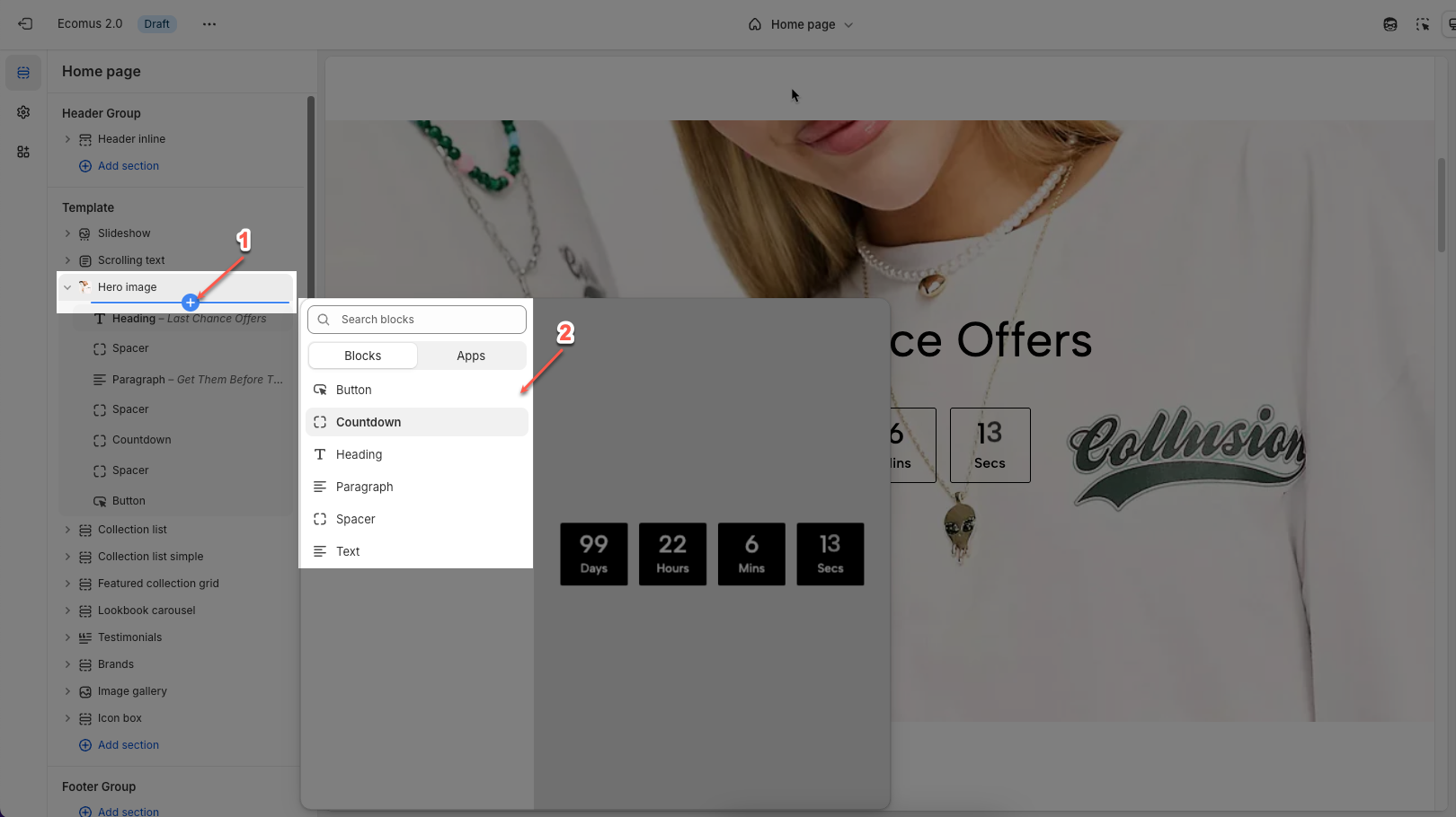
Before customizing the Hero image section, make sure to add all the essential blocks that complete its structure. These include: Heading, Text, Button, Countdown, Paragraph and Spacer blocks. Once these blocks are in place, you can begin styling and adjusting them to match your brand and content goals.
To add a Heading / Text / Button / Countdown / Paragraph or Spacer block to the Infinite loop slider section, click the Add block button > Select Heading / Text / Button / Countdown / Paragraph or Spacer block.
2.1. Customize the Heading/ Text block
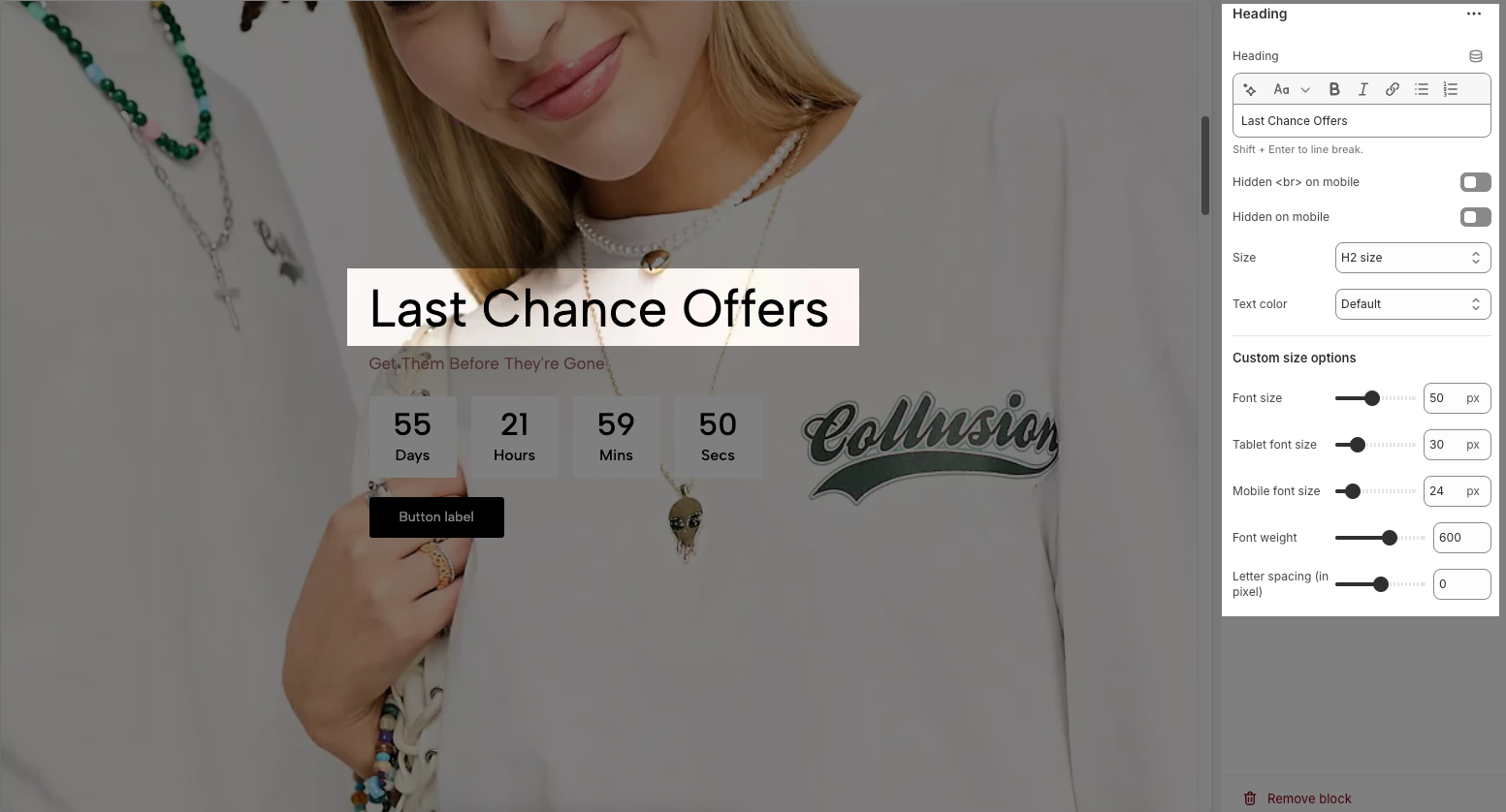
Customizing the Heading allows you to control its appearance across different devices, ensuring consistency and responsiveness. Below are the available options to fine-tune your heading styles.
Heading: Allows you to enter and format the text (bold, italic, underline, lists, links, etc.). Shift + Enter to line break.
Hidden <br> on mobile: Disables line breaks on mobile devices.
Hidden on mobile: Hides the heading on mobile screens.
Size: Lets you select sizes for the heading.
Text color: Allows you to set the text color. Please follow this guideline to configure the Color.
Custom Size Options:
Font size: Adjusts the heading size for desktop.
Tablet font size: Adjusts the heading size for table.
Mobile font size: Adjusts the heading size for mobile.
Font weight: Controls the thickness of the text (e.g., 600 is semi-bold).
Letter spacing: Adjusts the space between characters.
2.2. Customize the Paragraph block.
The Paragraph block is used to add and format body text on your page, helping to convey information clearly and effectively. With various customization options, you can adjust the appearance of your text to match the design and improve readability. Below are the available options for customization:
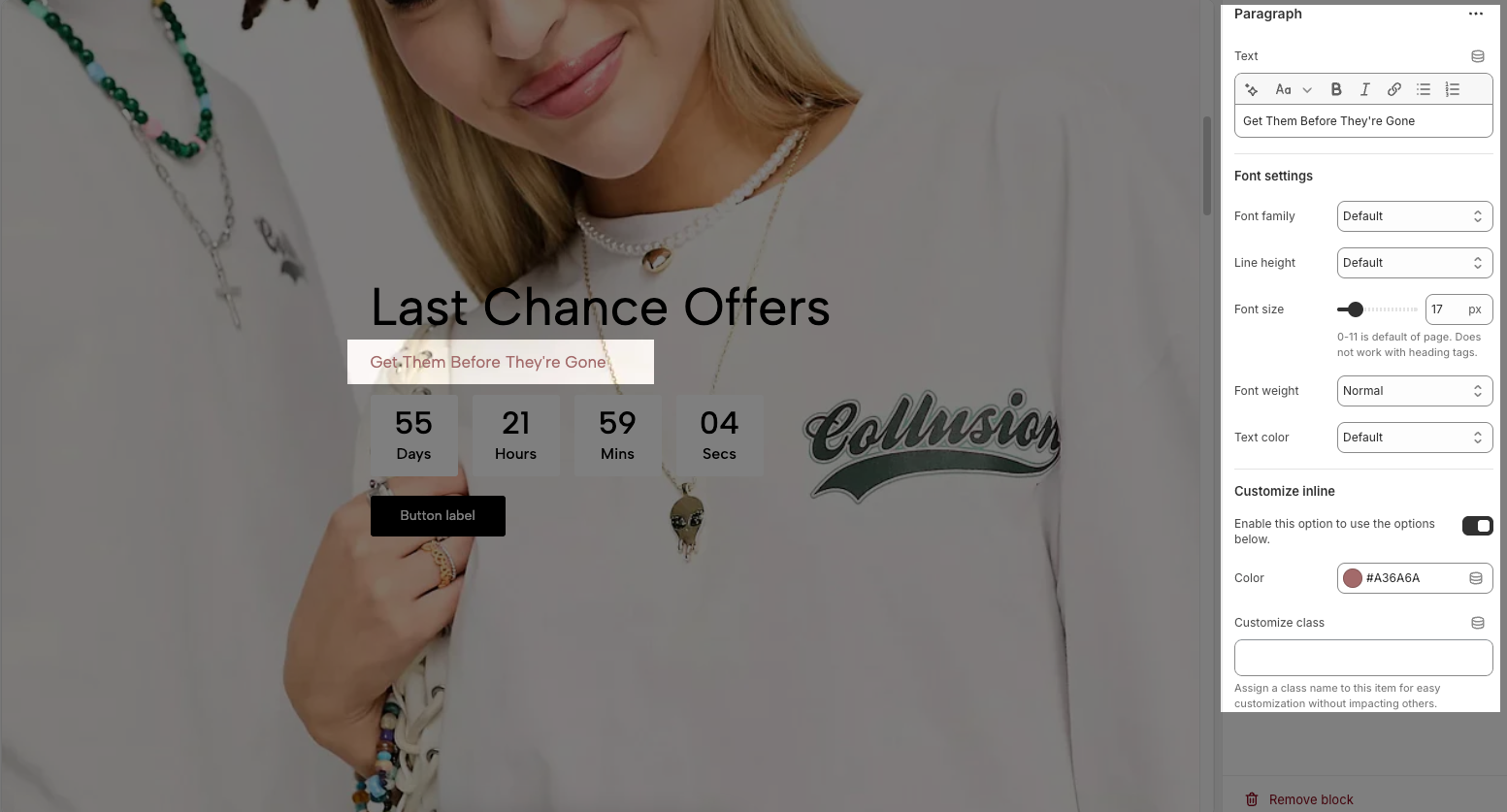
Font Settings
Font family: Selects the font style for the paragraph text.
Line height: Adjusts the spacing between lines of text.
Font size: Sets the text size in pixels.
Font weight: Controls the thickness of the text (e.g., Normal, Bold).
Text color: Allows you to choose a color for the text.
Customize Inline
Enable this option to use the options below: Activates further inline customization.
Color: Allows setting a color the paragraph text.
Customize class: Assigns a CSS class to the paragraph for advanced styling without affecting other elements.
2.3. Customize the Countdown block.
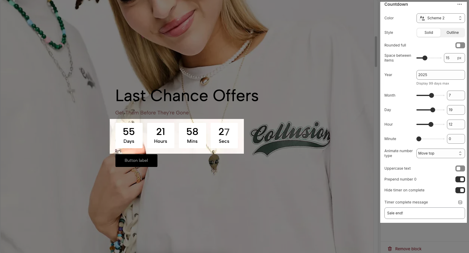
Color: Select the color scheme for the countdown timer section.
Style: Choose between:
Solid: Timer boxes have a filled background.
Outline: Timer boxes have only borders with no fill.
Rounded full: Enable to make countdown boxes fully rounded.
Space between items: Adjust horizontal spacing between countdown boxes (in pixels).
Year / Month / Day / Hour / Minute: Set the exact end date and time for the countdown.
Note: The countdown displays up to 99 days maximum.
Animate number type: Choose the number animation style (e.g., "Move top").
Uppercase text: Toggle to display time unit labels (Days, Hours, etc.) in uppercase letters.
Prepend number 0: Enable to show numbers with a leading zero (e.g., 05, 09).
Hide timer on complete: Enable to hide the countdown when it reaches zero.
Timer complete message: Enter the message that appears after the countdown ends (e.g., “Sale end!”).
2.4. Customize the Button block.
The Button block allows you to create interactive call-to-action elements that guide users to specific links. Customizing the button ensures it matches your design and provides a seamless user experience. Below are the available options for customization:
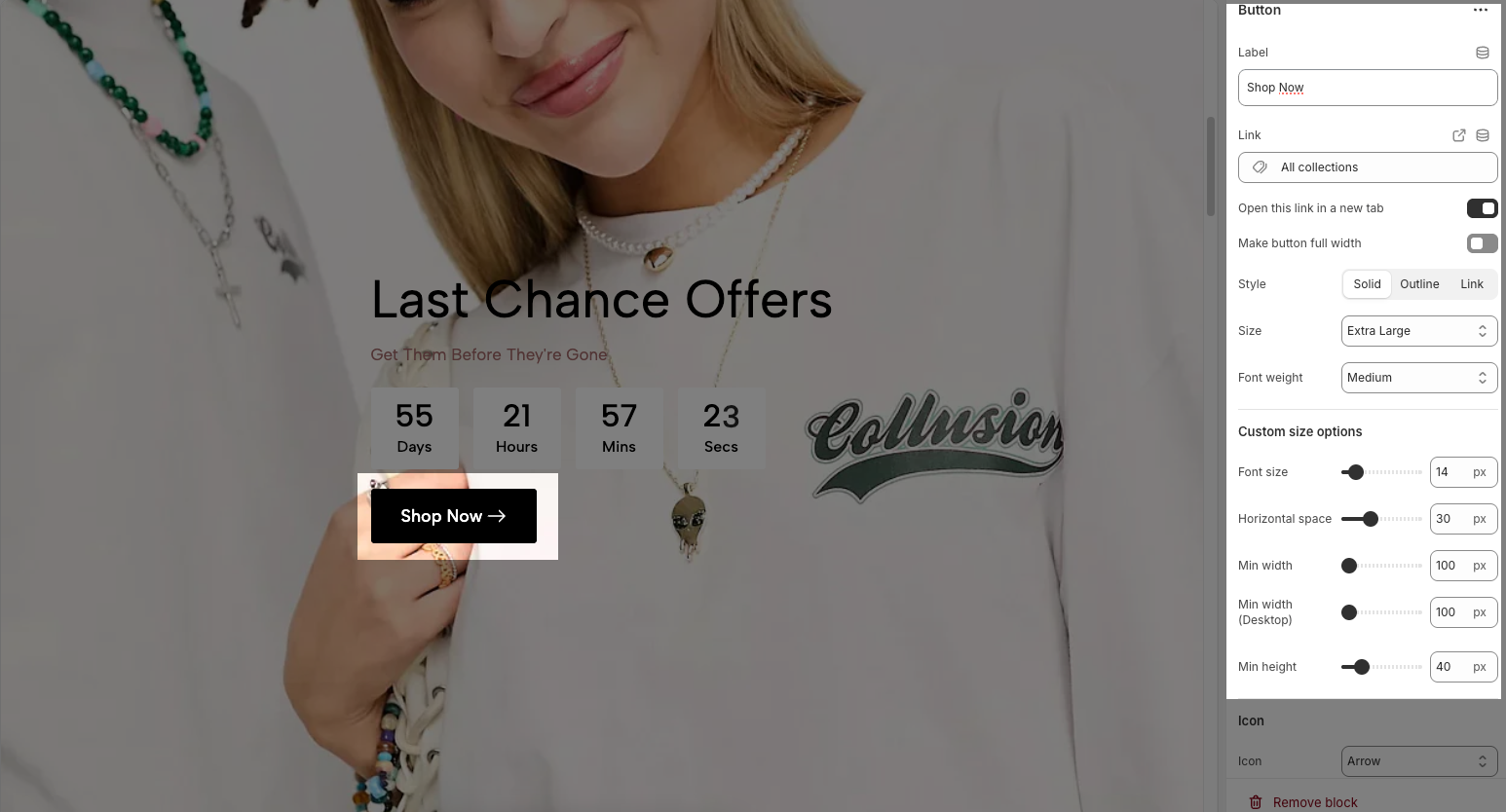
Label: Defines the text displayed on the button.
Link: Specifies the destination URL when the button is clicked.
Open this link in a new tab: Opens the link in a new browser tab when enabled.
Make button full width: Expands the button to take up the full width of its container.
Style: Choose between Solid, Outline, or Link styles for different visual effects.
Size: Adjusts the button size (e.g., Extra Large, Medium, etc.).
Font weight: Controls the thickness of the button text (e.g., Normal, Bold).
Custom Size Options:
Font size: Adjusts the heading size for desktop.
Tablet font size: Adjusts the heading size for table.
Mobile font size: Adjusts the heading size for mobile.
Font weight: Controls the thickness of the text (e.g., 600 is semi-bold).
Letter spacing: Adjusts the space between characters.
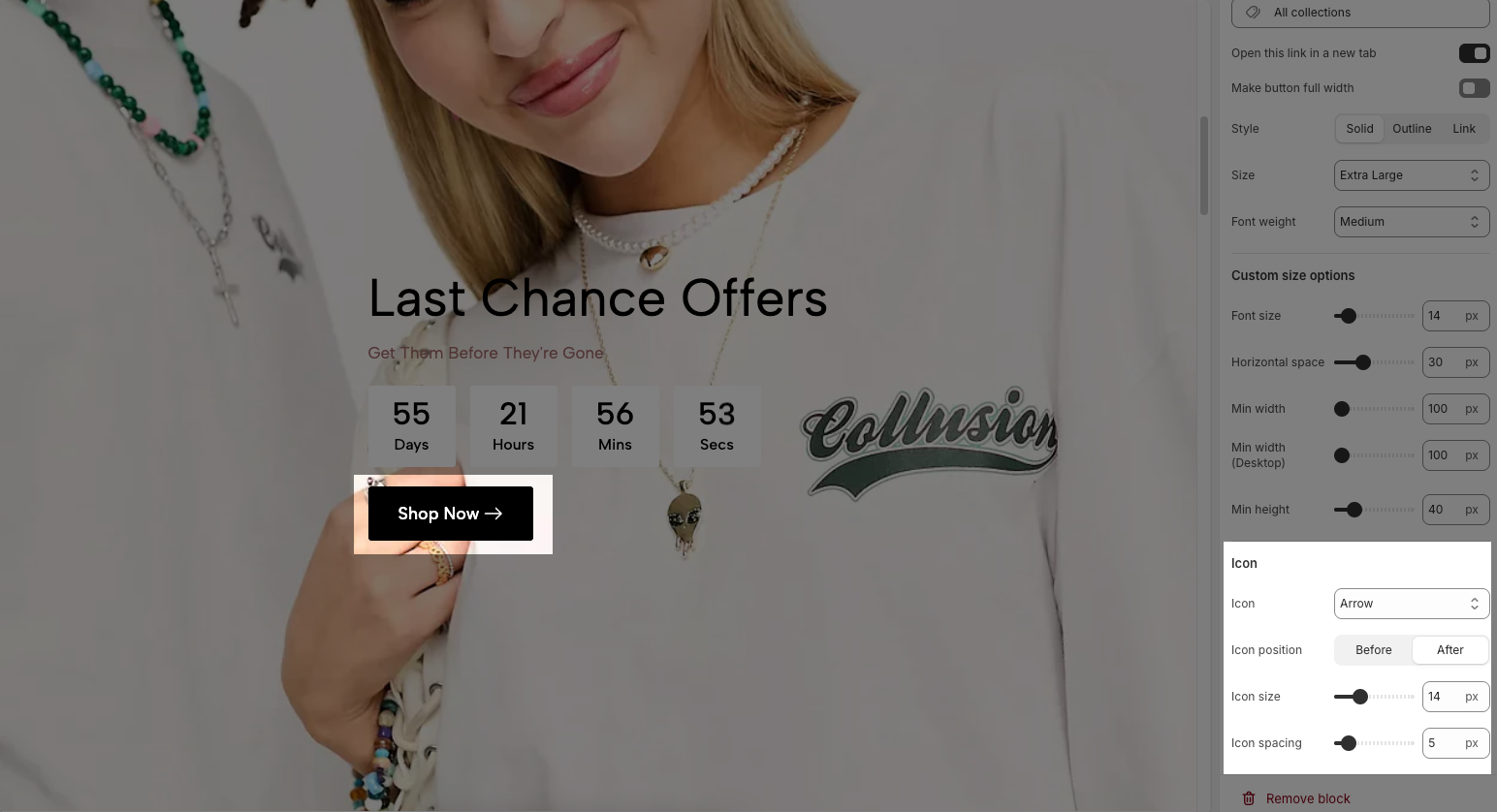
Icon:
Icon: Select the icon to display on the button (e.g., arrow, plus, etc.).
Icon position: Choose whether the icon appears Before or After the button text.
Icon size: Adjust the size of the icon in pixels.
Icon spacing: Set the spacing between the icon and the text to ensure proper alignment and readability.
2.5. Customize the Spacer block.
The Spacer block is used to add empty space between blocks. It helps improve the layout, create visual separation, and ensure a balanced design. This block is particularly useful for adjusting spacing in different screen sizes (desktop, tablet, and mobile) to enhance readability and aesthetics.
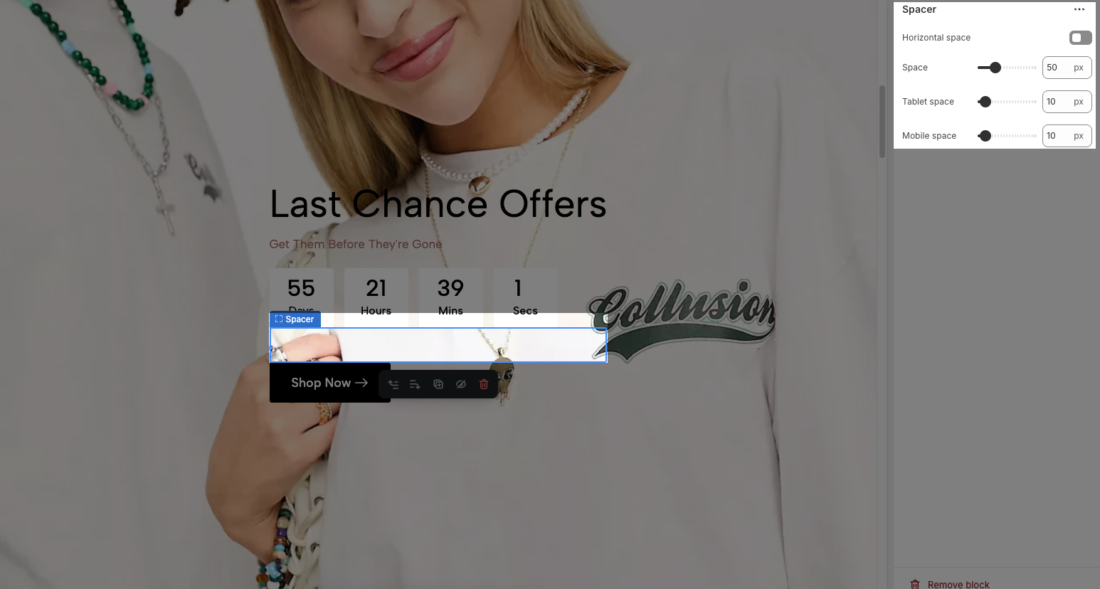
Horizontal space: If enabled, the spacer will also add horizontal spacing instead of only vertical spacing.
Space: Adjusts the amount of space (in pixels) on desktop screens.
Tablet space: Defines the amount of space for tablet devices, ensuring responsive spacing.
Mobile space: Sets the spacing specifically for mobile screens.
3. How to customize the Hero image section?
Here’s how you can customize the Hero image section to best fit your content and layout. Below are the available options for customization:
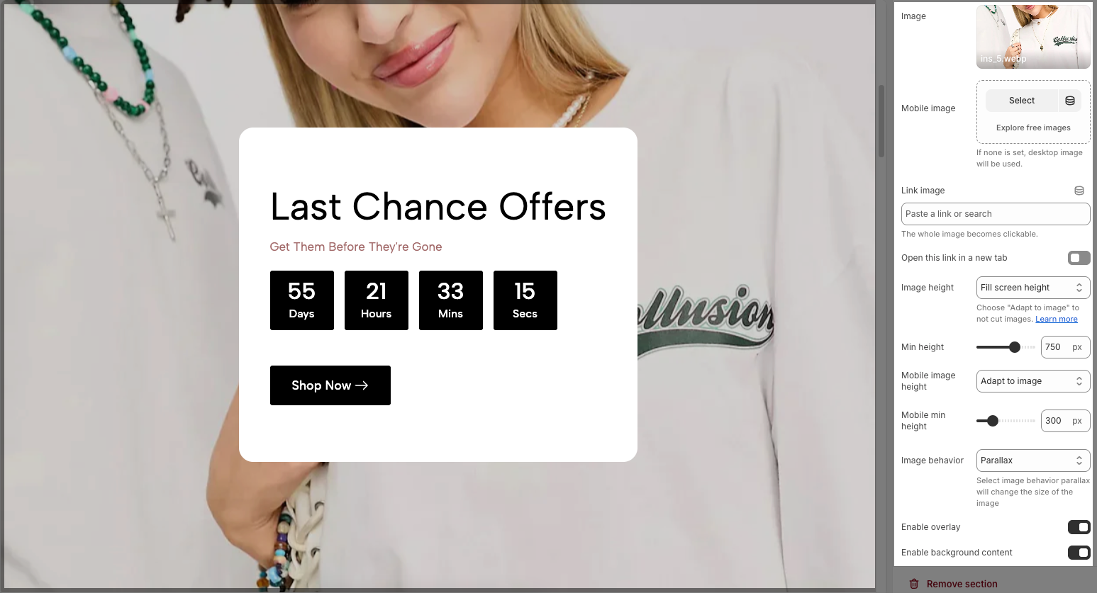
Image: This section allows you to select a desktop image.
Select: Click this button to choose an image from your files or a library.
Explore free images: This option suggests finding images that are available for free.
Mobile image: This section is for selecting an image specifically for mobile devices.
Note: If you don't choose a separate mobile image, the desktop image will be displayed on mobile devices.
Link image: In this input field, you can paste a URL or type a search query to link the image to. And the whole image becomes clickable.
Open this link in a new tab: This is a toggle switch. When enabled (switch to the right), clicking the linked image will open the destination URL in a new browser tab or window. When disabled (switch to the left), the link will open in the current tab/window.
Image height: This controls how the image scales vertically. Options include: Adapt to image, Fill screen height, and Min height. You can choose "Adapt to image" to not cut images.
Min height: This sets the minimum height for the image.
Mobile image height: Similar to "Image height," this controls how the image scales vertically for mobile devices.
Mobile min height: This sets the minimum height for the image for mobile devices.
Image behavior: This defines how the image interacts with scrolling or other elements. Options include: None, Parallax, and Ambient movement. Select image behavior parallax will change the size of the image.
Enable overlay: This is a toggle switch. When enabled, it likely adds a semi-transparent layer on top of the image, which can be used for text, icons, or other visual effects.
Enable background content: This is a toggle switch. When enabled, background added behind the content.
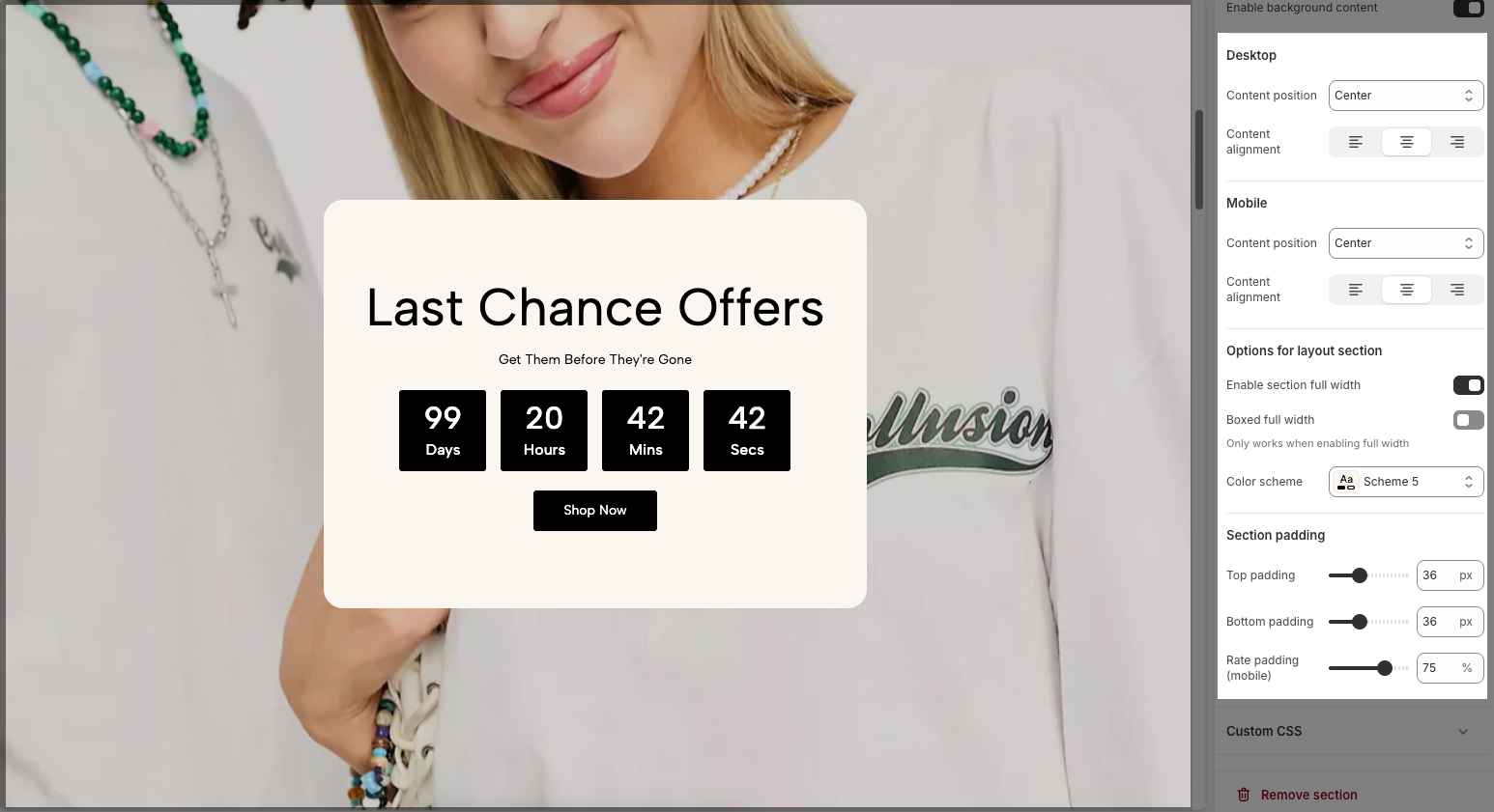
Desktop
Content position: This dropdown menu allows you to control the vertical positioning of the content on desktop screens. Example:
Top: Align the content to the top of the slider area.
Center: Centers the content vertically within the slider area.
Bottom: Align the content to the bottom of the slider area.
Content alignment: This set of three buttons controls the horizontal alignment of the content on desktop screens.
Left align (first button): Aligns the content to the left side of the slide.
Center align (second button): Centers the content horizontally within the slide.
Right align (third button): Aligns the content to the right side of the slide.
Mobile
Content position: This dropdown controls the vertical positioning of the content on mobile devices. This allows for different layouts on smaller screens.
Top: Aligns the content to the top on mobile.
Center: Centers the content vertically on mobile.
Bottom: Aligns the content to the bottom on mobile.
Content alignment: Similar to the desktop "Content alignment," these three buttons control the horizontal alignment of the content on mobile devices.
Left align (first button): Aligns the content to the left side on mobile.
Center align (second button): Centers the content horizontally on mobile.
Right align (third button): Aligns the content to the right side on mobile.
Section padding
Top padding: Sets the vertical spacing (in pixels) above the section.
Bottom padding: Sets the vertical spacing (in pixels) below the section.
Rate padding (mobile): Defines the vertical padding as a percentage for mobile devices, allowing responsive spacing.
Custom CSS
Allows users to customize by adding CSS rules, beyond the limitations of default settings. This allows for fine-tuning the design to every detail, to suit specific needs.
Add custom styles to this section only.
To add custom styles to your entire online store, go to theme settings for detailed instructions.


