


The Infinite Loop Slider section allows you to display a continuously scrolling carousel of images, text, or promotional content. It’s perfect for showcasing brand logos, featured collections, announcements, or anything you want to highlight in a dynamic, eye-catching way. This section runs in a seamless loop, adding motion and visual interest to your storefront.
1. How to access the Infinite loop slider section?
Step 01: From Shopify Admin, click on Online Store > Select Themes > In the Current theme section, click the Customize button.
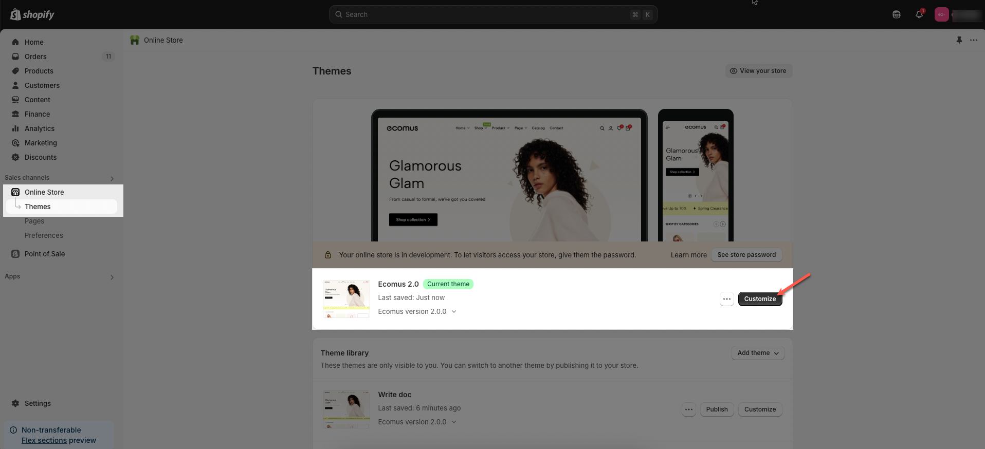
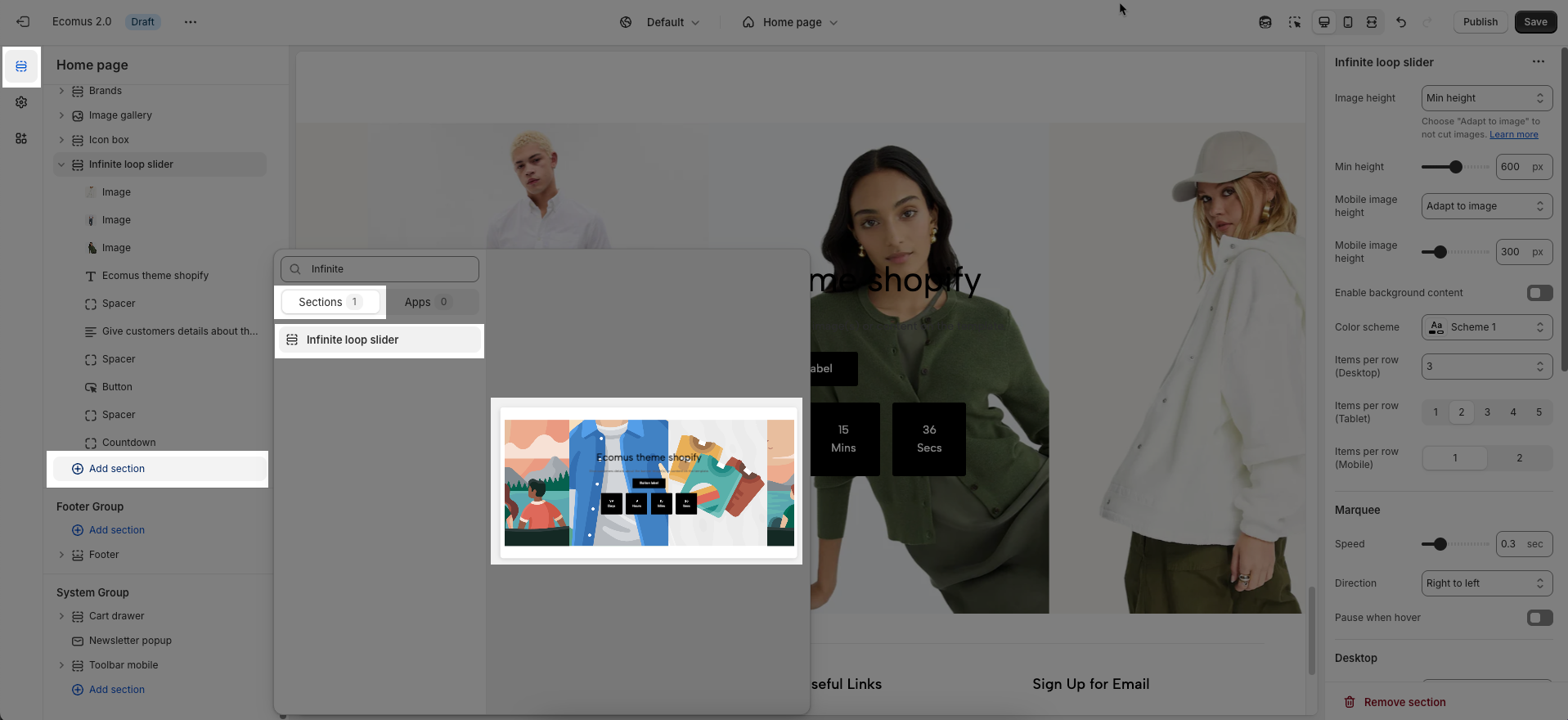
Step 02: In the theme editor (Customize), click the Sections button > Click the Add section button > In the Sections tab, scroll through the list or use the search bar to find and select Infinite loop slider.
2. How to customize the Infinite loop slider section?
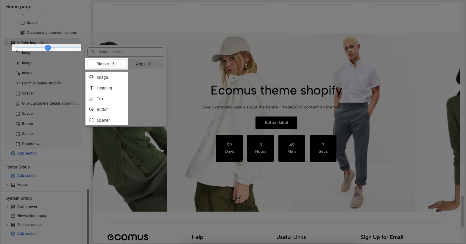
Before customizing the Infinite Loop Slider section, make sure to add all the essential blocks that complete its structure. These include: Image, Heading, Text, Button, and Spacer blocks. Once these blocks are in place, you can begin styling and adjusting them to match your brand and content goals.
2.1. Customize Image block
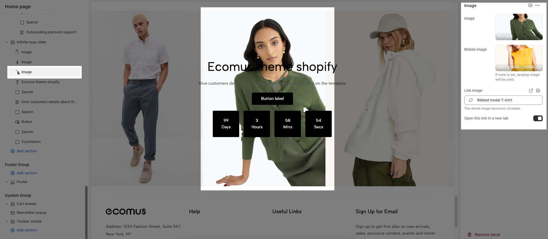
To add an Image block to the Infinite loop slider section, click the Add block button > Select Image block.
Once the Image block is added, you can customize its settings in the right-hand sidebar:
Image: This is the primary image that will be displayed on your website (typically for desktop view).
Mobile Image: You can upload or select a different image to show specifically on mobile devices. If no mobile image is set, the desktop image will be used instead. The “Select” button allows you to upload a mobile-specific image. And the link “Explore free images” lets you browse stock images.
Link Image: This field lets you turn the entire image into a clickable link. Paste a URL or search for a page to link the image to. When users click on the image, they will be taken to this link.
Open this link in a new tab: Toggle this on if you want the image link to open in a new browser tab. When turned off, the link opens in the same tab.
2.2. Customize Heading / Text / Button / Spacer block
To add a Heading / Text / Button / Spacer block to the Infinite loop slider section, click the Add block button > Select Heading / Text / Button / Spacer block.
To customize these blocks, please follow this guide
2.3. Customize the Infinite loop slider section
Here’s how you can customize the Infinite Loop Slider section to best fit your content and layout. Below are the available options for customization:
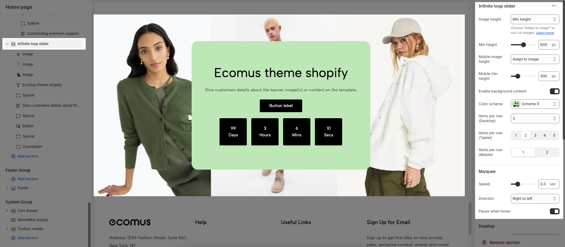
Infinite loop slider
Image height: Determines how the slider image height is calculated. Options include:
Min height: When you select "Min height", you're choosing to manually set the slider's height, rather than letting it automatically adjust to the image.
Adapt to image: Keeps the image’s original aspect ratio and avoids cropping.
Adapt to first image: This option allows the slider's height to match the height of the first image in the slider.
Min height: If option "Min height" is chosen, this sets the specific pixel value for desktop images. You can customize the slider height anywhere between 200px and 1000px.
Mobile image height: This controls how the image height behaves on mobile devices. Options include:
Min height: When you select "Min height", you're choosing to manually set the slider's height, rather than letting it automatically adjust to the image.
Adapt to image: Keeps the image’s original aspect ratio and avoids cropping.
Adapt to first image: This option allows the slider's height to match the height of the first image in the slider.
Mobile min height: If option "Min height" is chosen, this sets the specific pixel value for mobile images. You can customize the slider height anywhere between 100px and 1000px.
Enable background content: Enable this option to add background content behind the content
Color scheme: Choose from available preset color themes for the slider.
Items per row (Desktop): Select how many items to show per row on the desktop view.
Items per row (Tablet): Choose how many items to show per row on tablet screens.
Items per row (Mobile): Decide whether to show 1 or 2 items per row on mobile devices.
Marquee
Speed: Adjusts how fast the slider scrolls in seconds (e.g., 0.3 sec per frame).
Direction: Sets the scroll direction from Left to right or Right to left.
Pause when hover: Toggle this on to pause the slider animation when the user hovers over it.
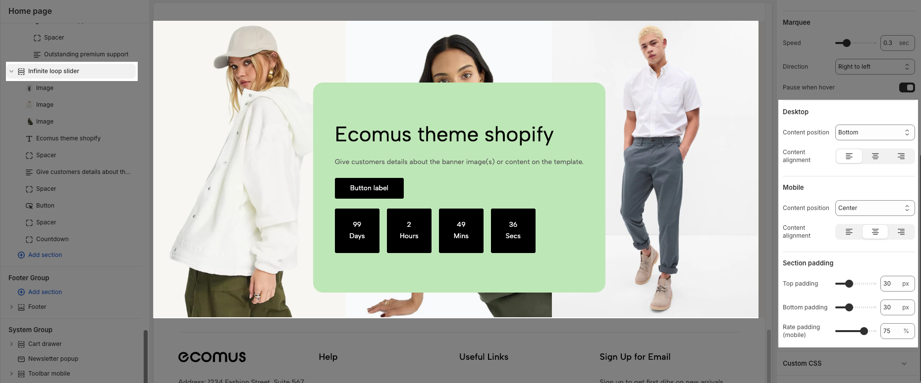
Desktop
Content position: This dropdown menu allows you to control the vertical positioning of the content within the slider on desktop screens. Example:
Top: Align the content to the top of the slider area.
Center: Centers the content vertically within the slider area.
Bottom: Align the content to the bottom of the slider area.
Content alignment: This set of three buttons controls the horizontal alignment of the content within each slide on desktop screens.
Left align (first button): Aligns the content to the left side of the slide.
Center align (second button): Centers the content horizontally within the slide.
Right align (third button): Aligns the content to the right side of the slide.
Mobile
Content position: This dropdown controls the vertical positioning of the content within the slider specifically on mobile devices. This allows for different layouts on smaller screens.
Top: Aligns the content to the top of the slider area on mobile.
Center: Centers the content vertically within the slider area on mobile.
Bottom: Aligns the content to the bottom of the slider area on mobile.
Content alignment: Similar to the desktop "Content alignment," these three buttons control the horizontal alignment of the content within each slide on mobile devices.
Left align (first button): Aligns the content to the left side of the slide on mobile.
Center align (second button): Centers the content horizontally within the slide on mobile.
Right align (third button): Aligns the content to the right side of the slide on mobile.
Section padding
This section controls the spacing around the entire slider section, both above and below the content.
Top padding: This option allows you to set the amount of space (padding) at the top of the slider section. You can drag the slider or directly enter a numerical value to adjust this spacing
Bottom padding: This option allows you to set the amount of space (padding) at the bottom of the slider section. You can drag the slider or directly enter a numerical value to adjust this spacing
Rate padding (mobile): This option allows you to set the aspect ratio-based padding for mobile view (in percentage). For example, 75% means the height will be 75% of the width.


