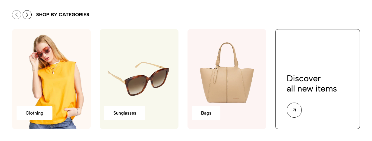
The Collection List section allows you to showcase multiple collections in a visually appealing grid or slider layout. This section helps users navigate your store easily by highlighting featured collections, seasonal categories, or best-selling products.
1. How to access the Collection list section?
Step 01: From Shopify Admin, click on Online Store > Select Themes > In the Current theme section, click the Customize button.

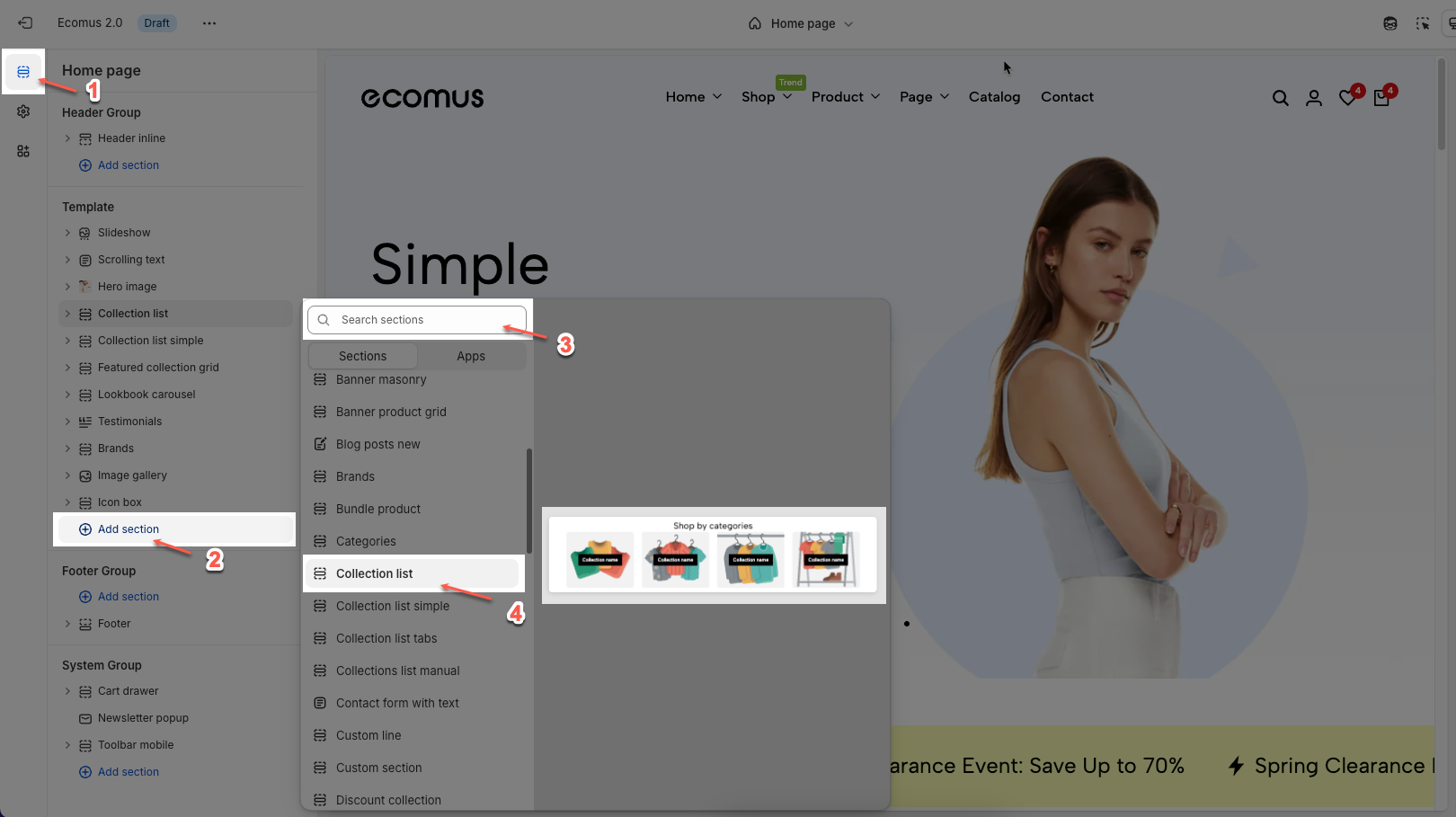
Step 02: In the theme editor (Customize), click the Sections button > Click the Add section button > In the Sections tab, scroll through the list or use the search bar to find and select the Collection list.
2. How to customize the Collection list section?
2.1. Collection Item block.
The Collection Item block allows you to display individual collections within the Collection List section. You can customize each collection's image, title, and link to enhance navigation and user experience.
To add a collection item, click Add Block > "Collection item"
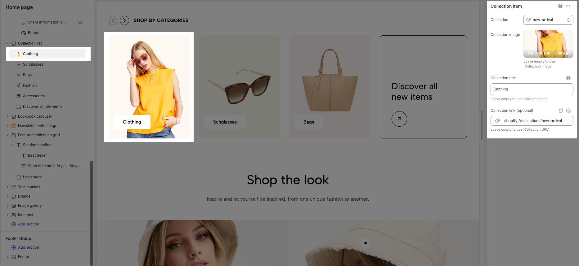
Collection: Select the collection you want to display.
Collection image: Upload or choose an image for the collection (leave empty to use the default collection image).
Collection title: Enter a custom title for the collection (leave empty to use the default collection title).
Collection link (optional): Add a custom link for the collection (leave empty to use the default collection URL).
2.2. Items View All block.
The other block is Items View All, which allows you to create a button leading to a collection list of products.
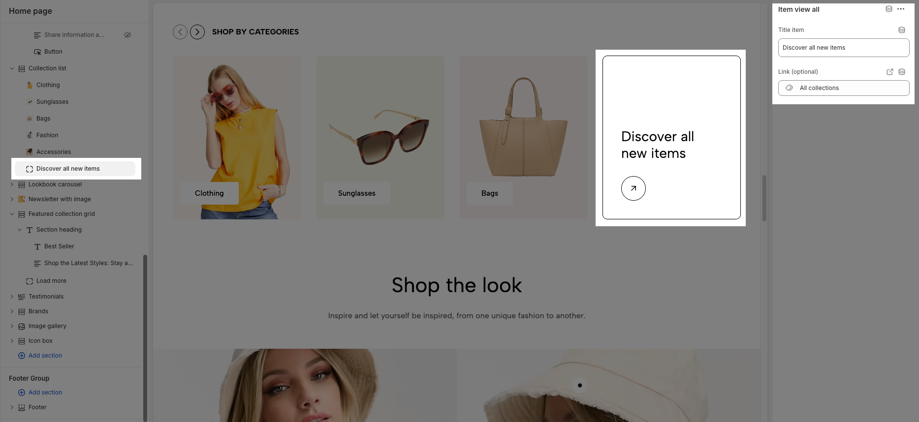
Title item: Sets the displayed text for the "View All" item.
Link (optional): Defines the destination link when users click the item.
2.3. How to configure the Collection List section?
The Collection List section allows you to showcase multiple collections in a visually appealing grid layout. Below are the available configuration options to customize this section.
2.3.1. Heading options
There are numerous options to adjust the heading and subheading. See the video below to have better insights.
2.3.2. General options
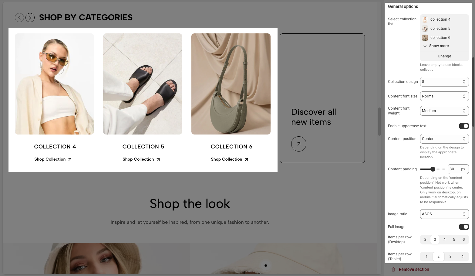
Select collection list: Choose a collection list to display. If left empty, it will use block collections.
Collection design: Select a predefined layout style for displaying collections.
Content font size & weight: Adjust the font size and weight of collection titles.
Enable uppercase text: Enable this option to display text in uppercase.
Content position: Choose where the text appears within each collection item. Some positions may not work with certain designs.
Content padding: Adjusts the spacing around the content when the position is not centered. Works on desktop only.
Image ratio: Select an aspect ratio for the collection images.
Full image: Enable to display the entire image instead of cropping it to fit the layout.
Items per row (Desktop, Tablet, Mobile): Set the number of collection items shown per row on different devices. On very small screens, items may automatically be displayed in full width.
Spacing between items: Adjust the gap between collection items
Enable half item: Add a collection at the end of the screen and divide it in half.
2.3.3. Slider settings
You have several options: Use prev/next button, Use dots, Navigation design, Navigation position, or Dots position. See the video below for better insight.
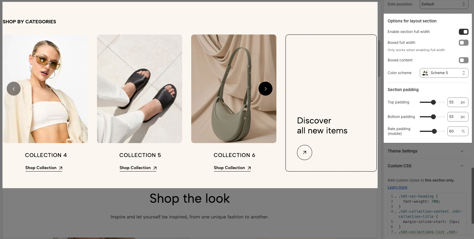
2.3.4. Options for layout section and Section padding
Enable section full width: Expands the section to take up the entire width of the screen.
Boxed full width: Works only when "Enable section full width" is active, keeping the content within a boxed layout while maintaining the full-width background.
Color scheme: Selects a predefined color theme for the section.
Top padding: Adjusts the spacing above the section.
Bottom padding: Adjusts the spacing below the section.
Rate padding (mobile): Controls the padding percentage for mobile screens to ensure proper spacing and responsiveness.