This is a section on Product page. The breadcrumb can reduce the number of actions a visitor needs to take in order to navigate to a higher-level page, and improve the discoverability of your store.
1. How to access the Breadcrumb nav?
Step 01: From Shopify Admin, click on Online Store > Select Themes > In the Current theme section, click the Customize button.

Step 02: In the theme editor (Customize), click to open dropdown pages in the topbar > select Products > select Default product
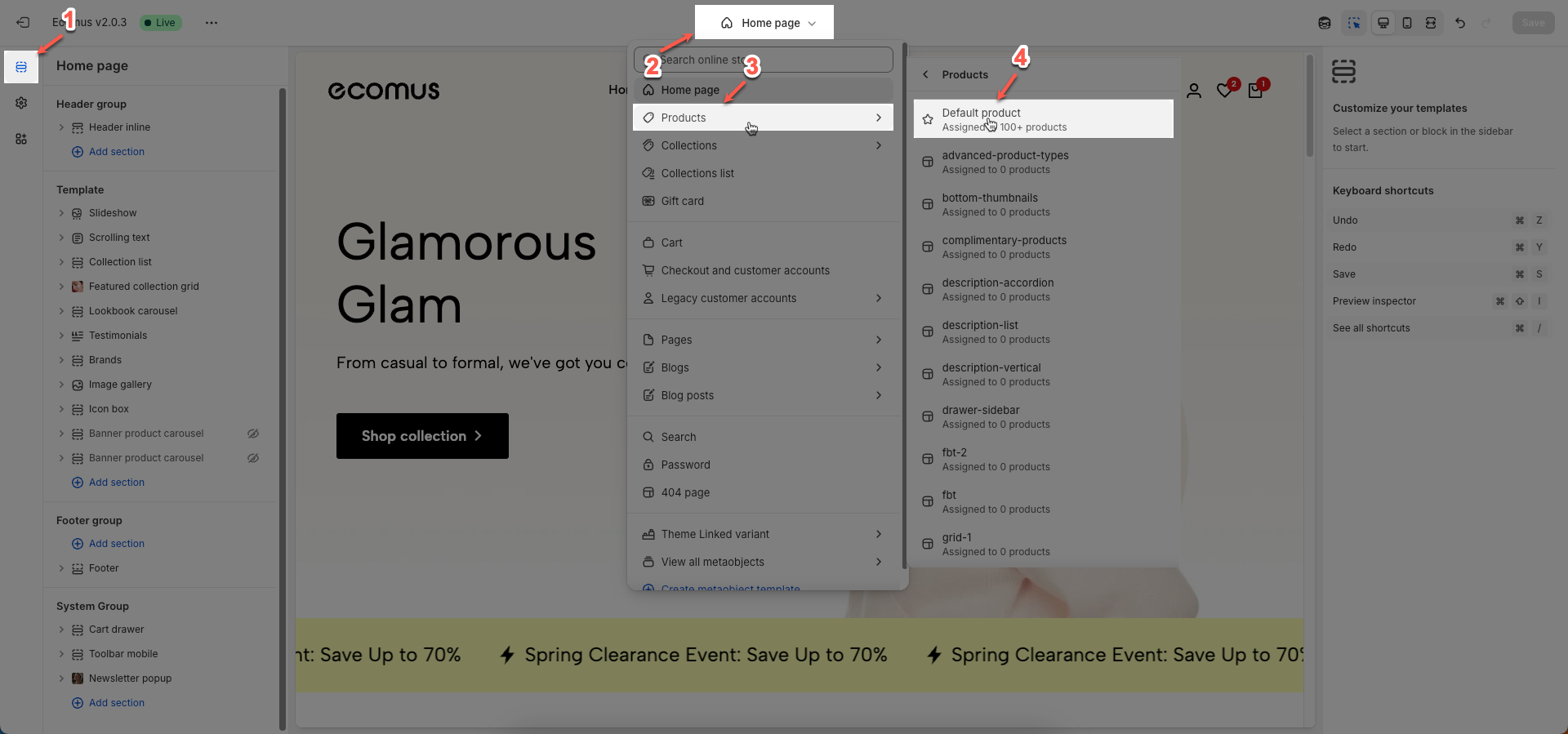
Step 03: In the Sections tab, scroll and find Breadcrumb nav in Template
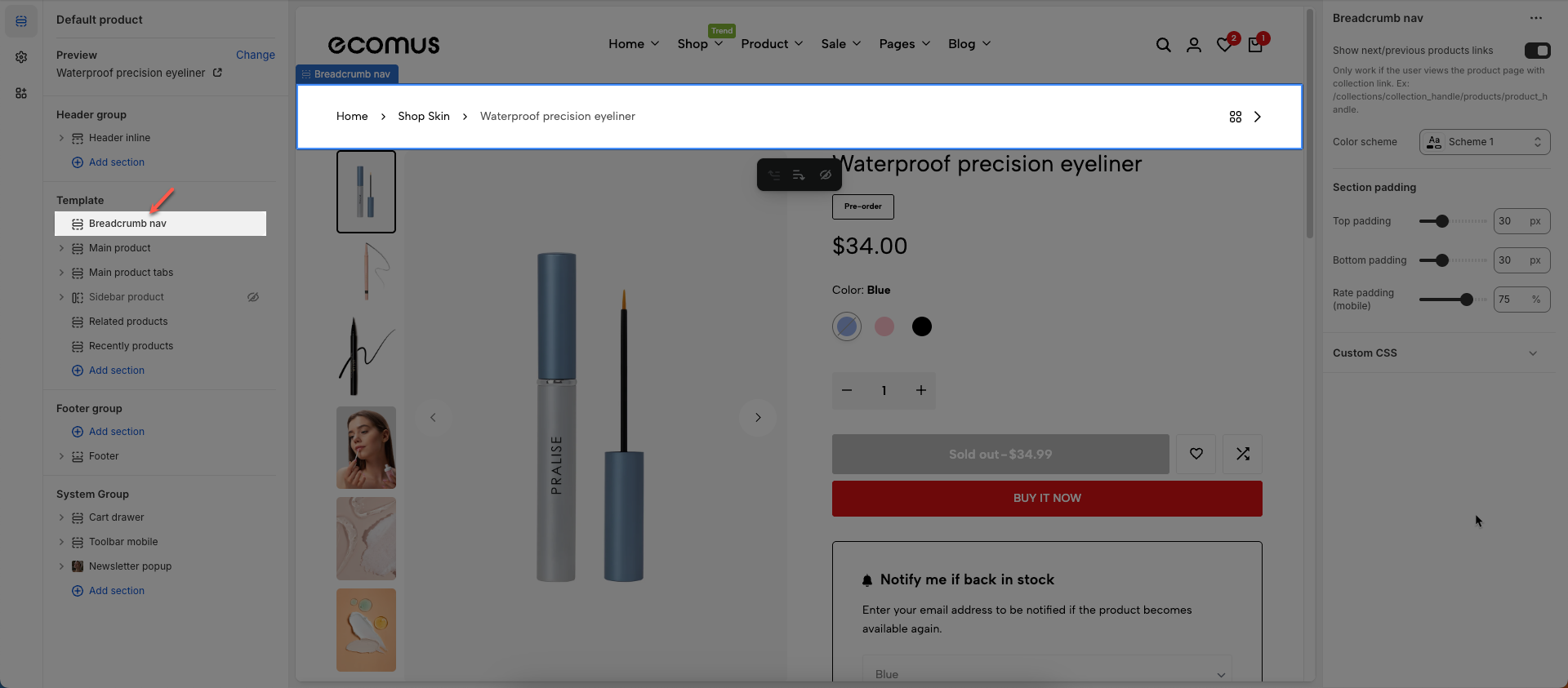
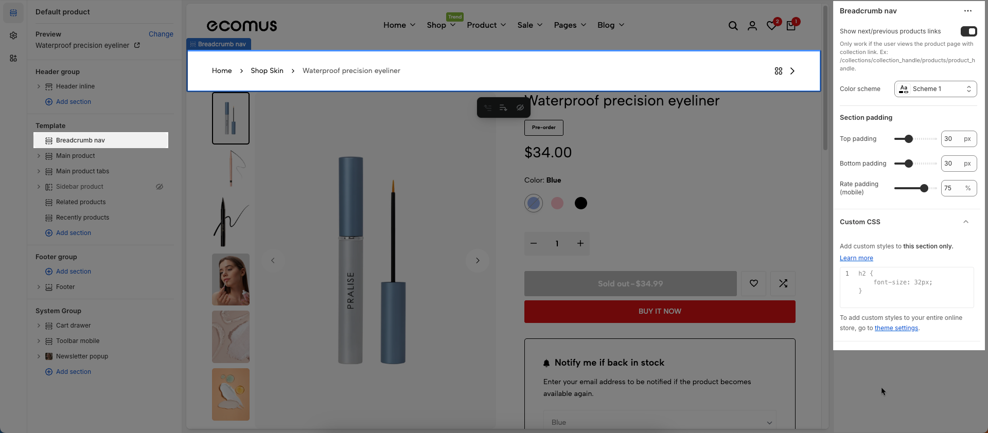
2. How to customize the Breadcrumb nav?
Show next/previous products links: To show Prev/Next and Back to Collection buttons, you need to go Theme settings > Product Card > untick Remove collection URL
Only work if the user views the product page with collection link. Ex: /collections/collection_handle/products/product_handle.
Color scheme: Select the color scheme to be applied to this section or component
Section padding
Top padding: This option allows you to set the amount of space (padding) at the top of the slider section. You can drag the slider or directly enter a numerical value to adjust this spacing
Bottom padding: This option allows you to set the amount of space (padding) at the bottom of the slider section. You can drag the slider or directly enter a numerical value to adjust this spacing
Rate padding (mobile): This option allows you to set the aspect ratio-based padding for mobile view (in percentage). For example, 75% means the height will be 75% of the width.
Custom CSS
Allows users to customize by adding CSS rules, beyond the limitations of default settings. This allows for fine-tuning the design to every detail, to suit specific needs.
Add custom styles to this section only.
To add custom styles to your entire online store, go to theme settings.