


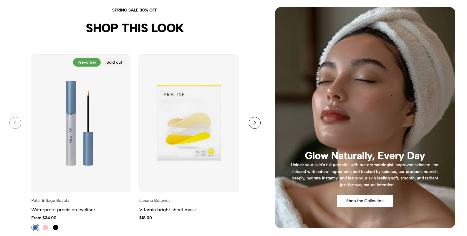
Section: Banner product carousel is a flexible and powerful component designed to showcase a featured product collection with an accompanying advertising banner or brand image. It is an ideal solution to attract customers' attention, direct them to specific products, and at the same time convey a marketing or promotional message right on the homepage or collection page.
1. How to access the Banner product carousel section?
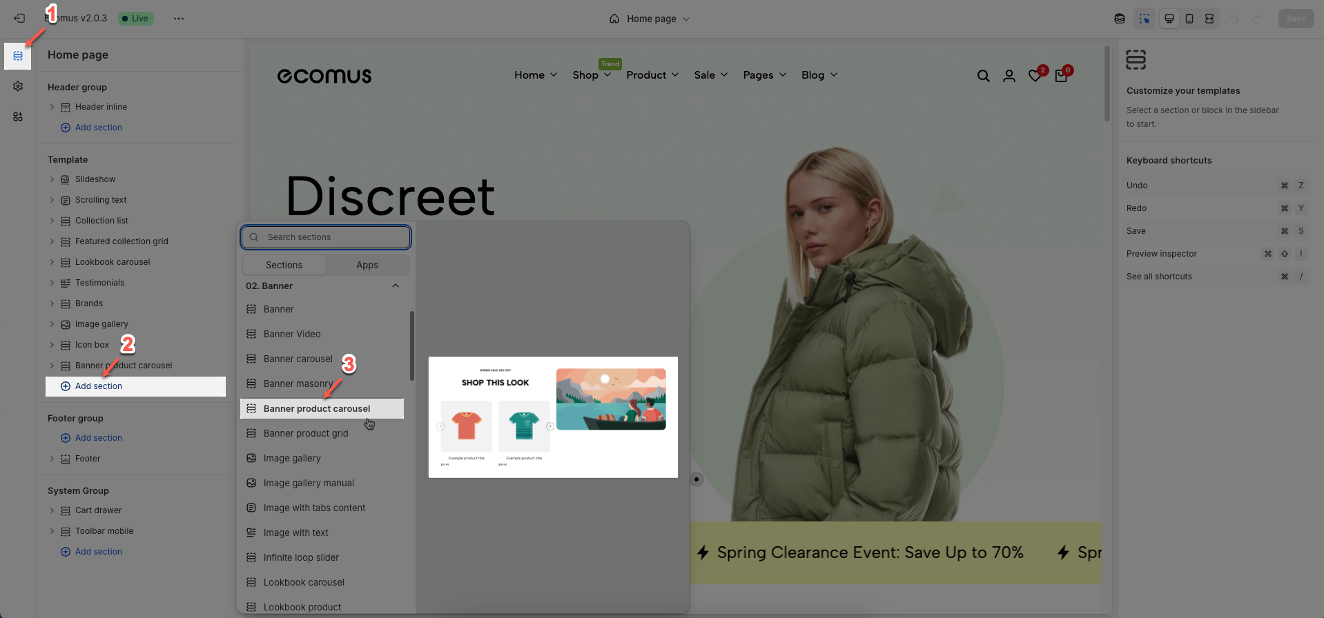
Step 01: From Shopify Admin, click on Online Store > Select Themes > In the Current theme section, click the Customize button.

Step 02: In the theme editor (Customize), click the Sections button > Click the Add section button > In the Sections tab, scroll through the list or use the search bar to find and select the Banner product carousel.
2. How to customize the Banner product carousel section?
2.1. Carousel product block
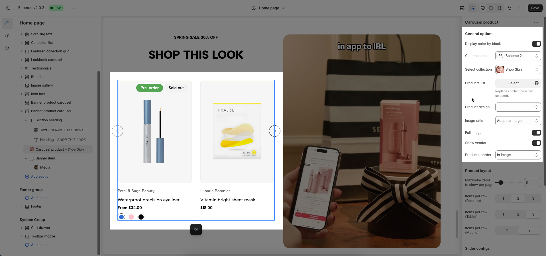
After finding the Carousel product block, you can adjust its settings using the sidebar—located on the right or left side of your screen depending on your device
General options
Select collection or product list to display full options
Display color by block: Allows each block to have its own color scheme, independent of the overall section's color scheme.
Color scheme: Select the color scheme to be applied to this section or component
Select collection: Select the product collection to be displayed.
Products list: Displays the list of products fetched from the selected collection.
Replaces collection when selected.
Product design: Select the design style (layout) for individual product items, including the arrangement of names, prices, and buttons.
Image ratio: Set the aspect ratio of product images (Adapt to image, Square, ASOS,...)
Full image: Check to make the product image completely fill its container space within the product card, potentially cropping parts if necessary.
Show vendor: Check to display the product's vendor (brand) name.
Products border: Select the border style for products:
None: No border is applied.
In image: A border appears only around the product image area.
On items: A border appears around the entire product card or item.
Product layout
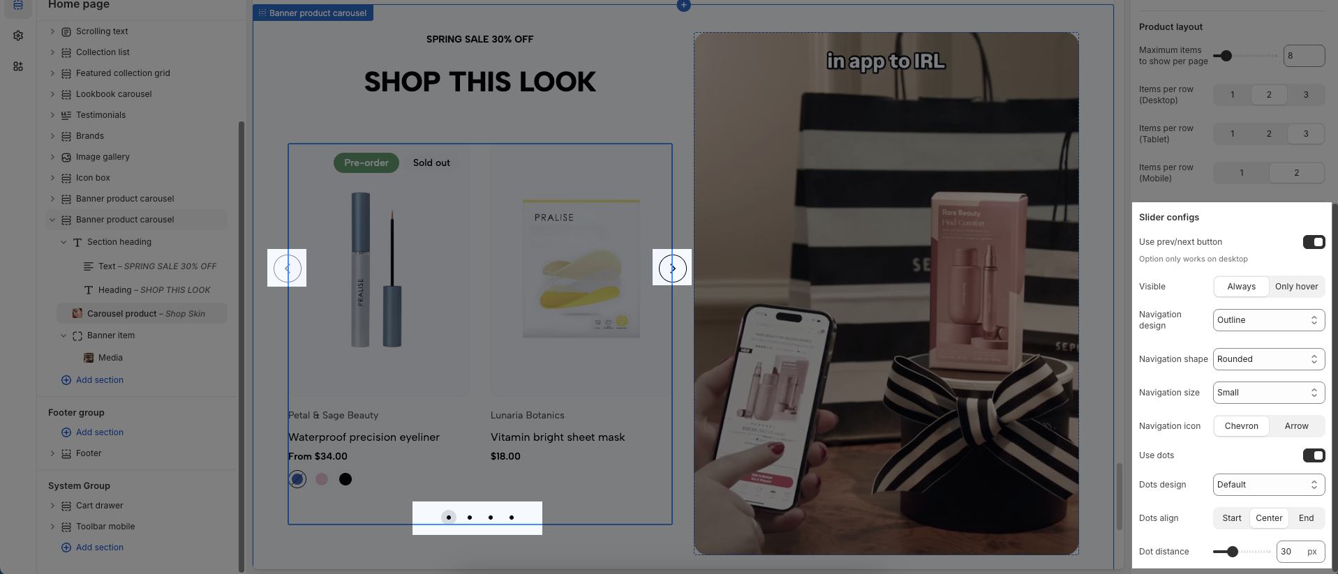
Maximum items to show per page: Set the maximum number of items to display per page or per load.
Items per row (Desktop): Set the number of items per row when viewed on desktop devices.
Items per row (Tablet): Set the number of items per row when viewed on tablet devices.
Items per row (Mobile): Set the number of items per row when viewed on mobile devices.
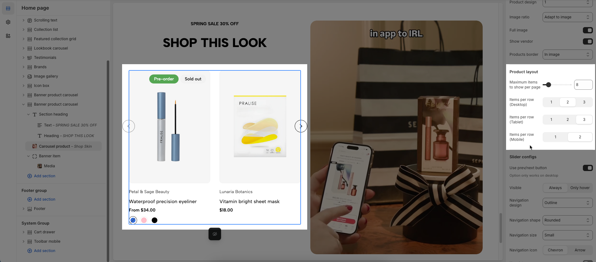
Slider configs
Use prev/next button: Check to display "previous/next" navigation buttons for the carousel or slider.
Visible: Check to make this element or component visible on the page (always or only hover)
Navigation design: Select the design style for the navigation buttons
Navigation shape: Select the shape for the navigation buttons (e.g., "square", "rounded", "circle").
Navigation size: Set the size of the navigation buttons (e.g., small, medium, large).
Navigation icon: Select the icon to be displayed inside the navigation buttons.
Use dots: Check to display pagination dots (indicators) for the carousel.
Dots design: Select the design style for the pagination dots (e.g., "outline dot", "elessi", "dashed").
Dots align: Set the horizontal alignment for the pagination dots (left, center, right).
Dot distance: Set the distance between individual pagination dots (in pixels).
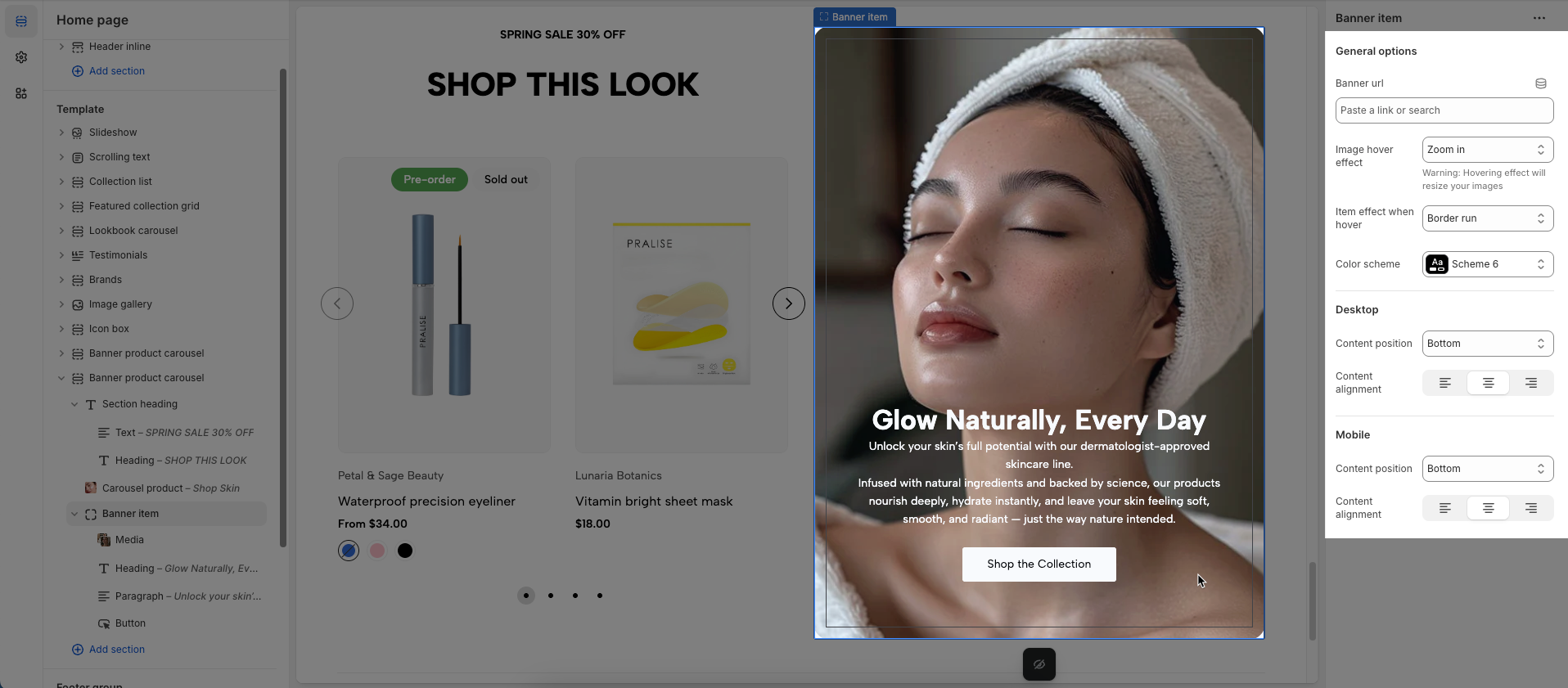
2.2. Banner item block
Add content from heading, paragraph, media,... blocks to customize
After finding the Banner item block, you can adjust its settings using the sidebar—located on the right or left side of your screen depending on your device
General options
Banner URL: Enter the URL (web address) that the banner will link to when clicked.
Image hover effect: Select the visual effect that occurs when a user hovers their mouse cursor over an image
Warning: Hovering effect will resize your images
Item effect when hover: Select the effect that will occur on the entire item when a user hovers over it.
Color scheme: Select the color scheme to be applied to this section or component. A color scheme includes predefined colors for backgrounds, text, buttons, etc.
Desktop & Mobile
Content position: Set the position of content (text, buttons) within a larger container
Content alignment: Set the horizontal alignment of content (text) within its immediate container (left, center, right).
2.3. Content blocks
2.3.1. Section heading
Add content from heading, text blocks to customize
After finding the Section heading block, you can adjust its settings using the sidebar—located on the right or left side of your screen depending on your device
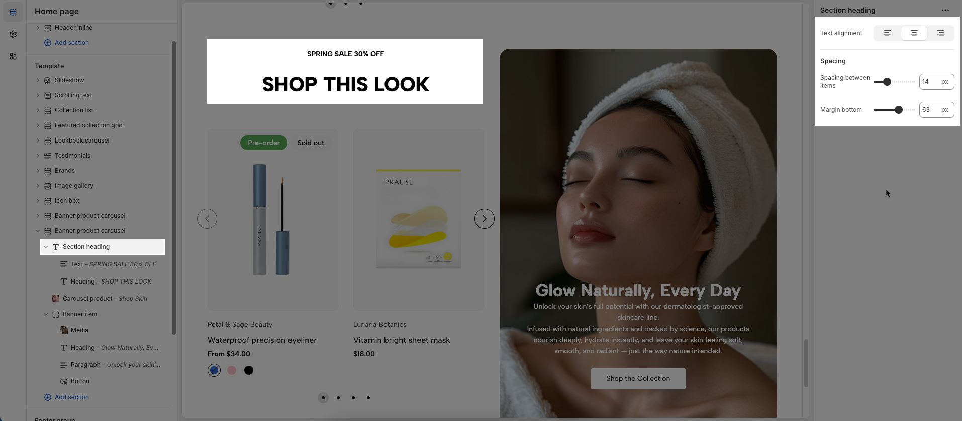
Text alignment: Set the horizontal alignment of text content within its immediate container.
Spacing
Spacing between items: Đặt khoảng cách giữa các mục
Margin bottom: Set the bottom margin for this element (in pixels).
2.3.2. Heading
To add a Heading block to the Section heading or Banner item, click the Add block button (plus icon ➕) under the Section heading or Banner item.
After adding the Heading block, you can adjust its settings using the sidebar—located on the right or left side of your screen, depending on your device
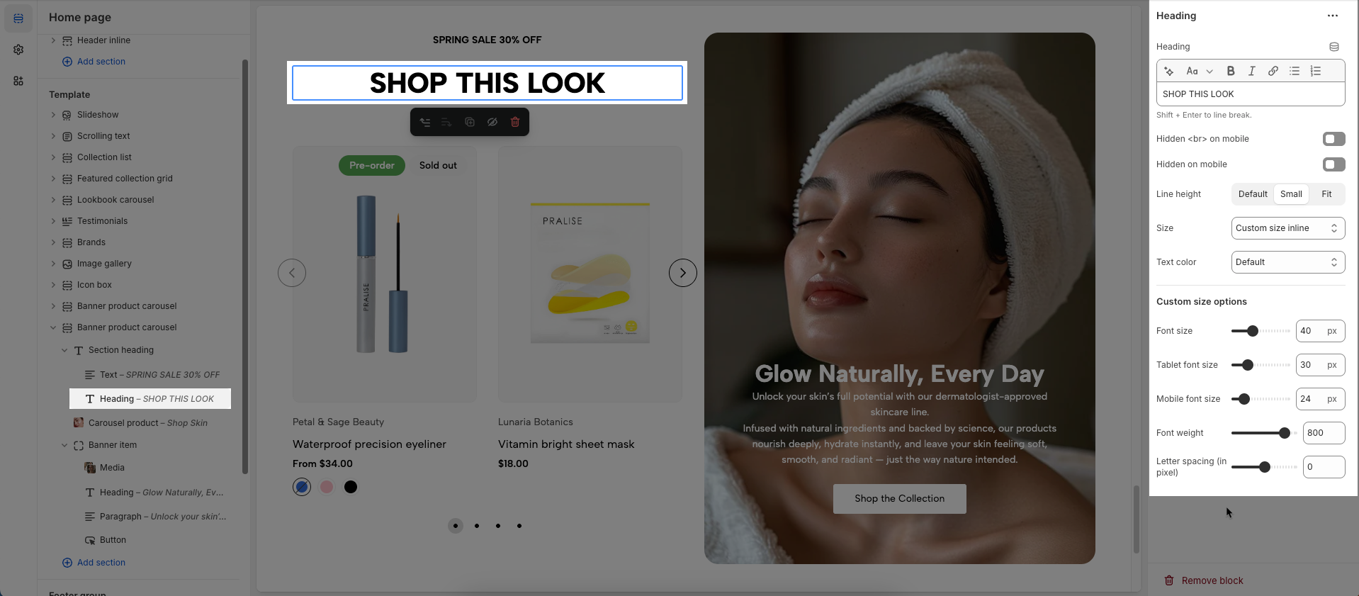
Heading: Allows you to enter and format the text (bold, italic, underline, lists, links, etc.). Shift + Enter to line break.
Hidden <br> on mobile: Disables line breaks on mobile devices.
Hidden on mobile: Hides the heading on mobile screens.
Line height: Set the line height of the text.
Default: Uses the theme's standard line height, typically around 1.5 - 1.6 times the font size for good readability.
Small: Decreases the line height, making the text appear more compact, suitable for large headings or space-constrained text.
Fit: Adjusts the line height to fit the text more tightly within the given space, often at 1 times the font size or less, which can sometimes reduce readability for long passages.
Size: Lets you select sizes for the heading.
Text color: Allows you to set the text color. Please follow this guideline to configure the Color.
Custom Size Options:
Font size: Adjusts the heading size for desktop.
Tablet font size: Adjusts the heading size for table.
Mobile font size: Adjusts the heading size for mobile.
Font weight: Controls the thickness of the text (e.g., 600 is semi-bold).
Letter spacing: Adjusts the space between characters.
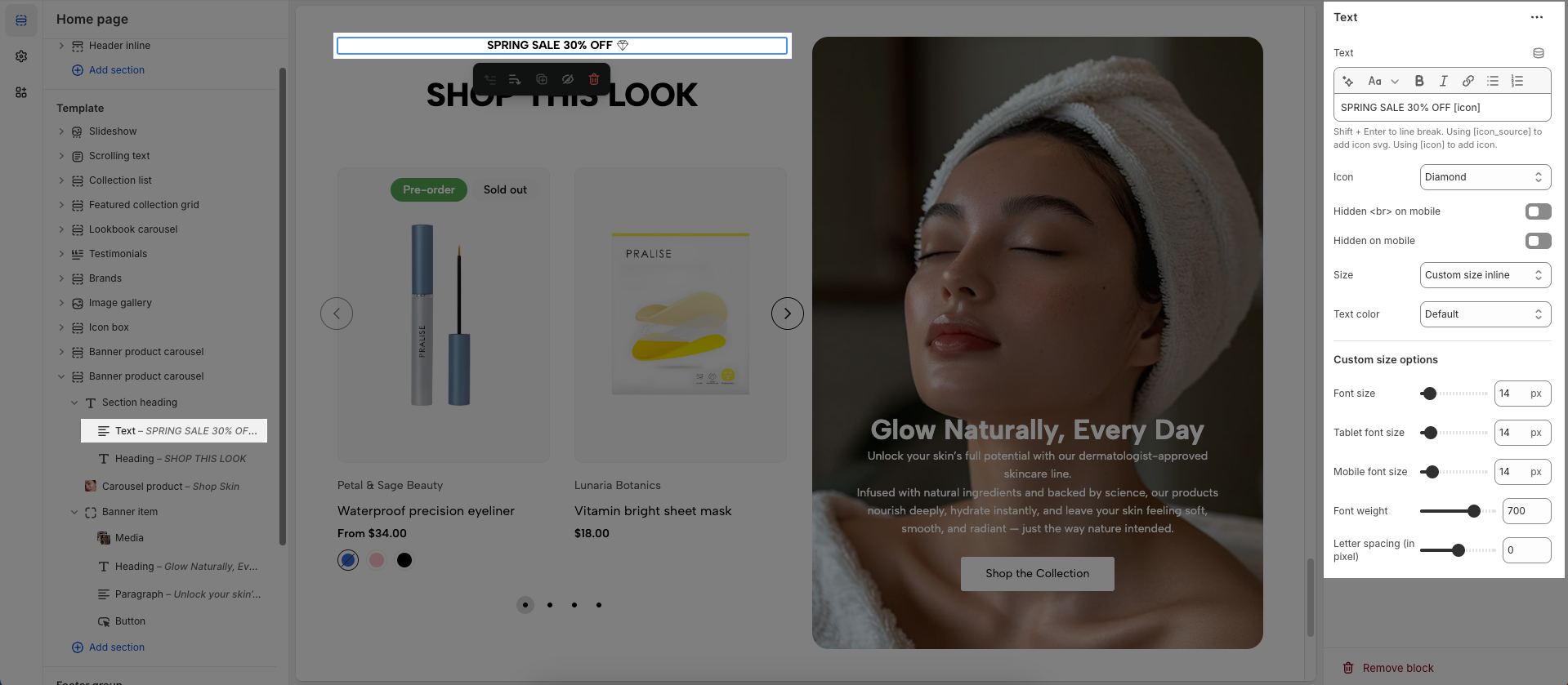
2.3.3. Text
To add a Text block to the Section heading or Banner item, click the Add block button (plus icon ➕) under the Section heading or Banner item.
After adding the Text block, you can adjust its settings using the sidebar—located on the right or left side of your screen, depending on your device
Text: Allows you to enter and format the text (bold, italic, underline, lists, links, etc.).
Shift + Enter to line break. Using [icon_source] to add icon svg. Using [icon] to add icon.
Icon: Choose an icon you want to display
Hidden <br> on mobile: Disables line breaks on mobile devices.
Hidden on mobile: Hides the heading on mobile screens.
Size: Lets you select sizes for the heading.
Text color: Allows you to set the text color. Please follow this guideline to configure the Color.
Custom Size Options:
Font size: Adjusts the heading size for desktop.
Tablet font size: Adjusts the heading size for table.
Mobile font size: Adjusts the heading size for mobile.
Font weight: Controls the thickness of the text (e.g., 600 is semi-bold).
Letter spacing: Adjusts the space between characters.
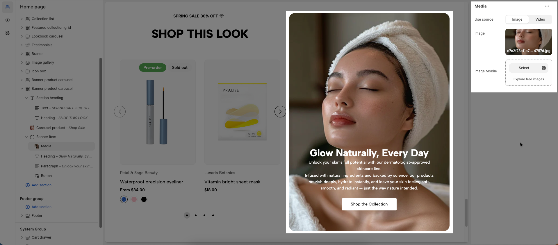
2.3.4. Media
To add a Media block to the Banner item, click the Add block button (plus icon ➕) under the Banner item.
After adding the Media block, you can adjust its settings using the sidebar—located on the right or left side of your screen, depending on your device
Use source: Select the type of media source to be used (image or video).
Image: Upload or select the image to be displayed (Only visible when the selected source is Image)
Image Mobile: Upload or select a different image to be displayed specifically on mobile devices (Only visible when the selected source is Image)
Video: Upload or select the local video file to be played (Only visible when the selected source is Video)
External link video: Enter the external URL link (YouTube, Vimeo) for the video (Only visible when the selected source is Video)
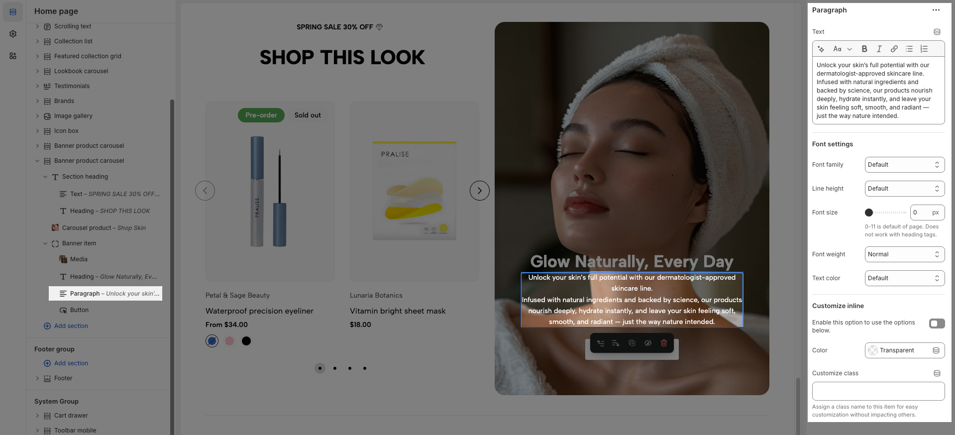
2.3.5. Paragraph
To add a Paragraph block to the Banner item, click the Add block button (plus icon ➕) under the Banner item.
After adding the Paragraph block, you can adjust its settings using the sidebar—located on the right or left side of your screen, depending on your device
Text: Enter the text content to be displayed.
Font settings
Font family: Select the font family (typeface) to be applied to this text.
Line height: Set the line height of the text. Adjusts the vertical spacing between lines of text.
Font size: Set the font size for the text (in pixels, rems, or ems).
Font weight: Set the boldness or weight of the font (e.g., normal, bold, extra-bold).
Text color: Select the color for the text.
Customize inline
Enable this option to use the options below: Enable this option to use the settings below.
Color: Select the color to be applied to this element.
Customize class: Assign a class name to this item for easy customization without impacting others.
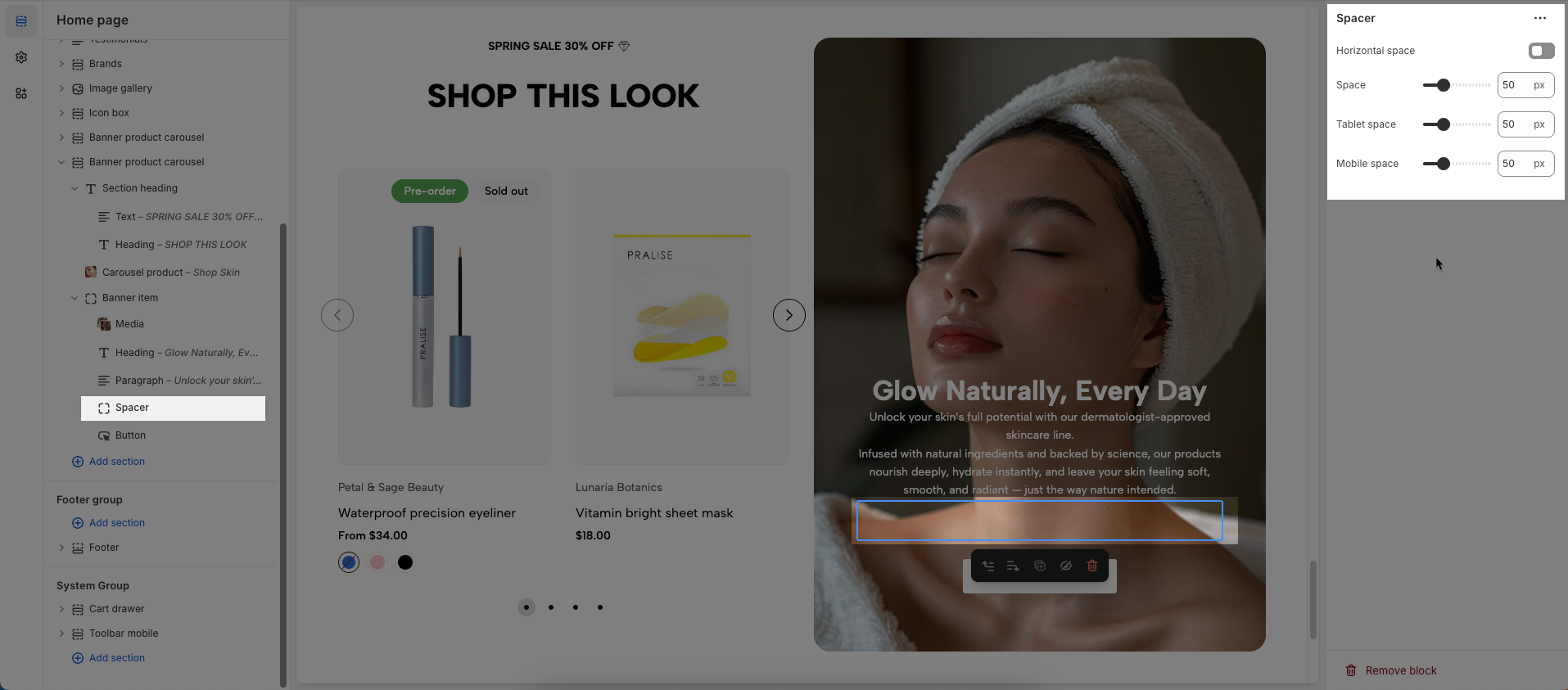
2.3.6. Spacer
To add a Spacer block to the Banner item, click the Add block button (plus icon ➕) under the Banner item.
After adding the Spacer block, you can adjust its settings using the sidebar—located on the right or left side of your screen, depending on your device
Horizontal space: If enabled, the spacer will also add horizontal spacing instead of only vertical spacing.
Space: Adjusts the amount of space (in pixels) on desktop screens.
Tablet space: Defines the amount of space for tablet devices, ensuring responsive spacing.
Mobile space: Sets the spacing specifically for mobile screens.
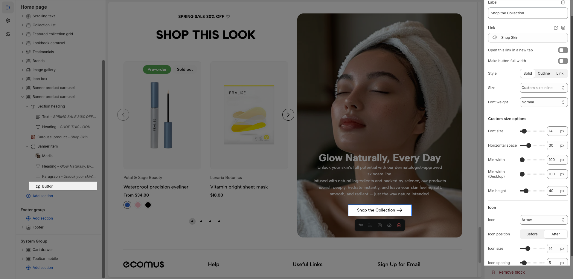
2.3.7. Button
To add a Button block to the Banner item, click the Add block button (plus icon ➕) under the Banner item.
After adding the Button block, you can adjust its settings using the sidebar—located on the right or left side of your screen, depending on your device
Label: Defines the text displayed on the button.
Link: Specifies the destination URL when the button is clicked.
Open this link in a new tab: Opens the link in a new browser tab when enabled.
Make button full width: Expands the button to take up the full width of its container.
Style: Choose between Solid, Outline, or Link styles for different visual effects.
Size: Adjusts the button size (e.g., Extra Large, Medium, etc.).
Font weight: Controls the thickness of the button text (e.g., Normal, Bold).
Custom Size Options:
Font size: Adjusts the heading size for desktop.
Horizontal space: Set the horizontal spacing (margin or padding) for the element.
Min width: Set the minimum width for the element (in pixels, percentages, or other units). The element will not shrink below this size.
Min width (Desktop): Set the minimum width for the element when viewed on desktop devices.
Min height: Set the minimum height for the element (in pixels, percentages, or other units). The element will not shrink below this size.
Icon:
Icon: Select the icon to display on the button (e.g., arrow, plus, etc.).
Icon position: Choose whether the icon appears Before or After the button text.
Icon size: Adjust the size of the icon in pixels.
Icon spacing: Set the spacing between the icon and the text to ensure proper alignment and readability.
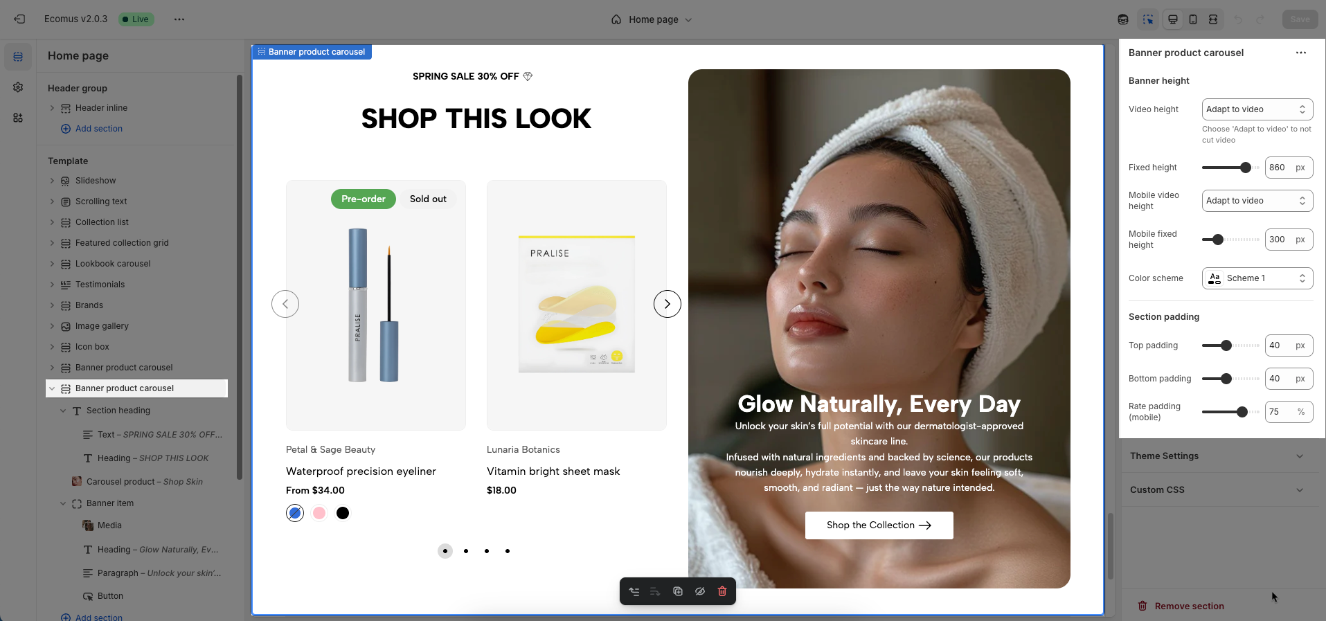
2.4. Banner product carousel section
After adding the Banner product carousel section, you can customize its settings using the sidebar—located on the right or left side of your screen depending on your device.
Banner height
Video height: Set the height of the video (in pixels or percentage).
Choose 'Adapt to video' to not cut video
Fixed height: Enable this option to fix the height of the element, preventing it from changing based on content or screen size.
Mobile video height: Set the height of the video when viewed on mobile devices (in pixels or percentage).
Mobile fixed height: Enable this option to fix the height of the element specifically on mobile devices.
Color scheme: Select the color scheme to be applied to this section or component
Section padding
Top padding: This option allows you to set the amount of space (padding) at the top of the slider section. You can drag the slider or directly enter a numerical value to adjust this spacing
Bottom padding: This option allows you to set the amount of space (padding) at the bottom of the slider section. You can drag the slider or directly enter a numerical value to adjust this spacing
Rate padding (mobile): This option allows you to set the aspect ratio-based padding for mobile view (in percentage). For example, 75% means the height will be 75% of the width.
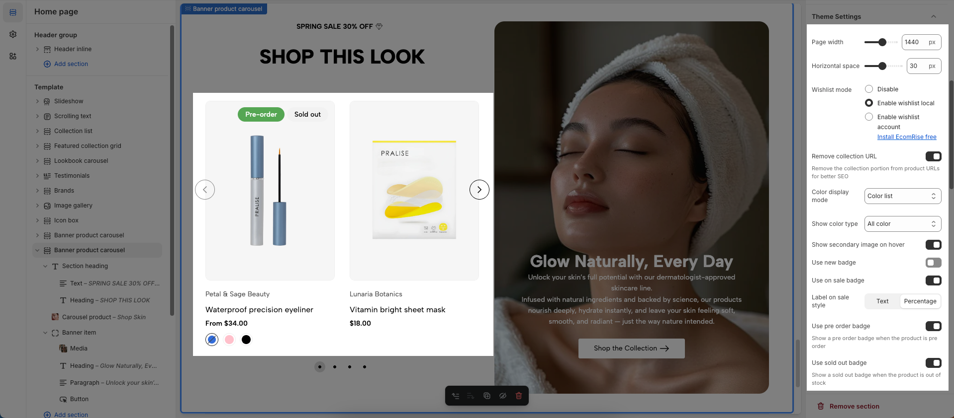
Theme Settings
Page width: Defines the maximum width of the page content, influencing layout and display on various devices.
Horizontal space: Set the horizontal spacing (margin or padding) for the element.
Wishlist mode: Enables or disables the wishlist feature, providing users with a function to save favorite products.
You can Disable, Enable wishlist local, Enable wishlist account Install EcomRise free, Enable Growave wishlist
Remove collection URL: Eliminates the collection URL from the product page path, optimizing SEO and creating shorter URLs.
Remove the collection portion from product URLs for better SEO
Color display mode: Selects the product color display method, such as color list or count
Show color type: Displays All colors or Only color available. This option allows customers to see the complete color range of a product or focus solely on colors currently in stock.
Show secondary image on hover: Displays a secondary product image when hovering over it, giving customers a multi-dimensional view of the product.
Use new badge: Enables or disables the display of a "new" badge on new products, attracting customer attention.
Use on sale badge: Enables or disables the display of an "on sale" badge on discounted products, stimulating purchases.
Label style: Selects the display style "Text" or "Percentage" for the "on sale" badge
Use pre-order badge: Enables or disables the display of a "pre-order" badge on upcoming products, informing customers of pre-order availability.
Use sold out badge: Enables or disables the display of a "sold out" badge on out-of-stock products, notifying customers of product availability.
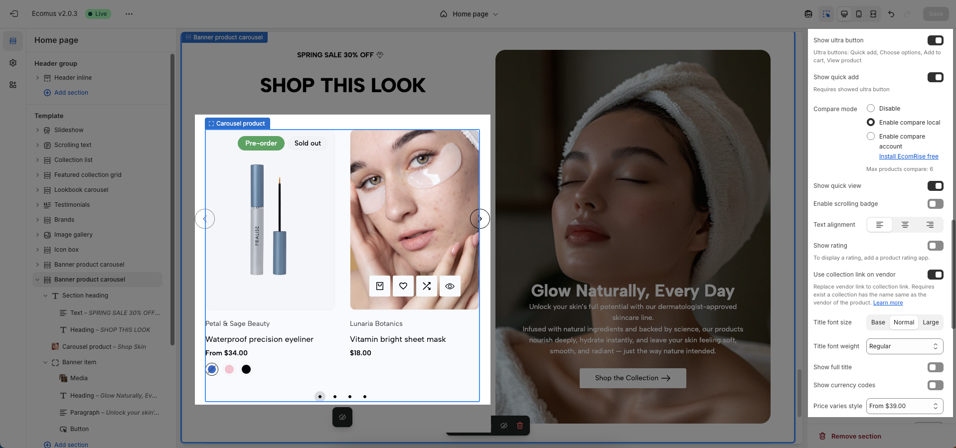
Show ultra button: Enables or disables the "ultra" button (custom button), allowing the addition of special action buttons to products.
Ultra buttons: Quick add, Choose options, Add to cart, View product
Show quick add: Requires showed ultra button
Compare mode: Enables or disables the product comparison mode, allowing customers to compare products side-by-side for informed purchasing decisions.
You can Disable, Enable compare local, Enable compare account
Max products compare: 6
Show quick view: Enables or disables the "quick view" button, allowing customers to view product details without leaving the current page.
Text alignment: Adjusts the text alignment of products (left, right, center), customizing the display layout.
Show rating: Enables or disables the display of product ratings, providing customer feedback information.
To display a rating, add a product rating app.
Use collection link on vendor: Replace vendor link to collection link. Requires exist a collection has the name same as the vendor of the product. Learn more
Title font size: Adjusts the font size of the product title, ensuring readability and compatibility with the website design
Title font weight: Selects the font weight of the product title, creating emphasis and attracting attention.
Show full title: Enables or disables the display of the full product title, preventing title truncation and ensuring complete information.
Show currency codes: Enables or disables the display of currency codes next to product prices, providing clear currency information.
Price varies style: Choose a display style for variable product prices (e.g. "From [price]"), which helps customers understand the price range.
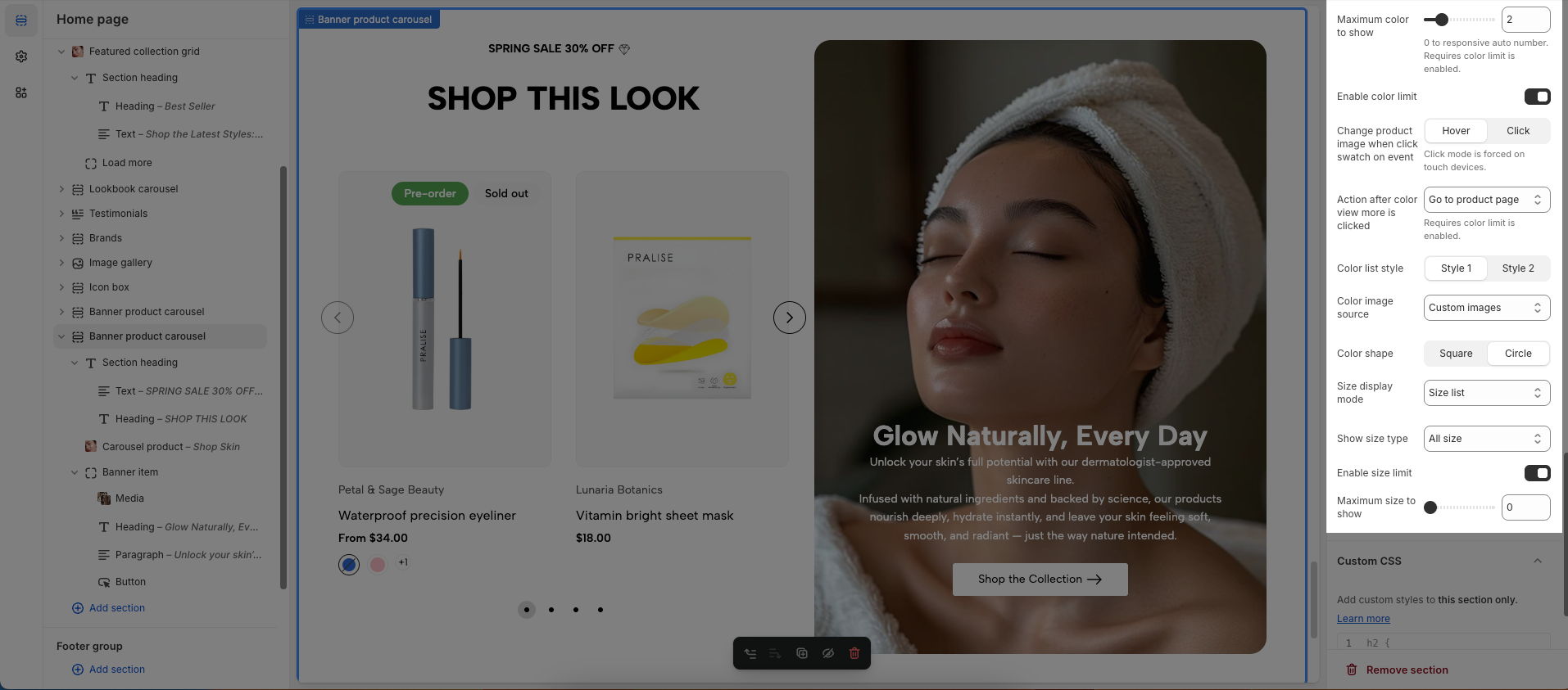
Maximum color to show: Limits the number of product colors displayed
0 to responsive auto number. Requires color limit is enabled.
Enable color limit: Enables or disables the limit on the number of product colors displayed, allowing control over the color count shown on the product page.
Change product image when click swatch on event: Allows the product image to change when a user clicks on a color swatch, creating a more interactive and visual experience.
Click mode is forced on touch devices.
Action after color view more is clicked: Defines the action that occurs when a user clicks the "view more colors" button, such as showing all colors or redirecting to a more detailed page (Expand all colors, Go to product page)
Requires color limit is enabled.
Color list style: Selects the display style for the product color list
Color image source: Selects the image source for product colors, allowing the use of actual product images or standard color images for display (Custom images or variant images)
Color shape: Selects the display shape for product colors (e.g., square, circle), customizing the color display interface.
Size display mode: Choose how the product size options are displayed.
Show size type: Choose which product sizes to display (All sizes, Only available sizes).
Enable size limit: Enables or disables the limit on the number of product sizes displayed
Maximum size to show: Limits the number of product sizes displayed, with "0" for responsive auto-adjustment based on screen resolution. (Requires size limit to be enabled.)
Enable scrolling badge: Enables or disables scrolling badges, allowing badges to move with the page
Icon SVG (If you want to download svg Remixicon): Use icon from Remixicon to enhance visual appeal and personalize the interface.
Text: Enter custom text to display alongside icons or other information, creating clear and engaging messages.
Show sale percentage: Enables or disables the display of the sale percentage on products, helping customers easily identify discounts.
Show sale text: Enables or disables the display of sale text (e.g., "Sale"), providing clear information about promotional offers.
Follow this document to know more about the Scrolling badge
Custom CSS
Allows users to customize by adding CSS rules, beyond the limitations of default settings. This allows for fine-tuning the design to every detail, to suit specific needs.
Add custom styles to this section only.
To add custom styles to your entire online store, go to theme settings.


