


The "Top Bar" is a thin, horizontal strip located at the very top of a website, typically above the main header or navigation. Its primary function is to display high-priority, concise information that needs to be visible immediately to users, without being intrusive. Common uses include announcements, promotional messages, contact information, or quick links.
1. How to access the Banner carousel section?
Step 01: From Shopify Admin, click on Online Store > Select Themes > In the Current theme section, click the Customize button.

Step 02: In the theme editor (Customize), click the Sections button > click Add section button > find & add the Top bar section
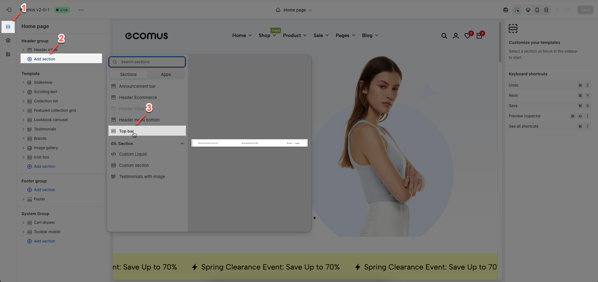
Place the top bar section above the header to ensure proper display.
2. How to customize the Top bar section?
2.1. Blocks
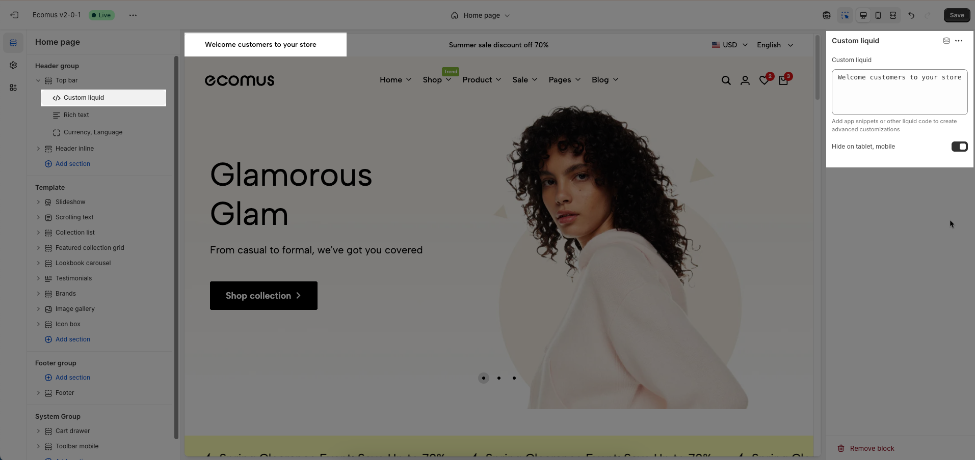
2.1.1. Custom liquid block
To add Custom liquid block to the Top bar, click the Add block button (plus icon ➕) under the Top bar
Custom liquid: Enter your custom Liquid, HTML, CSS, or JavaScript code. This code will be rendered directly within this section, allowing for advanced customizations.
Add app snippets or other liquid code to create advanced customizations
Hide on tablet, mobile: Check to hide this entire section (including the custom code) on tablet and mobile devices.
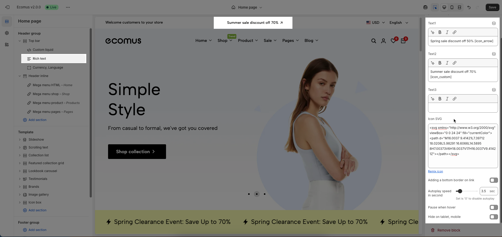
2.1.2. Rich text block
To add Rich text block to the Top bar, click the Add block button (plus icon ➕) under the Top bar
You can use short codes: [icon_arrow] or use can add custom icon SVG code using the [icon_custom] short code
Text1, Text2, Text3: Enter the text content for these fields. Each field can be used for different announcements, taglines, or concise information.
Icon SVG: A text area to paste your own SVG code if you want a fully custom icon instead of using the preset options. You can click Remix icon link to remix or customize the current SVG icon using an external editor.
Adding a bottom border on link: Check to add a bottom border to links within this section. This helps to visually emphasize the links.
Autoplay speed in seconds: Set the autoplay speed in seconds. Set to 0 to disable autoplay.
Pause when hover: Check to pause autoplay when the user hovers over the slider.
Hide on tablet, mobile: Check to hide this entire section on tablet and mobile devices.
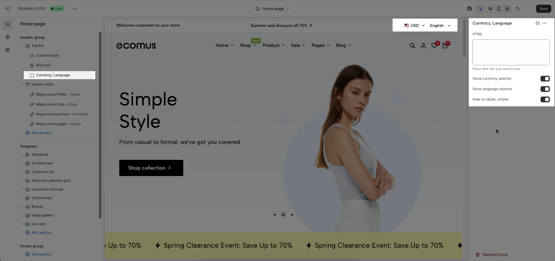
2.1.3. Currency, Language block
To add Currency, Language block to the Top bar, click the Add block button (plus icon ➕) under the Top bar
HTML: Place here text you want to see
Show currency selector: Check to display the currency selector, allowing customers to view and purchase products in their desired currency.
Show language selector: Check to display the language selector, allowing customers to browse your store in their preferred language.
Hide on tablet, mobile: Check to hide these items (currency selector, language selector, and location link) on tablet and mobile devices.
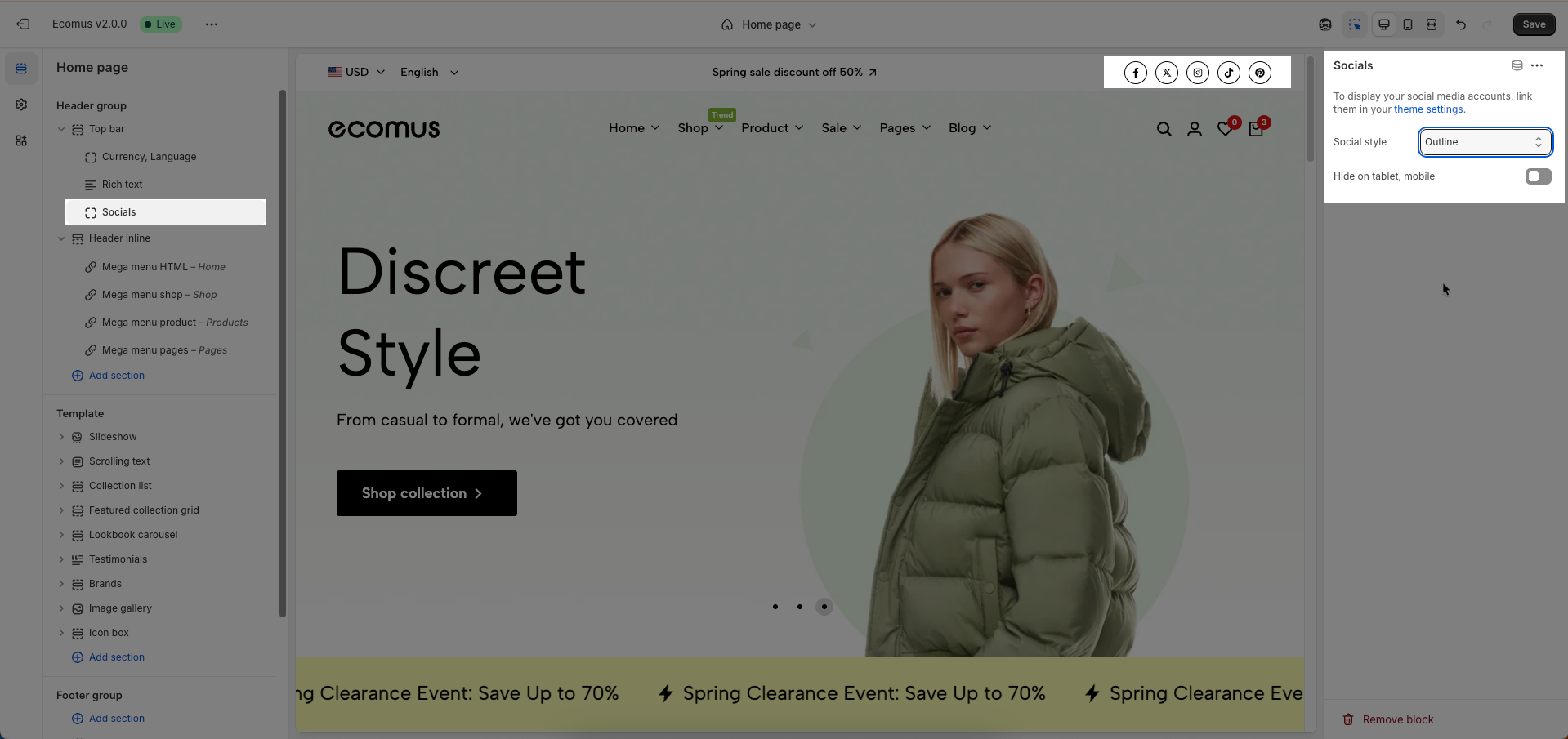
2.1.4. Socials block
To add Socials block to the Top bar, click the Add block button (plus icon ➕) under the Top bar
Social style: Select the display style for social media icons. These options determine the shape, coloring, and hover effects of the icons.
Hide on tablet, mobile: Check to hide this entire section on tablet and mobile devices.
To display your social media accounts, link them in your theme settings.
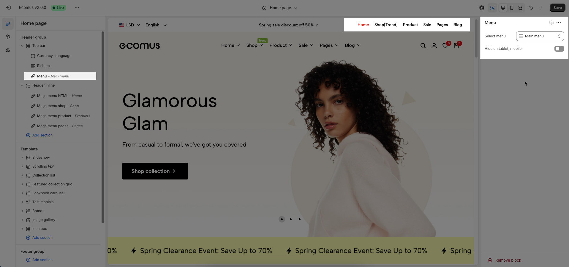
2.1.5. Menu block
To add Menu block to the Top bar, click the Add block button (plus icon ➕) under the Top bar
Select menu: Select the navigation menu to be displayed in this section.
Hide on tablet, mobile: Check to hide this entire section on tablet and mobile devices.
You can add maximum 3 blocks.
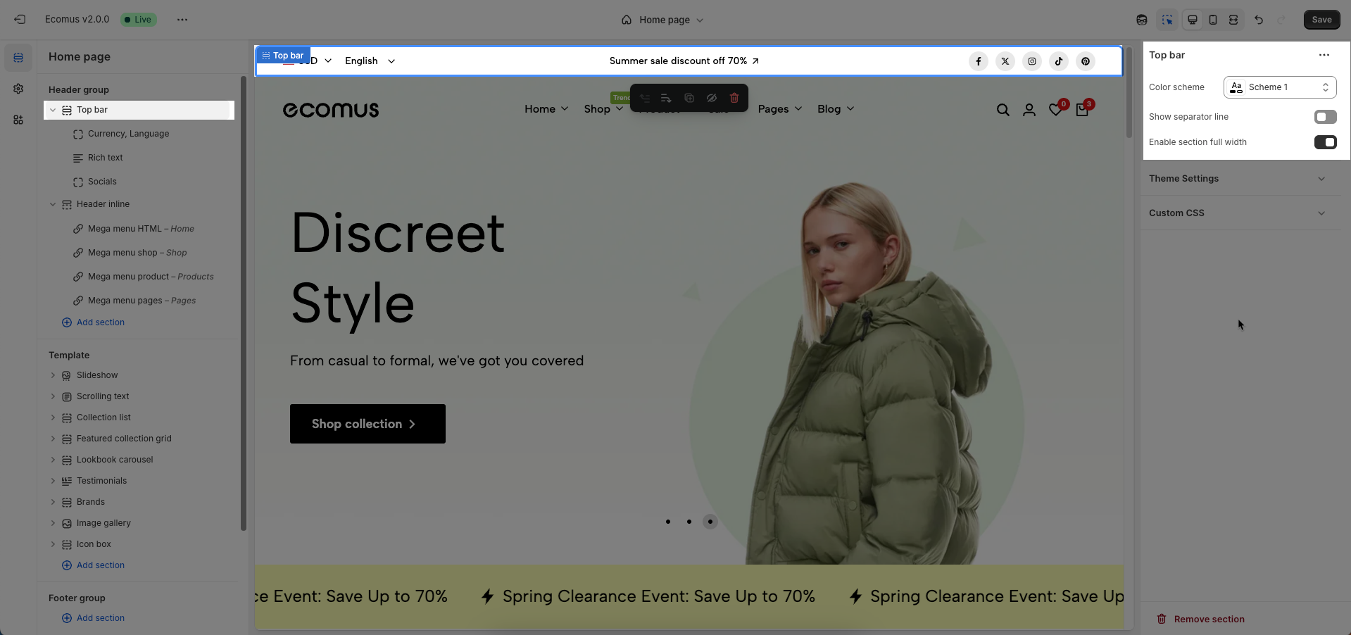
2.2. Top bar section
Colors schema: Select the color schema to be applied to this section. A color schema defines color variables such as background color, text color, button colors, and more, ensuring consistency and easy management.
Show separator line: Check to display a separator line above or below this section, helping to visually divide content.
Enable section full width: Check to stretch this section to full width of the screen. If unchecked, the content will be constrained to the page's maximum content width.
Relevant options will be displayed based on the block you've added.
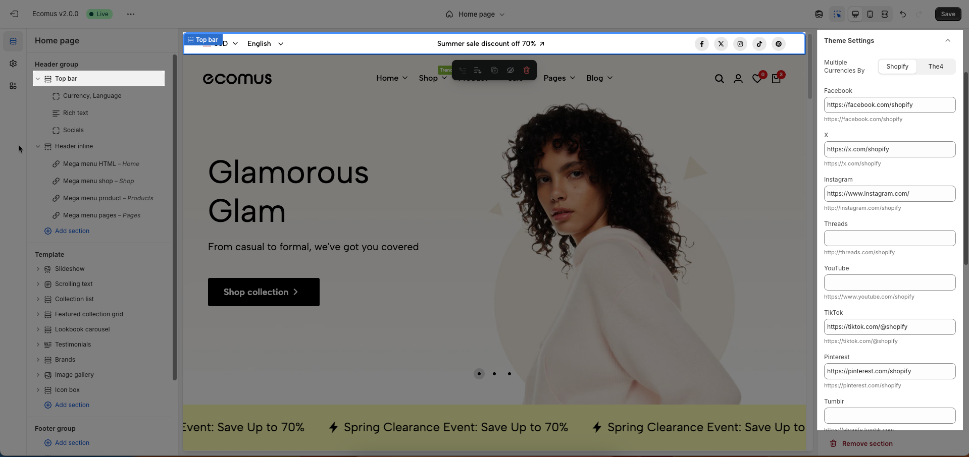
Multiple Currencies By: Select the multi-currency management tool being used.
Shopify: Utilizes Shopify Payments' built-in multi-currency feature.
The4: Uses The4's custom solution (likely an app or integrated theme feature).
You can add or remove Social media from the corresponding fields
Custom CSS
Allows users to customize by adding CSS rules, beyond the limitations of default settings. This allows for fine-tuning the design to every detail, to suit specific needs.
Add custom styles to this section only.
To add custom styles to your entire online store, go to theme settings for detailed instructions.


