


This guide will help you customize shared blocks across different sections, such as Headings, Text, Spacer, Button and Paragraphs. By following this tutorial, you'll learn how to adjust these blocks to fit your design needs, ensuring consistency and flexibility throughout your layout.
1. Heading/ Text
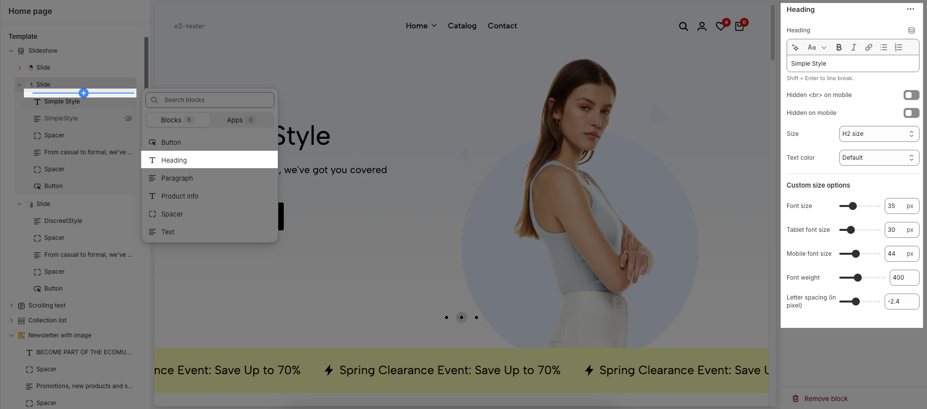
Customizing the Heading allows you to control its appearance across different devices, ensuring consistency and responsiveness. Below are the available options to fine-tune your heading styles.
Heading: Allows you to enter and format the text (bold, italic, underline, lists, links, etc.). Shift + Enter to line break.
Hidden <br> on mobile: Disables line breaks on mobile devices.
Hidden on mobile: Hides the heading on mobile screens.
Size: Lets you select sizes for the heading.
Text color: Allows you to set the text color. Please follow this guideline to configure the Color.
Custom Size Options:
Font size: Adjusts the heading size for desktop.
Tablet font size: Adjusts the heading size for table.
Mobile font size: Adjusts the heading size for mobile.
Font weight: Controls the thickness of the text (e.g., 600 is semi-bold).
Letter spacing: Adjusts the space between characters.
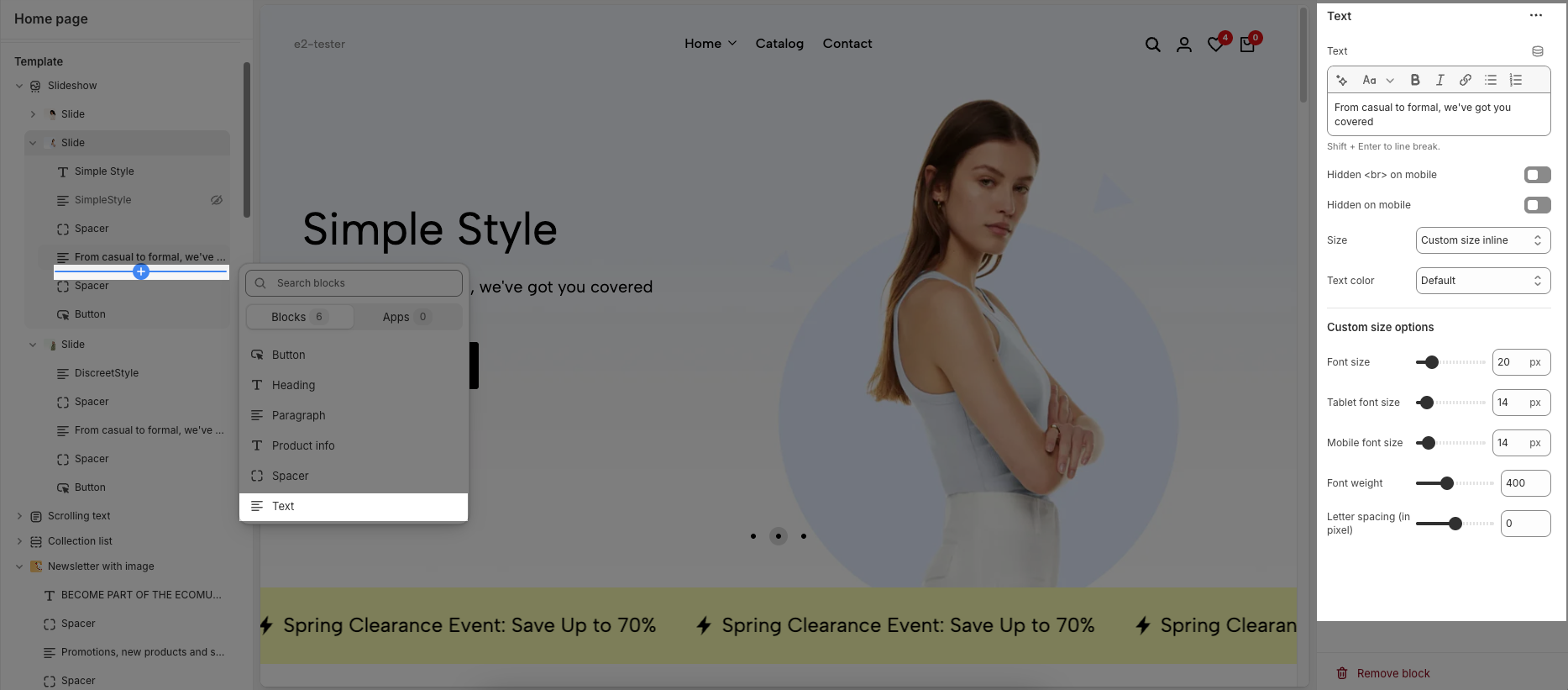
The Text block offers the same customization options as the heading block, allowing you to adjust font size, weight, color, and spacing. These settings help maintain consistency and readability across different devices. Below are the available options for customization.
2. Button
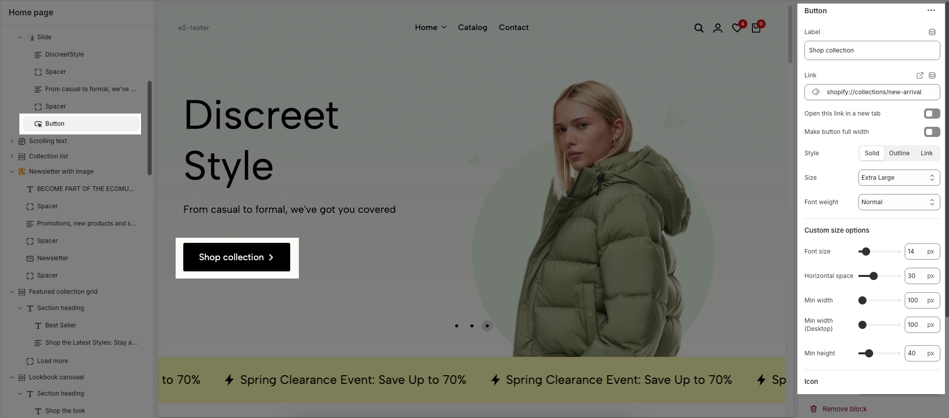
The Button block allows you to create interactive call-to-action elements that guide users to specific links. Customizing the button ensures it matches your design and provides a seamless user experience. Below are the available options for customization:
Label: Defines the text displayed on the button.
Link: Specifies the destination URL when the button is clicked.
Open this link in a new tab: Opens the link in a new browser tab when enabled.
Make button full width: Expands the button to take up the full width of its container.
Style: Choose between Solid, Outline, or Link styles for different visual effects.
Size: Adjusts the button size (e.g., Extra Large, Medium, etc.).
Font weight: Controls the thickness of the button text (e.g., Normal, Bold).
Custom Size Options:
Font size: Adjusts the heading size for desktop.
Tablet font size: Adjusts the heading size for table.
Mobile font size: Adjusts the heading size for mobile.
Font weight: Controls the thickness of the text (e.g., 600 is semi-bold).
Letter spacing: Adjusts the space between characters.
Icon:
Icon: Select the icon to display on the button (e.g., arrow, plus, etc.).
Icon position: Choose whether the icon appears Before or After the button text.
Icon size: Adjust the size of the icon in pixels.
Icon spacing: Set the spacing between the icon and the text to ensure proper alignment and readability.
3. Paragragh
The Paragraph block is used to add and format body text on your page, helping to convey information clearly and effectively. With various customization options, you can adjust the appearance of your text to match the design and improve readability. Below are the available options for customization:
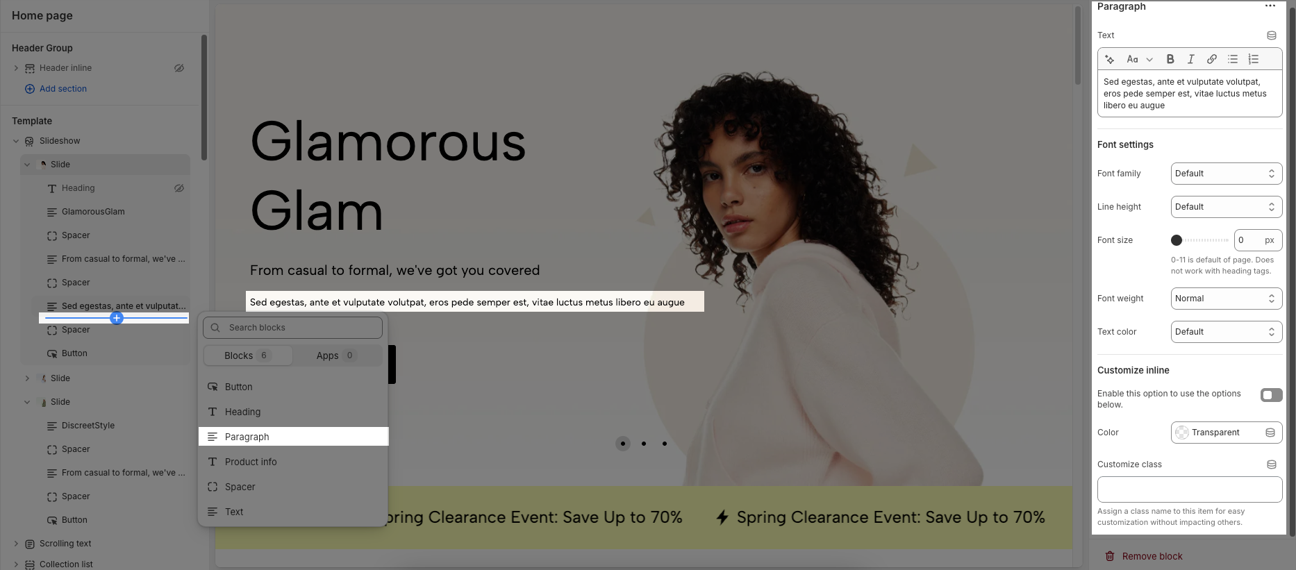
Font Settings
Font family: Selects the font style for the paragraph text.
Line height: Adjusts the spacing between lines of text.
Font size: Sets the text size in pixels.
Font weight: Controls the thickness of the text (e.g., Normal, Bold).
Text color: Allows you to choose a color for the text.
Customize Inline
Enable this option to use the options below: Activates further inline customization.
Color: Allows setting a color the paragraph text.
Customize class: Assigns a CSS class to the paragraph for advanced styling without affecting other elements.
4. Spacer
The Spacer block is used to add empty space between blocks. It helps improve the layout, create visual separation, and ensure a balanced design. This block is particularly useful for adjusting spacing in different screen sizes (desktop, tablet, and mobile) to enhance readability and aesthetics.
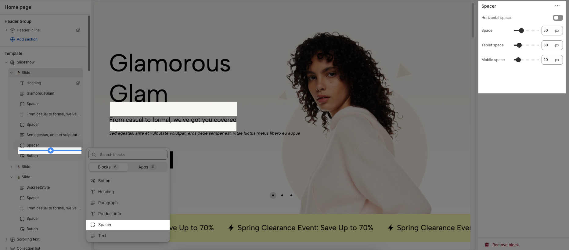
Horizontal space: If enabled, the spacer will also add horizontal spacing instead of only vertical spacing.
Space: Adjusts the amount of space (in pixels) on desktop screens.
Tablet space: Defines the amount of space for tablet devices, ensuring responsive spacing.
Mobile space: Sets the spacing specifically for mobile screens.


