This section help you create a tabs of store list.
1. How to access the Store tabs section?
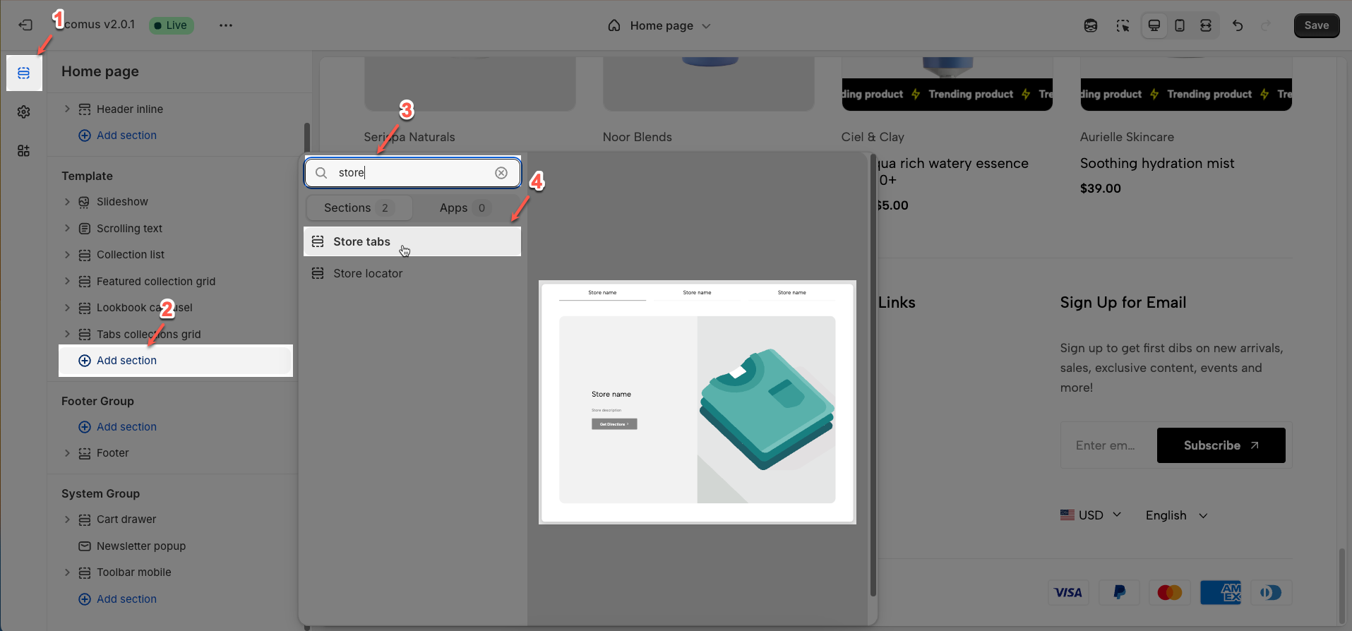
Step 01: From Shopify Admin, click on Online Store > Select Themes > In the Current theme section, click the Customize button.

Step 02: In the theme editor (Customize), click the Sections button > Click the Add section button > In the Sections tab, scroll through the list or use the search bar to find and select the Store tabs.
2. How to customize the Store tabs section?
2.1. Store tabs section
2.1.1. Heading options
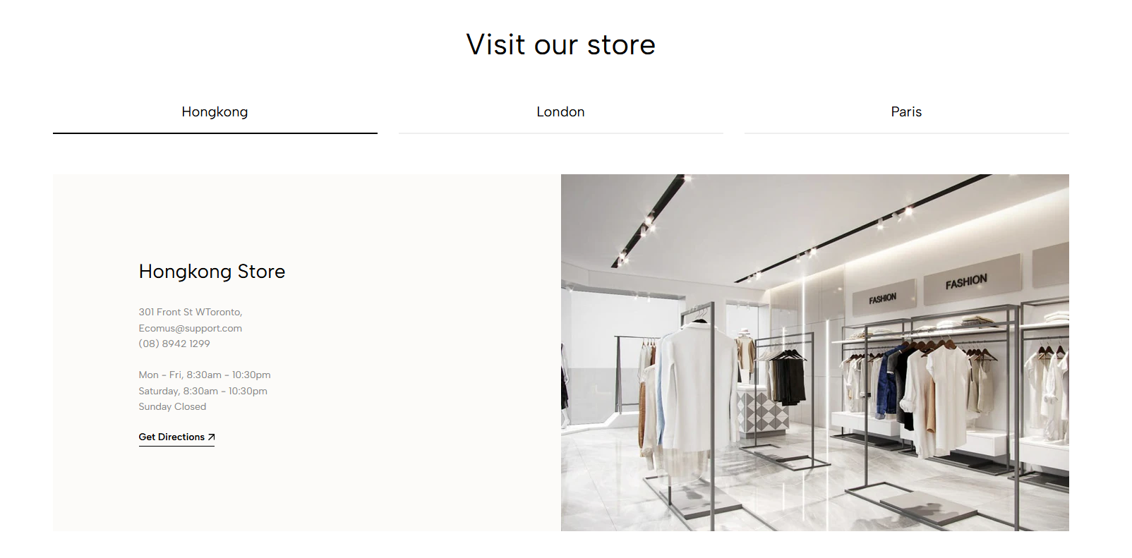
Heading: Set the main title for your section to grab attention and build trust
Alignment: Choose how your heading is positioned—left or center
Heading tag: Select the HTML heading tag (H1, H2, H3, etc.) for SEO and accessibility purposes
Heading font size: Customize the font size of your heading to ensure it stands out while maintaining readability across all devices
Subheading: Add a short introductory text below the heading to provide context, helping visitors understand their value
Subheading size: Adjust the font size of the description text to make it easy to read without overpowering the main heading
Heading reverse: Enable this option to swap the position of the heading and description, allowing for alternative layouts that better suit your design preferences
Distance between heading items: Adjust the spacing between the heading and the description to ensure optimal readability and visual balance
Distance between heading and content: Set the gap between the heading section and the content to create a clear separation and improve the overall layout structure
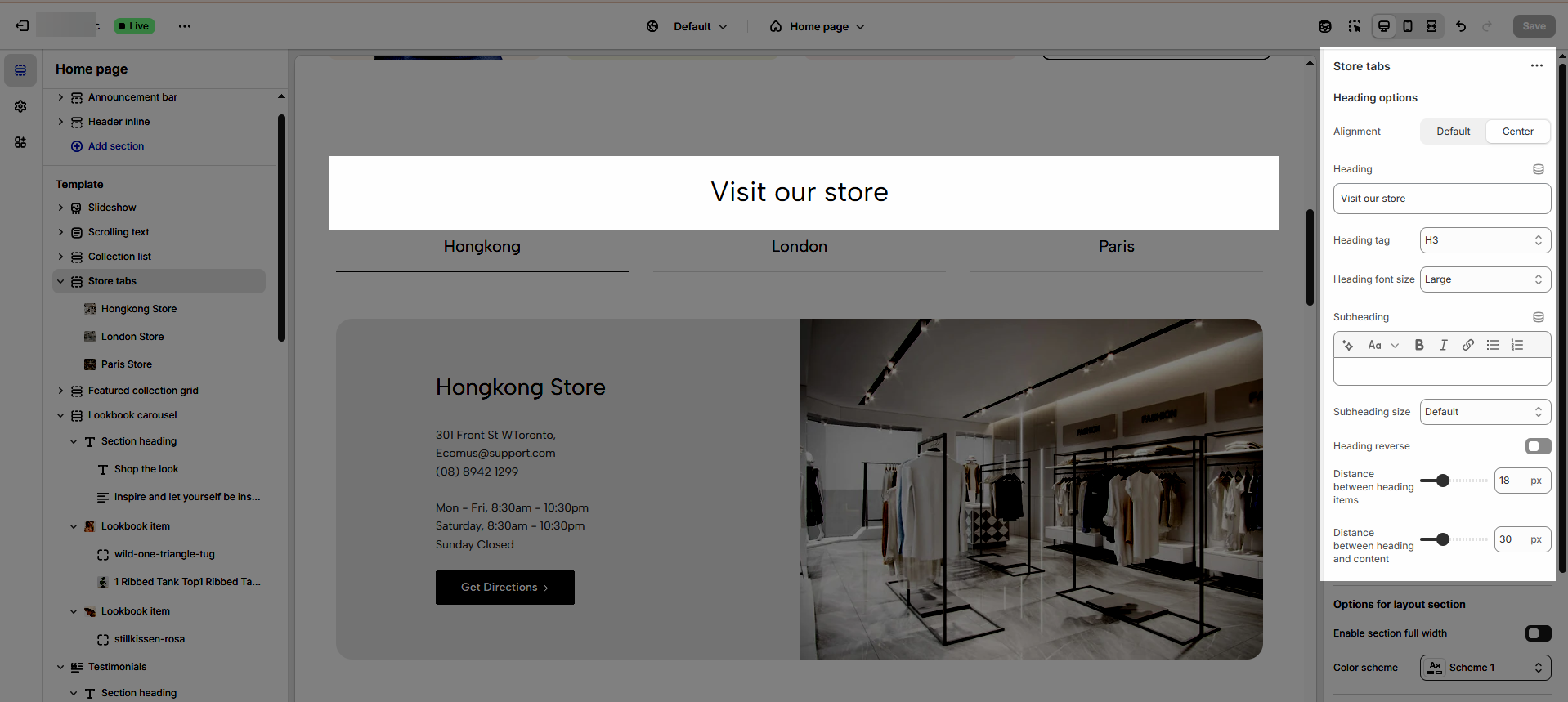
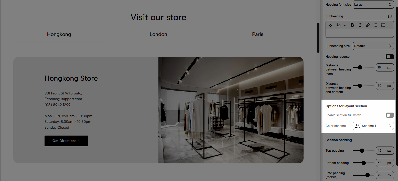
2.1.2. Options for layout section
Enable section full width: This toggle switch, when turned on, will make the entire section span the full width of the browser window. When turned off, the section will likely be constrained to the website's main content width.
Color scheme: This dropdown menu allows you to select a predefined color scheme for the section. Clicking the dropdown will likely reveal other color palettes that you can apply to the background, text, and other elements within this section for a consistent look.
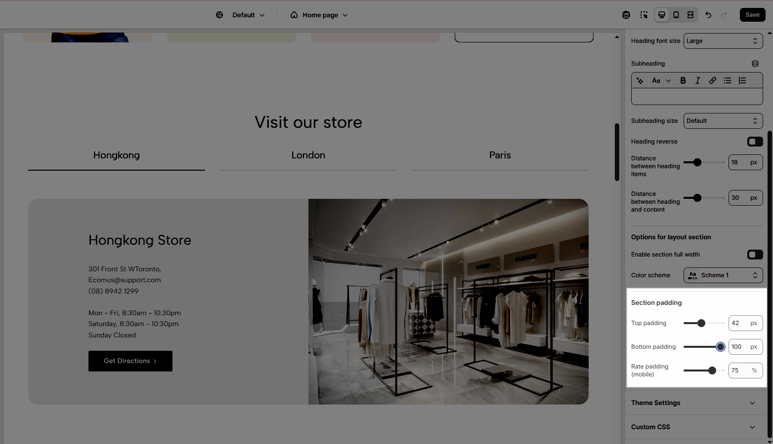
2.1.3. Section padding
Top padding: This option allows you to set the amount of space (padding) at the top of the slider section. You can drag the slider or directly enter a numerical value to adjust this spacing
Bottom padding: This option allows you to set the amount of space (padding) at the bottom of the slider section. You can drag the slider or directly enter a numerical value to adjust this spacing
Rate padding (mobile): This option allows you to set the aspect ratio-based padding for mobile view (in percentage). For example, 75% means the height will be 75% of the width.
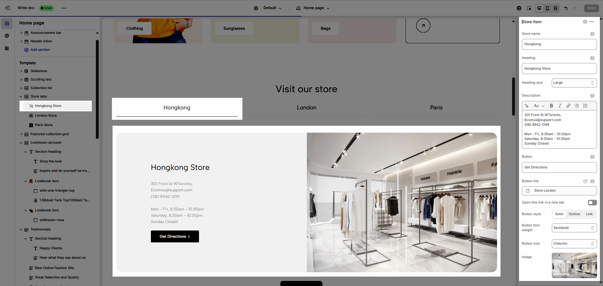
2.2. Store item block
To add a Store item block to the Store tabs, click the Add Store item button (plus icon ➕) under the Store tabs.
After adding the Store item block, you can adjust its settings using the sidebar—located on the right or left side of your screen depending on your device
Store name: Input the name of your store that you want to show.
Heading: Enter the main title for this section.
Heading size: Choose the font size for the heading (Normal, Medium, Large, X - Large, XX - Large)
Description: Enter a brief description for this section.
Button: Input the text you want to show on the button.
Button link: Paste the web address you want users to visit when they click the button.
Open this link in a new tab: Opens the link in a new browser tab when enabled.
Button style: Select the visual style of the button (Solid, Outline, Link)
Button font weight: Adjust the font weight of the button text for emphasis or design consistency.
Button icon: Optionally select a graphic icon to enhance button recognition and visual appeal.
Image: Upload a visual image to illustrate or complement the content.