


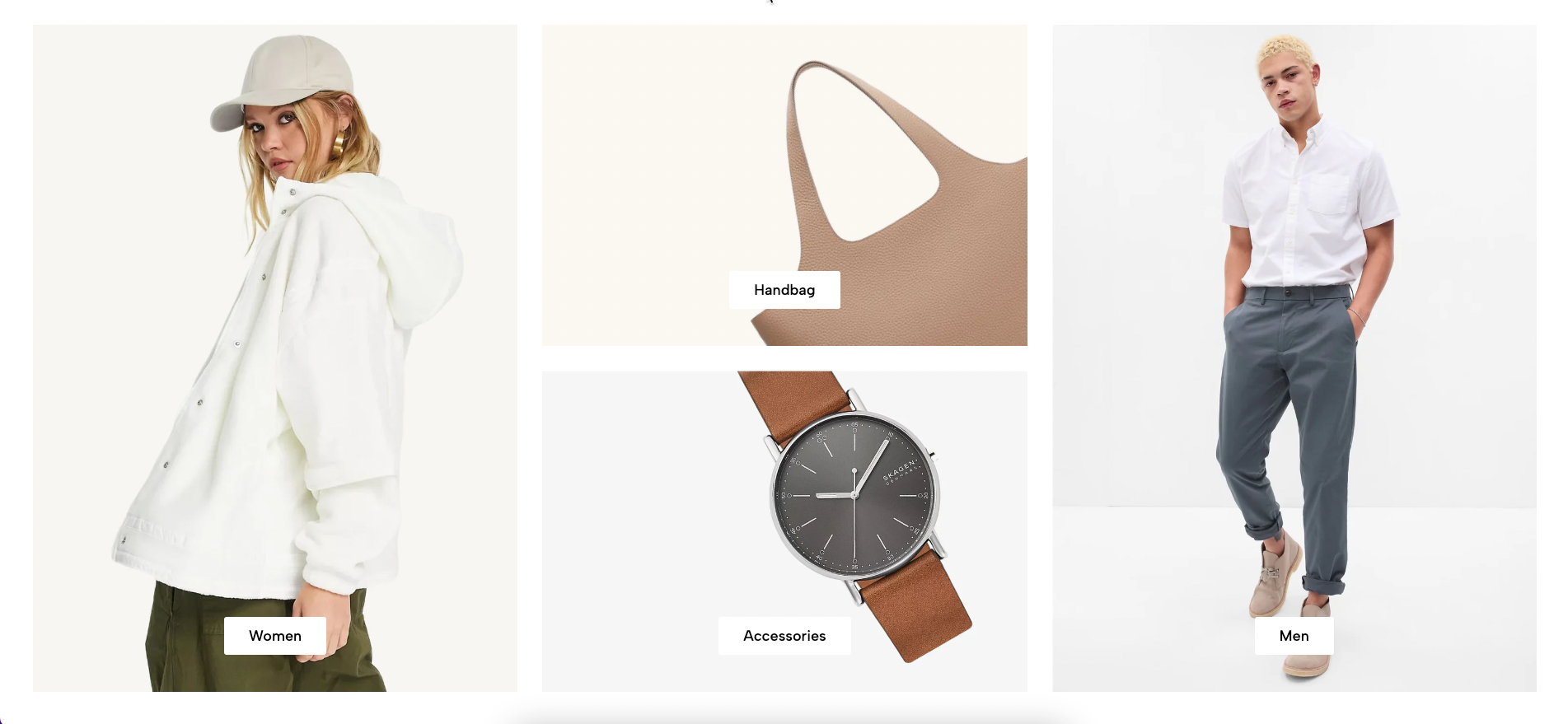
Banner Masonry is a visually dynamic layout that arranges banners in a grid with varying sizes, creating a modern and engaging design. This section allows you to showcase multiple banners in an eye-catching way, making it ideal for highlighting promotions, featured products, or storytelling through images. In this guide, you'll learn how to customize and optimize the Banner Masonry section.
From Theme section sidebar -> Add section -> Banner Masonry Section
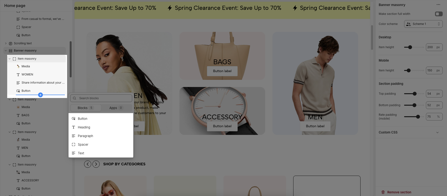
1. Item masonry
1.1. Item masonry block
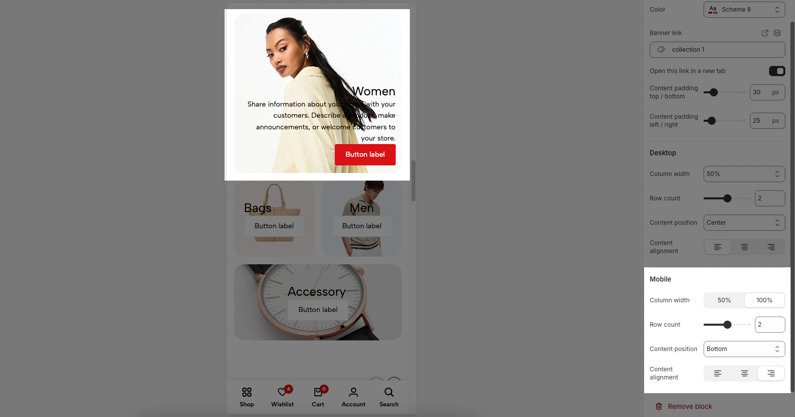
Each image represents one banner masonry. In this block, you can adjust your Banner masonry with many options below:
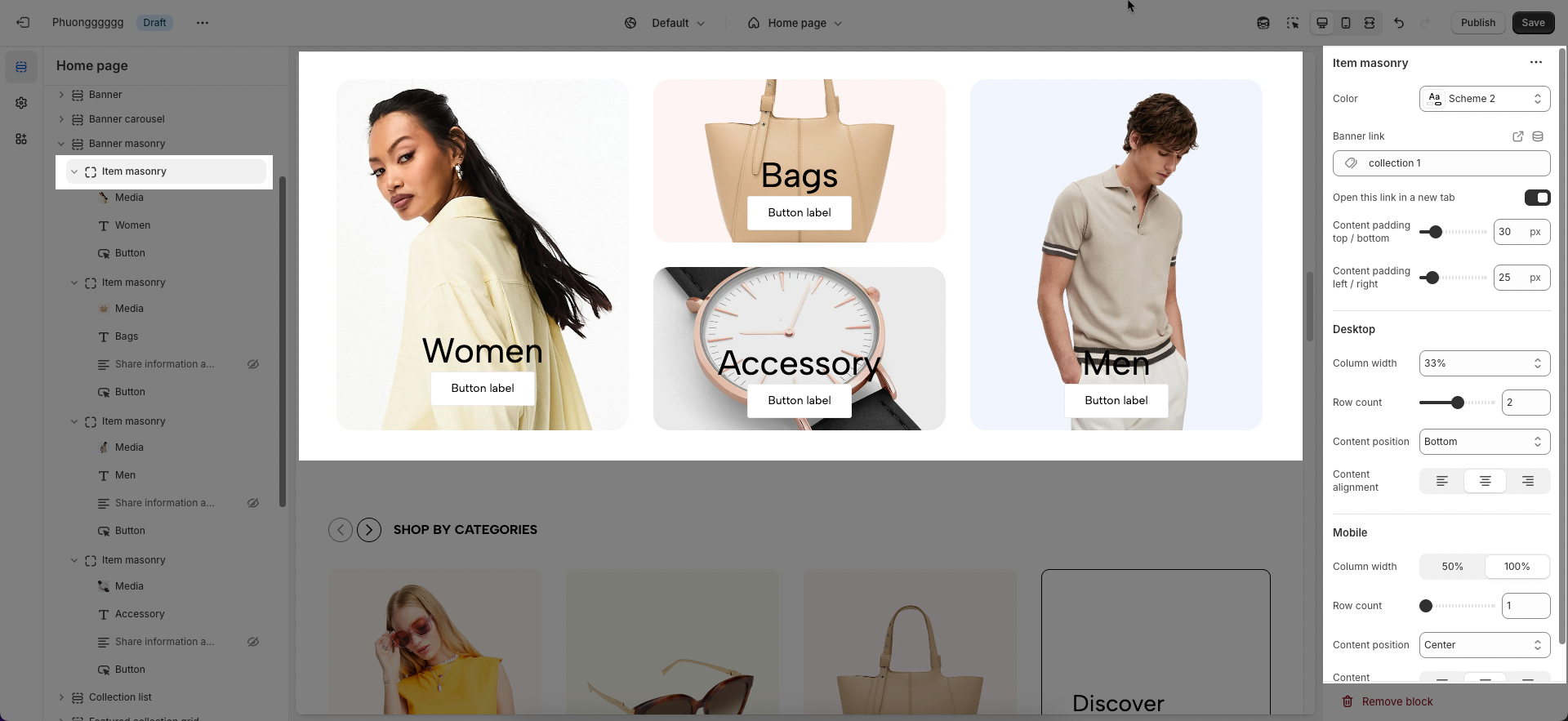
General options
Color: Select the color scheme for the banner.
Banner link: Enter the link for the banner when clicked.
Open this link in a new tab: Enable/disable opening the link in a new tab.
Content padding (top/bottom, left/right): Adjust the spacing between the content and the banner edges.
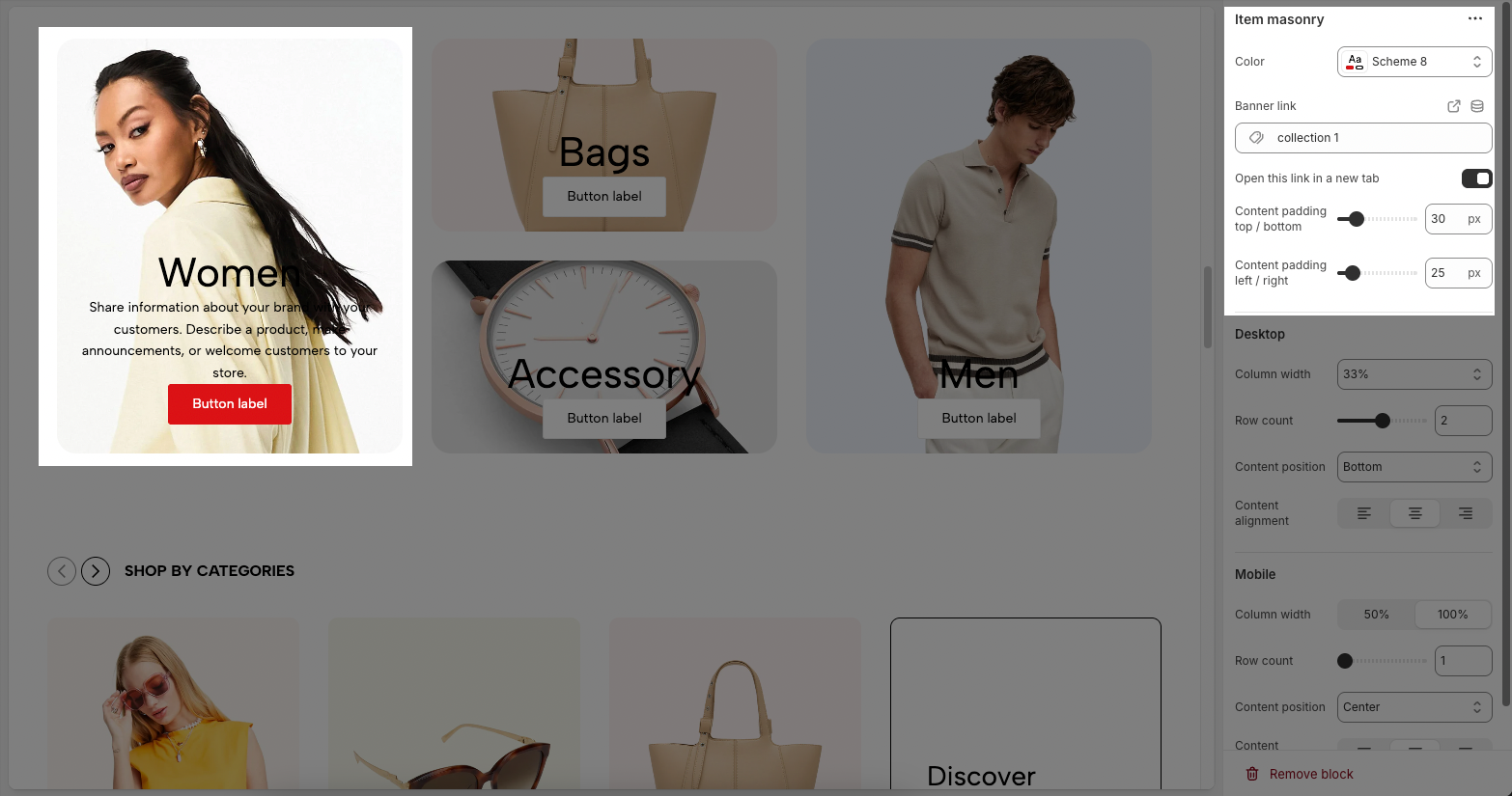
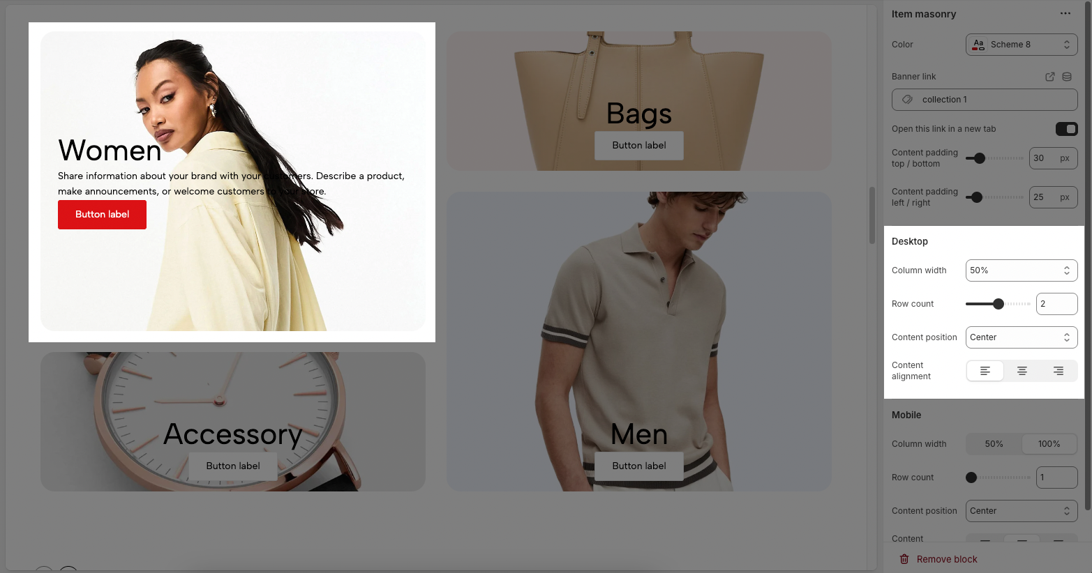
Desktop
Column width: Set the banner width as a percentage of the total width.
Row count: Define the number of banner rows in the Masonry layout.
Content position: Choose where the content appears (top, center, bottom,....).
Content alignment: Align the content (left, center, right).
Mobile
Column width: Set the banner width on mobile (50% or 100%).
Row count: Define the number of banner rows displayed on mobile.
Content position: Choose the content position on mobile.
Content alignment: Align the content on mobile.
1.2. Other blocks
In the Masonry Item, you can add various blocks such as Heading, Text, Button, Paragraph, and Spacer to enhance the layout and design.
To customize these blocks, follow the detailed guide here.
2. Banner masonry section
The Banner Masonry section offers various customization options to create a visually appealing and well-structured layout. Below are the key settings you can adjust to optimize the banner's appearance on different devices.
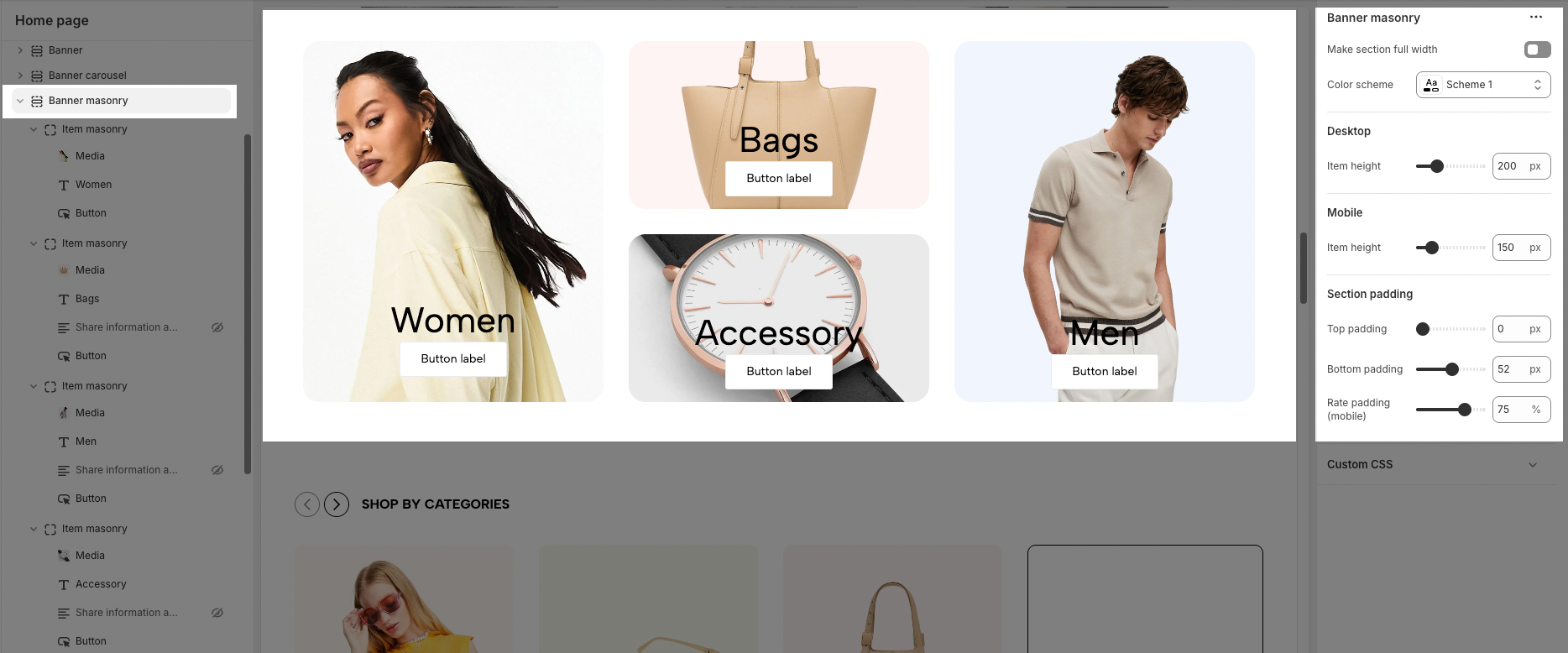
General
Make section full width: Enable/disable full-width display for the banner section.
Color scheme: Select a predefined color scheme for the banner.
Desktop
Item height: Set the height of each banner item on desktop.
Mobile
Item height: Set the height of each banner item on mobile devices.
Section padding
Top padding: Adjust the space above the banner section.
Bottom padding: Adjust the space below the banner section.
Rate padding (mobile): Set the percentage-based padding for the banner section on mobile devices.


