


The "Image with Tabs Content" section provides a flexible structure for presenting diverse content related to a visual image. Each tab allows for embedding different types of content such as text, lists, or even shortcodes, creating an interactive experience and step-by-step information discovery.
1. How to access the Image with tabs content section?
Step 01: From Shopify Admin, click on Online Store > Select Themes > In the Current theme section, click the Customize button.

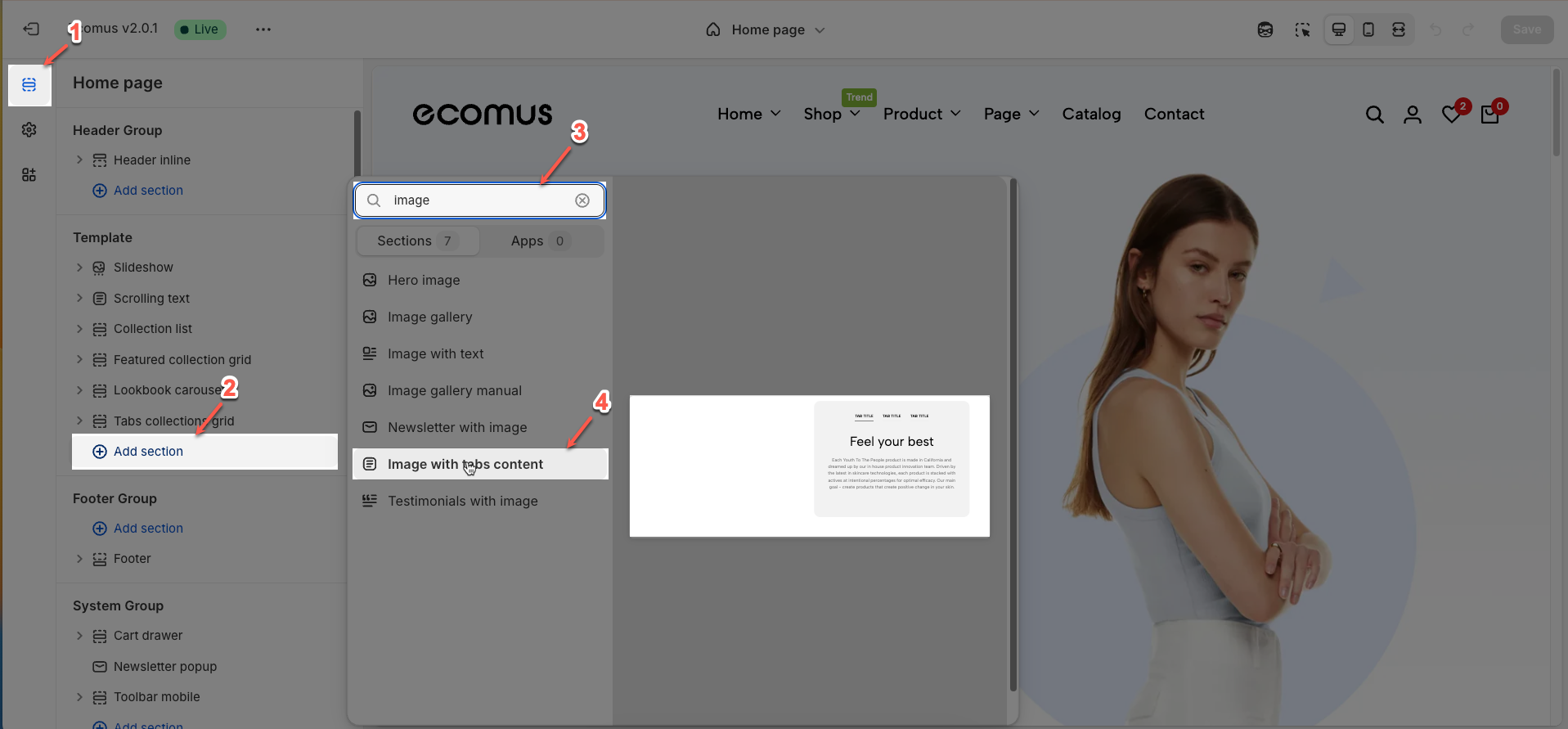
Step 02: In the theme editor (Customize), click the Sections button > Click the Add section button > In the Sections tab, scroll through the list or use the search bar to find and select the Image with tabs content.
2. How to customize the Image with tabs content section?
2.1. Tab item block
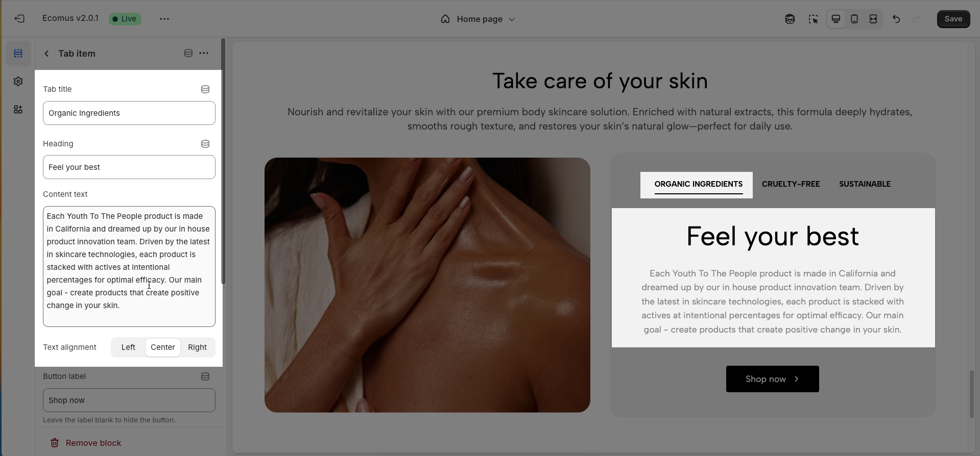
To add a Tab item block to the Image with tabs content, click the Add Tab item button (plus icon ➕) under the Image with tabs content.
After adding the Tab item block, you can adjust its settings using the sidebar—located on the right or left side of your screen depending on your device
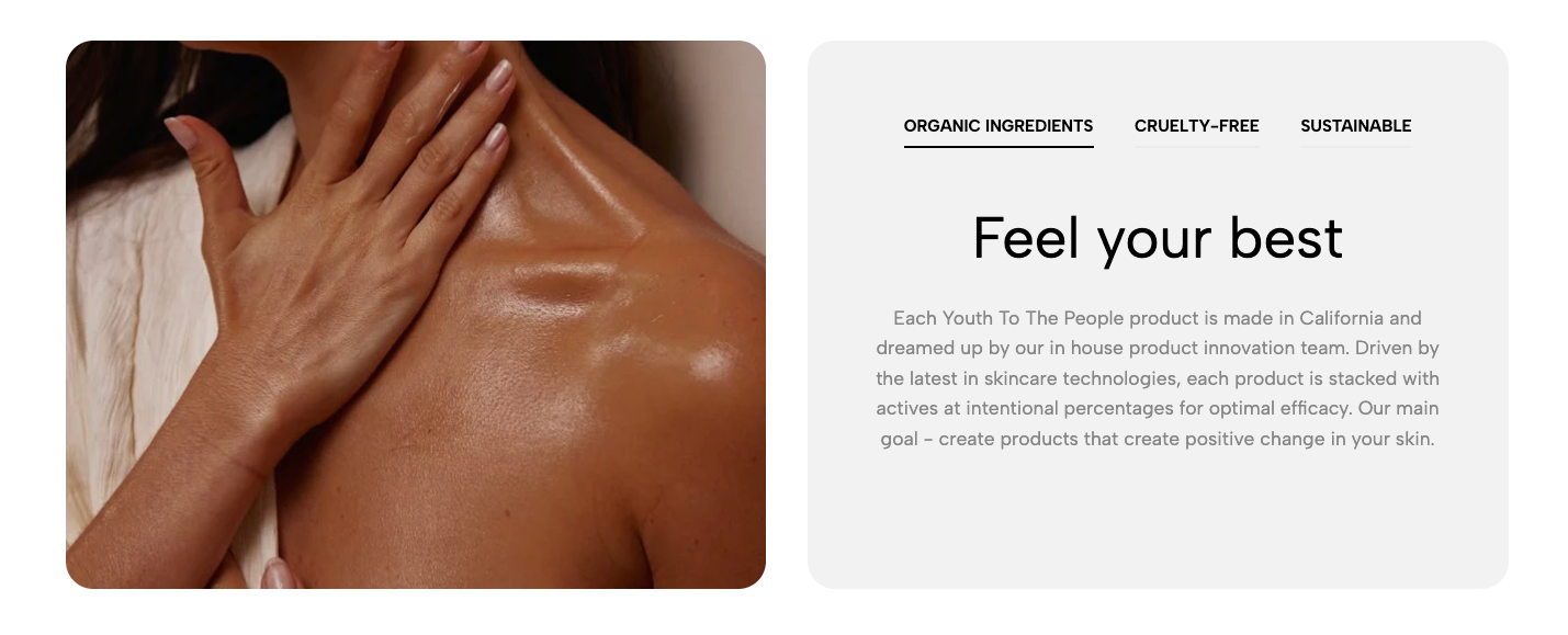
Tab title: Define the display label for this tab, providing clear indication of the contained content.
Heading: Enter a prominent heading designed to capture attention and introduce the primary theme of the tab's content.
Content text: Compose a concise descriptive paragraph. The aim is to convey a compelling message, encouraging users to explore further details.
Text alignment: Select the alignment method for the heading and content text (left, center, right) to optimize visual layout and readability.
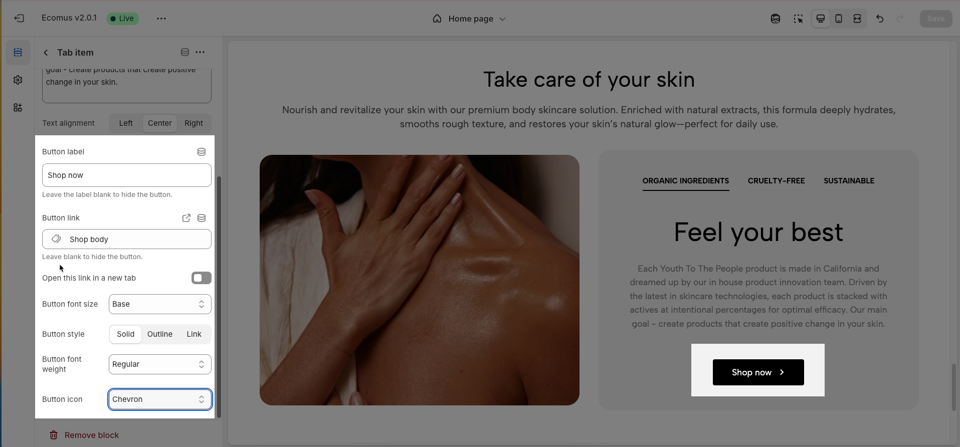
Button label: Define the text displayed on the call-to-action button, guiding users towards a specific interaction.
Button link: Specify the destination URL to which users will be redirected upon clicking the button.
Open this link in a new tab: Enable this option to have the link open in a new browser tab, preserving the user's current browsing experience.
Button font size: Adjust the font size of the button label to ensure readability and consistency with the overall design.
Button style: Select the visual presentation style for the button (e.g., Solid, Outline, Link) to align with the brand aesthetic and intended function.
Button font weight: Adjust the font weight of the text on the button label to create emphasis or ensure readability across different design styles.
Button icon: Optionally select an icon (e.g., Chevron, Arrow) to visually represent the button's action and enhance recognizability.
2.2. Image with tabs content section
After adding the Image with tabs content section, you can customize its settings using the sidebar—located on the right or left side of your screen depending on your device.
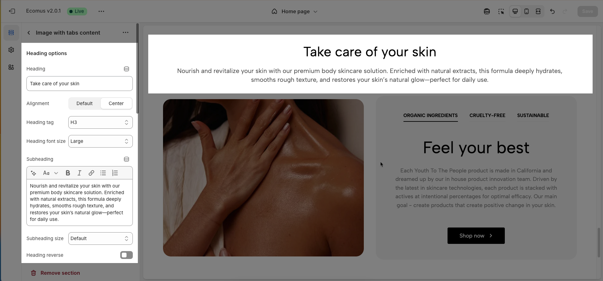
2.2.1. Heading options
Heading: Enter the primary title for this section to provide context and capture the viewer's attention.
Alignment: Select the text alignment method for the heading (Default, Center) to adjust the visual layout.
Heading tag: Choose the semantic HTML tag for the heading (H2, H3, H4, H5, H6) to improve SEO and content structure.
Heading font size (Small, Medium, Large, Extra Large): Adjust the font size of the heading to establish visual hierarchy and align with the design.
Subheading: Enter a secondary heading to provide additional details or break down the main content.
Subheading size (Base, Default, Medium, Large, Extra Large): Adjust the font size of the subheading to create distinction from the main heading and content.
Heading reverse: Enable this option to reverse the display order of the main heading and subheading (if present).
Distance between heading items: Adjust the spacing (margin/padding) between the main heading and subheading to improve layout and readability.
Distance between heading and content: Adjust the spacing (margin/padding) between the heading (main and sub) and the main content of the section.
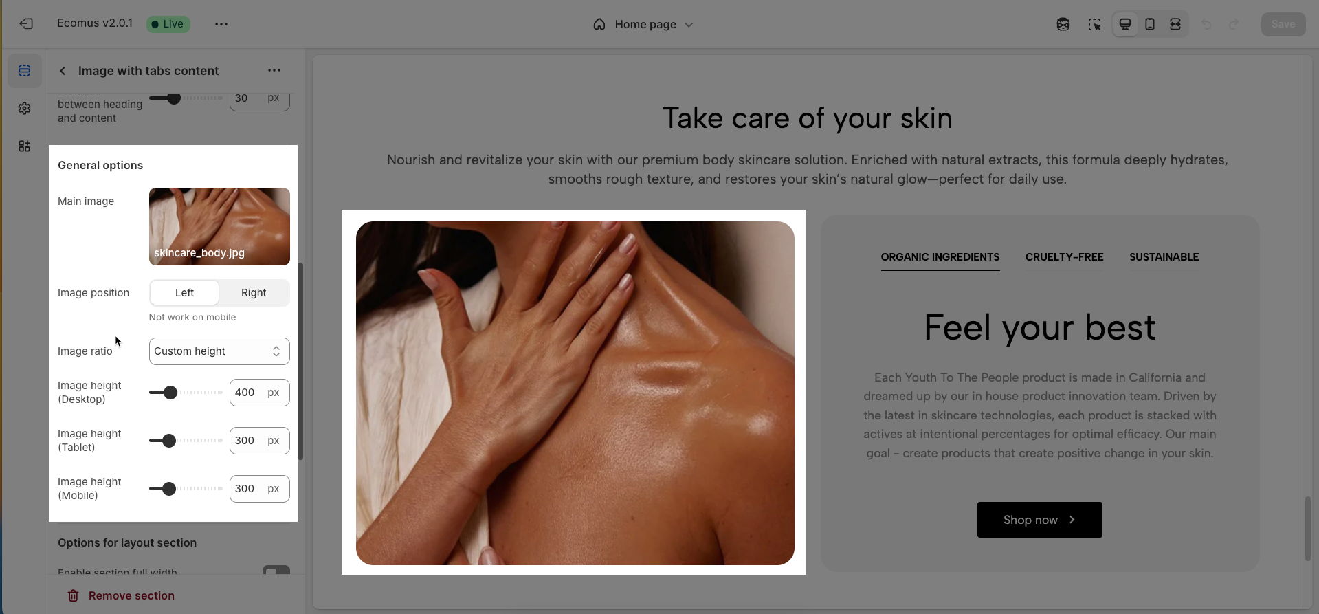
2.2.2. General options
Main image: Upload the primary image to capture attention and convey the visual message of the section.
Image position (Not work on mobile): Select the display position of the main image relative to the content (Left, Right) on desktop interfaces.
Image ratio: Define the display aspect ratio for the main image (Adapt to image, Full height screen, Custom height)
Custom height (Desktop): Enter the desired height value (in pixels or percentage) for the main image on desktop interfaces when the "Custom height" ratio is selected. This allows for precise control over the image dimensions on larger screens.
Image height (Tablet): Set a specific height value (in pixels or percentage) for the main image on tablet interfaces to ensure optimal display.
Image height (Mobile): Set a specific height value (in pixels or percentage) for the main image on mobile interfaces to ensure the best viewing experience on smaller screens.
2.2.3. Options for layout section
Enable section full width: This toggle switch, when turned on, will make the entire section span the full width of the browser window. When turned off, the section will likely be constrained to the website's main content width.
Color scheme: This dropdown menu allows you to select a predefined color scheme for the section. Clicking the dropdown will likely reveal other color palettes that you can apply to the background, text, and other elements within this section for a consistent look.
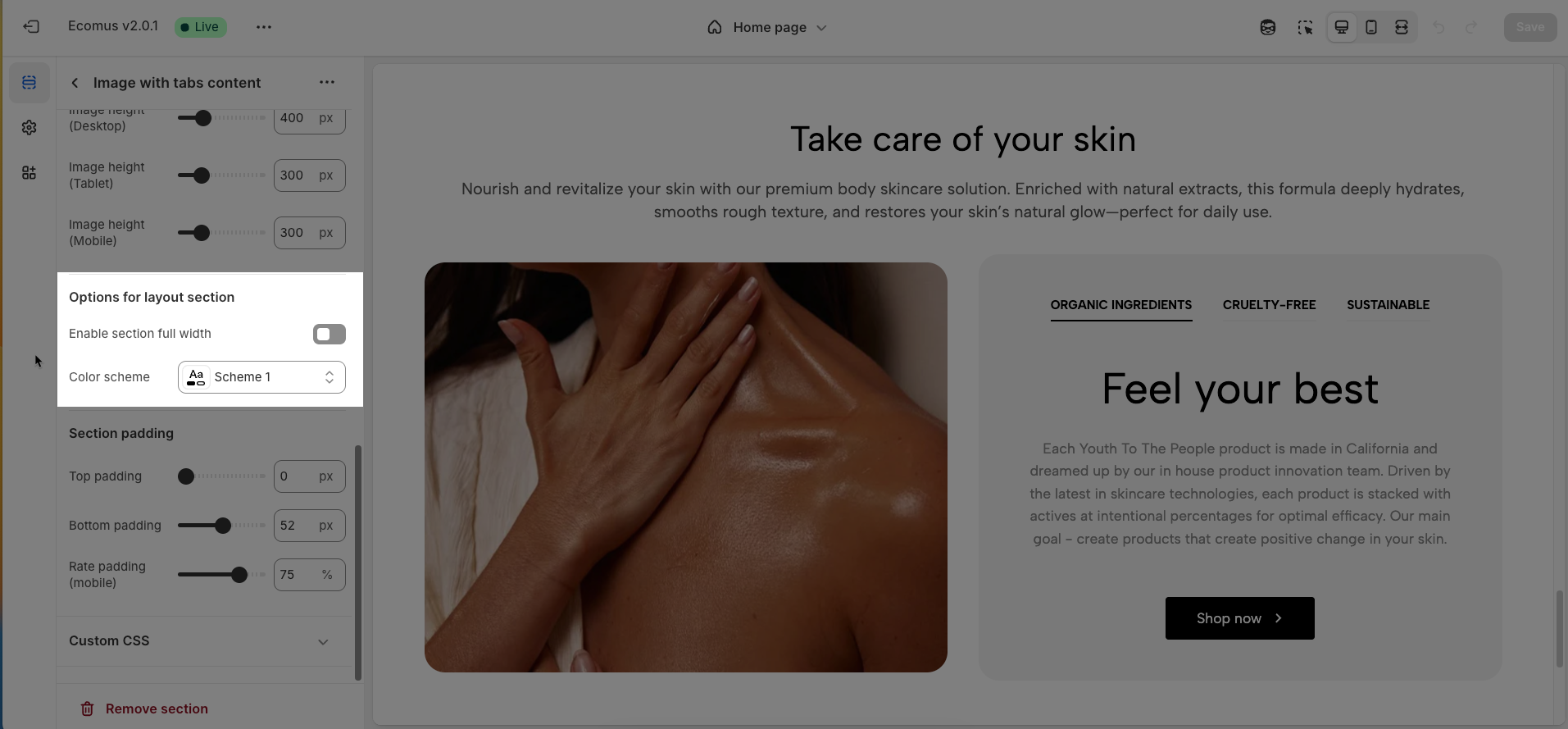
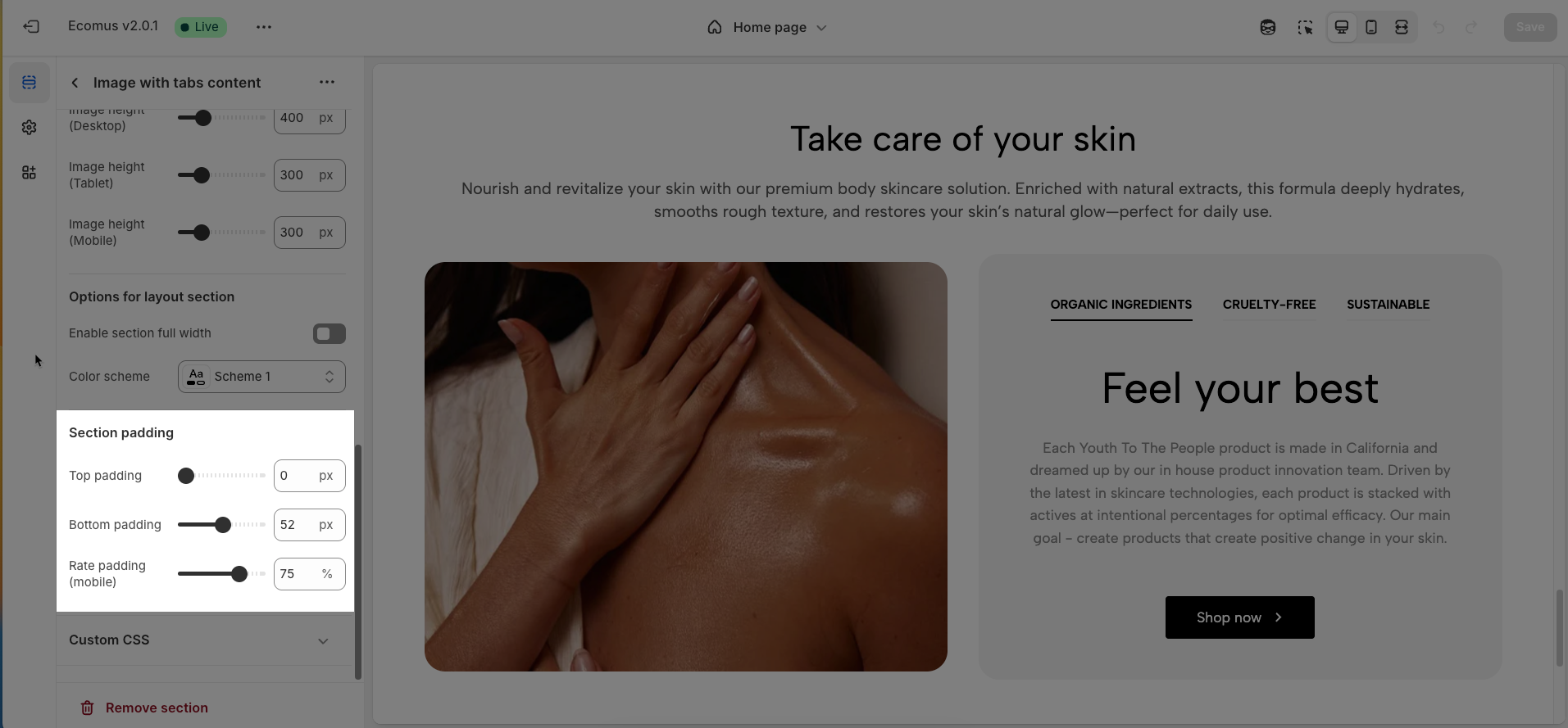
2.2.4. Section padding
Top padding: This option allows you to set the amount of space (padding) at the top of the slider section. You can drag the slider or directly enter a numerical value to adjust this spacing
Bottom padding: This option allows you to set the amount of space (padding) at the bottom of the slider section. You can drag the slider or directly enter a numerical value to adjust this spacing
Rate padding (mobile): This option allows you to set the aspect ratio-based padding for mobile view (in percentage). For example, 75% means the height will be 75% of the width.
2.2.5. Custom CSS
Allows users to customize by adding CSS rules, beyond the limitations of default settings. This allows for fine-tuning the design to every detail, to suit specific needs.
Add custom styles to this section only.
To add custom styles to your entire online store, go to theme settings.
![image with tabs content 9].png](https://support.the4.co/storage/48595/eQirK6k7Up5B41o984noMEkRdssYbLteZJUJUP9T.png)


