


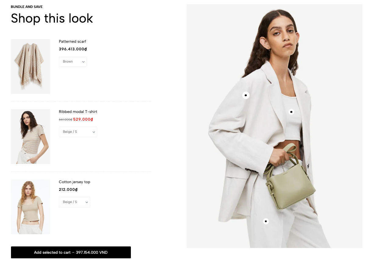
The Bundle Product section is designed to showcase complementary items as a set, allowing customers to “Shop the look” by adding multiple related products to their cart in one click. This section visually connects products using pinpoints on an image, making it easy to highlight full outfits or product combinations for increased upselling and customer engagement.
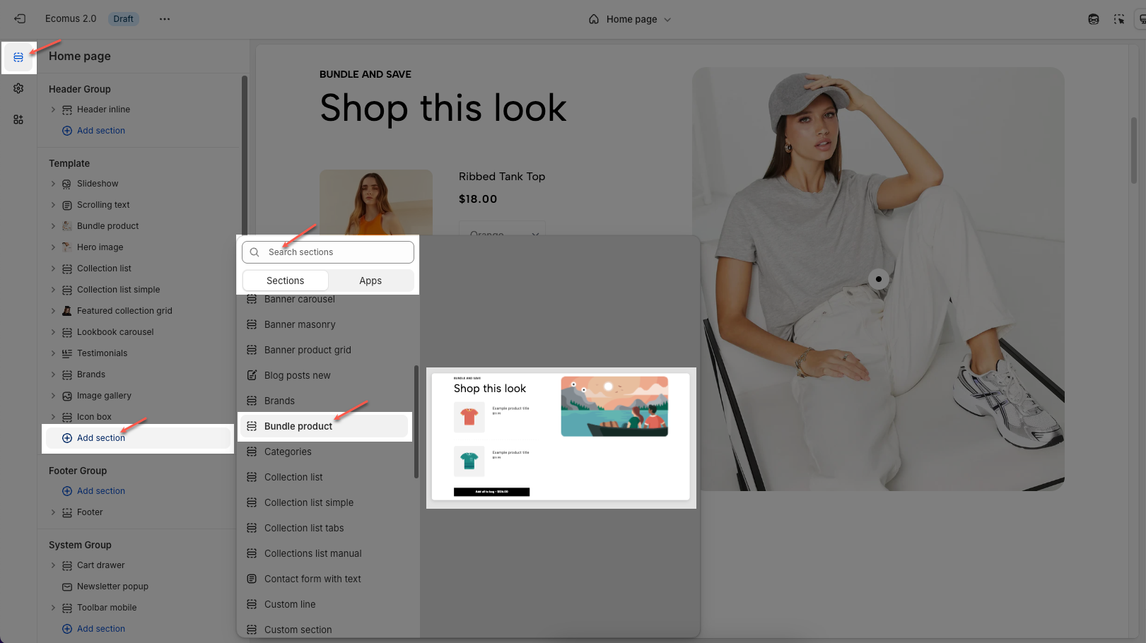
1. How to access the Bundle product section?
Step 01: From Shopify Admin, click on Online Store > Select Themes > In the Current theme section, click the Customize button.

Step 02: In the theme editor (Customize), click the Sections button > Click the Add section button > In the Sections tab, scroll through the list or use the search bar to find and select the Bundle product.
2. How to customize the Bundle pin item block?
To add a Bundle pin item block, click the Add Bundle pin item button under Bundle product section
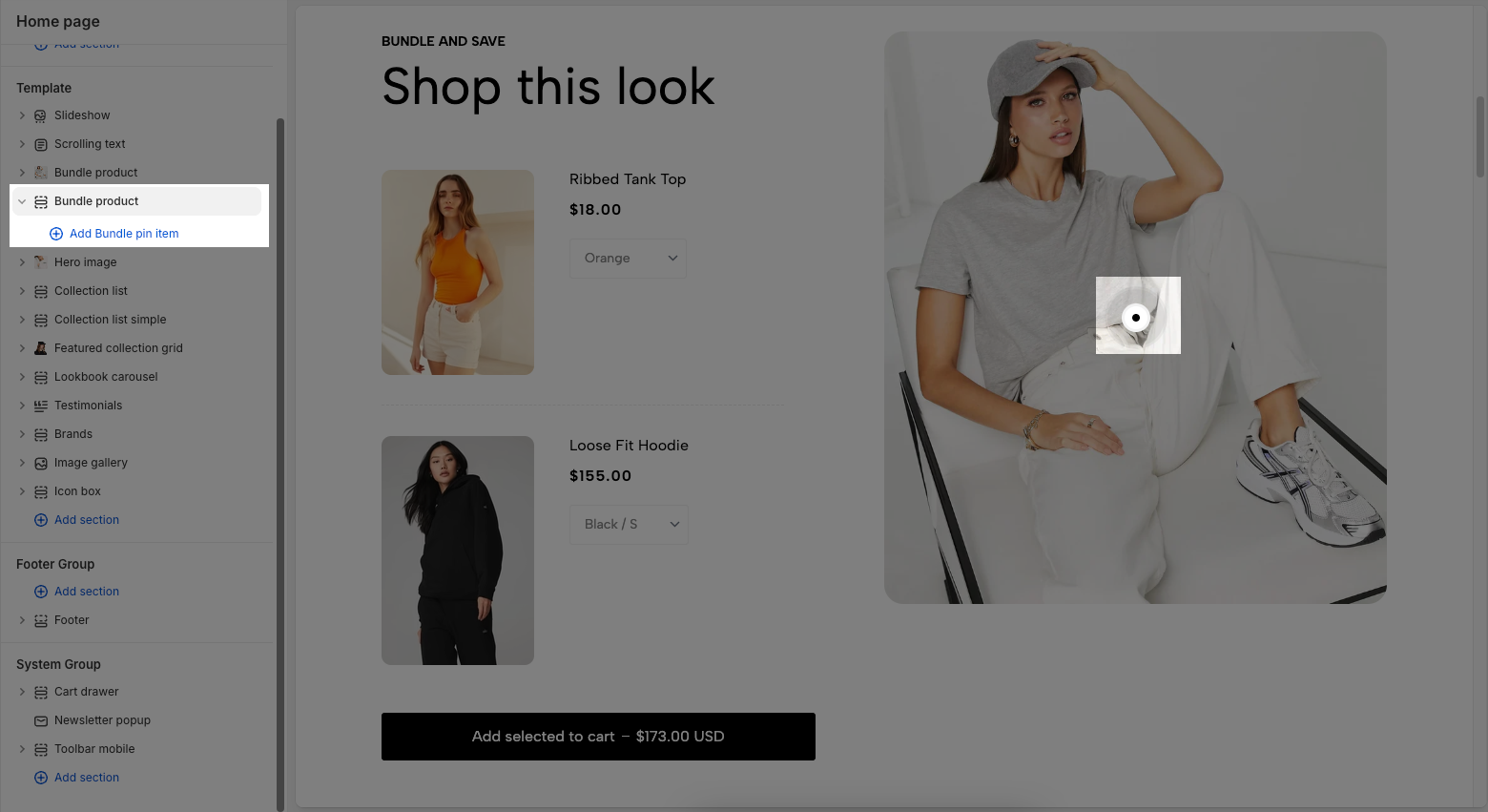
Below are the available options to fine-tune your Bundle pin item styles.
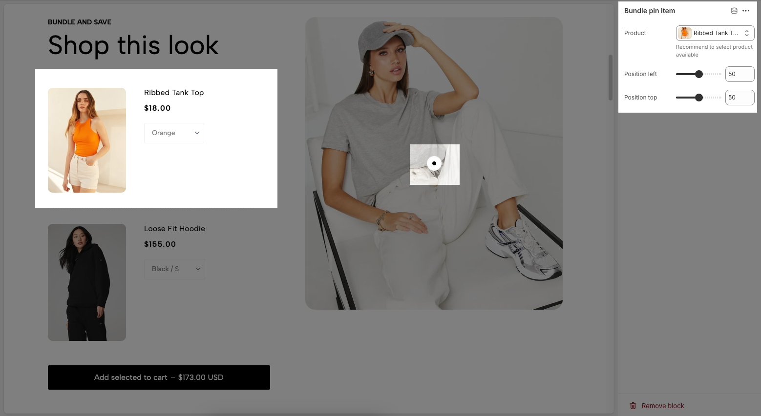
Product: Use the "Select" button to choose a product you want to include in the bundle. It's recommended to select a product that is currently available in your store.
Position left: Adjusts the horizontal position (left-right) of the product pin on the image. A lower value moves the pin to the left, and a higher value moves it to the right.
Position top: Adjusts the vertical position (top-bottom) of the product pin. A lower value moves the pin upward, and a higher value moves it downward.
3. How to customize the Bundle product section?
Here’s how you can customize the Bundle product section to best fit your content and layout. Below are the available options for customization:
3.1. Bundle product
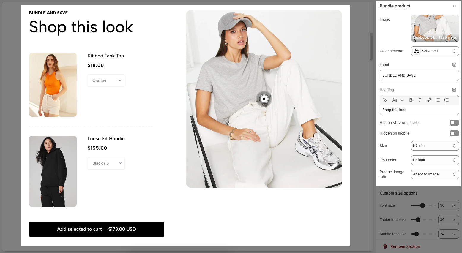
Image: The featured image for the bundle product section, often used as the visual reference for the product pins.
Color scheme: Selects the color style for the section’s background and text.
Label: A smaller text displayed above the heading—commonly used for short titles or categories
Heading: The main title of the section, which can be styled using the formatting toolbar (bold, italic, alignment, etc.).
Hidden
<br>on mobile: Enable or disable this option to line breaks for Heading on mobile screens for better responsiveness.Hidden on mobile: Hides the entire heading when viewed on mobile devices.
Size: Controls the text size of the heading, options include: Base size, H6 size, H5 size, H4 size, H3 size, H2 size, H1 size, H0 size, and Custom size inline.
Text color: Sets the color of the heading.
Product image ratio: Adjusts how product images are cropped or resized. Options include: Adapt to image, Square, Portrait, ASOS, Landscape, Custom
3.2. Custom size options
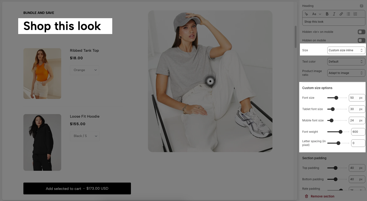
Font size: Sets the heading font size (in pixels) for desktop view.
Tablet font size: Specifies the heading font size when viewed on a tablet.
Mobile font size: Defines the heading font size on mobile devices.
Font weight: Controls the thickness of the text. Higher values (e.g. 600) make the text bolder.
Letter spacing (in pixel): Adjusts the space between each character. Positive values increase spacing, negative values reduce it.
3.3. Section padding
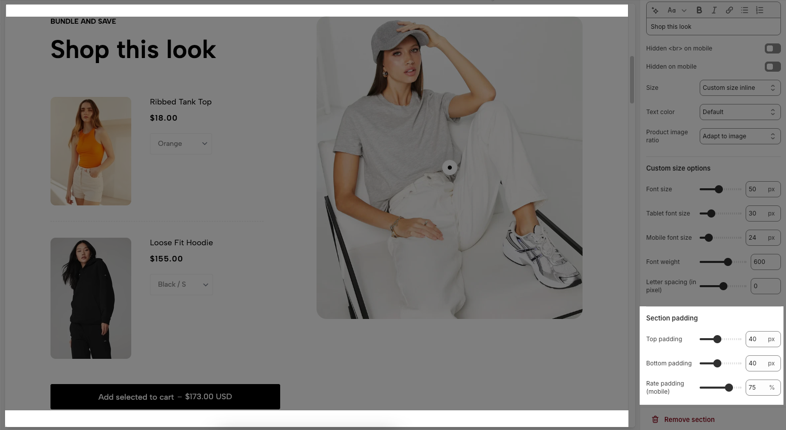
Top padding: Sets the vertical spacing (in pixels) above the section.
Bottom padding: Sets the vertical spacing (in pixels) below the section.
Rate padding (mobile): Defines the vertical padding as a percentage for mobile devices, allowing responsive spacing.
3.4. Theme settings
Page width: Defines the maximum width of the page content, influencing layout and display on various devices.
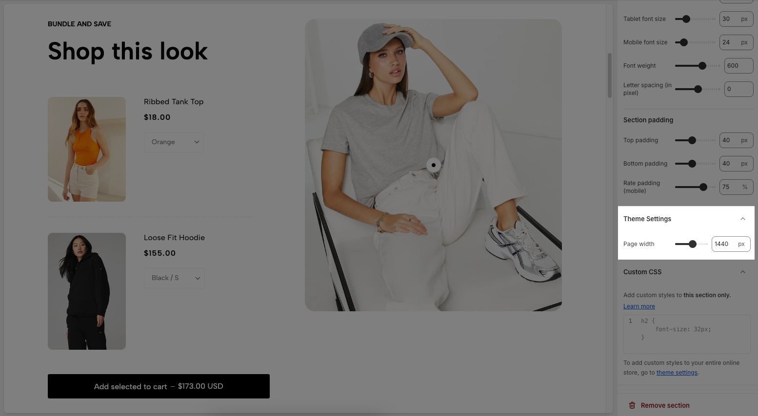
3.5. Custom CSS
Allows users to customize by adding CSS rules, beyond the limitations of default settings. This allows for fine-tuning the design to every detail, to suit specific needs.
Add custom styles to this section only.
To add custom styles to your entire online store, go to theme settings for detailed instructions.


