


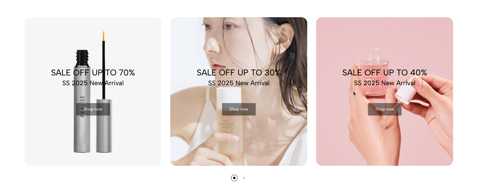
Versatile "Banner Carousel" section: Allows you to create a smooth and interactive slideshow of banner ads or featured images. Supports customizing the number of slides, motion effects (e.g. slide, fade), transition speed, and navigation options (previous/next buttons, dots). Easily add links, titles, and descriptions to each banner.
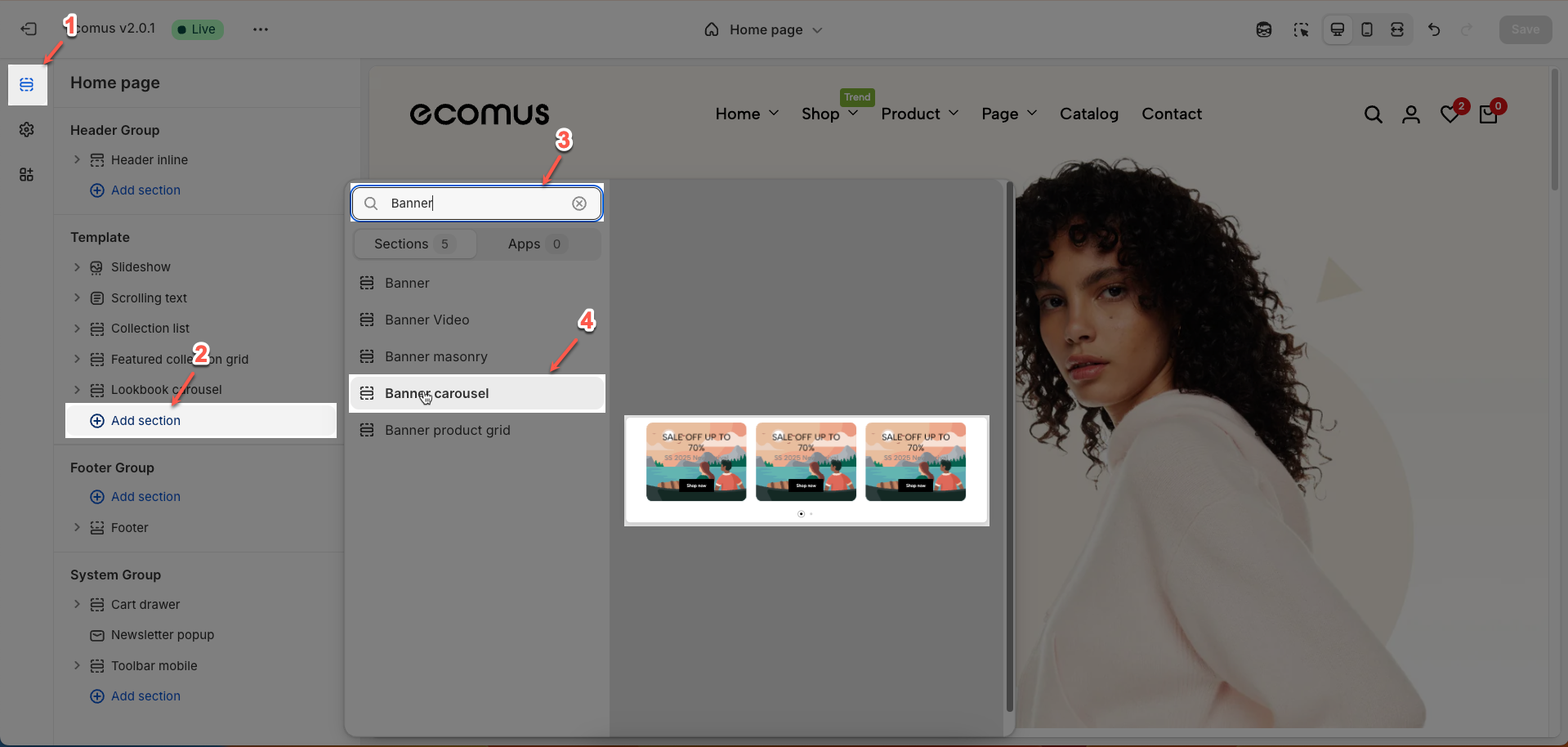
1. How to access the Banner carousel section?
Step 01: From Shopify Admin, click on Online Store > Select Themes > In the Current theme section, click the Customize button.

Step 02: In the theme editor (Customize), click the Sections button > Click the Add section button > In the Sections tab, scroll through the list or use the search bar to find and select the Banner carousel.
2. How to customize the Banner carousel section?
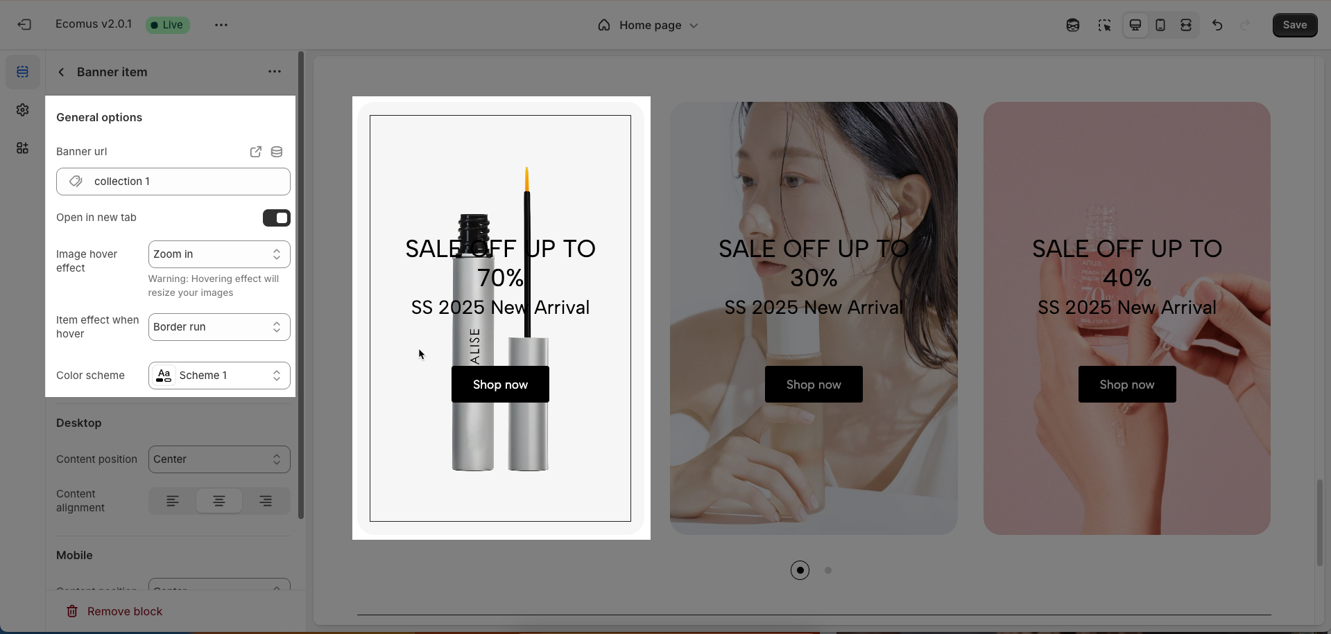
2.1. Banner item
To add a Banner item block to the Banner carousel, click the Add Banner item button (plus icon ➕) under the Banner carousel.
After adding the Banner item block, you can adjust its settings using the sidebar—located on the right or left side of your screen depending on your device
2.1.1. General options
Banner URL: Enter the destination URL that users will be redirected to when clicking on this banner.
Open in new tab: Toggle the option to open the banner's link in a new browser tab. Opening in a new tab can be useful to prevent users from navigating away from your current page.
Image hover effect (None, Zoom in, Rotate, Move to top, Move to right, Move to bottom, Move to left, FilterBounceIn): Select the visual effect to display when users hover their mouse over the banner image. These effects can add interactivity and engagement to the banner.
Warning: Hovering effect will resize your images
Item effect when hover (None, Border run, Pervasive circle, Plus zoom overlay, Overlay): Select the visual effect to display on the entire item (including the image and other content if present) when users hover their mouse over it
Color scheme: Select the color scheme for text elements or overlays (if any) on the banner.
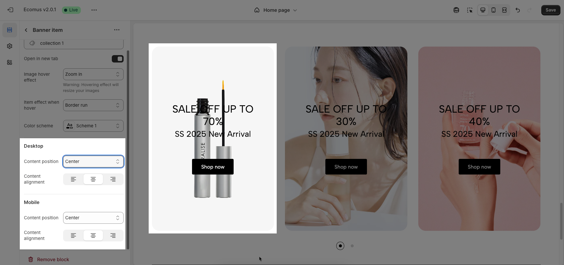
2.1.2. Desktop & Mobile options
Content position: Determines the display position of the content block (e.g., title, description) on the banner (Top left, Top, Top right, Center, Center left, Center right, Bottom right, Bottom left, Bottom)
Content alignment: Adjusts the text alignment within the content block. The left, center, and right alignment options allow you to control the reading flow and aesthetics of the text on the banner.
2.2. Media block
To add a Media block to the Banner item, click the Add Media button (plus icon ➕) under the Banner item.
After adding the Media block, you can adjust its settings using the sidebar—located on the right or left side of your screen depending on your device
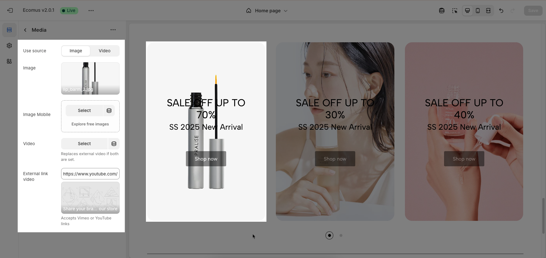
Use source (Image, Video): Select the primary content source type for the banner. You can use either a static image or a dynamic video to capture customer attention.
Image: Upload a high-quality static image to serve as the background or main content of the banner on desktop versions.
Image Mobile: Upload a separate static image optimized for mobile devices. Use a smaller image size and an aspect ratio suitable for vertical screens to improve page load performance on mobile.
Video: Upload a direct video file to play as the background or main content of the banner
Replaces external video if both are set
External link video: Enter the link (URL) of a video from Vimeo or YouTube to embed it in the banner.
Accepts Vimeo or YouTube links
2.3. Heading block
To add a Heading block to the Banner item, click the Add Heading button (plus icon ➕) under the Banner item.
After adding the Heading block, you can adjust its settings using the sidebar—located on the right or left side of your screen depending on your device
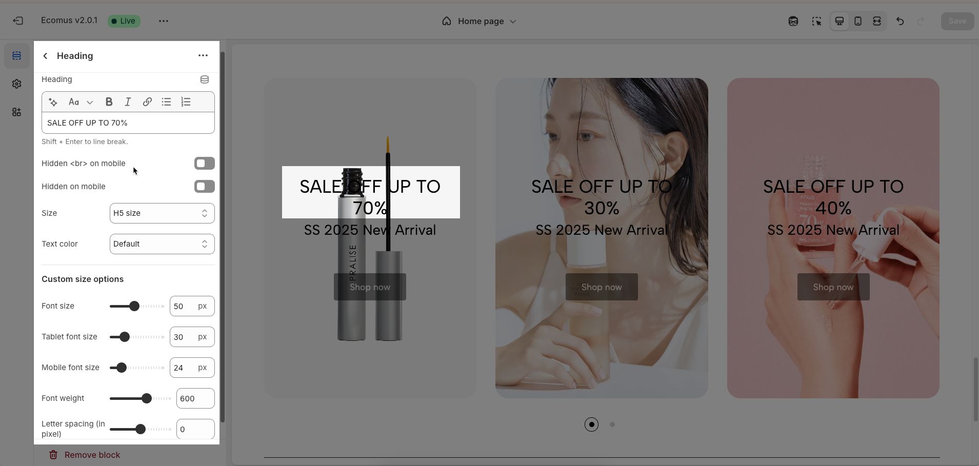
Heading (Shift + Enter to line break): Define the main title that represents your content or section. Make it engaging and relevant.
Hidden <br> on mobile: Remove unnecessary line breaks on mobile devices
Hidden on mobile: Choose whether to hide the heading completely on mobile devices for a streamlined display.
Choose "Custom size inline" to freely adjust the size in the Custom Size Options section.
Size: Adjust the overall heading size to fit the design aesthetics of your store.
Text Color: Customize the heading color to align with your brand identity and improve readability.
Font size (Desktop/Tablet/Mobile): Set different font sizes for each device type to ensure a responsive and visually appealing layout.
Font weight: Controls the thickness of the heading text
Letter spacing (in pixel): Adjust the space between letters to enhance readability and design precision.
2.4. Text block
To add a Text block to the Banner item, click the Add Text button (plus icon ➕) under the Banner item.
After adding the Text block, you can adjust its settings using the sidebar—located on the right or left side of your screen depending on your device
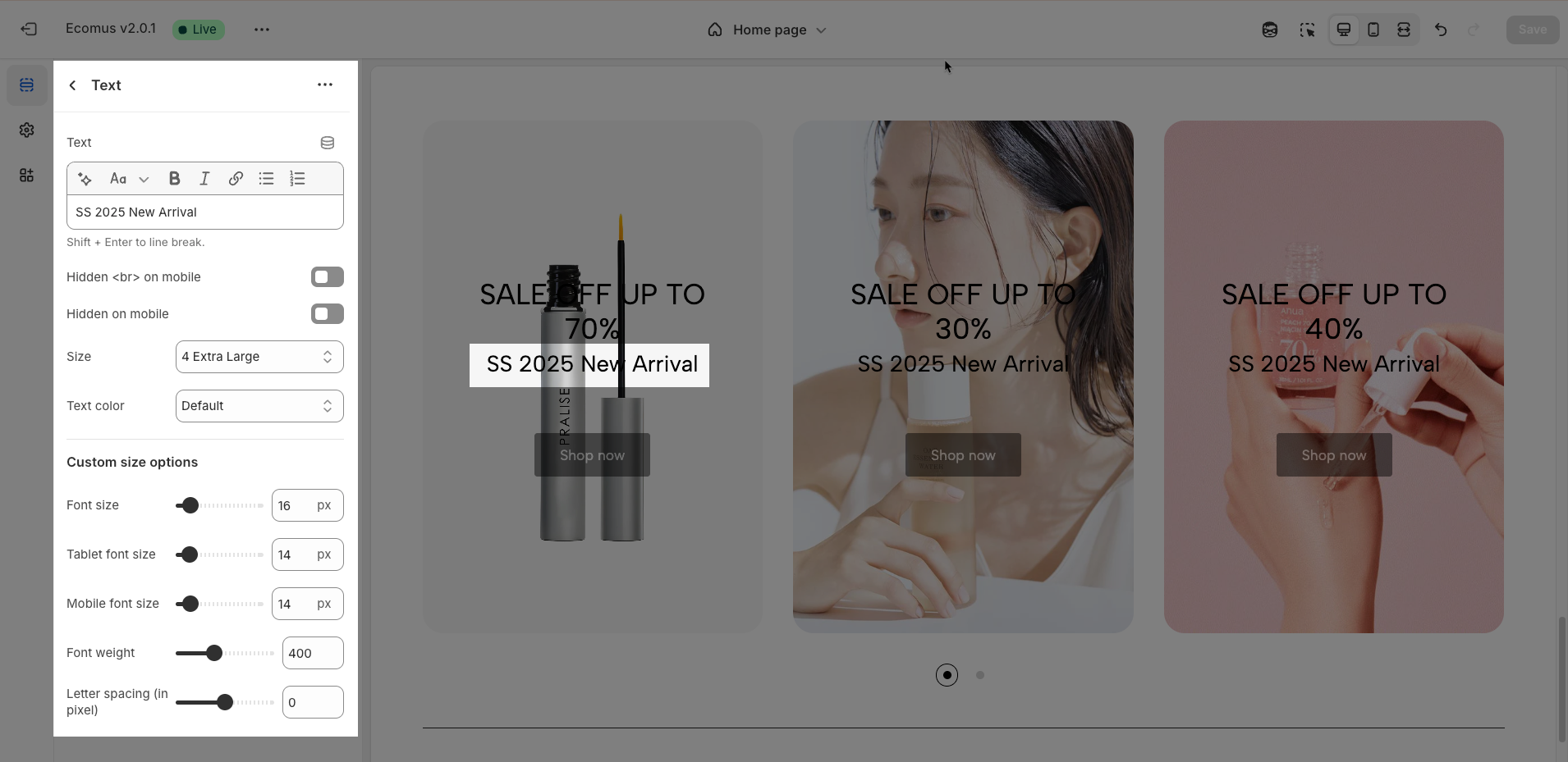
Text (Shift + Enter to line break): Allows users to add textual content, providing information, descriptions, or explanations.
Hidden <br> on mobile: Remove unnecessary line breaks on mobile devices
Hidden on mobile: Choose whether to hide the heading completely on mobile devices for a streamlined display.
Choose "Custom size inline" to freely adjust the size in the Custom Size Options section.
Size: Adjust the overall heading size to fit the design aesthetics of your store.
Text Color: Customize the heading color to align with your brand identity and improve readability.
Font size (Desktop/Tablet/Mobile): Set different font sizes for each device type to ensure a responsive and visually appealing layout.
Font weight: Controls the thickness of the heading text
Letter spacing (in pixel): Adjust the space between letters to enhance readability and design precision.
2.5. Spacer block
To add a Spacer block to the Banner item, click the Add Spacer button (plus icon ➕) under the Banner item.
After adding the Spacer block, you can adjust its settings using the sidebar—located on the right or left side of your screen depending on your device
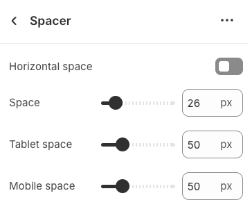
Horizontal space: Enable to adjust the horizontal space between elements, creating a balanced and easy-to-read layout
Space: Setting space between elements creates clear separation.
Tablet space: Optimizes the spacing between elements on tablet screens, ensuring content is displayed balanced and easy to interact with on medium-sized screen devices.
Mobile space: Adjusts the spacing between elements on mobile phone screens, optimizing the user experience on small screens
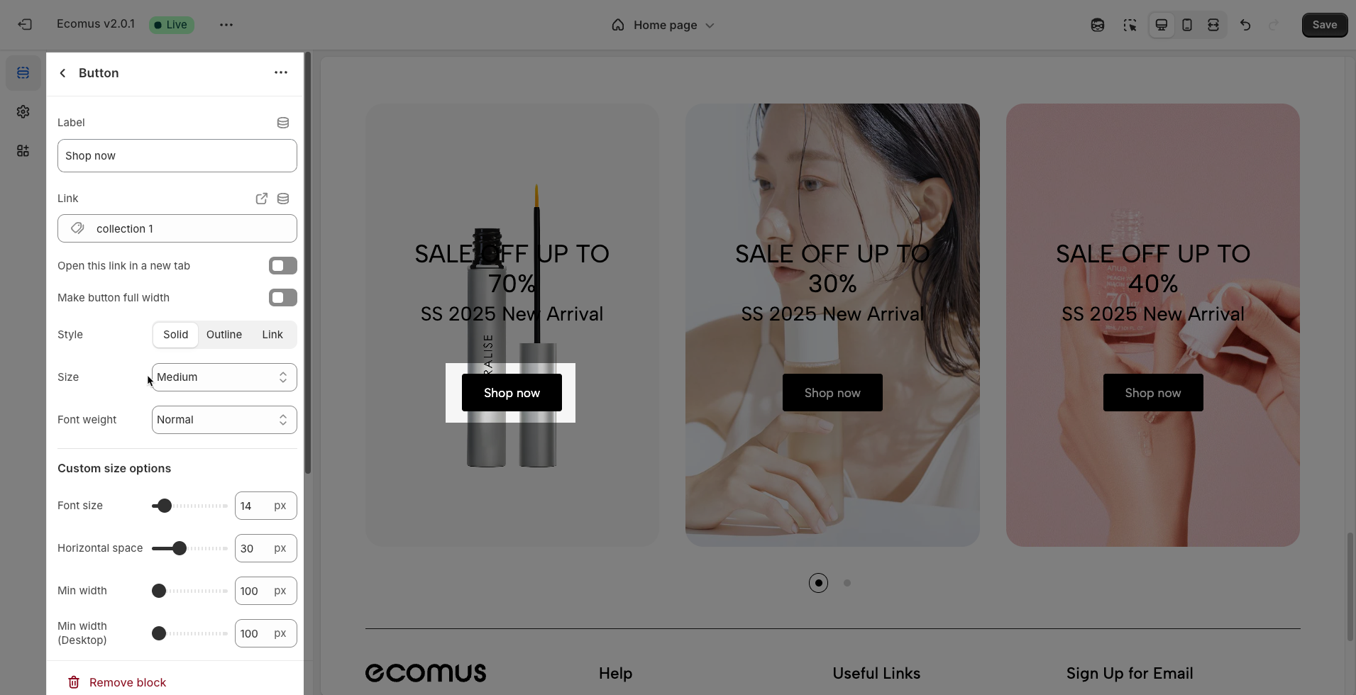
2.6. Button block
To add a Button block to the Banner item, click the Add Button button (plus icon ➕) under the Banner item.
After adding the Button block, you can adjust its settings using the sidebar—located on the right or left side of your screen depending on your device
The Button block allows you to create interactive call-to-action elements that guide users to specific links. Customizing the button ensures it matches your design and provides a seamless user experience. Below are the available options for customization:
Label: Defines the text displayed on the button.
Link: Specifies the destination URL when the button is clicked.
Open this link in a new tab: Opens the link in a new browser tab when enabled.
Make button full width: Expands the button to take up the full width of its container.
Style: Choose between Solid, Outline, or Link styles for different visual effects.
Size: Adjusts the button size (e.g., Extra Large, Medium, etc.).
Font weight: Controls the thickness of the button text (e.g., Normal, Bold).
Custom Size Options
Font size: Adjusts the heading size for desktop.
Tablet font size: Adjusts the heading size for tablet.
Mobile font size: Adjusts the heading size for mobile.
Font weight: Controls the thickness of the text (e.g., 600 is semi-bold).
Letter spacing: Adjusts the space between characters.
Icon
Icon: Select the icon to display on the button (e.g., arrow, plus, etc.).
Icon position: Choose whether the icon appears Before or After the button text.
Icon size: Adjust the size of the icon in pixels.
Icon spacing: Set the spacing between the icon and the text to ensure proper alignment and readability.
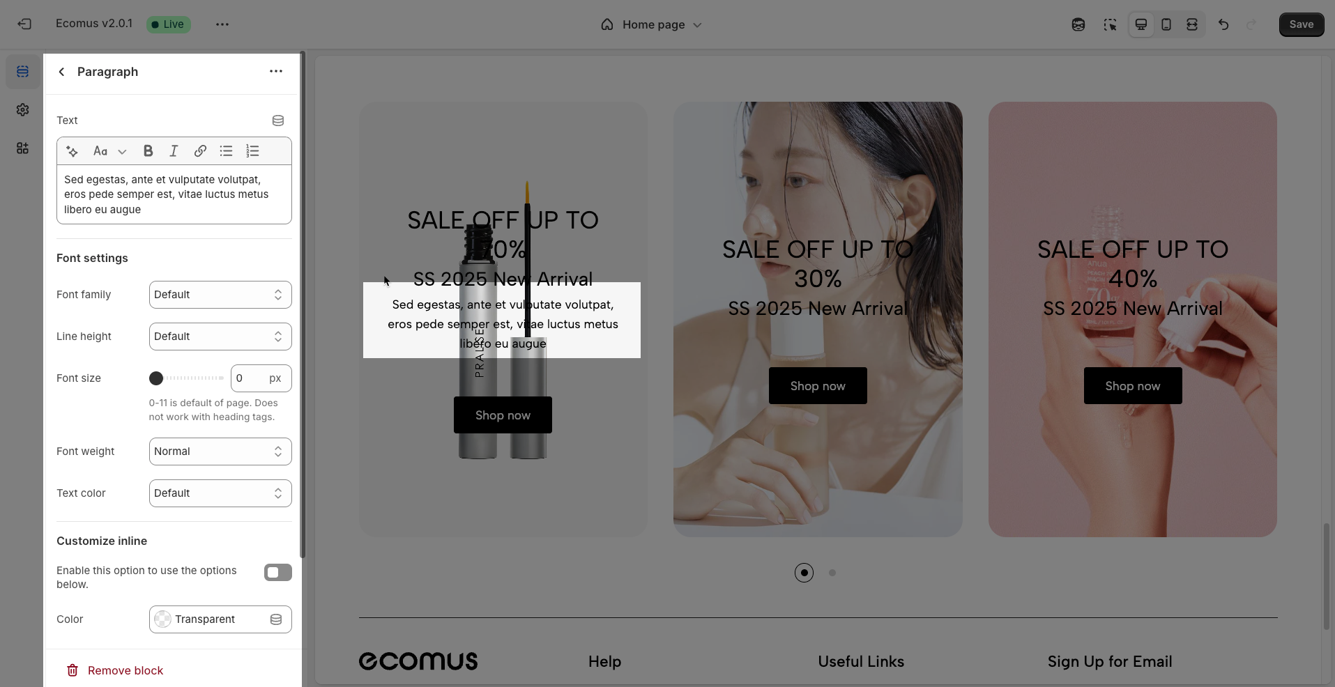
2.7. Paragraph block
To add a Paragraph block to the Banner item, click the Add Paragraph button (plus icon ➕) under the Banner item.
After adding the Paragraph block, you can adjust its settings using the sidebar—located on the right or left side of your screen depending on your device
Text: Enter the text content you want to display. This is the fundamental field for adding your message, title, or description for this element.
Font settings
Font family: Select the typeface (font) for the text from the list of fonts available in the theme or integrated web fonts
Line height: Adjust the vertical space between lines of text (usually in pixels or as a multiplier). Appropriate line height significantly improves readability, especially for longer paragraphs.
Font size: Set the font size of the text (usually in pixels or relative units like
emorrem). Font size impacts the prominence and readability of the text across different screen sizes.0-11 is default of page. Does not work with heading tags.
Font weight: Select the weight or boldness of the font (e.g., normal, bold, semibold,...). Font weight can be used to emphasize keywords or create visual hierarchy.
Text color: Choose the color for the text. Ensure the color has good contrast with the background color to make the text easily readable and attract attention when needed.
Customize inline
Enable this option to use the options below: Enable this option to activate advanced color settings for the text.
Color: Select a specific color for the text when the "Enable this option to use the options below" option is enabled.
Customize class: Add custom CSS classes to this text element. This allows developers or users with CSS knowledge to apply unique styles not provided by the theme's default options.
Assign a class name to this item for easy customization without impacting others.
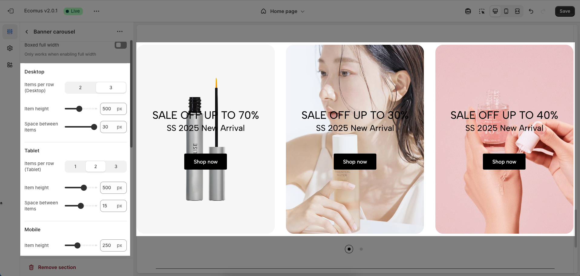
2.8. Banner carousel section
After adding the Banner carousel section, you can customize its settings using the sidebar—located on the right or left side of your screen depending on your device.
Color scheme: Select the overall color scheme for this section. The color scheme will affect the background color, text color (if not customized individually), and other decorative elements within the section.
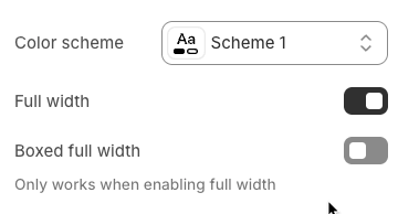
Full width: Set the section to span the entire horizontal width of the browser viewport. This option is often used to create prominent sections without side margins, maximizing screen real estate.
Boxed full width: Set the section to have a defined maximum width (typically matching the website's main content width) and be centered on the screen. While occupying the full horizontal space within its container, this option will have side margins on larger screens, creating a more structured and focused layout.
Only works when enabling full width
Desktop
Items per row (Desktop): Define the number of items displayed in a single row on desktop screens
Item height: Set a fixed height for each item in the list. This can help create a uniform and structured layout, especially when items have inconsistent content heights.
Space between items: Adjust the spacing (margin or padding) between items
Tablet
Items per row (Tablet): Define the number of items displayed in a single row on tablet screens. Typically, this number will be less than on desktop to suit the smaller screen size.
Item height: Set a fixed height for each item on tablet screens. You can use the same value as desktop or adjust it to fit the tablet layout.
Space between items: Adjust the spacing between items on tablet screens. This spacing may differ from desktop to optimize the display space on tablets.
Mobile
Item height: Set a fixed height for each item on mobile screens. As there is usually only one item per row, this height will determine the vertical size of each item on small screens.
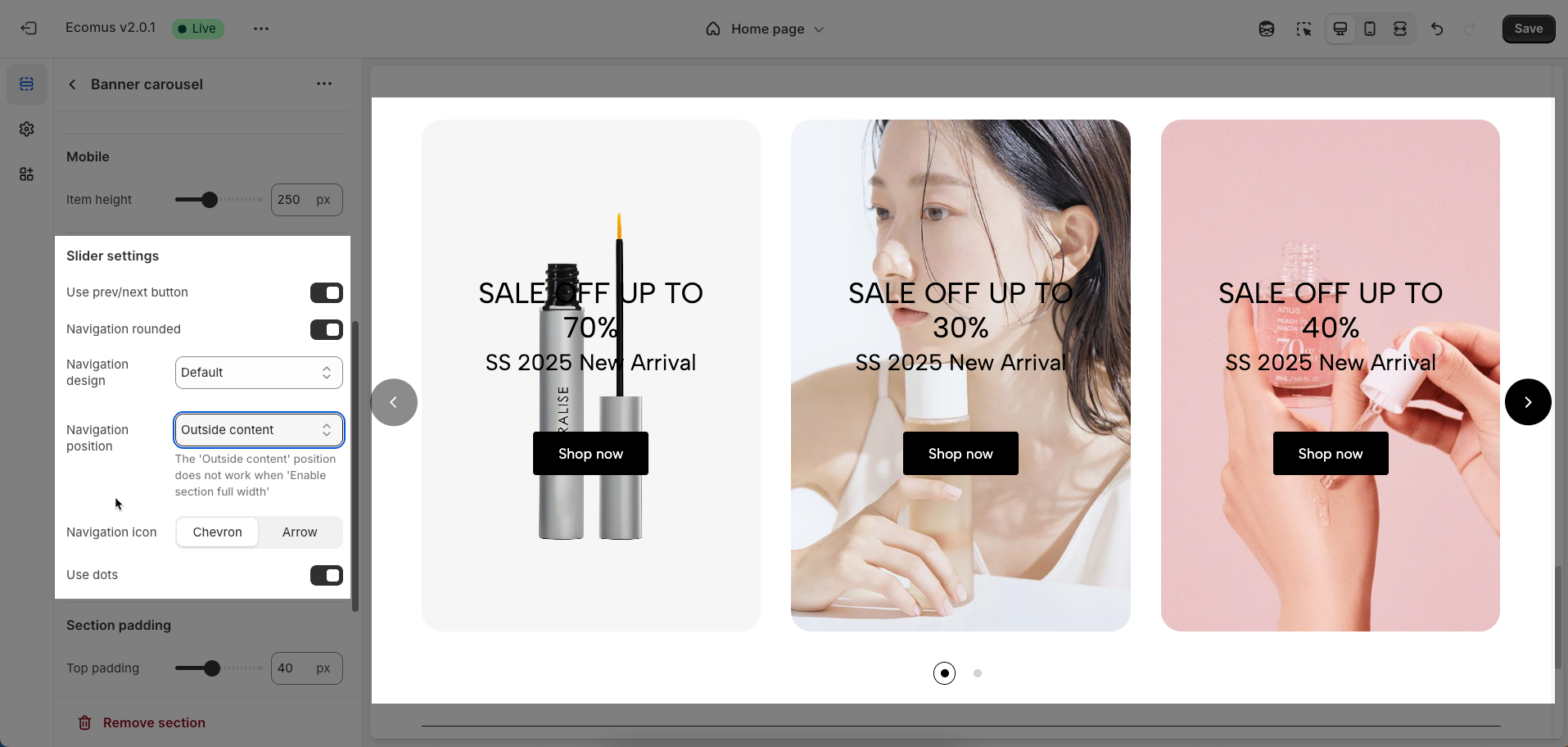
Slider settings
These options control the behavior and appearance of the carousel navigation.
Use prev/next button: This toggle switch enables or disables the display of the prev/next button on the carousel. When turned off, these buttons will not be visible.
Navigation design: This dropdown menu allows you to choose from different visual designs for the prev/next button. Options included Default, Outline, and Simple
Navigation position: This dropdown menu controls the placement of the prev/next button. Option included:
Inside content: The prev/next buttons are displayed overlaid on top of the carousel's content.
Outside content: The prev/next buttons are positioned to the left and right of the carousel's items, in the surrounding container.
On the border: The prev/next buttons are placed along the edges or borders of the carousel container.
Navigation icon: This set of buttons allows you to choose the type of icon used for The prev/next buttons. You can select either "Chevron" (arrow-like symbols, often angled) or "Arrow" (more traditional straight arrows).
Use dots: This toggle switch enables or disables the display of pagination dots below the carousel. When turned off, pagination dots will not be visible.
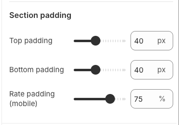
Section padding
Top padding: This option allows you to set the amount of space (padding) at the top of the slider section. You can drag the slider or directly enter a numerical value to adjust this spacing
Bottom padding: This option allows you to set the amount of space (padding) at the bottom of the slider section. You can drag the slider or directly enter a numerical value to adjust this spacing
Rate padding (mobile): This option allows you to set the aspect ratio-based padding for mobile view (in percentage). For example, 75% means the height will be 75% of the width.
Custom CSS
Allows users to customize by adding CSS rules, beyond the limitations of default settings. This allows for fine-tuning the design to every detail, to suit specific needs.
Add custom styles to this section only.
To add custom styles to your entire online store, go to theme settings.


