


The 'Brands' section is designed to showcase a curated list of brand logos in a clean, horizontal layout. This section helps build customer trust, highlight partnerships, or emphasize featured brands on your storefront. It's visually minimalist yet effective for boosting brand recognition.

1. How to access the Brands section?
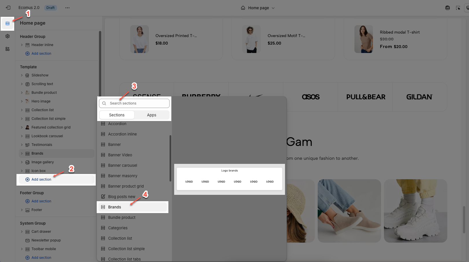
Step 01: From Shopify Admin, click on Online Store > Select Themes > In the Current theme section, click the Customize button.

Step 02: In the theme editor (Customize), click the Sections button > Click the Add section button > In the Sections tab, scroll through the list or use the search bar to find and select the Brands.
2. How to customize the Brands section?
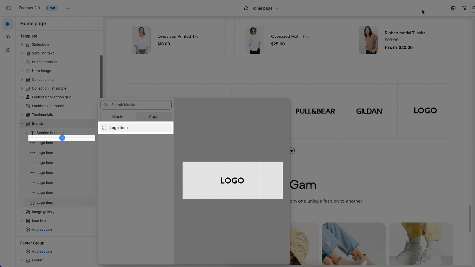
2.1. Customize Logo item block
To add a Logo item block, click the Add block button under Brands section. Then choose Logo item
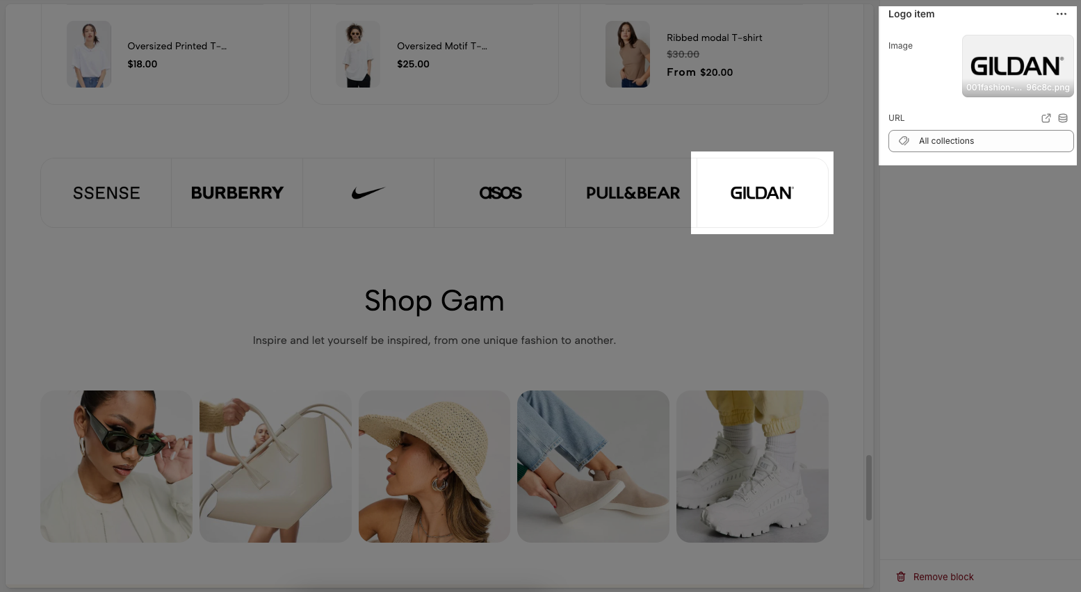
Below are the available options to fine-tune your 'Logo item' styles.
Image: Allows you to upload the brand logo image you want to display.
Click the "Select" button to upload an image from your computer.
Or choose "Explore free images" to use free images available in the platform's library.
URL: Allows you to insert a link (URL) that users will be redirected to when they click on the logo. Paste the link into this field.
2.2. Customize Brands section
Here’s how you can customize the Brands section to best fit your content and layout. Below are the available options for customization:
2.2.1. Brands
Color scheme: Choose the color scheme for the Brands section.
General settings
Enable item border: Toggle on/off to show or hide borders around brand logos.
Open tab: Select how links open when clicking logos:
Current window – open in the same tab.
New window – open in a new browser tab.
Slider settings
Use prev/next button: Enable to show previous/next navigation arrows in the slider.
Use dots: Enable to display navigation dots below the slider.
Desktop
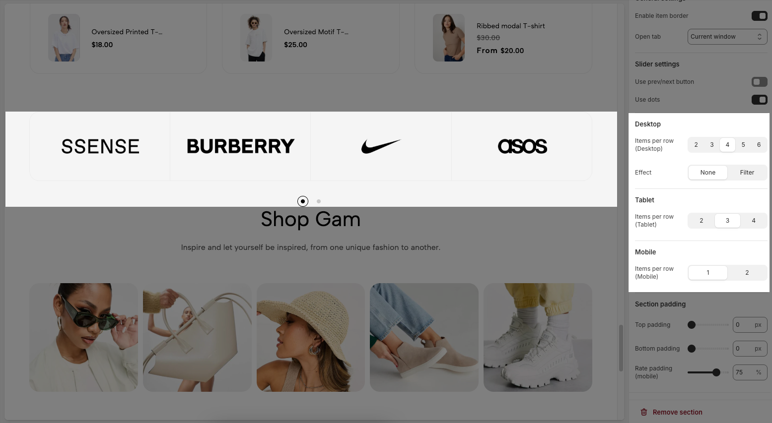
Items per row (Desktop): Choose how many brand logos appear per row on desktop (2 to 6).
Effect: Apply a hover effect to logos:
None – no effect.
Filter – applies a visual filter when hovering.
Table
Items per row (Tablet): Set how many logos appear per row on tablets (2 to 4).
Mobile
Items per row (Mobile): Set how many logos appear per row on mobile devices (1 or 2).
Section padding
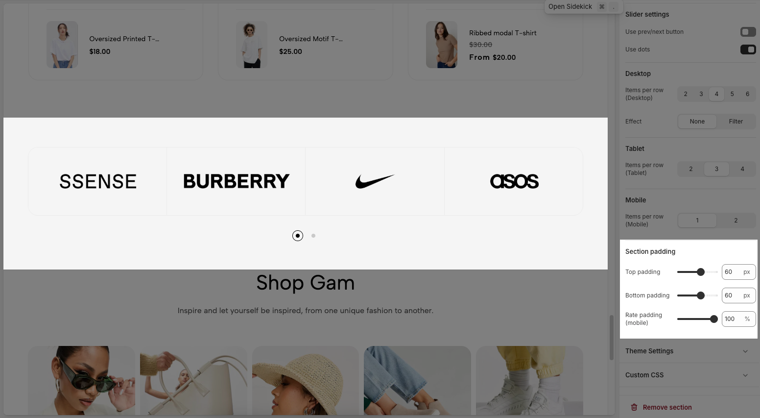
Top padding: Sets the vertical spacing (in pixels) above the section.
Bottom padding: Sets the vertical spacing (in pixels) below the section.
Rate padding (mobile): Defines the vertical padding as a percentage for mobile devices, allowing responsive spacing.
2.2.2. Theme settings
Page width: Defines the maximum width of the page content, influencing layout and display on various devices.
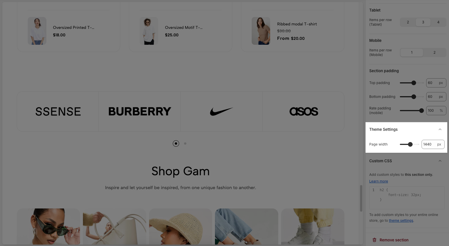
2.2.3. Custom CSS
Allows users to customize by adding CSS rules, beyond the limitations of default settings. This allows for fine-tuning the design to every detail, to suit specific needs.
Add custom styles to this section only.
To add custom styles to your entire online store, go to theme settings for detailed instructions.


