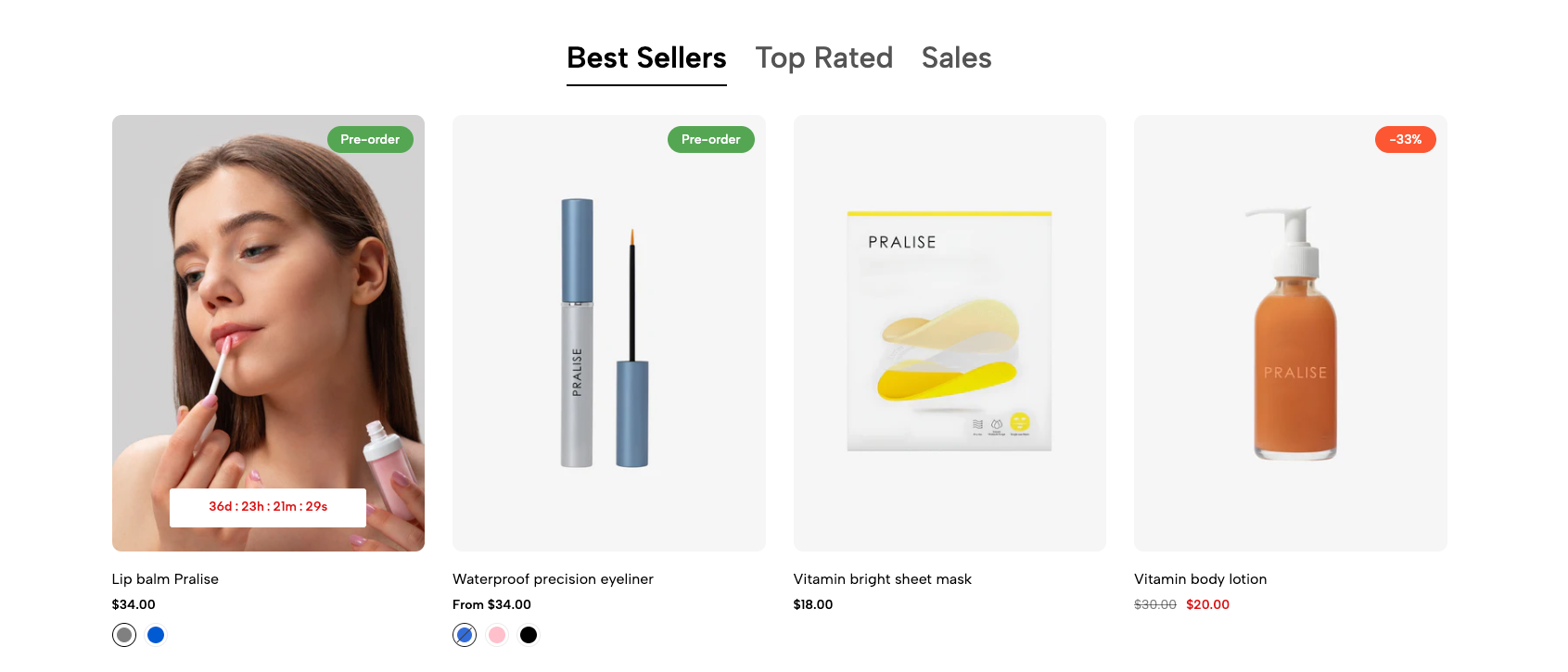
The "Tab Collections Grid" section offers a modular architecture, allowing for the flexible display of product collections in a tabbed format. The collection data is clearly m , making it easy to access and customize through Shopify Liquid properties. Supports extensive customization of the display interface, from layout structure to UI/UX components, ensuring seamless integration with the overall theme design.
1. How to access the Tab collections grid section?
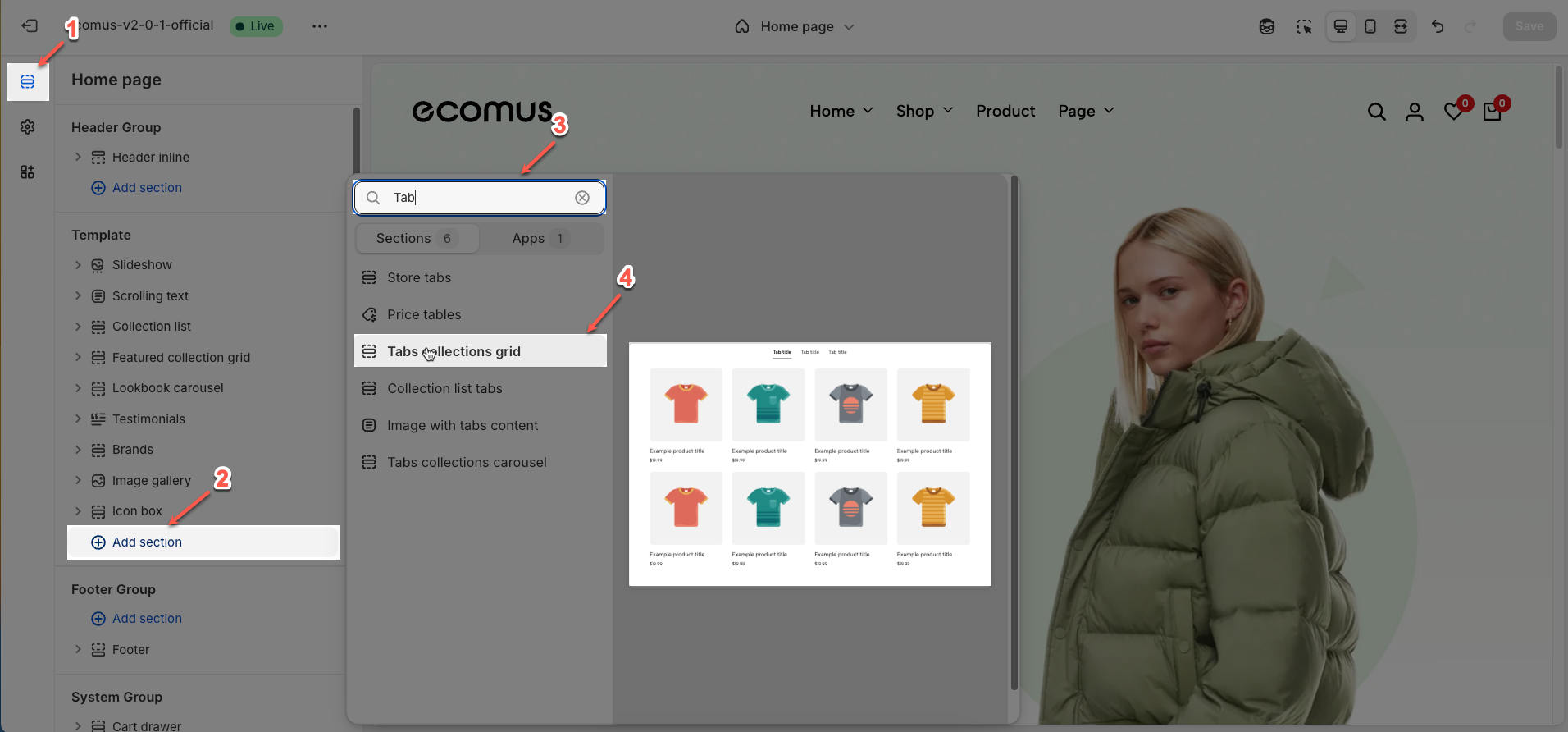
Step 01: From Shopify Admin, click on Online Store > Select Themes > In the Current theme section, click the Customize button.

Step 02: In the theme editor (Customize), click the Sections button > Click the Add section button > In the Sections tab, scroll through the list or use the search bar to find and select the Tab collections grid.
2. How to customize the Tab collections grid section?
2.1. Tab item block
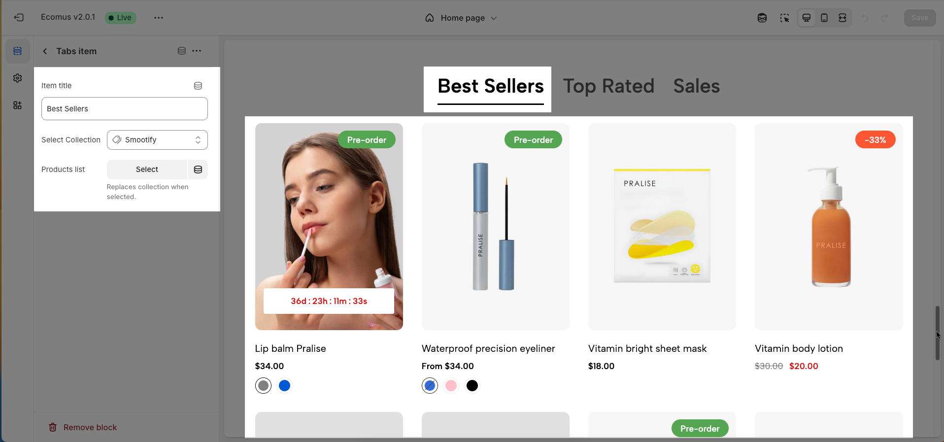
To add a Tab item block to the Tab collections grid, click the Add Tab item button (plus icon ➕) under the Tab collections grid.
After adding the Tab item block, you can adjust its settings using the sidebar—located on the right or left side of your screen depending on your device
Item title: Set the display name for this collection tab.
Select Collection: Link this tab to an existing product collection.
Products list (Replaces collection when selected): Choose specific products to display instead of the entire collection.
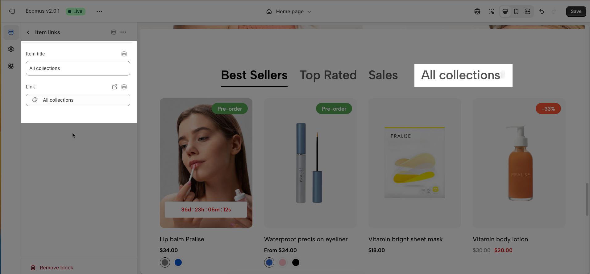
2.2. Item link block
To add an Item link block to the Tab collections grid, click the Add Item link button (plus icon ➕) under the Tab collections grid.
After adding the Item link block, you can adjust its settings using the sidebar—located on the right or left side of your screen depending on your device
Item title: Set the display name for this link.
Link: The web address you want users to visit
2.3. Tab collections grid section
After adding the Tab collections grid section, you can customize its settings using the sidebar—located on the right or left side of your screen depending on your device.
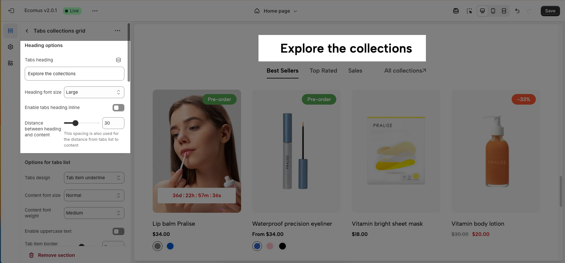
2.3.1. Heading options
Tabs heading: Define the main title that represents your content or section. Make it engaging and relevant.
Heading font size: Adjust the overall heading size to fit the design aesthetics of your store.
Enable tabs heading inline: If enabled, the tab titles will be arranged horizontally next to each other.
Distance between heading and content (This spacing is also used for the distance from tabs list to content): Set the padding between the heading and the content area of the tab.
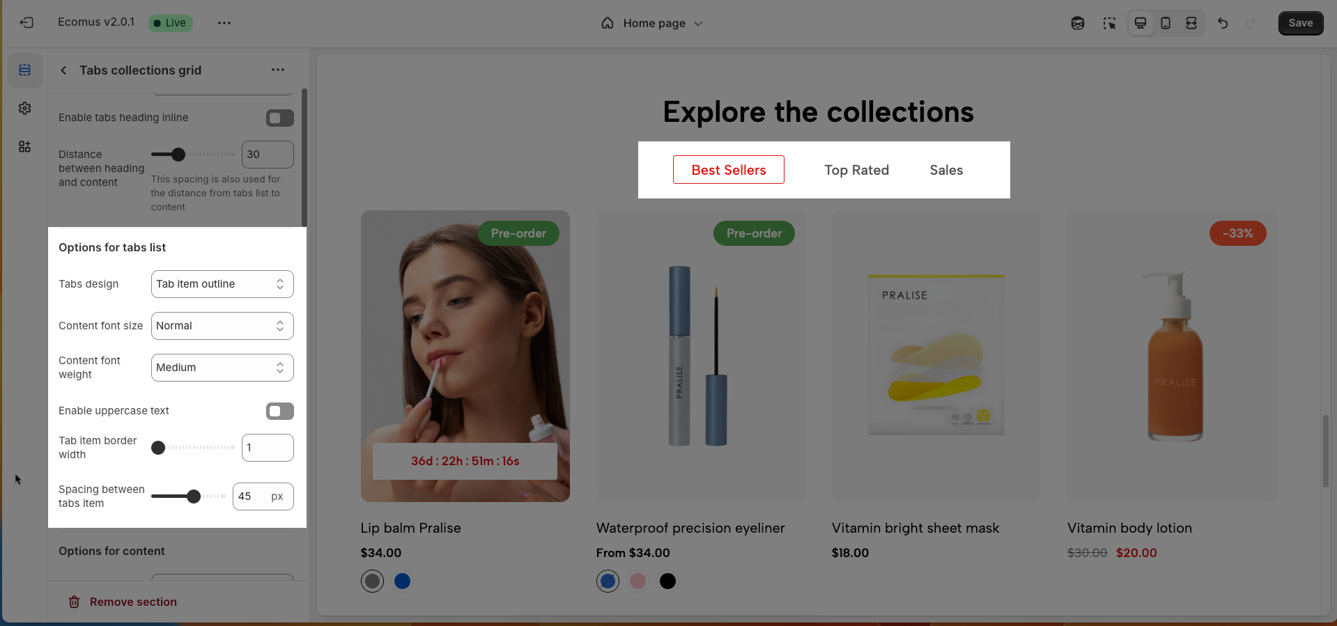
2.3.2. Options for tabs list
Tab design: Select between an outline or an underline style for the tabs.
Content text size: Adjust the size of the text within the tab content (Normal, Large, Extra large).
Content text weight: Adjust the boldness of the text within the content (Regular, Medium, Semibold, Extra Bold).
Enable uppercase text: Enable to display all text in the tab headings in uppercase.
Tab item border width: Set the thickness of the border around each tab item (if the outline style is selected).
Spacing between tab items: Set the horizontal space between the tab titles.
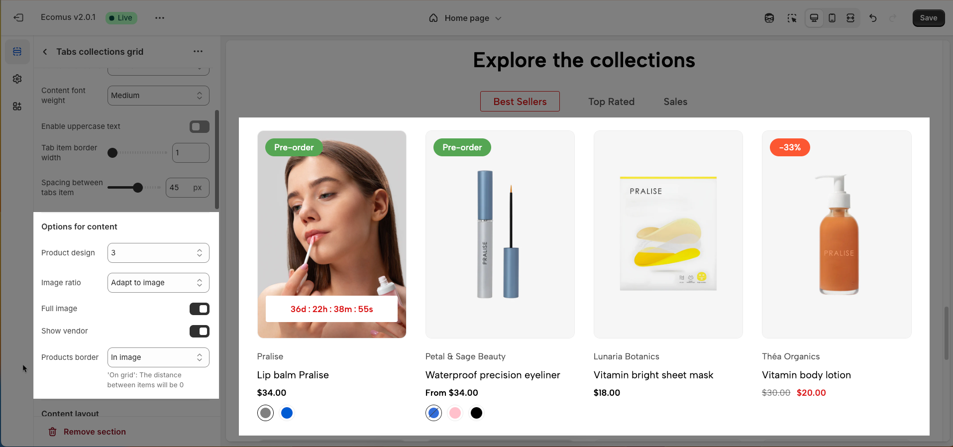
2.3.3. Options for content
Product design: Choose the overall display style for the products within the tab.
Image ratio: Choose the aspect ratio for the product images (Adapt to image, Square, Portrait, ASOS, Landscape, Custom)
Full image: If enabled, the complete product image will be shown without cropping.
Show vendor: Enable to display the vendor name of the product.
Products border: Choose the border display style for the products ('On grid': The distance between items will be 0): In image, on grid, on item, none.
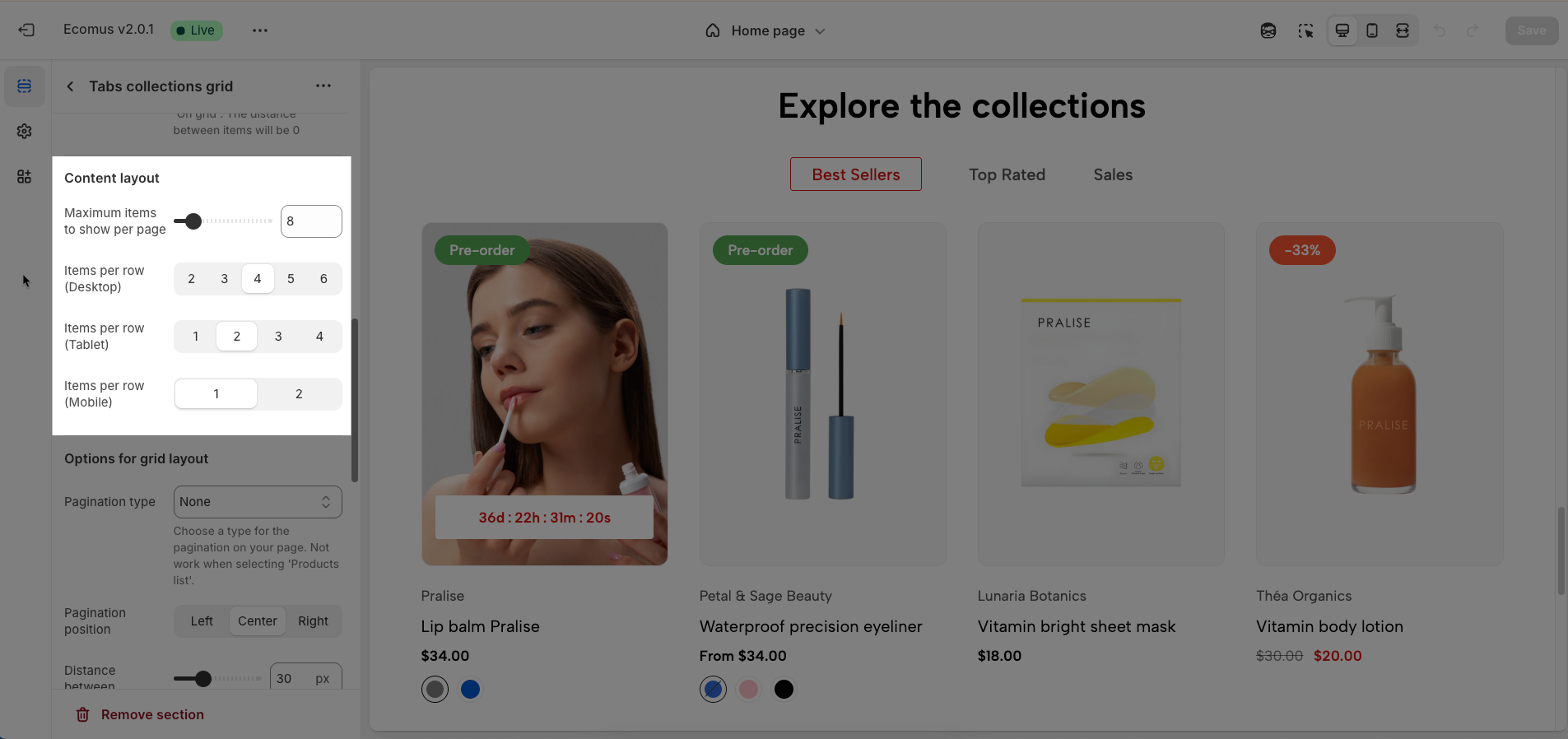
2.3.4. Content layout
Maximum items to show per page: Limits the number of products or items displayed on each page, optimizing loading speed and user experience.
Items per row (Desktop): Defines the number of products or items displayed in each row on desktop screens, optimizing the layout for large screens.
Items per row (Tablet): Adjusts the number of products or items displayed in each row on tablet screens, ensuring balanced and easy viewing.
Items per row (Mobile): Optimizes the number of products or items displayed in each row on mobile phone screens, ensuring neat and interactive display.
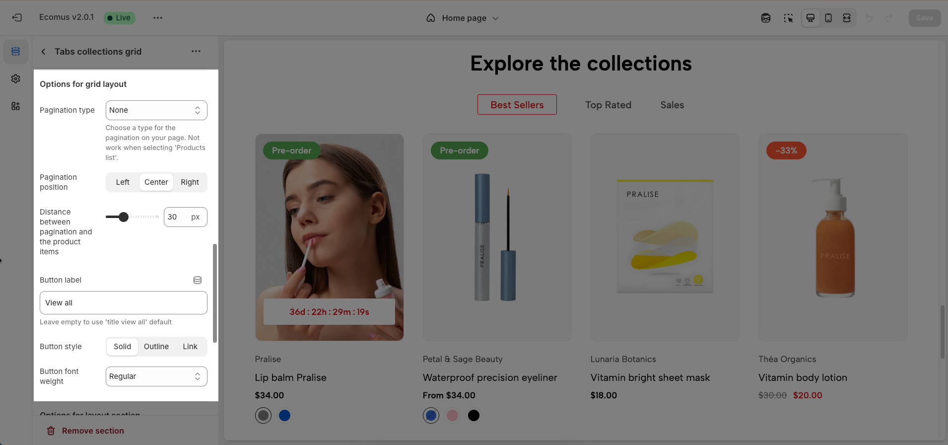
2.3.5. Options for grid layout
Pagination type: Select the pagination style for your page. This does not function when 'Products list' is chosen. (None, View all, Load more button)
Pagination position: Set the alignment of the pagination buttons (Left, Center, Right).
Distance between pagination and the product items: Set the padding or margin between the pagination buttons and the product list.
Button label: Input the text to display on the button (leave blank to use the default 'view all' text).
Button style: Select the visual style of the button (Solid background, Border only, Text link).
Button font weight: Choose the font weight for the button label (Regular, Medium, Semibold, Bold).
2.3.6. Options for layout section
Enable section full width: This toggle switch, when turned on, will make the entire section span the full width of the browser window. When turned off, the section will likely be constrained to the website's main content width.
Color scheme: This dropdown menu allows you to select a predefined color scheme for the section. Clicking the dropdown will likely reveal other color palettes that you can apply to the background, text, and other elements within this section for a consistent look.
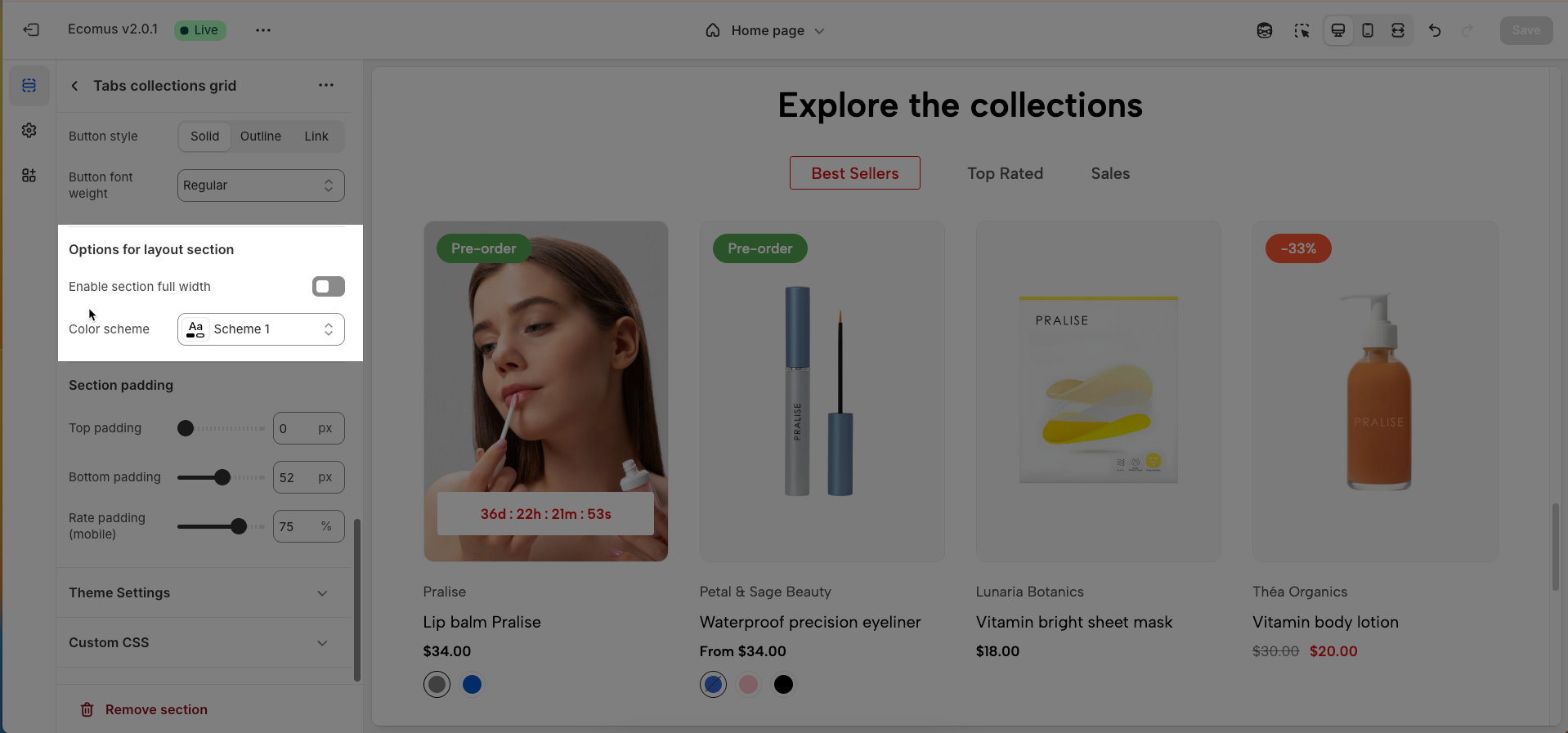
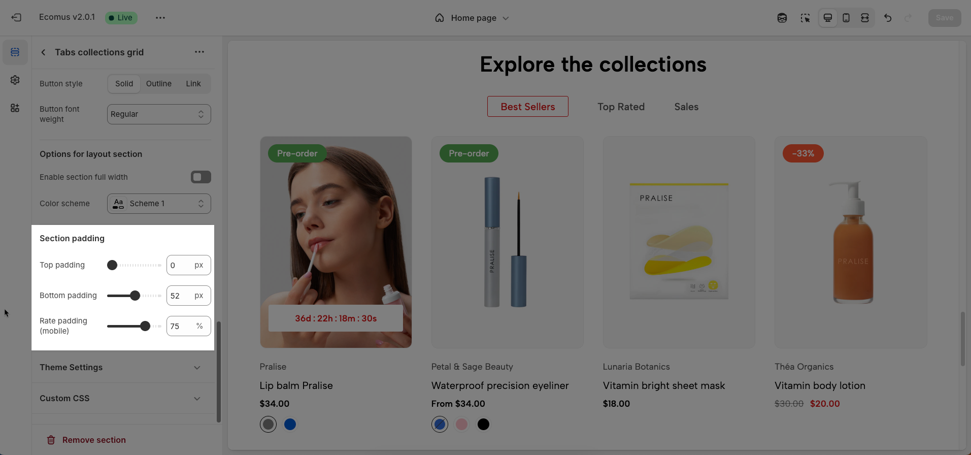
2.3.7. Section padding
Top padding: This option allows you to set the amount of space (padding) at the top of the slider section. You can drag the slider or directly enter a numerical value to adjust this spacing
Bottom padding: This option allows you to set the amount of space (padding) at the bottom of the slider section. You can drag the slider or directly enter a numerical value to adjust this spacing
Rate padding (mobile): This option allows you to set the aspect ratio-based padding for mobile view (in percentage). For example, 75% means the height will be 75% of the width.
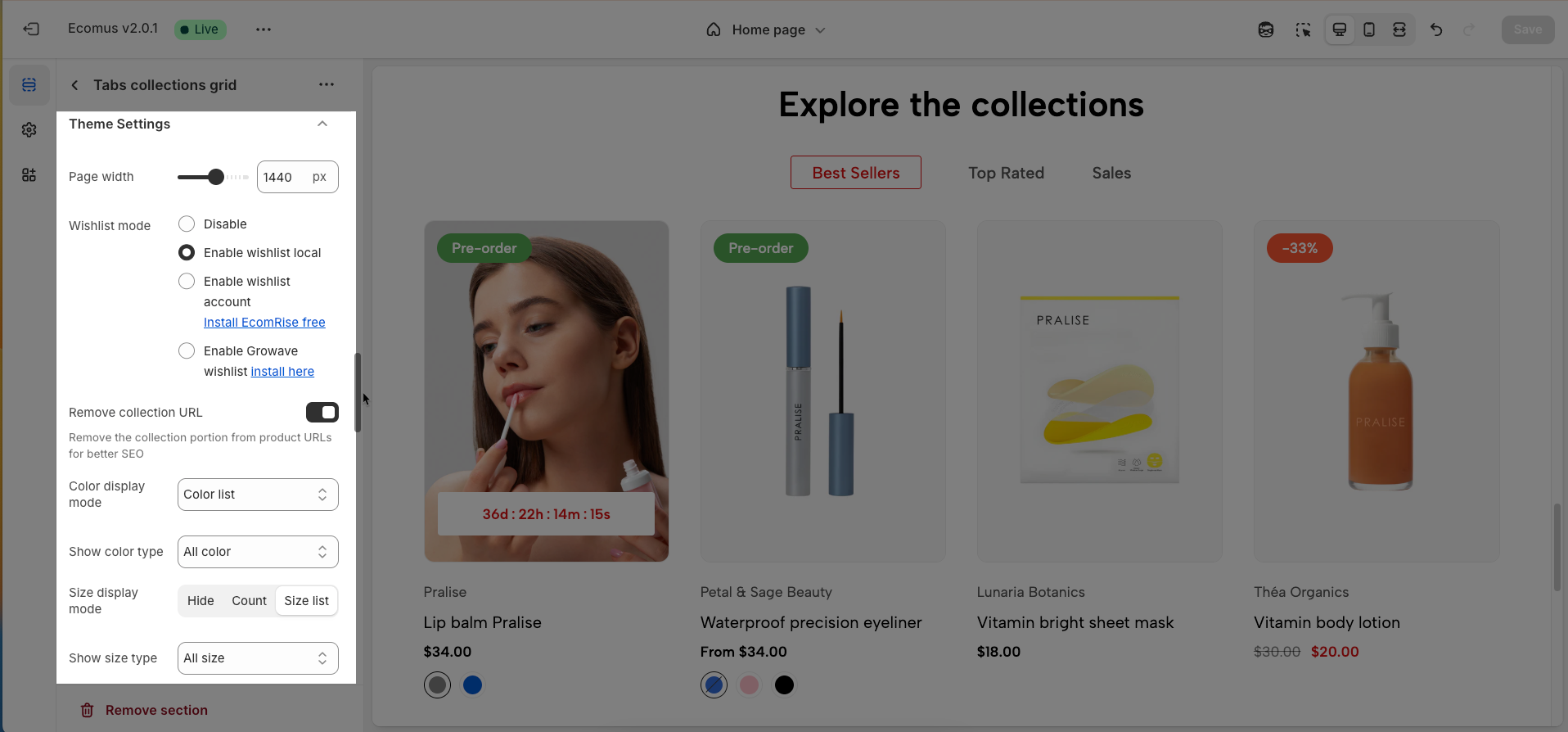
2.3.8. Theme Settings
Page width: Defines the maximum width of the page content, influencing layout and display on various devices.
Wishlist mode: Enables or disables the wishlist feature, providing users with a function to save favorite products.
You can Disable, Enable wishlist local, Enable wishlist account Install EcomRise free, Enable Growave wishlist
Remove collection URL: Eliminates the collection URL from the product page path, optimizing SEO and creating shorter URLs.
Remove the collection portion from product URLs for better SEO
Color display mode: Selects the product color display method, such as color list or count
Show color type: Displays All colors or Only color available. This option allows customers to see the complete color range of a product or focus solely on colors currently in stock.
Size display mode: Choose how the product size options are displayed.
Show size type: Choose which product sizes to display (All sizes, Only available sizes).
Show secondary image on hover: Displays a secondary product image when hovering over it, giving customers a multi-dimensional view of the product.
Use new badge: Enables or disables the display of a "new" badge on new products, attracting customer attention.
Use on sale badge: Enables or disables the display of an "on sale" badge on discounted products, stimulating purchases.
On sale badge display style: Selects the display style "Text" or "Percentage" for the "on sale" badge
Use pre-order badge: Enables or disables the display of a "pre-order" badge on upcoming products, informing customers of pre-order availability.
Use sold out badge: Enables or disables the display of a "sold out" badge on out-of-stock products, notifying customers of product availability.
Compare mode: Enables or disables the product comparison mode, allowing customers to compare products side-by-side for informed purchasing decisions.
You can Disable, Enable compare local, Enable compare account
Max products compare: 6
Show quick view: Enables or disables the "quick view" button, allowing customers to view product details without leaving the current page.
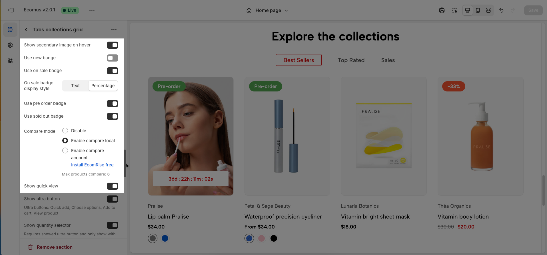
Show ultra button: Enables or disables the "ultra" button (custom button), allowing the addition of special action buttons to products.
Ultra buttons: Quick add, Choose options, Add to cart, View product
Show quantity selector: Requires showed ultra button and only show with button add to cart. Quantity selector button shows with Product Design 2,3,4,6,7,10,11,12
Show quick add: Requires showed ultra button
Enable size limit: Enables or disables the limit on the number of product sizes displayed
Maximum size to show: Limits the number of product sizes displayed, with "0" for responsive auto-adjustment based on screen resolution. (Requires size limit to be enabled.)
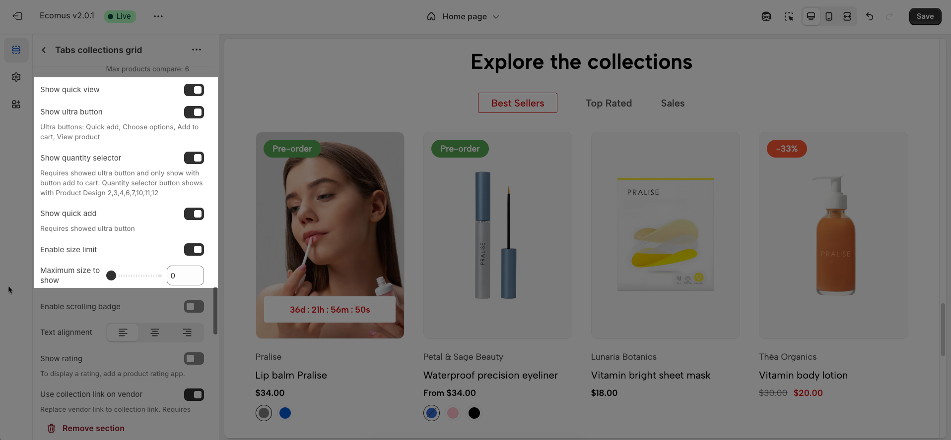
Enable scrolling badge: Enables or disables scrolling badges, allowing badges to move with the page
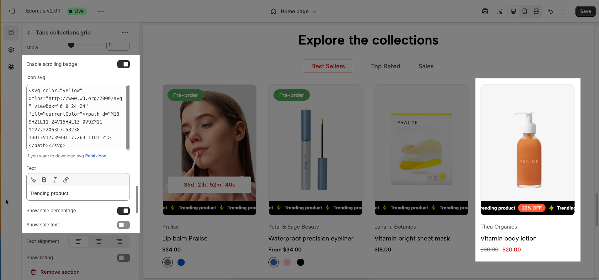
Icon SVG (If you want to download svg Remixicon): Use icon from Remixicon to enhance visual appeal and personalize the interface.
Text: Enter custom text to display alongside icons or other information, creating clear and engaging messages.
Show sale percentage: Enables or disables the display of the sale percentage on products, helping customers easily identify discounts.
Show sale text: Enables or disables the display of sale text (e.g., "Sale"), providing clear information about promotional offers.
Follow this document to know more about the Scrolling badge
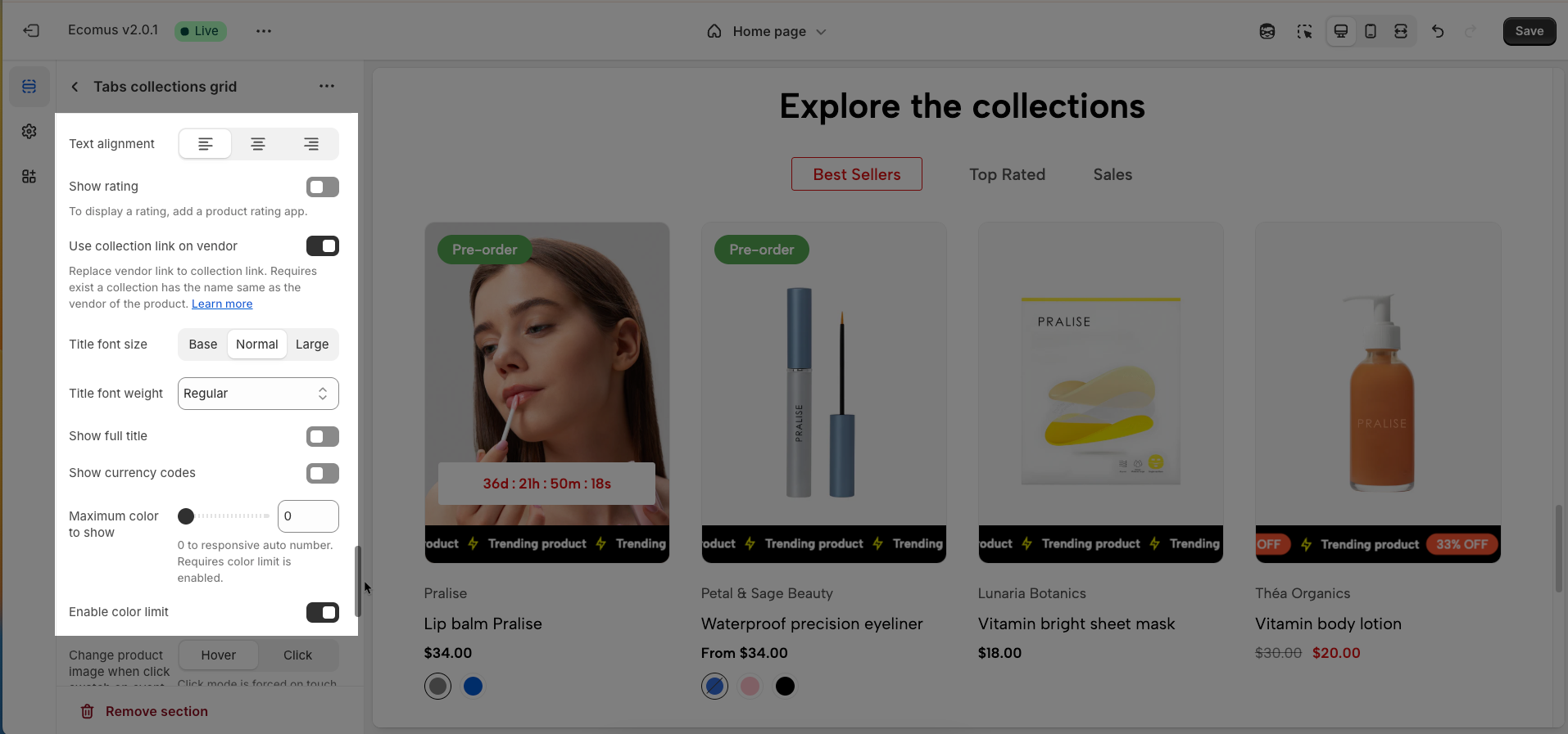
Text alignment: Adjusts the text alignment of products (left, right, center), customizing the display layout.
Show rating: Enables or disables the display of product ratings, providing customer feedback information.
To display a rating, add a product rating app.
Title font size: Adjusts the font size of the product title, ensuring readability and compatibility with the website design
Title font weight: Selects the font weight of the product title, creating emphasis and attracting attention.
Show full title: Enables or disables the display of the full product title, preventing title truncation and ensuring complete information.
Show currency codes: Enables or disables the display of currency codes next to product prices, providing clear currency information.
Maximum color to show: Limits the number of product colors displayed
0 to responsive auto number. Requires color limit is enabled.
Enable color limit: Enables or disables the limit on the number of product colors displayed, allowing control over the color count shown on the product page.
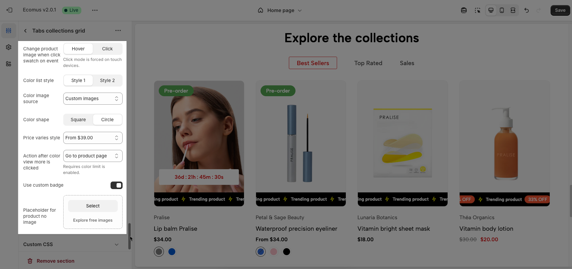
Change product image when click swatch on event: Allows the product image to change when a user clicks on a color swatch, creating a more interactive and visual experience.
Click mode is forced on touch devices.
Color list style: Selects the display style for the product color list
Color image source: Selects the image source for product colors, allowing the use of actual product images or standard color images for display (Custom images or variant images)
Color shape: Selects the display shape for product colors (e.g., square, circle), customizing the color display interface.
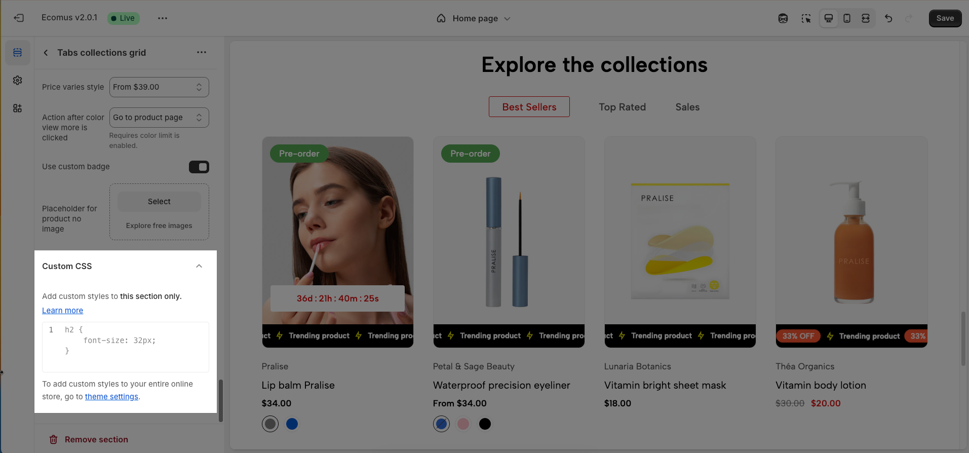
Price varies style: Choose a display style for variable product prices (e.g. "From [price]"), which helps customers understand the price range.
Action after color view more is clicked: Defines the action that occurs when a user clicks the "view more colors" button, such as showing all colors or redirecting to a more detailed page (Expand all colors, Go to product page)
Requires color limit is enabled.
Use custom badge: Enable to use a custom badge (label) for the product.
Placeholder for product no image: Choose an image to display when a product has no image.
2.3.9. Custom CSS
Allows users to customize by adding CSS rules, beyond the limitations of default settings. This allows for fine-tuning the design to every detail, to suit specific needs.
Add custom styles to this section only.
To add custom styles to your entire online store, go to theme settings.