Choose a heading that aligns with your brand’s tone and message to build trust and engagement.
1. Section heading
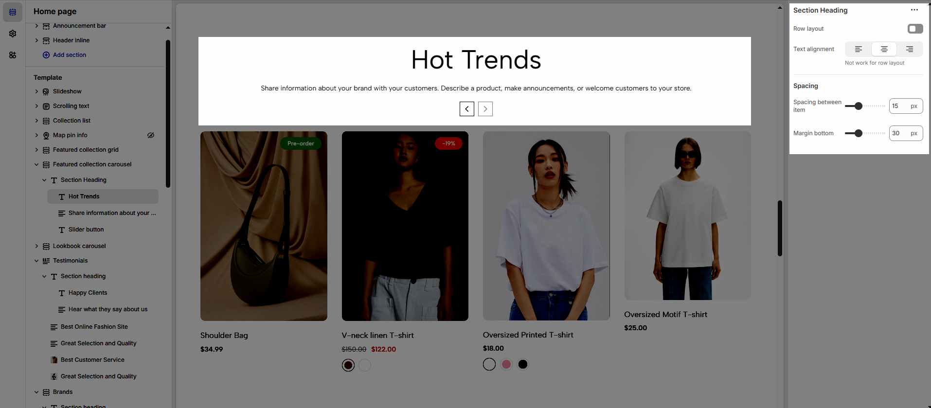
Enable Row Layout to align your content horizontally for a clean and structured design.
Text alignment: Choose how your testimonials are aligned for the best visual impact. Center alignment creates a balanced look, while left or right alignment can match your overall design style.
Spacing between items: Adjust the spacing between items to create the perfect flow
Margin bottom: Set the bottom margin to control the spacing between the heading and the section
2. Blocks
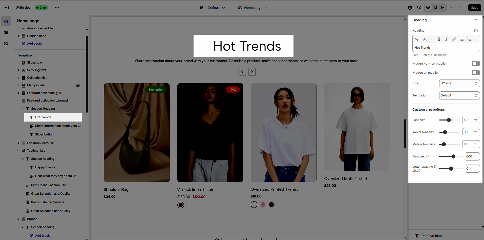
2.1. Heading
Heading: Define the main title that represents your content or section. Make it engaging and relevant.
Hidden <br> on mobile: Remove unnecessary line breaks on mobile devices
Hidden on mobile: Choose whether to hide the heading completely on mobile devices for a streamlined display.
Choose "Custom size inline" to freely adjust the size in the Custom Size Options section.
Size: Adjust the overall heading size to fit the design aesthetics of your store.
Text Color: Customize the heading color to align with your brand identity and improve readability.
Font size (Desktop/Tablet/Mobile): Set different font sizes for each device type to ensure a responsive and visually appealing layout.
Font weight: Control the thickness of the heading text
Letter spacing (in pixel): Adjust the space between letters to enhance readability and design precision.
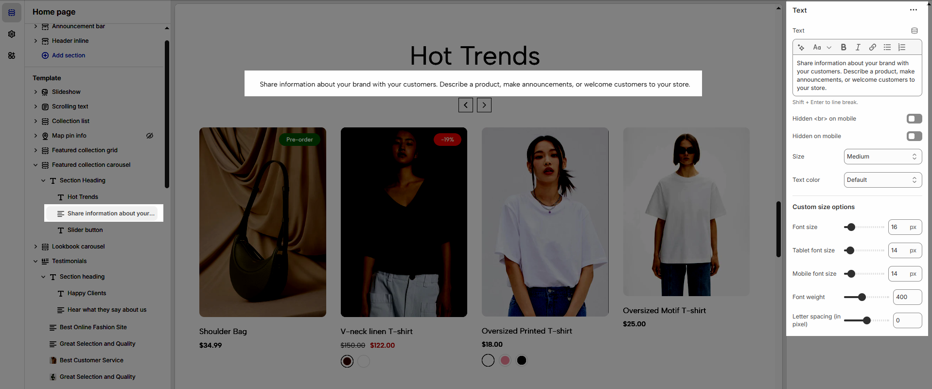
2.2. Text
You can customize the Text just like the heading.
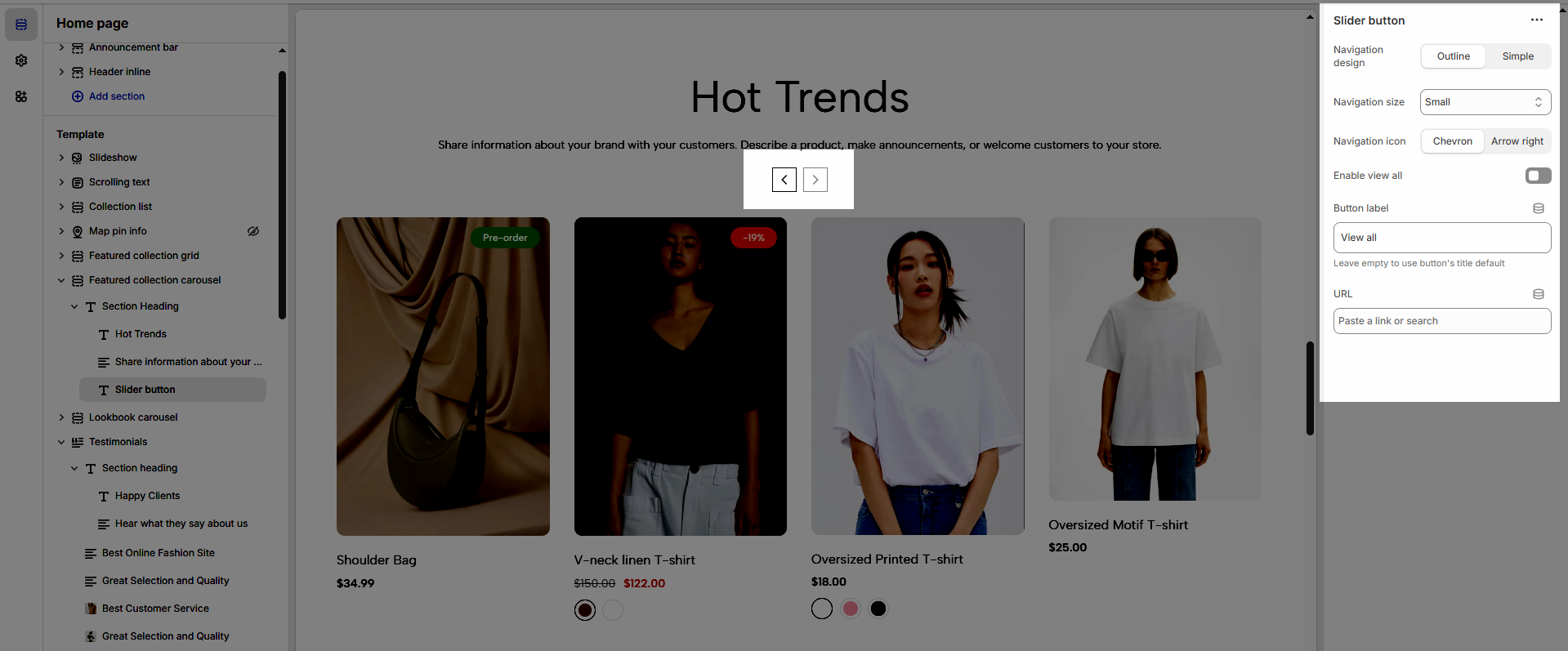
2.3. Slider button
Navigation design: Choose the style of navigation that best suits your store’s aesthetic and enhances user experience.
Navigation size: Adjust the size of the navigation elements to ensure optimal visibility and usability.
Navigation icon: Select an icon that complements the navigation style and makes it more intuitive for users.
Enable view all: Turn on this option to allow customers to see the full collection or category at once.
Button label: Enter a clear and engaging call-to-action text for the navigation button.
URL: Provide the destination link for the navigation button to direct customers to the relevant page.