


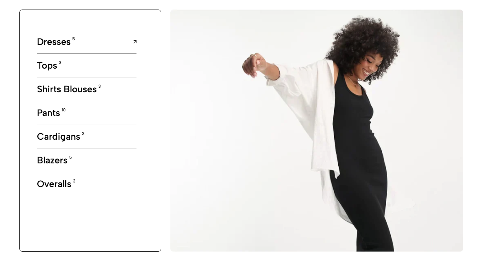
The "Collection List Tabs" section provides an efficient mechanism for displaying multiple product collections as toggleable tabs. Each tab represents a separate collection, allowing users to easily browse through different product categories without reloading the page.
1. How to access the Collection list tabs section?
Step 01: From Shopify Admin, click on Online Store > Select Themes > In the Current theme section, click the Customize button.

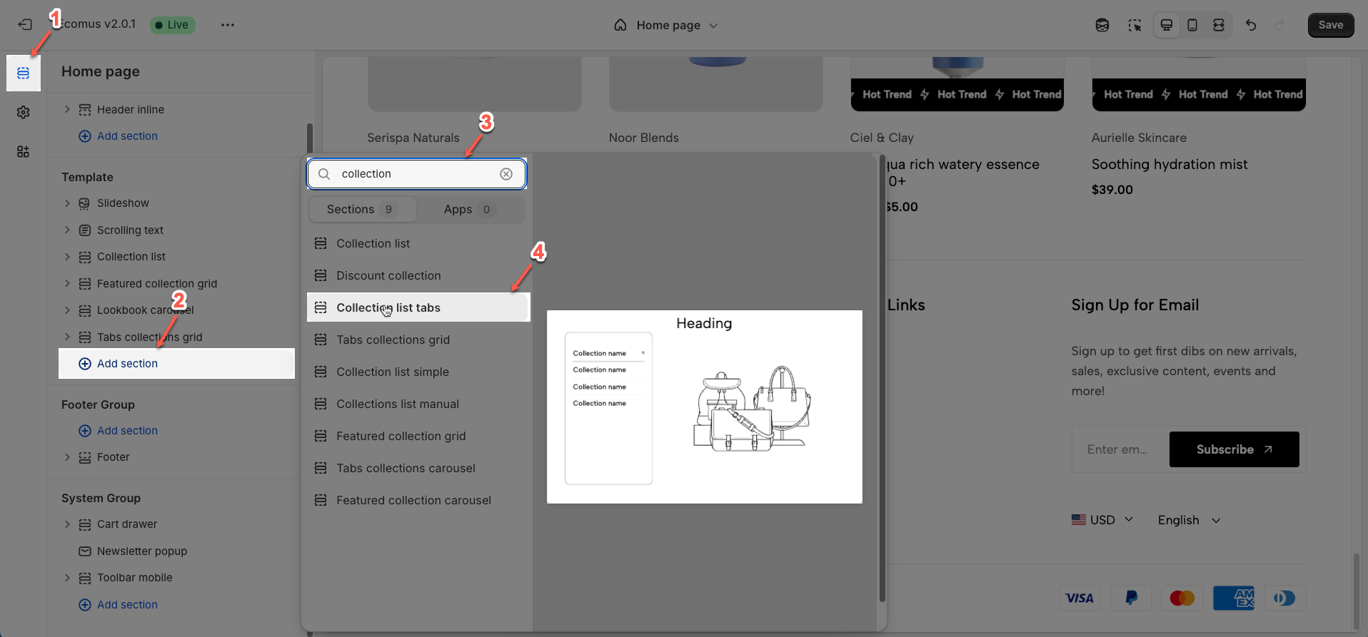
Step 02: In the theme editor (Customize), click the Sections button > Click the Add section button > In the Sections tab, scroll through the list or use the search bar to find and select the Collection list tabs.
2. How to customize the Collection list tabs section?
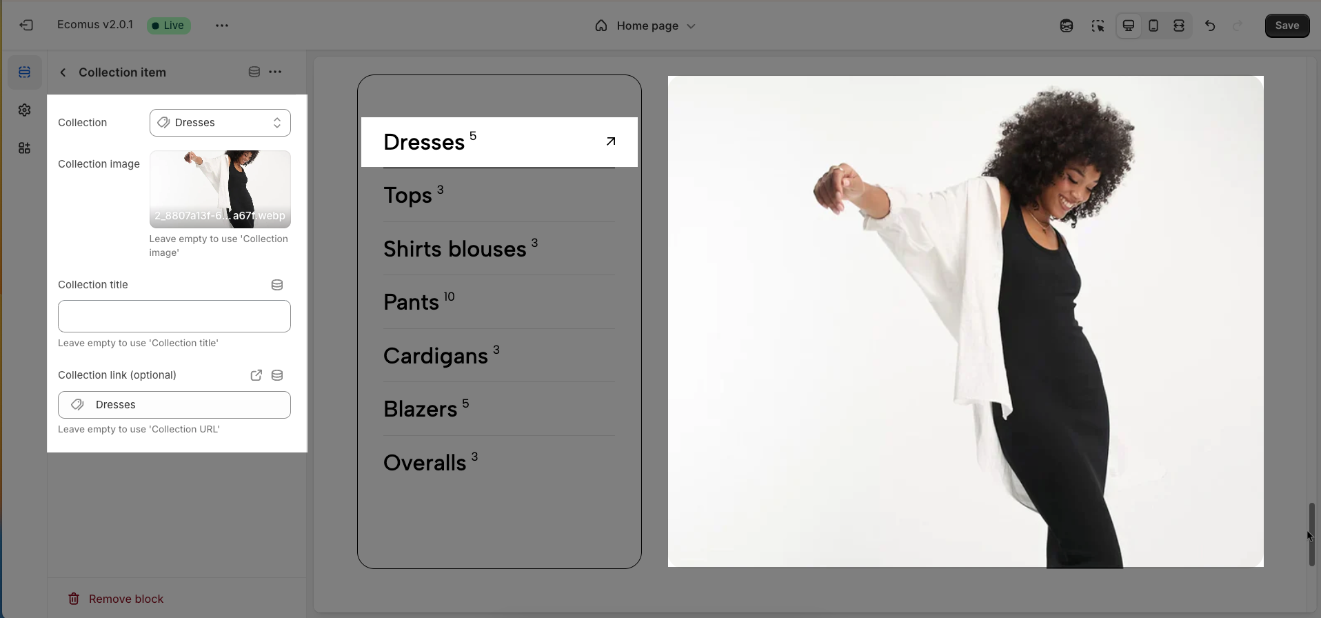
2.1. Collection item block
To add a Collection item block to the Collection list tabs, click the Add Collection item button (plus icon ➕) under the Collection list tabs.
After adding the Collection item block, you can adjust its settings using the sidebar—located on the right or left side of your screen depending on your device
Collection: Select the specific product collection you wish to display within this tab.
Collection image: Upload a representative image for this collection, which may be displayed (depending on theme configuration) alongside the tab title.
Leave empty to use 'Collection image'
Collection title: Enter the display title for this tab, typically the name of the selected collection
Leave empty to use 'Collection title'
Collection link (optional): Enter a custom URL if you wish this tab to link to a page other than the default collection page.
Leave empty to use 'Collection URL'
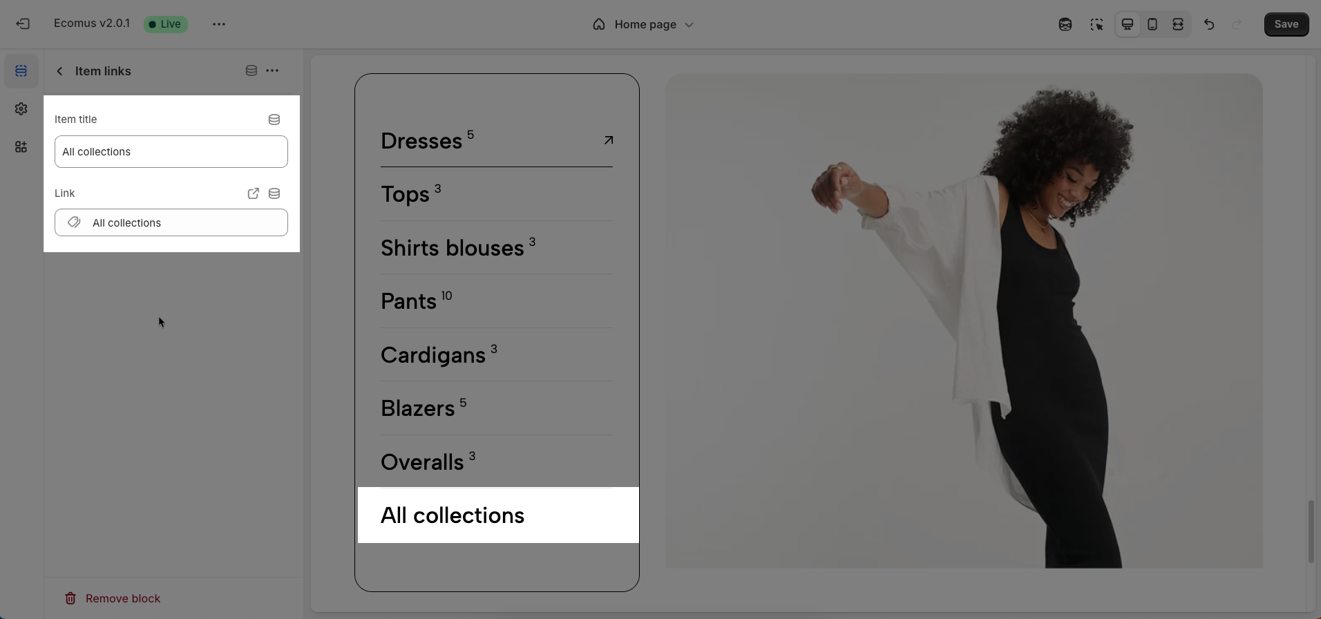
2.2. Item link block
To add a Item link block to the Collection list tabs, click the Add Item link button (plus icon ➕) under the Collection list tabs.
After adding the Item link block, you can adjust its settings using the sidebar—located on the right or left side of your screen depending on your device
Item title: Enter the display title for this item within the tab list. The title should be concise and easily understandable for quick user comprehension.
Link: Enter the URL of the collection page or destination page that this item will navigate to upon user click. Ensure the link is accurate for correct user redirection.
2.3. Collection list tabs section
After adding the Collection list tabs section, you can customize its settings using the sidebar—located on the right or left side of your screen depending on your device.
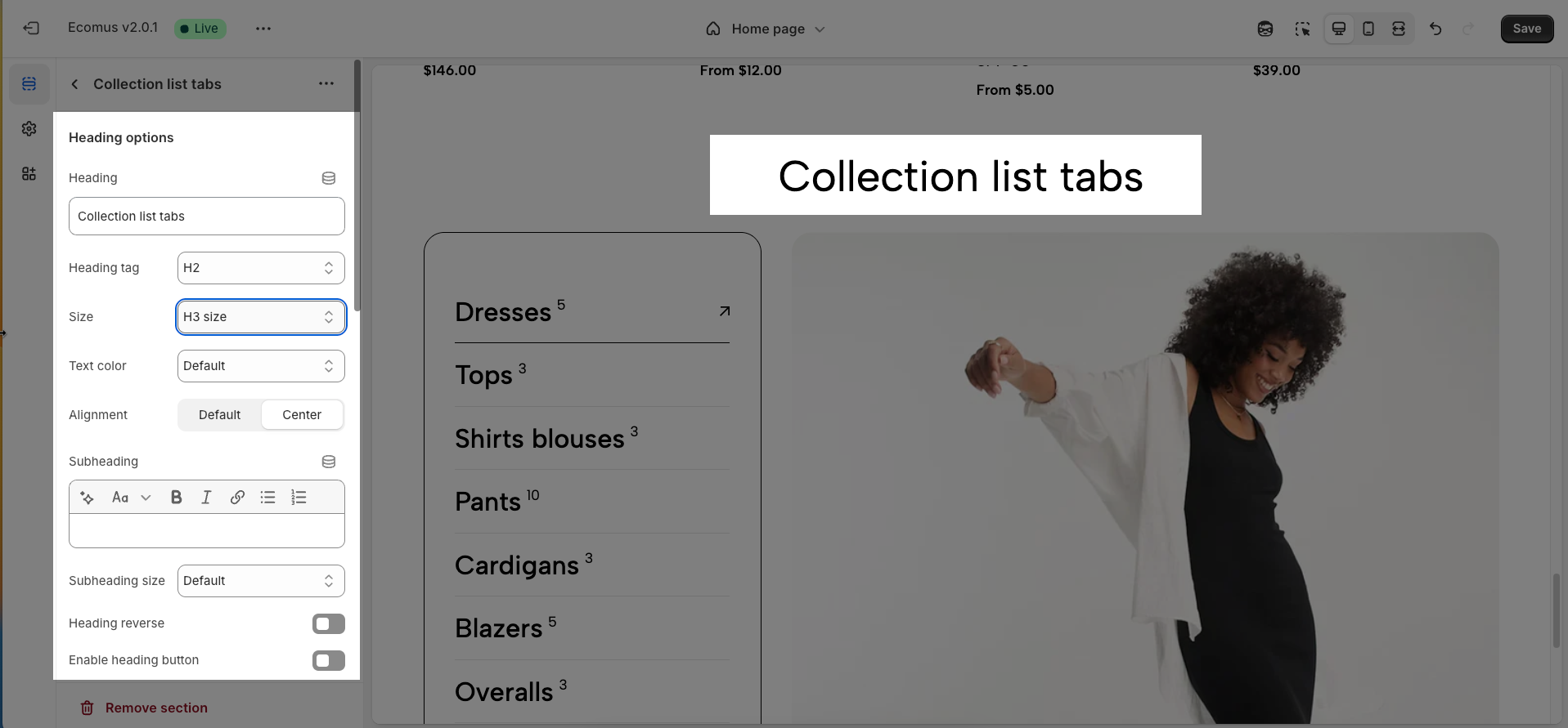
2.3.1. Heading options
Heading: Set the main title for your section to grab attention and build trust
Alignment: Choose how your heading is positioned—left or center
Heading tag: Select the HTML heading tag (H1, H2, H3, etc.) for SEO and accessibility purposes
Heading font size: Customize the font size of your heading to ensure it stands out while maintaining readability across all devices
Subheading: Add a short introductory text below the heading to provide context, helping visitors understand their value
Subheading size: Adjust the font size of the description text to make it easy to read without overpowering the main heading
Heading reverse: Enable this option to swap the position of the heading and description, allowing for alternative layouts that better suit your design preferences
Distance between heading items: Adjust the spacing between the heading and the description to ensure optimal readability and visual balance
Distance between heading and content: Set the gap between the heading section and the content to create a clear separation and improve the overall layout structure
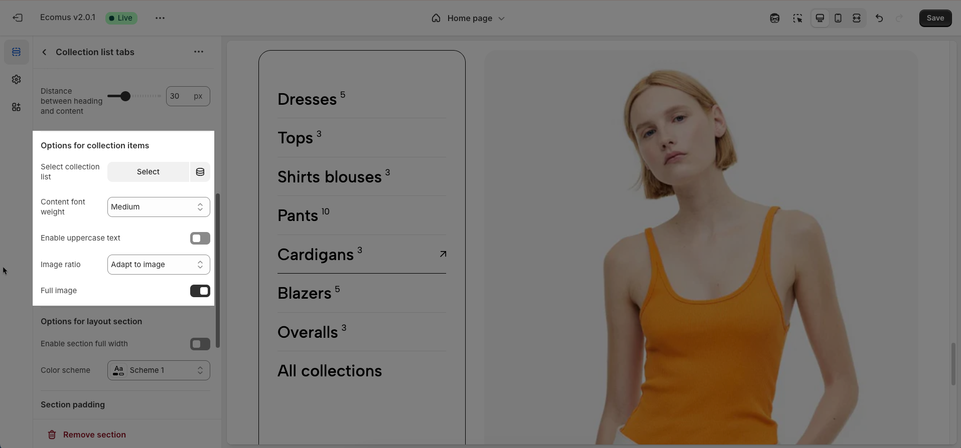
2.3.2. Options for collection items
Select collection list: Link this section to a collection list created within the Shopify admin. This will determine the collections and their display order in the tabs.
Content font weight: Adjust the font weight for the titles and descriptions (if any) of the collection items within the tabs (Regular, Medium, Semibold, Bold)
Enable uppercase text: Activate this option to display all titles of the collection tabs in uppercase. This can create a strong visual style and attract attention.
Image ratio: Define the display aspect ratio for the representative images of the collections within the tabs (e.g., Auto, Square, Custom). Selecting an appropriate ratio ensures visually appealing and consistent image rendering
Full image: Enable this option to ensure the entire frame of the collection's representative image is displayed without any cropping. This is particularly important if you want to convey the full details of the image.
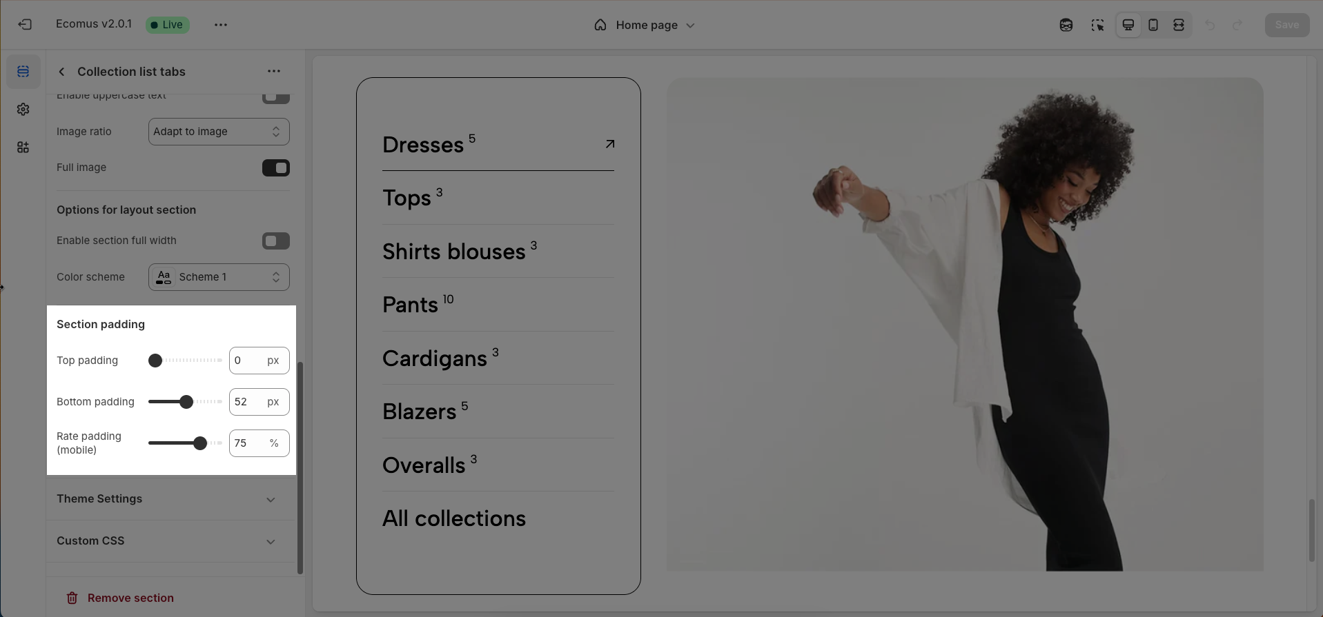
2.3.3. Options for layout section
Enable section full width: This toggle switch, when turned on, will make the entire section span the full width of the browser window. When turned off, the section will likely be constrained to the website's main content width.
Color scheme: This dropdown menu allows you to select a predefined color scheme for the section. Clicking the dropdown will likely reveal other color palettes that you can apply to the background, text, and other elements within this section for a consistent look.
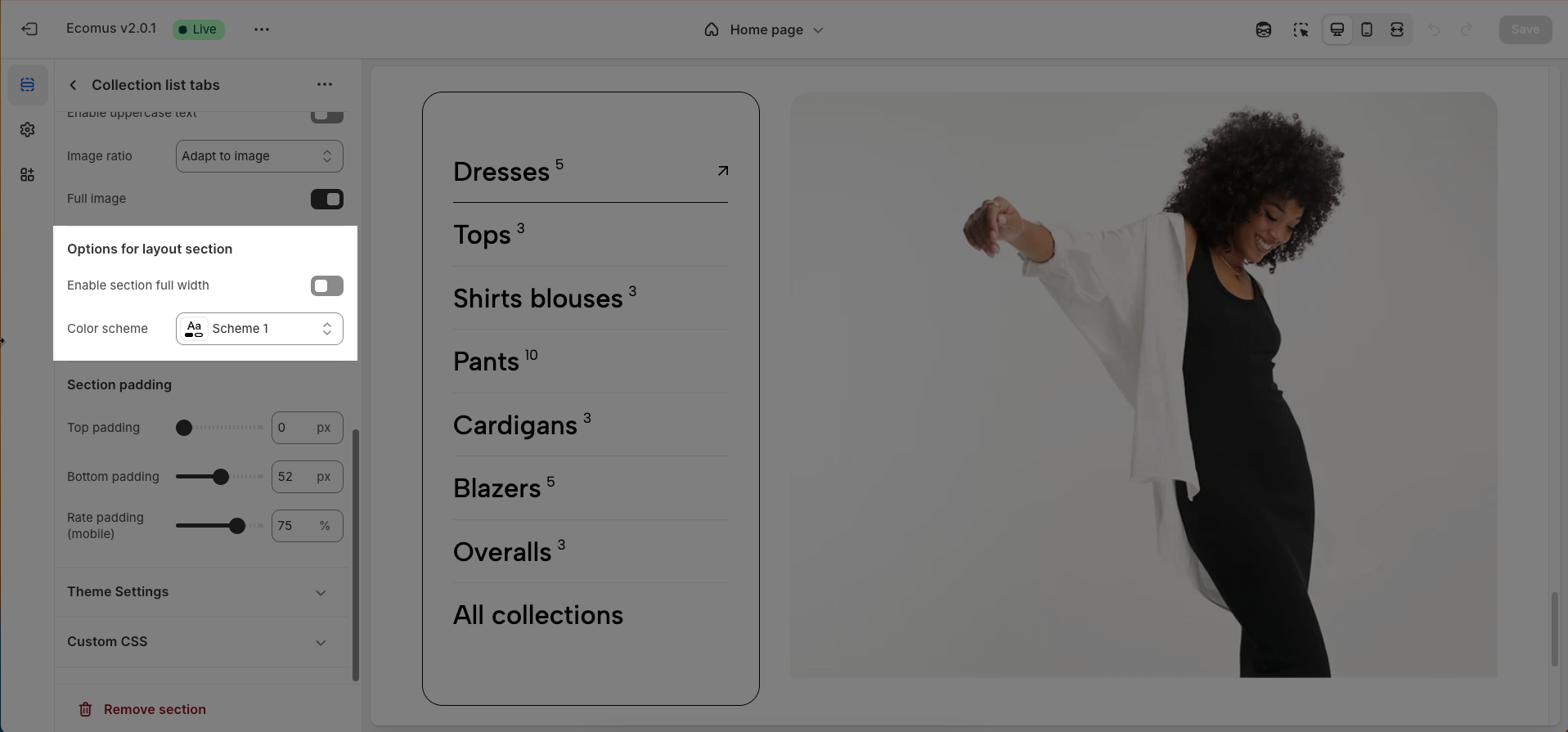
2.3.4. Section padding
Top padding: This option allows you to set the amount of space (padding) at the top of the slider section. You can drag the slider or directly enter a numerical value to adjust this spacing
Bottom padding: This option allows you to set the amount of space (padding) at the bottom of the slider section. You can drag the slider or directly enter a numerical value to adjust this spacing
Rate padding (mobile): This option allows you to set the aspect ratio-based padding for mobile view (in percentage). For example, 75% means the height will be 75% of the width.
2.3.5. Theme Settings
Page width: Defines the maximum width of the page content, influencing layout and display on various devices.
2.3.6. Custom CSS
Allows users to customize by adding CSS rules, beyond the limitations of default settings. This allows for fine-tuning the design to every detail, to suit specific needs.
Add custom styles to this section only.
To add custom styles to your entire online store, go to theme settings.


