


The "Custom section" allows users to freely design and add unique content to their website, going beyond the limitations of pre-defined sections. With the "Custom section", you have full control over the design, ensuring that your website reflects your creative ideas and specific requirements.
1. How to access the Custom section?
Step 01: From Shopify Admin, click on Online Store > Select Themes > In the Current theme section, click the Customize button.

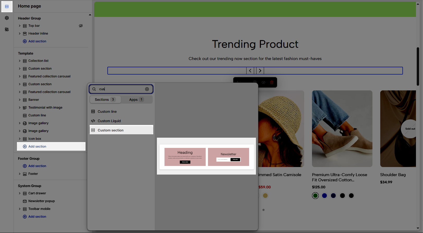
Step 02: In the theme editor (Customize), click the Sections button > Click the Add section button > In the Sections tab, scroll through the list or use the search bar to find and select the Custom section.
2. How to customize the Custom section?
2.1. Custom section
After adding the Custom section, you can customize its settings in the right sidebar.
2.1.1. Spacing item
Spacing between items: Adjusts the distance between elements in a list or grid on desktop screens, creating a clear and visually appealing layout.
Spacing between items tablet: Optimizes the spacing between elements on tablet screens, ensuring content is displayed balanced and easy to interact with.
Spacing between items mobile: Adjusts the spacing between elements on mobile phone screens, optimizing the user experience on small screens.
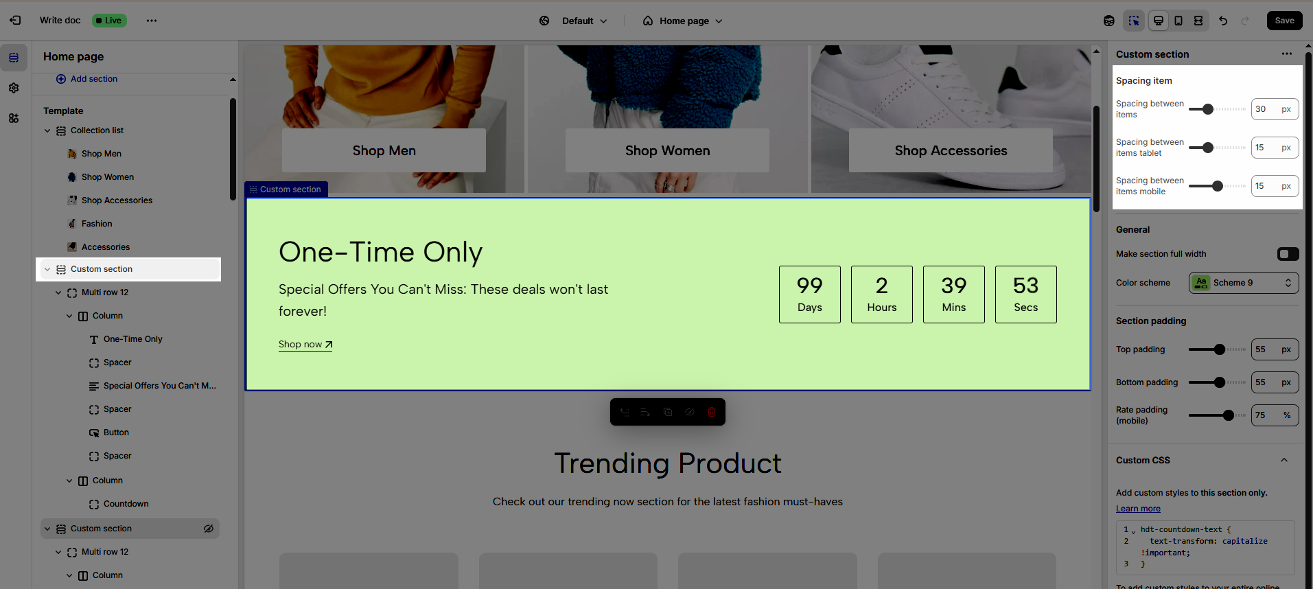
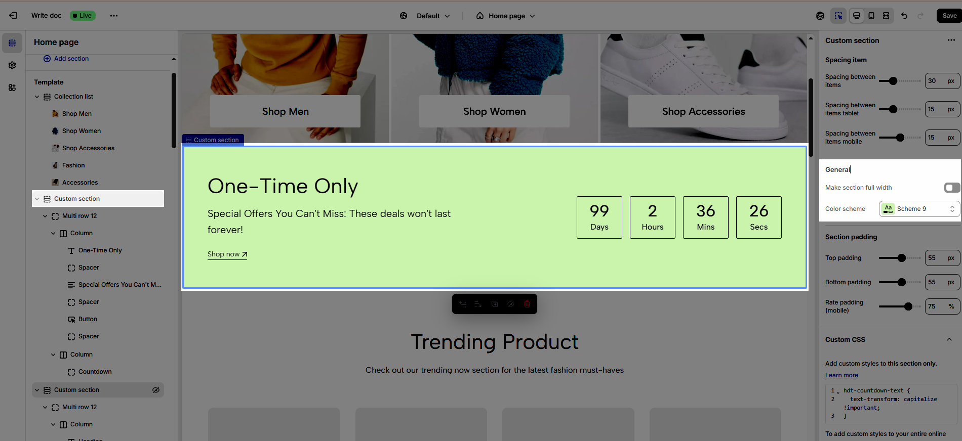
2.1.2. General
Make section full width: Extends the element to fill the entire horizontal screen space, creating a wide and attention-grabbing layout.
Color Scheme: Selects the overall color palette for the section, ensuring aesthetics and consistency.
2.1.3. Section padding
Top padding: Creates space above the content within an element, separating it from elements above and improving visual layout.
Bottom padding: Creates space below the content within an element, separating it from elements below and improving visual layout.
Rate padding (mobile): Adjust spacing around mobile top elements, optimizing user experience and ensuring easy interaction on smaller screens.
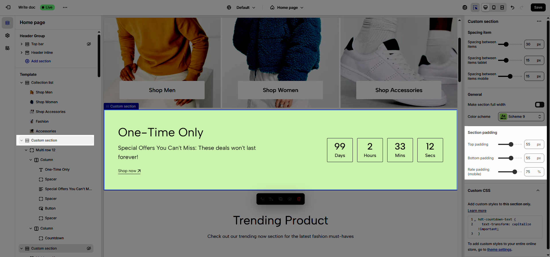
2.1.4. Custom CSS
Allows users to customize by adding CSS rules, beyond the limitations of default settings. This allows for fine-tuning the design to every detail, to suit specific needs.
Add custom styles to this section only.
To add custom styles to your entire online store, go to theme settings.
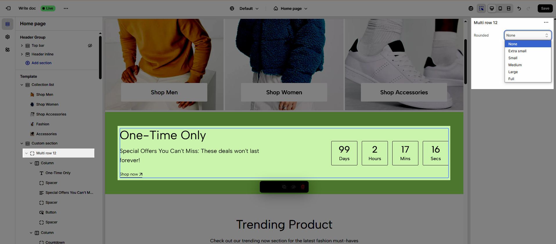
2.2. Multi Row
To add Multi Row block to the Custom section, click the Add block button (plus icon ➕) under the Custom section.
This feature offers two display modes: Multi Row 10 and Multi Row 12.
Once the Multi Row is added, you can customize its settings in the right-hand sidebar:
Rounded: Provide the ability to customize the roundness of element corners, from sharp right angles to smooth, rounded edges (Users can select from the following rounded corner options: none, extra small, small, medium, large, and full).
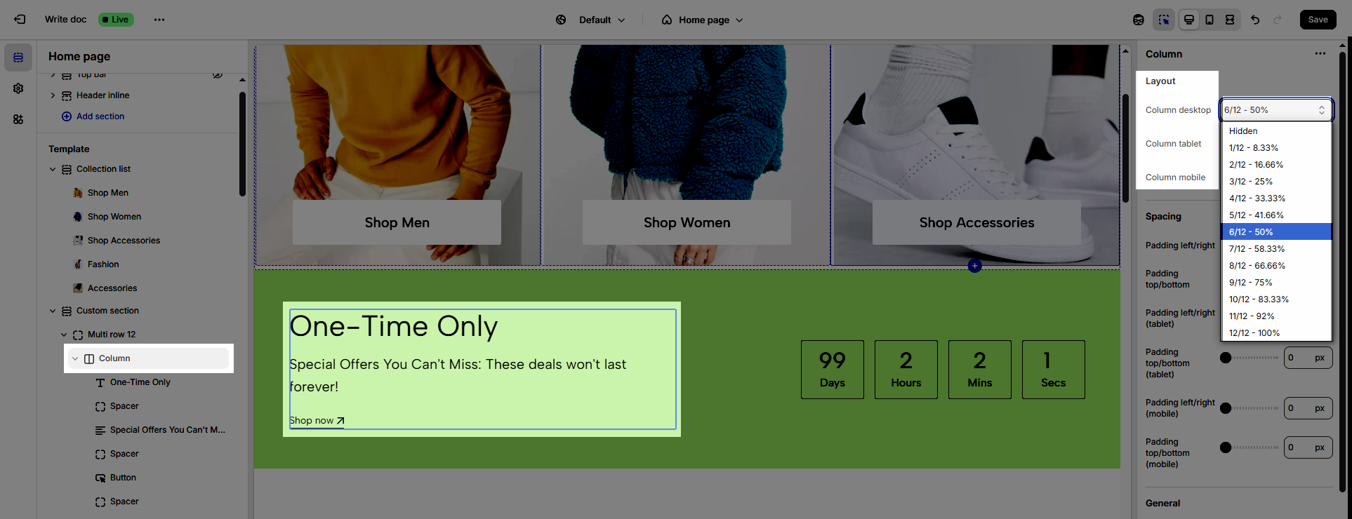
2.3. Column
To add Column block to the Custom section, click the Add block button (plus icon ➕) under the Multi Row block.
You can create a variable number of columns, depending on the desired layout
Once the Column is added, you can customize its settings in the right-hand sidebar:
2.3.1. Layout
We provide percentage options to customize columns for a professional layout design
Column desktop: Allows users to allocate percentage-based widths to individual columns on desktop screens, creating flexible and professional layouts.
Column tablet: Adjusts percentage-based widths for each column on tablet screens, ensuring balanced and readable content.
Column mobile: Optimizes percentage-based widths for each column on mobile phone screens, ensuring content is displayed neatly and interactively.
2.3.2. Spacing
Padding left/right: Adjusts the space to the left and right of the content within an element, creating padding and improving horizontal layout.
Padding top/bottom: Adjusts the space above and below the content within an element, creating padding and improving vertical layout.
Padding left/right (tablet): Optimizes the space to the left and right of the content on tablet screens, ensuring a balanced and readable layout.
Padding top/bottom (tablet): Optimizes the space above and below the content on tablet screens, ensuring a balanced and readable layout.
Padding left/right (mobile): Adjusts the space to the left and right of the content on mobile phone screens, optimizing the user experience on small screens.
Padding top/bottom (mobile): Adjusts the space above and below the content on mobile phone screens, optimizing the user experience on small screens
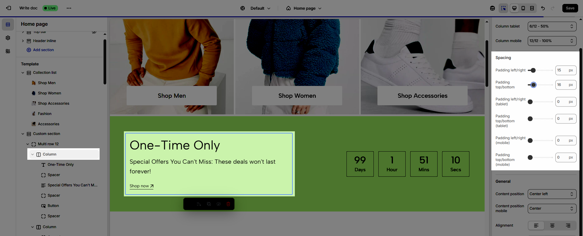
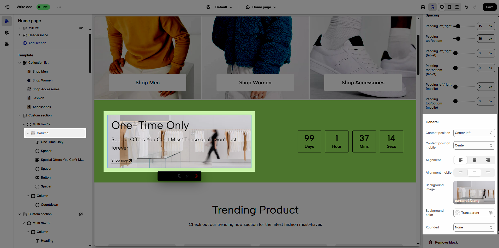
2.3.3. General
Content position: Selects the display position of content within an element, allowing for precise alignment in various directions, creating an intuitive and design-appropriate layout
Content position mobile: Optimizes the content display position for mobile screens, ensuring content is readable and interactive on small devices, maintaining a good user experience.
Allows users to define the display position of content within an element, ranging from top corners (top left, top right) to bottom corners (bottom left, bottom right), or centered both horizontally and vertically
Alignment: Adjusts the horizontal placement of text or elements, creating a visually organized and readable layout.
Alignment mobile: Optimizes text or element alignment for mobile screens, ensuring content is displayed neatly and interactively on small devices.
Background image: Adds a background image to an element, creating an appealing visual effect and enhancing the website's aesthetics.
Background color: Selects a background color for an element, creating contrast and highlighting content.
Rounded: Adjusts the curvature of element corners, creating a softer and more modern interface (Users can select from the following rounded corner options: none, extra small, small, medium, large, and full).
2.4. Other Blocks
2.4.1. Heading block
To add Heading block to the Custom section, click the Add block button (plus icon ➕) under the Column block.
Once the Heading block is added, you can customize its settings in the right-hand sidebar:
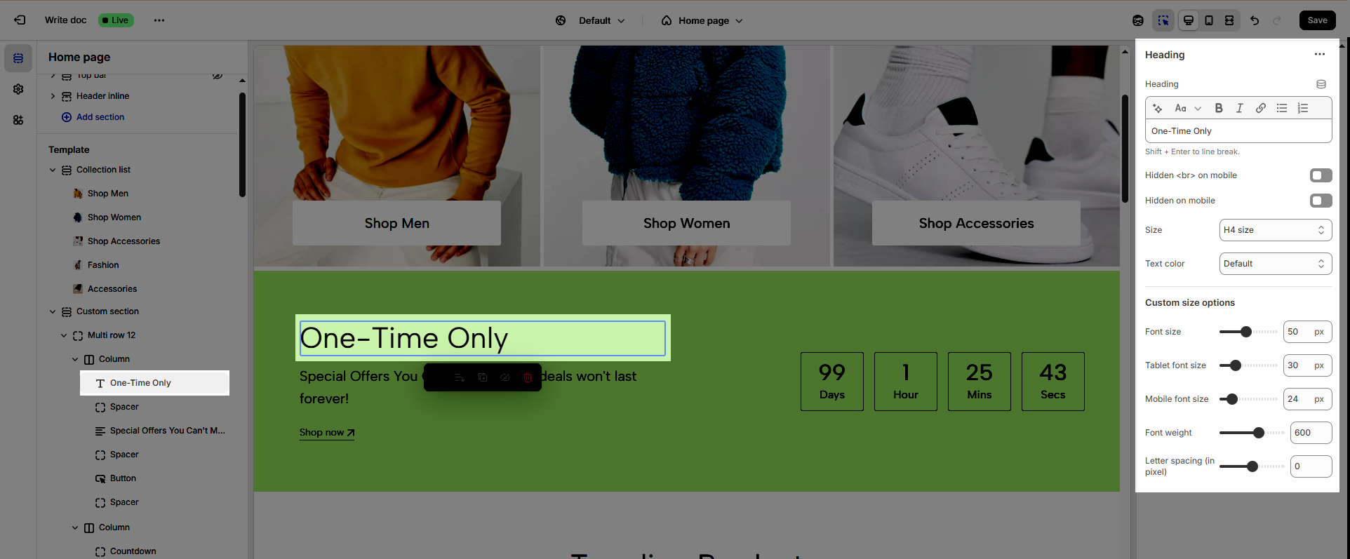
Heading (Shift + Enter to line break): Define the main title that represents your content or section. Make it engaging and relevant.
Hidden <br> on mobile: Remove unnecessary line breaks on mobile devices
Hidden on mobile: Choose whether to hide the heading completely on mobile devices for a streamlined display.
Choose "Custom size inline" to freely adjust the size in the Custom Size Options section.
Size: Adjust the overall heading size to fit the design aesthetics of your store.
Text Color: Customize the heading color to align with your brand identity and improve readability.
Font size (Desktop/Tablet/Mobile): Set different font sizes for each device type to ensure a responsive and visually appealing layout.
Font weight: Controls the thickness of the heading text
Letter spacing (in pixel): Adjust the space between letters to enhance readability and design precision.
2.4.2. Text block
To add Text block to the Custom section, click the Add block button (plus icon ➕) under the Column block.
Once the Text block is added, you can customize its settings in the right-hand sidebar:
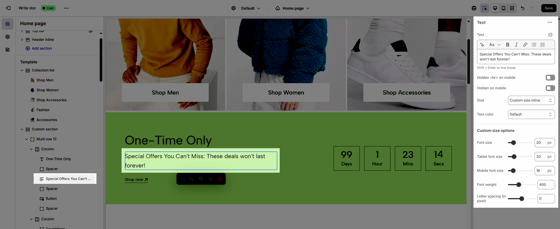
Text (Shift + Enter to line break): Allows users to add textual content, providing information, descriptions, or explanations.
Hidden <br> on mobile: Remove unnecessary line breaks on mobile devices
Hidden on mobile: Choose whether to hide the heading completely on mobile devices for a streamlined display.
Choose "Custom size inline" to freely adjust the size in the Custom Size Options section.
Size: Adjust the overall heading size to fit the design aesthetics of your store.
Text Color: Customize the heading color to align with your brand identity and improve readability.
Font size (Desktop/Tablet/Mobile): Set different font sizes for each device type to ensure a responsive and visually appealing layout.
Font weight: Controls the thickness of the heading text
Letter spacing (in pixel): Adjust the space between letters to enhance readability and design precision.
2.4.3. Spacer block
To add Spacer block to the Custom section, click the Add block button (plus icon ➕) under the Column block.
Once the Spacer block is added, you can customize its settings in the right-hand sidebar:
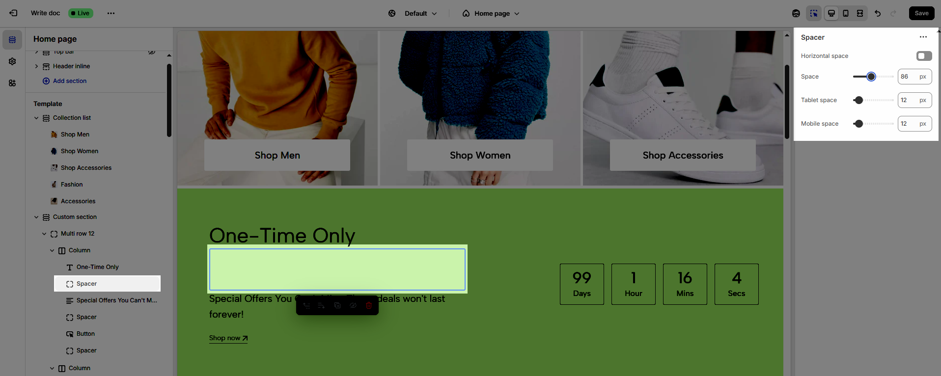
Horizontal space: Enable to adjust the horizontal space between elements, creating a balanced and easy-to-read layout
Space: Setting space between elements creates clear separation.
Tablet space: Optimizes the spacing between elements on tablet screens, ensuring content is displayed balanced and easy to interact with on medium-sized screen devices.
Mobile space: Adjusts the spacing between elements on mobile phone screens, optimizing the user experience on small screens
2.4.4. Button block
To add Button block to the Custom section, click the Add block button (plus icon ➕) under the Column block.
Once the Button block is added, you can customize its settings in the right-hand sidebar:
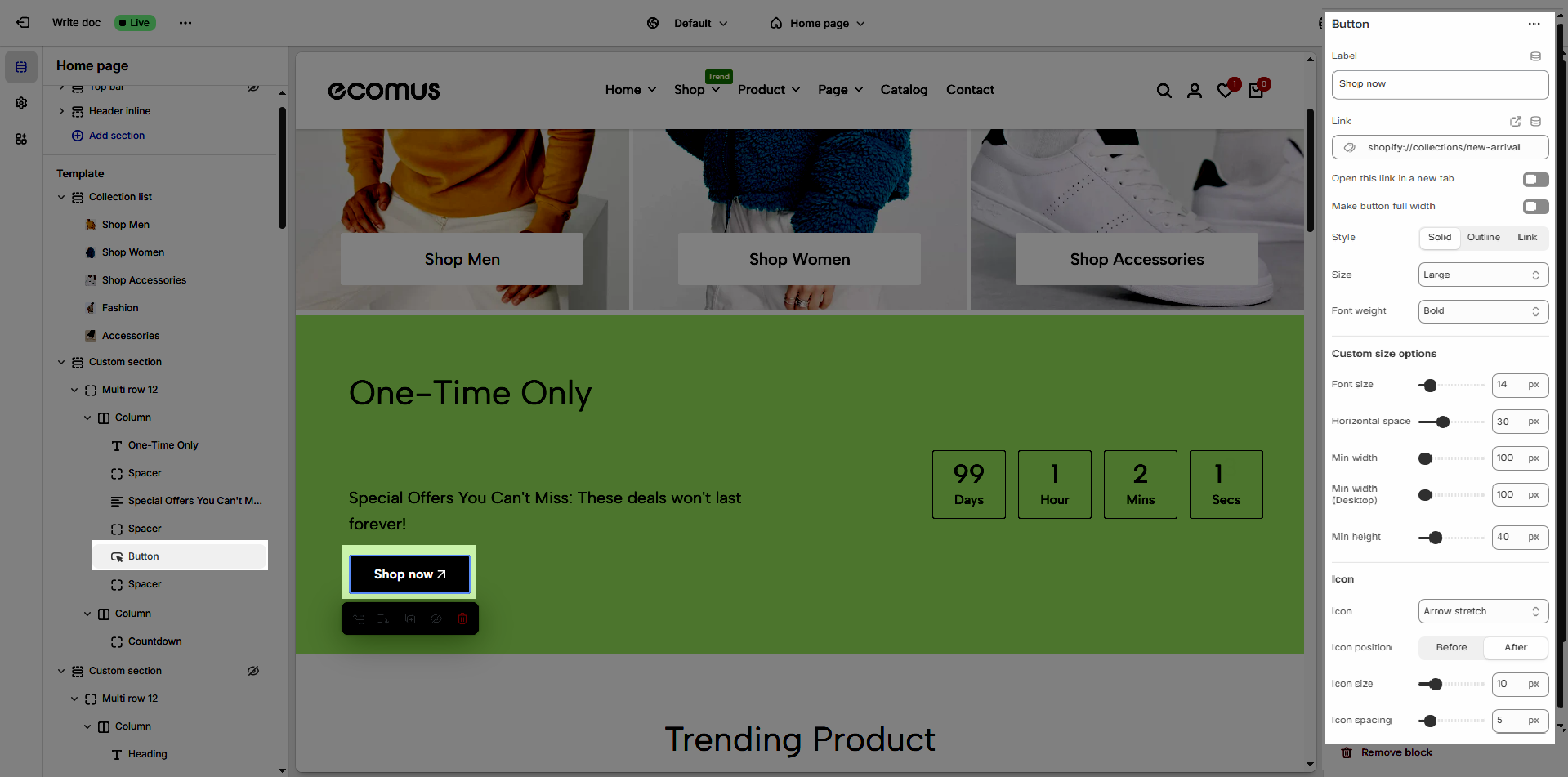
The Button block allows you to create interactive call-to-action elements that guide users to specific links. Customizing the button ensures it matches your design and provides a seamless user experience. Below are the available options for customization:
Label: Defines the text displayed on the button.
Link: Specifies the destination URL when the button is clicked.
Open this link in a new tab: Opens the link in a new browser tab when enabled.
Make button full width: Expands the button to take up the full width of its container.
Style: Choose between Solid, Outline, or Link styles for different visual effects.
Size: Adjusts the button size (e.g., Extra Large, Medium, etc.).
Font weight: Controls the thickness of the button text (e.g., Normal, Bold).
Custom Size Options
Font size: Adjusts the heading size for desktop.
Tablet font size: Adjusts the heading size for tablet.
Mobile font size: Adjusts the heading size for mobile.
Font weight: Controls the thickness of the text (e.g., 600 is semi-bold).
Letter spacing: Adjusts the space between characters.
Icon
Icon: Select the icon to display on the button (e.g., arrow, plus, etc.).
Icon position: Choose whether the icon appears Before or After the button text.
Icon size: Adjust the size of the icon in pixels.
Icon spacing: Set the spacing between the icon and the text to ensure proper alignment and readability.
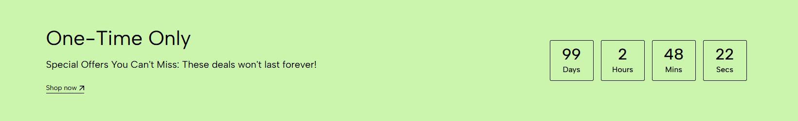
2.4.5. Countdown block
To add Countdown block to the Custom section, click the Add block button (plus icon ➕) under the Column block.
Once the Countdown block is added, you can customize its settings in the right-hand sidebar:
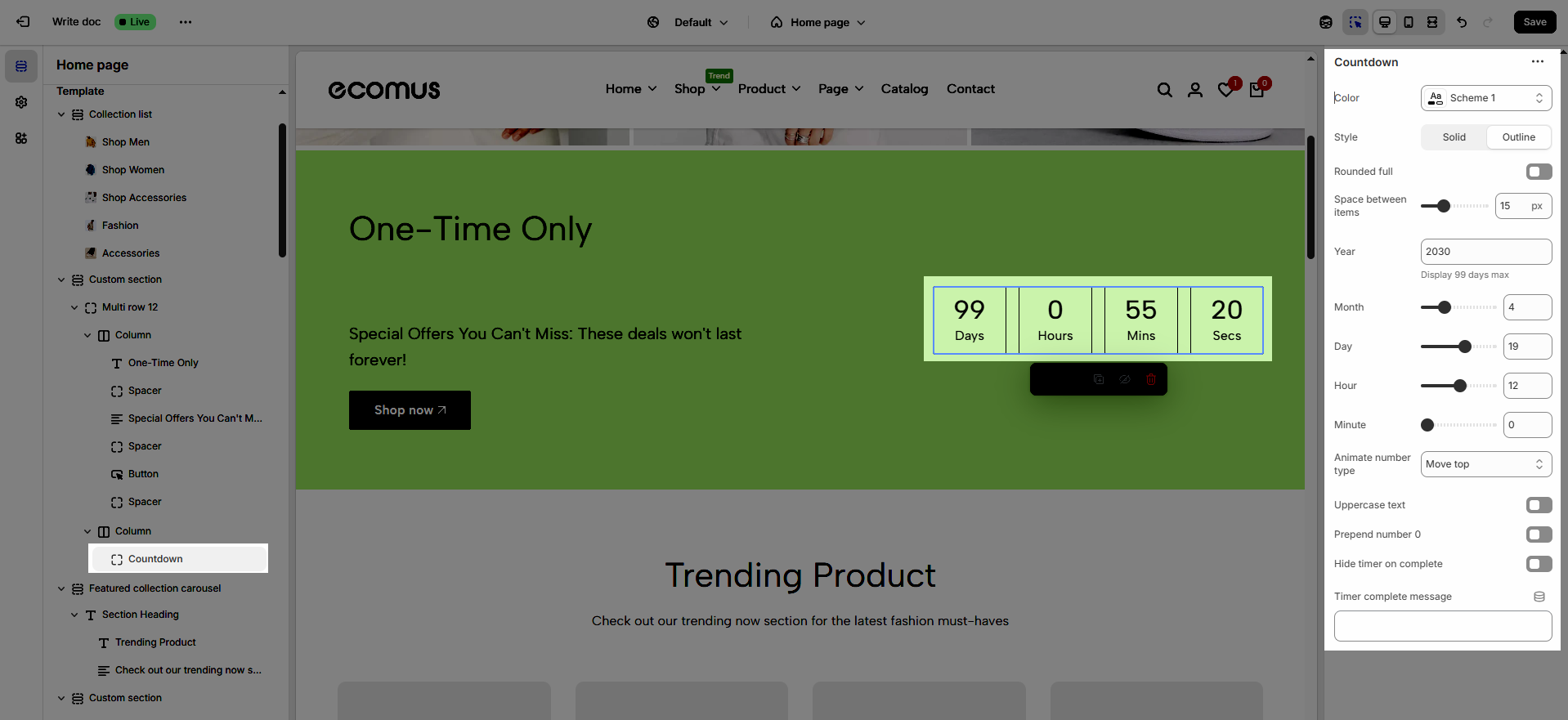
Color: Selects the overall color palette for the section, ensuring aesthetics and consistency.
Style: Select the display style for the countdown timer, either Solid fill or Outline, to customize the appearance to match the design
Rounded full: Fully rounds the corners of the countdown timer, creating a soft and modern effect.
Space between items: Adjusts the spacing between the countdown components (years, months, days, hours, minutes), optimizing the layout.
Year: Displays the year in the countdown, limited to a maximum of 99 days, suitable for short-term events
Month: Displays the month in the countdown, counting down by months.
Day: Displays the days in the countdown, counting down by days.
Hour: Displays the hours in the countdown, counting down by hours.
Minute: Displays the hours in the countdown, counting down by minutes.
Animate number type (None, Move top, Move bottom, Scale, Rotate): Selects the animation style for the countdown numbers, creating visual interest and engagement.
Uppercase text: Converts the countdown label text to uppercase, ensuring consistency.
Prepend number 0: Adds a leading zero to single-digit countdown numbers (e.g., 01, 02), ensuring uniform formatting.
Hide timer on complete: Hides the countdown timer upon completion, preventing unnecessary information display.
Timer complete message: Displays a message when the countdown timer finishes, notifying users of the event's status.
2.4.6. Image block
To add Image block to the Custom section, click the Add block button (plus icon ➕) under the Column block.
Once the Image block is added, you can customize its settings in the right-hand sidebar:
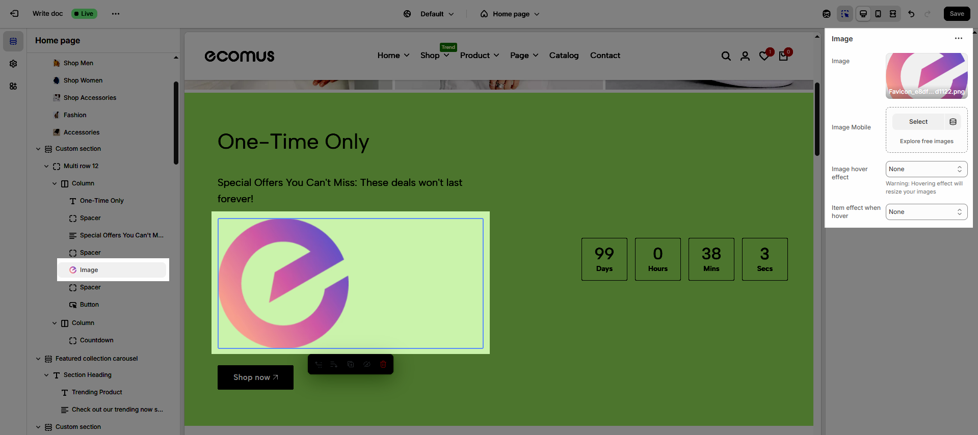
Image: Allows users to upload and display the image, creating visual impact and conveying information effectively.
Image Mobile: Allows users to upload and display images on mobile devices
Image hover effect: Adds effects when users hover over images, creating interactivity and attracting attention.
Warning: Hovering effect will resize your images
Item effect when hover: Selects the display effect when users hover over images (none, border run, pervasive circle, plus zoom overlay, overlay)
2.4.7. Social block
To add Social block to the Custom section, click the Add block button (plus icon ➕) under the Column block.
Once the Social block is added, you can customize its settings in the right-hand sidebar:
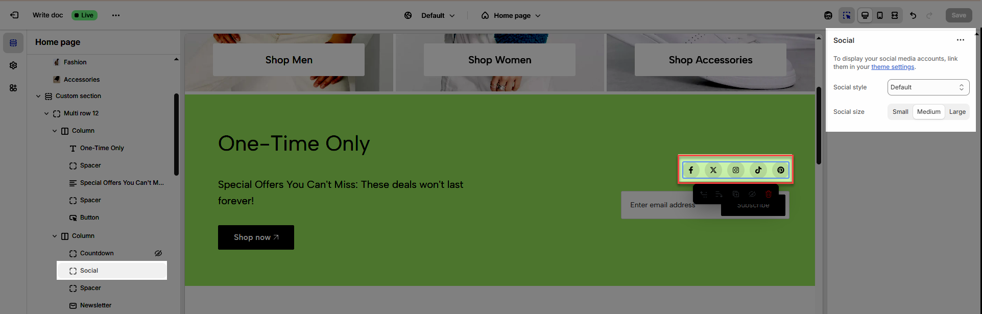
Social style: Enables users to select the display style for social media icons (default, outline, simple), ensuring consistency with the overall website design
Social size: Adjusts the size of social media icons (small, medium, large), ensuring they are displayed clearly and appropriately for the website layout.
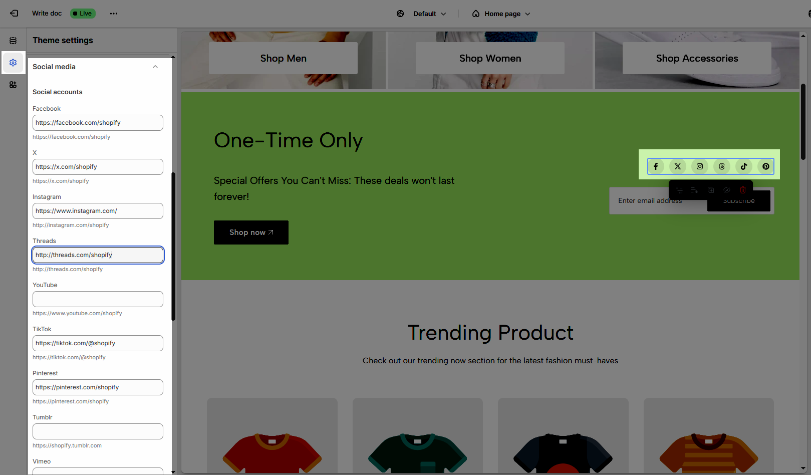
To display your social media accounts, link them in your theme settings.
How to connect your site with social media accounts like Facebook, X, Instagram, Pinterest, Tumblr, etc...
From Theme customize > select Theme settings tab > scroll down and find Social media, and enter the links in the respective fields.
2.4.8. Newsletter block
To add Newsletter block to the Custom section, click the Add block button (plus icon ➕) under the Column block.
Once the Newsletter block is added, you can customize its settings in the right-hand sidebar:
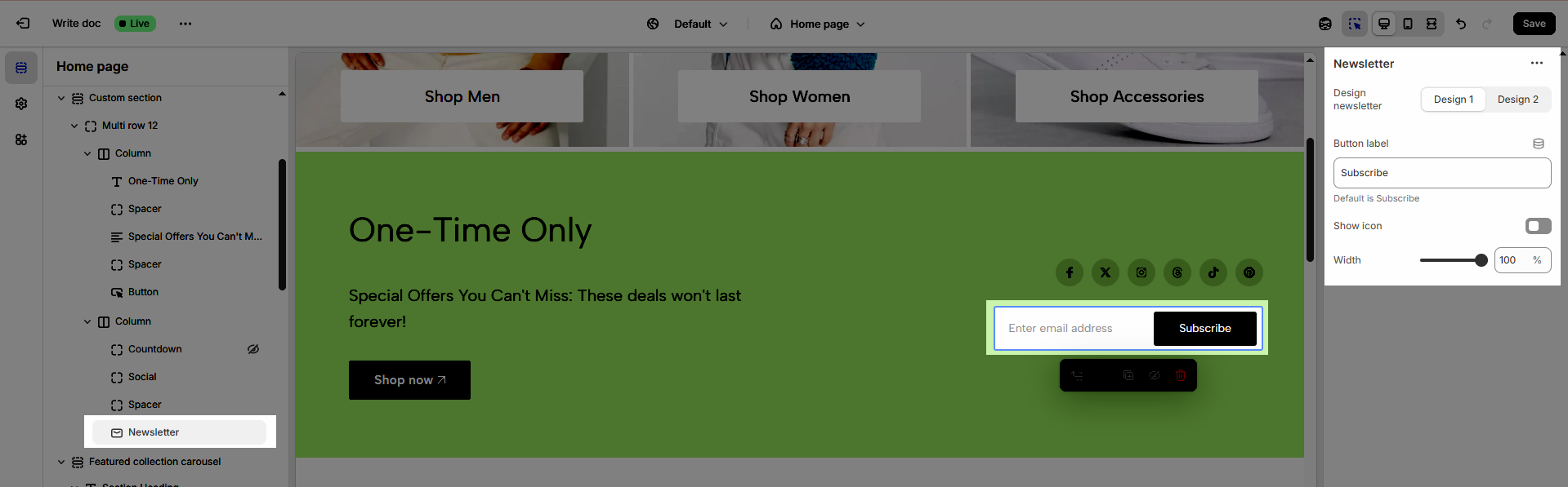
Design newsletter: There are 2 designs available for you to choose from (design 1, design 2)
Button label: Allows customization of the text on the newsletter subscription button, creating engagement and aligning with the website's message.
Default is Subscribe
Show icon: Displays an icon next to the newsletter subscription button, enhancing visual appeal and attracting user attention.
Width: Adjusts the width of the newsletter section, ensuring a balanced layout and compatibility with the overall website design.
2.4.9. Video popup block
To add Video popup block to the Custom section, click the Add block button (plus icon ➕) under the Column block.
Once the Video popup block is added, you can customize its settings in the right-hand sidebar:
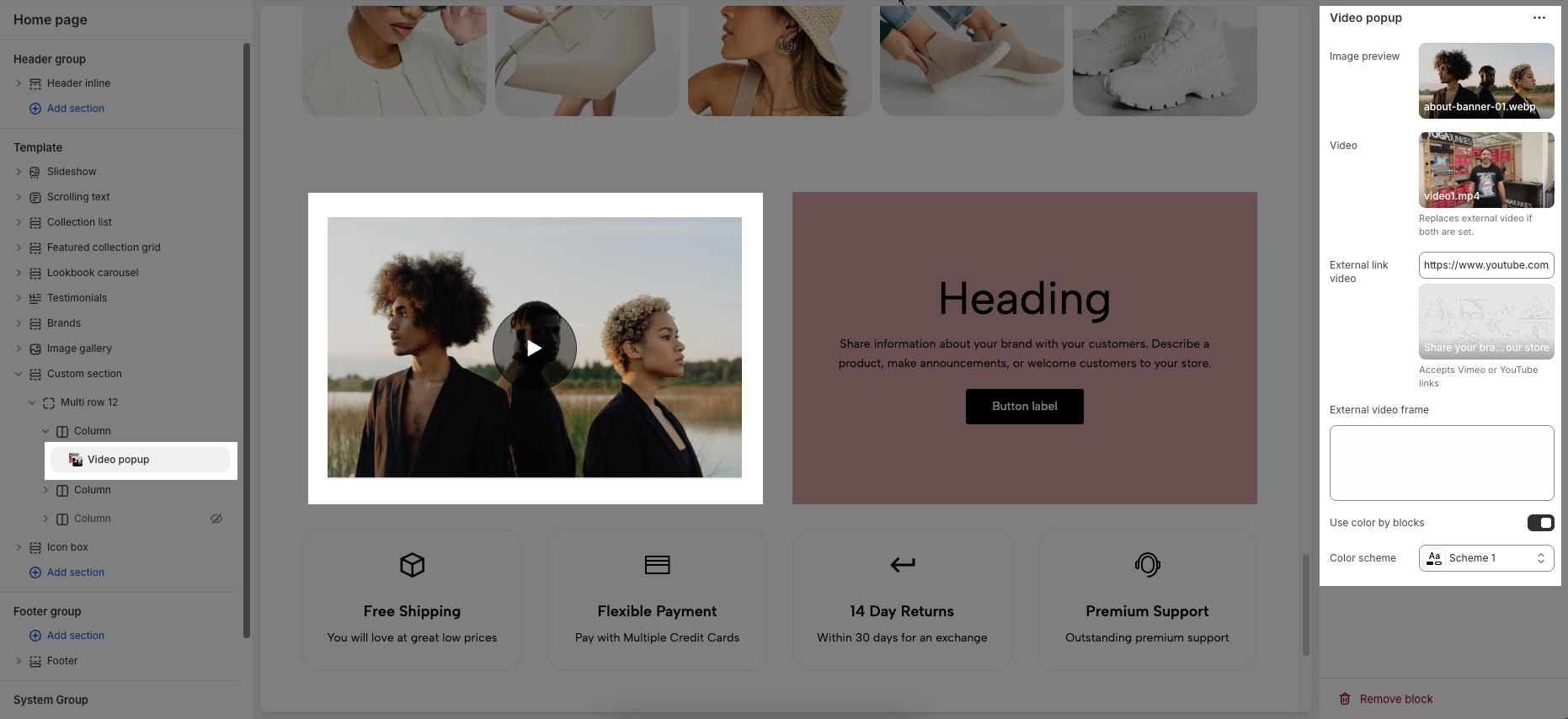
Image preview: Allows you to select an image that will be displayed before the video is played. You can upload your own image or explore free images.
Video: Lets you upload a video file directly. If both this and the external link video are set, the uploaded video will take priority.
External link video: Enter a YouTube or Vimeo video link to embed. This is used if no direct video file is uploaded.
External video frame: Add custom HTML code for embedding an external video frame if needed. This gives you more flexibility for custom integrations.
Use color by blocks: When enabled, the section will use the global Color scheme selected below.
Color scheme: Choose a predefined color scheme to apply to the popup’s appearance for consistent styling.
2.4.10. Product Carousel & Product Grid block
To add Product Carousel & Product Grid block to the Custom section, click the Add block button (plus icon ➕) under the Column block.
Once the Product Carousel & Product Grid block is added, you can customize its settings in the right-hand sidebar:
Follow this guide
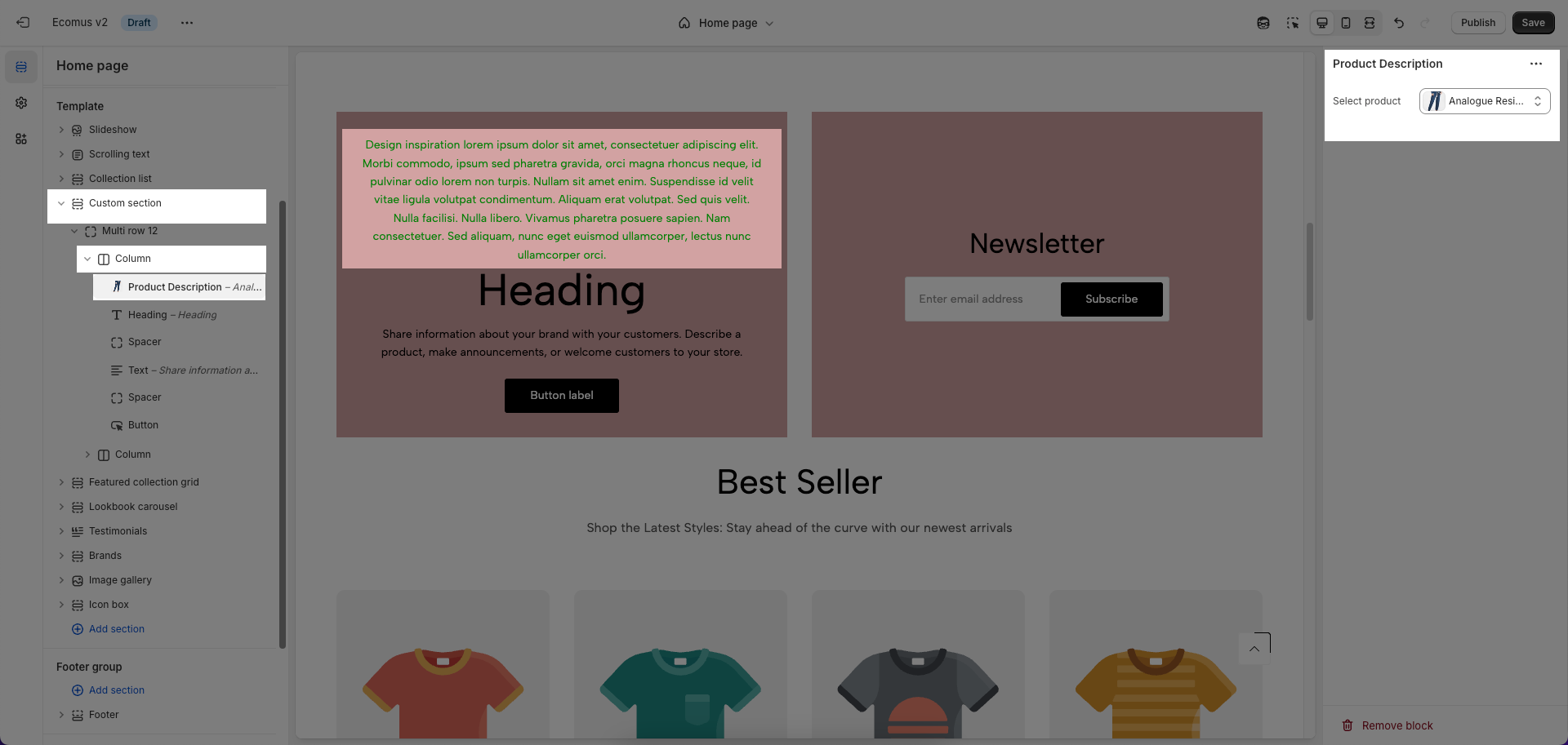
2.4.11. Product description block
The Product Description option allows you to display the description of a specific product inside the selected block or section.
Select product: Use the dropdown to choose a product from your store. Once selected, the block will automatically pull and show that product’s description text on the page.
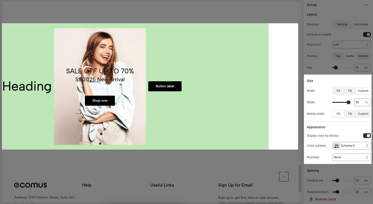
2.5. Group block
To add Group block to the Custom section, click the Add block button (plus icon ➕) under the Custom section.
Once the Group is added, you can customize its settings in the right-hand sidebar:
Layout
Direction: Choose the layout direction for the group, either stacking elements vertically or placing them horizontally.
Vertical on mobile: Toggle to force the layout to stack vertically on mobile devices, regardless of desktop layout.
Alignment: Set the horizontal alignment of the content inside the group (Left, Center, or Right).
Position: Set the vertical position of the content inside the group (Top, Center, or Bottom).
Gap: Adjust the spacing between elements inside the group, measured in pixels
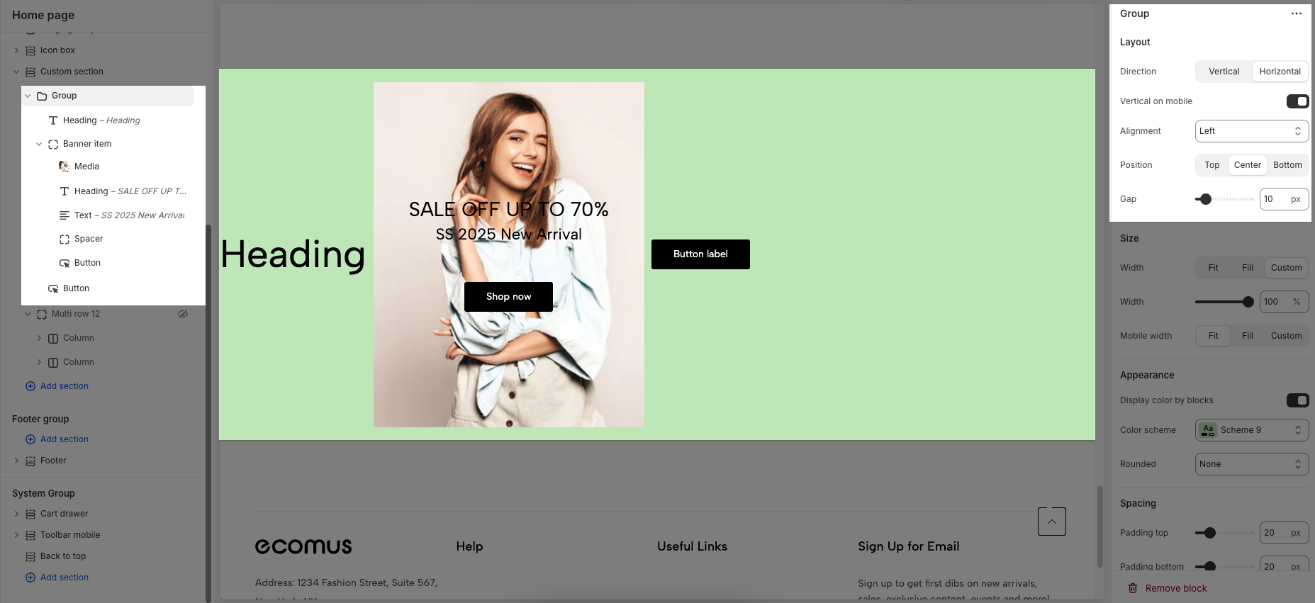
Size
Width (Fit): Automatically adjusts the width of the inner group block to fit its content within the outer group block.
Width (Fill): Expands the width to fill the entire available space.
Width (Custom): Allows you to set a specific custom width in percentages or pixels.
Mobile width: Configure the width of the group on mobile devices using Fit, Fill, or Custom settings.
Appearance
Display color by blocks: Toggle to allow each block within the group to have its own background color.
Color scheme: Select a predefined color scheme to apply to the group.
Rounded: Choose the degree of corner rounding (border radius) for the group.
Spacing
Padding top: Sets the space between the top edge of the block and its content.
Padding bottom: Sets the space between the bottom edge of the block and its content.
Padding left: Sets the space between the left edge of the block and its content.
Padding right: Sets the space between the right edge of the block and its content.
Padding rate mobile: Adjusts the padding proportionally on mobile devices, based on the set desktop padding.


